Flutter Cartesian Charts Column Chart (SfCartesianChart)
16 Apr 202620 minutes to read
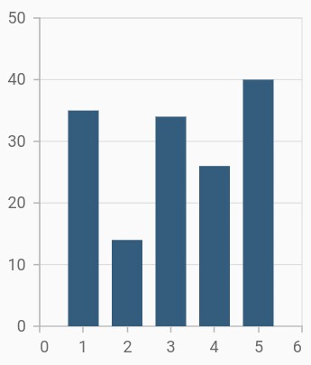
To render a column chart, create an instance of ColumnSeries, and add it to the series collection property of SfCartesianChart. The following properties can be used to customize the appearance:
-
color- changes the color of the series. -
opacity- controls the transparency of the chart series. -
borderWidth- changes the stroke width of the series. -
borderColor- changes the stroke color of the series.
@override
    Widget build(BuildContext context) {
        final List<ChartData> chartData = [
            ChartData(1, 35),
            ChartData(2, 23),
            ChartData(3, 34),
            ChartData(4, 25),
            ChartData(5, 40)
        ];
        return Scaffold(
            body: Center(
                child: Container(
                    child: SfCartesianChart(
                        series: <CartesianSeries<ChartData, int>>[
                            // Renders column chart
                            ColumnSeries<ChartData, int>(
                                dataSource: chartData,
                                xValueMapper: (ChartData data, _) => data.x,
                                yValueMapper: (ChartData data, _) => data.y
                            )
                        ]
                    )
                )
            )
        );
    }
    class ChartData {
        ChartData(this.x, this.y);
        final int x;
        final double y;
    }
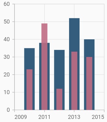
Side-by-side series placement
By default, all the column series that have the same x and y-axes are placed side by side in a chart. If you want to place a series one over the other (overlapped), set the enableSideBySideSeriesPlacement property of SfCartesianChart to false and configure the width property to differentiate the series. The following code snippet and screenshot illustrate the overlapped placement of column series.
@override
    Widget build(BuildContext context) {
        final List<ChartData> chartData = [
            ChartData(2010, 35, 23),
            ChartData(2011, 38, 49),
            ChartData(2012, 34, 12),
            ChartData(2013, 52, 33),
            ChartData(2014, 40, 30)
        ];

        return Scaffold(
            body: Center(
                child: Container(
                    child: SfCartesianChart(
                        // Columns will be rendered back to back
                        enableSideBySideSeriesPlacement: false,
                        series: <CartesianSeries<ChartData, int>>[
                            ColumnSeries<ChartData, int>(
                                dataSource: chartData,
                                xValueMapper: (ChartData data, _) => data.x,
                                yValueMapper: (ChartData data, _) => data.y
                            ),
                            ColumnSeries<ChartData, int>(
                                opacity: 0.9,
                                width: 0.4,
                                dataSource: chartData,
                                xValueMapper: (ChartData data, _) => data.x,
                                yValueMapper: (ChartData data, _) => data.y1
                            )
                        ]
                    )
                )
            )
        );
    }
    class ChartData {
        ChartData(this.x, this.y, this.y1);
        final int x;
        final double y;
        final double y1;
    }
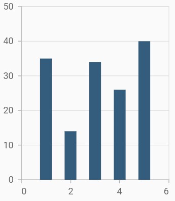
Column width and spacing
The spacing property is used to change the spacing between two segments. The default value of spacing is 0, and the value ranges from 0 to 1. Here, 1 and 0 correspond to 100% and 0% of the available space, respectively.
The width property is used to change the width of the rectangle. The default value of the width is 0.7, and the value ranges from 0 to 1. Here, 1 and 0 correspond to 100% and 0% of the available width, respectively.
@override
    Widget build(BuildContext context) {
        final List<ChartData> chartData = [
            ChartData(1, 35),
            ChartData(2, 23),
            ChartData(3, 34),
            ChartData(4, 25),
            ChartData(5, 40)
        ];
        return Scaffold(
            body: Center(
                child: Container(
                    child: SfCartesianChart(
                        series: <CartesianSeries<ChartData, int>>[
                            ColumnSeries<ChartData, int>(
                                dataSource: chartData,
                                xValueMapper: (ChartData data, _) => data.x,
                                yValueMapper: (ChartData data, _) => data.y,
                                // Width of the columns
                                width: 0.8,
                                // Spacing between the columns
                                spacing: 0.2
                            )
                        ]
                    )
                )
            )
        );
    }
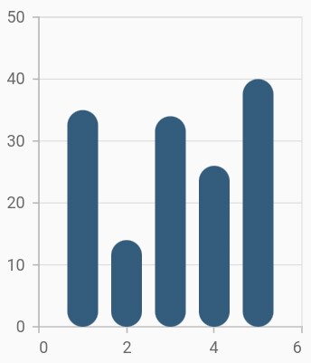
Rounded corners
The borderRadius property is used to add the rounded corners to the rectangle.
@override
    Widget build(BuildContext context) {
        final List<ChartData> chartData = [
            ChartData(1, 35),
            ChartData(2, 23),
            ChartData(3, 34),
            ChartData(4, 25),
            ChartData(5, 40)
        ];
        return Scaffold(
            body: Center(
                child: Container(
                    child: SfCartesianChart(
                        series: <CartesianSeries<ChartData, int>>[
                            ColumnSeries<ChartData, int>(
                                dataSource: chartData,
                                xValueMapper: (ChartData data, _) => data.x,
                                yValueMapper: (ChartData data, _) => data.y,
                                // Sets the corner radius
                                borderRadius: BorderRadius.all(Radius.circular(15))
                            )
                        ]
                    )
                )
            )
        );
    }
See Also
-
Rendering each data points with different border radius in column charts.
-
Adding rounded corners for the specific sides in column charts.
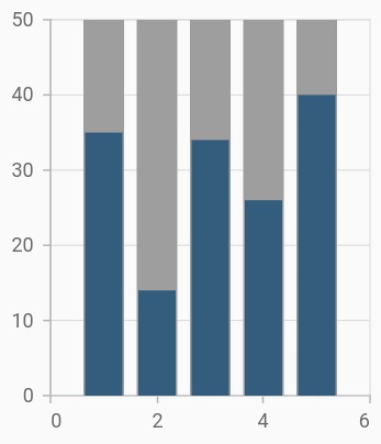
Track customization
Renders columns with tracks. A track is a rectangular bar rendered from the start to the end of the axis. Column series will be rendered above the track. The isTrackVisible property is used to enable the track. The following properties can be used to customize the appearance:
-
trackColor- changes the color of the track. -
trackBorderWidth- changes the stroke width of the track. -
trackBorderColor- changes the stroke color of the track. -
trackPadding- adds padding to the track.
@override
    Widget build(BuildContext context) {
        final List<ChartData> chartData = [
            ChartData(1, 35),
            ChartData(2, 23),
            ChartData(3, 34),
            ChartData(4, 25),
            ChartData(5, 40)
        ];
        return Scaffold(
            body: Center(
                child: Container(
                    child: SfCartesianChart(
                        series: <CartesianSeries<ChartData, int>>[
                            ColumnSeries<ChartData, int>(
                                dataSource: chartData,
                                // Renders the track
                                isTrackVisible: true,
                                xValueMapper: (ChartData data, _) => data.x,
                                yValueMapper: (ChartData data, _) => data.y
                            )
                        ]
                    )
                )
            )
        );
    }
See Also
Note: You can refer to our Flutter Column Chart feature tour page for its groundbreaking feature representations.