Flutter Cartesian Charts Stacked Line Chart (SfCartesianChart)
16 Apr 202621 minutes to read
To create a Flutter stacked line chart quickly, you can check this video.
To render a stacked line chart, create an instance of StackedLineSeries, and add it to the series collection property of SfCartesianChart. The following properties can be used to customize the appearance of stacked line series:
-
color- changes the color of the line. -
opacity- controls the transparency of the chart series. -
width- changes the stroke width of the line.
@override
    Widget build(BuildContext context) {
         return Scaffold(
            body: Center(
                child: Container(
                    child: SfCartesianChart(
                        primaryXAxis: CategoryAxis(),
                        series: <CartesianSeries>[
                            StackedLineSeries<ChartData, String>(
                                dataSource: chartData,
                                xValueMapper: (ChartData data, _) => data.x,
                                yValueMapper: (ChartData data, _) => data.y1
                            ),
                            StackedLineSeries<ChartData, String>(
                                dataSource: chartData,
                                xValueMapper: (ChartData data, _) => data.x,
                                yValueMapper: (ChartData data, _) => data.y2
                            ),
                             StackedLineSeries<ChartData, String>(
                                dataSource: chartData,
                                xValueMapper: (ChartData data, _) => data.x,
                                yValueMapper: (ChartData data, _) => data.y3
                            ),
                            StackedLineSeries<ChartData, String>(
                                dataSource: chartData,
                                xValueMapper: (ChartData data, _) => data.x,
                                yValueMapper: (ChartData data, _) => data.y4
                            )
                        ]
                    )
                )
            )
        );
    }
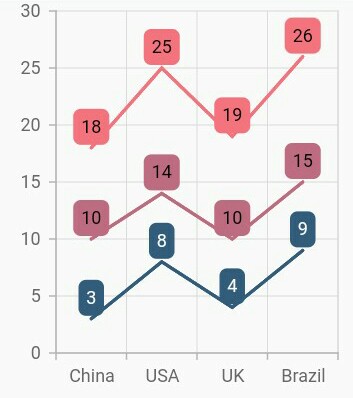
Grouping series
You can group and stack the similar stacked series types using the groupName property of stacked series. The stacked series that contains the same groupName will be stacked in a single group.
@override
    Widget build(BuildContext context) {
         return Scaffold(
            body: Center(
                child: Container(
                    child: SfCartesianChart(
                        primaryXAxis: CategoryAxis(),
                        series: <CartesianSeries>[
                            StackedLineSeries<ChartData, String>(
                                groupName: 'Group A',
                                dataLabelSettings: DataLabelSettings(
                                    isVisible: true,
                                    useSeriesColor: true
                                ),
                                dataSource: chartData,
                                xValueMapper: (ChartData data, _) => data.x,
                                yValueMapper: (ChartData data, _) => data.y1
                            ),
                            StackedLineSeries<ChartData, String>(
                                groupName: 'Group B',
                                dataLabelSettings: DataLabelSettings(
                                    isVisible: true,
                                    useSeriesColor: true
                                ),
                                dataSource: chartData,
                                xValueMapper: (ChartData data, _) => data.x,
                                yValueMapper: (ChartData data, _) => data.y2
                            ),
                            StackedLineSeries<ChartData, String>(
                                groupName: 'Group A',
                                dataLabelSettings: DataLabelSettings(
                                    isVisible: true,
                                    useSeriesColor: true
                                ),
                                dataSource: chartData,
                                xValueMapper: (ChartData data, _) => data.x,
                                yValueMapper: (ChartData data, _) => data.y3
                            ),
                        ]
                    )
                )
            )
        );
    }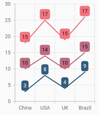
Display cumulative values
You can show the cumulative data label values using the showCumulativeValues property. If the series are grouped using groupName, then cumulative values will be shown based on grouping.
@override
    Widget build(BuildContext context) {
         return Scaffold(
            body: Center(
                child: Container(
                    child: SfCartesianChart(
                        primaryXAxis: CategoryAxis(),
                        series: <CartesianSeries>[
                            StackedLineSeries<ChartData, String>(
                                groupName: 'Group A',
                                dataLabelSettings: DataLabelSettings(
                                    isVisible: true,
                                    showCumulativeValues: true,
                                    useSeriesColor: true
                                ),
                                dataSource: chartData,
                                xValueMapper: (ChartData data, _) => data.x,
                                yValueMapper: (ChartData data, _) => data.y1
                            ),
                            StackedLineSeries<ChartData, String>(
                                groupName: 'Group B',
                                dataLabelSettings: DataLabelSettings(
                                    isVisible: true,
                                    showCumulativeValues: true,
                                    useSeriesColor: true
                                ),
                                dataSource: chartData,
                                xValueMapper: (ChartData data, _) => data.x,
                                yValueMapper: (ChartData data, _) => data.y2
                            ),
                            StackedLineSeries<ChartData, String>(
                                groupName: 'Group A',
                                dataLabelSettings: DataLabelSettings(
                                    isVisible: true,
                                    showCumulativeValues: true,
                                    useSeriesColor: true
                                ),
                                dataSource: chartData,
                                xValueMapper: (ChartData data, _) => data.x,
                                yValueMapper: (ChartData data, _) => data.y3
                            ),
                        ]
                    )
                )
            )
        );
    }