Flutter Cartesian Charts Axis Types (SfCartesianChart)
16 Apr 202624 minutes to read
Charts typically have two axes that are used to measure and categorize data: a vertical (Y) axis, and a horizontal (X) axis.
The vertical(Y) axis always uses numerical scale. Horizontal(X) axis supports the following types of scale:
- Category
- Numeric
- Date-time
- Date-time category
- Logarithmic
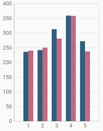
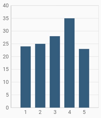
Numeric axis
Numeric axis uses numerical scale and displays numbers as labels. By default, NumericAxis is set to both horizontal axis and vertical axis.
@override
    Widget build(BuildContext context) {
        final List<ChartData> chartData = [
            ChartData(1, 235, 240),
            ChartData(2, 242, 250),
            ChartData(3, 320, 280),
            ChartData(4, 360, 355),
            ChartData(5, 270, 245)
        ];
        return Scaffold(
            body: Center(
                child: Container(
                    child: SfCartesianChart(
                        primaryXAxis: NumericAxis(),
                        primaryYAxis: NumericAxis(),
                        series: <CartesianSeries<ChartData, double>>[
                            // Renders column chart
                            ColumnSeries<ChartData, double>(
                                dataSource: chartData,
                                xValueMapper: (ChartData data, int index) => data.x,
                                yValueMapper: (ChartData data, int index) => data.y
                            ),
                            ColumnSeries<ChartData, double>(
                                dataSource: chartData,
                                xValueMapper: (ChartData data, int index) => data.x,
                                yValueMapper: (ChartData data, int index) => data.y1
                            ),
                        ]
                    )
                )
            )
        );
    }

    class ChartData{
        ChartData(this.x, this.y, this.y1);
        final double x;
        final double y;
        final double y1;
    }
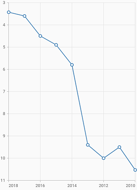
Inversed numeric axis
By using the isInversed property in Cartesian charts, the numeric axis can be inverted. Axis is rendered from the minimum value to the maximum value by default, and can be inverted from the maximum value to the minimum value.
@override
    Widget build(BuildContext context) {
        final List<ChartData> chartData = <ChartData>[
            ChartData(2010, 10.53),
            ChartData(2011, 9.5),
            ChartData(2012, 10),
            ChartData(2013, 9.4),
            ChartData(2014, 5.8),
            ChartData(2015, 4.9),
            ChartData(2016, 4.5),
            ChartData(2017, 3.6),
            ChartData(2018, 3.43),
        ];
        return Scaffold(
            body: Center(
                child: Container(
                    child: SfCartesianChart(
                        primaryXAxis: NumericAxis(isInversed: true),
                        primaryYAxis: NumericAxis(isInversed: true),
                        series: <CartesianSeries<ChartData, int>>[
                        LineSeries<ChartData, int>(
                            dataSource: chartData,
                            markerSettings: MarkerSettings(isVisible: true),
                            xValueMapper: (ChartData data, int index) => data.x,
                            yValueMapper: (ChartData data, int index) => data.y),
                        ],
                    )
                )
            )
        );
    }
    class ChartData{
        ChartData(this.x, this.y);
        final int x;
        final double y;
    }
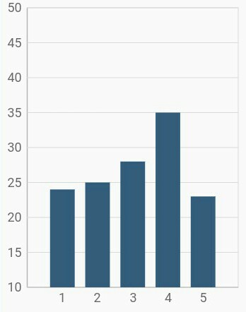
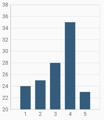
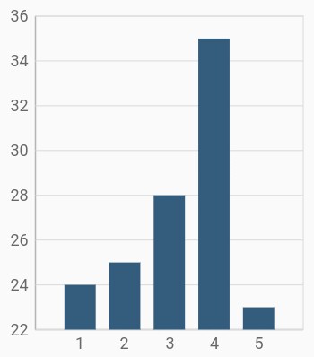
Customizing range
To customize the range of an axis, use the minimum and maximum properties of NumericAxis. By default, nice range will be calculated automatically based on the provided data.
@override
    Widget build(BuildContext context) {
        final List<ChartData> chartData = [
            ChartData(1, 24),
            ChartData(2, 25),
            ChartData(3, 28),
            ChartData(4, 35),
            ChartData(5, 23)
        ];
        return Scaffold(
            body: Center(
                child: Container(
                    child: SfCartesianChart(
                        primaryYAxis: NumericAxis(
                            minimum: 10,
                            maximum: 50
                        ),
                        series: <CartesianSeries<ChartData, int>>[
                        ColumnSeries<ChartData, int>(
                            dataSource: chartData,
                            xValueMapper: (ChartData data, int index) => data.x,
                            yValueMapper: (ChartData data, int index) => data.y),
                        ],
                    )
                )
            )
        );
    }
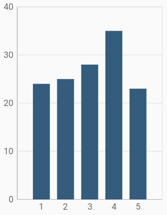
Customizing interval
Axis interval can be customized using the interval property of ChartAxis. By default, nice interval will be calculated based on the minimum and maximum values of the provided data.
@override
    Widget build(BuildContext context) {
        return Scaffold(
            body: Center(
                child: Container(
                    child: SfCartesianChart(
                        primaryYAxis: NumericAxis(
                            // axis interval is set to 10
                            interval: 10
                        ),
                        series: <CartesianSeries<ChartData, int>>[
                        ColumnSeries<ChartData, int>(
                            dataSource: chartData,
                            xValueMapper: (ChartData data, int index) => data.x,
                            yValueMapper: (ChartData data, int index) => data.y),
                        ],
                    )
                )
            )
        );
    }
Applying padding to the range
Padding can be applied to the minimum and maximum extremes of the axis range using the rangePadding property. Numeric axis supports the following types of padding:
- additional
- additionalStart
- additionalEnd
- auto
- none
- normal
- round
- roundStart
- roundEnd
additional
When the value of rangePadding property is ChartRangePadding.additional, the axis range will be rounded and an interval of the axis will be added as padding to the minimum and maximum values of the range.
@override
    Widget build(BuildContext context) {
        return Scaffold(
            body: Center(
                child: Container(
                    child: SfCartesianChart(
                        primaryYAxis: NumericAxis(
                            // Additional range padding is applied to y axis
                            rangePadding: ChartRangePadding.additional
                        ),
                        series: <CartesianSeries<ChartData, int>>[
                        ColumnSeries<ChartData, int>(
                            dataSource: chartData,
                            xValueMapper: (ChartData data, int index) => data.x,
                            yValueMapper: (ChartData data, int index) => data.y),
                        ],
                    )
                )
            )
        );
    }
additionalStart
When the value of rangePadding property is ChartRangePadding.additionalStart, the axis range will be rounded and an interval of the axis will be added as padding to the minimum value of the range.
@override
    Widget build(BuildContext context) {
        return Scaffold(
            body: Center(
                child: Container(
                    child: SfCartesianChart(
                        primaryYAxis: NumericAxis(
                            // Additional range padding is applied to start of the y axis
                            rangePadding: ChartRangePadding.additionalStart
                        ),
                        series: <CartesianSeries<ChartData, int>>[
                        ColumnSeries<ChartData, int>(
                            dataSource: chartData,
                            xValueMapper: (ChartData data, int index) => data.x,
                            yValueMapper: (ChartData data, int index) => data.y),
                        ],
                    )
                )
            )
        );
    }
additionalEnd
When the value of rangePadding property is ChartRangePadding.additionalEnd, the axis range will be rounded and an interval of the axis will be added as padding to the maximum value of the range.
@override
    Widget build(BuildContext context) {
        return Scaffold(
            body: Center(
                child: Container(
                    child: SfCartesianChart(
                        primaryYAxis: NumericAxis(
                            // Additional range padding is applied to end of the y axis
                            rangePadding: ChartRangePadding.additionalEnd
                        ),
                        series: <CartesianSeries<ChartData, int>>[
                        ColumnSeries<ChartData, int>(
                            dataSource: chartData,
                            xValueMapper: (ChartData data, int index) => data.x,
                            yValueMapper: (ChartData data, int index) => data.y),
                        ],
                    )
                )
            )
        );
    }
auto
When the value of rangePadding property is ChartRangePadding.auto, the horizontal numeric axis takes none for padding calculation, whereas the vertical numeric axis takes normal for padding calculation. This is also the default value of rangePadding.
@override
    Widget build(BuildContext context) {
        return Scaffold(
            body: Center(
                child: Container(
                    child: SfCartesianChart(
                        primaryYAxis: NumericAxis(
                            rangePadding: ChartRangePadding.auto
                        ),
                        series: <CartesianSeries<ChartData, int>>[
                        ColumnSeries<ChartData, int>(
                            dataSource: chartData,
                            xValueMapper: (ChartData data, int index) => data.x,
                            yValueMapper: (ChartData data, int index) => data.y),
                        ],
                    )
                )
            )
        );
    }
none
When the value of rangePadding property is ChartRangePadding.none, padding will not be applied to the axis.
@override
    Widget build(BuildContext context) {
        return Scaffold(
            body: Center(
                child: Container(
                    child: SfCartesianChart(
                        primaryYAxis: NumericAxis(
                            rangePadding: ChartRangePadding.none
                        ),
                        series: <CartesianSeries<ChartData, int>>[
                        ColumnSeries<ChartData, int>(
                            dataSource: chartData,
                            xValueMapper: (ChartData data, int index) => data.x,
                            yValueMapper: (ChartData data, int index) => data.y),
                        ],
                    )
                )
            )
        );
    }
normal
When the value of rangePadding property is ChartRangePadding.normal, padding is applied to the axis based on the default range calculation.
@override
    Widget build(BuildContext context) {
        return Scaffold(
            body: Center(
                child: Container(
                    child: SfCartesianChart(
                        primaryYAxis: NumericAxis(
                            rangePadding: ChartRangePadding.normal
                        ),
                        series: <CartesianSeries<ChartData, int>>[
                        ColumnSeries<ChartData, int>(
                            dataSource: chartData,
                            xValueMapper: (ChartData data, int index) => data.x,
                            yValueMapper: (ChartData data, int index) => data.y),
                        ],
                    )
                )
            )
        );
    }
round
When the value of rangePadding property is ChartRangePadding.round, axis range will be rounded to the nearest possible numeric value.
@override
    Widget build(BuildContext context) {
        return Scaffold(
            body: Center(
                child: Container(
                    child: SfCartesianChart(
                        primaryYAxis: NumericAxis(
                            rangePadding: ChartRangePadding.round
                        ),
                        series: <CartesianSeries<ChartData, int>>[
                        ColumnSeries<ChartData, int>(
                            dataSource: chartData,
                            xValueMapper: (ChartData data, int index) => data.x,
                            yValueMapper: (ChartData data, int index) => data.y),
                        ],
                    )
                )
            )
        );
    }
roundStart
When the value of rangePadding property is ChartRangePadding.roundStart, axis range will be rounded to the nearest possible numeric value at the start position of the axis.
@override
    Widget build(BuildContext context) {
        return Scaffold(
            body: Center(
                child: Container(
                    child: SfCartesianChart(
                        primaryYAxis: NumericAxis(
                            rangePadding: ChartRangePadding.roundStart
                        ),
                        series: <CartesianSeries<ChartData, int>>[
                        ColumnSeries<ChartData, int>(
                            dataSource: chartData,
                            xValueMapper: (ChartData data, int index) => data.x,
                            yValueMapper: (ChartData data, int index) => data.y),
                        ],
                    )
                )
            )
        );
    }
roundEnd
When the value of rangePadding property is ChartRangePadding.roundEnd, axis range will be rounded to the nearest possible numeric value at the end position of the axis.
@override
    Widget build(BuildContext context) {
        return Scaffold(
            body: Center(
                child: Container(
                    child: SfCartesianChart(
                        primaryYAxis: NumericAxis(
                            rangePadding: ChartRangePadding.roundEnd
                        ),
                        series: <CartesianSeries<ChartData, int>>[
                        ColumnSeries<ChartData, int>(
                            dataSource: chartData,
                            xValueMapper: (ChartData data, int index) => data.x,
                            yValueMapper: (ChartData data, int index) => data.y),
                        ],
                    )
                )
            )
        );
    }
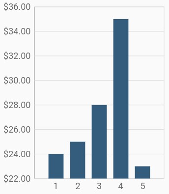
Formatting the labels
The numberFormat property of numeric axis formats the numeric axis labels with globalized label formats. The following code snippet demonstrates how to format numeric labels.
import 'package:intl/intl.dart';

    @override
    Widget build(BuildContext context) {
        return Scaffold(
            body: Center(
                child: Container(
                    child: SfCartesianChart(
                        primaryYAxis: NumericAxis(
                            // Y axis labels will be rendered with currency format
                            numberFormat: NumberFormat.simpleCurrency()
                        ),
                        series: <CartesianSeries<ChartData, int>>[
                        ColumnSeries<ChartData, int>(
                            dataSource: chartData,
                            xValueMapper: (ChartData data, int index) => data.x,
                            yValueMapper: (ChartData data, int index) => data.y),
                        ],
                    )
                )
            )
        );
    }
Also refer label format and date format for formatting the labels
further.
Note: You must import
intlpackage for formatting labels using theNumberFormatclass anddate Formatclass.
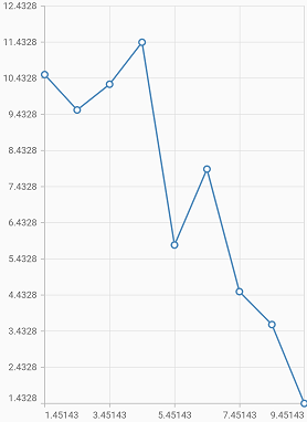
Decimal places
The decimalPlaces property of numeric axis can be used to control the number of decimal digits of the numeric axis labels. The default value of decimalPlaces property is 3.
@override
    Widget build(BuildContext context) {
        final List<ChartData> chartData = <ChartData>[
            ChartData(1.45143, 10.53333),
            ChartData(2.45143, 9.55445),
            ChartData(3.45143, 10.26587),
            ChartData(4.45143, 11.42762),
            ChartData(5.45143, 5.817699),
            ChartData(6.45143, 7.917744),
            ChartData(7.45143, 4.52734),
            ChartData(8.45143, 3.615545),
            ChartData(9.45143, 1.4327671),
        ];
        return Scaffold(
            body: Center(
                child: Container(
                    child: SfCartesianChart(
                        primaryXAxis: NumericAxis(
                            decimalPlaces: 5
                        ),
                        primaryYAxis: NumericAxis(
                            decimalPlaces: 4,
                            rangePadding: ChartRangePadding.none
                        ),
                        series: <CartesianSeries<ChartData, double>>[
                            LineSeries<ChartData, double>(
                                dataSource: chartData,
                                markerSettings: MarkerSettings(isVisible: true),
                                xValueMapper: (ChartData data, int index) => data.x,
                                yValueMapper: (ChartData data, int index) => data.y),
                        ],
                    )
                )
            )
        );
    }
Note:
- In order to control the decimal places of the y-axis labels, you need to use
decimalPlacesproperty of the axis along with setting therangePaddingtoChartRangePadding.none.- For x-axis labels, setting the
decimalPlacesalone is enough.
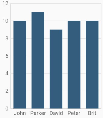
Category axis
Category axis displays text labels instead of numbers. When the string values are bound to x values, then the x-axis must be initialized with CategoryAxis.
@override
    Widget build(BuildContext context) {
        final List<ChartData> chartData = [
            ChartData('John', 10),
            ChartData('Parker', 11),
            ChartData('David', 9),
            ChartData('Peter', 10),
            ChartData('Brit', 10)
        ];
        return Scaffold(
            body: Center(
                child: Container(
                    child: SfCartesianChart(
                        primaryXAxis: CategoryAxis(),
                        series: <CartesianSeries<ChartData, String>>[
                            // Renders column chart
                            ColumnSeries<ChartData, String>(
                                dataSource: chartData,
                                xValueMapper: (ChartData data, int index) => data.x,
                                yValueMapper: (ChartData data, int index) => data.y
                            )
                        ]
                    )
                )
            )
        );
    }

    class ChartData{
        ChartData(this.x, this.y);
        final String x;
        final double y;
    }
Placing labels between the ticks
Labels in category axis can be placed on the ticks by setting the labelPlacement to LabelPlacement.onTicks. The default value of the labelPlacement property is LabelPlacement.betweenTicks. So, the labels will be placed between the ticks by default.
@override
    Widget build(BuildContext context) {
        return Scaffold(
            body: Center(
                child: Container(
                    child: SfCartesianChart(
                        primaryXAxis: CategoryAxis(
                            // Axis labels will be placed on the ticks
                            labelPlacement: LabelPlacement.onTicks
                        ),
                    )
                )
            )
        );
    }
Displaying labels after a fixed interval
To display the labels after a fixed interval n, set the interval property of ChartAxis to n. The default value of interval is null.
@override
    Widget build(BuildContext context) {
        return Scaffold(
            body: Center(
                child: Container(
                    child: SfCartesianChart(
                        primaryXAxis: CategoryAxis(
                            labelPlacement: LabelPlacement.betweenTicks,
                            interval: 2
                        ),
                    )
                )
            )
        );
    }
Indexed category axis
Category axis can also be rendered based on the index values of data source by setting the arrangeByIndex property to true in the axis.
final List<ChartData> chartData = [
        ChartData('John', 10),
        ChartData('David', 9),
        ChartData('Brit', 10),
    ];

    final List<ChartData> chartData2 = [
        ChartData('Anto', 11),
        ChartData('Peter', 12),
        ChartData('Parker', 8),
    ];

    @override
    Widget build(BuildContext context) {
        return Scaffold(
            body: Center(
                child: Container(
                    child: SfCartesianChart(
                        primaryXAxis: CategoryAxis(
                            // Axis will be rendered based on the index values
                            arrangeByIndex: true
                        ),
                        series: <CartesianSeries<ChartData, String>>[
                            ColumnSeries<ChartData, String>(
                                dataSource: chartData,
                                xValueMapper: (ChartData data, int index) => data.x,
                                yValueMapper: (ChartData data, int index) => data.y,
                            ),
                            ColumnSeries<ChartData, String>(
                                dataSource: chartData2,
                                xValueMapper: (ChartData data, int index) => data.x,
                                yValueMapper: (ChartData data, int index) => data.y,
                            )
                        ]
                    )
                )
            )
        );
    }

    class ChartData {
        ChartData(this.x, this.y);
        final String x;
        final double? y;
    }
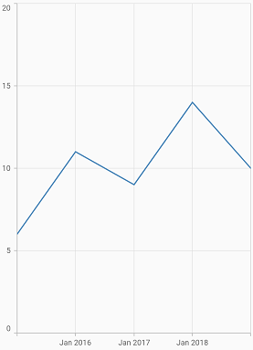
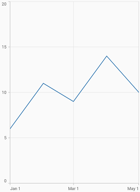
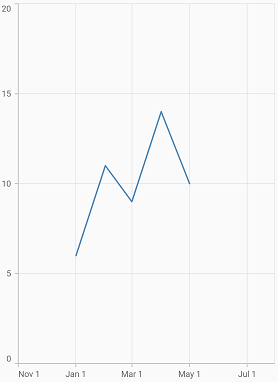
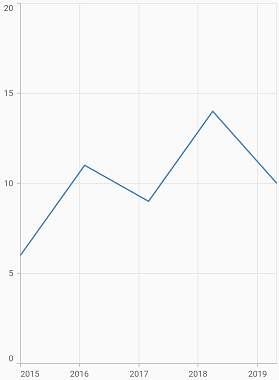
Date-time axis
The date-time axis uses date-time scale and displays date-time values as axis labels in specified format.
@override
    Widget build(BuildContext context) {
        final List<ChartData> chartData = [
            ChartData(DateTime(2015, 1), 6),
            ChartData(DateTime(2016, 1), 11),
            ChartData(DateTime(2017, 1), 9),
            ChartData(DateTime(2018, 1), 14),
            ChartData(DateTime(2019, 1), 10),
        ];
        return Scaffold(
            body: Center(
                child: Container(
                    child: SfCartesianChart(
                        primaryXAxis: DateTimeAxis(),
                         series: <CartesianSeries<ChartData, DateTime>>[
                            // Renders line chart
                            LineSeries<ChartData, DateTime>(
                                dataSource: chartData,
                                xValueMapper: (ChartData data, int index) => data.x,
                                yValueMapper: (ChartData data, int index) => data.y
                            )
                        ]
                    )
                )
            )
        );
    }

    class ChartData{
        ChartData(this.x, this.y);
        final DateTime x;
        final double y;
    }
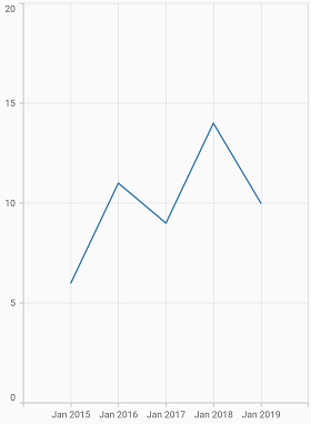
Customizing range
To customize the range of an axis, use the minimum and maximum properties of DateTimeAxis. By default, nice range will be calculated automatically based on the provided data.
@override
    Widget build(BuildContext context) {
        return Scaffold(
            body: Center(
                child: Container(
                    child: SfCartesianChart(
                        primaryXAxis: DateTimeAxis(
                            minimum: DateTime(2014, 1),
                            maximum: DateTime(2020, 1),
                        ),
                        series: <CartesianSeries<ChartData, DateTime>>[
                        LineSeries<ChartData, DateTime>(
                            dataSource: chartData,
                            xValueMapper: (ChartData data, int index) => data.x,
                            yValueMapper: (ChartData data, int index) => data.y),
                        ],
                    )
                )
            )
        );
    }
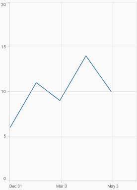
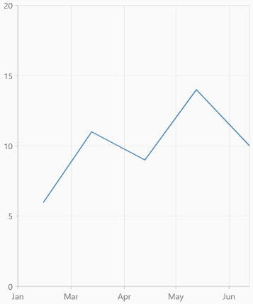
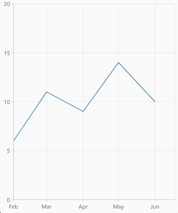
Date-time intervals
The date-time intervals can be customized using the interval and intervalType properties of DateTimeAxis. For example, setting interval as 2 and intervalType to years, would consider 2 years to be an interval.
The Flutter Chart supports the following types of interval for date-time axis:
- auto
- years
- months
- days
- hours
- minutes
- seconds
- milliseconds
@override
    Widget build(BuildContext context) {
        return Scaffold(
            body: Center(
                child: Container(
                    child: SfCartesianChart(
                        primaryXAxis: DateTimeAxis(
                            // Interval type will be months
                            intervalType: DateTimeIntervalType.months,
                            interval: 2
                        ),
                        series: <CartesianSeries<ChartData, DateTime>>[
                        LineSeries<ChartData, DateTime>(
                            dataSource: chartData,
                            xValueMapper: (ChartData data, int index) => data.x,
                            yValueMapper: (ChartData data, int index) => data.y),
                        ],
                    )
                )
            )
        );
    }
See Also
Double range support
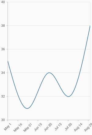
Date-time axis interval property can be customized using double value.
For example, if you are rendering a series with months in x-axis with an interval of 0.5, then the interval will be calculated in days. The interval calculation may vary depending upon the number of days in the month.
@override
    Widget build(BuildContext context) {
        final List<ChartData> chartData = [
            ChartData(DateTime(2015, 5, 1), 35),
            ChartData(DateTime(2015, 5, 31), 31),
            ChartData(DateTime(2015, 6, 30), 34),
            ChartData(DateTime(2015, 7, 30), 32),
            ChartData(DateTime(2015, 8, 30), 38),
        ];
        return Scaffold(
            body: Center(
                child: Container(
                    child: SfCartesianChart(
                        primaryXAxis: DateTimeAxis(
                             interval: 0.5,
                        ),
                        primaryYAxis: NumericAxis(),
                        series: <CartesianSeries<ChartData, DateTime>>[
                        SplineSeries<ChartData, DateTime>(
                            dataSource: chartData,
                            xValueMapper: (ChartData data, int index) => data.x,
                            yValueMapper: (ChartData data, int index) => data.y),
                        ],
                    )
                )
            )
        );
     }
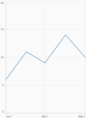
Applying padding to range
Padding can be applied to the minimum and maximum extremes of a range using the RangePadding property. The date-time axis supports the following types of padding:
- none
- round
- roundStart
- roundEnd
- additional
- additionalStart
- additionalEnd
- normal
none
When the value of rangePadding property is ChartRangePadding.none, padding will not be applied to the axis.
@override
    Widget build(BuildContext context) {
        final List<ChartData> chartData = [
            ChartData(DateTime(2015, 1), 6),
            ChartData(DateTime(2015, 2), 11),
            ChartData(DateTime(2015, 3), 9),
            ChartData(DateTime(2015, 4), 14),
            ChartData(DateTime(2015, 5), 10),
        ];
        return Scaffold(
            body: Center(
                child: Container(
                    child: SfCartesianChart(
                        primaryXAxis: DateTimeAxis(
                            rangePadding: ChartRangePadding.none
                        ),
                        series: <CartesianSeries<ChartData, DateTime>>[
                        LineSeries<ChartData, DateTime>(
                            dataSource: chartData,
                            xValueMapper: (ChartData data, int index) => data.x,
                            yValueMapper: (ChartData data, int index) => data.y),
                        ],
                    )
                )
            )
        );
    }
round
When the value of rangePadding property is ChartRangePadding.round, axis range will be rounded to the nearest possible date-time value.
@override
    Widget build(BuildContext context) {
        return Scaffold(
            body: Center(
                child: Container(
                    child: SfCartesianChart(
                        primaryXAxis: DateTimeAxis(
                            rangePadding: ChartRangePadding.round
                        )
                    )
                )
            )
        );
    }
roundStart
When the value of rangePadding property is ChartRangePadding.roundStart, axis range will be rounded to the nearest possible date-time value at the start position of the axis.
@override
    Widget build(BuildContext context) {
        return Scaffold(
            body: Center(
                child: Container(
                    child: SfCartesianChart(
                        primaryXAxis: DateTimeAxis(
                            rangePadding: ChartRangePadding.roundStart
                        )
                    )
                )
            )
        );
    }
roundEnd
When the value of rangePadding property is ChartRangePadding.roundEnd, axis range will be rounded to the nearest possible date-time value at the end position of the axis.
@override
    Widget build(BuildContext context) {
        return Scaffold(
            body: Center(
                child: Container(
                    child: SfCartesianChart(
                        primaryXAxis: DateTimeAxis(
                            rangePadding: ChartRangePadding.roundEnd
                        )
                    )
                )
            )
        );
    }
additional
When the value of rangePadding property is ChartRangePadding.additional, range will be rounded and date-time interval of the axis will be added as padding to the minimum and maximum extremes of a range.
@override
    Widget build(BuildContext context) {
        return Scaffold(
            body: Center(
                child: Container(
                    child: SfCartesianChart(
                        primaryXAxis: DateTimeAxis(
                            rangePadding: ChartRangePadding.additional
                        )
                    )
                )
            )
        );
    }
additionalStart
When the value of rangePadding property is ChartRangePadding.additionalStart, range will be rounded and date-time interval of the axis will be added as padding to the minimum extreme of a range.
@override
    Widget build(BuildContext context) {
        return Scaffold(
            body: Center(
                child: Container(
                    child: SfCartesianChart(
                        primaryXAxis: DateTimeAxis(
                            rangePadding: ChartRangePadding.additionalStart
                        )
                    )
                )
            )
        );
    }
additionalEnd
When the value of rangePadding property is ChartRangePadding.additionalEnd, range will be rounded and date-time interval of the axis will be added as padding to the maximum extreme of a range.
@override
    Widget build(BuildContext context) {
        return Scaffold(
            body: Center(
                child: Container(
                    child: SfCartesianChart(
                        primaryXAxis: DateTimeAxis(
                            rangePadding: ChartRangePadding.additionalEnd
                        )
                    )
                )
            )
        );
    }
normal
When the value of rangePadding property is ChartRangePadding.normal, padding will be applied to the axis based on the default range calculation.
@override
    Widget build(BuildContext context) {
        return Scaffold(
            body: Center(
                child: Container(
                    child: SfCartesianChart(
                        primaryXAxis: DateTimeAxis(
                            rangePadding: ChartRangePadding.normal
                        )
                    )
                )
            )
        );
    }
Formatting the labels
The date formats property formats the date-time axis labels. The default data-time axis label can be formatted with various built-in DateFormat, which depend on the given data source.
import 'package:intl/intl.dart';

    @override
    Widget build(BuildContext context) {
        return Scaffold(
            body: Center(
                child: Container(
                    child: SfCartesianChart(
                        primaryXAxis: DateTimeAxis(
                            // X axis labels will be rendered based on the below format
                            dateFormat: DateFormat.y()
                        )
                    )
                )
            )
        );
    }
Also refer label format and number format for formatting the labels further.
Note: You must import
intlpackage for formatting labels using theNumberFormatclass anddate Formatclass.
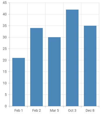
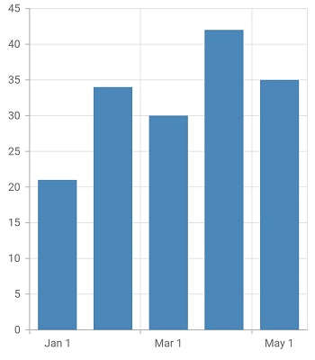
Date-time category axis
Date-time category axis is a combination of both DateTimeAxis and CategoryAxis. Date-time category axis is used to display the date-time values with non-linear intervals. For example, the business days alone have been depicted in a week here.
@override
    Widget build(BuildContext context) {
        final List<ChartData> chartData = [
            ChartData(DateTime(2015, 2, 1), 21),
            ChartData(DateTime(2015, 2, 2), 34),
            ChartData(DateTime(2015, 3, 5), 30),
            ChartData(DateTime(2015, 10, 3), 42),
            ChartData(DateTime(2015, 12, 8), 35),
        ];
        return Scaffold(
            body: Center(
                child: Container(
                    child: SfCartesianChart(
                        primaryXAxis: DateTimeCategoryAxis(),
                        series: <CartesianSeries<ChartData, DateTime>>[
                            // Renders Column chart
                            ColumnSeries<ChartData, DateTime>(
                                dataSource: chartData,
                                xValueMapper: (ChartData data, int index) => data.x,
                                yValueMapper: (ChartData data, int index) => data.y
                            )
                        ]
                    )
                )
            )
        );
    }

    class ChartData{
        ChartData(this.x, this.y);
        final DateTime x;
        final double y;
    }
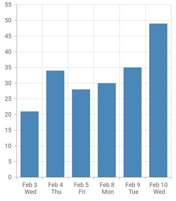
Customizing range
To customize the range of an axis, use the minimum and maximum properties of DateTimeCategoryAxis. By default, nice range will be calculated automatically based on the provided data.
@override
    Widget build(BuildContext context) {
        final List<ChartData> chartData = [
            ChartData(DateTime(2015, 2, 3), 21),
            ChartData(DateTime(2015, 2, 4), 34),
            ChartData(DateTime(2015, 2, 5), 30),
            ChartData(DateTime(2015, 2, 8), 42),
            ChartData(DateTime(2015, 2, 9), 35),
            ChartData(DateTime(2015, 2, 9), 49),
        ];
        return Scaffold(
            body: Center(
                child: Container(
                    child: SfCartesianChart(
                        primaryXAxis: DateTimeCategoryAxis(
                            minimum: DateTime(2010, 2, 3),
                            maximum: DateTime(2010, 2, 10)
                        )
                    )
                )
            )
        );
    }
Date-time intervals
The date-time category intervals can be customized using the interval and intervalType properties of DateTimeCategoryAxis. For example, To display the axis labels after a fixed interval n, set the interval property of ChartAxis to n and to display the labels in months, set the intervalType property of DateTimeCategoryAxis as months.
The Flutter Chart supports the following types of interval for date-time category axis:
- auto
- years
- months
- days
- hours
- minutes
- seconds
- milliseconds
@override
    Widget build(BuildContext context) {
        return Scaffold(
            body: Center(
                child: Container(
                    child: SfCartesianChart(
                        primaryXAxis: DateTimeCategoryAxis(
                            // Interval type will be years
                            intervalType: DateTimeIntervalType.months,
                            interval: 2
                        )
                    )
                )
            )
        );
    }
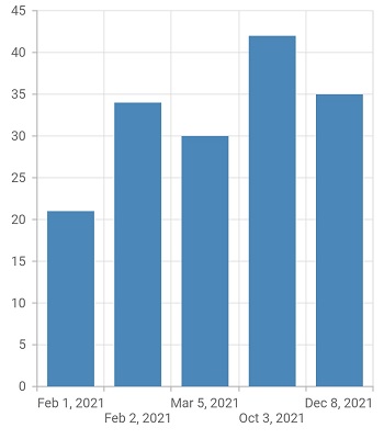
Formatting the labels
The date formats property formats the date-time category axis labels. The default data-time category axis label can be formatted with various built-in DateFormat, which depend on the given data source.
import 'package:intl/intl.dart';

    @override
    Widget build(BuildContext context) {
        return Scaffold(
            body: Center(
                child: Container(
                    child: SfCartesianChart(
                        primaryXAxis: DateTimeCategoryAxis(
                            // X axis labels will be rendered based on the below format
                            dateFormat: DateFormat.yMMMd()
                        )
                    )
                )
            )
        );
    }
Also refer label format and number format for formatting the labels further.
Note: You must import
intlpackage for formatting labels using theNumberFormatclass anddate formatsclass.
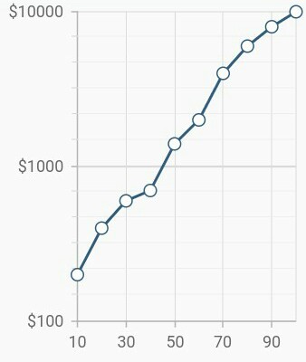
Logarithmic axis
Logarithmic axis uses logarithmic scale and displays numbers as axis labels.
@override
    Widget build(BuildContext context) {
        return Scaffold(
            body: Center(
                child: Container(
                    child: SfCartesianChart(
                        primaryXAxis: NumericAxis(),
                        primaryYAxis: LogarithmicAxis(),
                        series: <CartesianSeries<ChartData, double>>[
                            // Renders Column chart
                            ColumnSeries<ChartData, double>(
                                dataSource: chartData,
                                xValueMapper: (ChartData data, int index) => data.x,
                                yValueMapper: (ChartData data, int index) => data.y
                            )
                        ]
                    )
                )
            )
        );
    }

    class ChartData{
        ChartData(this.x, this.y);
        final double x;
        final double y;
    }
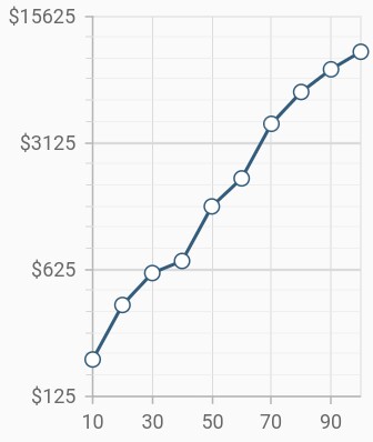
Change logarithmic range
To customize the range of log axis, use the minimum, maximum, and interval properties. By default, the range will be calculated automatically based on the provided data.
@override
    Widget build(BuildContext context) {
        return Scaffold(
            body: Center(
                child: Container(
                    child: SfCartesianChart(
                        primaryYAxis: LogarithmicAxis(
                            minimum: 100,
                            maximum: 100000,
                            interval: 1,
                        )
                    )
                )
            )
        );
    }
Change log base value
To customize the log base value, use the logBase property.
@override
    Widget build(BuildContext context) {
        return Scaffold(
            body: Center(
                child: Container(
                    child: SfCartesianChart(
                        primaryYAxis: LogarithmicAxis(
                           logBase: 5,
                        )
                    )
                )
            )
        );
    }
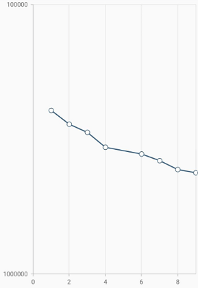
Inversed logarithmic axis
By using the isInversed Property in Cartesian charts, the logarithmic axis can be inverted. Axis gets rendered from the minimum value to the maximum value by default and can be inverted from the maximum value to the minimum value.
@override
    Widget build(BuildContext context) {
        final dynamic chartData = <ChartData>[
        ChartData('IND', 160, 10),
        ChartData('CHN', 12343, 7),
        ChartData('MAL', 19, 11),
        ChartData('JAP', 14, 7),
        ChartData('USA', 11, 8),
        ChartData('ITL', 5, 6),
        ChartData('SPA', 10, 3),
        ChartData('PAK', 1, 7)
        ];
        return Scaffold(
            body: Center(
                child: Container(
                    child: SfCartesianChart(
                        primaryXAxis: LogarithmicAxis(
                          isInversed:true,
                        ),
                        series : <StepLineSeries<ChartData, String>>[
                        StepLineSeries<ChartData, String>(
                        dataSource: chartData,
                        xValueMapper: (ChartData data, int index) => data.x,
                        yValueMapper: (ChartData data, int index) => data.y,
                        animationDuration: 0),
                        ]
                    )
                )
            )
        );
    }

    class ChartData {
       ChartData(this.x, this.y, this.z);
       final String x;
       final int y;
       final int z;
    }
See Also
Note:
chartDatain the above code snippets is a class type list and holds the data for binding to the chart series. Refer Bind data source topic for more details.