Flutter Cartesian Charts Axis Customization (SfCartesianChart)
16 Apr 202624 minutes to read
Common axis features
Customization of features such as axis title, labels, grid lines and tick lines are common to all the axes. Each of these features are explained in this section.
Axis Visibility
Axis visibility can be controlled using the isVisible property of axis. Default value of isVisible is true. When the axis visibility is set to false, then the axis elements like ticks, labels, title, etc will be hidden.
@override
    Widget build(BuildContext context) {
        return Scaffold(
            body: Center(
                child: Container(
                    child: SfCartesianChart(
                        primaryXAxis: NumericAxis(
                            // X axis is hidden now
                            isVisible: false
                        )
                    )
                )
            )
        );
    }
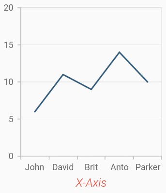
Axis title
The title property in axis provides options to customize the text and font of axis title. Axis does not display title by default. The title can be customized using following properties,
-
text- used to set the title for axis. -
textStyle- used to change the text color, size, font family, font style, and font weight. -
color- used to change the color of the label. -
fontFamily- used to change the font family for the axis title. -
fontStyle- used to change the font style for the axis title. -
fontWeight- used to change the font weight for the axis title. -
fontSize- used to change the font size for the axis title.
@override
    Widget build(BuildContext context) {
        return Scaffold(
            body: Center(
                child: Container(
                    child: SfCartesianChart(
                        primaryXAxis: CategoryAxis(
                            title: AxisTitle(
                                text: 'X-Axis',
                                textStyle: TextStyle(
                                    color: Colors.deepOrange,
                                    fontFamily: 'Roboto',
                                    fontSize: 16,
                                    fontStyle: FontStyle.italic,
                                    fontWeight: FontWeight.w300
                                )
                            )
                        )
                    )
                )
            )
        );
    }
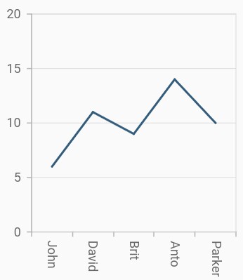
Axis label rotation
The labelRotation property of axis can be used to rotate the axis labels position. Default value of labelRotation property is 0.
@override
    Widget build(BuildContext context) {
        return Scaffold(
            body: Center(
                child: Container(
                    child: SfCartesianChart(
                        primaryXAxis: CategoryAxis(
                            // Axis labels will be rotated to 90 degree
                            labelRotation: 90
                        )
                    )
                )
            )
        );
    }
Axis line customization
SfCartesianChart provides support to customize the style of the axis line by defining the axisLine property as shown in the below code snippet.
-
color- used to change the stroke color of axis line. -
width- used to change the stroke width of axis line. -
dashArray- used to render axis line series with dashes.
@override
    Widget build(BuildContext context) {
        return Scaffold(
            body: Center(
                child: Container(
                    child: SfCartesianChart(
                        primaryXAxis: CategoryAxis(
                            axisLine: AxisLine(
                                color: Colors.deepOrange,
                                width: 2,
                                dashArray: <double>[5,5]
                            )
                        )
                    )
                )
            )
        );
    }
Axis label customization
The labelStyle property in axis provides options to customize the font of axis label. The axis label can be customized using following properties,
-
labelStyle- used to change the text color, size, font family, font style, and font weight. -
color- used to change the color of the axis label. -
fontFamily- used to change the font family for the axis label. -
fontStyle- used to change the font style for the axis label. -
fontWeight- used to change the font weight for the axis label. -
fontSize- used to change the font size for the axis label.
@override
    Widget build(BuildContext context) {
        return Scaffold(
            body: Center(
                child: Container(
                    child: SfCartesianChart(
                        primaryXAxis: CategoryAxis(
                            labelStyle: TextStyle(
                                color: Colors.deepOrange,
                                fontFamily: 'Roboto',
                                fontSize: 14,
                                fontStyle: FontStyle.italic,
                                fontWeight: FontWeight.w500
                            )
                        )
                    )
                )
            )
        );
    }
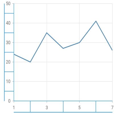
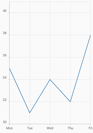
Axis border customization
The color and width of the axis border can be customized with borderColor and borderWidth properties respectively. The border types can be changed using the axisBorderType property and the default value is AxisBorderType.rectangle. Another value of axisBorderType is AxisBorderType.withoutTopAndBottom.
-
AxisBorderType.rectangle- Renders the border as a rectangle around a label. -
AxisBorderType.withoutTopAndBottom- Renders the border without the top and bottom of a rectangle.
@override
    Widget build(BuildContext context) {
      final List<ChartData> chartData = <ChartData>[
        ChartData(1, 24),
        ChartData(2, 20),
        ChartData(3, 35),
        ChartData(4, 27),
        ChartData(5, 30),
        ChartData(6, 41),
        ChartData(7, 26)
      ];
      return Scaffold(
        body: SfCartesianChart(
          primaryXAxis: NumericAxis(
            borderWidth: 1.0,
            borderColor: Colors.blue
          ),
          primaryYAxis: NumericAxis(
            borderWidth: 1.0,
            borderColor: Colors.blue
          ),
          series: <CartesianSeries<ChartData, int>>[
            LineSeries<ChartData, int>(
              dataSource: chartData,
              xValueMapper: (ChartData data, _) => data.x,
              yValueMapper: (ChartData data, _) => data.y,
            )
          ]
        )
      );
    }

    class ChartData {
      ChartData(this.x, this.y);
        final int x;
        final int y;
    }
Axis animation
The axis animation can be enabled using the enableAxisAnimation property of the chart. It defaults to false and this is applicable for all the primary and secondary axis in the chart.
On setting the enableAxisAnimationproperty to true, the axis elements like grid lines, tick lines, and labels will be animated when the axis range is changed dynamically. Axis visible range will be changed while zooming, panning, or while updating the data points.
Widget build(BuildContext context) {
        return Container(
            child: SfCartesianChart(
                enableAxisAnimation: true,
            )
        );
    }
Formatting axis label content
The labelFormat property is used to add prefix or suffix with the axis label.
import 'package:intl/intl.dart';

    @override
    Widget build(BuildContext context) {
        return Scaffold(
            body: Center(
                child: Container(
                    child: SfCartesianChart(
                        primaryYAxis: NumericAxis(
                            // '°C' will be append to all the labels in Y axis
                            labelFormat: '{value}°C'
                        )
                    )
                )
            )
        );
    }
Also refer number format and date format for formatting the labels further.
Note: You must import
intlpackage for formatting axis label using theNumberFormatclass anddate Formatclass.
Label and tick positioning
Axis labels and ticks can be positioned inside or outside the chart area by using labelPosition and tickPosition properties of ChartAxis. By default labels and ticks will be positioned outside the chart area.
@override
    Widget build(BuildContext context) {
        return Scaffold(
            body: Center(
                child: Container(
                    child: SfCartesianChart(
                        primaryXAxis: CategoryAxis(
                            labelPosition: ChartDataLabelPosition.inside,
                            tickPosition: TickPosition.inside
                        )
                    )
                )
            )
        );
    }
Edge label placement
Labels with long text at the edges of an axis may appear partially outside the chart. The edgeLabelPlacement property can be used to avoid the partial appearance of labels at the corners. Default value of this property is EdgeLabelPlacement.none. Other available options of edgeLabelPlacement are shift and hide. EdgeLabelPlacement.shift option will move the edge labels inside the axis bounds, where the EdgeLabelPlacement.hide option will hides the edge labels.
@override
    Widget build(BuildContext context) {
        return Scaffold(
            body: Center(
                child: Container(
                    child: SfCartesianChart(
                        primaryXAxis: NumericAxis(
                            // Edge labels will be shifted
                            edgeLabelPlacement: EdgeLabelPlacement.shift
                        )
                    )
                )
            )
        );
    }
Grid lines customization
The width property is used to control the visibility of grid lines. majorGridLines and minorGridLines properties in axis are used to customize the major grid lines and minor grid lines of an axis respectively. We have provided options to change the width, dashes, color of grid lines. By default minor grid lines will not be visible.
@override
    Widget build(BuildContext context) {
        return Scaffold(
            body: Center(
                child: Container(
                    child: SfCartesianChart(
                        primaryXAxis: NumericAxis(
                            majorGridLines: MajorGridLines(
                                width: 1,
                                color: Colors.red,
                                dashArray: <double>[5,5]
                            ),
                            minorGridLines: MinorGridLines(
                                width: 1,
                                color: Colors.green,
                                dashArray: <double>[5,5]
                            ),
                            minorTicksPerInterval:2
                        )
                    )
                )
            )
        );
    }
Tick lines customization
The majorTickLines and minorTickLines properties in axis are used to customize the major tick lines of an axis and minor tick lines of an axis respectively. We have provided options to customize the width, size, color and minorTicksPerInterval of tick lines. By default minor tick lines will not be visible.
@override
    Widget build(BuildContext context) {
        return Scaffold(
            body: Center(
                child: Container(
                    child: SfCartesianChart(
                        primaryXAxis: NumericAxis(
                            majorTickLines: MajorTickLines(
                                size: 6,
                                width: 2,
                                color: Colors.red
                            ),
                            minorTickLines: MinorTickLines(
                                size: 4,
                                width: 2,
                                color: Colors.blue
                            ),
                            minorTicksPerInterval:2
                        )
                    )
                )
            )
        );
    }
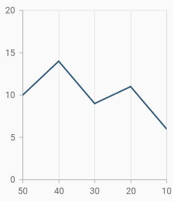
Inversing axis
Axis can be inversed using the isInversed property of an axis. Default value of isInversed property is false.
@override
    Widget build(BuildContext context) {
        return Scaffold(
            body: Center(
                child: Container(
                    child: SfCartesianChart(
                        primaryXAxis: NumericAxis(
                            // X axis will be inversed
                            isInversed: true
                        )
                    )
                )
            )
        );
    }
Placing axes at the opposite side
The opposedPosition property of axis can be used to place the axis at the opposite side of its default position. Default value of opposedPosition property is false.
@override
    Widget build(BuildContext context) {
        return Scaffold(
            body: Center(
                child: Container(
                    child: SfCartesianChart(
                        primaryXAxis: NumericAxis(
                            // X axis will be opposed
                            opposedPosition: true
                        )
                    )
                )
            )
        );
    }
Maximum number of labels per 100 logical pixels
By default, a maximum of 3 labels are displayed for each 100 logical pixels in axis. The maximum number of labels that should be present within 100 logical pixels length can be customized using the maximumLabels property of an axis. This property is applicable only for automatic range calculation and will not work if you set value for interval property of an axis.
@override
    Widget build(BuildContext context) {
        return Scaffold(
            body: Center(
                child: Container(
                    child: SfCartesianChart(
                        primaryXAxis: CategoryAxis(
                            maximumLabels: 3
                        )
                    )
                )
            )
        );
    }
Initial visible minimum
The initialVisibleMinimum property defines the lowest data point initially displayed on an axis. When panning is enabled, you can pan to the actual minimum range of an axis. This property only works at load time. Use the controller to programmatically change the visible minimum.
@override
    Widget build(BuildContext context) {
        return Scaffold(
            body: Center(
                child: Container(
                    child: SfCartesianChart(
                        primaryXAxis: NumericAxis(
                            initialVisibleMinimum: 2
                        )
                    )
                )
            )
        );
    }
Also refer minimum and maximum range of an axis.
Initial visible maximum
The initialVisibleMaximum property defines the highest data point finally displayed on an axis. When panning is enabled, you can pan to the actual maximum range of an axis. This property only works at load time. Use the controller to programmatically change the visible maximum.
@override
    Widget build(BuildContext context) {
        return Scaffold(
            body: Center(
                child: Container(
                    child: SfCartesianChart(
                        primaryXAxis: NumericAxis(
                            initialVisibleMaximum: 4
                        )
                    )
                )
            )
        );
    }
Offset the rendering
Plot offset
The plotOffset property is used to offset the rendering of the axis at start and end position. The following code snippet demonstrates how to apply the plot offset of an axis.
@override
    Widget build(BuildContext context) {
        return Scaffold(
            body: Center(
                child: Container(
                    child: SfCartesianChart(
                        primaryXAxis: NumericAxis(
                            // 20 logical pixels gap will be left at the start and end of the x axis
                            plotOffset: 20
                        )
                    )
                )
            )
        );
    }
Plot offset start
The plotOffsetStart property is used to offset the rendering of the axis at start position. The following code snippet demonstrates how to apply the plot offset start of an axis.
@override
    Widget build(BuildContext context) {
        return Scaffold(
            body: Center(
                child: Container(
                    child: SfCartesianChart(
                        primaryXAxis: NumericAxis(
                            // 20 logical pixels gap will be left at the start of the x axis
                            plotOffsetStart: 20
                        )
                    )
                )
            )
        );
    }
Plot offset end
The plotOffsetEnd property is used to offset the rendering of the axis at end position. The following code snippet demonstrates how to apply the plot offset end of an axis.
@override
    Widget build(BuildContext context) {
        return Scaffold(
            body: Center(
                child: Container(
                    child: SfCartesianChart(
                        primaryXAxis: NumericAxis(
                            // 20 logical pixels gap will be left at the end of the x axis
                            plotOffsetEnd: 20
                        )
                    )
                )
            )
        );
    }
Smart axis labels
Axis labels may overlap with each other based on chart dimensions and label size. The labelIntersectAction property of axis is used to avoid overlapping of axis labels. The default value of the labelIntersectAction is AxisLabelIntersectAction.hide. Other available values are AxisLabelIntersectAction.none, AxisLabelIntersectAction.wrap, AxisLabelIntersectAction.multipleRows, AxisLabelIntersectAction.rotate45 and AxisLabelIntersectAction.rotate90.
@override
    Widget build(BuildContext context) {
        return Scaffold(
            body: Center(
                child: Container(
                    child: SfCartesianChart(
                        primaryXAxis: CategoryAxis(
                            // Axis labels will be placed in multiple rows, if it is intersected
                            labelIntersectAction: AxisLabelIntersectAction.multipleRows
                        )
                    )
                )
            )
        );
    }
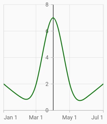
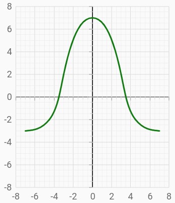
Axis crossing
Axis can be positioned anywhere in the plot area using the crossesAt property. This property specifies where the horizontal axis should intersect or cross the vertical axis, or vice-versa. The default value of the crossesAt property is null.
@override
    Widget build(BuildContext context) {
        return Scaffold(
            body: Center(
                child: Container(
                    child: SfCartesianChart(
                        primaryXAxis: NumericAxis(
                            crossesAt: 0
                        ),
                        primaryYAxis:NumericAxis(
                            crossesAt: 0
                        )
                    )
                )
            )
        );
    }
Crossing in category axis
For crossing in horizontal category axis, index value should be provided for the crossesAt property of vertical axis.
@override
    Widget build(BuildContext context) {
        return Scaffold(
            body: Center(
                child: Container(
                    child: SfCartesianChart(
                        primaryXAxis:CategoryAxis(),
                        primaryYAxis:NumericAxis(
                            crossesAt: 3
                        )
                    )
                )
            )
        );
    }
Crossing in date-time axis
For crossing in horizontal date-time axis, date value should be provided for the crossesAt property of vertical axis.
@override
    Widget build(BuildContext context) {
        return Scaffold(
            body: Center(
                child: Container(
                    child: SfCartesianChart(
                        primaryXAxis: DateTimeAxis(),
                        primaryYAxis:NumericAxis(
                            crossesAt: DateTime(2018, 4, 1)
                        )
                    )
                )
            )
        );
    }
Positioning the axis labels when crossing
The placeLabelsNearAxisLine property is used to determine whether the axis labels of crossed axis should be placed near to the axis line or not. The default value of placeLabelsNearAxisLine property is false.
@override
    Widget build(BuildContext context) {
        return Scaffold(
            body: Center(
                child: Container(
                    child: SfCartesianChart(
                        primaryXAxis: NumericAxis(
                            placeLabelsNearAxisLine: false
                        ),
                        primaryYAxis:NumericAxis(
                            placeLabelsNearAxisLine: false
                        )
                    )
                )
            )
        );
    }
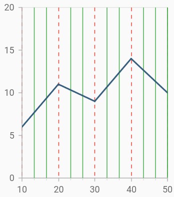
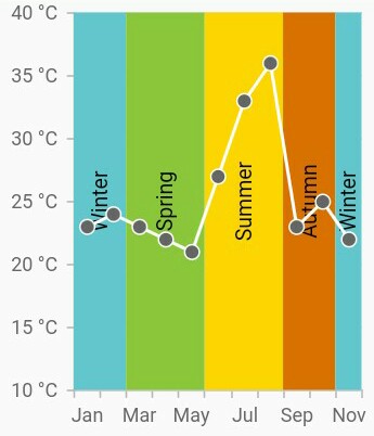
Plot bands
Plot bands are also known as strip lines, which are used to shade the different ranges in plot area with different colors to improve the readability of the chart. You can also add a text to indicate what that particular region indicates. You can enable the plot bands to be drawn repeatedly at regular intervals. This will be useful when you need to mark an event that occurs recursively along the timeline of the chart.
Since plot bands are drawn based on the axis, you have to add plot bands using the plotBands property of the respective axis. You can also add multiple plot bands to an axis.
The following properties are used to configure the plot bands:
-
size- changes how long plot band should be expanded. This is applicable only when end is not specified. -
sizeType- changes the date-time unit of the value specified in the size property. The values can be year, month, day, hour, minute, second, and millisecond. -
text- changes the text of the plot band. -
textAngle- changes the angle of the text. -
color- changes the color of the plot band. -
gradient- applies gradient color for plot band. -
opacity- changes the opacity of the plot band. -
borderWidth- changes the stroke width of the plot band. -
borderColor- changes the stroke color of the plot band. -
horizontalTextAlignment- aligns the text horizontally. -
verticalTextAlignment- aligns the text vertically. -
isVisible- changes the visibility of the plot band in chart axis. -
shouldRenderAboveSeries- changes the rendering order of the plot band. -
isRepeatable- specifies the plot band need to be repeated in specified interval. -
textStyle- customizes the text style of plot band.
Add plot band for category axis
Plot band can be added to the category axis by specifying index values to the start and end properties.
@override
    Widget build(BuildContext context) {
        return Scaffold(
            body: Center(
                child: Container(
                    child: SfCartesianChart(
                        primaryXAxis:CategoryAxis(
                            plotBands: <PlotBand>[
                            PlotBand(
                            isVisible: true,
                            start: 1,
                            end: 2,
                        ),
                    )
                )
            )
        );
    }
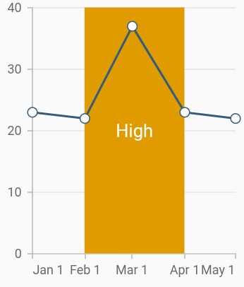
Add plot band for date-time axis
Plot band can be added to the date-time axis by specifying date values to the start and end properties.
@override
    Widget build(BuildContext context) {
        return Scaffold(
            body: Center(
                child: Container(
                    child: SfCartesianChart(
                        primaryXAxis:DateTimeAxis(
                            plotBands: <PlotBand>[
                            PlotBand(
                            isVisible: true,
                            start: DateTime(2018, 2, 1),
                            end:  DateTime(2018, 4, 1),
                        ),
                     ],
                  )
              )
          )
        )
      );
    }
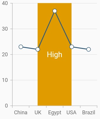
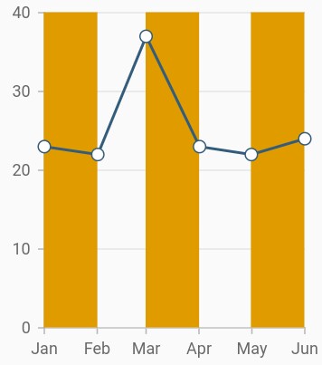
Recursive plot band
This feature is used to enable the plot bands to be drawn repeatedly at the regular intervals. This will be useful when you need to mark an event that occurs recursively along the timeline of the chart. The following properties are used to configure this feature:
-
repeatEvery- changes the frequency of the plot band being repeated. -
repeatUntil- specifies the end value at which point strip line has to stop repeating.
The following code snippet and screenshot demonstrate this feature by highlighting weekends.
@override
    Widget build(BuildContext context) {
        return Scaffold(
            body: Center(
                child: Container(
                    child: SfCartesianChart(
                        primaryXAxis:DateTimeAxis(
                            plotBands: <PlotBand>[
                            PlotBand(
                            isVisible: true,
                            isRepeatable: true,
                            repeatEvery: 2,
                            size: 1,
                            sizeType: DateTimeIntervalType.months,
                            repeatUntil: DateTime(2018, 6, 1),
                            ),
                        ],
                    )
                )
            )
         )
      );
    }
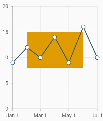
Segmented plot band
Typically, if you draw a plot band for a vertical axis, the height of the plot band is determined by the start and end properties, and the end of the plot band is equivalent to the end of its associated horizontal axis, i.e., plot band is drawn horizontally to the entire stretch of its associated horizontal axis. Similarly, for horizontal axis, width is determined by the Start and Width properties, and vertically, it is drawn to the entire stretch of the associated vertical axis.
Suppose, you need to draw a plot band that should not stretch along its associated axis, you have to set the associatedAxisStart and associatedAxisEnd properties. The values provided in these two properties correspond to its associated axis specified by the associatedAxisName property in the axis.
@override
    Widget build(BuildContext context) {
        return Scaffold(
            body: Center(
                child: Container(
                    child: SfCartesianChart(
                        primaryXAxis:DateTimeAxis(
                            plotBands: <PlotBand>[
                            PlotBand(
                            isVisible: true,
                            start: DateTime(2018,2,1),
                            end: DateTime(2018,6,1),
                            associatedAxisStart: 8,
                            associatedAxisEnd: 15,
                            shouldRenderAboveSeries: true,
                            color: const Color.fromRGBO(224, 155, 0, 1)
                        ),
                      ]
                    )
                )
            )
        )
      );
    }
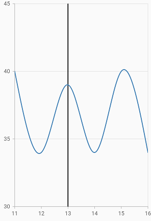
Plot line
When you specify the same value for both start and end, it will draw a line. You can customize the line using the borderWidth and borderColor properties.
@override
    Widget build(BuildContext context) {
        return Scaffold(
            body: Center(
                child: Container(
               child: SfCartesianChart(
                    primaryXAxis: NumericAxis(
                      plotBands: <PlotBand>[
                        PlotBand(
                          isVisible: true,
                          start: 13,
                          end: 13,
                          borderWidth: 2,
                        borderColor: Colors.black,
                               )
                           ]
                         )
                      )
                    )
                )
            );
        }
See Also
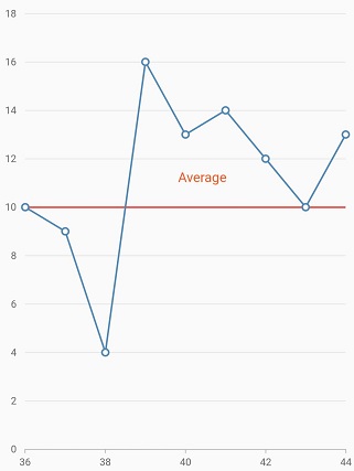
Plot band padding
Padding to the plot band text can be added using the verticalTextPadding or horizontalTextPadding properties. The verticalTextPadding is used to move the plot band text vertically and horizontalTextPadding is used to move the plot band text horizontally.
These properties takes pixel or percentage value. For pixel input should be like 10px and for percentage input should be like 10%. If no suffix is specified (10), it will be considered as pixel value. Percentage value refers to the overall width of the chart. i.e 100% is equal to the width of the chart.
This is applicable for both vertical and horizontal axis. Positive value for this property moves the text to right and negative value moves to left.
If verticalTextAlignment or horizontalTextAlignment is specified, text padding will be calculated from that modified position. Defaults to null.
@override
    Widget build(BuildContext context) {
      return Container(
        child: SfCartesianChart(
            primaryXAxis: NumericAxis(
                plotBands: <PlotBand>[
                    PlotBand(
                        verticalTextPadding:'5%',
                        horizontalTextPadding: '5%',
                        text: 'Average',
                        textAngle: 0,
                        start: 10,
                        end: 10,
                        textStyle: TextStyle(color: Colors.deepOrange, fontSize: 16),
                        borderColor: Colors.red,
                        borderWidth: 2
                    )
                ]
            )
        )
      );
    }
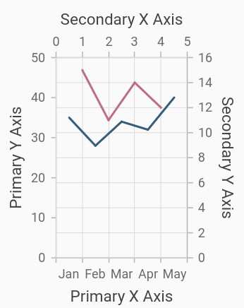
Multiple axes
By default, the chart is rendered with primary x axis and primary y axis. But, the users can add n number of axis to the chart. An additional horizontal or vertical axis can be added to the chart using the axes property, and then you can associate it to a series by specifying the name of the axis to the xAxisName or yAxisName property in the series.
@override
    Widget build(BuildContext context) {
        return Scaffold(
            body: Center(
                child: Container(
                    child: SfCartesianChart(
                        primaryXAxis: CategoryAxis(
                            title: AxisTitle(text: 'Primary X Axis')
                        ),
                        primaryYAxis: NumericAxis(
                            title: AxisTitle(
                                text: 'Primary Y Axis'
                            )
                        ),
                        // adding multiple axis
                        axes: <ChartAxis>[
                            NumericAxis(
                                name: 'xAxis',
                                opposedPosition: true,
                                interval:1,
                                minimum: 0,
                                maximum: 5,
                                title: AxisTitle(
                                    text: 'Secondary X Axis'
                                )
                            ),
                            NumericAxis(
                                name: 'yAxis',
                                opposedPosition: true,
                                title: AxisTitle(
                                    text: 'Secondary Y Axis'
                                )
                            )
                        ],
                        series: <CartesianSeries>[
                            LineSeries<ChartData, String>(
                                dataSource: [
                                    ChartData('Jan', 35),
                                    ChartData('Feb', 28),
                                    ChartData('Mar', 34),
                                    ChartData('Apr', 32),
                                    ChartData('May', 40)
                                ],
                                xValueMapper: (ChartData data, _) => data.x,
                                yValueMapper: (ChartData data, _) => data.y
                            ),
                            LineSeries<ChartData, String>(
                                dataSource: [
                                    ChartData('Jan', 15, 1),
                                    ChartData('Feb', 11, 2),
                                    ChartData('Mar', 14, 3),
                                    ChartData('Apr', 12, 4),
                                ],
                                xValueMapper: (ChartData data, _) => data.y1,
                                yValueMapper: (ChartData data, _) => data.y,
                                xAxisName: 'xAxis',
                                yAxisName: 'yAxis'
                            )
                        ]
                    )
                )
            )
        );
    }

    class ChartData {
        ChartData(this.x, this.y, this.y1);
        final String x;
        final double? y;
        final double? y1;
    }
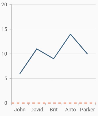
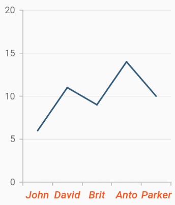
Axis label alignment
The position of axis label can be aligned using the labelAlignment property.The following options are available in axis label alignment.
-
LabelAlignment.start- if it is a horizontal axis, aligns the labels before the gridline and if it is a vertical axis, aligns the labels below the gridline. -
LabelAlignment.end- if it is a horizontal axis, aligns the labels after the gridline and if it is a vertical axis, align the labels above the gridline. -
LabelAlignment.center- aligns the axis label to the center of the gridlines.
Center
Aligns the axis label to the center of the gridlines.
@override
    Widget build(BuildContext context) {
        return Scaffold(
            body: Center(
                child: Container(
                        child: SfCartesianChart(
                            primaryXAxis: DateTimeAxis(),
                            primaryYAxis:
                                NumericAxis(
                                    //Aligns the y-axis labels
                                    labelAlignment: LabelAlignment.center
                                ),
                        )
                )
            )
        );
    }
Start
If it is a horizontal axis, aligns the labels before the gridline and if it is a vertical axis, aligns the labels below the gridline.
@override
    Widget build(BuildContext context) {
        return Scaffold(
            body: Center(
                child: Container(
                        child: SfCartesianChart(
                            primaryXAxis: DateTimeAxis(),
                            primaryYAxis: NumericAxis(
                                //Aligns the y-axis labels
                                labelAlignment:LabelAlignment.start),
                        )
                )
            )
        );
    }
End
If it is a horizontal axis, aligns the labels after the gridline and if it is a vertical axis, align the labels above the gridline.
@override
    Widget build(BuildContext context) {
        return Scaffold(
            body: Center(
                child: Container(
                        child: SfCartesianChart(
                            primaryXAxis: DateTimeAxis(),
                            primaryYAxis: NumericAxis(
                                //Aligns the y-axis labels
                                labelAlignment: LabelAlignment.end
                            ),
                        )
                )
            )
        );
    }
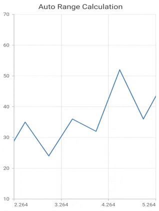
Auto range calculation
This feature determines the value axis range, based on the visible data points or based on the overall data points available in chart.
By default, value axis range will be calculated automatically based on the visible data points on dynamic changes. The visible data points are changed on performing interactions like pinch zooming, selection zooming, panning and also on specifying initialVisibleMinimum and initialVisibleMaximum values.
To toggle this functionality, anchorRangeToVisiblePoints property can be used. i.e. on setting this property to false, the value axis range will be calculated based on all the data points in chart irrespective of visible points.
Note: This is applicable only to the value axis and not for other axis and applicable only when zoom mode is set to x.
@override
    Widget build(BuildContext context) {
      return Container(
          child: SfCartesianChart(
             primaryYAxis: NumericAxis(
              anchorRangeToVisiblePoints: false
              ),
          )
      );
    }
See Also
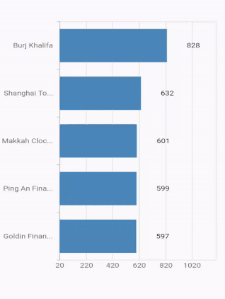
Axis label width customization
The maximum width for axis labels and the space occupied by the axis labels can be controlled by using the maximumLabelWidth and labelsExtent properties of the axis respectively. If the provided width is lesser than the axis label’s width, the label gets trimmed and the tooltip is shown when clicking/tapping the axis label in both cases. Both properties default to null.
@override
    Widget build(BuildContext context) {
      return Container(
          child: SfCartesianChart(
            primaryXAxis: CategoryAxis(
                maximumLabelWidth: 80,
            ),
            series: <CartesianSeries<ChartData, String>>[
                    BarSeries<ChartData, String>(
                        dataSource: <ChartData>[
                            ChartData('Goldin Finance 117', 597),
                            ChartData('Ping An Finance Center', 599),
                            ChartData('Makkah Clock Royal Tower', 601),
                            ChartData('Shanghai Tower', 632),
                            ChartData('Burj Khalifa', 828)],
                        xValueMapper: (ChartData data, _) => data.x,
                        yValueMapper: (ChartData data, _) => data.y
                    ),
            ]
          )
      );
    }

    class ChartData {
        ChartData(this.x, this.y);
        final String x;
        final double y;
}Note: If both
maximumLabelWidthandlabelsExtentproperties are specified, then the priority goes tolabelsExtentproperty.
Auto scrolling
Auto scrolling feature available in SfCartesianChart is used to ensure that specified range of data is always visible in the chart and you can view the remaining data points by scrolling. The autoScrollingDelta property of the chart axis can be used to set the number of data points to be always visible in the chart. It always shows the recently added data points and scrolling will be reset to the start or end of the range, based on autoScrollingMode property’s value, whenever a new point is added dynamically.
@override
    Widget build(BuildContext context) {
      return Container(
          child: SfCartesianChart(
             primaryYAxis: DateTimeAxis(
                 autoScrollingDelta: 7
             ),
          )
      );
    }
AutoScrollingMode
AutoScrollingMode property can be used to determine whether the axis should be scrolled from start position or end position. The default value of AutoScrollingMode is end.
@override
    Widget build(BuildContext context) {
      return Container(
          child: SfCartesianChart(
             primaryYAxis: NumericAxis(
                 autoScrollingMode: AutoScrollingMode.start
             ),
          )
      );
    }
AutoScrollingDeltaType
In DateTimeAxis, you can apply auto scrolling delta value in Years, Months, Days, Hours, Minutes, Seconds and auto by setting AutoScrollingDeltaType property. Default value of this property is DateTimeIntervalType.auto and the delta will be calculated automatically based on range.
@override
    Widget build(BuildContext context) {
      return Container(
          child: SfCartesianChart(
             primaryYAxis: DateTimeAxis(
                 autoScrollingDeltaType: DateTimeIntervalType.months
             ),
          )
      );
    }
RangeController
The rangeController property defines the lowest and highest data points that are displayed on an axis.
If the same [RangeController] instance is used in both the chart axis and the [RangeSelector], the chart’s visible range will be updated based on the range selected in the [RangeSelector].
Here you need to specify the minimum, maximum, initialVisibleMinimum, and initialVisibleMaximum properties to the axis and the axis values will be visible with respect to initialVisibleMinimum and initialVisibleMaximum properties.
@override
Widget build(BuildContext context) {
RangeController rangeController = RangeController(
start: DateTime(2020, 2, 1),
end: DateTime(2020, 2, 30),
);
SfCartesianChart sliderChart = SfCartesianChart(
margin: const EdgeInsets.all(0),
primaryXAxis:
DateTimeAxis(isVisible: false),
primaryYAxis: NumericAxis(isVisible: false),
plotAreaBorderWidth: 0,
series: <SplineAreaSeries<ChartSampleData, DateTime>>[
SplineAreaSeries<ChartSampleData, DateTime>(
// Add required properties.
)
],
);
return Scaffold(
body: Column(
children: <Widget>[
Expanded(
child: SfCartesianChart(
primaryXAxis: DateTimeAxis(
maximum: DateTime(2020, 1, 1),
minimum: DateTime(2020, 3, 30),
// set minimum value from the range controller
initialVisibleMinimum: rangeController.start,
rangeController: rangeController),
primaryYAxis: NumericAxis(),
series: <SplineSeries<ChartSampleData, DateTime>>[
SplineSeries<ChartSampleData, DateTime>(
dataSource: splineSeriesData,
xValueMapper: (ChartSampleData data, _) =>
data.x as DateTime,
yValueMapper: (ChartSampleData data, _) => data.y,
// Add required properties.
)
],
),
),
Expanded(
child: SfRangeSelectorTheme(
data: SfRangeSelectorThemeData(),
child: SfRangeSelector(
min: min,
max: max,
controller: rangeController,
showTicks: true,
showLabels: true,
dragMode: SliderDragMode.both,
onChanged: (SfRangeValues value) {
// set the start value to rangeController from this callback
rangeController.start = value.start;
// set the end value to rangeController from this callback
rangeController.end = value.end;
setState(() {});
},
child: Container(
child: sliderChart,
),
),
)),
],
),
);
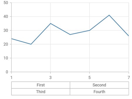
}Multi-level labels
The multi-level labels in the Cartesian chart are used to categorize axis labels and they can be added to the chart axis by using the multiLevelLabels property. The below properties are used to add the multi-level label.
-
start- Represents the start value of an multi-level label. -
end- Represents the end value of an multi-level label. -
text- Represents the text which needs to be rendered for a multilevel label. -
level- Represents the hierarchical structure of a multi level label.
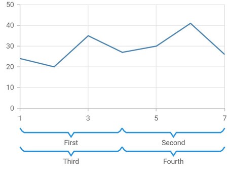
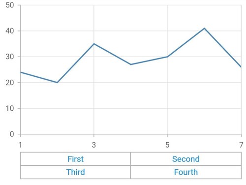
Multi-level labels in numeric axis
The NumericMultiLevelLabel class is used to render multi-level labels in the numeric axis. Here the values for start and end have to be double.
@override
    Widget build(BuildContext context) {
      final List<ChartData> chartData = <ChartData>[
        ChartData(1, 24),
        ChartData(2, 20),
        ChartData(3, 35),
        ChartData(4, 27),
        ChartData(5, 30),
        ChartData(6, 41),
        ChartData(7, 26)
      ];
      return Scaffold(
        body: SfCartesianChart(
          primaryXAxis: NumericAxis(
            multiLevelLabels: const <NumericMultiLevelLabel>[
              NumericMultiLevelLabel(
                start: 1,
                end: 4,
                text: 'First'
              ),
              NumericMultiLevelLabel(
                start: 4,
                end: 7,
                text: 'Second'
              ),
              NumericMultiLevelLabel(
                start: 1,
                end: 4,
                text: 'Third',
                level: 1
              ),
              NumericMultiLevelLabel(
                start: 4,
                end: 7,
                text: 'Fourth',
                level: 1
              ),
            ]
          ),
          series: <CartesianSeries<ChartData, int>>[
            LineSeries<ChartData, int>(
              dataSource: chartData,
              xValueMapper: (ChartData data, _) => data.x,
              yValueMapper: (ChartData data, _) => data.y,
            )
          ],
        )
      );
    }

    class ChartData {
      ChartData(this.x, this.y);
        final int x;
        final int y;
    }
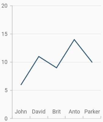
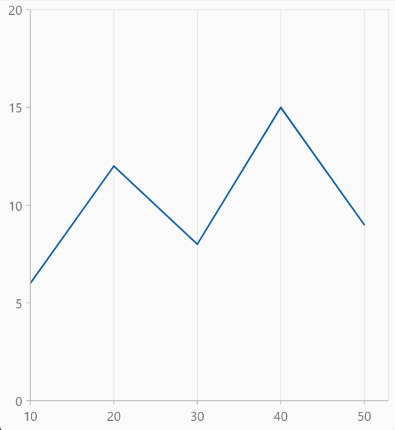
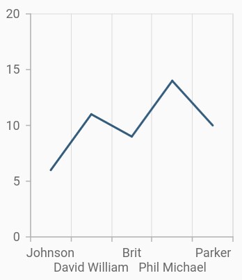
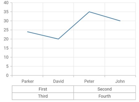
Multi-level labels in category axis
The CategoricalMultiLevelLabel is used to render multi-level labels in the category axis. Here start and end values need to be string values that are available in the data source.
@override
    Widget build(BuildContext context) {
      final List<ChartData> chartData = <ChartData>[
        ChartData('Parker', 24),
        ChartData('David', 20),
        ChartData('Peter', 35),
        ChartData('John', 30)
      ];
      return Scaffold(
        body: SfCartesianChart(
          primaryXAxis: CategoryAxis(
            multiLevelLabels: const <CategoricalMultiLevelLabel>[
              CategoricalMultiLevelLabel(
                start:'Parker',
                end:'David',
                text: 'First'
              ),
              CategoricalMultiLevelLabel(
                start:'Peter',
                end:'John',
                text: 'Second'
              ),
              CategoricalMultiLevelLabel(
                start:'Parker',
                end:'David',
                text: 'Third',
                level: 1
              ),
              CategoricalMultiLevelLabel(
                start:'Peter',
                end:'John',
                text: 'Fourth',
                level: 1
              )
            ]
          ),
          series: <CartesianSeries<ChartData, String>>[
            LineSeries<ChartData, String>(
              dataSource: chartData,
              xValueMapper: (ChartData data, _) => data.x,
              yValueMapper: (ChartData data, _) => data.y,
            )
          ]
        )
      );
    }

    class ChartData {
      ChartData(this.x, this.y);
       final String x;
       final int y;
    }
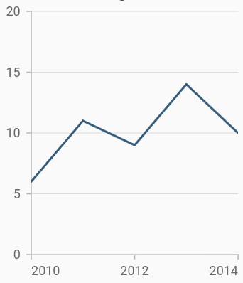
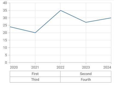
Multi-level labels in date time axis
The DateTimeMultiLevelLabel is used to render multi-level labels in the date-time axis. Here start and end properties need to be date-time values.
@override
    Widget build(BuildContext context) {
      final List<ChartData> chartData = <ChartData>[
        ChartData(DateTime(2020,1,1), 24),
        ChartData(DateTime(2021,1,1), 20),
        ChartData(DateTime(2022,1,1), 35),
        ChartData(DateTime(2023,1,1), 27),
        ChartData(DateTime(2024,1,1), 30)
      ];
      return Scaffold(
        body: SfCartesianChart(
          primaryXAxis: DateTimeAxis(
            dateFormat: DateFormat.y(),
            edgeLabelPlacement: EdgeLabelPlacement.shift,
            multiLevelLabels: <DateTimeMultiLevelLabel>[
              DateTimeMultiLevelLabel(
                start: DateTime(2020,1,1),
                end: DateTime(2022,1,1),
                text: 'First'
              ),
              DateTimeMultiLevelLabel(
                start: DateTime(2022,1,1),
                end: DateTime(2024,1,1),
                text: 'Second'
              ),
              DateTimeMultiLevelLabel(
                start: DateTime(2020,1,1),
                end: DateTime(2022,1,1),
                text: 'Third',
                level: 1
              ),
              DateTimeMultiLevelLabel(
                start: DateTime(2022,1,1),
                end: DateTime(2024,1,1),
                text: 'Fourth',
                level: 1
              ),
            ]
          ),
          series: <CartesianSeries<ChartData, DateTime>>[
            LineSeries<ChartData, DateTime>(
              dataSource: chartData,
              xValueMapper: (ChartData data, _) => data.x,
              yValueMapper: (ChartData data, _) => data.y,
            )
          ]
        )
      );
    }

    class ChartData {
      ChartData(this.x, this.y);
        final DateTime x;
        final int y;
    }
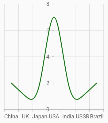
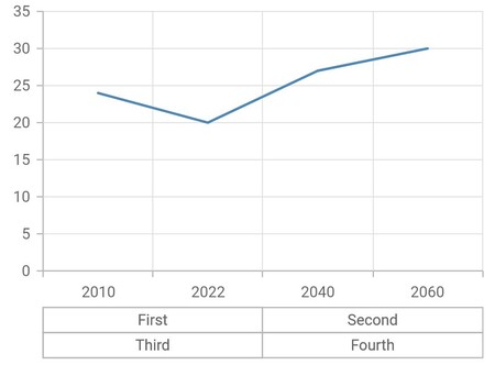
Multi-level labels in date time category axis
The DateTimeCategoricalMultiLevelLabel is used to render multi-level labels in the date-time category axis. Here start and end properties need to be date-time values.
@override
    Widget build(BuildContext context) {
      final List<ChartData> chartData = <ChartData>[
        ChartData(DateTime(2010,1,1), 24),
        ChartData(DateTime(2022,1,1), 20),
        ChartData(DateTime(2040,1,1), 27),
        ChartData(DateTime(2060,1,1), 30)
      ];
      return Scaffold(
        body: SfCartesianChart(
          primaryXAxis: DateTimeCategoryAxis(
            multiLevelLabels: <DateTimeCategoricalMultiLevelLabel>[
              DateTimeCategoricalMultiLevelLabel(
                start: DateTime(2010,1,1),
                end: DateTime(2022,1,1),
                text: 'First'
              ),
              DateTimeCategoricalMultiLevelLabel(
                start: DateTime(2040,1,1),
                end: DateTime(2060,1,1),
                text: 'Second'
              ),
              DateTimeCategoricalMultiLevelLabel(
                start: DateTime(2010,1,1),
                end: DateTime(2022,1,1),
                text: 'Third',
                level: 1
              ),
              DateTimeCategoricalMultiLevelLabel(
                start: DateTime(2040,1,1),
                end: DateTime(2060,1,1),
                text: 'Fourth',
                level: 1
              ),
            ]
          ),
          series: <CartesianSeries<ChartData, DateTime>>[
            LineSeries<ChartData, DateTime>(
              dataSource: chartData,
              xValueMapper: (ChartData data, _) => data.x,
              yValueMapper: (ChartData data, _) => data.y,
            )
          ]
        )
      );
    }

    class ChartData {
      ChartData(this.x, this.y);
        final DateTime x;
        final int y;
    }
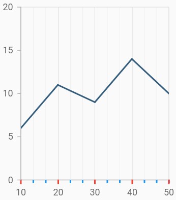
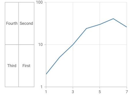
Multi-level labels in logarithmic axis
The LogarithmicMultiLevelLabel is used to render multi-level labels in the logarithmic axis. Here the start and end properties need to be double values.
@override
    Widget build(BuildContext context) {
      final List<ChartData> chartData = <ChartData>[
        ChartData(1, 2),
        ChartData(2, 5),
        ChartData(3, 10),
        ChartData(4, 24),
        ChartData(5, 30),
        ChartData(6, 41),
        ChartData(7, 26)
      ];
      return Scaffold(
        body: SfCartesianChart(
          primaryYAxis: LogarithmicAxis(
            multiLevelLabels: const <LogarithmicMultiLevelLabel>[
              LogarithmicMultiLevelLabel(
                start: 1,
                end: 10,
                text: 'First'
              ),
              LogarithmicMultiLevelLabel(
                start: 10,
                end: 100,
                text: 'Second'
              ),
              LogarithmicMultiLevelLabel(
                start: 1,
                end: 10,
                text: 'Third',
                level: 1
              ),
              LogarithmicMultiLevelLabel(
                start: 10,
                end: 100,
                text: 'Fourth',
                level: 1
              ),
            ]
          ),
          series: <CartesianSeries<ChartData, int>>[
            LineSeries<ChartData, int>(
              dataSource: chartData,
              xValueMapper: (ChartData data, _) => data.x,
              yValueMapper: (ChartData data, _) => data.y,
            )
          ]
        )
      );
    }

    class ChartData {
      ChartData(this.x, this.y);
       final int x;
       final int y;
    }
Multi-level label customization
The multiLevelLabelStyle property is used to customize the multi-level label’s border width, border type, color, and text style.
Multi-level label text customization
The text style of the multi-level label like color, font size, font-weight, etc can be customized by using TextStyle class.
@override
    Widget build(BuildContext context) {
      final List<ChartData> chartData = <ChartData>[
        ChartData(1, 24),
        ChartData(2, 20),
        ChartData(3, 35),
        ChartData(4, 27),
        ChartData(5, 30),
        ChartData(6, 41),
        ChartData(7, 26)
      ];
      return Scaffold(
        body: SfCartesianChart(
          primaryXAxis: NumericAxis(
            multiLevelLabelStyle: MultiLevelLabelStyle(
              textStyle: TextStyle(
                  fontSize: 1,
                  color: Colors.blue)
            ),
            multiLevelLabels: const <NumericMultiLevelLabel>[
              NumericMultiLevelLabel(
                start: 1,
                end: 4,
                text: 'First'
              ),
              NumericMultiLevelLabel(
                start: 4,
                end: 7,
                text: 'Second'
              ),
              NumericMultiLevelLabel(
                start: 1,
                end: 4,
                text: 'Third',
                level: 1
              ),
              NumericMultiLevelLabel(
                start: 4,
                end: 7,
                text: 'Fourth',
                level: 1
              )
            ]
          ),
          series: <CartesianSeries<ChartData, int>>[
            LineSeries<ChartData, int>(
              dataSource: chartData,
              xValueMapper: (ChartData data, _) => data.x,
              yValueMapper: (ChartData data, _) => data.y,
            )
          ]
        )
      );
    }

    class ChartData {
     ChartData(this.x, this.y);
     final int x;
     final int y;
    }
Multi-level label border customization
The border width, color and type of the multi-level label can be customized using the borderWidth, borderColor and borderType properties.
The different types of multi-level label’s border are mentioned below,
-
MultiLevelBorderType.rectangle- Renders the multi-level label border as rectangle. -
MultiLevelBorderType.withoutTopAndBottom- Renders the multi-level label border as rectangle without it’s top and bottom. -
MultiLevelBorderType.squareBrace- Renders the multi-level label border as square braces. -
MultiLevelBorderType.curlyBrace- Renders the multi-level label border as curly braces.
@override
    Widget build(BuildContext context) {
      final List<ChartData> chartData = <ChartData>[
        ChartData(1, 24),
        ChartData(2, 20),
        ChartData(3, 35),
        ChartData(4, 27),
        ChartData(5, 30),
        ChartData(6, 41),
        ChartData(7, 26)
      ];
      return Scaffold(
        body: SfCartesianChart(
          primaryXAxis: NumericAxis(
            multiLevelLabelStyle: MultiLevelLabelStyle(
              borderColor: Colors.blue,
              borderWidth: 2.0,
              borderType: MultiLevelBorderType.curlyBrace,
            ),
            multiLevelLabels: const <NumericMultiLevelLabel>[
              NumericMultiLevelLabel(
                start: 1,
                end: 4,
                text: 'First'
              ),
              NumericMultiLevelLabel(
                start: 4,
                end: 7,
                text: 'Second'
              ),
              NumericMultiLevelLabel(
                start: 1,
                end: 4,
                text: 'Third',
                level: 1
              ),
              NumericMultiLevelLabel(
                start: 4,
                end: 7,
                text: 'Fourth',
                level: 1
              )
            ]
          ),
          series: <CartesianSeries<ChartData, int>>[
            LineSeries<ChartData, int>(
              dataSource: chartData,
              xValueMapper: (ChartData data, _) => data.x,
              yValueMapper: (ChartData data, _) => data.y,
            )
          ]
        )
      );
    }

    class ChartData {
     ChartData(this.x, this.y);
     final int x;
     final int y;
    }