Theme for Syncfusion® widgets
23 May 202519 minutes to read
The Syncfusion® theme widget allows you to apply colors, font-styles, etc in the application level across all the Syncfusion® Flutter widgets with a uniform approach and provide a consistent look.
Using SfTheme widget
The SfTheme widget is used to apply theme at one place to all of the applicable Syncfusion® Flutter widgets. This widget is used to configure theme data for all widgets using SfThemeData class. The SfThemeData holds the color and typography values for light and dark themes.
The SfTheme widget is available in the syncfusion_flutter_core package. Since all our widgets are core dependent, you don’t need to include the core as a separate package. For example, here we have included the syncfusion_flutter_charts package in the pub spec file for the purpose of depicting the working model of the theme widget.
dependencies:
syncfusion_flutter_charts: ^xx.x.xxNote: Here xx.x.xx denotes the current version of
Syncfusion Flutter Chartwidget.
To use the theme widgets, import the following library in your Dart code.
import 'package:syncfusion_flutter_core/theme.dart';Once the required package has been imported, initialize the SfTheme widget and then add any widget as a child. The theme data applied in this SfTheme widget is applied to all the Syncfusion® widgets that are descendant of this SfTheme widget. For demonstration purposes, SfCartesianChart has been added as a child of SfTheme widget in the below code snippet.
@override
Widget build(BuildContext context) {
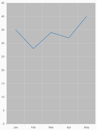
final List<ChartData> chartData = [
ChartData('Jan', 35),
ChartData('Feb', 28),
ChartData('Mar', 34),
ChartData('Apr', 32),
ChartData('May', 40)
];
return Scaffold(
body: Center(
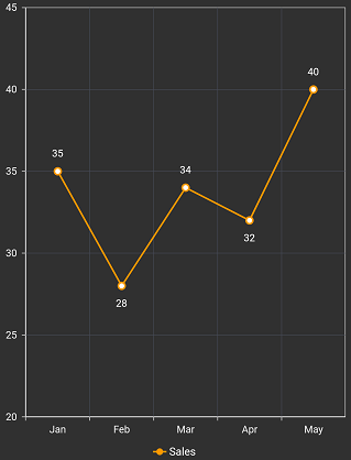
child: SfTheme(
data: SfThemeData(
chartThemeData: SfChartThemeData(
plotAreaBackgroundColor: Colors.grey[400]
)
),
child: SfCartesianChart(
primaryXAxis: CategoryAxis(),
series: <ChartSeries<ChartData, int>>[
// Renders area chart
LineSeries<ChartData, int>(
dataSource: chartData,
xValueMapper: (ChartData data, _) => data.x,
yValueMapper: (ChartData data, _) => data.y)
]
)
)
)
);
}
In the above code snippet, chartThemeData property has been configured with SfChartThemeData instance. Similarly, the SfThemeData class has theme data properties for other widgets also. Refer to the following table to know about the theme data classes that are applicable for respective widgets.
Dark theme
Syncfusion® Flutter widgets provide support for light and dark themes. As the name suggests, these themes will have colors with light and dark color contrasts, respectively.
By default, the light theme will be applied. You can apply a dark theme using the brightness property.
@override
    Widget build(BuildContext context) {
        return Scaffold(
            body: Center(
                child: SfTheme(
                    data: SfThemeData(
                        brightness: Brightness.dark
                    ),
                    child: SfCartesianChart(
                       // Other configurations
                    )
                )
            )
        );
    }
Specialized theme widget
Using the SfTheme widget you can apply theme across all the Syncfusion® Flutter widgets at one place. If you wish to apply a specific theme to a specific widget alone, this can be achieved using the specialized theme widget.
Initialize the specialized theme widget and then add respective widget as a child. For example, SfChartTheme (specialized) widget in case of SfCartesianChart, SfCircularChart, SfPyramidChart, SfPyramidChart widgets.The theme data applied in this specialized widget is applied to all its applicable widgets that are descendant of this widget. For demonstration purpose, SfCartesianChart has been added as child of SfChartTheme widget in the below code snippet.
@override
    Widget build(BuildContext context) {
        return Scaffold(
            body: SfChartTheme(
                data: SfChartThemeData(
                        brightness: Brightness.dark,
                        backgroundColor: Colors.blue[300]
                ),
                child: SfCartesianChart(
                  // Other configurations
                )
            )
        );
    }
In the above code snippet, data property has been configured with SfChartThemeData instance.
Here, the SfChartThemeData includes the properties required to customize the SfCartesianChart, SfCircularChart, SfPyramidChart, and SfFunnelChart widgets.
Similarly, refer the following table to know about the other specialized theme widget classes that are applicable for respective widgets.
Note: When dark or light theme is applied to the material app, and Syncfusion® theme widgets are not initialized in your application, then based on the theme applied to the material app, the appropriate theme will be applied to Syncfusion® widgets.