Flutter Cartesian Charts Bar Chart (SfCartesianChart)
16 Apr 202614 minutes to read
To create a Flutter bar chart quickly, you can check this video.
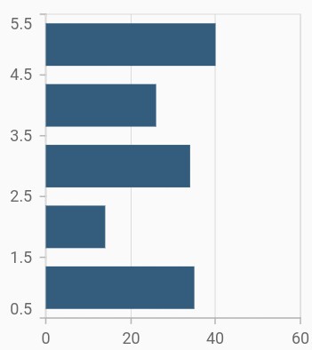
To render a bar chart, create an instance of BarSeries, and add it to the series collection property of SfCartesianChart. The following properties can be used to customize the appearance:
-
color- changes the color of the series. -
opacity- controls the transparency of the chart series. -
borderWidth- changes the stroke width of the series. -
borderColor- changes the stroke color of the series.
@override
    Widget build(BuildContext context) {
        final List<ChartData> chartData = [
            ChartData(1, 35),
            ChartData(2, 23),
            ChartData(3, 34),
            ChartData(4, 25),
            ChartData(5, 40)
        ];
        return Scaffold(
            body: Center(
                child: Container(
                    child: SfCartesianChart(
                        series: <CartesianSeries>[
                            // Renders bar chart
                            BarSeries<ChartData, double>(
                                dataSource: chartData,
                                xValueMapper: (ChartData data, _) => data.x,
                                yValueMapper: (ChartData data, _) => data.y
                            )
                        ]
                    )
                )
            )
        );
    }
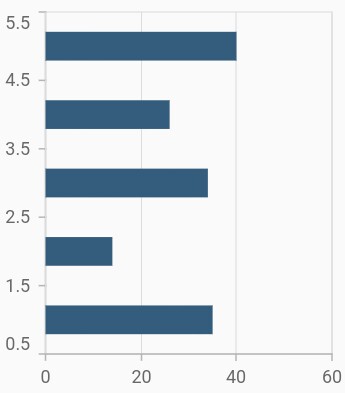
Bar width and spacing
The spacing property is used to change the spacing between two segments. The default value of spacing is 0, and the value ranges from 0 to 1. Here, 1 and 0 correspond to 100% and 0% of the available space, respectively.
The width property is used to change the width of the rectangle. The default value of the width is 0.7, and the value ranges from 0 to 1. Here, 1 and 0 correspond to 100% and 0% of the available width, respectively.
@override
    Widget build(BuildContext context) {
        final List<ChartData> chartData = [
            ChartData(1, 35),
            ChartData(2, 23),
            ChartData(3, 34),
            ChartData(4, 25),
            ChartData(5, 40)
        ];
        return Scaffold(
            body: Center(
                child: Container(
                    child: SfCartesianChart(
                        series: <CartesianSeries>[
                            BarSeries<ChartData, double>(
                                dataSource: chartData,
                                xValueMapper: (ChartData data, _) => data.x,
                                yValueMapper: (ChartData data, _) => data.y,
                                // Width of the bars
                                width: 0.6,
                                // Spacing between the bars
                                spacing: 0.3
                            )
                        ]
                    )
                )
            )
        );
    }
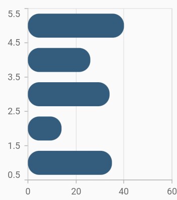
Rounded corners
The borderRadius property is used to add the rounded corners to the rectangle.
@override
    Widget build(BuildContext context) {
        final List<ChartData> chartData = [
            ChartData(1, 35),
            ChartData(2, 23),
            ChartData(3, 34),
            ChartData(4, 25),
            ChartData(5, 40)
        ];
        return Scaffold(
            body: Center(
                child: Container(
                    child: SfCartesianChart(
                        series: <CartesianSeries>[
                            BarSeries<ChartData, double>(
                                dataSource: chartData,
                                xValueMapper: (ChartData data, _) => data.x,
                                yValueMapper: (ChartData data, _) => data.y,
                                borderRadius: BorderRadius.all(Radius.circular(15))
                            )
                        ]
                    )
                )
            )
        );
    }
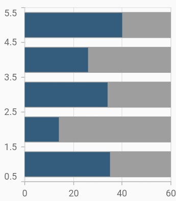
Track customization
You can render the bar chart with a track. A track is a rectangular bar rendered from the start to the end of the axis. Bar series will be rendered above the track. The isTrackVisible property is used to enable the track. The following properties can be used to customize the appearance:
-
trackColor- changes the color of the track. -
trackBorderWidth- changes the stroke width of the track. -
trackBorderColor- changes the stroke color of the track. -
trackPadding- adds padding to the track.
@override
    Widget build(BuildContext context) {
        final List<ChartData> chartData = [
            ChartData(1, 35),
            ChartData(2, 23),
            ChartData(3, 34),
            ChartData(4, 25),
            ChartData(5, 40)
        ];
        return Scaffold(
            body: Center(
                child: Container(
                    child: SfCartesianChart(
                        series: <CartesianSeries>[
                            BarSeries<ChartData, double>(
                                dataSource: chartData,
                                // Renders the track
                                isTrackVisible: true,
                                xValueMapper: (ChartData data, _) => data.x,
                                yValueMapper: (ChartData data, _) => data.y
                            )
                        ]
                    )
                )
            )
        );
    }
Also refer, color palette, color mapping, animation, gradient and empty points for customizing the bar series further.
Note: You can refer to our Flutter Bar Chart feature tour page for its groundbreaking feature representations. You can also explore our Flutter Bar Chart example that shows how to easily configure with built-in support for creating stunning visual effects.