Pie and Doughnut in WPF Charts (SfChart)
8 Jul 202618 minutes to read
Pie Chart
PieSeries is divided into sectors, illustrating numerical proportion. The following code example illustrates the PieSeries.
<chart:PieSeries XBindingPath="Category" ItemsSource="{Binding Tax}" YBindingPath="Percentage"/>PieSeries series = new PieSeries()
{
ItemsSource = new ViewModel().Tax,
XBindingPath = "Category",
YBindingPath = "Percentage"
};
chart.Series.Add(series);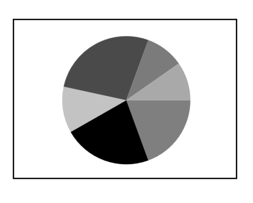
The rendering size of the PieSeries can be controlled using PieCoefficient property as in below code example.
<chart:PieSeries
    PieCoefficient="0.9"
    XBindingPath="Category"
    ItemsSource="{Binding Tax}"
    YBindingPath="Percentage">
</chart:PieSeries>
PieSeries series = new PieSeries()
{
ItemsSource = new ViewModel().Tax,
XBindingPath = "Category",
YBindingPath = "Percentage",
PieCoefficient = 0.9
};
chart.Series.Add(series);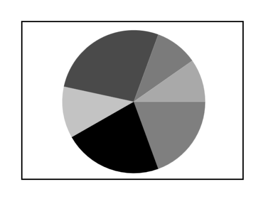
Group small data points into “others”
The small segments in the pie chart can be grouped into the “others” category using the GroupTo and GroupMode properties of PieSeries.
The GroupMode property is used to specify the grouping type based on slice Angle, actual data point Value, or Percentage, and the GroupTo property is used to set the limit to group data points into a single slice. The grouped segment is labeled as “Others” in legend and toggled as other segment. The default value of the GroupTo property is [double.NAN], and the default value of the GroupMode property is Value.
Pie series without grouping
Pie series with grouping (Mode - Value)
<Window.Resources>
    <local:DataLabelTemplateConverter x:Key="DataLabelConverter"/>

    <DataTemplate x:Key="DataLabelTemplate">
        <StackPanel Orientation="Vertical" Margin="5">
            <TextBlock
                Text="{Binding Converter={StaticResource DataLabelConverter}}"
                Margin="3"
                Foreground="White">
            </TextBlock>
        </StackPanel>
    </DataTemplate>
</Window.Resources>

<chart:PieSeries
    ItemsSource="{Binding Data}"
    XBindingPath="Country"
    YBindingPath="Count"
    GroupMode="Value"
    GroupTo="1000">
    <chart:PieSeries.AdornmentsInfo>
        <chart:ChartAdornmentInfo
            ShowConnectorLine="True"
            ConnectorHeight="80"
            ShowLabel="True"
            LabelTemplate="{StaticResource DataLabelTemplate}"
            SegmentLabelContent="LabelContentPath">
        </chart:ChartAdornmentInfo>
    </chart:PieSeries.AdornmentsInfo>
</chart:PieSeries>pieSeries.GroupMode = PieGroupMode.Value;
pieSeries.GroupTo = 1000;
ChartAdornmentInfo adornmentInfo = new ChartAdornmentInfo()
{
ShowConnectorLine = true,
ShowLabel = true,
ConnectorHeight = 80,
LabelTemplate = this.RootGrid.Resources["DataLabelTemplate"] as DataTemplate,
SegmentLabelContent = LabelContent.LabelContentPath,
};
pieSeries.AdornmentsInfo = adornmentInfo;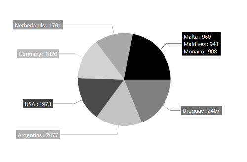
You can explore our KB article on showing adornment labels for grouped values in WPF Circular Chart to learn how to configure and display labels for grouped values effectively.
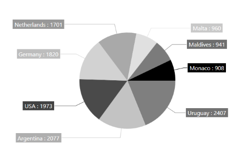
Pie series with grouping (Mode - Angle)
<chart:PieSeries
    ItemsSource="{Binding Data}"
    XBindingPath="Country"
    YBindingPath="Count"
    GroupMode="Angle"
    GroupTo="30">
    <chart:PieSeries.AdornmentsInfo>
        <chart:ChartAdornmentInfo
            ShowConnectorLine="True"
            ConnectorHeight="80"
            ShowLabel="True"
            LabelTemplate="{StaticResource DataLabelTemplate}"
            SegmentLabelContent="LabelContentPath">
        </chart:ChartAdornmentInfo>
    </chart:PieSeries.AdornmentsInfo>
</chart:PieSeries>pieSeries.GroupMode = PieGroupMode.Angle;
pieSeries.GroupTo = 30;
ChartAdornmentInfo adornmentInfo = new ChartAdornmentInfo()
{
ShowConnectorLine = true,
ShowLabel = true,
ConnectorHeight = 80,
LabelTemplate = this.RootGrid.Resources["DataLabelTemplate"] as DataTemplate,
SegmentLabelContent = LabelContent.LabelContentPath,
};
pieSeries.AdornmentsInfo = adornmentInfo;
Pie series with grouping (Mode - Percentage)
<chart:PieSeries
    ItemsSource="{Binding Data}"
    XBindingPath="Country"
    YBindingPath="Count"
    GroupMode="Percentage"
    GroupTo="10" >
    <chart:PieSeries.AdornmentsInfo>
        <chart:ChartAdornmentInfo
            ShowConnectorLine="True"
            ConnectorHeight="80"
            ShowLabel="True"
            LabelTemplate="{StaticResource DataLabelTemplate}"
            SegmentLabelContent="LabelContentPath">
        </chart:ChartAdornmentInfo>
    </chart:PieSeries.AdornmentsInfo>
</chart:PieSeries>pieSeries.GroupMode = PieGroupMode.Percentage;
pieSeries.GroupTo = 10;
ChartAdornmentInfo adornmentInfo = new ChartAdornmentInfo()
{
ShowConnectorLine = true,
ShowLabel = true,
ConnectorHeight = 80,
LabelTemplate = this.RootGrid.Resources["DataLabelTemplate"] as DataTemplate,
SegmentLabelContent = LabelContent.LabelContentPath,
};
pieSeries.AdornmentsInfo = adornmentInfo;
NOTE
You can explore our WPF Pie Chart feature tour page for its groundbreaking features. You can also explore our WPF Pie Chart example to know how to render and configure the pie chart.
Doughnut Chart
DoughnutSeries is similar to PieSeries. It is used to show the relationship between parts of data and whole data.
The DoughnutSeries can be added to chart as in below code example:
<chart:DoughnutSeries XBindingPath="Category" ItemsSource="{Binding Tax}" YBindingPath="Percentage"/>DoughnutSeries series = new DoughnutSeries()
{
ItemsSource = new ViewModel().Tax,
XBindingPath = "Category",
YBindingPath = "Percentage"
};
chart.Series.Add(series);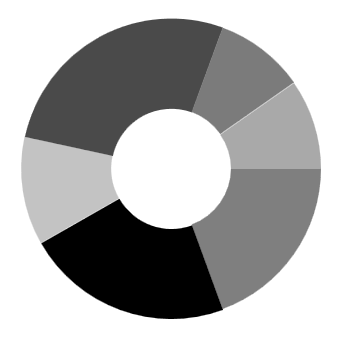
The Doughnut also having coefficient property, DoughnutCoefficient which defines the inner circle. Also it has DoughnutSize, used to define the size for this series like PieCoefficient in PieSeries.
<chart:DoughnutSeries
    DoughnutCoefficient="0.7"
    XBindingPath="Category"
    ItemsSource="{Binding Tax}"
    YBindingPath="Percentage">
</chart:DoughnutSeries>
DoughnutSeries series = new DoughnutSeries()
{
ItemsSource = new ViewModel().Tax,
XBindingPath = "Category",
YBindingPath = "Percentage",
DoughnutCoefficient = 0.9
};
chart.Series.Add(series);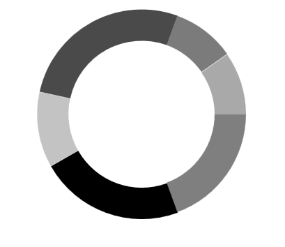
Size
The size of doughnut series can be customized by using its DoughnutSize property. The following code illustrates how to use the property in series.
<syncfusion:SfChart>
    <syncfusion:DoughnutSeries DoughnutSize="0.8"/>
    <syncfusion:DoughnutSeries DoughnutSize="0.8"/>
</syncfusion:SfChart>
DoughnutSeries doughnut = new DoughnutSeries();
doughnut.DoughnutSize = 0.8;
chart.Series.Add(doughnut);
DoughnutSeries doughnut1 = new DoughnutSeries();
doughnut1.DoughnutSize = 0.8;
chart.Series.Add(doughnut1);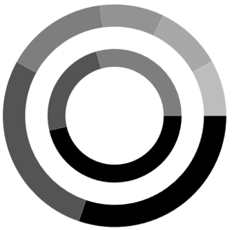
Hole Size
DoughnutHoleSize is an attachable property. It gets or sets the double value, which is used to customize the doughnut hole size. Its value ranges from 0 to 1, and it can be set as shown in the following code example.
<Chart:SfChart Chart:DoughnutSeries.DoughnutHoleSize="0.2"></chart:SfChart>SfChart chart = new SfChart();
DoughnutSeries.SetDoughnutHoleSize(chart, 0.2);
Semi Pie and Doughnut
By using custom StartAngle and EndAngle properties, you can draw pie series in different shapes such as semicircular or quarter circular series.
<syncfusion:PieSeries
    x:Name="PieSeries"
    StartAngle="180"
    EndAngle="360"
    XBindingPath="Utilization"
    YBindingPath="ResponseTime"
    ItemsSource="{Binding Value}">
</syncfusion:PieSeries>
PieSeries series = new PieSeries()
{
ItemsSource = new ViewModel().Value,
XBindingPath = "Utilization",
YBindingPath = "ResponseTime",
StartAngle = 180,
EndAngle = 360
};
chart.Series.Add(series);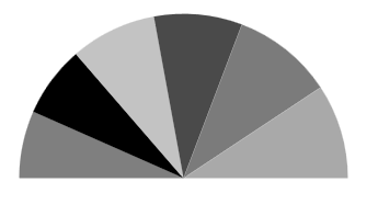
<syncfusion:DoughnutSeries
    StartAngle="180"
    EndAngle="360"
    XBindingPath="Utilization"
    YBindingPath="ResponseTime"
    ItemsSource="{Binding Value}">
</syncfusion:DoughnutSeries>
DoughnutSeries series = new DoughnutSeries()
{
ItemsSource = new ViewModel().Value,
XBindingPath = "Utilization",
YBindingPath = "ResponseTime",
StartAngle = 180,
EndAngle = 360
};
chart.Series.Add(series);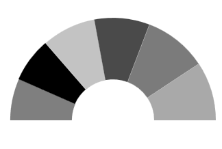
Stacked doughnut
Doughnut segments can be separated as individual circles using the IsStackedDoughnut property. The following properties are used to customize the stacked doughnut chart:
• CapStyle - Specifies the shapes of the start and end points of a circular segment. The supported values are BothFlat, BothCurve, StartCurve, and EndCurve. The default value of the this property is BothFlat.
• SegmentSpacing - Changes the spacing between two individual segments. The default value of spacing is 0, and the value ranges from 0 to 1. Here, 1 represents 100%, and 0 represents 0% of the available space.
• MaximumValue - Represents the entire span of an individual circle. The default value of the this property is double.NaN.
• TrackColor - Changes the color of the track area.
• TrackBorderColor - Changes the color of the track border.
• TrackBorderWidth - Changes the width of the track border.
<chart:SfChart>
    …
    <chart:DoughnutSeries XBindingPath="Category" YBindingPath="Expenditure" ItemsSource="{Binding ExpenditureData}"
                          IsStackedDoughnut="True" CapStyle="BothCurve" SegmentSpacing="0.2"
                          MaximumValue="100">
    </chart:DoughnutSeries>

</chart:SfChart>
SfChart chart = new SfChart();
DoughnutSeries doughnutSeries = new DoughnutSeries()
{
XBindingPath = "Category",
YBindingPath = "Expenditure",
ItemsSource = new ViewModel().ExpenditureData,
IsStackedDoughnut = true,
CapStyle = DoughnutCapStyle.BothCurve,
SegmentSpacing = 0.2,
MaximumValue = 100
};
chart.Series.Add(doughnutSeries);
Add content to the center of doughnut chart
You can add any content to the center of the doughnut chart using the CenterView property of DoughnutSeries. The binding context of the CenterView will be the respective DoughnutSeries.
<chart:SfChart>
    <!-- code omitted for brevity -->
    <chart:DoughnutSeries
        XBindingPath="Category"
        YBindingPath="Expenditure"
        ItemsSource="{Binding ExpenditureData}"
        IsStackedDoughnut="True"
        CapStyle="BothCurve"
        SegmentSpacing="0.2"
        MaximumValue="100">

        <chart:DoughnutSeries.CenterView>
            <ContentControl HorizontalAlignment="Center" VerticalAlignment="Center" >
                <Image Source="/Image/Person.png" Width="164" Height="164"/>
            </ContentControl>
        </chart:DoughnutSeries.CenterView>
    </chart:DoughnutSeries>
</chart:SfChart>
ContentControl centerView = new ContentControl()
{
Content = new Image()
{
HorizontalAlignment = HorizontalAlignment.Center,
VerticalAlignment = VerticalAlignment.Center,
Source = new BitmapImage(new Uri("Image/Person.png", UriKind.Relative)),
Width = 164,
Height = 164
}
};
doughnutSeries.CenterView = centerView;
Explode Segments
The following properties are used to explode the individual segments in Pie and Doughnut.
-
ExplodeAll- Used to explode all the segments of these series. -
ExplodeIndex- Used to explode any specific segment. -
ExplodeRadius- Used to define the explode distance. -
ExplodeOnMouseClick-Used to explode the segment when segment is clicked.
Explode Index
<syncfusion:PieSeries
    x:Name="PieSeries"
    ItemsSource="{Binding Data}"
    ExplodeIndex="2"
    ExplodeRadius="10"
    XBindingPath="Utilization"
    YBindingPath="ResponseTime">
</syncfusion:PieSeries>
PieSeries series = new PieSeries()
{
ItemsSource = new ViewModel().Data,
XBindingPath = "Utilization",
YBindingPath = "ResponseTime",
ExplodeIndex = 2,
ExplodeRadius = 10
};
chart.Series.Add(series);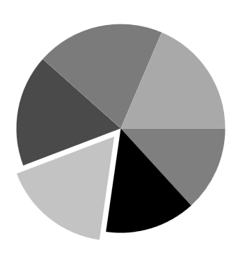
NOTE
We have defined ExplodeRadius as 30, by default its value is zero. So you need to define explode, when you set ExplodeIndex or ExplodeAll.
Explode All
<chart:PieSeries
    ExplodeAll="True"
    ExplodeRadius="15"
    XBindingPath="Category"
    ItemsSource="{Binding Tax}"
    YBindingPath="Percentage">
</chart:PieSeries>
PieSeries series = new PieSeries()
{
ItemsSource = new ViewModel().Tax,
XBindingPath = "Category",
YBindingPath = "Percentage",
ExplodeAll = true,
ExplodeRadius = 15
};
chart.Series.Add(series);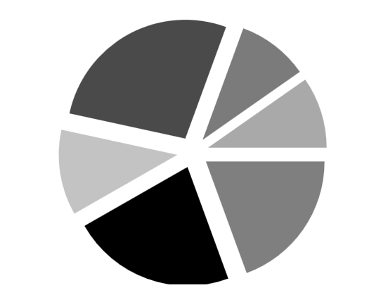
NOTE
You can refer to our WPF Doughnut Chart feature tour page for its groundbreaking feature representations. You can also explore our WPF Doughnut Chart example to know how to render and configure the doughnut chart.
See also
How to show adornment labels for grouped values in WPF Circular ChartHow to deselect a chart segment by using code behind in WPF ChartHow to view corner segments without cutting in edge of WPF ChartHow to customize the space between segments in WPF Chart (SfChart)How to display the labels inside segments in WPF Chart (SfChart)How to show tooltip when segment is underneath axis line of WPF Chart (SfChart)How to create pie chart example in C# WPF