Axis in WPF Charts (SfChart)
8 Jul 202624 minutes to read
ChartAxis is used to locate a data point inside the chart area. Charts typically have two axes that are used to measure and categorize data: a vertical (Y) axis and a horizontal (X) axis.
Vertical (Y) axis always uses a numerical scale. Horizontal (X) axis supports the following types of scale:
- Category
- Numeric
- Date time
- Logarithmic Axis
The following are the APIs in ChartAxis:
-
ArrangeRect- Represents the bounds of chart axis size. -
VisibleRange- Represents the axis start and end visible values as follows.
| Gets the start value of the visible range. | |
| Gets the end value of the visible range. | |
| Gets the delta value of the visible range. | |
| Gets the empty value of the visible range. | |
| Gets a value indicating whether the visible range is empty or not. | |
| Gets the median value of the visible range. |
-
VisibleLabels- Represents the axis label collection which are visible in the axis.
The following topics explain in detail about the axis and its parts.
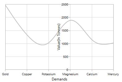
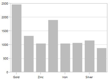
Header
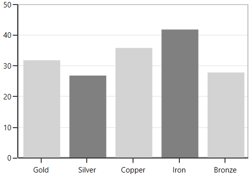
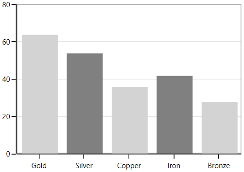
In ChartAxis you can define any object as a header using the Header property. The following code example demonstrates defining the header in primary and secondary axes.
<syncfusion:SfChart>
    <syncfusion:SfChart.PrimaryAxis>
        <syncfusion:CategoryAxis Header="Metals"/>
    </syncfusion:SfChart.PrimaryAxis>
    <syncfusion:SfChart.SecondaryAxis>
        <syncfusion:NumericalAxis Header="Values(In Tonnes)"/>
    </syncfusion:SfChart.SecondaryAxis>
</syncfusion:SfChart>chart.PrimaryAxis = new CategoryAxis() { Header = "Medals" };
chart.SecondaryAxis = new NumericalAxis() { Header = "Values(In Tonnes)" };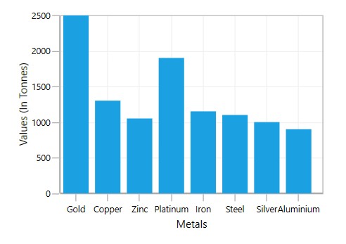
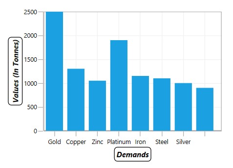
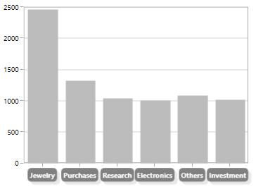
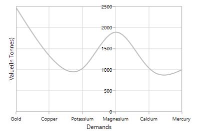
Header Customization
Default appearance of the header can be customized using the HeaderTemplate property. The following code snippet demonstrates the header customization.
<syncfusion:SfChart x:Name="chart">
    <syncfusion:SfChart.Resources>
        <DataTemplate x:Key="headerTemplate1">
            <Border BorderBrush="Black" CornerRadius="5" BorderThickness="1">
                <TextBlock Text="Demands" FontSize="12" FontStyle="Italic" FontWeight="Bold" Margin="3"/>
            </Border>
        </DataTemplate>

        <DataTemplate x:Key="headerTemplate2">
            <Border BorderBrush="Black" CornerRadius="5" BorderThickness="1">
                <TextBlock FontSize="12" Margin="3" FontStyle="Italic" FontWeight="Bold"/>
            </Border>
        </DataTemplate>
    </syncfusion:SfChart.Resources>

    <syncfusion:SfChart.PrimaryAxis>
        <syncfusion:CategoryAxis HeaderTemplate="{StaticResource headerTemplate1}"/>
    </syncfusion:SfChart.PrimaryAxis>

    <syncfusion:SfChart.SecondaryAxis>
        <syncfusion:NumericalAxis Header="Values(In Tonnes)" HeaderTemplate="{StaticResource headerTemplate2}"/>
    </syncfusion:SfChart.SecondaryAxis>
</syncfusion:SfChart>chart.PrimaryAxis = new CategoryAxis()
{
HeaderTemplate = chart.Resources["headerTemplate1"] as DataTemplate
};
chart.SecondaryAxis = new NumericalAxis()
{
HeaderTemplate = chart.Resources["headerTemplate2"] as DataTemplate
};
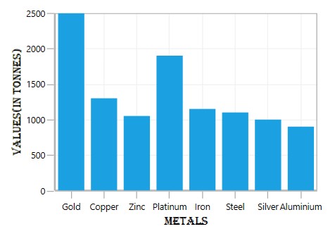
HeaderStyle
HeaderStyle property is used to provide style for the axis header. The following code example explains header style customization.
<syncfusion:SfChart.PrimaryAxis>
    <syncfusion:CategoryAxis Header="Metals" >
        <syncfusion:CategoryAxis.HeaderStyle>
            <syncfusion:LabelStyle FontFamily="Algerian" FontSize="13" Foreground="Black">
            </syncfusion:LabelStyle>
        </syncfusion:CategoryAxis.HeaderStyle>
    </syncfusion:CategoryAxis>
</syncfusion:SfChart.PrimaryAxis>

<syncfusion:SfChart.SecondaryAxis>
    <syncfusion:NumericalAxis Header="Values(In Tonnes)">
        <syncfusion:NumericalAxis.HeaderStyle>
            <syncfusion:LabelStyle FontFamily="Algerian" FontSize="13" Foreground="Black">
            </syncfusion:LabelStyle>
        </syncfusion:NumericalAxis.HeaderStyle>
    </syncfusion:NumericalAxis>
</syncfusion:SfChart.SecondaryAxis>
LabelStyle style = new LabelStyle()
{
FontFamily = new FontFamily("Algerian"),
FontSize = 13,
Foreground = new SolidColorBrush(Colors.Black)
};
chart.PrimaryAxis = new CategoryAxis()
{
Header = "Medals",
LabelStyle = style
};
chart.SecondaryAxis = new NumericalAxis()
{
Header = "Values(In Tonnes)",
LabelStyle = style
};
Axis Labels
Labels will be generated by the range and the values bound to XBindingPath or YBindingPath properties.
Positioning the Labels
The LabelsPosition property is used to position the axis label either inside or outside the chart plotting area. By default, LabelsPosition is Outside.
Inside
<syncfusion:SfChart.PrimaryAxis>
    <syncfusion:NumericalAxis  LabelsPosition="Inside">
    </syncfusion:NumericalAxis>
</syncfusion:SfChart.PrimaryAxis>chart.PrimaryAxis = new NumericalAxis()
{
LabelsPosition = AxisElementPosition.Inside
};
LabelRotationAngle
LabelRotationAngle property allows you to define the angle for the label content. The following code example illustrates the LabelRotationAngle.
<syncfusion:SfChart.PrimaryAxis>
    <syncfusion:DateTimeAxis  LabelRotationAngle="90"/>
</syncfusion:SfChart.PrimaryAxis>chart.PrimaryAxis = new DateTimeAxis()
{
LabelRotationAngle = 90
};
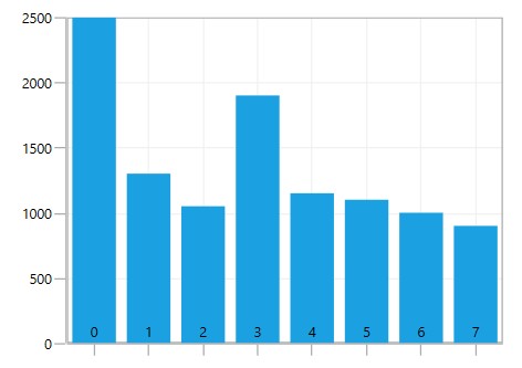
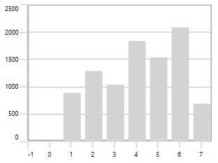
Custom Labels
SfChart allows the user to define the labels for the axis. For defining the axis label, you have to set the LabelContent and Position properties. You can define the labels using the CustomLabels property as in the below code snippet.
<syncfusion:SfChart.PrimaryAxis>
    <syncfusion:CategoryAxis>
        <syncfusion:CategoryAxis.CustomLabels>
            <syncfusion:ChartAxisLabel Position="0" LabelContent="0-1"/>
            <syncfusion:ChartAxisLabel Position="1" LabelContent="1-2"/>
            <syncfusion:ChartAxisLabel Position="2" LabelContent="2-3"/>
            <syncfusion:ChartAxisLabel Position="3" LabelContent="3-4"/>
            <syncfusion:ChartAxisLabel Position="4" LabelContent="4-5"/>
            <syncfusion:ChartAxisLabel Position="5" LabelContent="5-6"/>
        </syncfusion:CategoryAxis.CustomLabels>
    </syncfusion:CategoryAxis>
</syncfusion:SfChart.PrimaryAxis>
CategoryAxis axis = new CategoryAxis();
axis.CustomLabels.Add(new ChartAxisLabel() { Position = 0, LabelContent = "0-1" });
axis.CustomLabels.Add(new ChartAxisLabel() { Position = 1, LabelContent = "1-2" });
axis.CustomLabels.Add(new ChartAxisLabel() { Position = 2, LabelContent = "2-3" });
axis.CustomLabels.Add(new ChartAxisLabel() { Position = 3, LabelContent = "3-4" });
axis.CustomLabels.Add(new ChartAxisLabel() { Position = 4, LabelContent = "4-5" });
axis.CustomLabels.Add(new ChartAxisLabel() { Position = 5, LabelContent = "5-6" });
chart.PrimaryAxis = axis;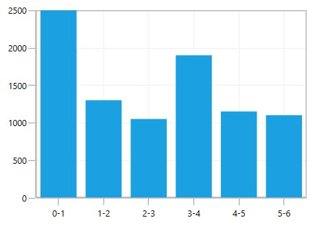
You can also directly bind the collection of labels to the LabelsSource property for defining custom labels. The following code example demonstrates defining the label collection in code behind and binding the property in the XAML page.
<syncfusion:SfChart.PrimaryAxis>
    <syncfusion:CategoryAxis LabelsSource="{Binding Labels}" ContentPath="Content" PositionPath="Position"/>
</syncfusion:SfChart.PrimaryAxis>chart.PrimaryAxis = new CategoryAxis()
{
ContentPath = "Content",
PositionPath = "Position",
LabelsSource = Labels
};
public List<LabelItem> Labels { get; set; }
Labels = new List<LabelItem>
{
new LabelItem() { Position = 0, Content = "0-1"},
new LabelItem() { Position = 1, Content = "1-2"},
new LabelItem() { Position = 2, Content = "2-3"},
new LabelItem() { Position = 3, Content = "3-4"},
new LabelItem() { Position = 4, Content = "4-5"},
new LabelItem() { Position = 5, Content = "5-6"},
new LabelItem() { Position = 6, Content = "6-7"},
new LabelItem() { Position = 7, Content = "7-8"},
};
public class LabelItem
{
public string Content { get; set; }
public int Position { get; set; }
}
Label Formatting
Axis labels can be formatted by predefined formatting types based on the axis types.
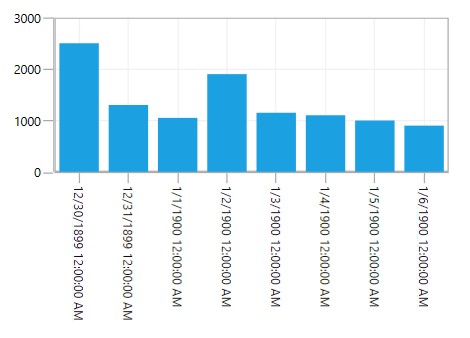
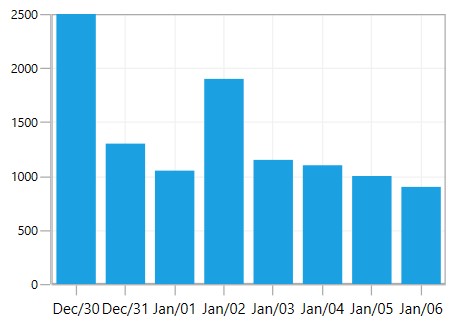
DateTimeAxis
<syncfusion:SfChart.PrimaryAxis>
    <syncfusion:DateTimeAxis LabelFormat="MMM/dd" FontSize="12"/>
</syncfusion:SfChart.PrimaryAxis>chart.PrimaryAxis = new DateTimeAxis()
{
LabelFormat = "MM/dd",
FontSize = 12
};
TimeSpanAxis
<syncfusion:SfChart.PrimaryAxis>
    <syncfusion:TimeSpanAxis LabelFormat="g" ></syncfusion:TimeSpanAxis>
</syncfusion:SfChart.PrimaryAxis>chart.PrimaryAxis = new TimeSpanAxis()
{
LabelFormat = "g",
};
NumericalAxis
<syncfusion:SfChart.SecondaryAxis>
    <syncfusion:NumericalAxis LabelFormat="0.00"/>
</syncfusion:SfChart.SecondaryAxis>chart.PrimaryAxis = new NumericalAxis()
{
LabelFormat = "0.00",
};
Adding Units to Labels
To display the measuring units, they can be added as a prefix or suffix to the axis labels. This can be achieved using the PrefixLabelTemplate and PostfixLabelTemplate properties.
PrefixLabelTemplate
<syncfusion:SfChart x:Name="chart">
    <syncfusion:SfChart.Resources>
        <DataTemplate x:Key="prefixLabelTemplate">
            <TextBlock FontSize="10" VerticalAlignment="Center" Text="$"/>
        </DataTemplate>
    </syncfusion:SfChart.Resources>

    <syncfusion:SfChart.SecondaryAxis>
        <syncfusion:NumericalAxis
            FontSize="10"
            PrefixLabelTemplate="{StaticResource prefixLabelTemplate}"/>
    </syncfusion:SfChart.SecondaryAxis>
</syncfusion:SfChart>chart.SecondaryAxis = new NumericalAxis()
{
PrefixLabelTemplate = chart.Resources["prefixLabelTemplate"] as DataTemplate
};
PostfixLabelTemplate
<syncfusion:SfChart x:Name="chart">
        <syncfusion:SfChart.Resources>
            <DataTemplate x:Key="postfixLabelTemplate">
                <TextBlock FontSize="10" VerticalAlignment="Center" Text="K"/>
            </DataTemplate>
        </syncfusion:SfChart.Resources>

        <syncfusion:SfChart.SecondaryAxis>
            <syncfusion:NumericalAxis
                FontSize="10"
                PostfixLabelTemplate="{StaticResource postfixLabelTemplate}"/>
        </syncfusion:SfChart.SecondaryAxis>
</syncfusion:SfChart>chart.SecondaryAxis = new NumericalAxis()
{
PostfixLabelTemplate = chart.Resources["postfixLabelTemplate"] as DataTemplate
};
LabelTemplate
LabelTemplate property allows you to define the appearance for the axis labels. The following code example illustrates the LabelTemplate property.
<syncfusion:SfChart x:Name="chart">
    <syncfusion:SfChart.Resources>
        <DataTemplate x:Key="labelTemplate">
            <Border Background="Gray" CornerRadius="5">
                <TextBlock
                    Text="{Binding LabelContent}"
                    Foreground="White"
                    FontStyle="Normal"
                    FontSize="10"
                    FontWeight="Bold"
                    Margin="3"/>
                <Border.Effect>
                    <DropShadowEffect
                        ShadowDepth="6"
                        Direction="315"
                        Color="LightGray"
                        Opacity="0.25"
                        BlurRadius="0.8"/>
                </Border.Effect>
            </Border>
        </DataTemplate>
    </syncfusion:SfChart.Resources>

    <syncfusion:SfChart.PrimaryAxis>
        <syncfusion:CategoryAxis LabelTemplate="{StaticResource labelTemplate}"/>
    </syncfusion:SfChart.PrimaryAxis>
</syncfusion:SfChart>chart.PrimaryAxis = new CategoryAxis()
{
LabelTemplate = chart.Resources["labelTemplate"] as DataTemplate
};
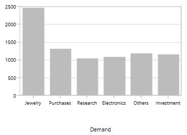
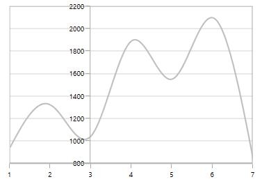
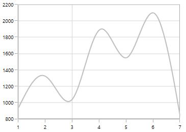
LabelExtent
This property allows us to set the distance between the axis header and the axis using the LabelExtent property. The following code snippet defines the LabelExtent property.
<syncfusion:SfChart.PrimaryAxis>
    <syncfusion:CategoryAxis Header="Demand" LabelExtent="50"/>
</syncfusion:SfChart.PrimaryAxis>chart.PrimaryAxis = new NumericalAxis()
{
Header = "Demand",
LabelExtent = 50
};
Smart Axis Labels
When there are a larger number of axis labels, they may overlap with each other. SfChart provides support to handle the overlapping labels using the LabelsIntersectAction property. By default, the LabelsIntersectAction value is Hide.
The following are the options for the intersecting action.
- None
- Hide
- MultipleRows
- Rotate
None
None option is used to display all the labels even if they intersect. The following code snippet demonstrates the LabelsIntersectAction as the None option.
<syncfusion:SfChart.PrimaryAxis>
    <syncfusion:DateTimeAxis LabelsIntersectAction="None"/>
</syncfusion:SfChart.PrimaryAxis>chart.PrimaryAxis = new DateTimeAxis()
{
LabelsIntersectAction = AxisLabelsIntersectAction.None
};
Hide
Hide option is used to hide the labels if they intersect. You can define the hide as shown in the below code snippet.
<syncfusion:SfChart.PrimaryAxis>
    <syncfusion:DateTimeAxis  LabelsIntersectAction="Hide"/>
</syncfusion:SfChart.PrimaryAxis>chart.PrimaryAxis = new DateTimeAxis()
{
LabelsIntersectAction = AxisLabelsIntersectAction.Hide
};
MultipleRows
This option is used to move the labels to the next row if they intersect. The following code demonstrates the MultipleRows option in LabelsIntersectAction.
<syncfusion:SfChart.PrimaryAxis>
    <syncfusion:DateTimeAxis LabelsIntersectAction="MultipleRows"/>
</syncfusion:SfChart.PrimaryAxis>chart.PrimaryAxis = new DateTimeAxis()
{
LabelsIntersectAction = AxisLabelsIntersectAction.MultipleRows
};
Auto
This option in the LabelsIntersectAction property is used to rotate the labels if they intersect. The following code snippet and image demonstrate the rotate option in the LabelsIntersectAction property.
<syncfusion:DateTimeAxis LabelsIntersectAction="Auto"></syncfusion:DateTimeAxis>chart.PrimaryAxis = new DateTimeAxis()
{
LabelsIntersectAction = AxisLabelsIntersectAction.Auto
};
EdgeLabelsDrawingMode
SfChart provides support to customize the position of the edge labels in the axis using the EdgeLabelsDrawingMode property. The EdgeLabelsDrawingMode property default value is Center.
The following are the customizing options in EdgeLabelsDrawingMode.
- Center - Positions the label with the tick line as center.
- Fit - Positions the gridline inside based on the edge label size.
- Hide - Hides the edge labels.
- Shift - Shifts the edge labels to the left or right so that they come inside the chart area.
Center
<syncfusion:SfChart.PrimaryAxis>
    <syncfusion:DateTimeAxis EdgeLabelsDrawingMode="Center"/>
</syncfusion:SfChart.PrimaryAxis>chart.PrimaryAxis = new DateTimeAxis()
{
EdgeLabelsDrawingMode = EdgeLabelsDrawingMode.Center
};
Shift
<syncfusion:SfChart.PrimaryAxis>
    <syncfusion:DateTimeAxis DateTimeAxis LabelFormat="MMM-dd" EdgeLabelsDrawingMode="Shift"/>
</syncfusion:SfChart.PrimaryAxis>chart.PrimaryAxis = new DateTimeAxis()
{
EdgeLabelsDrawingMode = EdgeLabelsDrawingMode.Shift
};
Hide
<syncfusion:SfChart.PrimaryAxis>
    <syncfusion:DateTimeAxis  EdgeLabelsDrawingMode="Hide"/>
</syncfusion:SfChart.PrimaryAxis>chart.PrimaryAxis = new DateTimeAxis()
{
EdgeLabelsDrawingMode = EdgeLabelsDrawingMode.Hide
};
Fit
<syncfusion:SfChart.PrimaryAxis>
    <syncfusion:DateTimeAxis EdgeLabelsDrawingMode="Fit"/>
</syncfusion:SfChart.PrimaryAxis>chart.PrimaryAxis = new DateTimeAxis()
{
EdgeLabelsDrawingMode = EdgeLabelsDrawingMode.Fit
};
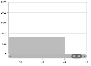
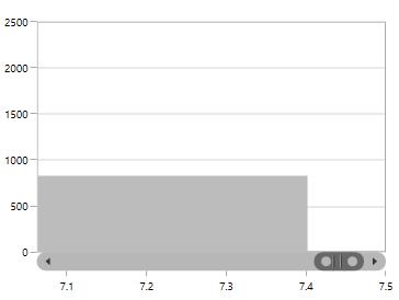
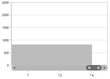
EdgeLabelsVisibilityMode
The visibility of the extreme labels of the axis can be controlled using the EdgeLabelsVisibilityMode property. By default, the Default option in EdgeLabelsVisibilityMode is set, which displays the edge label based on auto interval calculations. The following image depicts the default option in EdgeLabelsVisibilityMode while zooming.
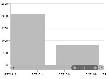
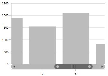
Always Visible
The AlwaysVisible option in EdgeLabelsVisibilityMode is used to view the edge labels even while performing zooming.
The following code example and image demonstrate the AlwaysVisible option while zooming.
<syncfusion:SfChart.PrimaryAxis>
    <syncfusion:NumericalAxis EdgeLabelsVisibilityMode="AlwaysVisible" EnableScrollBar="True"/>
</syncfusion:SfChart.PrimaryAxis>chart.PrimaryAxis = new NumericalAxis()
{
EdgeLabelsVisibilityMode = EdgeLabelsVisibilityMode.AlwaysVisible
};
Visible
Visible option is used to display the edge labels (first and last label) irrespective of the auto interval calculation until zooming (i.e., in normal state).
<syncfusion:SfChart.PrimaryAxis>
    <syncfusion:NumericalAxis EdgeLabelsVisibilityMode="Visible" EnableScrollBar="True"/>
</syncfusion:SfChart.PrimaryAxis>chart.PrimaryAxis = new NumericalAxis()
{
EdgeLabelsVisibilityMode = EdgeLabelsVisibilityMode.Visible
};
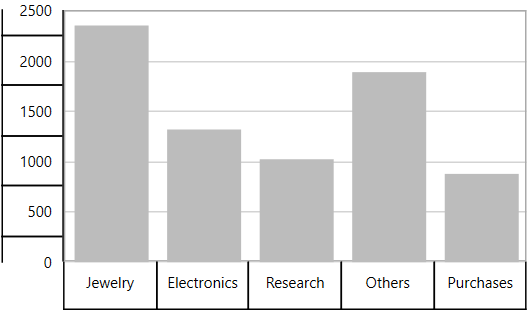
Axis Label Border
ChartAxis provides support to place the border around its label. To place the border around axis, enable ShowLabelBorder property of axis; it can be set as shown in the following code example.
<syncfusion:SfChart.PrimaryAxis>
    <syncfusion:CategoryAxis ShowLabelBorder="True"/>
</syncfusion:SfChart.PrimaryAxis>

<syncfusion:SfChart.SecondaryAxis>
    <syncfusion:NumericalAxis ShowLabelBorder="True"/>
</syncfusion:SfChart.SecondaryAxis>chart.PrimaryAxis = new CategoryAxis()
{
ShowLabelBorder = true,
};
chart.SecondaryAxis = new NumericalAxis()
{
ShowLabelBorder = true
};
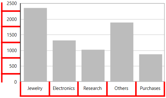
The border color and width can be customized with LabelBorderBrush and LabelBorderWidth properties of chart axis; it can be set as shown in the following code example.
<syncfusion:SfChart.PrimaryAxis>
    <syncfusion:CategoryAxis LabelBorderWidth="3" ShowLabelBorder="True" LabelBorderBrush="Red"/>
</syncfusion:SfChart.PrimaryAxis>

<syncfusion:SfChart.SecondaryAxis>
    <syncfusion:NumericalAxis ShowLabelBorder="True"  LabelBorderWidth="3" LabelBorderBrush="Red"/>
</syncfusion:SfChart.SecondaryAxis>chart.PrimaryAxis = new CategoryAxis()
{
ShowLabelBorder = true,
LabelBorderWidth = 3,
LabelBorderBrush = new SolidColorBrush(Colors.Red)
};
chart.SecondaryAxis = new NumericalAxis()
{
ShowLabelBorder = true,
LabelBorderWidth = 3,
LabelBorderBrush = new SolidColorBrush(Colors.Red),
};
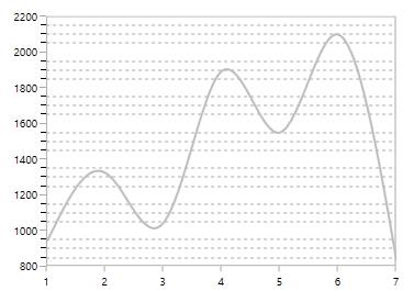
Grid lines
By default, gridlines are automatically added to the ChartAxis in its defined intervals. SfChart supports customization of gridline. The visibility of the gridlines can be controlled using the ShowGridLines property.
The following code example illustrates the ShowGridLines property as false in the primary axis.
<syncfusion:SfChart.PrimaryAxis>
    <syncfusion:NumericalAxis ShowGridLines="False"/>
</syncfusion:SfChart.PrimaryAxis>chart.PrimaryAxis = new NumericalAxis()
{
ShowGridLines = false
};
Style can also be applied to Major and Minor Gridlines using MajorGridLineStyle and MinorGridLineStyle properties.
MajorGridLineStyle
<syncfusion:SfChart x:Name="chart">
    <syncfusion:SfChart.Resources>
        <Style TargetType="Line" x:Key="lineStyle">
            <Setter Property="StrokeThickness" Value="2"/>
            <Setter Property="Stroke" Value="Black"/>
            <Setter Property="StrokeDashArray" Value="3,3"/>
        </Style>
    </syncfusion:SfChart.Resources>

    <syncfusion:SfChart.PrimaryAxis>
        <syncfusion:NumericalAxis MajorGridLineStyle="{StaticResource lineStyle}"/>
    </syncfusion:SfChart.PrimaryAxis>
</syncfusion:SfChart>chart.PrimaryAxis = new NumericalAxis()
{
MajorGridLineStyle = chart.Resources["lineStyle"] as Style
};
MinorGridLineStyle
Minor gridlines will be added automatically when the small tick lines is defined inside the chart area.
<syncfusion:SfChart x:Name="chart">
    <syncfusion:SfChart.Resources>
        <Style TargetType="Line" x:Key="lineStyle">
            <Setter Property="StrokeThickness" Value="1"/>
            <Setter Property="Stroke" Value="DarkGray"/>
            <Setter Property="StrokeDashArray" Value="3,3"/>
        </Style>
    </syncfusion:SfChart.Resources>

    <syncfusion:SfChart.SecondaryAxis>
        <syncfusion:NumericalAxis
            SmallTicksPerInterval="3"
            MinorGridLineStyle="{StaticResource lineStyle}"/>
    </syncfusion:SfChart.SecondaryAxis>
</syncfusion:SfChart>chart.PrimaryAxis = new NumericalAxis()
{
SmallTicksPerInterval = 3,
MinorGridLineStyle = chart.Resources["lineStyle"] as Style
};
Tick lines
Tick line are the small lines which is drawn on the axis line representing the axis labels .Tick lines will be drawn outside of the axis by default.
TickLineSize
Tick lines thickness can be customized using TickLineSize property as shown in the below code snippet.
<syncfusion:SfChart.PrimaryAxis>
    <syncfusion:NumericalAxis  TickLineSize="10"/>
</syncfusion:SfChart.PrimaryAxis>chart.PrimaryAxis = new NumericalAxis()
{
TickLineSize = 10
};
Positioning the Major Tick Lines
Tick lines can be positioned inside or outside of the chart area using TickLinesPosition property. By default the tick lines will positioned outside of the chart area. The following code example demonstrates the positioning tick lines inside chart area.
<syncfusion:SfChart.PrimaryAxis>
    <syncfusion:NumericalAxis TickLinesPosition="Inside"/>
</syncfusion:SfChart.PrimaryAxis>chart.PrimaryAxis = new NumericalAxis()
{
TickLinesPosition = AxisElementPosition.Inside
};
Customization
Style can be applied to major tick lines using MajorTickLineStyle property .The following code snippet demonstrates the styling of major tick lines.
<syncfusion:SfChart x:Name="chart">
    <syncfusion:SfChart.Resources>
        <Style TargetType="Line" x:Key="lineStyle">
            <Setter Property="StrokeThickness" Value="1"/>
            <Setter Property="Stroke" Value="Black"/>
            <Setter Property="StrokeDashArray" Value="3,3"/>
        </Style>
    </syncfusion:SfChart.Resources>

    <syncfusion:SfChart.PrimaryAxis>
        <syncfusion:NumericalAxis
            TickLineSize="10"
            MajorTickLineStyle="{StaticResource lineStyle}">
        </syncfusion:NumericalAxis>
    </syncfusion:SfChart.PrimaryAxis>
</syncfusion:SfChart>chart.PrimaryAxis = new NumericalAxis()
{
TickLineSize = 10,
MajorTickLineStyle = chart.Resources["lineStyle"] as Style
};
MinorTickLines
Minor tick lines can be added by defining SmallTicksPerInterval property. This property will add the tick lines to every interval.
The following code example demonstrates the small ticks set for every interval.
<syncfusion:SfChart.PrimaryAxis>
    <syncfusion:NumericalAxis Interval="1" SmallTicksPerInterval="4"/>
</syncfusion:SfChart.PrimaryAxis>chart.PrimaryAxis = new NumericalAxis()
{
Interval = 1,
SmallTicksPerInterval = 4
};
Positioning the minor tick lines
Minor tick lines can be positioned inside or outside using SmallTickLinesPosition property. By default the minor tick lines will be positioned outside.
The following code example demonstrates the positioning of minor tick lines inside the chart area.
<syncfusion:SfChart.PrimaryAxis>
    <syncfusion:NumericalAxis SmallTicksPerInterval="2" SmallTickLinesPosition="Inside"/>
</syncfusion:SfChart.PrimaryAxis>chart.PrimaryAxis = new NumericalAxis()
{
SmallTicksPerInterval = 2,
SmallTickLinesPosition = AxisElementPosition.Inside
};
Customization of Minor Ticklines
The thickness of the minor tick lines can be customized using SmallTickLineSize property as shown in the below code snippet.
<syncfusion:SfChart.PrimaryAxis>
    <syncfusion:NumericalAxis
        Interval="1"
        SmallTicksPerInterval="3"
        SmallTickLineSize="10">
    </syncfusion:NumericalAxis>
</syncfusion:SfChart.PrimaryAxis>chart.PrimaryAxis = new NumericalAxis()
{
Interval = 1,
SmallTicksPerInterval = 3,
SmallTickLineSize = 10
};
Styling customization of minor tick lines can be defined using MinorTickLineStyle property. The following code example and image demonstrates the style for minor tick lines.
<syncfusion:SfChart x:Name="chart">
    <syncfusion:SfChart.Resources>
        <Style TargetType="Line" x:Key="lineStyle" >
            <Setter Property="StrokeThickness" Value="0.5"/>
            <Setter Property="Stroke" Value="Black"/>
        </Style>
    </syncfusion:SfChart.Resources>

    <syncfusion:SfChart.PrimaryAxis>
        <syncfusion:NumericalAxis
            FontSize="12"
            Interval="1"
            SmallTicksPerInterval="3"
            TickLineSize="10"
            SmallTickLineSize="5"
            MinorTickLineStyle="{StaticResource lineStyle}"/>
    </syncfusion:SfChart.PrimaryAxis>
</syncfusion:SfChart>chart.PrimaryAxis = new NumericalAxis()
{
Interval = 1,
SmallTicksPerInterval = 3,
TickLineSize = 10,
SmallTickLineSize = 5
MinorTickLineStyle = chart.Resources["lineStyle"] as Style
};
NOTE
For category axis, small tick lines is not applicable since it is rendered based on index positions.
Customize individual axis elements
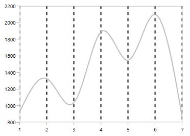
The RangeStyles can be used to customize the gridlines, ticks and axis labels for a specific region of ChartAxis. The following properties are used to customize the specific range in an axis:
-
Start- Sets the start range of an axis. -
End- Sets the end range of an axis. -
MajorGridLineStyle- Customizes the major grid lines of an axis. -
MinorGridLineStyle- Customizes the minor grid lines of an axis. -
MajorTickStyle- Customizes the major tick lines of an axis. -
MinorTickStyle- Customizes the minor tick lines of an axis. -
LabelStyle- Customizes the axis labels for a specific range.
<syncfusion:SfChart x:Name="chart">
    <syncfusion:SfChart.Resources>
        <Style TargetType="Line" x:Key="RangeLineStyle">
            <Setter Property="StrokeThickness" Value="2"/>
            <Setter Property="Stroke" Value="RoyalBlue"/>
        </Style>

        <Style TargetType="Line" x:Key="lineStyle">
            <Setter Property="StrokeThickness" Value="2"/>
            <Setter Property="Stroke" Value="Green"/>
        </Style>
    </syncfusion:SfChart.Resources>

    <syncfusion:SfChart.SecondaryAxis>
        <syncfusion:NumericalAxis MajorGridLineStyle= "{StaticResource lineStyle}" MajorTickLineStyle="{StaticResource lineStyle}">

            <syncfusion:NumericalAxis.LabelStyle>
                <syncfusion:LabelStyle Foreground="Green"/>
            </syncfusion:NumericalAxis.LabelStyle>

            <syncfusion:NumericalAxis.RangeStyles>
                <syncfusion:ChartAxisRangeStyleCollection>
                    <syncfusion:ChartAxisRangeStyle Start="18" End="22" MajorGridLineStyle= "{StaticResource RangeLineStyle}" MajorTickLineStyle = "{StaticResource RangeLineStyle}">
                        <syncfusion:ChartAxisRangeStyle.LabelStyle>
                            <syncfusion:LabelStyle Foreground="RoyalBlue" />
                        </syncfusion:ChartAxisRangeStyle.LabelStyle>
                    </syncfusion:ChartAxisRangeStyle>
                </syncfusion:ChartAxisRangeStyleCollection>
            </syncfusion:NumericalAxis.RangeStyles>

        </syncfusion:NumericalAxis>
    </syncfusion:SfChart.SecondaryAxis>
</syncfusion:SfChart>
NumericalAxis secondaryAxis = new NumericalAxis();
secondaryAxis.MajorGridLineStyle = chart.Resources["lineStyle"] as Style;
secondaryAxis.MajorTickLineStyle = chart.Resources["lineStyle"] as Style;
secondaryAxis.LabelStyle.Foreground = new SolidColorBrush(Colors.Green);
ChartAxisRangeStyleCollection axisRangeStyles = new ChartAxisRangeStyleCollection();
ChartAxisRangeStyle rangeStyle = new ChartAxisRangeStyle() { Start = 18, End = 22 };
rangeStyle.MajorGridLineStyle = chart.Resources["RangeLineStyle"] as Style;
rangeStyle.LabelStyle = new LabelStyle();
rangeStyle.LabelStyle.Foreground = new SolidColorBrush(Colors.RoyalBlue);
rangeStyle.MajorTickLineStyle = chart.Resources["RangeLineStyle"] as Style;
axisRangeStyles.Add(rangeStyle);
secondaryAxis.RangeStyles = axisRangeStyles;
chart.SecondaryAxis = secondaryAxis;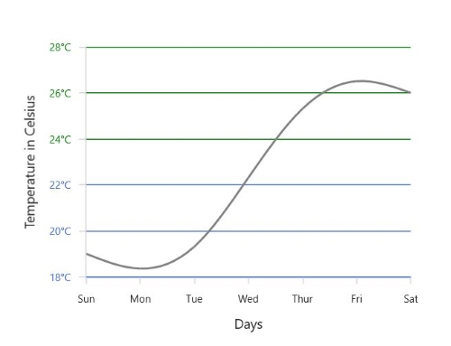
AxisLine
SfChart provides support to customize the style of the axis line by defining the AxisLineStyle property as shown in the below code snippet.
<syncfusion:SfChart.PrimaryAxis>
    <syncfusion:NumericalAxis  Interval="1" >
        <syncfusion:NumericalAxis.AxisLineStyle>
            <Style TargetType="Line"  >
                <Setter Property="StrokeThickness" Value="2"/>
                <Setter Property="Stroke" Value="Red"/>
                <Setter Property="StrokeDashArray" Value="2,2"/>
            </Style>
        </syncfusion:NumericalAxis.AxisLineStyle>
    </syncfusion:NumericalAxis>
</syncfusion:SfChart.PrimaryAxis>chart.PrimaryAxis = new NumericalAxis()
{
Interval = 1,
AxisLineStyle = chart.Resources["lineStyle"] as Style
};
Applying Padding to the Axis line
The padding to the axis line is defined using AxisLineOffset property. The following code example demonstrates the setting AxisLineOffset for x axis.
<syncfusion:SfChart.PrimaryAxis>
    <syncfusion:NumericalAxis AxisLineOffset="20"/>
</syncfusion:SfChart.PrimaryAxis>chart.PrimaryAxis = new NumericalAxis()
{
AxisLineOffset = 20
};
Origin Customization
SfChart allows you to customize the origin.By default the axis will be rendered having (0,0) as origin in x and y axes.
ShowAxisNextToOrigin
ShowAxisNextToOrigin property is used to move the axis line to the origin value in Origin property based on the x or y axes. .The following code example demonstrates shifting the axis in the origin value in numerical axis.
<syncfusion:SfChart.SecondaryAxis>
    <syncfusion:NumericalAxis Origin="3" ShowAxisNextToOrigin="True"/>
</syncfusion:SfChart.SecondaryAxis>chart.SecondaryAxis = new NumericalAxis()
{
Origin = 3,
ShowAxisNextToOrigin = true
};
Positioning the Header
The following image demonstrates the default positioning of header when the axis is moved inside based on the origin value.
If you want to position the header outside of the chart area then you can set the Far option in HeaderPosition property.
The following code example demonstrates the positioning of the header outside even when the axis is moved inside.
<syncfusion:SfChart.SecondaryAxis>
    <syncfusion:NumericalAxis
        HeaderPosition="Far"
        Origin="1"
        ShowAxisNextToOrigin="True"
        Header="Value(In Tonnes)">
    </syncfusion:NumericalAxis>
</syncfusion:SfChart.SecondaryAxis>chart.SecondaryAxis = new NumericalAxis()
{
Origin = 3,
ShowAxisNextToOrigin = true,
Header = "Value(In Tonnes)",
HeaderPosition = AxisHeaderPosition.Far
};
Adding Origin line
The origin line can be added to chart area by setting the ShowOrigin property to true .The following code example demonstrates the displaying origin line at (3,0) position value as set in Origin property.
<syncfusion:SfChart.SecondaryAxis>
    <syncfusion:NumericalAxis Origin="2" ShowOrigin="True"/>
</syncfusion:SfChart.SecondaryAxis>chart.SecondaryAxis = new NumericalAxis()
{
Origin = 3,
ShowOrigin = true
};
Customizing the OriginLine
The origin line of axis can be customized by using the OriginLineStyle property of the ChartAxis. The following code demonstrates how to apply style for origin line.
<syncfusion:SfChart.SecondaryAxis>
    <syncfusion:NumericalAxis Origin="3" ShowOrigin="True">
        <syncfusion:NumericalAxis.OriginLineStyle>
            <Style TargetType="Line">
                <Setter Property="Stroke" Value="Red"/>
                <Setter Property="StrokeDashArray" Value="3"/>
            </Style>
        </syncfusion:NumericalAxis.OriginLineStyle>
    </syncfusion:NumericalAxis>
</syncfusion:SfChart.SecondaryAxis>
NumericalAxis numericalAxis = new NumericalAxis()
{
Origin = 3,
ShowOrigin = true
};
Style style = new Style(typeof(Line));
style.Setters.Add(new Setter(Line.StrokeProperty, new SolidColorBrush(Colors.Red)));
style.Setters.Add(new Setter(Line.StrokeDashArrayProperty, new DoubleCollection() { 3 }));
numericalAxis.OriginLineStyle = style;
chart.SecondaryAxis = numericalAxis;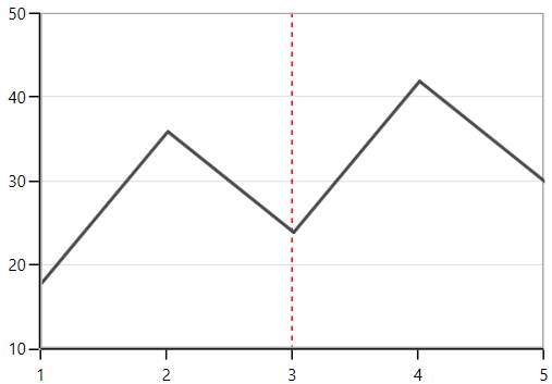
Types of Axis
ChartAxis supports the following types.
- NumericalAxis
- CategoryAxis
- DateTimeAxis
- DateTimeCategoryAxis
- TimeSpanAxis
- LogarithmicAxis
You can choose any type of ChartAxis, like DateTimeAxis, NumericalAxis, CategoryAxis, LogarithmicAxis or TimeSpanAxis depending on the value type. DateTimeCategoryAxis is a special type, used to plot date and time values for the given data points.
NumericalAxis
NumericalAxis is used to plot numerical values to the chart. NumericalAxis can be defined for both PrimaryAxis and SecondaryAxis. The following code snippet shows how to define the NumericalAxis.
<syncfusion:SfChart.PrimaryAxis>
    <syncfusion:NumericalAxis></syncfusion:NumericalAxis>
</syncfusion:SfChart.PrimaryAxis>

<syncfusion:SfChart.SecondaryAxis>
    <syncfusion:NumericalAxis></syncfusion:NumericalAxis>
</syncfusion:SfChart.SecondaryAxis>chart.PrimaryAxis = new NumericalAxis();
chart.SecondaryAxis = new NumericalAxis();
Customizing the NumericalAxis Range
Maximum property used for setting the maximum value for the axis range and Minimum property is used for setting the minimum value for the axis range.
<syncfusion:SfChart.SecondaryAxis>
    <syncfusion:NumericalAxis Maximum="2750" Minimum="250" Interval="250"/>
</syncfusion:SfChart.SecondaryAxis>chart.SecondaryAxis = new NumericalAxis()
{
Maximum = 2750,
Minimum = 250,
Interval = 250
};
NOTE
If minimum or maximum value is set, the other value is calculated by default internally.
StartRangeFromZero
NumericalAxis will calculate the range based on the data points binded to the axis. To start the range from zero have to define the StartRangeFromZero property to True. The following code example demonstrates the NumericalAxis range starting from zero.
<syncfusion:SfChart.SecondaryAxis>
    <syncfusion:NumericalAxis StartRangeFromZero="True"/>
</syncfusion:SfChart.SecondaryAxis>chart.SecondaryAxis = new NumericalAxis()
{
StartRangeFromZero = true
};
NOTE
By default, Range is calculated between the minimum and maximum value of the data points.
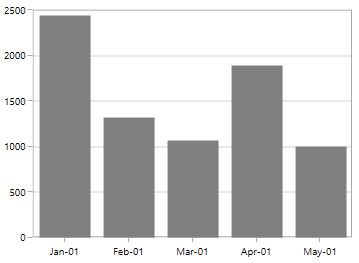
CategoryAxis
CategoryAxis is an indexed based axis that plots values based on the index of the data point collection. The points are equally spaced here. The following code example initializes the CategoryAxis.
<syncfusion:SfChart.PrimaryAxis>
    <syncfusion:CategoryAxis></syncfusion:CategoryAxis>
</syncfusion:SfChart.PrimaryAxis>chart.PrimaryAxis = new CategoryAxis();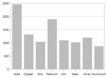
LabelPlacement
In CategoryAxis, labels is placed based on tick lines using LabelPlacement property. By default the labels is placed OnTicks. The following code example demonstrates placing the label between ticks in CategoryAxis.
<syncfusion:SfChart.PrimaryAxis>
    <syncfusion:CategoryAxis LabelPlacement="BetweenTicks"/>
</syncfusion:SfChart.PrimaryAxis>chart.PrimaryAxis = new CategoryAxis()
{
LabelPlacement = LabelPlacement.BetweenTicks
};
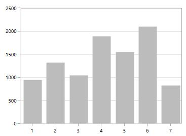
IsIndexed
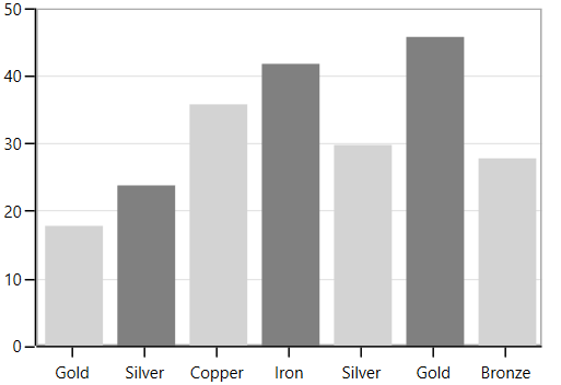
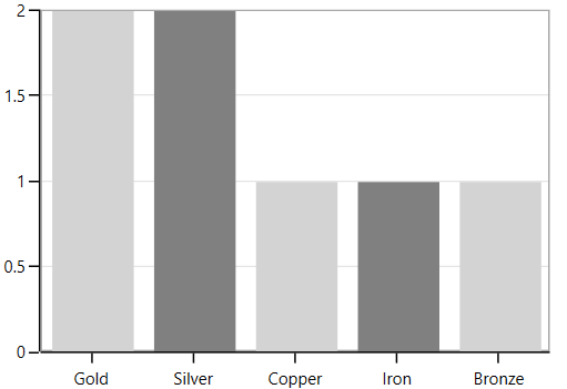
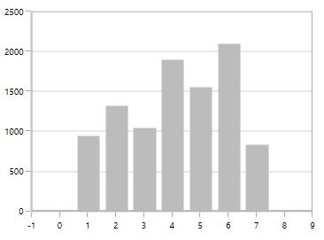
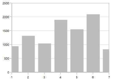
By default, CategoryAxis plots the values based on the index of the data points. However, the CategoryAxis can be made to plot the data points based on its data, instead of index value by disabling the IsIndexed property of CategoryAxis, and it is shown in the following code example.
<syncfusion:SfChart.PrimaryAxis>
    <syncfusion:CategoryAxis IsIndexed="False"/>
</syncfusion:SfChart.PrimaryAxis>chart.PrimaryAxis = new CategoryAxis()
{
IsIndexed = false,
};The following screenshot illustrates the series with IsIndexed value as False.
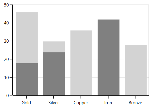
By default, the IsIndexed property value is true, and it is shown in following screenshot.
NOTE
This feature is not applicable for Accumulation series, ErrorBarSeries, RadarSeries, and PolarSeries.
AggregateFunctions
When the IsIndexed property of the CategoryAxis is disabled, the same index values(XValue) are grouped by AggregateFunctions property of the axis. The following are the types of AggregateFunctions,
The default value of AggregateFunctions is None, and it is shown in the following code example.
<syncfusion:SfChart.PrimaryAxis>
    <syncfusion:CategoryAxis IsIndexed="False"/>
</syncfusion:SfChart.PrimaryAxis>chart.PrimaryAxis = new CategoryAxis()
{
IsIndexed = false,
};
Average
The following code example illustrates the axis with AggregateFunctions is Average.
<syncfusion:SfChart.PrimaryAxis>
    <syncfusion:CategoryAxis IsIndexed="False" AggregateFunctions="Average"/>
</syncfusion:SfChart.PrimaryAxis>chart.PrimaryAxis = new CategoryAxis()
{
IsIndexed = false,
AggregateFunctions = AggregateFunctions.Average
};
Count
The following code example illustrates the axis with AggregateFunctions is Count.
<syncfusion:SfChart.PrimaryAxis>
    <syncfusion:CategoryAxis IsIndexed="False" AggregateFunctions="Count"/>
</syncfusion:SfChart.PrimaryAxis>chart.PrimaryAxis = new CategoryAxis()
{
IsIndexed = false,
AggregateFunctions = AggregateFunctions.Count
};
Max
The following code example illustrates the axis with AggregateFunctions is Max.
<syncfusion:SfChart.PrimaryAxis>
    <syncfusion:CategoryAxis IsIndexed="False" AggregateFunctions="Max"/>
</syncfusion:SfChart.PrimaryAxis>chart.PrimaryAxis = new CategoryAxis()
{
IsIndexed = false,
AggregateFunctions = AggregateFunctions.Max
};
Min
The following code example illustrates the axis with AggregateFunctions is Min.
<syncfusion:SfChart.PrimaryAxis>
    <syncfusion:CategoryAxis IsIndexed="False" AggregateFunctions="Min"/>
</syncfusion:SfChart.PrimaryAxis>chart.PrimaryAxis = new CategoryAxis()
{
IsIndexed = false,
AggregateFunctions = AggregateFunctions.Min
};
Sum
The following code example illustrates the axis with AggregateFunctions is Sum.
<syncfusion:SfChart.PrimaryAxis>
    <syncfusion:CategoryAxis IsIndexed="False" AggregateFunctions="Sum"/>
</syncfusion:SfChart.PrimaryAxis>chart.PrimaryAxis = new CategoryAxis()
{
IsIndexed = false,
AggregateFunctions = AggregateFunctions.Sum
};
DateTimeAxis
DateTimeAxis is used to plot DateTime values. The DateTimeAxis is widely used to make financial charts in places like the Stock Market, where index plotting is done every day.
<syncfusion:SfChart.PrimaryAxis>
    <syncfusion:DateTimeAxis LabelFormat="MMM-dd"></syncfusion:DateTimeAxis>
</syncfusion:SfChart.PrimaryAxis>chart.PrimaryAxis = new DateTimeAxis()
{
LabelFormat = "MMM-dd"
};
Customizing the Range
Minimum and Maximum properties behavior is same as in NumericalAxis instead of setting numerical value, you have to set date time values.
<syncfusion:SfChart.PrimaryAxis>
    <syncfusion:DateTimeAxis
        Minimum="2015/01/10"
        Maximum="2015/07/01"
        LabelFormat="MMM-dd"
        IntervalType="Months"
        Interval="1">
    </syncfusion:DateTimeAxis>
</syncfusion:SfChart.PrimaryAxis>chart.PrimaryAxis = new DateTimeAxis()
{
Minimum = new DateTime(2015, 01, 10),
Maximum = new DateTime(2015, 07, 01),
LabelFormat = "MMM-dd",
IntervalType = DateTimeIntervalType.Months,
Interval = 1
};
Business Hours Range Calculation
SfChart provides support to plot only the business hours in DateTimeAxis.This support is enabled by setting EnableBusinessHours property to true.
The following properties are used for business hour range calculation
-
OpenTime- Represents the open working time of a day. -
CloseTime- Represents the close working time of a day. -
WorkingDays- Represents the workingdaysof a week.
The following code snippet demonstrates the business hours support in DateTimeAxis.
<syncfusion:SfChart.PrimaryAxis>
    <syncfusion:DateTimeAxis
        EnableBusinessHours="True"
        OpenTime="9"
        CloseTime="24"
        WorkingDays="Friday,Saturday,Sunday,Monday,Tuesday,Wednesday,Sunday">
    </syncfusion:DateTimeAxis>
</syncfusion:SfChart.PrimaryAxis>chart.PrimaryAxis = new DateTimeAxis()
{
EnableBusinessHours = true,
OpenTime = 9,
CloseTime = 24,
WorkingDays = Day.Friday | Day.Saturday | Day.Sunday |
Day.Monday | Day.Tuesday | Day.Wednesday | Day.Sunday
};
DateTimeCategoryAxis
DateTimeCategoryAxis is a special type of axis used mainly with financial series. All the data points are plotted with equal spaces, similar to CategoryAxis, thereby removing space for missing dates. Interval and range for the axis are calculated similar to DateTimeAxis. There are no visual gaps between points, even when the difference between two points is more than a year.
<syncfusion:SfChart.PrimaryAxis>
    <syncfusion:DateTimeCategoryAxis LabelFormat="MMM-dd"/>
</syncfusion:SfChart.PrimaryAxis>chart.PrimaryAxis = new DateTimeCategoryAxis()
{
LabelFormat = "MMM-dd"
};
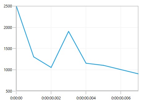
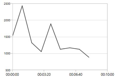
TimeSpan Axis
TimeSpanAxis is used to plot the time span values in the PrimaryAxis. TimeSpanAxis has the advantage of plotting data with milliseconds difference. The limitation of TimeSpanAxis is that it can only accept timespan values (hh:mm:ss) and date time values are not accepted.
<syncfusion:SfChart.PrimaryAxis>
    <syncfusion:TimeSpanAxis></syncfusion:TimeSpanAxis>
</syncfusion:SfChart.PrimaryAxis>chart.PrimaryAxis = new TimeSpanAxis();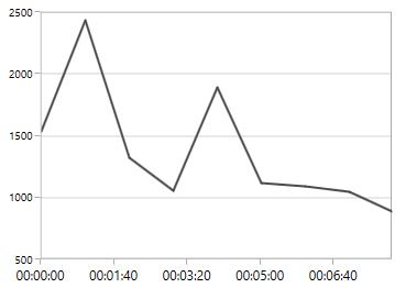
Customizing the Range
The following code snippet demonstrates the Minimum and Maximum properties for TimeSpanAxis.
<syncfusion:SfChart.PrimaryAxis>
    <syncfusion:TimeSpanAxis Minimum="00:00:00" Maximum="00:10:00"/>
</syncfusion:SfChart.PrimaryAxis>chart.PrimaryAxis = new TimeSpanAxis()
{
Minimum = new TimeSpan(00, 00, 00),
Maximum = new TimeSpan(00, 10, 00)
};
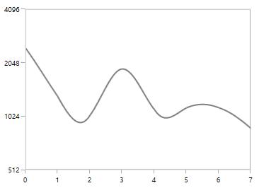
LogarithmicAxis
LogarithmicAxis is used to plot the logarithmic scale for the chart. The Logarithmic values will be plotted based on the logarithmic base value as 10.
<syncfusion:SfChart.SecondaryAxis>
    <syncfusion:LogarithmicAxis/>
</syncfusion:SfChart.SecondaryAxis>chart.SecondaryAxis = new LogarithmicAxis();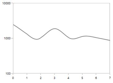
Logarithmic Base
You can also change the base for logarithmic values. By default the logarithmic values is calculated the base from 10.The following code example demonstrates the logarithmic values in y axis calculated from base 2.
<syncfusion:SfChart.SecondaryAxis>
    <syncfusion:LogarithmicAxis LogarithmicBase="2"/>
</syncfusion:SfChart.SecondaryAxis>chart.SecondaryAxis = new LogarithmicAxis()
{
LogarithmicBase = 2
};
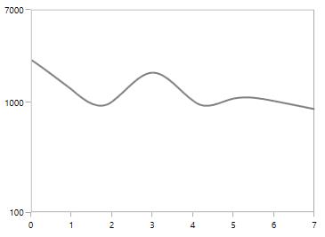
Customizing the Range
The following code snippet demonstrates the range customization of LogarithmicAxis based on Minimum and Maximum properties.
<syncfusion:SfChart.SecondaryAxis>
    <syncfusion:LogarithmicAxis Minimum="100" Maximum="7000"/>
</syncfusion:SfChart.SecondaryAxis>chart.SecondaryAxis = new LogarithmicAxis()
{
Minimum = 100,
Maximum = 7000
};
The following property is common for all types of axes,
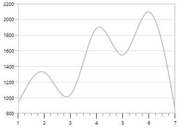
IncludeStripLineRange
IncludeStripLineRange
By default, striplines are drawn up to the chart axis range, if the provided values (Start and Width) exceed the actual range of chart axis. It can be avoided by using IncludeStripLineRange property. While enabling IncludeStripLineRange property, the axis range will be extended up to the provided stripline range. The property can be set as shown in the following code example.
<Chart:SfChart.SecondaryAxis>
    <Chart:NumericalAxis IncludeStripLineRange="True">
        <Chart:NumericalAxis.StripLines>
            <Chart:ChartStripLine
                Start="1000"
                Width="1500"
                Background="LightGray"
                Opacity="0.6">
            </Chart:ChartStripLine>
        </Chart:NumericalAxis.StripLines>
    </Chart:NumericalAxis>
</Chart:SfChart.SecondaryAxis>
NumericalAxis axis = new NumericalAxis();
axis.IncludeStripLineRange = true;
ChartStripLine stripline = new ChartStripLine()
{
Start = 1000,
Width = 1500,
Background = new SolidColorBrush(Colors.LightGray),
Opacity = 0.6
};
axis.StripLines.Add(stripline);
IncludeAnnotationRange
By default, annotations are drawn up to the chart axis range, if the provided values (X1, X2, Y1, and Y2) exceed the actual range of chart axis. It can be avoided by using IncludeAnnotationRange property. While enabling IncludeAnnotationRange property, the axis range will be extended up to the provided annotation range.
The property is applicable only for linear axes, and it can be set as shown in the following code example.
<Chart:SfChart.SecondaryAxis>
    <Chart:NumericalAxis IncludeAnnotationRange="True"/>
</Chart:SfChart.SecondaryAxis>

<Chart:SfChart.Annotations>
    <Chart:LineAnnotation X1="0" X2="4" Y1="0" Y2="3000"/>
</Chart:SfChart.Annotations>chart.SecondaryAxis = new NumericalAxis()
{
IncludeAnnotationRange = true
};
LineAnnotation annotation = new LineAnnotation();
annotation.X1 = 0;
annotation.X2 = 4;
annotation.Y1 = 0;
annotation.Y2 = 3000;
chart.Annotations.Add(annotation);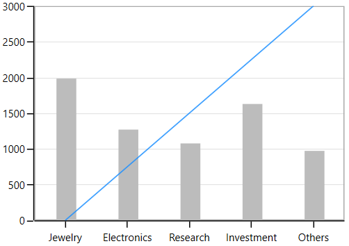
Inverting axis
Axis can be inverted using the IsInversed property. The default value of this property is [False].
<chart:SfChart.SecondaryAxis>
    <chart:NumericalAxis IsInversed="True"/>
</chart:SfChart.SecondaryAxis>this.Chart.SecondaryAxis.IsInversed = true;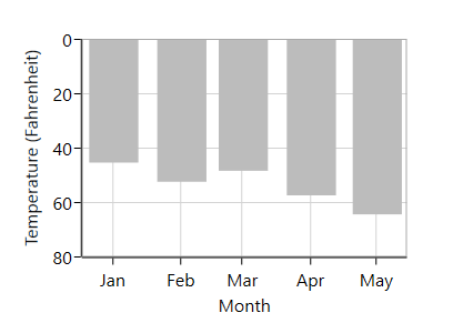
Customizing the Intervals
ChartAxis calculates the range and intervals automatically based on the data points. The axis range and interval can be defined using the Minimum, Maximum and Interval properties.
NumericalAxis
The following code snippet demonstrates the Interval customization in NumericalAxis.
<syncfusion:SfChart.SecondaryAxis>
    <syncfusion:NumericalAxis Interval="250"/>
</syncfusion:SfChart.SecondaryAxis>chart.SecondaryAxis = new NumericalAxis()
{
Interval = 250
};
CategoryAxis
The following code snippet demonstrates the Interval customization in CategoryAxis.
<syncfusion:SfChart.PrimaryAxis>
    <syncfusion:CategoryAxis Interval="2"/>
</syncfusion:SfChart.PrimaryAxis>chart.PrimaryAxis = new CategoryAxis()
{
Interval = 2
};
DateTimeAxis
The DateTimeAxis Interval value corresponds to the type specified in the IntervalType property.
For instance, if the Interval is set as 2 and IntervalType is set as Days, the labels are plotted for every two days. The following are the options for IntervalType property.
- Auto
- Days
- Hours
- Milliseconds
- Minutes
- Months
- Seconds
- Years
The default IntervalType of a DateTimeAxis is Auto. It calculates the type automatically and the interval, accordingly.
The following code snippet demonstrates the DateTimeAxis having one month interval.
<syncfusion:SfChart.PrimaryAxis>
    <syncfusion:DateTimeAxis Interval="1" IntervalType="Months" LabelFormat="MMM-dd"></syncfusion:DateTimeAxis>
</syncfusion:SfChart.PrimaryAxis>chart.PrimaryAxis = new DateTimeAxis()
{
Interval = 1,
IntervalType = DateTimeIntervalType.Months,
LabelFormat = "MMM-dd"
};
DesiredIntervalsCount
DesiredIntervalsCount property is used to specify the count of the axis labels between the first and last label. The following sample code defines the DesiredIntervalsCount property.
<syncfusion:SfChart.SecondaryAxis>
    <syncfusion:NumericalAxis DesiredIntervalsCount="7"/>
</syncfusion:SfChart.SecondaryAxis>chart.SecondaryAxis = new NumericalAxis()
{
DesiredIntervalsCount = 7
};
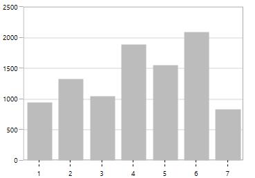
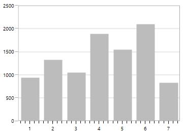
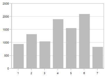
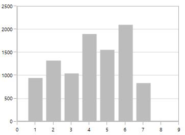
Maximum Labels
MaximumLabels property defines the count of the axis labels in the 100 pixels.
<syncfusion:SfChart.SecondaryAxis>
    <syncfusion:NumericalAxis  MaximumLabels="2"/>
</syncfusion:SfChart.SecondaryAxis>

<syncfusion:ColumnSeries
    ItemsSource="{Binding Demands}"
    XBindingPath="Demand"
    YBindingPath="Year2010">
    <syncfusion:ColumnSeries.YAxis>
        <syncfusion:NumericalAxis MaximumLabels="2"/>
    </syncfusion:ColumnSeries.YAxis>
</syncfusion:ColumnSeries>chart.SecondaryAxis = new NumericalAxis()
{
MaximumLabels = 2
};
NumericalAxis axis = new NumericalAxis() { MaximumLabels = 2 };
ColumnSeries series = new ColumnSeries()
{
ItemsSource = new ViewModel().Demands,
XBindingPath = "Demand",
YBindingPath = "Year2010",
YAxis = axis
};
chart.Series.Add(series);
Apply Padding to the Range
The NumericalAxis and DateTimeAxis have a RangePadding property that can be used to add padding to the range of a chart’s axes.
DateTimeRangePadding
The RangePadding types available in the DateTimeAxis are:
- Auto
- Additional
- None
- Round
- RoundStart
- RoundEnd
- PrependInterval
- AppendInterval
Auto
By default the date time range padding is Auto.
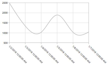
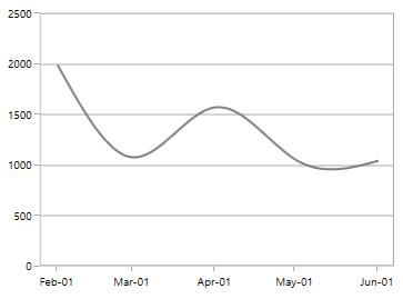
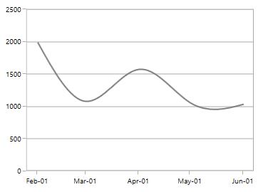
Additional
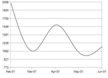
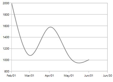
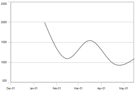
When RangePadding for DateTimeAxis, the DateTime interval of the axis is added as padding, as shown in the following screenshot.
<syncfusion:SfChart.PrimaryAxis>
    <syncfusion:DateTimeAxis RangePadding="Additional"/>
</syncfusion:SfChart.PrimaryAxis>chart.PrimaryAxis = new DateTimeAxis()
{
RangePadding = DateTimeRangePadding.Additional
};
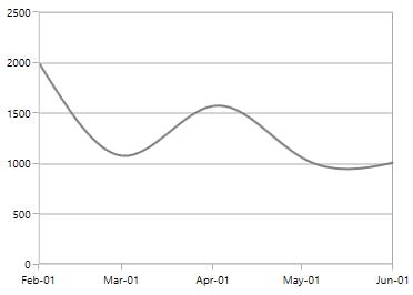
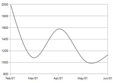
Round
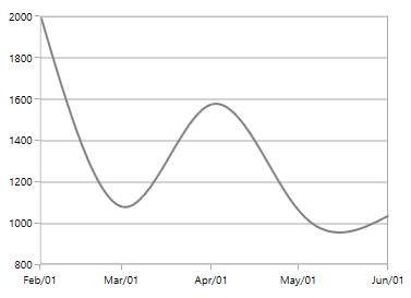
When RangePadding for DateTimeAxis is set to Round, the range of the chart axis is rounded off to the nearest possible DateTime value, as shown in the following screenshot.
<syncfusion:SfChart.PrimaryAxis>
    <syncfusion:DateTimeAxis RangePadding="Round"/>
</syncfusion:SfChart.PrimaryAxis>chart.PrimaryAxis = new DateTimeAxis()
{
RangePadding = DateTimeRangePadding.Round
};
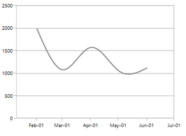
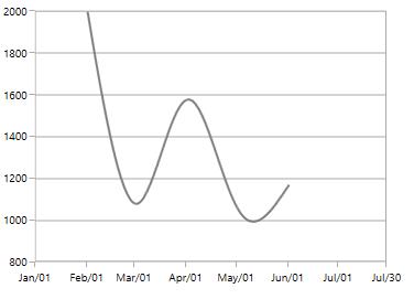
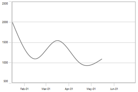
None
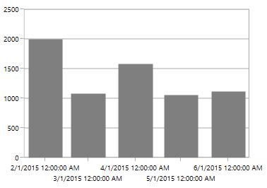
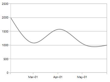
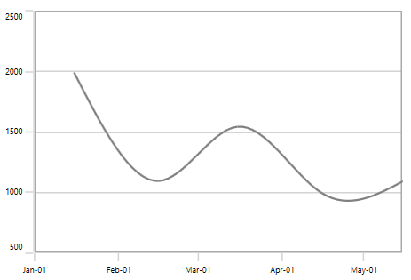
When the RangePadding for a DateTimeAxis is None.
The following screenshot demonstrates a chart’s x-axis with RangePadding set to None.
<syncfusion:SfChart.PrimaryAxis>
    <syncfusion:DateTimeAxis RangePadding="None"/>
</syncfusion:SfChart.PrimaryAxis>chart.PrimaryAxis = new DateTimeAxis()
{
RangePadding = DateTimeRangePadding.None
};
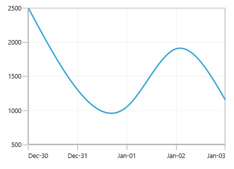
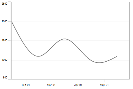
RoundStart
When RangePadding for DateTimeAxis is set to RoundStart, the range of the chart axis is rounded in the start off to the nearest possible DateTime value, as shown in the following screenshot.
<syncfusion:SfChart.PrimaryAxis>
    <syncfusion:DateTimeAxis  RangePadding="RoundStart"/>
</syncfusion:SfChart.PrimaryAxis>chart.PrimaryAxis = new DateTimeAxis()
{
RangePadding = DateTimeRangePadding.RoundStart
};
RoundEnd
When RangePadding for DateTimeAxis is set to RoundEnd, the range of the chart axis is rounded in the end off to the nearest possible DateTime value, as shown in the following screenshot.
<syncfusion:SfChart.PrimaryAxis>
    <syncfusion:DateTimeAxis RangePadding="RoundEnd"/>
</syncfusion:SfChart.PrimaryAxis>chart.PrimaryAxis = new DateTimeAxis()
{
RangePadding = DateTimeRangePadding.RoundEnd
};
PrependInterval
When RangePadding for DateTimeAxis is set to PrependInterval, the DateTime interval of the axis is added in the start as padding, as shown in the following screenshot.
<syncfusion:SfChart.PrimaryAxis>
    <syncfusion:DateTimeAxis  RangePadding="PrependInterval"/>
</syncfusion:SfChart.PrimaryAxis>chart.PrimaryAxis = new DateTimeAxis()
{
RangePadding = DateTimeRangePadding.PrependInterval
};
AppendInterval
When RangePadding for DateTimeAxis is set to AppendInterval, the DateTime interval of the axis is added in the end as padding, as shown in the following screenshot.
<syncfusion:SfChart.PrimaryAxis>
    <syncfusion:DateTimeAxis  RangePadding="AppendInterval"/>
</syncfusion:SfChart.PrimaryAxis>chart.PrimaryAxis = new DateTimeAxis()
{
RangePadding = DateTimeRangePadding.AppendInterval
};
NumericalRangePadding
The following types are available for NumericalAxis:
- Additional
- None
- Normal
- Round
- Auto
- RoundStart
- RoundEnd
- PrependInterval
- AppendInterval
Round
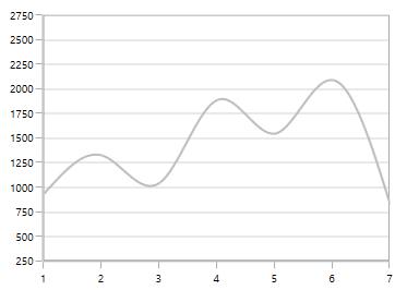
By default, the default RangePadding value for PrimaryAxis is Auto and for SecondaryAxis, the default value is Round.
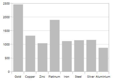
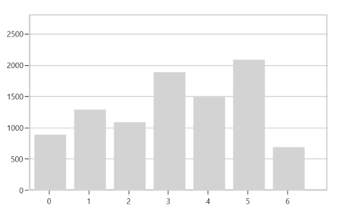
The following screenshot illustrates a chart’s y-axis with RangePadding set to Round.
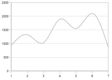
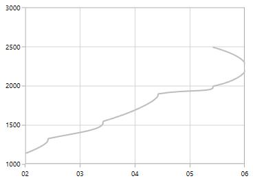
Normal
Normal RangePadding for a NumericalAxis is used mostly for the y-axis to have padding based on the Range calculation.
The following screenshot illustrates a chart’s y-axis with RangePadding set to Normal.
<syncfusion:SfChart.PrimaryAxis>
    <syncfusion:NumericalAxis RangePadding="Normal"/>
</syncfusion:SfChart.PrimaryAxis>chart.PrimaryAxis = new NumericalAxis()
{
RangePadding = NumericalPadding.Additional
};
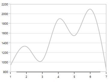
Additional
If RangePadding for NumericalAxis is set to Additional, the interval of the axis is added as padding.
The following screenshot demonstrates a chart’s x-axis with RangePadding set to Additional.
<syncfusion:SfChart.PrimaryAxis>
    <syncfusion:NumericalAxis RangePadding="Additional"/>
</syncfusion:SfChart.PrimaryAxis>chart.PrimaryAxis = new NumericalAxis()
{
RangePadding = NumericalPadding.Additional
};
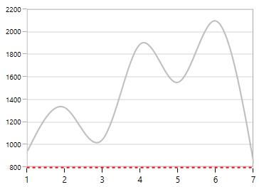
None
The following screenshot demonstrates RangePadding as None, where no padding is applied for the axis.
<syncfusion:SfChart.PrimaryAxis>
    <syncfusion:NumericalAxis  RangePadding="None"/>
</syncfusion:SfChart.PrimaryAxis>chart.PrimaryAxis = new NumericalAxis()
{
RangePadding = NumericalPadding.None
};
RoundStart
If RangePadding for NumericalAxis is set to RoundStart, rounds the range of the chart axis in the start to the nearest possible value.
The following screenshot demonstrates a chart’s x-axis with RangePadding set to RoundStart.
<syncfusion:SfChart.PrimaryAxis>
    <syncfusion:NumericalAxis RangePadding="RoundStart"/>
</syncfusion:SfChart.PrimaryAxis>chart.PrimaryAxis = new NumericalAxis()
{
RangePadding = NumericalPadding.RoundStart
};
RoundEnd
If RangePadding for NumericalAxis is set to RoundEnd, rounds the range of the chart axis in the end to the nearest possible value.
The following screenshot demonstrates a chart’s x-axis with RangePadding set to RoundEnd.
<syncfusion:SfChart.PrimaryAxis>
    <syncfusion:NumericalAxis RangePadding="RoundEnd"></syncfusion:NumericalAxis>
</syncfusion:SfChart.PrimaryAxis>chart.PrimaryAxis = new NumericalAxis()
{
RangePadding = NumericalPadding.RoundEnd
};
PrependInterval
If RangePadding for NumericalAxis is set to PrependInterval, the interval of the axis is added in the start as padding.
The following screenshot demonstrates a chart’s x-axis with RangePadding set to PrependInterval.
<syncfusion:SfChart.PrimaryAxis>
    <syncfusion:NumericalAxis  RangePadding="PrependInterval"/>
</syncfusion:SfChart.PrimaryAxis>chart.PrimaryAxis = new NumericalAxis()
{
RangePadding = NumericalPadding.PrependInterval
};
AppendInterval
If RangePadding for NumericalAxis is set to AppendInterval, the interval of the axis is added in the end as padding.
The following screenshot demonstrates a chart’s x-axis with RangePadding set to AppendInterval.
<syncfusion:SfChart.PrimaryAxis>
    <syncfusion:NumericalAxis  RangePadding="AppendInterval"/>
</syncfusion:SfChart.PrimaryAxis>chart.PrimaryAxis = new NumericalAxis()
{
RangePadding = NumericalPadding.AppendInterval
};
Applying Padding to the Axis
PlotOffset property is used to provide padding to the axis. The following code snippet demonstrates the padding applied to both x and y axes.
<syncfusion:SfChart.PrimaryAxis>
    <syncfusion:NumericalAxis  PlotOffset="30"/>
</syncfusion:SfChart.PrimaryAxis>

<syncfusion:SfChart.SecondaryAxis>
    <syncfusion:NumericalAxis PlotOffset="30"/>
</syncfusion:SfChart.SecondaryAxis>chart.PrimaryAxis = new NumericalAxis()
{
PlotOffset = 30
};
chart.SecondaryAxis = new NumericalAxis()
{
PlotOffset = 30
};
PlotOffsetStart
PlotOffsetStart property is used to provide padding to the axis at start position. The following code snippet demonstrates the padding applied to start position for both x and y axes.
<syncfusion:SfChart.PrimaryAxis>
    <syncfusion:NumericalAxis  PlotOffsetStart="30"/>
</syncfusion:SfChart.PrimaryAxis>

<syncfusion:SfChart.SecondaryAxis>
    <syncfusion:NumericalAxis PlotOffsetStart="30"/>
</syncfusion:SfChart.SecondaryAxis>chart.PrimaryAxis = new NumericalAxis()
{
PlotOffsetStart = 30
};
chart.SecondaryAxis = new NumericalAxis()
{
PlotOffsetStart = 30
};
PlotOffsetEnd
PlotOffsetEnd property is used to provide padding to the axis at end position. The following code snippet demonstrates the padding applied to end position for both x and y axes.
<syncfusion:SfChart.PrimaryAxis>
    <syncfusion:NumericalAxis PlotOffsetEnd="30"/>
</syncfusion:SfChart.PrimaryAxis>

<syncfusion:SfChart.SecondaryAxis>
    <syncfusion:NumericalAxis PlotOffsetEnd="30"/>
</syncfusion:SfChart.SecondaryAxis>chart.PrimaryAxis = new NumericalAxis()
{
PlotOffsetEnd = 30
};
chart.SecondaryAxis = new NumericalAxis()
{
PlotOffsetEnd = 30
};
AutoScrollingDelta
AutoScrollingDelta is used to ensure whether the specified range of data is always visible in the chart. It always shows the recently added data points at the end, and the scrolling will be reset to the end of the range whenever a new point is added.
By activating the EnableScrollBar property of the axis or by adding ChartZoomPanBehavior to the chart, you can scroll to the previous data points.
AutoScrollingDeltaType
In DateTimeAxis, you can apply auto scrolling delta value in Years, Months, Days, Hours, Minutes, Seconds and Milliseconds by setting the AutoScrollingDeltaType property. The default value of this property is Auto, and the delta will be calculated automatically based on range.
<chart:SfChart.PrimaryAxis>
    <chart:DateTimeAxis AutoScrollingDelta = "3" AutoScrollingDeltaType = "Days"/>
</chart:SfChart.PrimaryAxis>chart.PrimaryAxis = new DateTimeAxis()
{
AutoScrollingDelta = 3,
AutoScrollingDeltaType = DateTimeIntervalType.Days
};AutoScrollingMode
The AutoScrollingMode property is used to determine whether the axis should be scrolled from the start position or end position. The default value of this property is End.
<chart:SfChart.PrimaryAxis>
    <chart:DateTimeAxis AutoScrollingDelta = "3" AutoScrollingMode = "Start"/>
</chart:SfChart.PrimaryAxis>chart.PrimaryAxis = new DateTimeAxis()
{
AutoScrollingDelta = 3,
AutoScrollingMode = ChartAutoScrollingMode.Start
};Auto Interval Calculation on Zooming
EnableAutoIntervalOnZooming property is used to maintain the interval even it is in zooming state only if we set the interval to the axis. Default value of this property is true. While zooming based on the auto range padding the interval will be calculated.
If you set EnableAutoIntervalOnZooming as False, the intervals will be calculated on the interval based on the axis while zooming.
<syncfusion:SfChart.PrimaryAxis>
    <syncfusion:NumericalAxis EnableScrollBar="True" Interval="1" EnableAutoIntervalOnZooming="False"/>
</syncfusion:SfChart.PrimaryAxis>chart.PrimaryAxis = new NumericalAxis()
{
EnableScrollBar = true,
EnableAutoIntervalOnZooming = false,
Interval = 1
};
Multiple Axes
SfChart provides a way to arrange multiple series inside the same chart area, giving the chart more space than x-axis and y-axis. These axes can be arranged in a stacking order or in a side by side pattern.
By default, all the series are plotted based on primary and secondary axis. You can add more axes by adding additional axis to the series. There are two properties XAxis and YAxis in all the series type which is used to provide Multiple axes support, except AccumulationSeries.
<syncfusion:ColumnSeries
    ItemsSource="{Binding Demands}"
    XBindingPath="Demand"
    YBindingPath="Year2011">
</syncfusion:ColumnSeries>

<syncfusion:LineSeries
    ItemsSource="{Binding Demands}"
    XBindingPath="Date"
    YBindingPath="Year2011">
    <syncfusion:LineSeries.XAxis>
        <syncfusion:DateTimeAxis/>
    </syncfusion:LineSeries.XAxis>

    <syncfusion:LineSeries.YAxis>
        <syncfusion:NumericalAxis/>
    </syncfusion:LineSeries.YAxis>
</syncfusion:LineSeries>
ColumnSeries series1 = new ColumnSeries()
{
ItemsSource = new ViewModel().Demands,
XBindingPath = "Demand",
YBindingPath = "Year2011"
};
LineSeries series2 = new LineSeries()
{
ItemsSource = new ViewModel().Demands,
XBindingPath = "Date",
YBindingPath = "Year2011",
};
series2.XAxis = new DateTimeAxis()
{
Header = "Additional X Axis"
};
series2.YAxis = new NumericalAxis()
{
Header = "Additional Y Axis"
};
chart.Series.Add(series1);
chart.Series.Add(series2);
In the above screenshot, the LineSeries is plotted based on additional X & Y axes, and ColumnSeries (or remaining series) is plotted based on the primary and secondary axes.
Multi-level Labels
Axis can be customized with multiple levels of label by using its MultiLevelLabels property. These labels are placed based on the provided Start and End range values. You can add any number of labels to an axis. The following code example illustrates how to set a multilevel label.
<chart:SfChart.PrimaryAxis>
    <chart:CategoryAxis ShowLabelBorder="True">
        <chart:CategoryAxis.MultiLevelLabels>
            <chart:ChartMultiLevelLabel Start="-0.5" End="2.5" Text="Quarter 1"/>
        </chart:CategoryAxis.MultiLevelLabels>
    </chart:CategoryAxis>
</chart:SfChart.PrimaryAxis>chart.PrimaryAxis = new CategoryAxis()
{
ShowLabelBorder = true,
};
ChartMultiLevelLabel label = new ChartMultiLevelLabel()
{
Start = -0.5,
End = 2.5,
Text = "Quarter 1"
};
chart.PrimaryAxis.MultiLevelLabels.Add(label);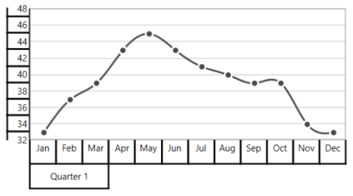
Regarding Start and End Properties
Start and End properties of ChartMultiLevelLabel are type of objects. You can provide the start and end values for a multi-level label based on its Axis type. It is described in the following table.
| S.No | Axis Type | Start/End value | Example |
|---|---|---|---|
| 1 | CategoryAxis | Index-Based | Start=0(zeroth index position) End = 1(first index position) |
| 2 | DateTimeCategoryAxis | Index-Based | Start = 0(zeroth index position) End = 1(first index position) |
| 3 | NumericalAxis | Value-Based | Start= 5( Value) End= 10( Value) |
| 4 | LogarithmicAxis | Value-Based | Start= 10(Value) End= 1000(Value) |
| 5 | DateTimeAxis | Value-Based | Start = "2017/01/01" End="2017/01/02" |
| 6 | TimeSpanAxis | Value-Based | Start = "00:00:01" End="00:00:05" |
Customizing multi-level labels
Border Customization
ChartMultiLevelLabel border width and color can be customized with LabelBorderWidth and LabelBorderBrush properties of chart axis. It can be set as shown in the following code example.
<chart:SfChart.PrimaryAxis>
    <chart:CategoryAxis LabelBorderBrush="Red" LabelBorderWidth="3"  ShowLabelBorder="True">
        <chart:CategoryAxis.MultiLevelLabels>
            <chart:ChartMultiLevelLabel Start="-0.5" End="2.5" Text="Quarter 1"/>
        </chart:CategoryAxis.MultiLevelLabels>
    </chart:CategoryAxis>
</chart:SfChart.PrimaryAxis>chart.PrimaryAxis = new CategoryAxis()
{
LabelBorderWidth = 3,
ShowLabelBorder = true,
LabelBorderBrush = new SolidColorBrush(Colors.Red),
};
ChartMultiLevelLabel label = new ChartMultiLevelLabel()
{
Start = -0.5,
End = 2.5,
Text = "Quarter 1",
BorderWidth = 4
};
chart.PrimaryAxis.MultiLevelLabels.Add(label);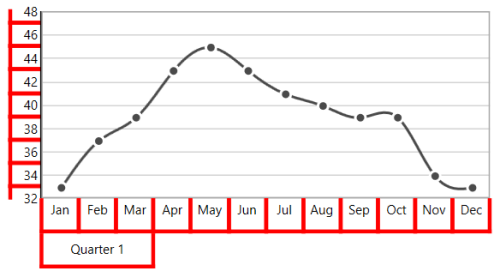
Border Type
Chart Axis provides support to various types of border for ChartMultiLevelLabels. It can be applied by using its MultiLevelLabelsBorderType property. The default MultiLevelLabelsBorderType is Rectangle. The another supported border types are Brace ,None and WithoutTopAndBottomBorder.
Rectangle
<chart:SfChart.PrimaryAxis>
    <chart:CategoryAxis ShowLabelBorder="True">
        <chart:CategoryAxis.MultiLevelLabels>
            <chart:ChartMultiLevelLabel Start="-0.5" End="2.5" Text="Quarter 1"/>
            <chart:ChartMultiLevelLabel Start="2.5" End="5.5" Text="Quarter 2"/>
            <chart:ChartMultiLevelLabel Start="5.5" End="8.5" Text="Quarter 3"/>
            <chart:ChartMultiLevelLabel Start="8.5" End="11.5" Text="Quarter 4"/>
        </chart:CategoryAxis.MultiLevelLabels>
    </chart:CategoryAxis>
</chart:SfChart.PrimaryAxis>

<chart:SfChart.SecondaryAxis>
    <chart:NumericalAxis  ShowLabelBorder="True">
        <chart:NumericalAxis.MultiLevelLabels>
            <chart:ChartMultiLevelLabel Start="32" End="36" Text="Low"/>
            <chart:ChartMultiLevelLabel Start="36" End="42" Text="Medium"/>
            <chart:ChartMultiLevelLabel Start="42" End="48" Text="High"/>
        </chart:NumericalAxis.MultiLevelLabels>
    </chart:NumericalAxis>
</chart:SfChart.SecondaryAxis>chart.PrimaryAxis = new CategoryAxis()
{
ShowLabelBorder = true,
};
ChartMultiLevelLabel label1 = new ChartMultiLevelLabel()
{
Start = -0.5,
End = 2.5,
Text = "Quarter 1",
};
chart.PrimaryAxis.MultiLevelLabels.Add(label1);
ChartMultiLevelLabel label2 = new ChartMultiLevelLabel()
{
Start = 2.5,
End = 5.5,
Text = "Quarter 2"
};
chart.PrimaryAxis.MultiLevelLabels.Add(label2);
ChartMultiLevelLabel label3 = new ChartMultiLevelLabel()
{
Start = 5.5,
End = 8.5,
Text = "Quarter 3"
};
chart.PrimaryAxis.MultiLevelLabels.Add(label3);
ChartMultiLevelLabel label4 = new ChartMultiLevelLabel()
{
Start = 8.5,
End = 11.5,
Text = "Quarter 4"
};
chart.PrimaryAxis.MultiLevelLabels.Add(label4);
chart.SecondaryAxis = new NumericalAxis()
{
ShowLabelBorder = true,
};
ChartMultiLevelLabel label5 = new ChartMultiLevelLabel()
{
Start = 32,
End = 36,
Text = "Low"
};
chart.SecondaryAxis.MultiLevelLabels.Add(label5);
ChartMultiLevelLabel label6 = new ChartMultiLevelLabel()
{
Start = 36,
End = 42,
Text = "Medium"
};
chart.SecondaryAxis.MultiLevelLabels.Add(label6);
ChartMultiLevelLabel label7 = new ChartMultiLevelLabel()
{
Start = 42,
End = 48,
Text = "High"
};
chart.SecondaryAxis.MultiLevelLabels.Add(label7);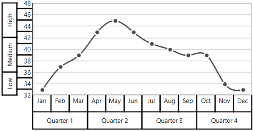
Brace
<chart:SfChart.PrimaryAxis>
    <chart:CategoryAxis MultiLevelLabelsBorderType="Brace" ShowLabelBorder="True">
        <chart:CategoryAxis.MultiLevelLabels>
            <chart:ChartMultiLevelLabel Start="-0.5" End="2.5" Text="Quarter 1"/>
            <chart:ChartMultiLevelLabel Start="2.5" End="5.5" Text="Quarter 2"/>
            <chart:ChartMultiLevelLabel Start="5.5" End="8.5" Text="Quarter 3"/>
            <chart:ChartMultiLevelLabel Start="8.5" End="11.5" Text="Quarter 4"/>
        </chart:CategoryAxis.MultiLevelLabels>
    </chart:CategoryAxis>
</chart:SfChart.PrimaryAxis>

<chart:SfChart.SecondaryAxis>
    <chart:NumericalAxis MultiLevelLabelsBorderType="Brace" ShowLabelBorder="True">
        <chart:NumericalAxis.MultiLevelLabels>
            <chart:ChartMultiLevelLabel Start="32" End="36" Text="Low"/>
            <chart:ChartMultiLevelLabel Start="36" End="42" Text="Medium"/>
            <chart:ChartMultiLevelLabel Start="42" End="48" Text="High"/>
        </chart:NumericalAxis.MultiLevelLabels>
    </chart:NumericalAxis>
</chart:SfChart.SecondaryAxis>chart.PrimaryAxis = new CategoryAxis()
{
ShowLabelBorder = true,
MultiLevelLabelsBorderType = BorderType.Brace
};
ChartMultiLevelLabel label1 = new ChartMultiLevelLabel()
{
Start = -0.5,
End = 2.5,
Text = "Quarter 1",
};
chart.PrimaryAxis.MultiLevelLabels.Add(label1);
ChartMultiLevelLabel label2 = new ChartMultiLevelLabel()
{
Start = 2.5,
End = 5.5,
Text = "Quarter 2",
};
chart.PrimaryAxis.MultiLevelLabels.Add(label2);
ChartMultiLevelLabel label3 = new ChartMultiLevelLabel()
{
Start = 5.5,
End = 8.5,
Text = "Quarter 3",
};
chart.PrimaryAxis.MultiLevelLabels.Add(label3);
ChartMultiLevelLabel label4 = new ChartMultiLevelLabel()
{
Start = 8.5,
End = 11.5,
Text = "Quarter 4",
};
chart.PrimaryAxis.MultiLevelLabels.Add(label4);
chart.SecondaryAxis = new NumericalAxis()
{
ShowLabelBorder = true,
MultiLevelLabelsBorderType = BorderType.Brace
};
ChartMultiLevelLabel label5 = new ChartMultiLevelLabel()
{
Start = 32,
End = 36,
Text = "Low",
};
chart.SecondaryAxis.MultiLevelLabels.Add(label5);
ChartMultiLevelLabel label6 = new ChartMultiLevelLabel()
{
Start = 36,
End = 42,
Text = "Medium",
};
chart.SecondaryAxis.MultiLevelLabels.Add(label6);
ChartMultiLevelLabel label7 = new ChartMultiLevelLabel()
{
Start = 42,
End = 48,
Text = "High",
};
chart.SecondaryAxis.MultiLevelLabels.Add(label7);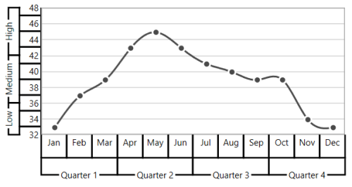
None
<chart:SfChart.PrimaryAxis MultiLevelLabelsBorderType="None" ShowLabelBorder="True">
    <chart:CategoryAxis>
        <chart:CategoryAxis.MultiLevelLabels>
            <chart:ChartMultiLevelLabel Start="-0.5" End="2.5" Text="Quarter 1"/>
            <chart:ChartMultiLevelLabel Start="2.5" End="5.5" Text="Quarter 2"/>
            <chart:ChartMultiLevelLabel Start="5.5" End="8.5" Text="Quarter 3"/>
            <chart:ChartMultiLevelLabel Start="8.5" End="11.5" Text="Quarter 4"/>
        </chart:CategoryAxis.MultiLevelLabels>
    </chart:CategoryAxis>
</chart:SfChart.PrimaryAxis>

<chart:SfChart.SecondaryAxis>
    <chart:NumericalAxis MultiLevelLabelsBorderType="None" ShowLabelBorder="True">
        <chart:NumericalAxis.MultiLevelLabels>
            <chart:ChartMultiLevelLabel Start="32" End="36" Text="Low"/>
            <chart:ChartMultiLevelLabel Start="36" End="42" Text="Medium"/>
            <chart:ChartMultiLevelLabel Start="42" End="48" Text="High"/>
        </chart:NumericalAxis.MultiLevelLabels>
    </chart:NumericalAxis>
</chart:SfChart.SecondaryAxis>chart.PrimaryAxis = new CategoryAxis()
{
ShowLabelBorder = true,
MultiLevelLabelsBorderType = BorderType.None
};
ChartMultiLevelLabel label1 = new ChartMultiLevelLabel()
{
Start = -0.5,
End = 2.5,
Text = "Quarter 1"
};
chart.PrimaryAxis.MultiLevelLabels.Add(label1);
ChartMultiLevelLabel label2 = new ChartMultiLevelLabel()
{
Start = 2.5,
End = 5.5,
Text = "Quarter 2"
};
chart.PrimaryAxis.MultiLevelLabels.Add(label2);
ChartMultiLevelLabel label3 = new ChartMultiLevelLabel()
{
Start = 5.5,
End = 8.5,
Text = "Quarter 3"
};
chart.PrimaryAxis.MultiLevelLabels.Add(label3);
ChartMultiLevelLabel label4 = new ChartMultiLevelLabel()
{
Start = 8.5,
End = 11.5,
Text = "Quarter 4"
};
chart.PrimaryAxis.MultiLevelLabels.Add(label4);
chart.SecondaryAxis = new NumericalAxis()
{
ShowLabelBorder = true,
MultiLevelLabelsBorderType = BorderType.None
};
ChartMultiLevelLabel label5 = new ChartMultiLevelLabel()
{
Start = 32,
End = 36,
Text = "Low"
};
chart.SecondaryAxis.MultiLevelLabels.Add(label5);
ChartMultiLevelLabel label6 = new ChartMultiLevelLabel()
{
Start = 36,
End = 42,
Text = "Medium"
};
chart.SecondaryAxis.MultiLevelLabels.Add(label6);
ChartMultiLevelLabel label7 = new ChartMultiLevelLabel()
{
Start = 42,
End = 48,
Text = "High"
};
chart.SecondaryAxis.MultiLevelLabels.Add(label7);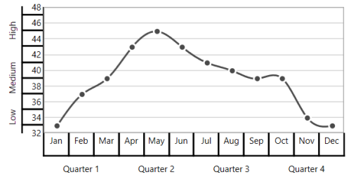
WithoutTopAndBottomBorder
<chart:SfChart.PrimaryAxis>
    <chart:CategoryAxis ShowLabelBorder="True" MultiLevelLabelsBorderType="WithoutTopAndBottomBorder">
        <chart:CategoryAxis.MultiLevelLabels>
            <chart:ChartMultiLevelLabel Start="-0.5" End="2.5" Text="Quarter 1"/>
            <chart:ChartMultiLevelLabel Start="2.5" End="5.5" Text="Quarter 2"/>
            <chart:ChartMultiLevelLabel Start="5.5" End="8.5" Text="Quarter 3"/>
            <chart:ChartMultiLevelLabel Start="8.5" End="11.5" Text="Quarter 4"/>
        </chart:CategoryAxis.MultiLevelLabels>
    </chart:CategoryAxis>
</chart:SfChart.PrimaryAxis>

<chart:SfChart.SecondaryAxis>
    <chart:NumericalAxis ShowLabelBorder="True" MultiLevelLabelsBorderType="WithoutTopAndBottomBorder">
        <chart:NumericalAxis.MultiLevelLabels>
            <chart:ChartMultiLevelLabel Start="32" End="36" Text="Low"/>
            <chart:ChartMultiLevelLabel Start="36" End="42" Text="Medium"/>
            <chart:ChartMultiLevelLabel Start="42" End="48" Text="High"/>
        </chart:NumericalAxis.MultiLevelLabels>
    </chart:NumericalAxis>
</chart:SfChart.SecondaryAxis>chart.PrimaryAxis = new CategoryAxis()
{
ShowLabelBorder = true,
MultiLevelLabelsBorderType = BorderType.WithoutTopAndBottomBorder
};
ChartMultiLevelLabel label1 = new ChartMultiLevelLabel()
{
Start = -0.5,
End = 2.5,
Text = "Quarter 1",
};
chart.PrimaryAxis.MultiLevelLabels.Add(label1);
ChartMultiLevelLabel label2 = new ChartMultiLevelLabel()
{
Start = 2.5,
End = 5.5,
Text = "Quarter 2",
};
chart.PrimaryAxis.MultiLevelLabels.Add(label2);
ChartMultiLevelLabel label3 = new ChartMultiLevelLabel()
{
Start = 5.5,
End = 8.5,
Text = "Quarter 3",
};
chart.PrimaryAxis.MultiLevelLabels.Add(label3);
ChartMultiLevelLabel label4 = new ChartMultiLevelLabel()
{
Start = 8.5,
End = 11.5,
Text = "Quarter 4",
};
chart.PrimaryAxis.MultiLevelLabels.Add(label4);
chart.SecondaryAxis = new NumericalAxis()
{
ShowLabelBorder = true,
MultiLevelLabelsBorderType = BorderType.WithoutTopAndBottomBorder
};
ChartMultiLevelLabel label5 = new ChartMultiLevelLabel()
{
Start = 32,
End = 36,
Text = "Low",
};
chart.SecondaryAxis.MultiLevelLabels.Add(label5);
ChartMultiLevelLabel label6 = new ChartMultiLevelLabel()
{
Start = 36,
End = 42,
Text = "Medium",
};
chart.SecondaryAxis.MultiLevelLabels.Add(label6);
ChartMultiLevelLabel label7 = new ChartMultiLevelLabel()
{
Start = 42,
End = 48,
Text = "High",
};
chart.SecondaryAxis.MultiLevelLabels.Add(label7);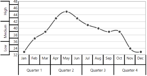
Text Customization
ChartMultiLevelLabel text can be customized with its FontSize, FontFamily and Foreground properties. It is shown in following code example.
<chart:SfChart.PrimaryAxis>
    <chart:CategoryAxis ShowLabelBorder="True">
        <chart:CategoryAxis.MultiLevelLabels>
            <chart:ChartMultiLevelLabel
                Start="-0.5" End="11.5"
                FontFamily="Algerian"
                Foreground="Blue"
                FontSize="14"
                Text="Year - 2016">
            </chart:ChartMultiLevelLabel>
        </chart:CategoryAxis.MultiLevelLabels>
    </chart:CategoryAxis>
</chart:SfChart.PrimaryAxis>chart.PrimaryAxis = new CategoryAxis()
{
ShowLabelBorder = true,
};
ChartMultiLevelLabel label = new ChartMultiLevelLabel()
{
Start = -0.5,
End = 11.5,
Text = "Year - 2016",
Foreground = new SolidColorBrush(Colors.Blue),
FontSize = 14,
FontFamily = new FontFamily("Algerian")
};
chart.PrimaryAxis.MultiLevelLabels.Add(label);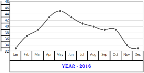
Label Alignment
The text of ChartMultiLevelLabel can be aligned with its LabelAlignment property. The default value of LabelAlignment property is Center.
Center
<chart:SfChart.PrimaryAxis>
    <chart:CategoryAxis  ShowLabelBorder="True">
        <chart:CategoryAxis.MultiLevelLabels>
            <chart:ChartMultiLevelLabel Start="-0.5" End="2.5" Text="Quarter 1"/>
            <chart:ChartMultiLevelLabel Start="2.5" End="5.5" Text="Quarter 2"/>
            <chart:ChartMultiLevelLabel Start="5.5" End="8.5" Text="Quarter 3"/>
            <chart:ChartMultiLevelLabel Start="8.5" End="11.5" Text="Quarter 4"/>
        </chart:CategoryAxis.MultiLevelLabels>
    </chart:CategoryAxis>
</chart:SfChart.PrimaryAxis>

<chart:SfChart.SecondaryAxis>
    <chart:NumericalAxis ShowLabelBorder="True">
        <chart:NumericalAxis.MultiLevelLabels>
            <chart:ChartMultiLevelLabel Start="32" End="36" Text="Low"/>
            <chart:ChartMultiLevelLabel Start="36" End="42" Text="Medium"/>
            <chart:ChartMultiLevelLabel Start="42" End="48" Text="High"/>
        </chart:NumericalAxis.MultiLevelLabels>
    </chart:NumericalAxis>
</chart:SfChart.SecondaryAxis>chart.PrimaryAxis = new CategoryAxis()
{
ShowLabelBorder = true,
};
ChartMultiLevelLabel label1 = new ChartMultiLevelLabel()
{
Start = -0.5,
End = 2.5,
Text = "Quarter 1",
};
chart.PrimaryAxis.MultiLevelLabels.Add(label1);
ChartMultiLevelLabel label2 = new ChartMultiLevelLabel()
{
Start = 2.5,
End = 5.5,
Text = "Quarter 2"
};
chart.PrimaryAxis.MultiLevelLabels.Add(label2);
ChartMultiLevelLabel label3 = new ChartMultiLevelLabel()
{
Start = 5.5,
End = 8.5,
Text = "Quarter 3"
};
chart.PrimaryAxis.MultiLevelLabels.Add(label3);
ChartMultiLevelLabel label4 = new ChartMultiLevelLabel()
{
Start = 8.5,
End = 11.5,
Text = "Quarter 4"
};
chart.PrimaryAxis.MultiLevelLabels.Add(label4);
chart.SecondaryAxis = new NumericalAxis()
{
ShowLabelBorder = true,
};
ChartMultiLevelLabel label5 = new ChartMultiLevelLabel()
{
Start = 32,
End = 36,
Text = "Low"
};
chart.SecondaryAxis.MultiLevelLabels.Add(label5);
ChartMultiLevelLabel label6 = new ChartMultiLevelLabel()
{
Start = 36,
End = 42,
Text = "Medium"
};
chart.SecondaryAxis.MultiLevelLabels.Add(label6);
ChartMultiLevelLabel label7 = new ChartMultiLevelLabel()
{
Start = 42,
End = 48,
Text = "High"
};
chart.SecondaryAxis.MultiLevelLabels.Add(label7);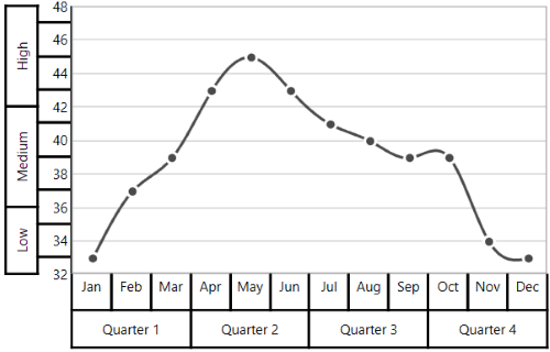
Near
<chart:SfChart.PrimaryAxis>
    <chart:CategoryAxis ShowLabelBorder="True">
        <chart:CategoryAxis.MultiLevelLabels>
            <chart:ChartMultiLevelLabel Start="-0.5" End="2.5" Text="Quarter 1" LabelAlignment="Near"/>
            <chart:ChartMultiLevelLabel Start="2.5" End="5.5" Text="Quarter 2" LabelAlignment="Near"/>
            <chart:ChartMultiLevelLabel Start="5.5" End="8.5" Text="Quarter 3" LabelAlignment="Near"/>
            <chart:ChartMultiLevelLabel Start="8.5" End="11.5" Text="Quarter 4" LabelAlignment="Near"/>
        </chart:CategoryAxis.MultiLevelLabels>
    </chart:CategoryAxis>
</chart:SfChart.PrimaryAxis>

<chart:SfChart.SecondaryAxis>
    <chart:NumericalAxis ShowLabelBorder="True">
        <chart:NumericalAxis.MultiLevelLabels>
            <chart:ChartMultiLevelLabel Start="32" End="36" Text="Low" LabelAlignment="Near"/>
            <chart:ChartMultiLevelLabel Start="36" End="42" Text="Medium" LabelAlignment="Near"/>
            <chart:ChartMultiLevelLabel Start="42" End="48" Text="High" LabelAlignment="Near"/>
        </chart:NumericalAxis.MultiLevelLabels>
    </chart:NumericalAxis>
</chart:SfChart.SecondaryAxis>chart.PrimaryAxis = new CategoryAxis()
{
ShowLabelBorder = true,
};
ChartMultiLevelLabel label1 = new ChartMultiLevelLabel()
{
Start = -0.5,
End = 2.5,
Text = "Quarter 1",
LabelAlignment = LabelAlignment.Near
};
chart.PrimaryAxis.MultiLevelLabels.Add(label1);
ChartMultiLevelLabel label2 = new ChartMultiLevelLabel()
{
Start = 2.5,
End = 5.5,
Text = "Quarter 2",
LabelAlignment = LabelAlignment.Near
};
chart.PrimaryAxis.MultiLevelLabels.Add(label2);
ChartMultiLevelLabel label3 = new ChartMultiLevelLabel()
{
Start = 5.5,
End = 8.5,
Text = "Quarter 3",
LabelAlignment = LabelAlignment.Near
};
chart.PrimaryAxis.MultiLevelLabels.Add(label3);
ChartMultiLevelLabel label4 = new ChartMultiLevelLabel()
{
Start = 8.5,
End = 11.5,
Text = "Quarter 4",
LabelAlignment = LabelAlignment.Near
};
chart.PrimaryAxis.MultiLevelLabels.Add(label4);
chart.SecondaryAxis = new NumericalAxis()
{
ShowLabelBorder = true,
};
ChartMultiLevelLabel label5 = new ChartMultiLevelLabel()
{
Start = 32,
End = 36,
Text = "Low",
LabelAlignment = LabelAlignment.Near
};
chart.SecondaryAxis.MultiLevelLabels.Add(label5);
ChartMultiLevelLabel label6 = new ChartMultiLevelLabel()
{
Start = 36,
End = 42,
Text = "Medium",
LabelAlignment = LabelAlignment.Near
};
chart.SecondaryAxis.MultiLevelLabels.Add(label6);
ChartMultiLevelLabel label7 = new ChartMultiLevelLabel()
{
Start = 42,
End = 48,
Text = "High",
LabelAlignment = LabelAlignment.Near
};
chart.SecondaryAxis.MultiLevelLabels.Add(label7);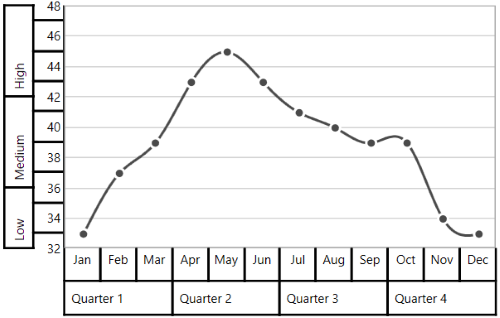
Far
<chart:SfChart.PrimaryAxis>
    <chart:CategoryAxis ShowLabelBorder="True">
        <chart:CategoryAxis.MultiLevelLabels>
            <chart:ChartMultiLevelLabel Start="-0.5" End="2.5" Text="Quarter 1" LabelAlignment="Far"/>
            <chart:ChartMultiLevelLabel Start="2.5" End="5.5" Text="Quarter 2" LabelAlignment="Far"/>
            <chart:ChartMultiLevelLabel Start="5.5" End="8.5" Text="Quarter 3" LabelAlignment="Far"/>
            <chart:ChartMultiLevelLabel Start="8.5" End="11.5" Text="Quarter 4" LabelAlignment="Far"/>
        </chart:CategoryAxis.MultiLevelLabels>
    </chart:CategoryAxis>
</chart:SfChart.PrimaryAxis>

<chart:SfChart.SecondaryAxis>
    <chart:NumericalAxis ShowLabelBorder="True">
        <chart:NumericalAxis.MultiLevelLabels>
            <chart:ChartMultiLevelLabel Start="32" End="36" Text="Low" LabelAlignment="Far"/>
            <chart:ChartMultiLevelLabel Start="36" End="42" Text="Medium" LabelAlignment="Far"/>
            <chart:ChartMultiLevelLabel Start="42" End="48" Text="High" LabelAlignment="Far"/>
        </chart:NumericalAxis.MultiLevelLabels>
    </chart:NumericalAxis>
</chart:SfChart.SecondaryAxis>chart.PrimaryAxis = new CategoryAxis()
{
ShowLabelBorder = true,
};
ChartMultiLevelLabel label1 = new ChartMultiLevelLabel()
{
Start = -0.5,
End = 2.5,
Text = "Quarter 1",
LabelAlignment = LabelAlignment.Near
};
chart.PrimaryAxis.MultiLevelLabels.Add(label1);
ChartMultiLevelLabel label2 = new ChartMultiLevelLabel()
{
Start = 2.5,
End = 5.5,
Text = "Quarter 2",
LabelAlignment = LabelAlignment.Near
};
chart.PrimaryAxis.MultiLevelLabels.Add(label2);
ChartMultiLevelLabel label3 = new ChartMultiLevelLabel()
{
Start = 5.5,
End = 8.5,
Text = "Quarter 3",
LabelAlignment = LabelAlignment.Near
};
chart.PrimaryAxis.MultiLevelLabels.Add(label3);
ChartMultiLevelLabel label4 = new ChartMultiLevelLabel()
{
Start = 8.5,
End = 11.5,
Text = "Quarter 4",
LabelAlignment = LabelAlignment.Near
};
chart.PrimaryAxis.MultiLevelLabels.Add(label4);
chart.SecondaryAxis = new NumericalAxis()
{
ShowLabelBorder = true,
};
ChartMultiLevelLabel label5 = new ChartMultiLevelLabel()
{
Start = 32,
End = 36,
Text = "Low",
LabelAlignment = LabelAlignment.Near
};
chart.SecondaryAxis.MultiLevelLabels.Add(label5);
ChartMultiLevelLabel label6 = new ChartMultiLevelLabel()
{
Start = 36,
End = 42,
Text = "Medium",
LabelAlignment = LabelAlignment.Near
};
chart.SecondaryAxis.MultiLevelLabels.Add(label6);
ChartMultiLevelLabel label7 = new ChartMultiLevelLabel()
{
Start = 42,
End = 48,
Text = "High",
LabelAlignment = LabelAlignment.Near
};
chart.SecondaryAxis.MultiLevelLabels.Add(label7);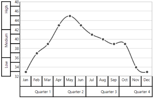
The text of ChartMultiLevelLabel will be trimmed automatically when the text width exceeds the width of ChartMultiLevelLabel, and it is shown below.
<chart:SfChart.SecondaryAxis>
<chart:NumericalAxis ShowLabelBorder="True">
<chart:NumericalAxis.MultiLevelLabels>
<chart:ChartMultiLevelLabel Start="32" End="36" Text="Low Temperature"/>
<chart:ChartMultiLevelLabel Start="36" End="42" Text="Medium Temperature"/>
<chart:ChartMultiLevelLabel Start="42" End="48" Text="High Temperature"/>
</chart:NumericalAxis.MultiLevelLabels>
</chart:NumericalAxis>
</chart:SfChart.SecondaryAxis>chart.SecondaryAxis = new NumericalAxis()
{
ShowLabelBorder = true,
};
ChartMultiLevelLabel label5 = new ChartMultiLevelLabel()
{
Start = 32,
End = 36,
Text = "Low Temperature"
};
chart.SecondaryAxis.MultiLevelLabels.Add(label5);
ChartMultiLevelLabel label6 = new ChartMultiLevelLabel()
{
Start = 36,
End = 42,
Text = "Medium Temperature"
};
chart.SecondaryAxis.MultiLevelLabels.Add(label6);
ChartMultiLevelLabel label7 = new ChartMultiLevelLabel()
{
Start = 42,
End = 48,
Text = "High Temperature"
};
chart.SecondaryAxis.MultiLevelLabels.Add(label7);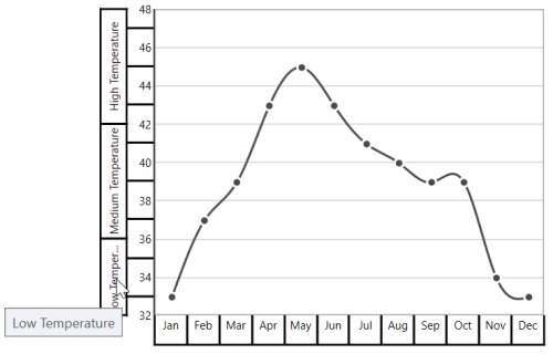
Events
ActualRangeChanged
The ActualRangeChanged event occurs when an axis range is changed. This argument contains the following information.
-
ActualMinimum- Gets or sets the actual minimum value of axis. -
ActualMaximum- Gets or sets the actual maximum value of axis. -
VisibleMinimum- Gets or sets the visible minimum value of axis. -
VisibleMaximum- Gets or sets the visible maximum value of axis. -
ActualInterval- Gets the actual interval of axis.
LabelCreated
The LabelCreated event occurs when the axis label is created. This argument contains AxisLabel of ChartAxisLabel, which contains the following properties.
-
LabelContent- Gets or sets the content of label. -
Position- Gets or sets the position of label.
AxisBoundsChanged
The AxisBoundsChanged event occurs when the bounds of the axis are changed. This argument contains the following information.
LabelClicked
The LabelClicked event is triggered when labels are clicked. Supports for 2D axis. The argument contains AxisLabel of ChartAxisLabel, which contains the following properties.
-
LabelContent- Gets the content of label. -
Position- Gets the position of label. -
PrefixLabelTemplate- Gets the prefix template of label. -
PostfixLabelTemplate- Gets the postfix template of label.
NOTE
You can refer to our WPF Charts feature tour page for its groundbreaking feature representations. You can also explore our WPF Charts example to know various chart types and how to easily configure them with built-in support for creating stunning visual effects.
See also
How to add arrows to the chart axis in WPF ChartHow to display axis labels in a particular format of WPF ChartHow to define ticker labels of custom axis in WPF ChartHow to customize the axis grid lines in WPF Chart (SfChart)How to keep the axis interval constant while zooming in WPF ChartHow to apply custom labels in WPF Chart's LogarithmicAxisHow to wrap multi-level axis label's text in WPF ChartsHow can I retrieve the chart's axis range in WPFHow to customize the appearance of axis labels in WPF Chart (SfChart)How to wrap the axis labels in WPF SfChartHow to set the custom labels with auto range for axis in WPF Chart (SfChart)How to rotate axis label in the WPF Chart (SfChart)How to hide axis in WPF Chart (SfChart)