Histogram in WPF Charts
18 Nov 20183 minutes to read
Histogram Chart
HistogramSeries is one of the seven basic tools of quality control to visualize the frequency distribution of data over a certain time period. HistogramSeries is often used to plot the density of data.
The following code example shows how to add the HistogramSeries:
<chart:HistogramSeries
    x:Name="histogramSeries"
    HistogramInterval="5"
    Interior="#BCBCBC"
    ItemsSource="{Binding Product}"
    XBindingPath="Price"
    YBindingPath="Value"/>
HistogramSeries series = new HistogramSeries()
{
ItemsSource = new ViewModel().Product,
XBindingPath = "Price",
YBindingPath = "Value",
HistogramInterval = 5,
Interior = new SolidColorBrush(Color.FromRgb(0xBC, 0xBC, 0xBC))
};
chart.Series.Add(series);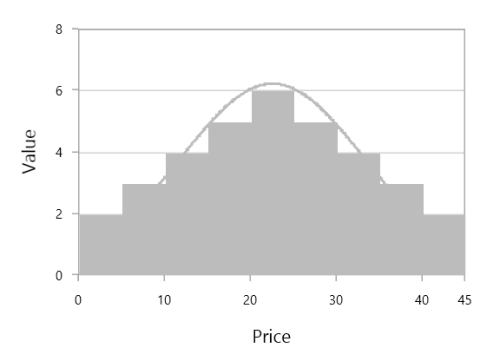
You can customize the interval using the HistogramInterval property, and the normal distribution curve can be collapsed using the ShowNormalDistributionCurve property.
<chart:HistogramSeries
    x:Name="histogramSeries"
    HistogramInterval="5"
    ShowNormalDistributionCurve="False"
    Interior="#BCBCBC"
    ItemsSource="{Binding Product}"
    XBindingPath="Price"
    YBindingPath="Value"/>
HistogramSeries series = new HistogramSeries()
{
ItemsSource = new ViewModel().Product,
XBindingPath = "Price",
YBindingPath = "Value",
HistogramInterval = 5,
ShowNormalDistributionCurve = false,
Interior = new SolidColorBrush(Color.FromRgb(0xBC, 0xBC, 0xBC))
};
chart.Series.Add(series);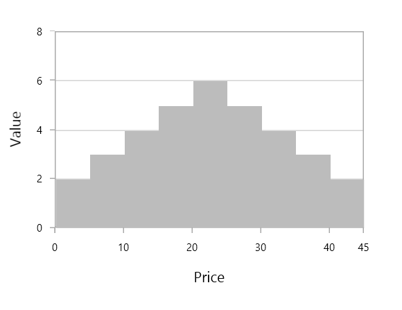
CurveLineStyle
You can customize the normal distribution curve by using the CurveLineStyle property.
<!-- code omitted for brevity -->
<Style TargetType="Polyline" x:Key="CurveColorStyle">
    <Setter Property="Stroke" Value="LightSeaGreen"/>
    <Setter Property="StrokeThickness" Value="3"/>
    <Setter Property="StrokeDashArray" Value="1,2" />
</Style>
<!-- code omitted for brevity -->

<chart:HistogramSeries
    x:Name="histogramSeries"
    HistogramInterval="5"
    ShowNormalDistributionCurve="True"
    CurveLineStyle="{StaticResource CurveColorStyle}"
    Interior="LightSkyBlue"
    ItemsSource="{Binding Product}"
    XBindingPath="Price"
    YBindingPath="Value"/>
// code omitted for brevity
HistogramSeries series = new HistogramSeries()
{
ItemsSource = new ViewModel().Product,
XBindingPath = "Price",
YBindingPath = "Value",
HistogramInterval = 5,
ShowNormalDistributionCurve = true,
CurveLineStyle = histogramChart.Resources["CurveColorStyle"] as Style,
Interior = new SolidColorBrush(Colors.LightSkyBlue)
};
chart.Series.Add(series);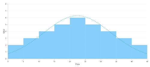
You can explore our WPF Histogram Chart feature tour page for its groundbreaking features. You can also explore our WPF Histogram Chart example to know how to represent time-dependent data, showing trends in data at equal intervals.