Line and StepLine in WPF Charts (SfChart)
8 Jul 20263 minutes to read
Line Chart
Line series join points on a plot by straight lines, showing data trends at equal intervals. The following code example explains how to create a simple LineSeries using given data
<chart:LineSeries
    XBindingPath="Year"
    ItemsSource="{Binding List}"
    YBindingPath="India"
    Interior="#4A4A4A"/>
<chart:LineSeries
    XBindingPath="Year"
    ItemsSource="{Binding List}"
    YBindingPath="America"
    Interior="#4A4A4A"/>
LineSeries series1 = new LineSeries()
{
ItemsSource = new ViewModel().List,
XBindingPath = "Year",
YBindingPath = "India",
Interior = new SolidColorBrush(Color.FromRgb(0x4A, 0x4A, 0x4A))
};
LineSeries series2 = new LineSeries()
{
ItemsSource = new ViewModel().List,
XBindingPath = "Year",
YBindingPath = "America",
Interior = new SolidColorBrush(Color.FromRgb(0x4A, 0x4A, 0x4A))
};
chart.Series.Add(series1);
chart.Series.Add(series2);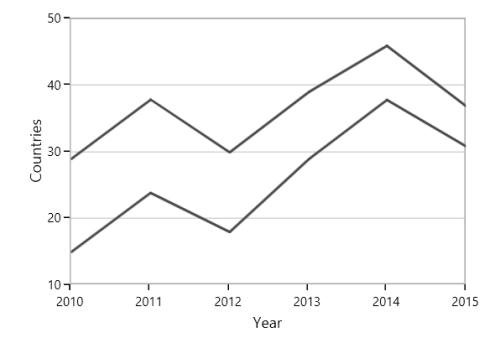
NOTE
You can explore our WPF Line Chart feature tour page for its groundbreaking features. You can also explore our WPF Line Chart example to know how to represent time-dependent data, showing trends in data at equal intervals.
Step Line Chart
StepLineSeries plots horizontal and vertical lines to connect data points resulting in a step line progression. The following code illustrates how to initialize the StepLineSeries in chart.
<chart:StepLineSeries
    ItemsSource="{Binding Data}"
    XBindingPath="XValue"
    YBindingPath="YValue">
</chart:StepLineSeries>
StepLineSeries stepLine = new StepLineSeries();
stepLine.ItemsSource = new ViewModel().Data;
stepLine.XBindingPath = "XValue";
stepLine.YBindingPath = "YValue";
SteplineChart.Series.Add(stepLine);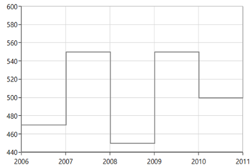
NOTE
You can explore our WPF Step Line Chart feature tour page for its groundbreaking features. You can also explore our WPF Step Line Chart example to know how to represent time-dependent data, showing trends in data at equal intervals.