Other Types in WPF Charts (SfChart)
8 Jul 202610 minutes to read
Box and Whisker Chart
BoxAndWhiskerSeries plots a combination of rectangle and lines to show the distribution of the dataset. The following code illustrates how to define the series in the chart.
<chart:BoxAndWhiskerSeries ItemsSource="{Binding BoxWhiskerData}"
    XBindingPath="Department"
    YBindingPath="Age">
</chart:BoxAndWhiskerSeries>
BoxAndWhiskerSeries boxAndWhisker = new BoxAndWhiskerSeries();
boxAndWhisker.ItemsSource = new BoxWhiskerViewModel().BoxWhiskerData;
boxAndWhisker.XBindingPath = "Department";
boxAndWhisker.YBindingPath = "Age";
boxWhiskerChart.Series.Add(boxAndWhisker);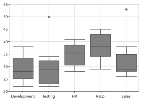
NOTE
By default, the
BoxPlotModeproperty value is Exclusive.
NOTE
You can refer to our WPF Box and Whisker Chart feature tour page for its groundbreaking feature representations. You can also explore our WPF Box and Whisker Chart example to know how to render and configure the box and whisker chart.
Customize the series Box mode
The series box plotting mode can be changed by using the BoxPlotMode property of BoxAndWhiskerSeries. The plotting mode of the series can be calculated as follows:
-
Exclusive– The quartile values are calculated by using the formula (N+1) * P (N count, P percentile), and the index value starts from 1 in the list. -
Inclusive– The quartile values are calculated by using the formula (N−1) * P (N count, P percentile), and the index value starts from 0 in the list. -
Normal– The quartile values are calculated by splitting the list and getting the median values.
Normal
The following code illustrates how to define the BoxPlotMode value as Normal.
<chart:BoxAndWhiskerSeries BoxPlotMode="Normal"></chart:BoxAndWhiskerSeries>BoxAndWhiskerSeries boxAndWhisker = new BoxAndWhiskerSeries();
boxAndWhisker.BoxPlotMode = BoxPlotMode.Normal;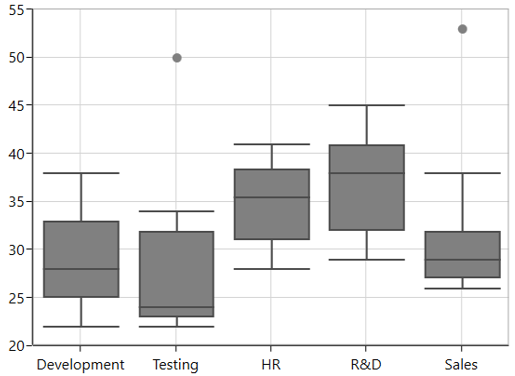
Inclusive
The following code illustrates how to define the BoxPlotMode value as Inclusive.
<chart:BoxAndWhiskerSeries BoxPlotMode="Inclusive"></chart:BoxAndWhiskerSeries>BoxAndWhiskerSeries boxAndWhisker = new BoxAndWhiskerSeries();
boxAndWhisker.BoxPlotMode = BoxPlotMode.Inclusive;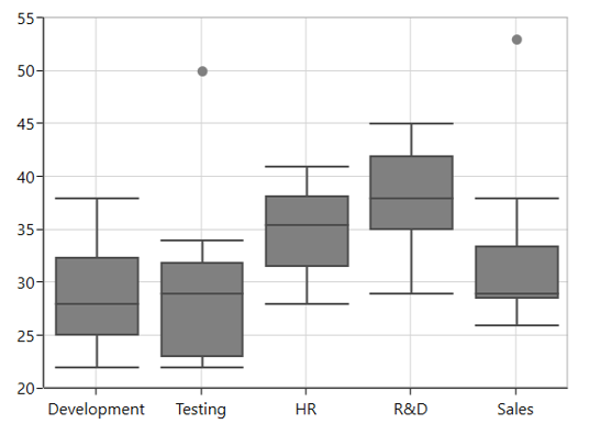
ShowMedian
The Median values of a given dataset are viewed by enabling the ShowMedian property of BoxAndWhiskerSeries. The following code illustrates how to enable the ShowMedian property.
<chart:BoxAndWhiskerSeries ShowMedian="True"></chart:BoxAndWhiskerSeries>BoxAndWhiskerSeries boxAndWhisker = new BoxAndWhiskerSeries();
boxAndWhisker.ShowMedian = true;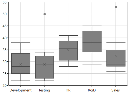
NOTE
The median is calculated as follows:
- The middle number of data points is the median for an odd number of data points.
- The average of the middle two numbers is the median for an even number of data points.
Outlier
The outlier is used to display the outlier point that lies either below the lower whisker or above the upper whisker line and it is an observation that is numerically distant from the rest of the data.
ShowOutlier
The outlier value in the box plot can be viewed by enabling the ShowOutlier property of BoxAndWhiskerSeries. By default, the ShowOutlier value is true. The following code demonstrates how to disable the ShowOutlier property.
<chart:BoxAndWhiskerSeries ShowOutlier="False"></chart:BoxAndWhiskerSeries>BoxAndWhiskerSeries boxAndWhisker = new BoxAndWhiskerSeries();
boxAndWhisker.ShowOutlier = false;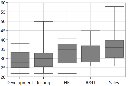
Outlier Template
The default appearance of the outlier symbol can be customized by using the OutlierTemplate property of BoxAndWhiskerSeries. The following code illustrates how to customize the outlier symbol.
<chart:BoxAndWhiskerSeries.OutlierTemplate>
    <DataTemplate>
        <Canvas>
            <Path
                Stretch="Fill"
                Height="10"
                Width="10"
                Fill="{Binding Interior}"
                Canvas.Left="{Binding RectX}"
                Canvas.Top="{Binding RectY}"
                Data="F1 M 145.193,54.8249L 169.315,54.8249L 169.315,
                    78.9463L 145.193,78.9463L 145.193,103.074L 121.071,
                    103.074L 121.071,78.9463L 96.946,78.9463L 96.946,
                    54.8249L 121.071,54.8249L 121.071,
                    30.6983L 145.193,30.6983L 145.193,54.8249 Z"/>
        </Canvas>
    </DataTemplate>
</chart:BoxAndWhiskerSeries.OutlierTemplate>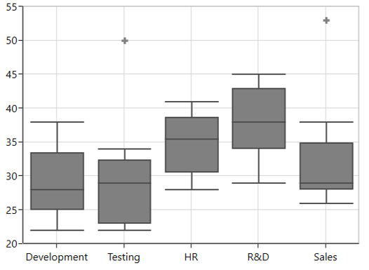
Waterfall Chart
WaterfallSeries clarifies the cumulative effect of a set of provided positive and negative values. The series is represented by a rectangle and a connector between the rectangles.
The following code illustrates how to use the series in the chart.
<chart:WaterfallSeries
    ItemsSource="{Binding RevenueDetails}"
    XBindingPath="Category"
    YBindingPath="Value">
</chart:WaterfallSeries>
WaterfallSeries waterfallSeries = new WaterfallSeries();
waterfallSeries.ItemsSource = new ViewModel().RevenueDetails;
waterfallSeries.XBindingPath = "Category";
waterfallSeries.YBindingPath = "Value";
chart.Series.Add(waterfallSeries);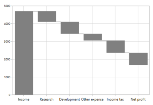
SummarySegmentPath and SummarySegmentBrush
SummaryBindingPath gets or sets the string value that indicates the sum of previous segments in the series.
The summary segment can be differentiated by applying the SummarySegmentBrush in the series.
<chart:WaterfallSeries
    ItemsSource="{Binding RevenueDetails}"
    XBindingPath="Category"
    YBindingPath="Value" Interior="Gray"
    SummaryBindingPath="IsSummary"
    SummarySegmentBrush="RoyalBlue">
</chart:WaterfallSeries>
WaterfallSeries waterfallSeries = new WaterfallSeries();
waterfallSeries.ItemsSource = new ViewModel().RevenueDetails;
waterfallSeries.XBindingPath = "Category";
waterfallSeries.YBindingPath = "Value";
waterfallSeries.SummaryBindingPath = "IsSummary";
waterfallSeries.SummarySegmentBrush = new SolidColorBrush(Colors.RoyalBlue);
chart.Series.Add(waterfallSeries);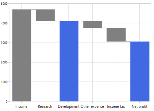
NegativeSegmentBrush
The appearance of the negative segment can be changed by using the NegativeSegmentBrush property of the series.
The following code illustrates how to change the appearance of the negative segment.
<chart:WaterfallSeries NegativeSegmentBrush="Red"></chart:WaterfallSeries>WaterfallSeries waterfallSeries = new WaterfallSeries();
waterfallSeries.NegativeSegmentBrush = new SolidColorBrush(Colors.Red);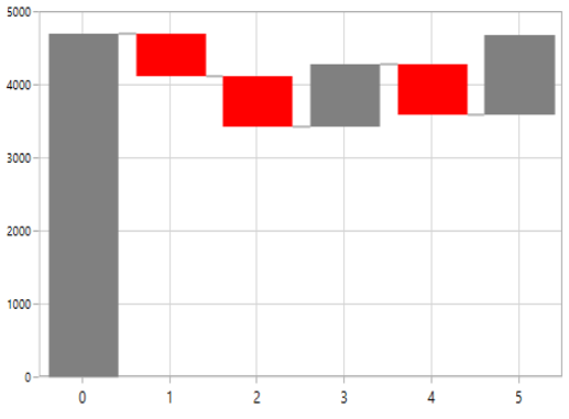
AllowAutoSum
The summary segment calculation can be changed by using the AllowAutoSum property. By default, the property is true. When disabling this property, it renders the segment by using the Y value of the provided ItemsSource collection.
The following code example illustrates how the AllowAutoSum property value can be set.
<chart:WaterfallSeries
    AllowAutoSum="False"
    SummaryBindingPath="IsSummary"
    SummarySegmentBrush="RoyalBlue">
</chart:WaterfallSeries>
WaterfallSeries waterfallSeries = new WaterfallSeries();
waterfallSeries.AllowAutoSum = true;
waterfallSeries.SummaryBindingPath = "IsSummary";
waterfallSeries.SummarySegmentBrush = new SolidColorBrush(Colors.RoyalBlue);
chart.Series.Add(waterfallSeries);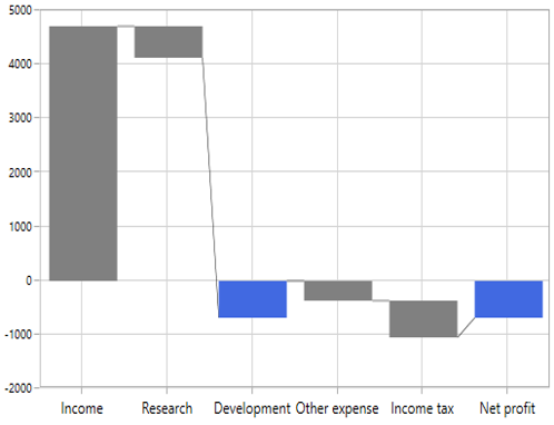
ConnectorLine
The connector line of the series can be enabled or disabled by using its ShowConnector line property. By default, the property value is true.
<chart:WaterfallSeries ShowConnector="False"></chart:WaterfallSeries>WaterfallSeries waterfallSeries = new WaterfallSeries();
waterfallSeries.ShowConnector = false;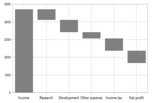
Connector line customization
The connector line can be customized by applying the ConnectorLineStyle property of the series. The following code example illustrates how to apply a style for the connector line.
<chart:WaterfallSeries.ConnectorLineStyle>
    <Style TargetType="Line">
        <Setter Property="Stroke" Value="Red"/>
        <Setter Property="StrokeDashArray" Value="1"/>
        <Setter Property="StrokeThickness" Value="2"/>
    </Style>
</chart:WaterfallSeries.ConnectorLineStyle>
Style style = new Style(typeof(Line));
style.Setters.Add(new Setter(Line.StrokeProperty, new SolidColorBrush(Colors.Red)));
style.Setters.Add(new Setter(Line.StrokeDashArrayProperty, new DoubleCollection() { 1 }));
style.Setters.Add(new Setter(Line.StrokeThicknessProperty, 2));
WaterfallSeries series = new WaterfallSeries();
series.ConnectorLineStyle = style;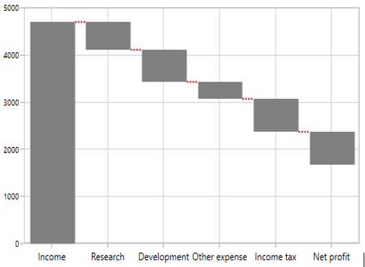
NOTE
You can explore our WPF Waterfall Chart feature tour page for its groundbreaking features. You can also explore our WPF Waterfall Chart example to know how to represent time-dependent data, showing trends in data at equal intervals.