Appearance in WPF Charts (SfChart)
8 Jul 202624 minutes to read
SfChart supports various customizing and styling options that allows you to enrich the application.
Palettes
SfChart provides options to apply different kinds of themes or palettes to your chart. You can define Palette either for the entire chart or for an individual series.
We have some predefined palette such as:
- Metro
- AutumnBrights
- FloraHues
- Pineapple
- TomotoSpectrum
- RedChrome
- PurpleChrome
- BlueChrome
- GreenChrome
- Elite
- LightCandy
- SandyBeach
NOTE
Elite, SandyBeach and LightCandy palettes are not supported in the bitmap series types.
Applying Palette to Series
Each palette applies a set of predefined brushes to the series in a predefined order. The following code example shows you how to set the Metro Palette for the chart series.
<chart:SfChart Height="250" Width="350" Palette="Metro">chart.Palette = ChartColorPalette.Metro;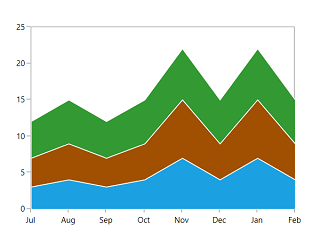
The following code example defined Palette as BlueChrome.
<chart:SfChart Height="250" Width="350" Palette="BlueChrome">chart.Palette = ChartColorPalette.BlueChrome;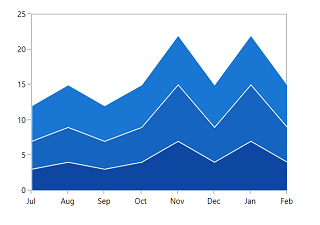
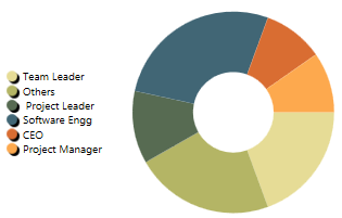
Applying Palette to Segment
Each palette applies a set of predefined brushes to the segment in a predefined order. The following code example shows you how to set the Metro Palette for the chart series.
<chart:DoughnutSeries
    YBindingPath="Percentage"
    Palette="Metro"
    XBindingPath="Category"
    ItemsSource="{Binding Tax}"/>
DoughnutSeries series = new DoughnutSeries()
{
ItemsSource = new ViewModel().Tax,
XBindingPath = "Category",
YBindingPath = "Percentage",
Palette = ChartColorPalette.Metro
};
chart.Series.Add(series);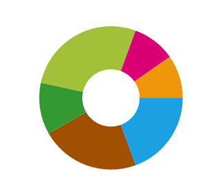
The following code example defined Palette as AutumnBrights.
<chart:DoughnutSeries
    YBindingPath="Percentage"
    Palette="AutumnBrights"
    XBindingPath="Category"
    ItemsSource="{Binding Tax}"/>
DoughnutSeries series = new DoughnutSeries()
{
ItemsSource = new ViewModel().Tax,
XBindingPath = "Category",
YBindingPath = "Percentage",
Palette = ChartColorPalette.AutumnBrights
};
chart.Series.Add(series);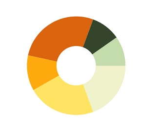
NOTE
Metro palette is the default palette for both Series and Segment.
Custom Palette
SfChart provides option which enables you to define your own color brushes with your preferred order for the Palette, using ColorModel as shown in the following code example.
<chart:DoughnutSeries
    ItemsSource="{Binding Tax}"
    XBindingPath="Category"
    YBindingPath="Percentage"
    Palette="Custom">
    <chart:DoughnutSeries.ColorModel>
        <chart:ChartColorModel>
            <chart:ChartColorModel.CustomBrushes>
                <SolidColorBrush Color="Cyan"/>
                <SolidColorBrush Color="DarkCyan"/>
            </chart:ChartColorModel.CustomBrushes>
        </chart:ChartColorModel>
    </chart:DoughnutSeries.ColorModel>
</chart:DoughnutSeries>
ChartColorModel colorModel = new ChartColorModel();
colorModel.CustomBrushes.Add(new SolidColorBrush(Colors.Cyan));
colorModel.CustomBrushes.Add(new SolidColorBrush(Colors.DarkCyan));
DoughnutSeries series = new DoughnutSeries()
{
ItemsSource = new ViewModel().Tax,
XBindingPath = "Category",
YBindingPath = "Percentage",
Palette = ChartColorPalette.Custom,
ColorModel = colorModel
};
chart.Series.Add(series);
You can define the custom palette for series as in the below code example:
<chart:SfChart
    Height="250"
    Width="350"
    Palette="Custom">

    <chart:SfChart.ColorModel>
        <chart:ChartColorModel>
            <chart:ChartColorModel.CustomBrushes>
                <SolidColorBrush Color="BlueViolet"/>
                <SolidColorBrush Color="PeachPuff"/>
                <SolidColorBrush Color="Purple"/>
            </chart:ChartColorModel.CustomBrushes>
        </chart:ChartColorModel>
    </chart:SfChart.ColorModel>

</chart:SfChart>chart.Palette = ChartColorPalette.Custom;
ChartColorModel colorModel = new ChartColorModel();
colorModel.CustomBrushes.Add(new SolidColorBrush(Colors.BlueViolet));
colorModel.CustomBrushes.Add(new SolidColorBrush(Colors.PeachPuff));
colorModel.CustomBrushes.Add(new SolidColorBrush(Colors.Purple));
chart.ColorModel = colorModel;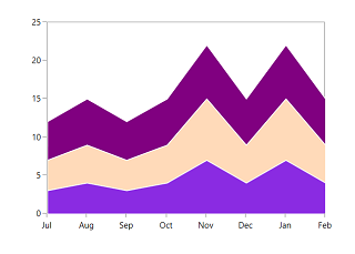
Gradient Colors
Gradient colors for the chart series can be set by using the Interior or ColorModel property of the chart series with the help of LinearGradientBrush or RadialGradientBrush.
The following code sample and screenshot illustrates how to apply the custom gradient colors for chart series using the ColorModel property.
<chart:ColumnSeries XBindingPath="XValue"
                    YBindingPath="YValue"
                    ItemsSource="{Binding Data}"
                    Palette="Custom">

    <chart:ColumnSeries.ColorModel>
        <chart:ChartColorModel>
            <chart:ChartColorModel.CustomBrushes>
                <LinearGradientBrush>
                    <GradientStop Offset="1" Color="#FFE7C7" />
                    <GradientStop Offset="0" Color="#FCB69F" />
                </LinearGradientBrush>
                <LinearGradientBrush>
                    <GradientStop Offset="1" Color="#fadd7d" />
                    <GradientStop Offset="0" Color="#fccc2d" />
                </LinearGradientBrush>
                <LinearGradientBrush>
                    <GradientStop Offset="1" Color="#DCFA97" />
                    <GradientStop Offset="0" Color="#96E6A1" />
                </LinearGradientBrush>
                <LinearGradientBrush>
                    <GradientStop Offset="1" Color="#DDD6F3" />
                    <GradientStop Offset="0" Color="#FAACA8" />
                </LinearGradientBrush>
                <LinearGradientBrush>
                    <GradientStop Offset="1" Color="#A8EAEE" />
                    <GradientStop Offset="0" Color="#7BB0F9" />
                </LinearGradientBrush>
            </chart:ChartColorModel.CustomBrushes>
        </chart:ChartColorModel>
    </chart:ColumnSeries.ColorModel>
</chart:ColumnSeries>
SfChart chart = new SfChart();
// code omitted for brevity
ChartColorModel colorModel = new ChartColorModel();
LinearGradientBrush gradientColor1 = new LinearGradientBrush();
GradientStop stop1 = new GradientStop()
{
Offset = 1,
Color = Color.FromRgb(255, 231, 199)
};
GradientStop stop2 = new GradientStop()
{
Offset = 0,
Color = Color.FromRgb(252, 182, 159)
};
gradientColor1.GradientStops.Add(stop1);
gradientColor1.GradientStops.Add(stop2);
LinearGradientBrush gradientColor2 = new LinearGradientBrush();
stop1 = new GradientStop()
{
Offset = 1,
Color = Color.FromRgb(250, 221, 125)
};
stop2 = new GradientStop()
{
Offset = 0,
Color = Color.FromRgb(252, 204, 45)
};
gradientColor2.GradientStops.Add(stop1);
gradientColor2.GradientStops.Add(stop2);
// code omitted for brevity
colorModel.CustomBrushes.Add(gradientColor1);
colorModel.CustomBrushes.Add(gradientColor2);
// code omitted for brevity
ColumnSeries series = new ColumnSeries()
{
ItemsSource = new ViewModel().Data,
XBindingPath = "Element",
YBindingPath = "YValue",
Palette = ChartColorPalette.Custom,
ColorModel = colorModel
};
chart.Series.Add(series);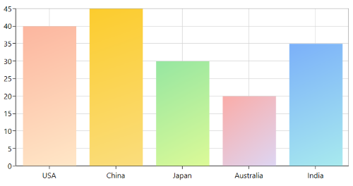
The following code sample and screenshot illustrates how to apply the gradient color using the Interior property of series with LinearGradientBrush.
<chart:ColumnSeries
    XBindingPath="XValue"
    YBindingPath="YValue"
    ItemsSource="{Binding Data}">

    <chart:ColumnSeries.Interior>
        <LinearGradientBrush>
            <GradientStop Offset="1" Color="#A8EAEE"/>
            <GradientStop Offset="0" Color="#7BB0F9"/>
        </LinearGradientBrush>
    </chart:ColumnSeries.Interior>

</chart:ColumnSeries>
SfChart chart = new SfChart();
// code omitted for brevity
LinearGradientBrush gradientColor = new LinearGradientBrush();
GradientStop stop1 = new GradientStop()
{
Offset = 1,
Color = Color.FromRgb(168, 234, 238)
};
GradientStop stop2 = new GradientStop()
{
Offset = 0,
Color = Color.FromRgb(123, 176, 249)
};
gradientColor.GradientStops.Add(stop1);
gradientColor.GradientStops.Add(stop2);
// code omitted for brevity
ColumnSeries series = new ColumnSeries()
{
ItemsSource = new ViewModel().Data,
XBindingPath = "Element",
YBindingPath = "YValue",
Interior = gradientColor
};
chart.Series.Add(series);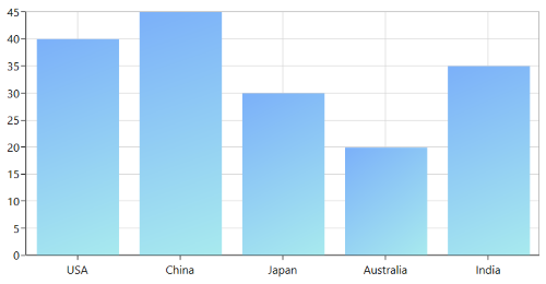
SegmentColorPath
The color for the chart segments can be bound from its items source collection by using the SegmentColorPath property of series. The following code illustrates how to bind the color to the series with SegmentColorPath property.
<chart:ColumnSeries SegmentColorPath="ColorPath"></chart:ColumnSeries>ColumnSeries series = new ColumnSeries()
{
SegmentColorPath = "SegmentColor"
};
NOTE
SegmentColorPath property is not applicable for Area, SplineArea, StepArea, RangeArea, FastLine, Candle, HiLoOpenClose, and CircularSeries (when the Polar and Radar DrawType is Area).
Customize Legends
SfChart provides many options to customize the chart legends. Basically it is an ItemsControl. So, you can customize the ItemTemplate, ItemsPanel, etc.
The following code example demonstrates applying the palette color to the legend icon interior.
<chart:SfChart.Legend>
    <chart:ChartLegend DockPosition="Left">
        <chart:ChartLegend.ItemTemplate>
            <DataTemplate>
                <StackPanel Orientation="Horizontal">
                    <Grid Margin="20,0,0,0">
                        <Grid.ColumnDefinitions>
                            <ColumnDefinition/>
                            <ColumnDefinition/>
                        </Grid.ColumnDefinitions>

                        <Ellipse Width="10" Height="10" Fill="{Binding Interior}">
                            <Ellipse.Effect>
                                <DropShadowEffect
                                    Direction="315"
                                    BlurRadius="0.8"
                                    ShadowDepth="3"
                                    Color="Black"/>
                            </Ellipse.Effect>
                        </Ellipse>

                        <TextBlock
                            Grid.Column="1"
                            Margin="5,0,0,0"
                            FontSize="10"
                            Foreground="Black"
                            Text="{Binding Demand}">
                        </TextBlock>
                    </Grid>
                </StackPanel>
            </DataTemplate>
        </chart:ChartLegend.ItemTemplate>
    </chart:ChartLegend>
</chart:SfChart.Legend>chart.Legend = new ChartLegend()
{
DockPosition = ChartDock.Left,
ItemTemplate = chart.Resources["itemTemplate"] as DataTemplate
};
If you are having more number of items in the legend, you can override the ItemsPanel and add ScrollViewer. So that you can able to scroll the legend items. Please refer this kb for more details
Customize ToolTip
SfChart provides the option to define your own template for Tooltip. The following code example demonstrates the custom tooltip using the TooltipTemplate property.
<chart:BarSeries
    ItemsSource="{Binding CategoricalDatas}"
    XBindingPath="Category"
    YBindingPath="Value"
    ShowTooltip="True"
    Palette="FloraHues"
    chart:ChartTooltip.ShowDuration="5000">

    <chart:BarSeries.TooltipTemplate>
        <DataTemplate>
            <Border BorderBrush="Black" BorderThickness="1">
                <Grid Height="40">
                    <Grid.RowDefinitions>
                        <RowDefinition Height="0.5*"/>
                        <RowDefinition Height="0.5*"/>
                    </Grid.RowDefinitions>

                    <Grid.ColumnDefinitions>
                        <ColumnDefinition/>
                        <ColumnDefinition/>
                        <ColumnDefinition/>
                    </Grid.ColumnDefinitions>

                    <Rectangle
                        Fill="White"
                        Grid.RowSpan="2"
                        Grid.ColumnSpan="3"/>

                    <Image
                        Grid.RowSpan="2"
                        Grid.Column="0"
                        HorizontalAlignment="Left"
                        Margin="3"
                        Source="{Binding Item.ImagePath}"/>

                    <TextBlock
                        Grid.Column="1"
                        Grid.ColumnSpan="2"
                        Margin="3,3,6,3"
                        FontSize="10"
                        HorizontalAlignment="Left"
                        VerticalAlignment="Center"
                        TextAlignment="Center"
                        Foreground="Black"
                        Text="{Binding Item.Category}"/>

                    <TextBlock
                        Grid.Row="1"
                        Grid.Column="1"
                        VerticalAlignment="Center"
                        HorizontalAlignment="Left"
                        Margin="3,3,6,3"
                        FontSize="10"
                        Foreground="Black"
                        Text="Value:"
                        TextAlignment="Left"/>

                    <TextBlock
                        Grid.Row="1"
                        Grid.Column="2"
                        VerticalAlignment="Center"
                        HorizontalAlignment="Left"
                        Margin="3,3,6,3"
                        FontSize="10"
                        Foreground="Black"
                        Text="{Binding Item.Value}"
                        TextAlignment="Left"/>
                </Grid>
            </Border>
        </DataTemplate>
    </chart:BarSeries.TooltipTemplate>
</chart:BarSeries>
BarSeries series = new BarSeries()
{
ItemsSource = new ViewModel().CategoricalDatas,
XBindingPath = "Category",
YBindingPath = "Value",
Palette = ChartColorPalette.FloraHues,
ShowTooltip = true,
TooltipTemplate = chart.Resources["tooltipTemplate"] as DataTemplate
};
ChartTooltip.SetShowDuration(series, 5000);
chart.Series.Add(series);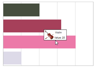
NOTE
You can refer to our WPF Charts feature tour page for its groundbreaking feature representations. You can also explore our WPF Charts example to know various chart types and how to easily configure them with built-in support for creating stunning visual effects.