How can I help you?
Cell Types in Windows Forms Grid Control
21 Jan 202524 minutes to read
GridControl allows the inclusion of some special controls in the grid cells. This attribute of a grid cell is referred to as its Cell Type. GridControl supports more than 20 built-in cell types
In GridControl each cell has been created by GridCellModelBase and GridCellRendererBase. GridCellModelBase defines the data or model part of a cell type. It holds all the data information of a cell.Rendering generally refers to the process of creating a visual representation on a user’s screen. GridCellRendererBase acts a base class for all the renderer part of the cell type.
Setting Cell Type for a Cell
This section will explain on how to add a basic cell type into a grid cell. To add the desired cell type in a cell, the CellType property can be used. There are two ways to assign cell types, by string format or by using the GridCellTypeName static class which contains all the built-in cell type names in it.
this.gridControl1[2, 2].CellType = GridCellTypeName.CheckBox;

//Set the text to be displayed in the checkbox cell.
this.gridControl1[2, 2].Description = "Enable";Me.gridControl1(2, 2).CellType = GridCellTypeName.CheckBox
'Set the text to be displayed in the checkbox cell.
Me.gridControl1(2, 2).Description = "Enable"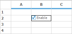
TextBox cell type
TextBox cells are the default cell type of GridControl. TextBox cells displays text and images which can be edited when clicked.
gridControl1[2, 2].Text = "TextBox";
gridControl1[2, 2].CellType = "TextBox";
gridControl1[2, 3].Text = "TextBox/Image";
gridControl1[2, 2].CellType = "TextBox";
gridControl1[2, 3].ImageIndex = 0;gridControl1(2, 2).Text = "TextBox"
gridControl1(2, 2).CellType = "TextBox"
'Text box with image assumes ImageList set the same Static sample code.
gridControl1(2, 3).Text = "TextBox/Image"
gridControl1(2, 2).CellType = "TextBox"
gridControl1(2, 3).ImageIndex = 0
Static cell type
Static cell type will display text that cannot be edited. It is possible to make the static cells as current cell but static cells cannot be activated for editing. Static cells can also include images in addition to the text.
gridControl1[2, 2].Text = "Static";
gridControl1[2, 2].CellType = "Static";

gridControl1[2, 3].Text = "Static/Image";
gridControl1[2, 2].CellType = "Static";
gridControl1[2, 3].ImageIndex = 2;gridControl1(2, 2).Text = "Static"
gridControl1(2, 2).CellType = "Static"
gridControl1(2, 3).Text = "Static/Image"
gridControl1(2, 2).CellType = "Static"
gridControl1(2, 3).ImageIndex = 2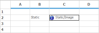
NOTE
Though static cells cannot be edited, it can be deleted by using the<kbd> DELETE</kbd> key.
Header cell type
Header cells are as same as that of static cells, in addition, this cell type has a button-like border that can have a depressed state. Header cell type is mainly used as header for rows and columns. If a particular cell needs to be of type header, then make use of this cell type.
gridControl1[2, 2].Text = "HeaderText";

//Sets Cell Type as "Header".
gridControl1[2, 2].CellType = "Header";gridControl1(2, 2).Text = "HeaderText"
'Sets Cell Type as "Header".
gridControl1(2, 2).CellType = "Header"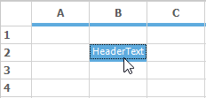
Image cell type
To show an Image in a cell, make use of the Image cell type. It can be achieved by setting the CellType property as GridCellTypeName.Image. Images can be added in GridControl by using the ImageList property. Multiple number of images can be added by using this property. For picking a particular image from the list, make use of the ImageIndex property.
// Add required number of images using ImageList.
ImageList imageList1 = new ImageList();
imageList1.Images.Add(SystemIcons.Warning.ToBitmap());
imageList1.Images.Add(SystemIcons.Application.ToBitmap());

//Sets the image list into the TableStyle.
gridControl1.TableStyle.ImageList = imageList1;
gridControl1[2, 2].CellType = GridCellTypeName.Image;

// Adds the image located in the index 1.
gridControl1[2, 2].ImageIndex = 1;
'Add required number of images using ImageList.
Dim imageList1 As New ImageList()
imageList1.Images.Add(SystemIcons.Warning.ToBitmap())
imageList1.Images.Add(SystemIcons.Application.ToBitmap())
'Sets the image list into the TableStyle.
gridControl1.TableStyle.ImageList = imageList1
gridControl1(2, 2).CellType = GridCellTypeName.Image
'Adds the image located in the index 1.
gridControl1(2, 2).ImageIndex = 1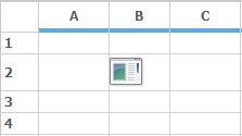
Multiple images in a Grid cell
It is possible to add multiple images in a grid cell with the help of CellDrawn event. In this event draw the multiple images by using DrawImage method and with precise bounds for the images.
//Sets the CellType to Image Type.
this.gridControl1[3,3].CellType = GridCellTypeName.Image;
gridControl1.CellDrawn+=new GridDrawCellEventHandler(gridControl1_CellDrawn);

private void gridControl1_CellDrawn(object sender, Syncfusion.Windows.Forms.Grid.GridDrawCellEventArgs e)
{
    if( e.RowIndex == 3 && e.ColIndex == 3)
    {

        //Draws the image to the Cell.
        e.Graphics.DrawImage(SystemIcons.Warning.ToBitmap(), e.Bounds.X, e.Bounds.Y);
        e.Graphics.DrawImage(SystemIcons.Information.ToBitmap(), e.Bounds.X +     SystemIcons.Warning.ToBitmap().Width + 10, e.Bounds.Y);
    }
}
'Sets the CellType to Image Type.
Me.gridControl1(3,3).CellType = GridCellTypeName.Image
AddHandler gridControl1.CellDrawn, AddressOf gridControl1_CellDrawn
Private Sub gridControl1_CellDrawn(ByVal sender As Object, ByVal e As Syncfusion.Windows.Forms.Grid.GridDrawCellEventArgs)
If e.RowIndex = 3 AndAlso e.ColIndex = 3 Then
'Draws the image to the Cell.
e.Graphics.DrawImage(SystemIcons.Warning.ToBitmap(), e.Bounds.X, e.Bounds.Y)
e.Graphics.DrawImage(SystemIcons.Information.ToBitmap(), e.Bounds.X + SystemIcons.Warning.ToBitmap().Width + 10, e.Bounds.Y)
End If
End Sub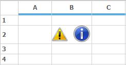
CheckBox cell type
CheckBox cell type displays a check box in a grid cell. The check box has three states:Checked, Unchecked and Indeterminate. It is possible to decide whether the check box should behave as a two-state check box or a three-state check box by using the CheckBoxOptions property. Use the Description property of the cell style to display the text in a checkbox cell.
gridControl1[2, 2].Description = "CheckBox";
this.gridControl1[2, 2].CellType = GridCellTypeName.CheckBox;

// Sets a flat look and values that represent checked, unchecked and indeterminate state.
this.gridControl1[2, 2].CheckBoxOptions = new GridCheckBoxCellInfo("True", "False", "", true);gridControl1(2, 2).Description = "CheckBox"
Me.gridControl1(2, 2).CellType = GridCellTypeName.CheckBox
'Sets a flat look and values that represent checked, unchecked and indeterminate state.
Me.gridControl1(2, 2).CheckBoxOptions = New GridCheckBoxCellInfo("True", "False", "", True)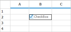
ComboBox cell Type
Adding a combo box to a grid cell, will enable to show a pop up displaying an associated list of choices. The combo box can be populated in several ways by setting the appropriate GridStyleInfo properties.
this.gridControl1[2, 2].CellType = GridCellTypeName.ComboBox;Me.gridControl1(2, 2).CellType = GridCellTypeName.ComboBoxThere are two ways to assign data source to a Combobox
- Using Choice List
- Using DataSource
The Combobox created using ChoiceList shows that the items are been created by StringCollection. The values can be customized in StringCollection and can be assigned to the Combobox.
StringCollection stringCollection = new StringCollection();

stringCollection.AddRange(new String[]{ "One", "Two", "Three", "Four", "Five" });
GridStyleInfo style = gridControl1.Model[2, 2];
style.CellType = GridCellTypeName.ComboBox;
style.ChoiceList = stringCollection;
Dim stringCollection As New StringCollection()
stringCollection.AddRange(New String(){ "One", "Two", "Three", "Four", "Five" })
Dim style As GridStyleInfo = gridControl1.Model(2, 2)
style.CellType = GridCellTypeName.ComboBox
style.ChoiceList = stringCollection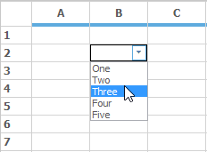
Whereas the combobox using the DataSource shows that the items are been added by populating the data from the data source.
The DisplayMember property denotes the string that needs to be displayed in the cell. But the ValueMember property denotes the string from the object data source which acts as a value for that cell.
// DataSource.
DataTable dataTable = new DataTable();
dataTable.Columns.Add("Name");

dataTable.Rows.Add(new object[] { "Nancy" });
dataTable.Rows.Add(new object[] { "Andrew" });
dataTable.Rows.Add(new object[] { "Janet" });
dataTable.Rows.Add(new object[] { "Margaret" });

//Assigning Datasource to combobox.
GridStyleInfo style = gridControl1.Model[2, 2];
style.CellType = GridCellTypeName.ComboBox;
style.DataSource = dataTable;
style.DisplayMember = "Name";
style.ValueMember = "Name";
' DataSource.
Dim dataTable As New DataTable()
dataTable.Columns.Add("Name")
dataTable.Rows.Add(New Object() { "Nancy" })
dataTable.Rows.Add(New Object() { "Andrew" })
dataTable.Rows.Add(New Object() { "Janet" })
dataTable.Rows.Add(New Object() { "Margaret" })
'Assigning Datasource to combobox.
Dim style As GridStyleInfo = gridControl1.Model(2, 2)
style.CellType = GridCellTypeName.ComboBox
style.DataSource = dataTable
style.DisplayMember = "Name"
style.ValueMember = "Name"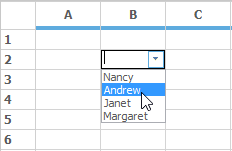
The drop-down cell behavior of a ComboBox can be changed by using the DropDownStyle property. It has three options AutoComplete, Editable and Exclusive.
-
AutoCompletemode is used to complete selection with the available choices while start typing. -
Editableis the default drop down style which is used to edit the selected content on the combobox cell. -
Exclusivestyle is used to just select the option from the combobox drop down, it will not allow to edit the contents of the cell.
Enabling AutoComplete in EditMode
For enabling the AutoComplete in edit mode, make use of the AutoCompleteInEditMode property. Choose any of the GridComboSelectionOption using AutoCompleteInEditMode property. Make sure that the DropDownStyle is in Editable state so that AutoCompleteInEditMode can be used.
this.gridControl1[5, 5].CellType = GridCellTypeName.ComboBox;
this.gridControl1[5, 5].DropDownStyle = GridDropDownStyle.Editable;
this.gridControl1[5, 5].AutoCompleteInEditMode = GridComboSelectionOptions.AutoSuggest;Me.gridControl1(5, 5).CellType = GridCellTypeName.ComboBox
Me.gridControl1(5, 5).DropDownStyle = GridDropDownStyle.Editable
Me.gridControl1(5, 5).AutoCompleteInEditMode = GridComboSelectionOptions.AutoSuggestChanging ButtonBar size
The size of the ComboBox button can be changed by setting the size of the ButtonBar in the ComboBoxCellModel.
//Creates Combobox Cell model object.
GridComboBoxCellModel model = this.gridControl1.Model.CellModels["ComboBox"] as GridComboBoxCellModel;

//Assigns a new value to its ButtonBarSize property.
model.ButtonBarSize = new Size(8, 8);
'Creates Combobox Cell model object.
Dim model As GridComboBoxCellModel = TryCast(Me.gridControl1.Model.CellModels("ComboBox"), GridComboBoxCellModel)
'Assigns a new value to its ButtonBarSize property.
model.ButtonBarSize = New Size(8, 8)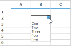
Controlling visible items in ComboBox cells
In order to control the items showing in dropdown of combo box, GridComboBoxListBoxPart.DropDownRows property can be used. This property has to be used in the Grid.CurrentCellShowingDropDown event so that items visibility can be handled for each separate combobox available in different cells.
gridControl1.CurrentCellShowingDropDown += gridControl1_CurrentCellShowingDropDown;

void gridControl1_CurrentCellShowingDropDown(object sender, GridCurrentCellShowingDropDownEventArgs e)
{
   GridControlBase grid = sender as GridControlBase;

   if (grid != null)
   {
      GridCurrentCell cc = grid.CurrentCell;
      GridComboBoxCellRenderer cellRenderer = cc.Renderer as GridComboBoxCellRenderer;

//Sets number of visible items for combobox in Row 6 as 4, Row 4 as 7, Row 2 as 10 , and so on.

      if (cc != null)
      {

         if (cc.RowIndex == 6)
            ((GridComboBoxListBoxPart)cellRenderer.ListBoxPart).DropDownRows = 4;

         else if (cc.RowIndex == 4)
            ((GridComboBoxListBoxPart)cellRenderer.ListBoxPart).DropDownRows = 7;

         else if (cc.RowIndex == 2)
            ((GridComboBoxListBoxPart)cellRenderer.ListBoxPart).DropDownRows = 10;

         else ((GridComboBoxListBoxPart)cellRenderer.ListBoxPart).DropDownRows = 6;
      }
   }
}gridControl1.CurrentCellShowingDropDown += gridControl1_CurrentCellShowingDropDown
Private Sub gridControl1_CurrentCellShowingDropDown(ByVal sender As Object, ByVal e As GridCurrentCellShowingDropDownEventArgs)
Dim grid As GridControlBase = TryCast(sender, GridControlBase)
If grid IsNot Nothing Then
Dim cc As GridCurrentCell = grid.CurrentCell
Dim cellRenderer As GridComboBoxCellRenderer = TryCast(cc.Renderer, GridComboBoxCellRenderer)
'Sets number of visible items for combobox in Row 6 as 4, Row 4 as 7, Row 2 as 10 , and so on.
If cc IsNot Nothing Then
If cc.RowIndex = 6 Then
CType(cellRenderer.ListBoxPart, GridComboBoxListBoxPart).DropDownRows = 4
ElseIf cc.RowIndex = 4 Then
CType(cellRenderer.ListBoxPart, GridComboBoxListBoxPart).DropDownRows = 7
ElseIf cc.RowIndex = 2 Then
CType(cellRenderer.ListBoxPart, GridComboBoxListBoxPart).DropDownRows = 10
Else
CType(cellRenderer.ListBoxPart, GridComboBoxListBoxPart).DropDownRows = 6
End If
End If
End If
End SubNOTE
For more reference regarding this, refer the KB link over here.
Setting ComboBox in header cells
It is also possible to place a ComboBox cell in header cells by just setting the CellType of the header to ComboBox and assign a valid data source.
// Create a data source.
StringCollection items = new StringCollection();
items.AddRange(new String[]{    "One",
                "Two",
                "Three",
                "Four",
                "Five"
                });

//Set the cell type into combobox.
this.gridControl1[0, 4].CellType = "ComboBox";
this.gridControl1[0, 4].CellValue = "combo";

//Set the GridShowButtons as Show option for showing the combobox in the normal view.

//The combobox is modified like current cell editing by assigning the GridShowButtons as CurrentCellEditing.
this.gridControl1[0, 4].ShowButtons = GridShowButtons.Show;
this.gridControl1[0, 4].CellAppearance = GridCellAppearance.Raised;
this.gridControl1[0, 4].ChoiceList = items;
' Create a data source.
Dim items As New StringCollection()
items.AddRange(New String(){ "One", "Two", "Three", "Four", "Five" })
'set the cell type into combobox.
Me.gridControl1(0, 4).CellType = "ComboBox"
Me.gridControl1(0, 4).CellValue = "combo"
'Set the GridShowButtons as Show option for showing the combobox in the normal view.
'The combobox is modified like current cell editing by assigning the GridShowButtons as CurrentCellEditing.
Me.gridControl1(0, 4).ShowButtons = GridShowButtons.Show
Me.gridControl1(0, 4).CellAppearance = GridCellAppearance.Raised
Me.gridControl1(0, 4).ChoiceList = itemsNOTE
To know more details and sample, refer the KB link over here.
RadioButton cell type
RadioButton cell type displays a radio button in a grid cell. The choices of radio button are mutually exclusive. Like combobox, radio button values can be populated by using the ChoiceList or DataSource property.
StringCollection stringCollection = new StringCollection();
stringCollection.AddRange(new String[]{   "Button 0",
                            "Disabled/disabled",
                            "Button 2",
                            "Button 3"});
this.gridControl1[3, 1].ChoiceList = stringCollection;
this.gridControl1[3, 1].CellType = "RadioButton";
Dim stringCollection As New StringCollection()
stringCollection.AddRange(New String(){ "Button 0", "Disabled/disabled", "Button 2", "Button 3"})
Me.gridControl1(3, 1).ChoiceList = stringCollection
Me.gridControl1(3, 1).CellType = "RadioButton"
Alignment in RadioButton
GridControl includes support for displaying radio button in both vertical and horizontal order. By default the RadioButton cell aligns the buttons in horizontal order. The display of order can be changed by using the RadioButtonAlignment property.
// Displays radio buttons vertically.
this.gridControl1[1, 1].RadioButtonAlignment = Syncfusion.Windows.Forms.Grid.ButtonAlignment.Vertical;

// Displays radio buttons horizontally.
this.gridControl1[2, 2].RadioButtonAlignment = Syncfusion.Windows.Forms.Grid.ButtonAlignment.Horizontal;
'Displays radio buttons vertically.
Me.gridControl1(1, 1).RadioButtonAlignment = Syncfusion.Windows.Forms.Grid.ButtonAlignment.Vertical
'Displays radio buttons horizontally.
Me.gridControl1(2, 2).RadioButtonAlignment = Syncfusion.Windows.Forms.Grid.ButtonAlignment.Horizontal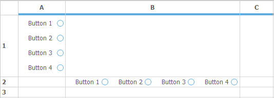
ColorEdit Cell Type
Color Edit cell type will allow to pick up colors and set a color object as the CellValue. To do this, set the CellType property as ColorEdit.On clicking the ColorEdit cell, a popup will be opened for choosing the desired color.
this.gridControl1[2, 2].CellType = GridCellTypeName.ColorEdit;
this.gridControl1[2, 2].CellValue = "Aqua";Me.gridControl1(2, 2).CellType = GridCellTypeName.ColorEdit
Me.gridControl1(2, 2).CellValue = "Aqua"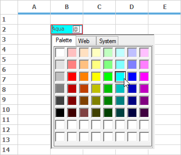
Customizing the Tab Name of the ColorUIControl
As mentioned in the beginning of this topic, each cell type has been created by its own cell model and cell renderer. To customize the tab name custom classes has to be created which derived from the GridDropDownCellModel and GridDropDownCellRenderer built-in classes. In this derived class override the InitializeDropDownContainer method and customize the tab name.
protected /*internal*/ override void InitializeDropDownContainer()
{
    base.InitializeDropDownContainer();

    colorUI = new ColorUIControl();
    colorUI.Dock = DockStyle.Fill;
    colorUI.Visible = true;
    colorUI.ColorSelected += new EventHandler(ColorUIColorSelected);
    this.colorUI.ColorGroups = ((Syncfusion.Windows.Forms.ColorUIGroups)((Syncfusion.Windows.Forms.ColorUIGroups.StandardColors)));
    //Color tab name has changed
    colorUI.StandardTabName = "TEST";
    this.DropDownContainer.Controls.Add(colorUI);
}
Protected Overrides Sub InitializeDropDownContainer() 'internal
MyBase.InitializeDropDownContainer()
colorUI = New ColorUIControl()
colorUI.Dock = DockStyle.Fill
colorUI.Visible = True
AddHandler colorUI.ColorSelected, AddressOf ColorUIColorSelected
Me.colorUI.ColorGroups = (CType((Syncfusion.Windows.Forms.ColorUIGroups.StandardColors), Syncfusion.Windows.Forms.ColorUIGroups))
'Color tab name has changed
colorUI.StandardTabName = "TEST"
Me.DropDownContainer.Controls.Add(colorUI)
End SubNOTE
For sample and more information check the KB link over here.
Control cell type
It is possible to add an arbitrary control in a grid cell through Control cell type. Each cells using this cell type requires to instantiate a control object and that object has to be assigned to the style.Control property. The following code illustrates how to set a cell type as Control.
Panel panel1 = new Panel();
panel.Controls.Add(new Button());
panel.Controls.Add(new RadioButton());

//Sets the control object.
this.gridControl1[2, 2].Control = panel1;
this.gridControl1[2, 2].CellType = "Control";
Dim panel1 As New Panel()
panel.Controls.Add(New Button())
panel.Controls.Add(New RadioButton())
'Sets the control object.
Me.gridControl1(2, 2).Control = panel1
Me.gridControl1(2, 2).CellType = "Control"
Inserting an animated image in cell
It is possible to animate an image in grid cell by setting the cell type as Control and assigning it to a picture box control. To display the image as an animated one it is necessary to refresh the picture cell for a given time interval. For more details and sample please check the KB link over here.
Currency cell type
This cell type can be used to represent monetary values to achieve accuracy in the calculations. It will add the currency sign in the cell and attempt to parse only the number from the input. To customize the currency cells make use of the GridStyleInfo properties.
For setting a current cell as a Currency cell type, make use of the CellType property as GridCellTypeName.Currency.
this.gridControl1[2, 2].CellType = GridCellTypeName.Currency;
this.gridControl1[3, 2].CellType = GridCellTypeName.Currency;
this.gridControl1[4, 2].CellType = GridCellTypeName.Currency;Me.gridControl1(2, 2).CellType = GridCellTypeName.ColorEdit
Me.gridControl1[3, 2].CellType = GridCellTypeName.Currency
Me.gridControl1[4, 2].CellType = GridCellTypeName.Currency
It is possible to display a special character if the currency cell is null by using the NullString property. Use this property and assign the desired text that needs to be displayed. All the currency cell type related properties will come under the CurrencyEdit property.
GridStyleInfo currencyStyle = new GridStyleInfo();
currencyStyle.CellType = GridCellTypeName.Currency;
currencyStyle.Text = "";
currencyStyle.CurrencyEdit.NullString = "*";
this.gridControl1[2, 2] = currencyStyle;
Dim currencyStyle As New GridStyleInfo()
currencyStyle.CellType = GridCellTypeName.Currency
currencyStyle.Text = ""
currencyStyle.CurrencyEdit.NullString = "*"
Me.gridControl1(2, 2) = currencyStyle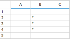
NOTE
The value in the cell (2, 2) is empty hence it is showing the string that is assigned in the
NullStringproperty.
For setting the number of digits for the decimal portion of the currency, make use of the CurrencyDecimalDigits property which is in the GridStyleInfo class. The values assigned has to be in integer. The default value is 2.
GridStyleInfo currencyStyle = new GridStyleInfo();
currencyStyle.CellType = GridCellTypeName.Currency;
currencyStyle.Text = "2";
currencyStyle.CurrencyEdit.CurrencyDecimalDigits = 2;
this.gridControl1[2, 2] = currencyStyle;
Dim currencyStyle As New GridStyleInfo()
currencyStyle.CellType = GridCellTypeName.Currency
currencyStyle.Text = "2"
currencyStyle.CurrencyEdit.CurrencyDecimalDigits = 2
Me.gridControl1(2, 2) = currencyStyle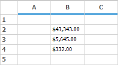
CurrencyDecimalSeparator is a string property that is used to display the decimal separator character. The default value is ..
GridStyleInfo currencyStyle = new GridStyleInfo();
currencyStyle.CellType = GridCellTypeName.Currency;
currencyStyle.Text = "700";
currencyStyle.CurrencyEdit.CurrencyDecimalDigits = 2;
currencyStyle.CurrencyEdit.CurrencyDecimalSeparator = "/";
this.gridControl1[2, 2] = currencyStyle;
Dim currencyStyle As New GridStyleInfo()
currencyStyle.CellType = GridCellTypeName.Currency
currencyStyle.Text = "700"
currencyStyle.CurrencyEdit.CurrencyDecimalDigits = 2
currencyStyle.CurrencyEdit.CurrencyDecimalSeparator = "/"
Me.gridControl1(2, 2) = currencyStyle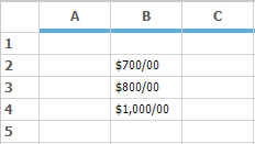
CurrencyGroupSeparator is a string property in GridStyleInfo class which specifies the separator to be used for grouping digits. The default string is comma.
GridStyleInfo currencyStyle = new GridStyleInfo();
currencyStyle.CellType = GridCellTypeName.Currency;
currencyStyle.Text = "7000";
currencyStyle.CurrencyEdit.CurrencyGroupSeparator = "/";
this.gridControl1[2, 2] = currencyStyle;
Dim currencyStyle As New GridStyleInfo()
currencyStyle.CellType = GridCellTypeName.Currency
currencyStyle.Text = "7000"
currencyStyle.CurrencyEdit.CurrencyDecimalDigits = 2
currencyStyle.CurrencyEdit.CurrencyDecimalSeparator = "/"
Me.gridControl1(2, 2) = currencyStyle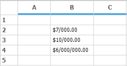
CurrencyGroupSizes property specifies the grouping of currency digit in the currency textbox. The value assigned has to be in the integer array because the values assigned will be from right to left.
GridStyleInfo currencyStyle = new GridStyleInfo();
currencyStyle.CellType = GridCellTypeName.Currency;
currencyStyle.Text = "700000";
currencyStyle.CurrencyEdit.CurrencyDecimalDigits = 0;
currencyStyle.CurrencyEdit.CurrencyGroupSizes = new int[] { 3, 2 };
this.gridControl1[2, 2] = currencyStyle;
Dim currencyStyle As New GridStyleInfo()
currencyStyle.CellType = GridCellTypeName.Currency
currencyStyle.Text = "700000"
currencyStyle.CurrencyEdit.CurrencyDecimalDigits = 0
currencyStyle.CurrencyEdit.CurrencyGroupSizes = New Integer() { 3, 2 }
Me.gridControl1(2, 2) = currencyStyle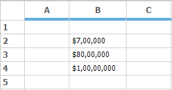
CurrencyPositivePattern and CurrencyNegativePattern are used to specify the format value for positive and negative currency values respectively. It is of integer type.
GridStyleInfo positiveValue = new GridStyleInfo();
positiveValue.CellType = GridCellTypeName.Currency;
positiveValue.Text = "700000";
positiveValue.Format = "###,###";
positiveValue.CurrencyEdit.CurrencyPositivePattern = 1;

this.gridControl1[2, 2] = positiveValue;

GridStyleInfo negativeValue = new GridStyleInfo();
negativeValue.CellType = GridCellTypeName.Currency;
negativeValue.Text = "-700000";
negativeValue.Format = "###,###";
negativeValue.CurrencyEdit.CurrencyNegativePattern = 2;

this.gridControl1[3, 2] = negativeValue;
Dim positiveValue As New GridStyleInfo()
positiveValue.CellType = GridCellTypeName.Currency
positiveValue.Text = "700000"
positiveValue.Format = "###,###"
positiveValue.CurrencyEdit.CurrencyPositivePattern = 1
Me.gridControl1(2, 2) = positiveValue
Dim negativeValue As New GridStyleInfo()
negativeValue.CellType = GridCellTypeName.Currency
negativeValue.Text = "-700000"
negativeValue.Format = "###,###"
negativeValue.CurrencyEdit.CurrencyNegativePattern = 2
Me.gridControl1(3, 2) = negativeValue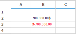
Currency cell type also has the support to the change the color of the currency value. For this PositiveColor and NegativeColor property is used. These properties is used to change the color of the positive value and negative value respectively. By default the color assigned for positive color is black and for negative color is Red.
GridStyleInfo positiveValue = new GridStyleInfo();
positiveValue.CellType = GridCellTypeName.Currency;
positiveValue.Text = "700000";
positiveValue.CurrencyEdit.CurrencyPositivePattern = 0;
positiveValue.CurrencyEdit.PositiveColor = Color.Blue;

this.gridControl1[2, 2] = positiveValue;

GridStyleInfo negativeValue = new GridStyleInfo();
negativeValue.CellType = GridCellTypeName.Currency;
negativeValue.Text = "-700000";
negativeValue.CurrencyEdit.CurrencyNegativePattern = 1;
negativeValue.CurrencyEdit.NegativeColor = Color.SaddleBrown;

this.gridControl1[3, 2] = negativeValue;
Dim positiveValue As New GridStyleInfo()
positiveValue.CellType = GridCellTypeName.Currency
positiveValue.Text = "700000"
positiveValue.CurrencyEdit.CurrencyPositivePattern = 0
positiveValue.CurrencyEdit.PositiveColor = Color.Blue
Me.gridControl1(2, 2) = positiveValue
Dim negativeValue As New GridStyleInfo()
negativeValue.CellType = GridCellTypeName.Currency
negativeValue.Text = "-700000"
negativeValue.CurrencyEdit.CurrencyNegativePattern = 1
negativeValue.CurrencyEdit.NegativeColor = Color.SaddleBrown
Me.gridControl1(3, 2) = negativeValue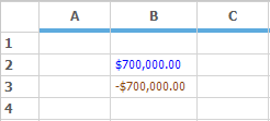
NegativeSign property can be used to denote which type of character has to be used in the place of the negative sign. By default the value is -.
GridStyleInfo negativeValue = new GridStyleInfo();
negativeValue.CellType = GridCellTypeName.Currency;
negativeValue.Text = "-700000";
negativeValue.CurrencyEdit.CurrencyNegativePattern = 1;
negativeValue.CurrencyEdit.NegativeSign = "^";

this.gridControl1[2, 2] = negativeValue;
Dim negativeValue As New GridStyleInfo()
negativeValue.CellType = GridCellTypeName.Currency
negativeValue.Text = "-700000"
negativeValue.CurrencyEdit.CurrencyNegativePattern = 1
negativeValue.CurrencyEdit.NegativeSign = "^"
Me.gridControl1(2, 2) = negativeValue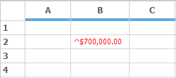
The symbol of the currency can be changed by using the CurrencySymbol property. By default the value is $.
GridStyleInfo currencyStyle = new GridStyleInfo();
currencyStyle.CellType = GridCellTypeName.Currency;
currencyStyle.Text = "700000";
currencyStyle.CurrencyEdit.CurrencySymbol = "₹";
this.gridControl1[2, 2] = currencyStyle;
Dim currencyStyle As New GridStyleInfo()
currencyStyle.CellType = GridCellTypeName.Currency
currencyStyle.Text = "700000"
currencyStyle.CurrencyEdit.CurrencySymbol = "₹"
Me.gridControl1(2, 2) = currencyStyle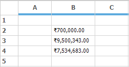
Formula cell type
FormulaCell cell type adds algebraic formulas to a cell that depends on other cells. The cell value should be a well-formed formula starting with an = and the CellType property set to FormulaCell. If a formula cell does not begin with an =, the cell is treated as a text box cell. For details, refer the topic Formula Support.
//Sets Cell Type as Formula Cell.
gridControl1[rowIndex, colIndex].CellType = "FormulaCell";

//Assigns a Formula.
gridControl1[rowIndex, colIndex].CellValue = "= (A1+A2) / 2";
'Sets Cell Type as Formula Cell.
gridControl1(rowIndex, colIndex).CellType = "FormulaCell"
'Assigns a Formula.
gridControl1(rowIndex, colIndex).CellValue = "= (A1+A2) / 2"MaskEdit cell type
MaskEdit cell type allows to create specially formatted text cells, which confirms an edit mask that has been specified. For setting a current cell as a MaskEdit cell type, then set the CellType property as GridCellTypeName.MaskEdit. There is a class named GridMaskEditInfo which contains all the style properties related to the Mask Edit cells.
GridStyleInfo maskStyleInfo = this.gridControl1.Model[2, 2];
maskStyleInfo.CellType = GridCellTypeName.MaskEdit;
maskStyleInfo.MaskEdit = GridMaskEditInfo.Default;
maskStyleInfo.MaskEdit.Mask = "999-99-9999";
maskStyleInfo.CellValue = "04492413";

GridStyleInfo maskStyleInfo1 = this.gridControl1.Model[4, 2];
maskStyleInfo1.CellType = GridCellTypeName.MaskEdit;
maskStyleInfo1.MaskEdit = GridMaskEditInfo.Default;
maskStyleInfo1.MaskEdit.Mask = "99:99:99";
maskStyleInfo1.CellValue = "120000";

GridStyleInfo maskStyleInfo2 = this.gridControl1.Model[6, 2];
maskStyleInfo2.CellType = GridCellTypeName.MaskEdit;
maskStyleInfo2.MaskEdit = GridMaskEditInfo.Default;
maskStyleInfo2.MaskEdit.Mask = "99/99/9999";
maskStyleInfo2.CellValue = "10232015";
Dim maskStyleInfo As GridStyleInfo = Me.gridControl1.Model(2, 2)
maskStyleInfo.CellType = GridCellTypeName.MaskEdit
maskStyleInfo.MaskEdit = GridMaskEditInfo.Default
maskStyleInfo.MaskEdit.Mask = "999-99-9999"
maskStyleInfo.CellValue = "04492413"
Dim maskStyleInfo1 As GridStyleInfo = Me.gridControl1.Model(4, 2)
maskStyleInfo1.CellType = GridCellTypeName.MaskEdit
maskStyleInfo1.MaskEdit = GridMaskEditInfo.Default
maskStyleInfo1.MaskEdit.Mask = "99:99:99"
maskStyleInfo1.CellValue = "120000"
Dim maskStyleInfo2 As GridStyleInfo = Me.gridControl1.Model(6, 2)
maskStyleInfo2.CellType = GridCellTypeName.MaskEdit
maskStyleInfo2.MaskEdit = GridMaskEditInfo.Default
maskStyleInfo2.MaskEdit.Mask = "99/99/9999"
maskStyleInfo2.CellValue = "10232015"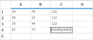
MonthCalendar cell type
To display the calendar in a Grid cell make use of the MonthCalendar cell type. It will automatically display the Month calendar in the drop down grid while clicking on it. The cell value given for this cell has to be in DateTime format.
GridStyleInfo monthCalendar = new GridStyleInfo();
monthCalendar.CellType = GridCellTypeName.MonthCalendar;
monthCalendar.CellValue = DateTime.Now;

this.gridControl1[2, 2] = monthCalendar;
Dim monthCalendar As New GridStyleInfo()
monthCalendar.CellType = GridCellTypeName.MonthCalendar
monthCalendar.CellValue = DateTime.Now
Me.gridControl1(2, 2) = monthCalendar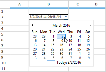
NumericUpDown cell type
NumericUpDown cell type makes the grid cell to increase or decrease a value by using a pair of arrow buttons. There is also a property NumericUpDown under the GridStyleInfo class which gets the value as of type GridNumericUpDownCellInfo. This GridNumericUpDownCellInfo class contains all the style properties related to the NumericUpDown cell type.
GridStyleInfo numericCellType = new GridStyleInfo();
numericCellType.CellType = GridCellTypeName.NumericUpDown;

GridNumericUpDownCellInfo numeric = new GridNumericUpDownCellInfo();

// Represents the first value of the NumericUpDown cell type.
numeric.StartValue = 5;

// Represents the maximum value.
numeric.Maximum = 10;

// Represents the minimum value.
numeric.Minimum = 0;

// Represents the step to increase or
// decrease while clicking up or down arrow.
numeric.Step = 2;

// Indicates whether to start over when the value.

// reaches the maximum or minimum.
numeric.WrapValue = true;

numericCellType.NumericUpDown = numeric;

this.gridControl1[2, 2] = numericCellType;
Dim numericCellType As New GridStyleInfo()
numericCellType.CellType = GridCellTypeName.NumericUpDown
Dim numeric As New GridNumericUpDownCellInfo()
'Represents the first value of the NumericUpDown cell type.
numeric.StartValue = 5
'Represents the maximum value.
numeric.Maximum = 10
'Represents the minimum value.
numeric.Minimum = 0
'Represents the step to increase.
'Decrease while clicking up or down arrow.
numeric.Step = 2
'Indicates whether to start over when the value.
'Reaches the maximum or minimum.
numeric.WrapValue = True
numericCellType.NumericUpDown = numeric
Me.gridControl1(2, 2) = numericCellType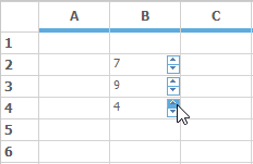
NumericUpDown cell can be customized to allow only numeric characters by setting the AcceptAlphaKeys property to false. This property can be derived from GridNumericUpDownCellModel.
// To allow only numeric characters.
GridNumericUpDownCellModel model = this.gridControl1.CellModels[GridCellTypeName.NumericUpDown] as GridNumericUpDownCellModel;
model.AcceptAlphaKeys = false;
' To allow only numeric characters.
Dim model As GridNumericUpDownCellModel = TryCast(Me.gridControl1.CellModels(GridCellTypeName.NumericUpDown), GridNumericUpDownCellModel)
model.AcceptAlphaKeys = FalseProgressBar cell type
Progress bars are used in applications to provide a visual cue during lengthy operations such as installation, copying, and printing etc. In GridControl progress bar cells can be used in a cell by setting the CellType name as ProgressBar.
The ProgressBar property in GridStyleInfo class will set all the style properties related to the progress bar. This property will get the value of type GridProgressBarInfo class.
GridStyleInfo progressBarCellType = new GridStyleInfo();
progressBarCellType.CellType = GridCellTypeName.ProgressBar;

GridProgressBarInfo progressBar = new GridProgressBarInfo();

//It denotes the Background style for the Progress Bar.
progressBar.BackgroundStyle = Syncfusion.Windows.Forms.Tools.ProgressBarBackgroundStyles.VerticalGradient;

// It checks whether background segment has to be shown.
progressBar.BackSegments = false;

// Sets the Font color of the progress bar text.
progressBar.FontColor = System.Drawing.Color.White;

// It denotes the foreground style of the Progress Bar.
progressBar.ProgressStyle = Syncfusion.Windows.Forms.Tools.ProgressBarStyles.Tube;

// Checks whether the text has to visible or not.
progressBar.TextVisible = true;

// Sets the start color and end color of the foreground.

// If ProgressStyle is in Tube.
progressBar.TubeEndColor = System.Drawing.Color.Honeydew;
progressBar.TubeStartColor = System.Drawing.Color.Green;
progressBar.ProgressValue = 50;

progressBarCellType.ProgressBar = progressBar;
this.gridControl1[2, 2] = progressBarCellType;
Dim progressBarCellType As New GridStyleInfo()
progressBarCellType.CellType = GridCellTypeName.ProgressBar
Dim progressBar As New GridProgressBarInfo()
'It denotes the Background style for the Progress Bar.
progressBar.BackgroundStyle = Syncfusion.Windows.Forms.Tools.ProgressBarBackgroundStyles.VerticalGradient
'It checks whether background segment has to be shown.
progressBar.BackSegments = False
'Sets the Font color of the progress bar text.
progressBar.FontColor = System.Drawing.Color.White
'It denotes the foreground style of the Progress Bar.
progressBar.ProgressStyle = Syncfusion.Windows.Forms.Tools.ProgressBarStyles.Tube
'Checks whether the text has to visible or not.
progressBar.TextVisible = True
'Sets the start color and end color of the foreground.
'If ProgressStyle is in Tube.
progressBar.TubeEndColor = System.Drawing.Color.Honeydew
progressBar.TubeStartColor = System.Drawing.Color.Green
progressBar.ProgressValue = 50
progressBarCellType.ProgressBar = progressBar
Me.gridControl1(2, 2) = progressBarCellType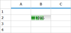
PushButton cell type
To display a Push Button in a grid cell, use the PushButton cell type. The appearance of the button can be changed by using the CellAppearance property.Use the Description property of the cell style to specify the text that is to be displayed on the button.
this.gridControl1[2, 2].CellType = GridCellTypeName.PushButton;
this.gridControl1[2, 2].CellAppearance = GridCellAppearance.Flat;
this.gridControl1[2, 2].Description = "Flat Appearance";

this.gridControl1[4, 2].CellType = GridCellTypeName.PushButton;
this.gridControl1[4, 2].CellAppearance = GridCellAppearance.Sunken;
this.gridControl1[4, 2].Description = "Sunken Appearance";

this.gridControl1[6, 2].CellType = GridCellTypeName.PushButton;
this.gridControl1[6, 2].CellAppearance = GridCellAppearance.Raised;
this.gridControl1[6, 2].Description = "Raised Appearance";Me.gridControl1(2, 2).CellType = GridCellTypeName.PushButton
Me.gridControl1(2, 2).CellAppearance = GridCellAppearance.Flat
Me.gridControl1(2, 2).Description = "Flat Appearance"
Me.gridControl1(4, 2).CellType = GridCellTypeName.PushButton
Me.gridControl1(4, 2).CellAppearance = GridCellAppearance.Sunken
Me.gridControl1(4, 2).Description = "Sunken Appearance"
Me.gridControl1(6, 2).CellType = GridCellTypeName.PushButton
Me.gridControl1(6, 2).CellAppearance = GridCellAppearance.Raised
Me.gridControl1(6, 2).Description = "Raised Appearance"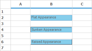
GridControl provides CellButtonClicked event which gets fired whenever the button is being clicked.
gridControl1.CellButtonClicked += new GridCellButtonClickedEventHandler(gridControl1_CellButtonClicked);

//...
private void gridControl1_CellButtonClicked(object sender, GridCellButtonClickedEventArgs e)
   {
       string s = string.Format("You clicked ({0},{1}).", e.RowIndex, e.ColIndex);
       MessageBox.Show(s);
   }
AddHandler GridControl1.CellButtonClicked, AddressOf gridControl1_CellButtonClicked
'...
Private Sub gridControl1_CellButtonClicked(sender As Object, e As GridCellButtonClickedEventArgs)
Dim s As String = String.Format("You clicked ({0},{1}).", e.RowIndex, e.ColIndex)
MessageBox.Show(s)
End SubRichTextBox cell type
The RichTextBox control will allow to display and edit rich text in grid cells. To make use of this control set the cell type as GridCellTypeName.RichTextBox.
GridStyleInfo style = gridControl1.Model[2, 2];
style.CellType = GridCellTypeName.RichText;
Dim style As GridStyleInfo = gridControl1.Model(2, 2)
style.CellType = GridCellTypeName.RichText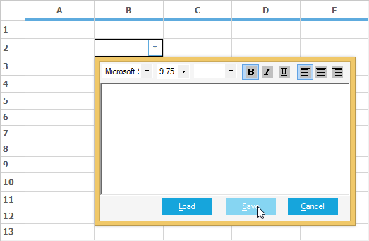
OriginalTextBox cell type
This cell type is used to show the text in a grid cell, it is derived from the System.Windows.Forms.TextBox control. CharacterCasing works only with this cell type. The RichTextBox cell type does not have CharacterCasing property.
//Set the OriginalTextBox cell for entire table.
this.gridControl1.TableStyle.CellType = GridCellTypeName.OriginalTextBox;

//Display text in upper case.
this.gridControl1.TableStyle.CharacterCasing = CharacterCasing.Upper;
'Set the OriginalTextBox cell for entire table.
Me.gridControl1.TableStyle.CellType = GridCellTypeName.OriginalTextBox
'Display text in upper case.
Me.gridControl1.TableStyle.CharacterCasing = CharacterCasing.Upper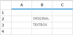
Creating a Custom Cell Type
Apart from the built in custom cell types given by the GridControl, it is also possible to create an own cell type in GridControl. In GridControl each cell has been created by GridCellModelBase and GridCellRendererBase
So every custom cell type also requires a model base class and a renderer base class. The Model class handles the serialization of the control and creates the renderer for the custom control. The renderer class handles the UI requirements of the cell.
To use a custom cell type in a GridControl, it is necessary to register this cell type with the GridControl. In the end of this session you will be able to create a simple custom cell type for the GridControl.
For creating a custom cell type, the below methods has to be followed.
- Creating Cell Model
- Creating Cell Renderer
- Registering cell model into a control
- Assigning cell types in Grid Cells
Creating cell model
For creating any Model base class you have to inherit the GridCellModelBase class. The main function of GridCellModelBase derived class is to serialize your control. It can hold any persistent state independent data that your control uses.
Another major function of this class is to create cell renderer object for the custom cell type. In fact, the only required override in GridCellModelBase derived class is the CreateRenderer method. In that override, it is possible to create and return GridCellRendererBase derived object that would handle the user interactions in new custom cell type.
In general, it is unlikely to derive directly from the base class. Instead of that, override an existing GridControl derived class such as GridStaticCellModel. The following code example illustrates this.
//Defines custom Cell Model by inheriting GridStaticCellModel.
public class LinkLabelCellModel : GridStaticCellModel
{
    protected LinkLabelCellModel(SerializationInfo info, StreamingContext context)
        : base(info, context)
    {
    }
    public LinkLabelCellModel(GridModel grid)
        : base(grid)
    {
    }

    //Overrides CreateRenderer Method to create CellRenderer object.

    public override GridCellRendererBase CreateRenderer(GridControlBase control)
    {
        return new LinkLabelCellRenderer(control, this);
    }
 }
'Defines custom Cell Model by inheriting GridStaticCellModel.
Public Class LinkLabelCellModel
Inherits GridStaticCellModel
Protected Sub New(ByVal info As SerializationInfo, ByVal context As StreamingContext)
MyBase.New(info, context)
End Sub
Public Sub New(ByVal grid As GridModel)
MyBase.New(grid)
End Sub
'Overrides CreateRenderer Method to create CellRenderer object.
Public Overrides Function CreateRenderer(ByVal control As GridControlBase) As GridCellRendererBase
Return New LinkLabelCellRenderer(control, Me)
End Function
End ClassCreating cell renderer
GridCellRendererBase class has to be inherited for creating any renderer base class. This base class handles drawing of the cell and user interaction aspects of the cell architecture.
This renderer class will take care of the handling of mouse and keyboard messages, also the UI related changes. It is necessary to override the required methods and properties and modify them as per your needs.
In general, it is unlikely to derive directly from the GridCellRendererBase class. Instead of that, override an existing GridControl derived class such as GridStaticModel, GridGenericControlCellModel etc.
public class LinkLabelCellRenderer : GridStaticCellRenderer
{
    private bool _isMouseDown;
    private bool _drawHotLink;
    private Color _hotColor;
    private Color _visitedColor;
    private string _EXEName;

    public LinkLabelCellRenderer(GridControlBase grid, GridCellModelBase cellModel)
        : base(grid, cellModel)
    {
        _isMouseDown = false;
        _drawHotLink = false;

        _hotColor = Color.Red;
        _visitedColor = Color.Purple;

        _EXEName = "iexplore.exe";
    }

    public Color VisitedLinkColor
    {
        get { return _visitedColor; }
        set { _visitedColor = value; }
    }

    public Color ActiveLinkColor
    {
        get { return _hotColor; }
        set { _hotColor = value; }
    }

    public string EXEName
    {
        get { return _EXEName; }
        set { _EXEName = value; }
    }

    protected virtual void LaunchBrowser(GridStyleInfo style)
    {
        try
        {
            System.Diagnostics.Process process = new System.Diagnostics.Process();
            process.StartInfo.FileName = EXEName;
            process.StartInfo.Arguments = (string)style.Tag;
            process.Start();
        }
        catch (Exception ex)
        {
            MessageBox.Show("Error: " + ex.ToString());
        }

    }

    private void DrawLink(bool useHotColor, int rowIndex, int colIndex)
    {

        if (useHotColor)
            _drawHotLink = true;

        this.Grid.RefreshRange(GridRangeInfo.Cell(rowIndex, colIndex), GridRangeOptions.None);

        _drawHotLink = false;
    }

    protected override void OnMouseDown(int rowIndex, int colIndex, System.Windows.Forms.MouseEventArgs e)
    {
        base.OnMouseDown(rowIndex, colIndex, e);
        DrawLink(true, rowIndex, colIndex);
        _isMouseDown = true;
    }

    protected override void OnMouseUp(int rowIndex, int colIndex, System.Windows.Forms.MouseEventArgs e)
    {
        base.OnMouseUp(rowIndex, colIndex, e);
        int row, col;
        this.Grid.PointToRowCol(new Point(e.X, e.Y), out row, out col);

        if (row == rowIndex && col == colIndex)
        {
            GridStyleInfo style = this.Grid.Model[row, col];
            LaunchBrowser(style);
            style.TextColor = VisitedLinkColor;
        }
        DrawLink(false, rowIndex, colIndex);
        _isMouseDown = false;
    }

    protected override void OnCancelMode(int rowIndex, int colIndex)
    {
        base.OnCancelMode(rowIndex, colIndex);
        _isMouseDown = false;
        _drawHotLink = false;
    }

    protected override System.Windows.Forms.Cursor OnGetCursor(int rowIndex, int colIndex)
    {

        //If over cell, return HandPointerCursor otherwise NoCursor.
        Point pt = this.Grid.PointToClient(Cursor.Position);
        int row, col;
        this.Grid.PointToRowCol(pt, out row, out col);

        return (row == rowIndex && col == colIndex) ? Cursors.Hand : (this._isMouseDown) ? Cursors.No : base.OnGetCursor(rowIndex, colIndex);
    }

    protected override int OnHitTest(int rowIndex, int colIndex, MouseEventArgs e, IMouseController controller)
    {
        //Return a nonzero so the mouse messages will be forwarded to the cell render

        //But do not include the cell borders so D&D can be handled

        if (controller != null && controller.Name == "OleDataSource")

            // Other controllers have higher priority than me
            return 0;

        return 1;

    }

    protected override void OnDraw(System.Drawing.Graphics g, System.Drawing.Rectangle clientRectangle, int rowIndex, int colIndex, Syncfusion.Windows.Forms.Grid.GridStyleInfo style)
    {
        style.Font.Underline = true;

        if (_drawHotLink)
        {
            style.TextColor = ActiveLinkColor;
        }
        base.OnDraw(g, clientRectangle, rowIndex, colIndex, style);

    }

    protected override void OnMouseHoverEnter(int rowIndex, int colIndex)
    {
        base.OnMouseHoverEnter(rowIndex, colIndex);
        DrawLink(true, rowIndex, colIndex);
    }

    protected override void OnMouseHoverLeave(int rowIndex, int colIndex, System.EventArgs e)
    {
        base.OnMouseHoverLeave(rowIndex, colIndex, e);
        DrawLink(false, rowIndex, colIndex);
    }

}
Public Class LinkLabelCellRenderer
Inherits GridStaticCellRenderer
Private _isMouseDown As Boolean
Private _drawHotLink As Boolean
Private _hotColor As Color
Private _visitedColor As Color
Private _EXEName As String
Public Sub New(ByVal grid As GridControlBase, ByVal cellModel As GridCellModelBase)
MyBase.New(grid, cellModel)
_isMouseDown = False
_drawHotLink = False
_hotColor = Color.Red
_visitedColor = Color.Purple
_EXEName = "iexplore.exe"
End Sub
Public Property VisitedLinkColor() As Color
Get
Return _visitedColor
End Get
Set(ByVal value As Color)
_visitedColor = value
End Set
End Property
Public Property ActiveLinkColor() As Color
Get
Return _hotColor
End Get
Set(ByVal value As Color)
_hotColor = value
End Set
End Property
Public Property EXEName() As String
Get
Return _EXEName
End Get
Set(ByVal value As String)
_EXEName = value
End Set
End Property
Protected Overridable Sub LaunchBrowser(ByVal style As GridStyleInfo)
Try
Dim process As New System.Diagnostics.Process()
process.StartInfo.FileName = EXEName
process.StartInfo.Arguments = CStr(style.Tag)
process.Start()
Catch ex As Exception
MessageBox.Show("Error: " & ex.ToString())
End Try
End Sub
Private Sub DrawLink(ByVal useHotColor As Boolean, ByVal rowIndex As Integer, ByVal colIndex As Integer)
If useHotColor Then
_drawHotLink = True
End If
Me.Grid.RefreshRange(GridRangeInfo.Cell(rowIndex, colIndex), GridRangeOptions.None)
_drawHotLink = False
End Sub
Protected Overrides Sub OnMouseDown(ByVal rowIndex As Integer, ByVal colIndex As Integer, ByVal e As System.Windows.Forms.MouseEventArgs)
MyBase.OnMouseDown(rowIndex, colIndex, e)
DrawLink(True, rowIndex, colIndex)
_isMouseDown = True
End Sub
Protected Overrides Sub OnMouseUp(ByVal rowIndex As Integer, ByVal colIndex As Integer, ByVal e As System.Windows.Forms.MouseEventArgs)
MyBase.OnMouseUp(rowIndex, colIndex, e)
Dim row, col As Integer
Me.Grid.PointToRowCol(New Point(e.X, e.Y), row, col)
If row = rowIndex AndAlso col = colIndex Then
Dim style As GridStyleInfo = Me.Grid.Model(row, col)
LaunchBrowser(style)
style.TextColor = VisitedLinkColor
End If
DrawLink(False, rowIndex, colIndex)
_isMouseDown = False
End Sub
Protected Overrides Sub OnCancelMode(ByVal rowIndex As Integer, ByVal colIndex As Integer)
MyBase.OnCancelMode(rowIndex, colIndex)
_isMouseDown = False
_drawHotLink = False
End Sub
Protected Overrides Function OnGetCursor(ByVal rowIndex As Integer, ByVal colIndex As Integer) As System.Windows.Forms.Cursor
'If over cell, return HandPointerCursor otherwise NoCursor...
Dim pt As Point = Me.Grid.PointToClient(Cursor.Position)
Dim row, col As Integer
Me.Grid.PointToRowCol(pt, row, col)
Return If((row = rowIndex AndAlso col = colIndex), Cursors.Hand, If((Me._isMouseDown), Cursors.No, MyBase.OnGetCursor(rowIndex, colIndex)))
End Function
Protected Overrides Function OnHitTest(ByVal rowIndex As Integer, ByVal colIndex As Integer, ByVal e As MouseEventArgs, ByVal controller As IMouseController) As Integer
'Return a nonzero so the mouse messages will be forwarded to the cell render
'But do not include the cell borders so D&D can be handled
If controller IsNot Nothing AndAlso controller.Name = "OleDataSource" Then
' Other controllers have higher priority than me
Return 0
End If
Return 1
End Function
Protected Overrides Sub OnDraw(ByVal g As System.Drawing.Graphics, ByVal clientRectangle As System.Drawing.Rectangle, ByVal rowIndex As Integer, ByVal colIndex As Integer, ByVal style As Syncfusion.Windows.Forms.Grid.GridStyleInfo)
style.Font.Underline = True
If _drawHotLink Then
style.TextColor = ActiveLinkColor
End If
MyBase.OnDraw(g, clientRectangle, rowIndex, colIndex, style)
End Sub
Protected Overrides Sub OnMouseHoverEnter(ByVal rowIndex As Integer, ByVal colIndex As Integer)
MyBase.OnMouseHoverEnter(rowIndex, colIndex)
DrawLink(True, rowIndex, colIndex)
End Sub
Protected Overrides Sub OnMouseHoverLeave(ByVal rowIndex As Integer, ByVal colIndex As Integer, ByVal e As System.EventArgs)
MyBase.OnMouseHoverLeave(rowIndex, colIndex, e)
DrawLink(False, rowIndex, colIndex)
End Sub
End ClassNOTE
For a sample implementation of a derived cell control that is based on the existing Static cell control, make use of the dashboard sample: <Installed Location>\Syncfusion\EssentialStudio\<Installed Version>\Windows\Grid.Windows\Samples\Custom Cell Types\Getting Started\
Registering cell model
After creating the Cell model and Cell Renderer for the custom cell type it is necessary to register that custom cell type to the GridControl. For registering make use of the CellModels.Add method and assign a name for the cell type in this method, like the below code.
// Registering the cell type LinkLabelCell to the GridControl.
gridControl1.CellModels.Add("LinkLabelCell", new LinkLabelCellModel(gridControl1.Model));
' Registering the cell type LinkLabelCell to the GridControl.
gridControl1.CellModels.Add("LinkLabelCell", New LinkLabelCellModel(gridControl1.Model))Assigning cell types
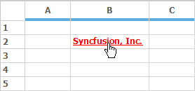
Assign the registered cell type to a GridControl like a normal cell type. The custom cell type LinkLabelCell acts as a hyperlink. The link for the LinkLabelCell will be assigned in the Tag property of that cell. This cell displays the ordinary text, but on clicking it will relocate to the link given in the Tag.
RegisterCellModel.GridCellType(gridControl1, CustomCellTypes.LinkLabelCell);
gridControl1[2, 2].CellType = CustomCellTypes.LinkLabelCell.ToString();
gridControl1[2, 2].Text = "Syncfusion, Inc.";
gridControl1[2, 2].Font.Bold = true;
gridControl1[2, 2].Tag = "http://www.syncfusion.com";RegisterCellModel.GridCellType(gridControl1, CustomCellTypes.LinkLabelCell)
gridControl1(2, 2).CellType = CustomCellTypes.LinkLabelCell.ToString()
gridControl1(2, 2).Text = "Syncfusion, Inc."
gridControl1(2, 2).Font.Bold = True
gridControl1(2, 2).Tag = "http://www.syncfusion.com"