How can I help you?
Getting Started with Windows Forms Grid Control
21 Jan 202518 minutes to read
This section will explain about creating simple Windows Forms GridControl and the overview of its basic functionalities.
Choosing the Best Grid
Essential® Grid includes a trio of grid controls as well as many other controls that are used in conjunction with these three grids. Essential® Grid works similar to Microsoft Excel and allows extremely detailed customization down to the cell level. Multi-level Undo / Redo, Shared Scrollbar support, Data / View separation, floating cells, more than 15 cell types, and unmatched extensibility are the unique features of the Essential® Grid.
GridGroupingControl: A high performance grouping grid that offers very flexible support for grouping flat data sources as well as hierarchical data sources. This grid supports expressions fields, filters, multi-column sorting, grouping, nested tables/hierarchies, and custom summaries. It can use any IList data source including ADO.NET DataSet/DataTables and IBindingList objects.
GridDataBoundGrid: A column oriented grid best suited for use with ADO.NET DataSet/DataTables data sources. If you are looking to bind with the ADO.NET data source without the grouping and hierarchical support then you can use GridDataBoundGrid. GridDataBoundGrid is marked as classic because all the features mentioned in this are available in GridGroupingControl with more efficiency and features.
GridControl: A cell oriented grid that contain its own data. Does not need to be bound to a data source. Easily customize down to the cell level. Used in a virtual manner such that, it can bind to any type of data source.
SfDataGrid: Designed based on column-oriented architecture that provides support to customize the grid easily. Used to display collection of data in rows and columns.
|
Control |
Grouping |
Sorting |
Summary |
Filtering |
Export |
|---|---|---|---|---|---|
|
GGC |
Yes |
Yes |
Yes |
Yes |
Yes |
|
GDBG |
- |
Yes |
- |
Yes |
Yes |
|
GC |
- |
* |
- |
* |
Yes |
|
SfDataGrid |
Yes |
Yes |
Yes |
Yes |
Yes |
NOTE
The ‘*’ is denotes that by default the support is not provided to the Control. It will be added by having some customizations. The Sorting and Filtering supports can be added to the
GridControlusing the customizations.
For binding the different kind of data sources and support for filtering, sorting, grouping for flat and hierarchical data sources make use of the GridGroupingControl.
If user wants a cell oriented grid that can contain its own data and does not need to be bound to a data source then GridControl is the best choice
If the user wants the support for filtering, sorting, grouping, summary calculation and hierarchical data sources with the blazing performance, the SfDataGrid control is one of the best choice.
Assembly Deployment
Refer control dependencies section to get the list of assemblies or NuGet package needs to be added as reference to use the control in any application.
Configuring a Simple GridControl
This section explains about creating Simple GridControl with some basic functionalities of it.
Adding GridControl through Designer
Windows Forms Grid Control can be added through designer by following the below steps.
- Create a new Windows Form Application.
-
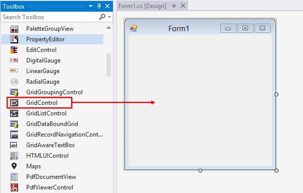
Drag and Drop GridControl from the toolbox into the designer page.
-
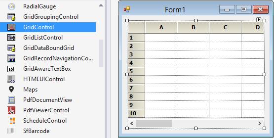
Once you drag drop the GridControl into the designer page, the GridControl will be added successfully into the application with the required libraries. The below mentioned assemblies will be added automatically into the application.
- Syncfusion.Grid.Base.dll
- Syncfusion.Grid.Windows.dll
- Syncfusion.Shared.Base.dll
- Syncfusion.Shared.Windows.dll
Adding GridControl through Code
Windows Forms GridControl can be added through code-behind by following the below steps.
-
Create a new Windows Form Application.
-
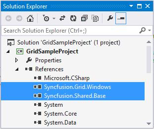
Add the below assemblies into the project file
-
Syncfusion.Grid.Windows.dll
-
Syncfusion.Shared.Base.dll
-
-
Initialize a
GridControlby using the below code in code behind.
//Initializing a new Grid.
    private Syncfusion.Windows.Forms.Grid.GridControl gridControl1 = new Syncfusion.Windows.Forms.Grid.GridControl();
'Initializing a new Grid.
Private gridControl1 As New Syncfusion.Windows.Forms.Grid.GridControl()- Use the below code for adding the initialized GridControl to the application.
//Add required size for the Grid.
   this.gridControl1.Size = new System.Drawing.Size(344, 250);

   this.Controls.Add(this.gridControl1);
'Add required size for the Grid.
Me.gridControl1.Size = New System.Drawing.Size(344, 250)
Me.Controls.Add(Me.gridControl1)Populating Data
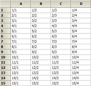
Windows Forms GridControl is a cell based control and hence to populate the GridControl, RowCount and ColCount are necessary. By default the RowCount and ColCount values are 10. Data can be populated by any one of the following methods.
- Populate data by looping through cells in GridControl.
//Specifying row and column count
   gridControl1.RowCount = 15;

   gridControl1.ColCount = 4;

   //Looping through the cells and assigning the values based on row and column index
   for (int row = 1; row <= gridControl1.RowCount; row++)
   {
       for (int col = 1; col <= gridControl1.ColCount; col++)
       {
           gridControl1.Model[row, col].CellValue = string.Format("{0}/{1}", row, col);
       }
   }
'Specifying row and column count
gridControl1.RowCount = 15
gridControl1.ColCount = 4
'Looping through the cells and assigning the values based on row and column index
For row As Integer = 1 To gridControl1.RowCount
For col As Integer = 1 To gridControl1.ColCount
gridControl1.Model(row, col).CellValue = String.Format("{0}/{1}", row, col)
Next col
Next row- Populate data by using PopulateValues method. This method will allow you to pass in a range of cells of type GridRangeInfo and data source of type object.
//Specifying row and column count
   gridControl1.RowCount = 15;

   gridControl1.ColCount = 4;

   //DataTable and other related binding types can be populated in GridControl

   //Data type of string array has been created here.
   string[,] table = new string[this.gridControl1.RowCount, this.gridControl1.ColCount];
   for (int row = 1; row <= this.gridControl1.RowCount; ++row)
   for (int col = 1; col <= this.gridControl1.ColCount; ++col)
   table[row - 1, col - 1] = string.Format("{0}/{1}", row, col);

   //Populating values using PopulateValues method
   this.gridControl1.PopulateValues(
   GridRangeInfo.Cells(1, 1, this.gridControl1.RowCount, this.gridControl1.ColCount),
   table);
'Specifying row and column count
gridControl1.RowCount = 15
gridControl1.ColCount = 4
'DataTable and other related binding types can be populated in GridControl
'Data type of string array has been created here.
Dim table(Me.gridControl1.RowCount - 1, Me.gridControl1.ColCount - 1) As String
For row As Integer = 1 To Me.gridControl1.RowCount
For col As Integer = 1 To Me.gridControl1.ColCount
table(row - 1, col - 1) = String.Format("{0}/{1}", row, col)
Next col
Next row
'Populating values using PopulateValues method
Me.gridControl1.PopulateValues(GridRangeInfo.Cells(1, 1, Me.gridControl1.RowCount, Me.gridControl1.ColCount), table)- Populate Data using QueryCellInfo event of the GridControl. This will load the data virtually ensuring the optimized performance. The data will be loaded in an on-demand basis. This will be discussed briefly in the Virtual Grid section.
//Specifying row and column count
   gridControl1.Model.RowCount = 15;

   gridControl1.Model.ColCount = 4;

   this.gridControl1.QueryCellInfo += gridControl1_QueryCellInfo;

   //Assigning values by handling the QueryCellInfo event
   void gridControl1_QueryCellInfo(object sender, GridQueryCellInfoEventArgs e)
   {
   if (e.RowIndex > 0 && e.ColIndex > 0)
   {
   e.Style.CellValue = string.Format("{0}/{1}", e.RowIndex, e.ColIndex);
   }
   }
'Specifying row and column count
gridControl1.Model.RowCount = 15
gridControl1.Model.ColCount = 4
AddHandler Me.gridControl1.QueryCellInfo, AddressOf gridControl1_QueryCellInfo
'Assigning values by handling the QueryCellInfo event
void gridControl1_QueryCellInfo(Object sender, GridQueryCellInfoEventArgs e)
If e.RowIndex > 0 AndAlso e.ColIndex > 0 Then
e.Style.CellValue = String.Format("{0}/{1}", e.RowIndex, e.ColIndex)
End IfFinal Look of the Grid:
Cell Styles
In Windows Forms GridControl, each cell contains distinct style information and can be displayed independently of other cells. GridControl uses GridStyleInfo objects to store state information about the appearance of a grid cell. So attributes like font, back color, cell value and cell types are all reflected in a single GridStyleInfo object.
Modifying Cell Styles through Designer
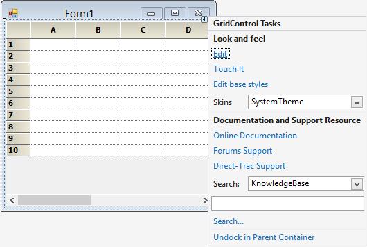
To edit the cell styles in Designer mode, the grid has to be selected in the designer mode and Edit option has to be clicked. This will allow the grid to be edited in the designer surface. Style settings also can be changed by using the PropertyGrid which is visible in the right side.
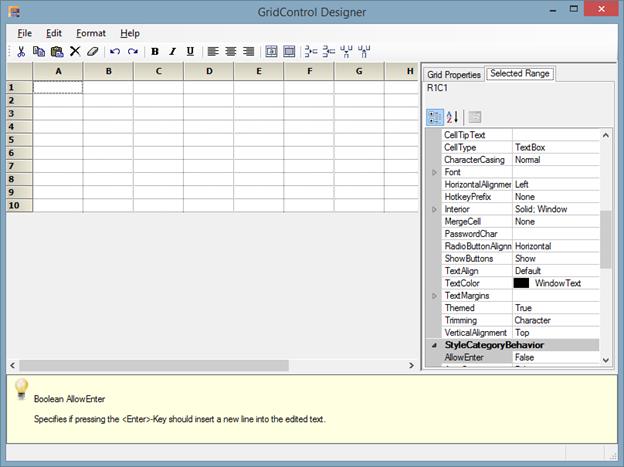
In property grid, there are two tabs mainly.
- Grid Properties.
- Selected Range.
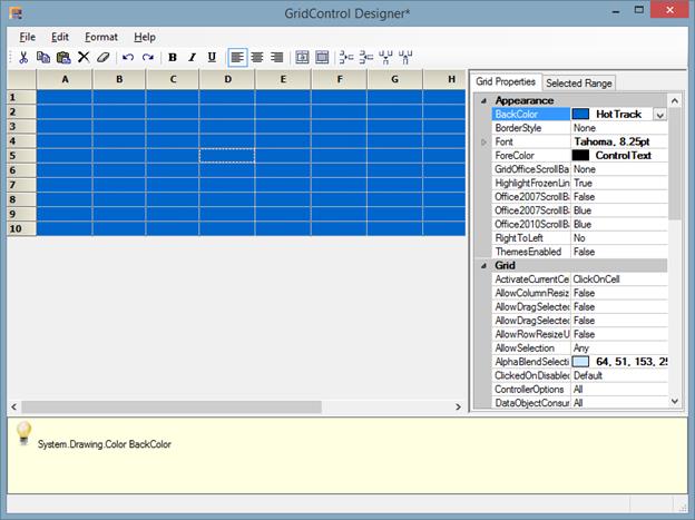
Grid Properties tab consists of all the properties related to the whole grid. The Appearance and style related settings can be changed for the whole grid.
All the style related properties for the whole grid will be displayed in this tab. If back color of the whole grid needs to be changed, then the BackColor property listed under the heading Appearance can be used and required color can be chosen.
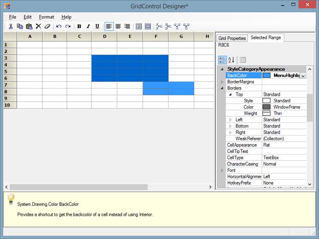
Selected Range tab consists of all the properties related to a particular cell or selected range of cells. The style and format related properties can be changed for the desired range of cells.
When you need to change the back color for the selected range of cells, then select the required cells and use the BackColor property listed under the heading StyleCategoryAppearance and required color can be chosen.
Modifying Cell Styles through Code
Values can be entered into the GridControl by using the GridRangeInfo class and properties of GridStyleInfo class. By using the GridStyleInfo class, the appearance of the cell can be customized and by using the ChangeCells method, the style can be assigned to the desired range of cells.
//Creates GridStyleInfo object.
GridStyleInfo style = new GridStyleInfo();

//Set properties to it.
style.BackColor = Color.DarkGreen;
style.TextColor = Color.White;
style.Font.Facename = "Verdana";
style.Font.Bold = true;
style.Font.Size = 9f;

//Apply the style to desired range of cells.
this.gridControl1.ChangeCells(GridRangeInfo.Cells(2, 2, 4, 2), style);
'Creates GridStyleInfo object.
Dim style As New GridStyleInfo()
'Set properties to it.
style.BackColor = Color.DarkGreen
style.TextColor = Color.White
style.Font.Facename = "Verdana"
style.Font.Bold = True
style.Font.Size = 9f
'Apply the style to desired range of cells.
Me.gridControl1.ChangeCells(GridRangeInfo.Cells(2, 2, 4, 2), style)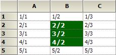
Selection
Windows Forms GridControl provides two types of selection namely Range selection and Record selection. Range selection also known as cell based selection is used to select a range of cells, rows and columns in grid. Record selection which is also known as record based selection is used to select a single record or a range of records at a time in a grid.
For selecting single row or multiple range of rows in GridControl, set the ListBoxSelectionMode property value as Single, MultiSimple or MultiExtended respectively. By default the value is None.
this.gridControl1.ListBoxSelectionMode = SelectionMode.None;Me.gridControl1.ListBoxSelectionMode = SelectionMode.NoneFor selecting the range of cells in GridControl, set the AllowSelection property to the appropriate value from the GridSelectionFlags enumeration.
this.gridControl1.AllowSelection = Syncfusion.Windows.Forms.Grid.GridSelectionFlags.Any;Me.gridControl1.AllowSelection = Syncfusion.Windows.Forms.Grid.GridSelectionFlags.AnySelection operation can be handled by using SelectionChanging and SelectionChanged events.
Editing
By default the GridControl is in editable state. Editing can be enabled or disabled by using the ReadOnly property. This property can be applied for whole grid as well as cell by cell basis.
// Disabling Edit mode for the whole Grid.
this.gridControl1.ReadOnly = false.

// Disabling edit mode for a particular cell.
GridStyleInfo style = gridControl1.Model[2, 2];

style.ReadOnly = false;
'Disabling Edit mode for the whole Grid.
Me.gridControl1.ReadOnly = False.
'Disabling edit mode for a particular cell.
Dim style As GridStyleInfo = gridControl1.Model(2, 2)
style.ReadOnly = FalseEditing operation can be customized by using CurrentCellStartEditing and CurrentCellEditingComplete events.
NOTE
You can also explore our WinForms Grid control example that shows how to render the Grid control in Windows Forms.