Microsoft Excel Like Features in Windows Forms Grid Control
21 Jan 202521 minutes to read
The Windows Forms Grid Control provides some of the functionalities of Microsoft Excel as the features. This section will walk through the implementation of these features.
Excel Like Selection Frame
To enable excel like selection frame in the grid, the ExcelLikeSelectionFrame property can be used. This enables the selected cells in a frame to be highlighted.
//Enable the Excel like selection frame to the GridControl
this.gridControl1.ExcelLikeSelectionFrame = true;
'Enable the Excel like selection frame to the GridControl
Me.gridControl1.ExcelLikeSelectionFrame = True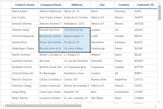
2016 Excel like Selection Frame
2016 Excel like selection frame can be enabled by setting the ExcelLikeSelectionFrame and ExcelLikeCurrentCell properties to true. The SelectionFrameOption property can be used to enable the 2016 Excel like selection frame or 2003 Excel like selection fame by using SelectionFrameOption enumeration. The default value of the SelectionFrameOption property is SelectionFrameOption.Excel2016.
The SelectionFrameOption enumeration has the following types of selection frame options,
SelectionFrameOption.Excel2003 - It is used the enable the 2003 Excel like selection frame for the grid.
SelectionFrameOption.Excel2016 - It is used the enable the 2016 Excel like selection frame for the grid.
//Enable the Excel like selection frame to grid
this.gridControl1.ExcelLikeSelectionFrame = true;

//Enable Excel like current cell to grid
this.gridControl1.ExcelLikeCurrentCell = true;
'Enable the Excel like selection frame to grid
Me.gridControl1.ExcelLikeSelectionFrame = True
'Enable Excel like current cell to grid
Me.gridControl1.ExcelLikeCurrentCell = True
Changing the Selection Border Brush
The selection border brush for 2016 Excel like selection frame can be changed by using the SelectionBorderBrush property.
//Sets the selection border brush for 2016 Excel-like selection frame.
this.gridControl1.Model.Options.SelectionBorderBrush = new SolidBrush(Color.DarkGreen);
'Sets the selection border brush for 2016 Excel-like selection frame.
Me.gridControl1.Model.Options.SelectionBorderBrush = New SolidBrush(Color.DarkGreen)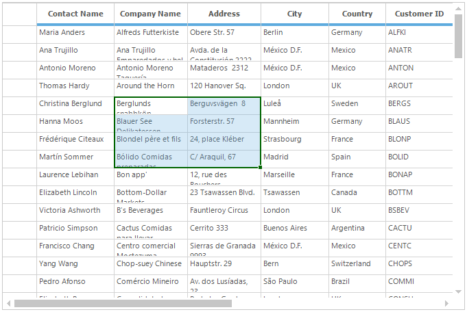
Changing the Selection Border Thickness
The selection border thickness for 2016 Excel like selection frame can be changed by using the SelectionBorderThickness property.
//Set the selection border thickness for 2016 Excel-like selection frame.
this.gridControl1.Model.Options.SelectionBorderThickness = 4;
'Set the selection border thickness for 2016 Excel-like selection frame.
Me.gridControl1.Model.Options.SelectionBorderThickness = 4
Setting the 2003 Excel like Selection Frame
2003 Excel like selection frame can be enabled by setting the SelectionFrameOption property to SelectionFrameOption.Excel2003.
//Enable the 2003 Excel like selection frame.
this.gridControl1.Model.Options.SelectionFrameOption = SelectionFrameOption.Excel2003;
'Enable the 2003 Excel like selection frame.
Me.gridControl1.Model.Options.SelectionFrameOption = SelectionFrameOption.Excel2003
Excel-like Current Cell
To have the Excel-Like current cell in the Windows Forms GridControl, set the ExcelLikeCurrentCell property to true. When the current cell moves out of a selected range, then the range will be cleared. Whereas the current cell can be moved inside a selected range, the range will be stayed.
//Enable Excel like current cell in Grid
this.gridControl1.ExcelLikeCurrentCell = true;
'Enable Excel like current cell in Grid
Me.gridControl1.ExcelLikeCurrentCell = True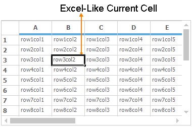
Excel-like Alignments
In Excel, by default the strings are aligned to left and the integer, double or decimal values are aligned to the right side of the cell. The text alignments in grid cells can be similar to text alignment in Excel cells by setting the ExcelLikeAlignment property to true.
//Enable Excel-Like Alignment to the Grid control
this.gridControl1.ExcelLikeAlignment = true;
'Enable Excel-Like Alignment to the Grid control
Me.gridControl1.ExcelLikeAlignment = True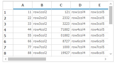
Work Book
The Windows Forms GridControl can be used like workbook in Excel. This can be achieved by adding the TabBarSplitterControl to the form. In this control, add the number of TabBarPage (work sheets) to be shown in the workbook. Fill each page with the GridControl to look like the work sheets in excel. The following code snippet will perform the above process,
//Creating Tab pages

//TabBarPage tabBarPage = new Syncfusion.Windows.Forms.TabBarPage();

//Add TabBarPage to the TabBarSplitterControl
this.tabBarSplitterControl1.Controls.Add(this.tabBarPage1);
this.tabBarSplitterControl1.Controls.Add(this.tabBarPage2);
this.tabBarSplitterControl1.Controls.Add(this.tabBarPage3);

//Adding Grid control to the Tab bar pages
this.tabBarPage1.Controls.Add(gridcontrol1);
this.tabBarPage2.Controls.Add(gridControl2);
this.tabBarPage3.Controls.Add(gridControl3);
'Creating Tab pages
'Dim tabBarPage As TabBarPage = New Syncfusion.Windows.Forms.TabBarPage()
'Add TabBarPage to the TabBarSplitterControl
Me.tabBarSplitterControl1.Controls.Add(Me.tabBarPage1)
Me.tabBarSplitterControl1.Controls.Add(Me.tabBarPage2)
Me.tabBarSplitterControl1.Controls.Add(Me.tabBarPage3)
'Adding Grid control to the Tab bar pages
Me.tabBarPage1.Controls.Add(gridcontrol1)
Me.tabBarPage2.Controls.Add(gridControl2)
Me.tabBarPage3.Controls.Add(gridControl3)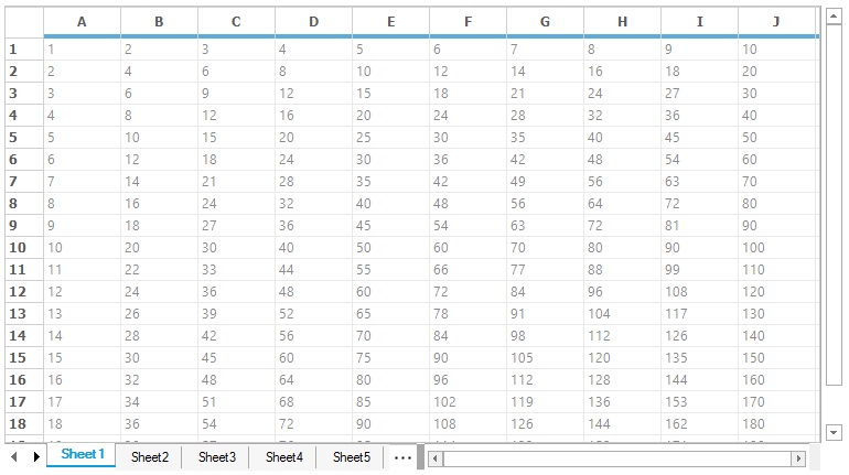
Excel-like Comment Tip
Excel-like cell comment tips can be included in the GridControl by implementing theIMouseController interface. The GridExcelTipStyleProperties class is used to define the Excel-Like comment tip for the cell. To add, delete or modify the comment, right-click on the cell or left-click the red corner.
//Code for add Comment tip
private ExcelTip.CommentMouseController commentMouseController1;

//Create the Comment mouse controller.
this.commentMouseController1 = new ExcelTip.CommentMouseController(gridControl1);

//Allow context menu to edit/add comments
this.commentMouseController1.ContextMenuEnabled = true;

//Register the controller
gridControl1.MouseControllerDispatcher.Add(commentMouseController1);

//Set the comment using custom style property, ExcelTipText
ExcelTip.GridExcelTipStyleProperties style = new ExcelTip.GridExcelTipStyleProperties(gridControl1[2, 2]);
style.ExcelTipText = "Comment for cell 2,2.";
'Code for add Comment tip
Private commentMouseController1 As ExcelTip.CommentMouseController
'Create the Comment mouse controller.
Me.commentMouseController1 = New ExcelTip.CommentMouseController(gridControl1)
'Allow context menu to edit/add comments
Me.commentMouseController1.ContextMenuEnabled = True
'Register the controller
gridControl1.MouseControllerDispatcher.Add(commentMouseController1)
'Set the comment using custom style property, ExcelTipText
Dim style As New ExcelTip.GridExcelTipStyleProperties(gridControl1(2, 2))
style.ExcelTipText = "Comment for cell 2,2."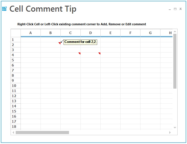
For more details about the Excel-Like comment tip, refer the following dashboard sample,
<Install Location> \Syncfusion\EssentialStudio[Version Number]\Windows\Grid.Windows\Samples\ToolTip\Cell Comment Tip Demo
Splitter
Splitter is used to display the multiple view of the grid. This Microsoft Excel-like feature enables the user to view more than one copy of a worksheet and scroll through each pane of worksheet independently. The panes are working simultaneously, i.e., the changes made in one pane are reflected in the other.
The splitter can be scrolled by placing the mouse pointer over it, holding down the left mouse button and dragging it to the required position. It can be split horizontally and vertically.
//Adding GridControl to the SplitterControl
this.splitterControl1.Controls.Add(this.gridControl);

//Events triggered while creating and closing the splitter pane
this.splitterControl1.PaneCreated += splitterControl1_PaneCreated;
this.splitterControl1.PaneClosing += splitterControl1_PaneClosing;

void splitterControl1_PaneClosing(object sender, SplitterPaneEventArgs e)
{
    Console.WriteLine("Splitter pane is closing");
}

void splitterControl1_PaneCreated(object sender, SplitterPaneEventArgs e)
{
    Console.WriteLine("Splitter pane is created");
}
'Adding GridControl to the SplitterControl
Me.splitterControl1.Controls.Add(Me.gridControl)
'Events triggered while creating and closing the splitter pane
Me.splitterControl1.PaneCreated += splitterControl1_PaneCreated
Me.splitterControl1.PaneClosing += splitterControl1_PaneClosing
Private Sub splitterControl1_PaneClosing(ByVal sender As Object, ByVal e As SplitterPaneEventArgs)
Console.WriteLine("Splitter pane is closing")
End Sub
Private Sub splitterControl1_PaneCreated(ByVal sender As Object, ByVal e As SplitterPaneEventArgs)
Console.WriteLine("Splitter pane is created")
End Sub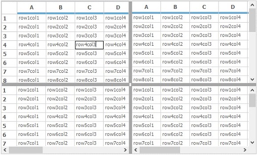
Freeze Pane
The Windows Forms GridControl supports Microsoft Excel-like Freeze Pane feature. In a large worksheet, it is often required that column or row labels remain in view. This feature enables to freeze either columns or rows in the grid, so that they may remain visible while scrolling. The number of rows to be frozen can be specified by using Model.Rows.FrozenCount property and the number of columns to be frozen can be specified by using Model.Cols.FrozenCount property.
//Frozen the Rows and columns in the Grid control
this.gridControl1.Rows.FrozenCount = 3;
this.gridControl1.Cols.FrozenCount = 2;

//Clear the Frozen range of Rows and Columns
this.gridControl1.Rows.RestoreFrozen();
this.gridControl1.Cols.RestoreFrozen();
'Frozen the Rows and columns in the Grid control
Me.gridControl1.Rows.FrozenCount = 3
Me.gridControl1.Cols.FrozenCount = 2
'Clear the Frozen range of Rows and Columns
Me.gridControl1.Rows.RestoreFrozen()
Me.gridControl1.Cols.RestoreFrozen()The frozen lines of the GridControl can be hidden by setting the HighlightFrozenLines property to false. By default, it will be enabled to display the frozen lines.
// To hide the highlighting of Frozen lines
this.gridControl1.HighlightFrozenLine = false;
' To hide the highlighting of Frozen lines
Me.gridControl1.HighlightFrozenLine = False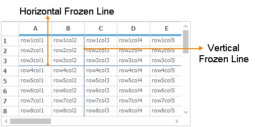
The frozen line color can be changed by using FixedLinesColor property. This frozen line color will be changed only when the HighlightFrozenLine property is enabled.
//Set Frozen Line color
this.gridControl1.Model.Properties.FixedLinesColor = Color.Green;
'Set Frozen Line color
Me.gridControl1.Model.Properties.FixedLinesColor = Color.Green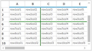
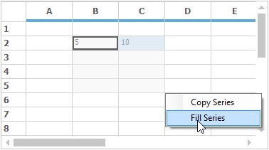
Copy/Fill Series
The Windows Forms GridControl can have the copy/fill series like Excel. The copy series is used to copy the content of the current cell to the entire selection whereas the fill series is used to fill the selection with the increment of the current cell.
An ExcelSelectionMarkerMouseController helper class that implements the behavior of Copy/Fill series in the GridControl. This class is available in the Syncfusion.GridHelperClasses.Windows assembly.
NOTE
To enable this feature, the ExcelLikeCurrentCell property has to be enabled for GridControl.
//Enable Excel like current cell in Grid
this.gridControl1.ExcelLikeCurrentCell = true;

//Create Selection marker for Copy/Fill series
ExcelSelectionMarkerMouseController marker = new Syncfusion.GridHelperClasses.ExcelSelectionMarkerMouseController(this.gridControl1);

//Add the selection marker to the MouseControllerDispatcher
this.gridControl1.MouseControllerDispatcher.Add(marker);
'Enable Excel like current cell in Grid
Me.gridControl1.ExcelLikeCurrentCell = True
'Create Selection marker for Copy/Fill series
Dim marker As ExcelSelectionMarkerMouseController = New Syncfusion.GridHelperClasses.ExcelSelectionMarkerMouseController(Me.gridControl1)
'Add the selection marker to the MouseControllerDispatcher
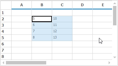
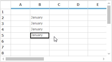
Me.gridControl1.MouseControllerDispatcher.Add(marker)The following examples are showing the difference between the Copy and Fill series,
-
The following example shows the Fill series is selected,
-
The range of cells are filled with the series,
-
The following example shows the
Copy Seriesis selected for January cell,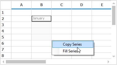
-
The range of cells are copied and filled with the January,
Highlighting Row/Column Header
This feature is used to highlight the corresponding row and column headers of one or more selected cells. It can be enabled by setting the MarkRowHeader and MarkColHeader property value as true.
//Highlight Row/Column header while having the current cell
this.gridControl1.MarkRowHeader = true;
this.gridControl1.MarkColHeader = true;
'Highlight Row/Column header while having the current cell
Me.gridControl1.MarkRowHeader = True
Me.gridControl1.MarkColHeader = True
Unhide Columns Using Double Click
The hidden columns can be shown by double clicking on the column headers as like Excel. This behavior can be determined by using the UnHideColsOnDblClick property. The default value of this property is true. So the unhide behavior can be disabled by setting this property as false.
//Disabling Un hide the columns on double click
this.gridControl1.UnHideColsOnDblClick = false;
' Disabling Un hide the columns on double click
Me.gridControl1.UnHideColsOnDblClick = FalseFor more details about the hiding columns and rows, refer the link over here.
FormatCell Dialog
The Format Cell Dialog is used to dynamically format the contents of the cell or range of cells in the GridControl. This can be enabled in the GridControl by using the GridFormatCellsDialog class.
// Add the format Cells dialog into the GridControl
GridFormatCellDialog formatCellDialog = new GridFormatCellDialog(this.gridControl1);
// To display the dialog
formatCellDialog.ShowDialog();
' Add the format Cells dialog into the GridControl
Dim formatCellDialog As New GridFormatCellDialog(Me.gridControl1)
' To display the dialog
formatCellDialog.ShowDialog()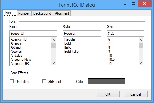
NOTE
You can refer the FormatCellDialog section for detailed information.
Covered Ranges
The range of cells can be covered like Excel merging functionality. In this technique, range of cells which has different data or same data can be covered. The range of cells can be covered by adding the GridRangeInfo to the CoveredRanges collection. The range can be cell, range of cells, table, row or column.
The CoveredRanges will be maintained in the GridModelCoveredRanges collection.
// Add covered range for the range of cells
this.gridControl1.Model.CoveredRanges.Add(GridRangeInfo.Cells(2, 2, 5, 5));
' Add covered range for the range of cells
Me.gridControl1.Model.CoveredRanges.Add(GridRangeInfo.Cells(2, 2, 5, 5))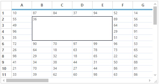
NOTE
For more information about
CoveredRanges, see the link over here.
Cell Merging
The cell merging also one of the technique to merge the range of cells in the GridControl. The range of cells will be merged based on the data. The cells which has same data will be merged in row wise in same column or column wise in same row. To enable the merging support in grid, the MergeCell, MergeCellsMode and MergeCellsLayout properties can be used.
The following code snippet is used to enable the merging in GridControl,
// Set MergeCells direction for the GridControl
this.gridControl1.TableStyle.MergeCell = GridMergeCellDirection.Both;

// Set merge cells behavior for the Grid
this.gridControl1.Model.Options.MergeCellsMode = GridMergeCellsMode.OnDemandCalculation
    | GridMergeCellsMode.MergeColumnsInRow | GridMergeCellsMode.MergeRowsInColumn;
this.gridControl1.Model.Options.MergeCellsLayout = GridMergeCellsLayout.Grid;
' Set MergeCells direction for the GridControl
Me.gridControl1.TableStyle.MergeCell = GridMergeCellDirection.Both
' Set merge cells behavior for the Grid
Me.gridControl1.Model.Options.MergeCellsMode = GridMergeCellsMode.OnDemandCalculation Or GridMergeCellsMode.MergeColumnsInRow Or GridMergeCellsMode.MergeRowsInColumn
Me.gridControl1.Model.Options.MergeCellsLayout = GridMergeCellsLayout.Grid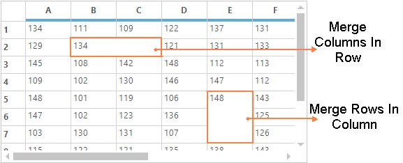
NOTE
Any range of cells cannot be merged like the covered ranges because merging has different functionality than the covered ranges, which allows only to merge the adjacent cells with same data.
For more details about the Cell Merging, refer the link over here.
Floating
Floating cells are those cells whose content floats over empty, adjacent cells. The floating cells can be enabled by setting GridControl.FloatCellsMode property. Setting this property toGridFloatCellsMode.BeforeDisplayCalculation will force the floating cells to always be calculated just prior to being displayed. Setting the property to GridFloatCellsMode.OnDemandCalculation will calculate the floating cells only if the cell contents or size changes.
The preventing of a cell being flooded by using FloodCell property.
// Enable Float Cells for GridControl
this.gridControl1.TableStyle.FloatCell = true;

// Set mode for calculating the float cells
this.gridControl1.FloatCellsMode = GridFloatCellsMode.OnDemandCalculation;
' Enable Float Cells for GridControl
Me.gridControl1.TableStyle.FloatCell = True
' Set mode for calculating the float cells
Me.gridControl1.FloatCellsMode = GridFloatCellsMode.OnDemandCalculation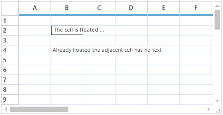
For more information about this section, refer the link over here.
Multilevel Undo Redo
GridControl lets you do the multilevel undo and redo operations which are used to revert the changes made in the grid. This can be enabled by setting CommandStack.Enabled property to true. Using the functions of GridModelCommandManager class, various tasks like undo and redo can be done. User can access this class from a grid using theCommandStack property of a GridModel instance.
//Enable Undo Redo
this.gridControl1.CommandStack.Enabled = true;

//Undo the last action performed in the grid
this.gridControl1.CommandStack.Undo();

//Redo the last action performed
this.gridControl1.CommandStack.Redo();
'Enable Undo Redo
Me.gridControl1.CommandStack.Enabled = True
'Undo the last action performed in the grid
Me.gridControl1.CommandStack.Undo()
'Redo the last action performed
Me.gridControl1.CommandStack.Redo()For more information about the Undo-Redo, See Undo - Redo
Find and Replace
The Windows Forms GridControl provides the support to search and replace the text and numbers like the Find and Replace feature of Excel. This feature can be added to the GridControl by including the Syncfusion.GridHelperClasses.Windows.dll to the assembly reference. The following classes are used to implement the Find and Replace technique in GridControl.
The GridFindReplaceDialogSink class is used to perform the Find and Replace of text in GridControl. The GridFindReplaceDialog is the built-in dialog which shows the options for finding and replacing of the text. If this dialog is used for finding and replacing, there is no need to implement the methods for finding and replacing the text programmatically.
The below example shows the Find and Replace dialog is shown in GridControl,
// Setting the Dialog sink
GridFindReplaceDialogSink findReplaceSink = new GridFindReplaceDialogSink(this.gridControl1);

// Setting the Dialog
GridFindReplaceDialog findReplaceDialog = GridFindReplaceDialog.Instance;

// Setting the sink to dialog
findReplaceDialog.ActiveSink = findReplaceSink;
findReplaceDialog.ShowDialog();
' Setting the Dialog sink
Dim findReplaceSink As New GridFindReplaceDialogSink(Me.gridControl1)
' Setting the Dialog
Dim findReplaceDialog As GridFindReplaceDialog = GridFindReplaceDialog.Instance
' Setting the sink to dialog
findReplaceDialog.ActiveSink = findReplaceSink
findReplaceDialog.ShowDialog()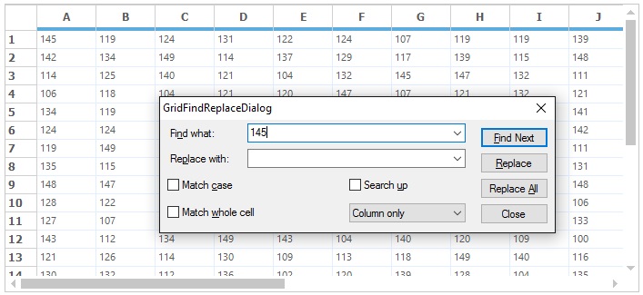
NOTE
This section has been explained briefly in Find and Replace section.