Styling in Flutter Data Grid
18 Nov 201824 minutes to read
The DataGrid supports changing the appearance of the grid by using the SfDataGridThemeData in SfDataGridTheme. The DataGrid should be wrapped inside the SfDataGridTheme.
The SfDataGridThemeData and SfDataGridTheme classes are available in syncfusion_flutter_core package. So, import the below file,
Note: The
SfDataGridThemeis optional. If not provided, the DataGrid uses default styling values.
import 'package:syncfusion_flutter_core/theme.dart';Change the header background color
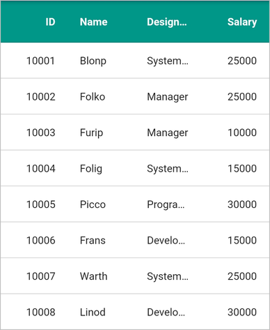
Change the header background color by using SfDataGridThemeData.headerColor property. The default header background color is based on the platform’s theme (light or dark).
Note: This property applies to all column headers in the grid.
@override
  Widget build(BuildContext context) {
    return Scaffold(
        appBar: AppBar(
          title: const Text('Syncfusion Flutter Data Grid'),
        ),
        body: SfDataGridTheme(
            data: SfDataGridThemeData(headerColor: const Color(0xff009889)),
            child: SfDataGrid(
                source: _employeeDataSource,
                columnWidthMode: ColumnWidthMode.fill,
                columns: <GridColumn>[
                  GridColumn(
                      columnName: 'id',
                      label: Container(
                          padding: EdgeInsets.all(16.0),
                          alignment: Alignment.center,
                          child: Text(
                            'ID',
                          ))),
                  GridColumn(
                      columnName: 'name',
                      label: Container(
                          padding: EdgeInsets.all(8.0),
                          alignment: Alignment.center,
                          child: Text('Name'))),
                  GridColumn(
                      columnName: 'designation',
                      label: Container(
                          padding: EdgeInsets.all(8.0),
                          alignment: Alignment.center,
                          child: Text(
                            'Designation',
                            overflow: TextOverflow.ellipsis,
                          ))),
                  GridColumn(
                      columnName: 'salary',
                      label: Container(
                          padding: EdgeInsets.all(8.0),
                          alignment: Alignment.center,
                          child: Text('Salary'))),
                ])));
  }
Change the header hover color
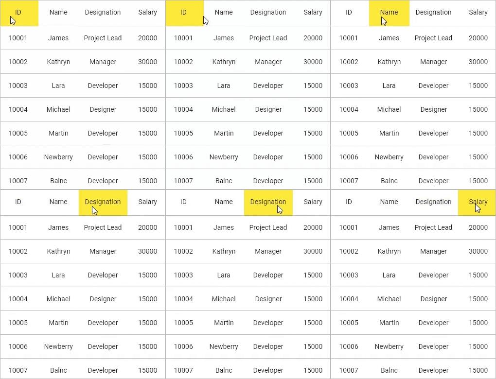
Change the color of the header on hovering by using the headerHoverColor property.
Note: This is applicable for web and desktop platforms.
@override
  Widget build(BuildContext context) {
    return Scaffold(
        appBar: AppBar(
          title: const Text('Syncfusion Flutter Data Grid'),
        ),
        body: SfDataGridTheme(
            data: SfDataGridThemeData(headerHoverColor: Colors.yellow),
            child: SfDataGrid(
                source: _employeeDataSource,
                columnWidthMode: ColumnWidthMode.fill,
                columns: <GridColumn>[
                  GridColumn(
                      columnName: 'id',
                      label: Container(
                          padding: EdgeInsets.all(16.0),
                          alignment: Alignment.center,
                          child: Text(
                            'ID',
                          ))),
                  GridColumn(
                      columnName: 'name',
                      label: Container(
                          padding: EdgeInsets.all(8.0),
                          alignment: Alignment.center,
                          child: Text('Name'))),
                  GridColumn(
                      columnName: 'designation',
                      label: Container(
                          padding: EdgeInsets.all(8.0),
                          alignment: Alignment.center,
                          child: Text(
                            'Designation',
                            overflow: TextOverflow.ellipsis,
                          ))),
                  GridColumn(
                      columnName: 'salary',
                      label: Container(
                          padding: EdgeInsets.all(8.0),
                          alignment: Alignment.center,
                          child: Text('Salary'))),
                ])));
  }
Change the row background color
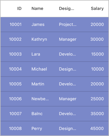
The DataGrid supports changing the row background color by using DataGridRowAdapter.color property.
Note: You must implement a custom DataGridSource and override the buildRow method to apply row background colors.
import 'package:syncfusion_flutter_datagrid/datagrid.dart';

class EmployeeDataSource extends DataGridSource {
  EmployeeDataSource({required List<Employee> employees}) {
    dataGridRows = employees
        .map<DataGridRow>((dataGridRow) => DataGridRow(cells: [
              DataGridCell<int>(columnName: 'id', value: dataGridRow.id),
              DataGridCell<String>(columnName: 'name', value: dataGridRow.name),
              DataGridCell<String>(
                  columnName: 'designation', value: dataGridRow.designation),
              DataGridCell<int>(
                  columnName: 'salary', value: dataGridRow.salary),
            ]))
        .toList();
  }

  List<DataGridRow> dataGridRows = [];

  @override
  List<DataGridRow> get rows => dataGridRows;

  @override
  DataGridRowAdapter? buildRow(DataGridRow row) {
    return DataGridRowAdapter(
      color: Colors.indigo[300],
        cells: row.getCells().map<Widget>((dataGridCell) {
      return Container(
          alignment: (dataGridCell.columnName == 'id' ||
                  dataGridCell.columnName == 'salary')
              ? Alignment.centerRight
              : Alignment.centerLeft,
          padding: const EdgeInsets.symmetric(horizontal: 16.0),
          child: Text(
            dataGridCell.value.toString(),
            style: const TextStyle(color: Colors.white),
            overflow: TextOverflow.ellipsis,
          ));
    }).toList());
  }
}
Styling grid lines
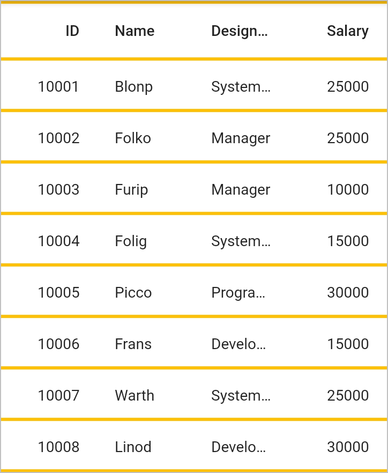
The color and thickness of the grid lines can be changed by using the SfDataGridThemeData.gridLineColor and SfDataGridThemeData.gridLineStrokeWidth properties.
Note: Default
gridLineColoris based on the platform theme. DefaultgridLineStrokeWidthis 1.0. Both properties apply to grid lines controlled bygridLinesVisibilityandheaderGridLinesVisibilityproperties.
@override
  Widget build(BuildContext context) {
    return Scaffold(
        body: SfDataGridTheme(
            data: SfDataGridThemeData(
                gridLineColor: Colors.amber, gridLineStrokeWidth: 3.0),
            child: SfDataGrid(source: _employeeDataSource, columns: <GridColumn>[
              GridColumn(
                  columnName: 'id',
                  label: Container(
                      padding: EdgeInsets.symmetric(horizontal: 16.0),
                      alignment: Alignment.centerRight,
                      child: Text(
                        'ID',
                        overflow: TextOverflow.ellipsis,
                      ))),
              GridColumn(
                  columnName: 'name',
                  label: Container(
                      padding: EdgeInsets.symmetric(horizontal: 16.0),
                      alignment: Alignment.centerLeft,
                      child: Text(
                        'Name',
                        overflow: TextOverflow.ellipsis,
                      ))),
              GridColumn(
                  columnName: 'designation',
                  label: Container(
                      padding: EdgeInsets.symmetric(horizontal: 16.0),
                      alignment: Alignment.centerLeft,
                      child: Text(
                        'Designation',
                        overflow: TextOverflow.ellipsis,
                      ))),
              GridColumn(
                  columnName: 'salary',
                  label: Container(
                      padding: EdgeInsets.symmetric(horizontal: 16.0),
                      alignment: Alignment.centerRight,
                      child: Text(
                        'Salary',
                        overflow: TextOverflow.ellipsis,
                      ))),
            ])));
  }
Configure grid line visibility
To customize grid line visibility, use the following properties.
- SfDataGrid.gridLinesVisibility: Controls border lines for cells (excluding header and stacked header cells).
- SfDataGrid.headerGridLinesVisibility: Controls border lines for header and stacked header cells.
The following GridLinesVisibility enum values are available:
-
GridLinesVisibility.vertical: Shows only vertical grid lines -
GridLinesVisibility.horizontal: Shows only horizontal grid lines -
GridLinesVisibility.both: Shows both vertical and horizontal grid lines -
GridLinesVisibility.none: Hides all grid lines
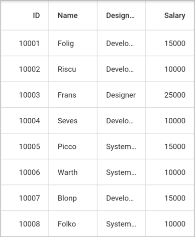
The following code describes how to show vertical and horizontal grid lines for the SfDataGrid.
@override
  Widget build(BuildContext context) {
    return Scaffold(
      body: SfDataGrid(
          source: _employeeDataSource,
          columns: <GridColumn>[
            GridColumn(
                columnName: 'id',
                label: Container(
                    padding: EdgeInsets.symmetric(horizontal: 16.0),
                    alignment: Alignment.centerRight,
                    child: Text(
                      'ID',
                      overflow: TextOverflow.ellipsis,
                    ))),
            GridColumn(
                columnName: 'name',
                label: Container(
                    padding: EdgeInsets.symmetric(horizontal: 16.0),
                    alignment: Alignment.centerLeft,
                    child: Text(
                      'Name',
                      overflow: TextOverflow.ellipsis,
                    ))),
            GridColumn(
                columnName: 'designation',
                label: Container(
                    padding: EdgeInsets.symmetric(horizontal: 16.0),
                    alignment: Alignment.centerLeft,
                    child: Text(
                      'Designation',
                      overflow: TextOverflow.ellipsis,
                    ))),
            GridColumn(
                columnName: 'salary',
                label: Container(
                    padding: EdgeInsets.symmetric(horizontal: 16.0),
                    alignment: Alignment.centerRight,
                    child: Text(
                      'Salary',
                      overflow: TextOverflow.ellipsis,
                    ))),
          ],
          gridLinesVisibility: GridLinesVisibility.both,
          headerGridLinesVisibility: GridLinesVisibility.both),
    );
  }
Disable the row highlighting
By default, the row highlighting on hovering support is enabled for the web and desktop platforms. Disable the row highlighting by setting the SfDataGrid.highlightRowOnHover property to false.
Note: Row highlighting on hover is only applicable for web and desktop platforms. On mobile platforms (iOS, Android), row highlighting is not shown.
@override
  Widget build(BuildContext context) {
    return Scaffold(
        body: SfDataGrid(
            highlightRowOnHover: false,
            source: _employeeDataSource,
            columns: <GridColumn>[
          GridColumn(
              columnName: 'id',
              label: Container(
                padding: EdgeInsets.symmetric(horizontal: 16.0),
                alignment: Alignment.centerRight,
                child: Text('ID'),
              )),
          GridColumn(
              columnName: 'name',
              label: Container(
                padding: EdgeInsets.symmetric(horizontal: 16.0),
                alignment: Alignment.centerLeft,
                child: Text('Name'),
              )),
          GridColumn(
              columnName: 'designation',
              label: Container(
                padding: EdgeInsets.symmetric(horizontal: 16.0),
                alignment: Alignment.centerLeft,
                child: Text('Designation'),
              )),
          GridColumn(
              columnName: 'salary',
              label: Container(
                padding: EdgeInsets.symmetric(horizontal: 16.0),
                alignment: Alignment.centerRight,
                child: Text('Salary'),
              )),
        ]));
  }
Change the row highlighting background color and text style
Change the row highlighting color and text style by using the SfDataGridThemeData.rowHoverColor and the SfDataGridThemeData.rowHoverTextStyle properties.
Note: Both properties work together to customize the hover appearance. Setting only
rowHoverColorapplies the background color while keeping the default text style. Setting onlyrowHoverTextStyleapplies the text styling while keeping the default hover background. These properties are applicable for web and desktop platforms only.
@override
  Widget build(BuildContext context) {
    return Scaffold(
        body: SfDataGridTheme(
            data: SfDataGridThemeData(
                rowHoverColor: Colors.yellow,
                rowHoverTextStyle: TextStyle(
                  color: Colors.red,
                  fontSize: 14,
                )),
            child: SfDataGrid(source: _employeeDataSource, columns: <GridColumn>[
              GridColumn(
                  columnName: 'id',
                  label: Container(
                    padding: EdgeInsets.symmetric(horizontal: 16.0),
                    alignment: Alignment.centerRight,
                    child: Text('ID'),
                  )),
              GridColumn(
                  columnName: 'name',
                  label: Container(
                    padding: EdgeInsets.symmetric(horizontal: 16.0),
                    alignment: Alignment.centerLeft,
                    child: Text('Name'),
                  )),
              GridColumn(
                  columnName: 'designation',
                  label: Container(
                    padding: EdgeInsets.symmetric(horizontal: 16.0),
                    alignment: Alignment.centerLeft,
                    child: Text('Designation'),
                  )),
              GridColumn(
                  columnName: 'salary',
                  label: Container(
                    padding: EdgeInsets.symmetric(horizontal: 16.0),
                    alignment: Alignment.centerRight,
                    child: Text('Salary'),
                  )),
            ])));
  }
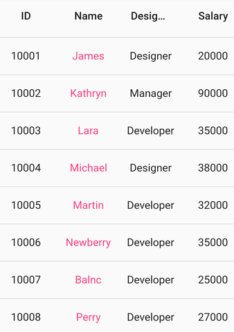
Change the cell value color
The DataGrid requires a widget for each cell from the user end. Typically, users load the Text widget to display the cell values. Text color can be changed by setting the TextStyle to the style property of the Text widget.
Note: Cell customization requires overriding the buildRow method in DataGridSource. This is the recommended approach for per-cell styling.
import 'package:syncfusion_flutter_datagrid/datagrid.dart';

class EmployeeDataSource extends DataGridSource {
  EmployeeDataSource({required List<Employee> employees}) {
    dataGridRows = employees
        .map<DataGridRow>((dataGridRow) => DataGridRow(cells: [
              DataGridCell<int>(columnName: 'id', value: dataGridRow.id),
              DataGridCell<String>(columnName: 'name', value: dataGridRow.name),
              DataGridCell<String>(
                  columnName: 'designation', value: dataGridRow.designation),
              DataGridCell<int>(
                  columnName: 'salary', value: dataGridRow.salary),
            ]))
        .toList();
  }

  List<DataGridRow> dataGridRows = [];

  @override
  List<DataGridRow> get rows => dataGridRows;

  @override
  DataGridRowAdapter? buildRow(DataGridRow row) {
    return DataGridRowAdapter(
        cells: row.getCells().map<Widget>((dataGridCell) {
      TextStyle? getTextStyle() {
        if (dataGridCell.columnName == 'name') {
          return const TextStyle(color: Colors.pinkAccent);
        } else {
          return null;
        }
      }
      return Container(
          alignment: Alignment.center,
          padding: const EdgeInsets.symmetric(horizontal: 8.0),
          child: Text(
            dataGridCell.value.toString(),
            style: getTextStyle(),
            overflow: TextOverflow.ellipsis,
          ));
    }).toList());
  }
}