How can I help you?
Column drag and drop in Flutter DataGrid (SfDataGrid)
22 May 202513 minutes to read
The SfDataGrid allows column header dragging and dropping by setting the SfDataGrid.allowColumnsDragging property to true and returning true from the SfDataGrid.onColumnDragging callback. During the column-dragging process, a drag feedback widget is displayed. By utilizing the SfDataGrid.onColumnDragging event, you can handle drag and drop operations according to your requirements.
The DataGrid provides the rearranged index of the dragged column, indicating its new position after being dropped. Inside the onColumnDragging callback, you can utilize this index to reorder the columns according to the desired position. This allows you to handle the column reordering directly within the callback at the sample level.
@override
  Widget build(BuildContext context) {
    return Scaffold(
      appBar: AppBar(title: const Text('Syncfusion Flutter DataGrid')),
      body: SfDataGrid(
        source: employeeDataSource,
        allowColumnsDragging: true,
        columns: columns,
        onColumnDragging: (DataGridColumnDragDetails details) {
          if (details.action == DataGridColumnDragAction.dropped &&
              details.to != null) {
            final GridColumn rearrangeColumn = columns[details.from];
            columns.removeAt(details.from);
            columns.insert(details.to!, rearrangeColumn);
            employeeDataSource.buildDataGridRows();
            employeeDataSource.refreshDataGrid();
          }
          return true;
        },
      ),
    );
  }

class EmployeeDataSource extends DataGridSource {
  EmployeeDataSource({required this.employees, required this.columns}) {
    buildDataGridRows();
  }

  void buildDataGridRows() {
    dataGridRows = employees.map<DataGridRow>((employee) {
      return DataGridRow(
        cells: columns.map<DataGridCell>((column) {
          return DataGridCell(
            columnName: column.columnName,
            value: employee[column.columnName],
          );
        }).toList());
    }).toList();
  }

  List<Employee> employees = [];
  List<GridColumn> columns = [];
  List<DataGridRow> dataGridRows = [];

  @override
  List<DataGridRow> get rows => dataGridRows;

  @override
  DataGridRowAdapter? buildRow(DataGridRow row) {
    return DataGridRowAdapter(
      cells: row.getCells().map((dataGridCell) {
        return Container(
          alignment: Alignment.center,
          padding: const EdgeInsets.symmetric(horizontal: 8.0),
          child: Text(
            dataGridCell.value.toString(),
          ));
      }).toList());
  }

  refreshDataGrid() {
    notifyListeners();
  }
}
NOTE:
- You can download the demo application from GitHub.
- To reorder the columns in the DataGrid, you should create an instance to hold the columns and then assign that instance to
the SfDataGrid.columns property instead of directly assigning the list of GridColumn. This allows you to reorder the collection within the callback, maintaining the desired column order.- Additionally, it is important to build the rows based on the columns collection after reordering. This is necessary because
the column index may change after the columns have been rearranged. By rebuilding the rows based on the updated columns collection, you ensure that the row data aligns correctly with the reordered columns.
onColumnDragging callback
The SfDataGrid.onColumnDragging callback is triggered when the column drags. This callback provides the following properties in the DataGridColumnDragDetails.
- from: Returns index of the currently dragging column.
- to: Returns index of the column after being dropped.
- action: Returns the column dragging details as the DataGridColumnDragAction enum.
- offset: Returns the current offset of the dragging column.
Cancel the column dropping for a specific column
You can cancel the column dropping at a specific column by returning false from the SfDataGrid.onColumnDragging callback. This allows you to restrict the column dropping for a specific column.
@override
  Widget build(BuildContext context) {
    return Scaffold(
      appBar: AppBar(title: const Text('Syncfusion Flutter DataGrid')),
      body: SfDataGrid(
        source: employeeDataSource,
        allowColumnsDragging: true,
        columns: columns,
        onColumnDragging: (DataGridColumnDragDetails details) {
          if (details.action == DataGridColumnDragAction.update &&
              details.to == 2) {
            return false;
          }
          if (details.action == DataGridColumnDragAction.dropped &&
              details.to != null) {
            final GridColumn rearrangeColumn = columns[details.from];
            columns.removeAt(details.from);
            columns.insert(details.to!, rearrangeColumn);
            employeeDataSource.buildDataGridRows();
            employeeDataSource.refreshDataGrid();
          }
          return true;
        },
      ),
    );
  }
Changing the feedback widget
The DataGrid allows you to change the drag feedback widget by returning a custom widget from the SfDataGrid.columnDragFeedbackBuilder builder. This allows you to change the drag feedback widget according to your requirements.
@override
  Widget build(BuildContext context) {
    return Scaffold(
      appBar: AppBar(title: const Text('Syncfusion Flutter DataGrid')),
      body: SfDataGrid(
        source: employeeDataSource,
        allowColumnsDragging: true,
        columns: columns,
        columnDragFeedbackBuilder: (context, column) {
          return Container(
            height: 50,
            width: column.actualWidth,
            color: Colors.grey,
            child: const Center(
              child: DefaultTextStyle(
                style: TextStyle(
                  fontSize: 14,
                  color: Colors.pink,
                  fontWeight: FontWeight.bold),
                child: Text('Drag View'),
              ),
            ),
          );
        },
        onColumnDragging: (DataGridColumnDragDetails details) {
          if (details.action == DataGridColumnDragAction.dropped &&
              details.to != null) {
            final GridColumn rearrangeColumn = columns[details.from];
            columns.removeAt(details.from);
            columns.insert(details.to!, rearrangeColumn);
            employeeDataSource.buildDataGridRows();
            employeeDataSource.refreshDataGrid();
          }
          return true;
        },
      ),
    );
  }
Drag indicator customization
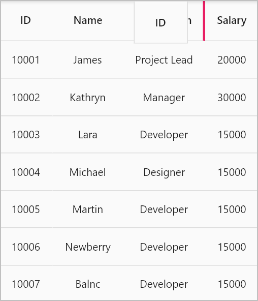
The color and thickness of the drag indicator can be customized by the SfDataGridThemeData.columnDragIndicatorColor and SfDataGridThemeData.columnDragIndicatorStrokeWidth properties.
The SfDataGridThemeData and SfDataGridTheme classes are available in the syncfusion_flutter_core package. So, import the following file.
import 'package:syncfusion_flutter_core/theme.dart';The following code describes how to change the drag indicator color and thickness by using SfDataGridTheme.
@override
  Widget build(BuildContext context) {
    return Scaffold(
      appBar: AppBar(title: const Text('Syncfusion Flutter DataGrid')),
      body: SfDataGridTheme(
        data: SfDataGridThemeData(
          columnDragIndicatorColor: Colors.pink,
          columnDragIndicatorStrokeWidth: 3),
        child: SfDataGrid(
          source: employeeDataSource,
          allowColumnsDragging: true,
          columns: columns,
          onColumnDragging: (DataGridColumnDragDetails details) {
            if (details.action == DataGridColumnDragAction.dropped &&
                details.to != null) {
              final GridColumn rearrangeColumn = columns[details.from];
              columns.removeAt(details.from);
              columns.insert(details.to!, rearrangeColumn);
              employeeDataSource.buildDataGridRows();
              employeeDataSource.refreshDataGrid();
            }
            return true;
          },
        ),
      ),
    );
  }