Conditional Styling in Flutter DataGrid (SfDataGrid)
8 Jul 202621 minutes to read
The SfDataGrid allows customizing the style of individual cells and rows based on your requirements. You can customize your widget in the DataGridSource.buildRow method with the help of DataGridRowAdapter.
Employee Model Class
The following examples use an Employee model class. Define it as shown below:
class Employee {
  Employee({
    required this.id,
    required this.name,
    required this.designation,
    required this.salary,
  });

  final int id;
  final String name;
  final String designation;
  final int salary;
}
When to Use Cell-Level vs Row-Level Styling
- Cell-level styling: Use when you need to style specific cells based on their individual content or column type. This allows fine-grained control over individual cell appearance.
- Row-level styling: Use when you want to apply consistent styling across an entire row based on row data. This is more efficient for styling multiple cells at once.
Cells
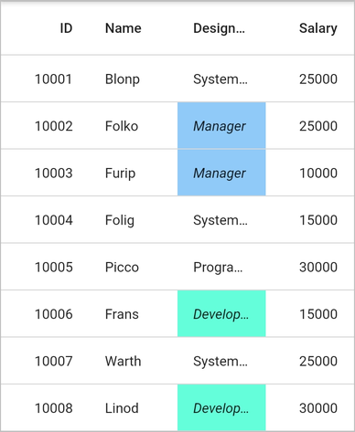
Styling based on content
Customize the appearance of cells conditionally based on their content by defining custom widgets in the DataGridRowAdapter.cells property. In the example below, cells in the designation column are styled with different background colors and text styles based on their values.
import 'package:syncfusion_flutter_datagrid/datagrid.dart';

  @override
  Widget build(BuildContext context) {
    return Scaffold(
      body: SfDataGrid(
        source: _employeeDataSource,
        columnWidthMode: ColumnWidthMode.lastColumnFill,
        columns: <GridColumn>[
          GridColumn(
            columnName: 'id',
            label: Container(
              padding: EdgeInsets.symmetric(horizontal: 16.0),
              alignment: Alignment.centerRight,
              child: Text(
                'ID',
                overflow: TextOverflow.ellipsis,
              )
            )
          ),
          GridColumn(
            columnName: 'name',
            label: Container(
              padding: EdgeInsets.symmetric(horizontal: 16.0),
              alignment: Alignment.centerLeft,
              child: Text(
                'Name',
                overflow: TextOverflow.ellipsis,
              )
            )
          ),
          GridColumn(
            columnName: 'designation',
            label: Container(
              padding: EdgeInsets.symmetric(horizontal: 16.0),
              alignment: Alignment.centerLeft,
              child: Text(
                'Designation',
                overflow: TextOverflow.ellipsis,
              )
            )
          ),
          GridColumn(
            columnName: 'salary',
            label: Container(
              padding: EdgeInsets.symmetric(horizontal: 16.0),
              alignment: Alignment.centerRight,
              child: Text(
                'Salary',
                overflow: TextOverflow.ellipsis,
              )
            )
          )
        ]
      )
    );
  }

class EmployeeDataSource extends DataGridSource {
  EmployeeDataSource(List<Employee> employees) {
    dataGridRows = employees
      .map<DataGridRow>((dataGridRow) => DataGridRow(cells: [
        DataGridCell<int>(columnName: 'id', value: dataGridRow.id),
        DataGridCell<String>(columnName: 'name', value: dataGridRow.name),
        DataGridCell<String>(
          columnName: 'designation', value: dataGridRow.designation),
        DataGridCell<int>(
          columnName: 'salary', value: dataGridRow.salary),
      ]))
      .toList();
  }

  List<DataGridRow> dataGridRows = [];

  @override
  List<DataGridRow> get rows => dataGridRows;

  @override
  DataGridRowAdapter? buildRow(DataGridRow row) {
    return DataGridRowAdapter(
      cells: row.getCells().map<Widget>((dataGridCell) {
        Color getColor() {
          if (dataGridCell.columnName == 'designation') {
            if (dataGridCell.value == 'Developer') {
              return Colors.tealAccent;
            } else if (dataGridCell.value == 'Manager') {
              return Colors.blue[200]!;
            }
          }
          return Colors.transparent;
        }

        TextStyle? getTextStyle() {
          if (dataGridCell.columnName == 'designation') {
            if (dataGridCell.value == 'Developer') {
              return TextStyle(fontStyle: FontStyle.italic);
            } else if (dataGridCell.value == 'Manager') {
              return TextStyle(fontStyle: FontStyle.italic);
            }
          }
          return null;
        }

        return Container(
          color: getColor(),
          alignment: (dataGridCell.columnName == 'id' ||
                    dataGridCell.columnName == 'salary')
              ? Alignment.centerRight
              : Alignment.centerLeft,
          padding: EdgeInsets.symmetric(horizontal: 16.0),
          child: Text(
            dataGridCell.value.toString(),
            overflow: TextOverflow.ellipsis,
            style: getTextStyle(),
          )
        );
      }).toList()
    );
  }
}
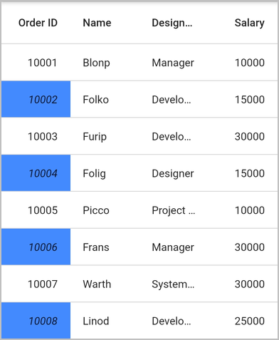
Styling alternate cells
Customize the appearance of alternating cells in a column by using the DataGridSource.buildRow method and the effectiveRows property to determine the row index. The effectiveRows property contains the sorted collection of rows if sorting is applied.
class EmployeeDataSource extends DataGridSource {
  EmployeeDataSource(List<Employee> employees) {
    dataGridRows = employees
      .map<DataGridRow>((dataGridRow) => DataGridRow(cells: [
        DataGridCell<int>(columnName: 'id', value: dataGridRow.id),
        DataGridCell<String>(columnName: 'name', value: dataGridRow.name),
        DataGridCell<String>(
          columnName: 'designation', value: dataGridRow.designation),
        DataGridCell<int>(
          columnName: 'salary', value: dataGridRow.salary),
      ]))
      .toList();
  }

  List<DataGridRow> dataGridRows = [];

  @override
  List<DataGridRow> get rows => dataGridRows;

  @override
  DataGridRowAdapter? buildRow(DataGridRow row) {
    return DataGridRowAdapter(
      cells: row.getCells().map<Widget>((dataGridCell) {
        if (dataGridCell.columnName == 'id') {
          final int index = effectiveRows.indexOf(row);
          return Container(
            color: (index % 2 != 0) ? Colors.blueAccent : Colors.transparent,
            alignment: Alignment.centerRight,
            padding: EdgeInsets.symmetric(horizontal: 16.0),
            child: Text(
              dataGridCell.value.toString(),
              overflow: TextOverflow.ellipsis,
              style: (index % 2 != 0)
                ? TextStyle(fontStyle: FontStyle.italic)
                : null,
            )
          );
        }
        return Container(
          alignment: (dataGridCell.columnName == 'salary')
              ? Alignment.centerRight
              : Alignment.centerLeft,
          padding: EdgeInsets.symmetric(horizontal: 16.0),
          child: Text(
            dataGridCell.value.toString(),
            overflow: TextOverflow.ellipsis,
          )
        );
      }).toList()
    );
  }
}
Rows
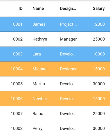
Styling based on content
Customize the appearance of rows conditionally based on their content using the DataGridRowAdapter.color property. In the example below, rows are styled with different background and text colors based on salary values.
import 'package:syncfusion_flutter_datagrid/datagrid.dart';

class EmployeeDataSource extends DataGridSource {
  EmployeeDataSource(List<Employee> employees) {
    dataGridRows = employees
      .map<DataGridRow>((dataGridRow) => DataGridRow(cells: [
        DataGridCell<int>(columnName: 'id', value: dataGridRow.id),
        DataGridCell<String>(columnName: 'name', value: dataGridRow.name),
        DataGridCell<String>(
          columnName: 'designation', value: dataGridRow.designation),
        DataGridCell<int>(
          columnName: 'salary', value: dataGridRow.salary),
      ]))
      .toList();
  }

  List<DataGridRow> dataGridRows = [];

  @override
  List<DataGridRow> get rows => dataGridRows;

  @override
  DataGridRowAdapter buildRow(DataGridRow row) {
    Color getRowBackgroundColor() {
      final int salary = row.getCells()[3].value;
      if (salary >= 10000 && salary < 15000) {
        return Colors.blue[300]!;
      } else if (salary <= 15000) {
        return Colors.orange[300]!;
      }
      return Colors.transparent;
    }

    TextStyle? getTextStyle() {
      final int salary = row.getCells()[3].value;
      if (salary >= 10000 && salary < 15000) {
        return TextStyle(color: Colors.white);
      } else if (salary <= 15000) {
        return TextStyle(color: Colors.white);
      }
      return null;
    }

    return DataGridRowAdapter(
      color: getRowBackgroundColor(),
      cells: row.getCells().map<Widget>((dataGridCell) {
        return Container(
          alignment: (dataGridCell.columnName == 'id' ||
                     dataGridCell.columnName == 'salary')
              ? Alignment.centerRight
              : Alignment.centerLeft,
          padding: EdgeInsets.symmetric(horizontal: 16.0),
          child: Text(
            dataGridCell.value.toString(),
            overflow: TextOverflow.ellipsis,
            style: getTextStyle(),
          )
        );
      }).toList()
    );
  }
}
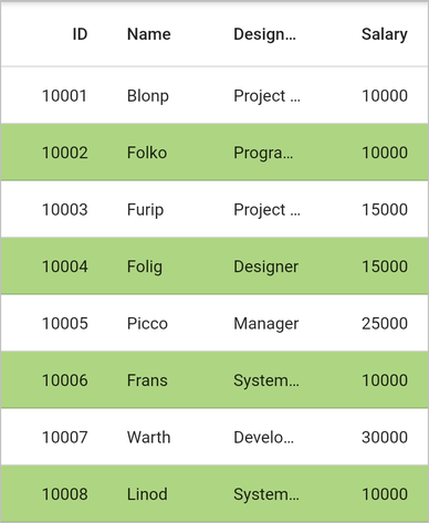
Styling alternate rows
Customize the appearance of alternating rows in SfDataGrid using the DataGridRowAdapter.color property. Use the effectiveRows property to get the row index. The effectiveRows collection contains sorted rows when sorting is applied, ensuring alternate row styling works correctly with sorted data.
import 'package:syncfusion_flutter_datagrid/datagrid.dart';

class EmployeeDataSource extends DataGridSource {
  EmployeeDataSource(List<Employee> employees) {
    dataGridRows = employees
        .map<DataGridRow>((dataGridRow) => DataGridRow(cells: [
              DataGridCell<int>(columnName: 'id', value: dataGridRow.id),
              DataGridCell<String>(columnName: 'name', value: dataGridRow.name),
              DataGridCell<String>(
                  columnName: 'designation', value: dataGridRow.designation),
              DataGridCell<int>(
                  columnName: 'salary', value: dataGridRow.salary),
            ]))
        .toList();
  }

  List<DataGridRow> dataGridRows = [];

  @override
  List<DataGridRow> get rows => dataGridRows;

  @override
  DataGridRowAdapter? buildRow(DataGridRow row) {
    Color getRowBackgroundColor() {
      final int index = effectiveRows.indexOf(row);
      if (index % 2 != 0) {
        return Colors.lightGreen[300]!;
      }

      return Colors.transparent;
    }

    return DataGridRowAdapter(
        color: getRowBackgroundColor(),
        cells: row.getCells().map<Widget>((dataGridCell) {
          return Container(
              alignment: (dataGridCell.columnName == 'id' ||
                      dataGridCell.columnName == 'salary')
                  ? Alignment.centerRight
                  : Alignment.centerLeft,
              padding: EdgeInsets.symmetric(horizontal: 16.0),
              child: Text(
                dataGridCell.value.toString(),
                overflow: TextOverflow.ellipsis,
              ));
        }).toList());
  }
}