How can I help you?
Column Types in Flutter DataGrid (SfDataGrid)
25 Sep 202524 minutes to read
SfDataGrid provides support for loading any type of widget in each column.
GridColumn
GridColumn is a class that provides base functionalities for all the column types in SfDataGrid.
Mapping column to a property
The column can be bound to a property in a data object using the GridColumn.columnName property. The label is used to display the required widget in a column header.
@override
  Widget build(BuildContext context) {
    return Scaffold(
      body: SfDataGrid(
        source: _employeeDataSource,
        columns: <GridColumn>[
          GridColumn(
            columnName: 'id',
            label: Container(
              padding: EdgeInsets.symmetric(horizontal: 16.0),
              alignment: Alignment.centerRight,
              child: Text(
                'ID',
                overflow: TextOverflow.ellipsis,
              )
            )
          ),
          GridColumn(
            columnName: 'name',
            label: Container(
              padding: EdgeInsets.symmetric(horizontal: 16.0),
              alignment: Alignment.centerLeft,
              child: Text(
                'Name',
                overflow: TextOverflow.ellipsis,
              )
            )
          ),
          GridColumn(
            columnName: 'designation',
            label: Container(
              padding: EdgeInsets.symmetric(horizontal: 16.0),
              alignment: Alignment.centerLeft,
              child: Text(
                'Designation',
                overflow: TextOverflow.ellipsis,
              )
            )
          ),
          GridColumn(
            columnName: 'salary',
            label: Container(
              padding: EdgeInsets.symmetric(horizontal: 16.0),
              alignment: Alignment.centerRight,
              child: Text(
                'Salary',
                overflow: TextOverflow.ellipsis,
              )
            )
          )
        ]
      )
    );
  }
Hiding a column
GridColumn.visible property can be used to set a column as hidden. The default value of the visible property is true.
NOTE
Set thevisibleproperty tofalseinstead of setting column width as0to hide a column.
@override
  Widget build(BuildContext context) {
    return Scaffold(
      body: SfDataGrid(
        source: _employeeDataSource,
        columns: <GridColumn>[
          GridColumn(
            columnName: 'id',
            label: Container(
              padding: EdgeInsets.symmetric(horizontal: 16.0),
              alignment: Alignment.centerRight,
              child: Text(
                'ID',
                overflow: TextOverflow.ellipsis,
              )
            )
          ),
          GridColumn(
            columnName: 'name',
            label: Container(
              padding: EdgeInsets.symmetric(horizontal: 16.0),
              alignment: Alignment.centerLeft,
              child: Text(
                'Name',
                overflow: TextOverflow.ellipsis,
              )
            )
          ),
          GridColumn(
            columnName: 'designation',
            visible: false,
            label: Container(
              padding: EdgeInsets.symmetric(horizontal: 16.0),
              alignment: Alignment.centerLeft,
              child: Text(
                'Designation',
                overflow: TextOverflow.ellipsis,
              )
            )
          ),
          GridColumn(
            columnName: 'salary',
            label: Container(
              padding: EdgeInsets.symmetric(horizontal: 16.0),
              alignment: Alignment.centerRight,
              child: Text(
                'Salary',
                overflow: TextOverflow.ellipsis,
              )
            )
          )
        ]
      )
    );
  }
Set manual width for a column
SfDataGrid allows you to customize the width of each GridColumn in the SfDataGrid.columns collection. To customize column width, use the GridColumn.width property. By default, this property will not be assigned any value. The GridColumn renders in view based on the value of the defaultColumnWidth property.
NOTE
Set thevisibleproperty tofalseinstead of setting column width as0to hide a column.
@override
  Widget build(BuildContext context) {
    return Scaffold(
      body: SfDataGrid(
        source: _employeeDataSource,
        columns: <GridColumn>[
          GridColumn(
            columnName: 'id',
            label: Container(
              padding: EdgeInsets.symmetric(horizontal: 16.0),
              alignment: Alignment.centerRight,
              child: Text(
                'ID',
                overflow: TextOverflow.ellipsis,
              )
            )
          ),
          GridColumn(
            columnName: 'name',
            width: 100.0,
            label: Container(
              padding: EdgeInsets.symmetric(horizontal: 16.0),
              alignment: Alignment.centerLeft,
              child: Text(
                'Name',
                overflow: TextOverflow.ellipsis,
              )
            )
          ),
          GridColumn(
            columnName: 'designation',
            label: Container(
              padding: EdgeInsets.symmetric(horizontal: 16.0),
              alignment: Alignment.centerLeft,
              child: Text(
                'Designation',
                overflow: TextOverflow.ellipsis,
              )
            )
          ),
          GridColumn(
            columnName: 'salary',
            label: Container(
              padding: EdgeInsets.symmetric(horizontal: 16.0),
              alignment: Alignment.centerRight,
              child: Text(
                'Salary',
                overflow: TextOverflow.ellipsis,
              )
            )
          )
        ]
      )
    );
  }
Checkbox column
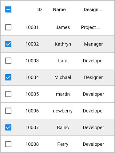
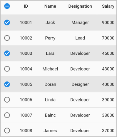
By setting the showCheckboxColumn property to true, you can select or deselect individual rows using checkboxes in each row. The checkbox column will be added as the first column.
The selection is applied to rows only if you set the SfDataGrid.selectionMode property other than none.
@override
  Widget build(BuildContext context) {
    return Scaffold(
      body: SfDataGrid(
        source: _employeeDataSource,
        showCheckboxColumn: true,
        selectionMode: SelectionMode.multiple,
        columns: [
          GridColumn(
            columnName: 'id',
            label: Container(
              padding: EdgeInsets.symmetric(horizontal: 16.0),
              alignment: Alignment.centerRight,
              child: Text(
                'ID',
                overflow: TextOverflow.ellipsis,
              )
            )
          ),
          GridColumn(
            columnName: 'name',
            label: Container(
              padding: EdgeInsets.symmetric(horizontal: 16.0),
              alignment: Alignment.centerLeft,
              child: Text(
                'Name',
                overflow: TextOverflow.ellipsis,
              )
            )
          ),
          GridColumn(
            columnName: 'designation',
            label: Container(
              padding: EdgeInsets.symmetric(horizontal: 16.0),
              alignment: Alignment.centerLeft,
              child: Text(
                'Designation',
                overflow: TextOverflow.ellipsis,
              )
            )
          ),
          GridColumn(
            columnName: 'salary',
            label: Container(
              padding: EdgeInsets.symmetric(horizontal: 16.0),
              alignment: Alignment.centerRight,
              child: Text(
                'Salary',
                overflow: TextOverflow.ellipsis,
              )
            )
          ),
        ]
      )
    );
  }
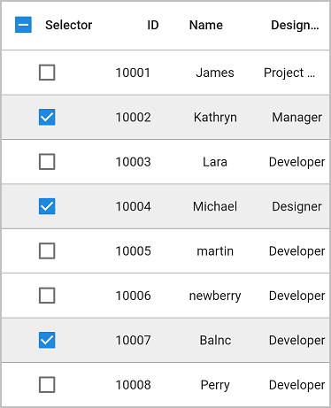
Show text in the header cell
Display widgets along with the checkbox in the header cell by adding a widget to the SfDataGrid.checkboxColumnSettings.label property.
@override
  Widget build(BuildContext context) {
    return Scaffold(
      body: SfDataGrid(
        source: _employeeDataSource,
        showCheckboxColumn: true,
        checkboxColumnSettings: DataGridCheckboxColumnSettings(
          label: Text('Selector'),
          width: 100
        ),
        selectionMode: SelectionMode.multiple,
        columns: [
          GridColumn(
            columnName: 'id',
            label: Container(
              padding: EdgeInsets.symmetric(horizontal: 16.0),
              alignment: Alignment.centerRight,
              child: Text(
                'ID',
                overflow: TextOverflow.ellipsis,
              )
            )
          ),
          GridColumn(
            columnName: 'name',
            label: Container(
              padding: EdgeInsets.symmetric(horizontal: 16.0),
              alignment: Alignment.centerLeft,
              child: Text(
                'Name',
                overflow: TextOverflow.ellipsis,
              )
            )
          ),
          GridColumn(
            columnName: 'designation',
            label: Container(
              padding: EdgeInsets.symmetric(horizontal: 16.0),
              alignment: Alignment.centerLeft,
              child: Text(
                'Designation',
                overflow: TextOverflow.ellipsis,
              )
            )
          ),
          GridColumn(
            columnName: 'salary',
            label: Container(
              padding: EdgeInsets.symmetric(horizontal: 16.0),
              alignment: Alignment.centerRight,
              child: Text(
                'Salary',
                overflow: TextOverflow.ellipsis,
              )
            )
          ),
        ]
      )
    );
  }
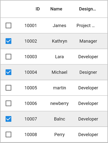
Disable the checkbox in the header cell
By default, a checkbox is displayed in the header cell. By setting the SfDataGrid.checkboxColumnSettings.showCheckboxOnHeader property to false, the checkbox can be hidden in the header cell.
@override
  Widget build(BuildContext context) {
    return Scaffold(
      body: SfDataGrid(
        source: _employeeDataSource,
        showCheckboxColumn: true,
        checkboxColumnSettings:
          DataGridCheckboxColumnSettings(showCheckboxOnHeader: false),
        selectionMode: SelectionMode.multiple,
        columns: [
          GridColumn(
            columnName: 'id',
            label: Container(
              padding: EdgeInsets.symmetric(horizontal: 16.0),
              alignment: Alignment.centerRight,
              child: Text(
                'ID',
                overflow: TextOverflow.ellipsis,
              )
            )
          ),
          GridColumn(
            columnName: 'name',
            label: Container(
              padding: EdgeInsets.symmetric(horizontal: 16.0),
              alignment: Alignment.centerLeft,
              child: Text(
                'Name',
                overflow: TextOverflow.ellipsis,
              )
            )
          ),
          GridColumn(
            columnName: 'designation',
            label: Container(
              padding: EdgeInsets.symmetric(horizontal: 16.0),
              alignment: Alignment.centerLeft,
              child: Text(
                'Designation',
                overflow: TextOverflow.ellipsis,
              )
            )
          ),
          GridColumn(
            columnName: 'salary',
            label: Container(
              padding: EdgeInsets.symmetric(horizontal: 16.0),
              alignment: Alignment.centerRight,
              child: Text(
                'Salary',
                overflow: TextOverflow.ellipsis,
              )
            )
          ),
        ]
      )
    );
  }
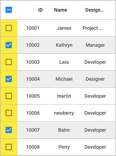
Change the background color of the checkbox column
The background color of the checkbox column can be customized by using the SfDataGrid.checkboxColumnSettings.backgroundColor property.
@override
  Widget build(BuildContext context) {
    return Scaffold(
      body: SfDataGrid(
        source: _employeeDataSource,
        showCheckboxColumn: true,
        checkboxColumnSettings:
          DataGridCheckboxColumnSettings(backgroundColor: Colors.yellow),
        selectionMode: SelectionMode.multiple,
        columns: [
          GridColumn(
            columnName: 'id',
            label: Container(
              padding: EdgeInsets.symmetric(horizontal: 16.0),
              alignment: Alignment.centerRight,
              child: Text(
                'ID',
                overflow: TextOverflow.ellipsis,
              )
            )
          ),
          GridColumn(
            columnName: 'name',
            label: Container(
              padding: EdgeInsets.symmetric(horizontal: 16.0),
              alignment: Alignment.centerLeft,
              child: Text(
                'Name',
                overflow: TextOverflow.ellipsis,
              )
            )
          ),
          GridColumn(
            columnName: 'designation',
            label: Container(
              padding: EdgeInsets.symmetric(horizontal: 16.0),
              alignment: Alignment.centerLeft,
              child: Text(
                'Designation',
                overflow: TextOverflow.ellipsis,
              )
            )
          ),
          GridColumn(
            columnName: 'salary',
            label: Container(
              padding: EdgeInsets.symmetric(horizontal: 16.0),
              alignment: Alignment.centerRight,
              child: Text(
                'Salary',
                overflow: TextOverflow.ellipsis,
              )
            )
          ),
        ]
      )
    );
  }
Get checked items
Get the checked items by using the DataGridController.selectedRows property because the selection and checkbox’s checked states are the same.
final DataGridController _dataGridController = DataGridController();

  @override
  Widget build(BuildContext context) {
    return Scaffold(
      body: Column(
        children: [
          TextButton(
            child: Text('Get Checked Items Information'),
            onPressed: () {
              //Index of the checked item
              var _selectedIndex = _dataGridController.selectedIndex;
              //CheckedRow
              var _selectedRow = _dataGridController.selectedRow;
              //Collection of checkedRows
              var _selectedRows = _dataGridController.selectedRows;
              print(_selectedIndex);
              print(_selectedRow);
              print(_selectedRows);
            }
          ),
          Expanded(
            child: SfDataGrid(
              source: _employeeDataSource,
              showCheckboxColumn: true,
              controller: _dataGridController,
              selectionMode: SelectionMode.multiple,
              columns: [
                GridColumn(
                  columnName: 'id',
                  label: Container(
                    padding: EdgeInsets.symmetric(horizontal: 16.0),
                    alignment: Alignment.centerRight,
                    child: Text(
                      'ID',
                      overflow: TextOverflow.ellipsis,
                    )
                  )
                ),
                GridColumn(
                  columnName: 'name',
                  label: Container(
                    padding: EdgeInsets.symmetric(horizontal: 16.0),
                    alignment: Alignment.centerLeft,
                    child: Text(
                      'Name',
                      overflow: TextOverflow.ellipsis,
                    )
                  )
                ),
                GridColumn(
                  columnName: 'designation',
                  label: Container(
                    padding: EdgeInsets.symmetric(horizontal: 16.0),
                    alignment: Alignment.centerLeft,
                    child: Text(
                      'Designation',
                      overflow: TextOverflow.ellipsis,
                    )
                  )
                ),
                GridColumn(
                  columnName: 'salary',
                  label: Container(
                    padding: EdgeInsets.symmetric(horizontal: 16.0),
                    alignment: Alignment.centerRight,
                    child: Text(
                      'Salary',
                      overflow: TextOverflow.ellipsis,
                    )
                  )
                ),
              ]
            )
          )
        ]
      )
    );
  }
Change the shape of the checkbox column
By default, the checkbox shows in the DataGrid as a square shape. Change the checkbox shape by setting the required shape in the SfDataGrid.checkboxShape property.
@override
  Widget build(BuildContext context) {
    return Scaffold(
      appBar: AppBar(title: const Text('Syncfusion Flutter DataGrid')),
      body: SfDataGrid(
        source: employeeDataSource,
        showCheckboxColumn: true,
        checkboxShape: CircleBorder(),
        selectionMode: SelectionMode.multiple,
        columns: [
          GridColumn(
            columnName: 'ID',
            label: Container(
              padding: EdgeInsets.symmetric(horizontal: 8.0),
              alignment: Alignment.center,
              child: Text('ID')
            )
          ),
          GridColumn(
            columnName: 'Name',
            label: Container(
              padding: EdgeInsets.symmetric(horizontal: 8.0),
              alignment: Alignment.center,
              child: Text('Name')
            )
          ),
          GridColumn(
            columnName: 'Designation',
            label: Container(
              padding: EdgeInsets.symmetric(horizontal: 8.0),
              alignment: Alignment.center,
              child: Text('Designation')
            )
          ),
          GridColumn(
            columnName: 'Salary',
            label: Container(
              padding: EdgeInsets.symmetric(horizontal: 8.0),
              alignment: Alignment.center,
              child: Text('Salary')
            )
          )
        ],
      ),
    );
  }
Callbacks
The SfDataGrid provides the following callback for checkbox interactions:
- onCheckboxValueChanged: This callback is triggered when the checkbox is selected or deselected, either by tapping on the checkbox or by selecting or deselecting a row (i.e., when the value of the checkbox changes).
The checkbox callbacks provide the following properties in their arguments:
- value: Represents the current state of the checkbox.
- row: Refers to the DataGridRow linked to the checkbox in the checkbox column. If the checkbox is part of a column header, the value will be null, indicating that it is not linked to any specific data row.
- rowType: Defines the type of row associated with the checkbox. It indicates whether the checkbox value in a data row or header row has been modified.
@override
  Widget build(BuildContext context) {
    return Scaffold(
      appBar: AppBar(title: const Text('Syncfusion Flutter DataGrid')),
      body: SfDataGrid(
        source: employeeDataSource,
        showCheckboxColumn: true,
        onCheckboxValueChanged: (details) {
          print(details);
        },
        selectionMode: SelectionMode.multiple,
        columns: [
          GridColumn(
            columnName: 'ID',
            label: Container(
              padding: const EdgeInsets.symmetric(horizontal: 8.0),
              alignment: Alignment.center,
              child: const Text('ID'),
            ),
          ),
          GridColumn(
            columnName: 'Name',
            label: Container(
              padding: const EdgeInsets.symmetric(horizontal: 8.0),
              alignment: Alignment.center,
              child: const Text('Name'),
            ),
          ),
          GridColumn(
            columnName: 'Designation',
            label: Container(
              padding: const EdgeInsets.symmetric(horizontal: 8.0),
              alignment: Alignment.center,
              child: const Text('Designation'),
            ),
          ),
          GridColumn(
            columnName: 'Salary',
            label: Container(
              padding: const EdgeInsets.symmetric(horizontal: 8.0),
              alignment: Alignment.center,
              child: const Text('Salary'),
            ),
          ),
        ],
      ),
    );
  }
Limitations
The following are the limitations of GridCheckboxColumn:
- The checkbox column does not support data operations such as sorting.
- The checkbox column does not support adding the stacked headers along with other columns.
- The checkbox column will be excluded in exporting operations.
Show the column header icons on hover
To display column header icons, such as sort and filter icons, when the mouse hovers over a column header, set the SfDataGrid.showColumnHeaderIconOnHover property to true. This feature is available only on web and desktop platforms.
@override
  Widget build(BuildContext context) {
    return Scaffold(
      appBar: AppBar(
        title: const Text('Syncfusion Flutter DataGrid'),
      ),
      body: SfDataGrid(
        source: employeeDataSource,
        allowSorting: true,
        allowFiltering: true,
        showColumnHeaderIconOnHover: true,
        columnWidthMode: ColumnWidthMode.fill,
        columns: <GridColumn>[
          GridColumn(
            columnName: 'id',
            label: Container(
              padding: EdgeInsets.all(16.0),
              alignment: Alignment.centerRight,
              child: Text(
                'ID',
              )
            )
          ),
          GridColumn(
            columnName: 'name',
            label: Container(
              padding: EdgeInsets.all(8.0),
              alignment: Alignment.centerLeft,
              child: Text('Name')
            )
          ),
          GridColumn(
            columnName: 'company',
            label: Container(
              padding: EdgeInsets.all(8.0),
              alignment: Alignment.center,
              child: Text(
                'Company',
                overflow: TextOverflow.ellipsis,
              )
            )
          ),
          GridColumn(
            columnName: 'city',
            label: Container(
              padding: EdgeInsets.all(8.0),
              alignment: Alignment.center,
              child: Text('City')
            )
          ),
          GridColumn(
            columnName: 'country',
            label: Container(
              padding: EdgeInsets.all(8.0),
              alignment: Alignment.center,
              child: Text('Country')
            )
          ),
        ],
      ),
    );
  }