How can I help you?
Flutter DataGrid (SfDataGrid) Overview
28 May 20252 minutes to read
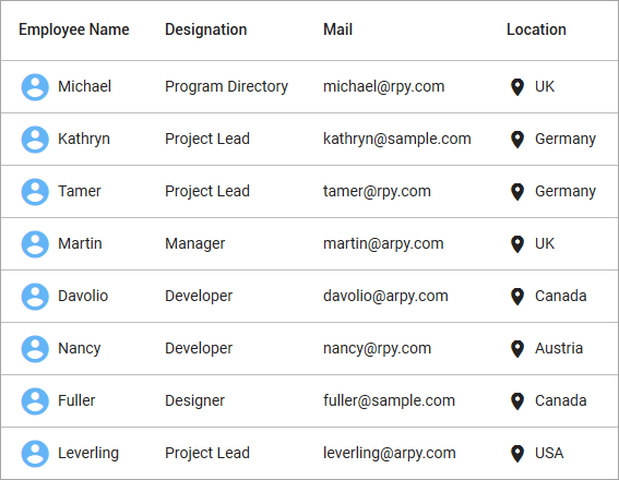
The Syncfusion® Flutter DataGrid is used to display and manipulate data in a tabular view. It is built from the ground up to achieve the best possible performance, even when loading large amounts of data.

Key Features
- Column types - Display any widget in each column, allowing for flexible content presentation.
- Column sizing - Configure column widths with various sizing options. Automatically adjust columns based on cell content to enhance readability.
- Row height - Customize heights for header and data rows. Automatically adjust row heights based on cell content. Set different heights for specific rows as needed.
- Editing - Enable users to modify cell values with support for custom editor widgets based on column types.
- Sorting - Sort data in ascending or descending order across single or multiple columns.
- Selection - Select one or more rows with keyboard navigation support for web platforms.
- Filtering - Filter data interactively similar to Excel with support for text, numeric, and date-time filtering. Programmatic filtering is also available.
- Column Drag and Drop - Reorder columns by dragging and dropping them to desired positions.
- Column resizing - Adjust column widths by dragging the right edge of column headers.
- Exporting - Export data to Excel and PDF formats.
- Styling - Customize the appearance of cells and headers with support for conditional styling.
- Stacked headers - Create unbound header rows that span across multiple rows and columns.
- Load more - Display an interactive view when scrolling reaches the bottom of the grid, enabling on-demand data loading.
- Paging - Load data in segments. It is useful when loading huge amounts of data.
- Freeze Panes - Freeze the rows and columns when scrolling the grid.
- Swiping - Implement swipe actions (left-to-right or right-to-left) for operations like deleting or editing rows.
- Footer - Show an additional row that can be displayed under the last row. Widgets can also be displayed in the footer row.
- Pull to refresh - Allows users to refresh data when the DataGrid is pulled down.
- Theme - Use a dark or light theme.
- Accessibility - Ensure screen readers can properly access and navigate the DataGrid.
- Right to Left (RTL) - Support right-to-left layouts for languages like Hebrew and Arabic.