Styles in Windows Forms DataGrid (SfDataGrid)
21 Jan 202519 minutes to read
Styling Record Cell
Appearance of the record cells can be customized by using the CellStyle property.
this.sfDataGrid1.Style.CellStyle.BackColor = Color.AliceBlue;
this.sfDataGrid1.Style.CellStyle.TextColor = Color.DarkBlue;Me.sfDataGrid1.Style.CellStyle.BackColor = Color.AliceBlue
Me.sfDataGrid1.Style.CellStyle.TextColor = Color.DarkBlue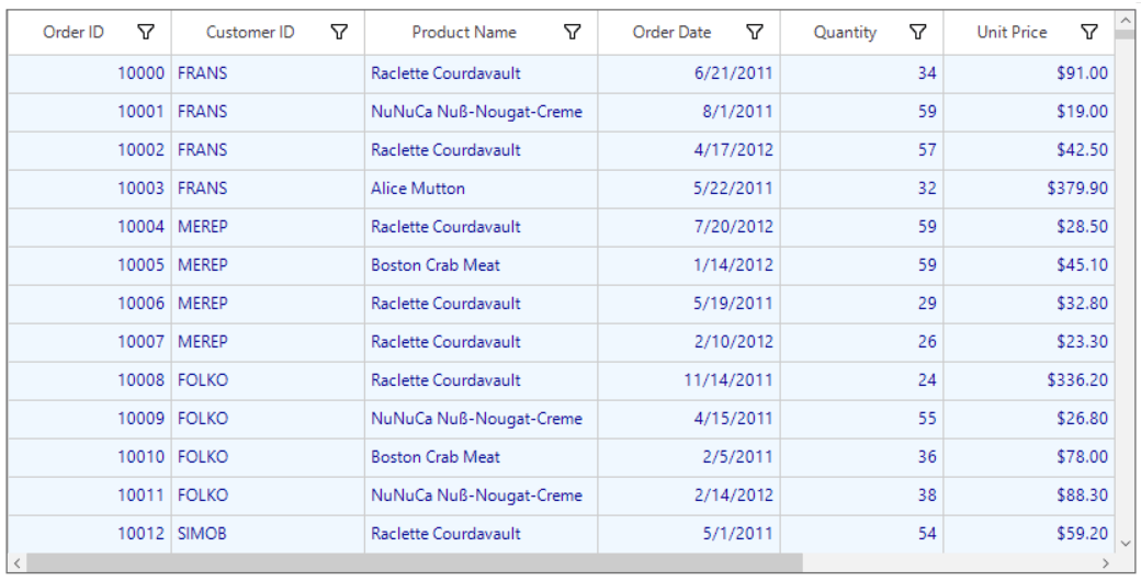
Appearance of the record cells of a particular column can be customized by using the GridColumnBase.CellStyle property.
this.sfDataGrid1.Columns["ProductName"].CellStyle.BackColor = Color.PaleTurquoise;
this.sfDataGrid1.Columns["ProductName"].CellStyle.TextColor = Color.DarkRed;Me.sfDataGrid1.Columns("ProductName").CellStyle.BackColor = Color.PaleTurquoise
Me.sfDataGrid1.Columns("ProductName").CellStyle.TextColor = Color.DarkRed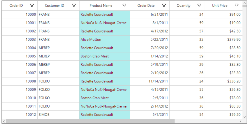
Font orientation of the record cells can be set by using the CellStyle.Font.Orientation property.
this.sfDataGrid1.RowHeight = 80;
this.sfDataGrid1.Style.CellStyle.Font.Orientation = 45;Me.sfDataGrid1.RowHeight = 80
Me.sfDataGrid1.Style.CellStyle.Font.Orientation = 45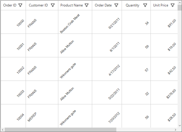
The text alignment of the record cells can be changed by using CellStyle.HorizontalAlignment and CellStyle.VerticalAlignment properties respectively.
//Change alignment for the record cells.
this.sfDataGrid1.Style.CellStyle.HorizontalAlignment = HorizontalAlignment.Left;
this.sfDataGrid1.Style.CellStyle.VerticalAlignment = System.Windows.Forms.VisualStyles.VerticalAlignment.Top;
'Change alignment for the record cells.
Me.sfDataGrid1.Style.CellStyle.HorizontalAlignment = HorizontalAlignment.Left
Me.sfDataGrid1.Style.CellStyle.VerticalAlignment = System.Windows.Forms.VisualStyles.VerticalAlignment.Top
The text alignment for the record cells in a specific column can be changed by using by using GridColumnBase.CellStyle.HorizontalAlignment and GridColumnBase.CellStyle.VerticalAlignment properties.
NOTE
GridColumnBase.CellStyle has higher priority than SfDataGrid.Style.CellStyle.
Styling Column Header
Appearance of the column headers can be customized by using the HeaderStyle property.
For more details, refer to Appearance in Header Row section.
Styling Stacked Header
Appearance of the stacked headers can be customized by the StackedHeaderStyle property.
For more details, refer to Appearance in Stacked Headers section.
Styling CaptionSummary
Appearance of the caption summary can be customized by using the CaptionSummaryRowStyle property.
For more details, refer to Appearance in Caption Summary section.
Styling GroupSummary
Appearance of the group summary can be customized by using the GroupSummaryRowStyle property.
For more details, refer to Appearance in Group Summary section.
Styling TableSummary
Appearance of the table summary can be customized by using the TableSummaryRowStyle property.
For more details, refer to Appearance in Table Summary section.
Gradient Background Style
SfDataGrid helps to provide gradient background appearance for the cells by using Interior property which is available in the StyleInfo properties of all the elements in the SfDataGrid.
The gradient background can be achieved by initializing the Interior property using BrushInfo object with GradientStyle and the necessary colors.
In the below example, gradient background is applied for the header cells and the record cells by providing the GradientStyle as Horizontal and the gradient start and end colors.
this.sfDataGrid1.Columns["OrderDate"].HeaderStyle.Interior = new Syncfusion.WinForms.Core.BrushInfo(GradientStyle.Horizontal, ColorTranslator.FromHtml("#5aff8d"), ColorTranslator.FromHtml("#12cb74"));
this.sfDataGrid1.Columns["Quantity"].HeaderStyle.Interior = new Syncfusion.WinForms.Core.BrushInfo(GradientStyle.Horizontal, ColorTranslator.FromHtml("#FFDF80"), ColorTranslator.FromHtml("#FFA925"));
this.sfDataGrid1.Columns["UnitPrice"].HeaderStyle.Interior = new Syncfusion.WinForms.Core.BrushInfo(GradientStyle.Horizontal, ColorTranslator.FromHtml("#f77891"), ColorTranslator.FromHtml("#ff5862"));

this.sfDataGrid1.Columns["OrderDate"].CellStyle.Interior = new Syncfusion.WinForms.Core.BrushInfo(GradientStyle.Horizontal, ColorTranslator.FromHtml("#5aff8d"), ColorTranslator.FromHtml("#12cb74"));
this.sfDataGrid1.Columns["Quantity"].CellStyle.Interior = new Syncfusion.WinForms.Core.BrushInfo(GradientStyle.Horizontal, ColorTranslator.FromHtml("#FFDF80"), ColorTranslator.FromHtml("#FFA925"));
this.sfDataGrid1.Columns["UnitPrice"].CellStyle.Interior = new Syncfusion.WinForms.Core.BrushInfo(GradientStyle.Horizontal, ColorTranslator.FromHtml("#f77891"), ColorTranslator.FromHtml("#ff5862"));Me.sfDataGrid1.Columns("OrderDate").HeaderStyle.Interior = New Syncfusion.WinForms.Core.BrushInfo(GradientStyle.Horizontal, ColorTranslator.FromHtml("#5aff8d"), ColorTranslator.FromHtml("#12cb74"))
Me.sfDataGrid1.Columns("Quantity").HeaderStyle.Interior = New Syncfusion.WinForms.Core.BrushInfo(GradientStyle.Horizontal, ColorTranslator.FromHtml("#FFDF80"), ColorTranslator.FromHtml("#FFA925"))
Me.sfDataGrid1.Columns("UnitPrice").HeaderStyle.Interior = New Syncfusion.WinForms.Core.BrushInfo(GradientStyle.Horizontal, ColorTranslator.FromHtml("#f77891"), ColorTranslator.FromHtml("#ff5862"))
Me.sfDataGrid1.Columns("OrderDate").CellStyle.Interior = New Syncfusion.WinForms.Core.BrushInfo(GradientStyle.Horizontal, ColorTranslator.FromHtml("#5aff8d"), ColorTranslator.FromHtml("#12cb74"))
Me.sfDataGrid1.Columns("Quantity").CellStyle.Interior = New Syncfusion.WinForms.Core.BrushInfo(GradientStyle.Horizontal, ColorTranslator.FromHtml("#FFDF80"), ColorTranslator.FromHtml("#FFA925"))
Me.sfDataGrid1.Columns("UnitPrice").CellStyle.Interior = New Syncfusion.WinForms.Core.BrushInfo(GradientStyle.Horizontal, ColorTranslator.FromHtml("#f77891"), ColorTranslator.FromHtml("#ff5862"))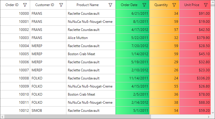
In the below example, gradient background is applied for the record cells by providing multiple gradient colors using BrushInfoColorList.
this.sfDataGrid1.Columns["OrderID"].CellStyle.Interior = new Syncfusion.WinForms.Core.BrushInfo(GradientStyle.Horizontal,
new Syncfusion.WinForms.Core.BrushInfoColorList(new Color[] { ColorTranslator.FromHtml("#FFDF80"), ColorTranslator.FromHtml("#FFA925"),
ColorTranslator.FromHtml("#ff5862"),ColorTranslator.FromHtml("#f77891")}));Me.sfDataGrid1.Columns("OrderID").CellStyle.Interior = New Syncfusion.WinForms.Core.BrushInfo(GradientStyle.Horizontal, New Syncfusion.WinForms.Core.BrushInfoColorList(New Color() { ColorTranslator.FromHtml("#FFDF80"), ColorTranslator.FromHtml("#FFA925"), ColorTranslator.FromHtml("#ff5862"),ColorTranslator.FromHtml("#f77891")}))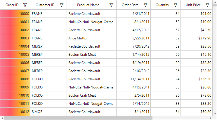
Pattern Background Style
SfDataGrid helps to provide background pattern for the cells by using Interior property which is available in the StyleInfo properties of all the elements in the SfDataGrid.
The background pattern can be achieved by initializing the Interior property using BrushInfo object with PatternStyle and the necessary colors.
In the below example, background pattern is applied for the header cells by providing the PatternStyle as SmallGrid and the fore color and back color for the pattern.
this.sfDataGrid1.Style.HeaderStyle.Interior = new Syncfusion.WinForms.Core.BrushInfo(PatternStyle.SmallGrid, ColorTranslator.FromHtml("#5aff8d"), ColorTranslator.FromHtml("#12cb74"));Me.sfDataGrid1.Style.HeaderStyle.Interior = New Syncfusion.WinForms.Core.BrushInfo(PatternStyle.SmallGrid, ColorTranslator.FromHtml("#5aff8d"), ColorTranslator.FromHtml("#12cb74"))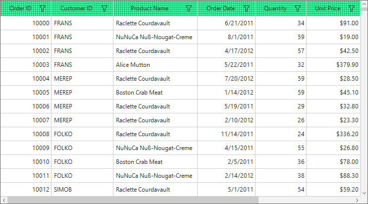
Styling UnboundRows
Appearance of the unbound rows can be customized by using the UnboundRowStyle property.
For more details, refer to Appearance in Unbound Rows section.
Styling AddNewRow
Appearance of the AddNewRow can be customized by using the AddNewRowStyle property.
For more details, refer to Appearance in AddNewRow section.
Styling RowHeader
Appearance of a row header can be customized by using the RowHeaderStyle property.
For more details, refer to Appearance in Row Header section.
Styling FilterRow
Appearance of a filter row can be customized by using the FilterRowStyle property.
For more details, refer to Appearance in Filter Row section.
Styling Scrollbars
Appearance of the vertical scrollbar can be customized by using the VerticalScrollBar property.
//Sets the back color of the vertical scrollbar arrow button.
this.sfDataGrid1.Style.VerticalScrollBar.ArrowButtonBackColor = Color.Gray;
this.sfDataGrid1.Style.VerticalScrollBar.ArrowButtonHoverBackColor = Color.White;
this.sfDataGrid1.Style.VerticalScrollBar.ArrowButtonPressedBackColor = Color.Blue;

//Sets the fore color of the vertical scrollbar arrow button.
this.sfDataGrid1.Style.VerticalScrollBar.ArrowButtonForeColor = Color.Black;
this.sfDataGrid1.Style.VerticalScrollBar.ArrowButtonHoverForeColor = Color.Black;
this.sfDataGrid1.Style.VerticalScrollBar.ArrowButtonPressedForeColor = Color.Gray;
this.sfDataGrid1.Style.VerticalScrollBar.ArrowButtonBorderColor = Color.Black;

// Sets the style properties of the thumb.
this.sfDataGrid1.Style.VerticalScrollBar.ThumbColor = Color.Gray;
this.sfDataGrid1.Style.VerticalScrollBar.ThumbHoverColor = Color.Black;
this.sfDataGrid1.Style.VerticalScrollBar.ThumbPressedColor = Color.Blue;
this.sfDataGrid1.Style.VerticalScrollBar.ThumbBorderColor = Color.Black;

// Sets the back color of the vertical scrollbar.
this.sfDataGrid1.Style.VerticalScrollBar.ScrollBarBackColor = Color.LightGray;
'Sets the back color of the vertical scrollbar arrow button.
Me.sfDataGrid1.Style.VerticalScrollBar.ArrowButtonBackColor = Color.Gray
Me.sfDataGrid1.Style.VerticalScrollBar.ArrowButtonHoverBackColor = Color.White
Me.sfDataGrid1.Style.VerticalScrollBar.ArrowButtonPressedBackColor = Color.Blue
'Sets the fore color of the vertical scrollbar arrow button.
Me.sfDataGrid1.Style.VerticalScrollBar.ArrowButtonForeColor = Color.Black
Me.sfDataGrid1.Style.VerticalScrollBar.ArrowButtonHoverForeColor = Color.Black
Me.sfDataGrid1.Style.VerticalScrollBar.ArrowButtonPressedForeColor = Color.Gray
Me.sfDataGrid1.Style.VerticalScrollBar.ArrowButtonBorderColor = Color.Black
' Sets the style properties of the thumb.
Me.sfDataGrid1.Style.VerticalScrollBar.ThumbColor = Color.Gray
Me.sfDataGrid1.Style.VerticalScrollBar.ThumbHoverColor = Color.Black
Me.sfDataGrid1.Style.VerticalScrollBar.ThumbPressedColor = Color.Blue
Me.sfDataGrid1.Style.VerticalScrollBar.ThumbBorderColor = Color.Black
' Sets the back color of the vertical scrollbar.
Me.sfDataGrid1.Style.VerticalScrollBar.ScrollBarBackColor = Color.LightGrayAppearance of the horizontal scrollbar can be customized by using the HorizontalScrollBar property.
//Sets the back color of the horizontal scrollbar arrow button.
this.sfDataGrid1.Style.HorizontalScrollBar.ArrowButtonBackColor = Color.Gray;
this.sfDataGrid1.Style.HorizontalScrollBar.ArrowButtonHoverBackColor = Color.White;
this.sfDataGrid1.Style.HorizontalScrollBar.ArrowButtonPressedBackColor = Color.Blue;

//Sets the fore color of the horizontal scrollbar arrow button.
this.sfDataGrid1.Style.HorizontalScrollBar.ArrowButtonForeColor = Color.Black;
this.sfDataGrid1.Style.HorizontalScrollBar.ArrowButtonHoverForeColor = Color.Black;
this.sfDataGrid1.Style.HorizontalScrollBar.ArrowButtonPressedForeColor = Color.Gray;
this.sfDataGrid1.Style.HorizontalScrollBar.ArrowButtonBorderColor = Color.Black;

// Sets the style properties of the thumb.
this.sfDataGrid1.Style.HorizontalScrollBar.ThumbColor = Color.Gray;
this.sfDataGrid1.Style.HorizontalScrollBar.ThumbHoverColor = Color.Black;
this.sfDataGrid1.Style.HorizontalScrollBar.ThumbPressedColor = Color.Blue;
this.sfDataGrid1.Style.HorizontalScrollBar.ThumbBorderColor = Color.Black;

// Sets the back color of the horizontal scrollbar.
this.sfDataGrid1.Style.HorizontalScrollBar.ScrollBarBackColor = Color.LightGray;
'Sets the back color of the horizontal scrollbar arrow button.
Me.sfDataGrid1.Style.HorizontalScrollBar.ArrowButtonBackColor = Color.Gray
Me.sfDataGrid1.Style.HorizontalScrollBar.ArrowButtonHoverBackColor = Color.White
Me.sfDataGrid1.Style.HorizontalScrollBar.ArrowButtonPressedBackColor = Color.Blue
'Sets the fore color of the horizontal scrollbar arrow button.
Me.sfDataGrid1.Style.HorizontalScrollBar.ArrowButtonForeColor = Color.Black
Me.sfDataGrid1.Style.HorizontalScrollBar.ArrowButtonHoverForeColor = Color.Black
Me.sfDataGrid1.Style.HorizontalScrollBar.ArrowButtonPressedForeColor = Color.Gray
Me.sfDataGrid1.Style.HorizontalScrollBar.ArrowButtonBorderColor = Color.Black
' Sets the style properties of the thumb.
Me.sfDataGrid1.Style.HorizontalScrollBar.ThumbColor = Color.Gray
Me.sfDataGrid1.Style.HorizontalScrollBar.ThumbHoverColor = Color.Black
Me.sfDataGrid1.Style.HorizontalScrollBar.ThumbPressedColor = Color.Blue
Me.sfDataGrid1.Style.HorizontalScrollBar.ThumbBorderColor = Color.Black
' Sets the back color of the horizontal scrollbar.
Me.sfDataGrid1.Style.HorizontalScrollBar.ScrollBarBackColor = Color.LightGray
Styling GroupDropArea
Appearance of the GroupDropArea can be customized by using the GroupDropAreaStyle property.
For more details, refer to Customizing GroupDropArea Appearance in Grouping section.
Styling GroupDropAreaItem
Appearance of the GroupDropAreaItem can be customized by using the GroupDropAreaItemStyle property.
For more details, refer to Customizing GroupDropAreaItem Appearance in Grouping section.
Styling Frozen Rows and Columns
Appearance of the frozen rows and columns can be customized by using the FreezePaneLineStyle property.
For more details, refer to Appearance in Freeze Panes section.
Selection
Appearance of the selected rows and current cell can be customized by using the SelectionStyle property.
For more details, refer to Appearance in Selection section.
Changing the Color and Thickness of the Gridlines
Color and thickness of the grid lines can be changed by using the Borders property.
this.sfDataGrid1.Style.CellStyle.Borders.All = new GridBorder(Color.DarkBlue, GridBorderWeight.ExtraThick);
this.sfDataGrid1.Style.HeaderStyle.Borders.All = new GridBorder(Color.DarkBlue, GridBorderWeight.ExtraThick);Me.sfDataGrid1.Style.CellStyle.Borders.All = New GridBorder(Color.DarkBlue, GridBorderWeight.ExtraThick)
Me.sfDataGrid1.Style.HeaderStyle.Borders.All = New GridBorder(Color.DarkBlue, GridBorderWeight.ExtraThick)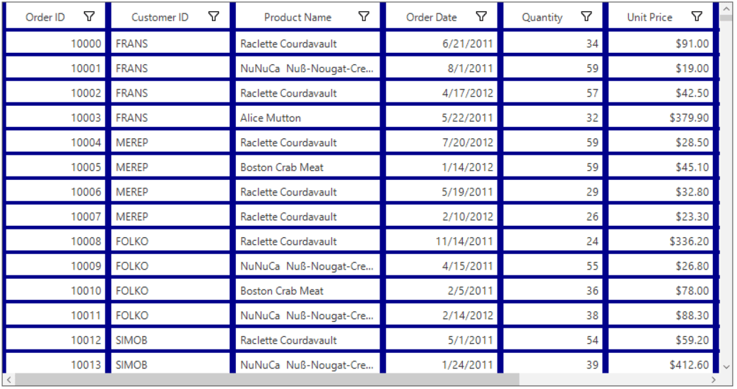
Changing the style of gridlines
The styles for the cell borders can be changed by initializing GridBorderStyle in the Borders property.
this.sfDataGrid1.Style.HeaderStyle.Borders.All = new GridBorder(GridBorderStyle.Dotted, Color.Blue, GridBorderWeight.Thin);
this.sfDataGrid1.Style.CellStyle.Borders.All = new GridBorder(GridBorderStyle.Dotted, Color.Blue, GridBorderWeight.Thin);Me.sfDataGrid1.Style.HeaderStyle.Borders.All = New GridBorder(GridBorderStyle.Dotted, Color.Blue, GridBorderWeight.Thin)
Me.sfDataGrid1.Style.CellStyle.Borders.All = New GridBorder(GridBorderStyle.Dotted, Color.Blue, GridBorderWeight.Thin)
Disable the gridlines
The cell borders can be disabled by setting GridBorderStyle to GridBorderStyle.None in the Borders property.
this.sfDataGrid1.Style.HeaderStyle.Borders.All = new GridBorder(GridBorderStyle.None);
this.sfDataGrid1.Style.CellStyle.Borders.All = new GridBorder(GridBorderStyle.None);Me.sfDataGrid1.Style.HeaderStyle.Borders.All = New GridBorder(GridBorderStyle.None)
Me.sfDataGrid1.Style.CellStyle.Borders.All = New GridBorder(GridBorderStyle.None)
Changing the grid border Color
The grid border color can be changed by using the Style.BorderColor property
this.sfDataGrid1.Style.BorderStyle = BorderStyle.FixedSingle;
this.sfDataGrid1.Style.BorderColor = Color.Red;Me.sfDataGrid1.Style.BorderStyle = BorderStyle.FixedSingle
Me.sfDataGrid1.Style.BorderColor = Color.Red
Showing busy indicator for the data operations
Indication of the data operation performed on the SfDataGrid can be showed with the help of BusyIndicator by setting the ShowBusyIndicator property to true. This will display an animated busy indicator image while performing the data operations such as loading large data, sorting, grouping, and filtering.
// To display the busy indicator in the SfDataGrid for the data operations.
this.sfDataGrid1.ShowBusyIndicator = true;
' To display the busy indicator in the SfDataGrid for the data operations.
Me.sfDataGrid1.ShowBusyIndicator = True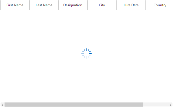
Changing the busy indicator image
The busy indicator image can be changed by using the SfDataGrid.Style.BusyIndicatorImage property. The image should be in GIF file format.
sfDataGrid1.Style.BusyIndicatorImage = Image.FromFile(@"../../BusyIndicator.gif");sfDataGrid1.Style.BusyIndicatorImage = Image.FromFile("../../BusyIndicator.gif")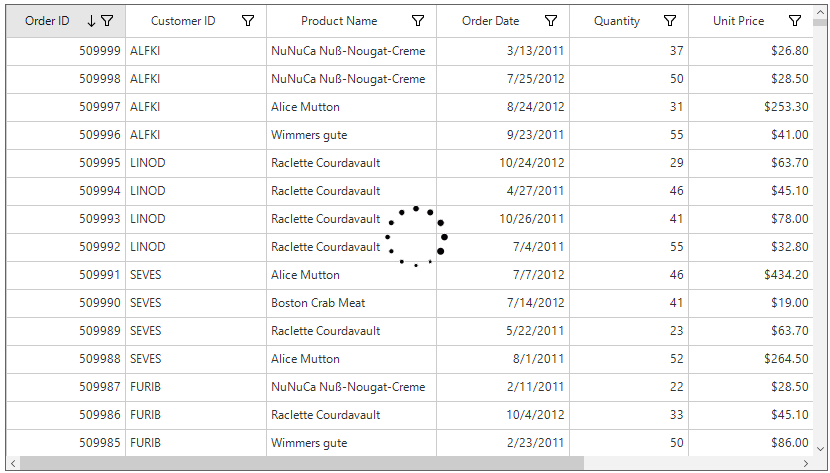
See also
How to change the outermost border color of the WinForms DataGrid (SfDataGrid)