How can I help you?
Column types in WinForms DataGrid (SfDataGrid)
21 Jan 202524 minutes to read
SfDataGrid provides support for various built-in column types. Each column has its own properties and renderer to handle different types of data.
|
Column Type |
Renderer |
Description |
| Use to display the string data | ||
| Use to display the numeric data | ||
| Use to display the date time value | ||
| Use to display the Boolean type data | ||
| Use to display combobox in each row | ||
| Use to display the image in each row | ||
| Use to display the Uri data | ||
| Use to display button in each row | ||
| Use to display progressbar in each row | ||
| Use to display multi select combobox in each row | ||
| Use to display the masked value. | ||
| Selects or deselects rows based on the check box value, which is not bound with data object. |
GridColumn
GridColumn is a class that provides base functionalities for all the column types in SfDataGrid.
Mapping Column to a Property
Column can be bound to a property in data object using GridColumnBase.MappingName property.
Formatting the Value
GridColumnBase.Format property can be used to set format for the data in the column.
this.sfDataGrid1.Columns["OrderDate"].Format = "yyyy/mm/dd";Me.sfDataGrid1.Columns("OrderDate").Format = "yyyy/mm/dd"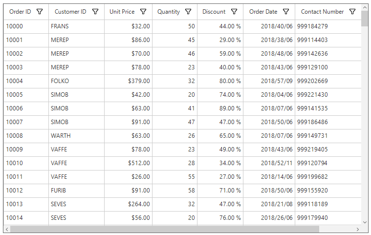
NOTE
This property works only for
GridDateTimeColumn,GridNumericColumnandGridButtonColumn.
Custom formatting
The SfDataGrid allows creating and assigning custom format for the columns through the IDataGridFormatProvider interface.
The GridColumnBase.FormatProvider property can be used to set custom format for the columns.
public Form1()
{
    InitializeComponent();
    var data = new OrderInfoCollection();
    sfDataGrid.DataSource = data.OrdersListDetails;

    sfDataGrid.Columns["OrderDate"].Format = "dd/MM/yyyy";
    sfDataGrid.Columns["OrderDate"].FormatProvider = new CustomFormatter();
}


public class CustomFormatter : IDataGridFormatProvider
 {
     public object Format(string format, GridColumnBase gridColumn, object record, object value)
     {
         if (value == null)
         {
             throw new ArgumentNullException((value == null) ? "format" : "args");
         }

         if (gridColumn is GridColumn && (gridColumn as GridColumn).MappingName == "OrderDate")
         {
             var orderInfo = record as OrderInfo;

             if (orderInfo.OrderDate.Month == 1)
                 return "January " + orderInfo.OrderDate.Day + ", " + orderInfo.OrderDate.Year;
         }

         return value.ToString();
     }


     public object GetFormat(Type formatType)
     {
         return this;
     }

     public string Format(string format, object arg, IFormatProvider formatProvider)
     {
         throw new NotImplementedException();
     }
 }
Public Sub New()
InitializeComponent()
Dim data = New OrderInfoCollection()
sfDataGrid.DataSource = data.OrdersListDetails
sfDataGrid.Columns("OrderDate").Format = "dd/mm/yyyy"
sfDataGrid.Columns("OrderDate").FormatProvider = New CustomFormatter()
End Sub
Public Class CustomFormatter
Implements IDataGridFormatProvider
Public Function Format(ByVal _format As String, ByVal gridColumn As GridColumnBase, ByVal record As Object, ByVal value As Object) As Object
If value Is Nothing Then
Throw New ArgumentNullException(If((value Is Nothing), "format", "args"))
End If
If TypeOf gridColumn Is GridColumn AndAlso (TryCast(gridColumn, GridColumn)).MappingName = "OrderDate" Then
Dim orderInfo = TryCast(record, OrderInfo)
If orderInfo.OrderDate.Month = 1 Then
Return "January " & orderInfo.OrderDate.Day & ", " & orderInfo.OrderDate.Year
End If
End If
Return value.ToString()
End Function
Public Function GetFormat(ByVal formatType As Type) As Object
Return Me
End Function
Public Function Format(ByVal _format As String, ByVal arg As Object, ByVal formatProvider As IFormatProvider) As String
Throw New NotImplementedException()
End Function
End Class
NOTE
The custom format will be applied, only when the GridColumnBase.Format property is set for the corresponding column.
Styling GridColumn
GridColumn support to customize the style of particular column using GridColumnBase.CellStyle and GridColumnBase.HeaderStyle properties. For more information, refer Styling section.
//Change the record cell back color for product name column.
this.sfDataGrid.Columns["ProductName"].CellStyle.BackColor = Color.SlateGray;

//Change the record cell text color for product name column.
this.sfDataGrid.Columns["ProductName"].CellStyle.TextColor = Color.White

//Change the header cell back color for product name column.
this.sfDataGrid.Columns["ProductName"].HeaderStyle.BackColor = Color.MediumSlateBlue;

//Change the header cell text color for product name column.
this.sfDataGrid.Columns["ProductName"].HeaderStyle.TextColor = Color.White;
'Change the record cell back color for product name column.
Me.sfDataGrid.Columns("ProductName").CellStyle.BackColor = Color.SlateGray
'Change the record cell text color for product name column.
'Change the header cell back color for product name column.
Color.White Me.sfDataGrid.Columns("ProductName").HeaderStyle.BackColor = Color.MediumSlateBlue
Me.sfDataGrid.Columns("ProductName").CellStyle.TextColor = Color.White Me.sfDataGrid.Columns("ProductName").HeaderStyle.BackColor
'Change the header cell text color for product name column.
Me.sfDataGrid.Columns("ProductName").HeaderStyle.TextColor = Color.White
Disable Column
A column can be disabled by setting the AllowFocus property. Therefore, that column cannot be selected or edited.
GridTextColumn
GridTextColumn provides support to display column data as text, which hosts TextBox in edit mode.
this.sfDataGrid1.Columns.Add(new GridTextColumn()
{
    MappingName = "ProductName",
    HeaderText = "Product Name"
});Me.sfDataGrid1.Columns.Add(New GridTextColumn() With {.MappingName = "ProductName", .HeaderText = "Product Name"})Multiline Support
SfDataGrid allows to edit multiline text in GridTextColumn by setting GridTextColumn.AllowMultiline property to true.
(this.sfDataGrid1.Columns["ProductName"] as GridTextColumn).AllowMultiline= true;TryCast(Me.sfDataGrid1.Columns("ProductName"), GridTextColumn).AllowMultiline= TrueVertical Scroll Bar
Vertical scroll bar can be enabled for multiline textbox cell while editing by setting the GridTextColumn.AllowVerticalScrollBar to true.
(this.sfDataGrid1.Columns["ProductName"] as GridTextColumn).AllowVerticalScrollbar = true;TryCast(Me.sfDataGrid1.Columns("ProductName"), GridTextColumn).AllowVerticalScrollbar = TrueGridNumericColumn
GridNumericColumn provides support to display columns data as numeric values.
this.sfDataGrid1.Columns.Add(new GridNumericColumn()
{
    MappingName = "UnitPrice",
    HeaderText = "Unit Price"
});Me.sfDataGrid1.Columns.Add(New GridNumericColumn() With {.MappingName = "UnitPrice", .HeaderText = "Unit Price"})Format Mode
SfDataGrid allows to set the below format modes for the numeric columns by using the GridNumericColumn.FormatMode property.
Numeric
Numeric format can be used to display numeric value.
Percent
Percent format can be used to display percentage values with percentage symbol.
this.sfDataGrid1.Columns.Add(new GridNumericColumn()
{
    MappingName = "Discount",
    HeaderText = "Discount",
    FormatMode = FormatMode.Percent
});Me.sfDataGrid1.Columns.Add(New GridNumericColumn() With {.MappingName = "Discount", .HeaderText = "Discount", .FormatMode = FormatMode.Percent})
Currency
Currency format can be used to display values in currency format with currency symbol.
this.sfDataGrid1.Columns.Add(new GridNumericColumn()
{
MappingName = "UnitPrice",
HeaderText = "Unit Price",
FormatMode = FormatMode.Currency,
});Me.sfDataGrid1.Columns.Add(New GridNumericColumn() With {.MappingName = "UnitPrice", .HeaderText = "Unit Price", .FormatMode = FormatMode.Currency})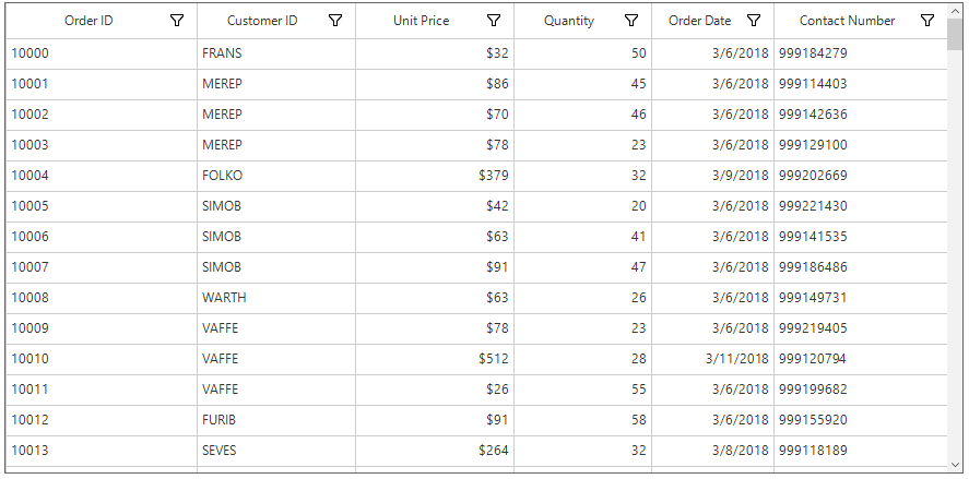
NOTE
By default,
GridNumericColumndisplays the record withNumericformat.
Data Formatting
GridNumericColumn allows to format the numeric data with culture-specific information by using the GridNumericColumn.NumberFormatInfo property.
NumberFormatInfo for Numeric Formatted Column
The below properties of NumberFormatInfo can be used to specify the format for the numeric values.
-
NumberDecimalDigits- The Number of decimal digits to be displayed after the decimal point can be changed by usingNumberDecimalDigitsproperty. -
NumberDecimalSeparator- By default, the dot (.) operator separates the decimal part of numeric value. Any operator can be used as decimal separator throughNumberDecimalSeparatorproperty. -
NumberGroupSeparator- By default, the comma (,) separates group of digits before the decimal point. Any operator can be used as group separator throughNumberGroupSeparatorproperty. -
NumberGroupSizes- The number of digits in each group before the decimal point on numeric values can be changed by usingNumberGroupSizesproperty. -
Formatting negative pattern- The pattern of negative numeric values can be formatted by usingNumberNegativePattern.
NumberFormatInfo numberFormat = Application.CurrentCulture.NumberFormat.Clone() as NumberFormatInfo;
numberFormat.NumberDecimalDigits = 2;
numberFormat.NumberDecimalSeparator = "*";
numberFormat.NumberGroupSizes = new int[] { };
this.sfDataGrid1.Columns.Add(new GridNumericColumn()
{
    HeaderText = "Quantity",
    MappingName = "Quantity",
    FormatMode = FormatMode.Numeric,
    NumberFormatInfo = numberFormat
});
Dim numberFormat As NumberFormatInfo = TryCast(Application.CurrentCulture.NumberFormat.Clone(), NumberFormatInfo)
numberFormat.NumberDecimalDigits = 2
numberFormat.NumberDecimalSeparator = "*"
numberFormat.NumberGroupSizes = New Integer() { }
Me.sfDataGrid1.Columns.Add(New GridNumericColumn() With {.HeaderText = "Quantity", .MappingName = "Quantity", .FormatMode = FormatMode.Numeric, .NumberFormatInfo = numberFormat})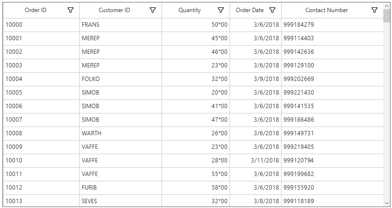
NumberFormatInfo for Percent Formatted Column
The below properties of NumberFormatInfo can be used to specify the format for the percentage values.
-
PercentSymbol- By default, the percent operator (%) will be loaded with the value. The symbol can be changed by usingPercentSymbolproperty. -
PercentDecimalDigits- The number of decimal digits to be displayed after the decimal point on percent value can be specified usingPercentDecimalDigitsproperty. -
PercentDecimalSeparator- By default, the dot (.) operator separates the decimal part of percent value. Any operator can be used as decimal separator throughPercentDecimalSeparatorproperty. -
PercentGroupSeparator- By default, the comma (,) operator separates the group of digits left to the decimal point on currency value. Any operator can be used as group separator throughPercentGroupSeparatorproperty. -
PercentGroupSizes- The number of digits in each group before the decimal point can be changed throughPercentGroupSizesproperty. -
Pattern- The pattern for both positive and negative percent values can be formatted throughPercentPositivePatternandPercentNegativePattern.
NumberFormatInfo numberFormat = Application.CurrentCulture.NumberFormat.Clone() as NumberFormatInfo;
numberFormat.PercentDecimalDigits = 2;
numberFormat.PercentDecimalSeparator = "*";
numberFormat.PercentSymbol = "/-";
this.sfDataGrid1.Columns.Add(new GridNumericColumn()
{
    MappingName = "Discount",
    HeaderText = "Discount",
    FormatMode = FormatMode.Percent ,
    NumberFormatInfo = numberFormat
});
Dim numberFormat As NumberFormatInfo = TryCast(Application.CurrentCulture.NumberFormat.Clone(), NumberFormatInfo)
numberFormat.PercentDecimalDigits = 2
numberFormat.PercentDecimalSeparator = "*"
numberFormat.PercentSymbol = "/-"
Me.sfDataGrid1.Columns.Add(New GridNumericColumn() With {.MappingName = "Discount", .HeaderText = "Discount", .FormatMode = FormatMode.Percent, .NumberFormatInfo = numberFormat})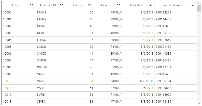
NumberFormatInfo for Currency Formatted Column
The below properties of NumberFormatInfo can be used to specify the format for the currency values.
-
CurrencySymbol- By default, the currency symbol will be displayed based on culture. The symbol can be changed by usingCurrencySymbolproperty. -
CurrencyDecimalDigits- The number of decimal digits to be displayed after the decimal point on currency values can be changed usingCurrencyDecimalDigitsproperty. -
CurrencyDecimalSeparator- By default, the dot (.) operator separates the decimal part of currency value. Any operator can be used as decimal separator throughCurrencyDecimalSeparatorproperty. -
CurrencyGroupSeparator- By default, the comma (,) separates the group of digits before the decimal point on currency value. Any operator can be used as group separator throughCurrencyGroupSeparatorproperty. -
CurrencyGroupSizes- The number of digits in each group before the decimal point on currency value can be changed by usingCurrencyGroupSizesproperty. -
Pattern- The pattern for both positive and negative currency values can be formatted throughCurrencyPositivePatternandCurrencyNegativePattern.
NumberFormatInfo numberFormat = Application.CurrentCulture.NumberFormat.Clone() as NumberFormatInfo;
numberFormat.CurrencyDecimalDigits = 2;
numberFormat.CurrencyDecimalSeparator = "*"
numberFormat.CurrencySymbol = "#";
this.sfDataGrid1.Columns.Add(new GridNumericColumn()
{
MappingName = "UnitPrice",
HeaderText = "Unit Price",
FormatMode = FormatMode.Currency,
NumberFormatInfo = numberFormat
});
Dim numberFormat As NumberFormatInfo = TryCast(Application.CurrentCulture.NumberFormat.Clone(), NumberFormatInfo)
numberFormat.CurrencyDecimalDigits = 2
"*" numberFormat.CurrencySymbol = "#"
numberFormat.CurrencyDecimalSeparator = "*" numberFormat.CurrencySymbol
Me.sfDataGrid1.Columns.Add(New GridNumericColumn() With {.MappingName = "UnitPrice", .HeaderText = "Unit Price", .FormatMode = FormatMode.Currency, .NumberFormatInfo = numberFormat})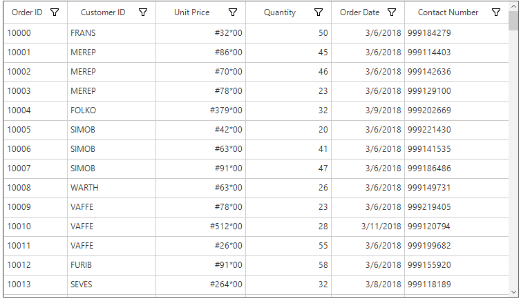
Displaying Null Value
GridNumericColumn provides support to restrict or allow null value in columns based on GridNumericColumn.AllowNull property.
Auto Increment
GridNumericColumn allows end-user to increment or decrement the value by pressing up and down arrow keys. This can be enabled by setting GridNumericColumn.InterceptArrowKeys property to true.
GridDateTimeColumn
GridDateTimeColumn provides support to display and edit the date time values on the cell.
this.sfDataGrid1.Columns.Add(new GridDateTimeColumn()
{
  MappingName = "OrderDate",
  HeaderText = "Order Date"
});Me.sfDataGrid1.Columns.Add(New GridDateTimeColumn() With {.MappingName = "OrderDate", .HeaderText = "Order Date"})Change the Pattern of Date Time Value
The date time value can be formatted by using GridDateTimeColumn.Pattern property, which contains the set of predefined date time patterns.
|
Pattern |
Expected |
| LongDate | Monday, June 15, 2016 |
| LongTime | 1:45:30 PM |
| ShortDate | 6/15/2016 |
| ShortTime | 1:45 PM |
| FullDateTime | Monday, June 15, 2016 1:45 PM |
| MonthDay | June 15 |
| RFC1123 | Mon, 15 Jun 2016 20:45:30 GMT |
| SortableDateTime | 2016-06-15T13:45:30 |
| UniversalSortableDateTime | 2016-06-15 13:45:30Z |
| YearMonth | June, 2016 |
| Custom | Sets the custom pattern for date and time value. |
Displaying Null Value
GridDateTimeColumn provides support to restrict or allow null value in columns based on AllowNull property. Instead of displaying null values, any default date time value can be displayed by usingNullValue property.
The NullValue property won’t work, when the AllowNull property is false.
Auto Increment
GridDateTimeColumn allows end-user to increment or decrement the value when MouseWheel by setting the AllowValueChangeOnMouseWheel property to true.
The value can also be changed by pressing up and down arrow keys when the InterceptArrowKeys property is true.
Setting Date Time Value Range
Displaying the input value can be restricted within the range by using MinDateTime and MaxDateTime properties.
GridCheckBoxColumn
GridCheckBoxColumn provides support to display and edit Boolean type data.
Three State Check Box
GridCheckBoxColumn provides support for the three check states rather than two. The states are checked, unchecked and an intermediate state. This can be enabled by setting AllowThreeState property to true.
this.sfDataGrid1.Columns.Add(new GridCheckBoxColumn()
{
    MappingName = "PaidStatus",
    HeaderText = "Paid Status",
    AllowThreeState = true
});Me.sfDataGrid1.Columns.Add(New GridCheckBoxColumn() With {.MappingName = "PaidStatus", .HeaderText = "Paid Status", .AllowThreeState = True})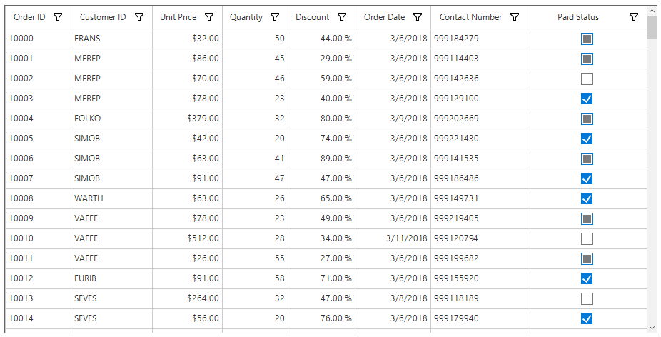
Text on the Check Box Column
GridCheckBoxColumn allows to display the text along with checkbox in the cell. This can be enabled by setting the AllowText property to true.
(this.sfDataGrid1.Columns["IsClosed"] as GridCheckBoxColumn).AllowText = true;TryCast(Me.sfDataGrid1.Columns("IsClosed"), GridCheckBoxColumn).AllowText = True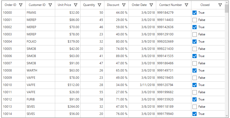
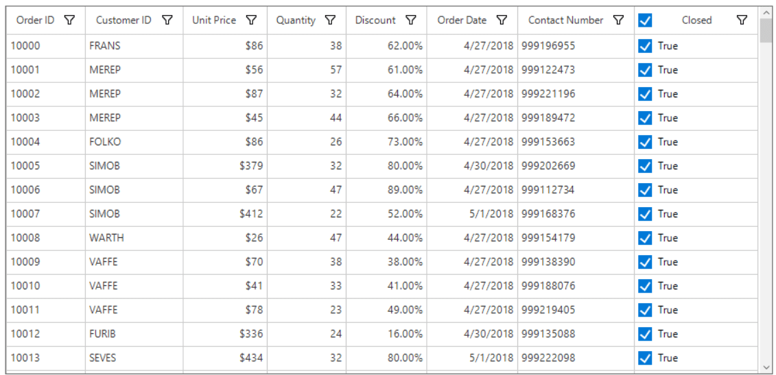
Check Box on Header
By default, CheckBox displays only in record cell. By enabling the AllowCheckBoxOnHeader property, CheckBox can be displayed in header cell of GridCheckBoxColumn.
(this.sfDataGrid1.Columns["IsClosed"] as GridCheckBoxColumn).AllowCheckBoxOnHeader = true;TryCast(Me.sfDataGrid1.Columns("IsClosed"), GridCheckBoxColumn).AllowCheckBoxOnHeader = True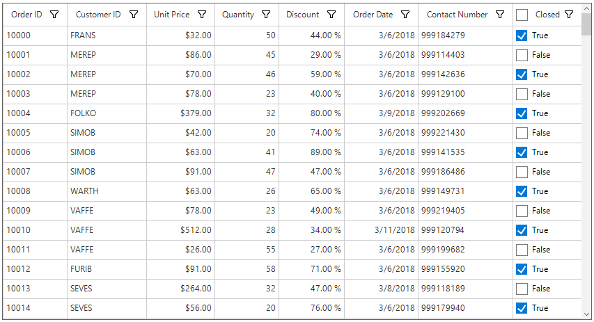
All the checkboxes in a column will be checked/unchecked by clicking on the CheckBox in the header.
By default, enabling the AllowCheckBoxOnHeader property will display the checkbox with text on the header cell of GridCheckBoxColumn. The text in the header cell can be disabled by setting empty value for the HeaderText property of the column.
(this.sfDataGrid1.Columns["IsClosed"] as GridCheckBoxColumn).AllowCheckBoxOnHeader = true;
this.sfDataGrid1.Columns["IsClosed"].HeaderText = string.Empty;TryCast(Me.sfDataGrid1.Columns("IsClosed"), GridCheckBoxColumn).AllowCheckBoxOnHeader = True
Me.sfDataGrid1.Columns("IsClosed").HeaderText = String.Empty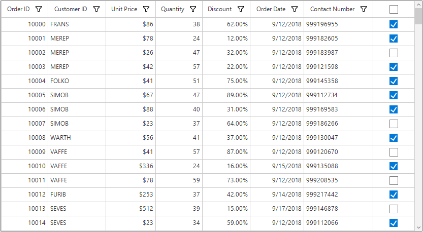
Customizing the Check Box Value
GridCheckBoxColumn allows to display check box for enumeration type columns also. The corresponding underlying value for the checked, unchecked and intermediate state can be specified by the below properties.
-
TrueValue – Specifies the underlying value corresponding
to a cell value of true, which appears as a checked box. -
FalseValue – Specifies the underlying value corresponding to a cell value of false, which appears as an unchecked box.
-
IntermediateValue – Specifies the underlying value corresponding to an indeterminate or null cell value, which appears as a disabled checkbox.
this.sfDataGrid1.Columns.Add(new GridCheckBoxColumn()
{
    MappingName = "PaidStatus",
    HeaderText = "Paid Status",
    TrueValue = PaidStatus.Paid,
    FalseValue = PaidStatus.NotPaid,
    IndeterminateValue = PaidStatus.UnKnown,
    AllowThreeState = true,
    AllowText = true
});Me.sfDataGrid1.Columns.Add(New GridCheckBoxColumn() With {.MappingName = "PaidStatus", .HeaderText = "Paid Status", .TrueValue = PaidStatus.Paid, .FalseValue = PaidStatus.NotPaid, .IndeterminateValue = PaidStatus.UnKnown, .AllowThreeState = True, .AllowText = True})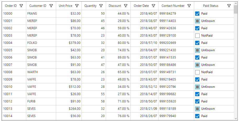
Appearance
Styling
SfDataGrid allows to customize the appearance of the check box column through SfDataGrid.Style.CheckBoxStyle property.
//Change the appearance of the checked box.
this.sfDataGrid1.Style.CheckBoxStyle.CheckedBackColor = Color.LawnGreen;
this.sfDataGrid1.Style.CheckBoxStyle.CheckedBorderColor = Color.DarkViolet;
this.sfDataGrid1.Style.CheckBoxStyle.CheckedTickColor = Color.Red;

//Change the appearance of the intermediate state checkbox
this.sfDataGrid1.Style.CheckBoxStyle.IndeterminateBorderColor = Color.DarkSlateGray;
this.sfDataGrid1.Style.CheckBoxStyle.IndeterminateColor = Color.Brown;

//Change the appearance of the unchecked box
this.sfDataGrid1.Style.CheckBoxStyle.UncheckedBackColor = Color.Moccasin;
this.sfDataGrid1.Style.CheckBoxStyle.UncheckedBorderColor = Color.DarkSlateGray;
'Change the appearance of the checked box.
Me.sfDataGrid1.Style.CheckBoxStyle.CheckedBackColor = Color.LawnGreen
Me.sfDataGrid1.Style.CheckBoxStyle.CheckedBorderColor = Color.DarkViolet
Me.sfDataGrid1.Style.CheckBoxStyle.CheckedTickColor = Color.Red
'Change the appearance of the intermediate state checkbox
Me.sfDataGrid1.Style.CheckBoxStyle.IndeterminateBorderColor = Color.DarkSlateGray
Me.sfDataGrid1.Style.CheckBoxStyle.IndeterminateColor = Color.Brown
'Change the appearance of the unchecked box
Me.sfDataGrid1.Style.CheckBoxStyle.UncheckedBackColor = Color.Moccasin
Me.sfDataGrid1.Style.CheckBoxStyle.UncheckedBorderColor = Color.DarkSlateGray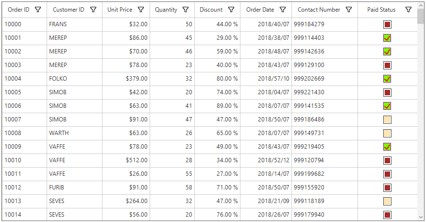
Conditional Styling
SfDataGrid allows to customize the appearance of the check box column based on conditions through QueryCheckBoxCellStyle event.
this.sfDataGrid1.QueryCheckBoxCellStyle += SfDataGrid1_QueryCheckBoxCellStyle;

void SfDataGrid1_QueryCheckBoxCellStyle(object sender, QueryCheckBoxCellStyleEventArgs e)
{
    if (e.RowIndex % 2 == 0)
    {
        e.Style.CheckedBackColor = Color.LawnGreen;
        e.Style.CheckedBorderColor = Color.DarkViolet;
        e.Style.CheckedTickColor = Color.Red;
    }
}
AddHandler sfDataGrid1.QueryCheckBoxCellStyle, AddressOf SfDataGrid1_QueryCheckBoxCellStyle
Private Sub SfDataGrid1_QueryCheckBoxCellStyle(ByVal sender As Object, ByVal e As QueryCheckBoxCellStyleEventArgs)
If e.RowIndex Mod 2 = 0 Then
e.Style.CheckedBackColor = Color.LawnGreen
e.Style.CheckedBorderColor = Color.DarkViolet
e.Style.CheckedTickColor = Color.Red
End If
End Sub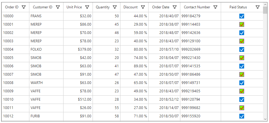
Canceling the check box state change
Changing the check box state can be canceled by setting the CellCheckBoxClickEventArgs.Cancel to true in the SfDataGrid.CellCheckBoxClick event.
this.sfDataGrid1.CellCheckBoxClick += sfDataGrid1_CellCheckBoxClick;

void sfDataGrid1_CellCheckBoxClick(object sender, CellCheckBoxClickEventArgs e)
{
    if (e.RowIndex == 1)
        e.Cancel = true;
}
AddHandler sfDataGrid1.CellCheckBoxClick, AddressOf SfDataGrid1_CellCheckBoxClick
Private Sub sfDataGrid1_CellCheckBoxClick(ByVal sender As Object, ByVal e As CellCheckBoxClickEventArgs)
If e.RowIndex = 1 Then
e.Cancel = True
End If
End SubGridComboBoxColumn
GridComboBoxColumn is derived from the GridColumn which hosts SfComboBox as edit element. Data source to the combo box can be set by using the GridComboBoxColumn.DataSource property.
By default, GridComboBoxColumn displays the value by using the MappingName property. You can set DisplayMember that denotes the string to be displayed in the cell (to serve as visual representation of object). You can set ValueMember that denotes string from the object data source that acts as a value for that cell or to get the SelectedValue from the SelectedItem.
this.sfDataGrid.Columns.Add( new GridComboBoxColumn() { MappingName = "ShipCity",HeaderText="Ship City" });
(this.sfDataGrid.Columns["ShipCity"] as GridComboBoxColumn).DataSource = orderInfo.ComboBoxItemsSource;Me.sfDataGrid.Columns.Add(New GridComboBoxColumn() With {.MappingName = "ShipCity", .HeaderText="Ship City"})
TryCast(Me.sfDataGrid.Columns("ShipCity"), GridComboBoxColumn).DataSource = orderInfo.ComboBoxItemsSourceThe SfDataGrid triggers the CellComboBoxSelectionChanged event when the SelectedValue is changed. The CellComboBoxSelectionChangedEventArgs of CellComboBoxSelectionChanged event provides the information of the changed cell value. Properties to get the selected item and index are as follows:
- SelectedIndex : Returns the index of selected item.
- SelectedItem : Returns the selected item from drop-down list.
Opening drop-down popup on single-click
Drop-down of the combo-box column can be shown on single click by using the custom combo-box renderer.
In the following code, the GridComboBoxCellRendererExt is created to call the ShowDropDown method to open the drop-down on the initialization.
Replace the default renderer with created renderer in the SfDataGrid.CellRenderers collection.
this.sfDataGrid.CellRenderers.Remove("ComboBox");
this.sfDataGrid.CellRenderers.Add("ComboBox", new GridComboBoxCellRendererExt());

public class GridComboBoxCellRendererExt : GridComboBoxCellRenderer
{
    protected override void OnInitializeEditElement(DataColumnBase column, RowColumnIndex rowColumnIndex, SfComboBox uiElement)
    {
        base.OnInitializeEditElement(column, rowColumnIndex, uiElement);
        uiElement.ShowDropDown();
    }
}Me.sfDataGrid.CellRenderers.Remove("ComboBox")
Me.sfDataGrid.CellRenderers.Add("ComboBox", New GridComboBoxCellRendererExt())
Public Class GridComboBoxCellRendererExt
Inherits GridComboBoxCellRenderer
Protected Overrides Sub OnInitializeEditElement(ByVal column As DataColumnBase, ByVal rowColumnIndex As RowColumnIndex, ByVal uiElement As SfComboBox)
MyBase.OnInitializeEditElement(column, rowColumnIndex, uiElement)
uiElement.ShowDropDown()
End Sub
End ClassCustomizing GroupCaptionText based on DisplayMemberPath
By default, the group caption text will be displayed based on the MappingName of combo-box column. This can be changed to display the DisplayMember by using the GroupMode property of the column.
sfDataGrid.Columns.Add(new GridComboBoxColumn() { MappingName = "ShipCityID", HeaderText = "Ship City", ValueMember = "ShipCityID", DisplayMember = "ShipCityName", GroupMode = Syncfusion.Data.DataReflectionMode.Display });sfDataGrid.Columns.Add(New GridComboBoxColumn() With {.MappingName = "ShipCityID", .HeaderText = "Ship City", .ValueMember = "ShipCityID", .DisplayMember = "ShipCityName", .GroupMode = Syncfusion.Data.DataReflectionMode.Display})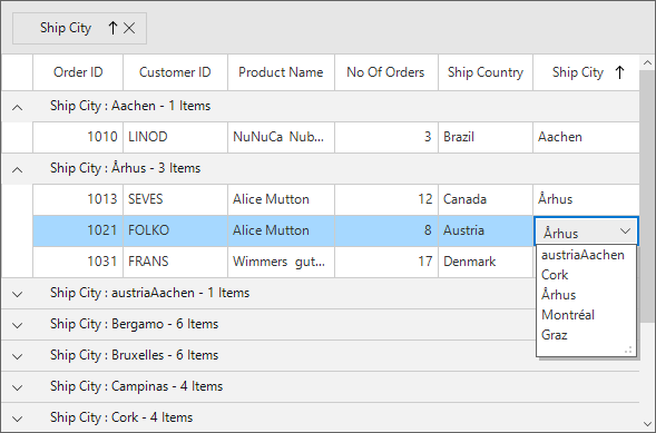
Loading different DataSources for each row of GridComboBoxColumn
Different data sources can be loaded for each row of the GridComboBoxColumn by using the DataSourceSelector property.
Implementing IDataSourceSelector
DataSourceSelector needs to implement IDataSourceSelector interface to implement the GetDataSource method that receives the following parameters,
- record – data object associated with row.
- dataSource – Data context of data grid.
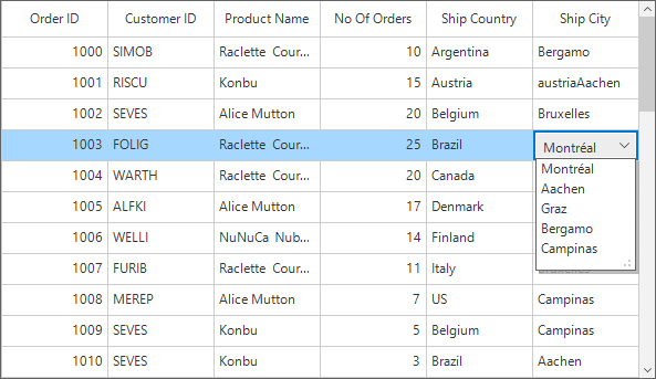
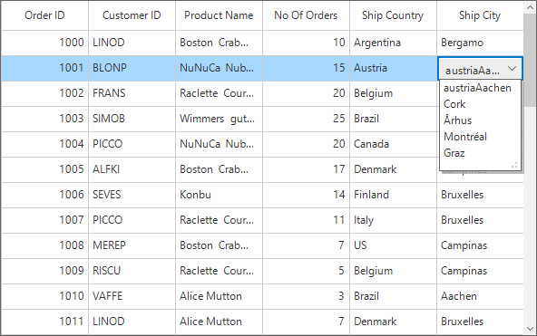
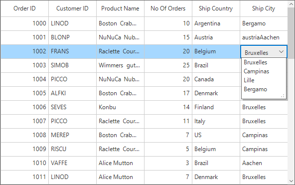
In the following code, DataSource of the Ship City column is returned based on ShipCountry column value by using the record and the data context of SfDataGrid passed to the GetDataSource method.
sfDataGrid.Columns.Add(new GridComboBoxColumn() { MappingName = "ShipCityID", HeaderText = "Ship City", ValueMember = "ShipCityID", DisplayMember = "ShipCityName", IDataSourceSelector = new DataSourceSelector()});

public class DataSourceSelector : IDataSourceSelector
{
    public IEnumerable GetDataSource(object record, object dataSource)
    {
        if (record == null)
            return null;

        var orderInfo = record as OrderDetails;
        var countryName = orderInfo.ShipCountry;

        var countryDetails = new CountryInfoRepository();

        //Returns ShipCity collection based on ShipCountry.
        if (countryDetails.ShipCities.ContainsKey(countryName))
        {
            ObservableCollection<ShipCityDetails> shipCities = null;
            countryDetails.ShipCities.TryGetValue(countryName, out shipCities);
            return shipCities.ToList();
        }
        return null;
    }
}sfDataGrid.Columns.Add(New GridComboBoxColumn() With {.MappingName = "ShipCityID", .HeaderText = "Ship City", .ValueMember = "ShipCityID", .DisplayMember = "ShipCityName", .IDataSourceSelector = New DataSourceSelector()})
Public Class DataSourceSelector
Implements IDataSourceSelector
Public Function GetDataSource(ByVal record As Object, ByVal dataSource As Object) As IEnumerable
If record Is Nothing Then
Return Nothing
End If
Dim orderInfo = TryCast(record, OrderDetails)
Dim countryName = orderInfo.ShipCountry
Dim countryDetails = New CountryInfoRepository()
'Returns ShipCity collection based on ShipCountry.
If countryDetails.ShipCities.ContainsKey(countryName) Then
Dim shipCities As ObservableCollection(Of ShipCityDetails) = Nothing
countryDetails.ShipCities.TryGetValue(countryName, shipCities)
Return shipCities.ToList()
End If
Return Nothing
End Function
End ClassFollowing screenshot illustrates the different Ship City DataSource bound to each row of the ComboBox column based on the Ship Country Name.
Editing the combo box
By default, the combo-box column is not allowed to edit the values. This can be changed by setting the GridComboBoxColumn.DropDownStyle as DropDown to edit the values by using the text box.
sfDataGrid.Columns.Add(new GridComboBoxColumn() { MappingName = "ShipCityID", HeaderText = "Ship City", ValueMember = "ShipCityID", DisplayMember = "ShipCityName", DropDownStyle = DropDownStyle.DropDown, IDataSourceSelector = new DataSourceSelector()});sfDataGrid.Columns.Add(New GridComboBoxColumn() With {.MappingName = "ShipCityID", .HeaderText = "Ship City", .ValueMember = "ShipCityID", .DisplayMember = "ShipCityName", .DropDownStyle = DropDownStyle.DropDown, .IDataSourceSelector = New DataSourceSelector()})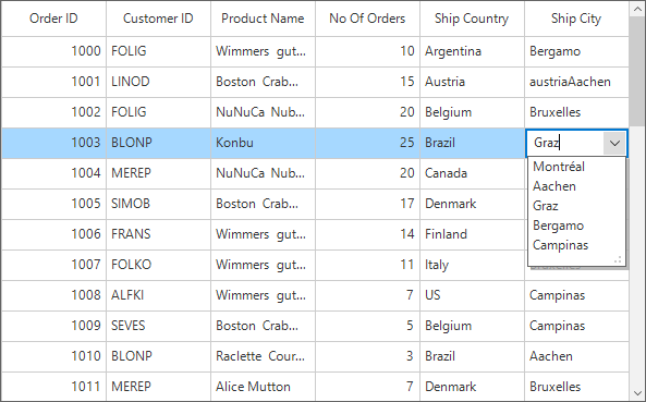
Auto completing on edit mode
The auto completion on the edit mode can be enabled by using the GridComboBoxColumn.AutoCompleteMode property. Default value is None. Following types of auto complete modes are available,
- None
- Append
- Suggest
- SuggestAppend
GridComboBoxColumn comboBoxColumn = sfDataGrid.Columns["ShipCityID"] as GridComboBoxColumn;
comboBoxColumn.DropDownStyle = DropDownStyle.DropDown;
comboBoxColumn.AutoCompleteMode = AutoCompleteMode.Suggest;
Dim comboBoxColumn As GridComboBoxColumn = TryCast(sfDataGrid.Columns("ShipCityID"), GridComboBoxColumn)
comboBoxColumn.DropDownStyle = DropDownStyle.DropDown
comboBoxColumn.AutoCompleteMode = AutoCompleteMode.Suggest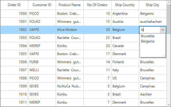
Auto suggesting on edit mode
By default, auto suggestion in the dropdown will display the value based on the Starts with filter condition. This can be changed to retrieve the matches with the Contains condition by using the AutoSuggestionMode property. You can also set delay for auto suggestion by using the AutoSuggestDelay property.
GridComboBoxColumn comboBoxColumn = sfDataGrid.Columns["ShipCityID"] as GridComboBoxColumn;
comboBoxColumn.DropDownStyle = DropDownStyle.DropDown;
comboBoxColumn.AutoCompleteMode = AutoCompleteMode.Suggest;
comboBoxColumn.AutoSuggestMode = AutoCompleteSuggestMode.Contains;
comboBoxColumn.AutoSuggestDelay = 1000;
Dim comboBoxColumn As GridComboBoxColumn = TryCast(sfDataGrid.Columns("ShipCityID"), GridComboBoxColumn)
comboBoxColumn.DropDownStyle = DropDownStyle.DropDown
comboBoxColumn.AutoCompleteMode = AutoCompleteMode.Suggest
comboBoxColumn.AutoSuggestMode = AutoCompleteSuggestMode.Contains
comboBoxColumn.AutoSuggestDelay = 1000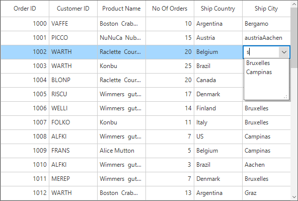
GridButtonColumn
GridButtonColumn provides support to display columns data as buttons.
this.sfDataGrid1.Columns.Add(new GridButtonColumn()
{
    MappingName = "ProductName ",
    HeaderText = "Product Name"
});Me.sfDataGrid1.Columns.Add(New GridButtonColumn() With {.MappingName = "ProductName ", .HeaderText = "Product Name"})
Default Text for the Buttons
By default, GridButtonColumn displays the button with underlying value as button text. The default text for the buttons can be changed by setting value for DefaultButtonText property. The DefaultButtonText property will work only when theAllowDefaultButtonText property value is true.
(this.sfDataGrid1.Columns["ProductName"] as GridButtonColumn).AllowDefaultButtonText = true;
(this.sfDataGrid1.Columns["ProductName"] as GridButtonColumn).DefaultButtonText = "Submit";TryCast(Me.sfDataGrid1.Columns("ProductName"), GridButtonColumn).AllowDefaultButtonText = True
TryCast(Me.sfDataGrid1.Columns("ProductName"), GridButtonColumn).DefaultButtonText = "Submit"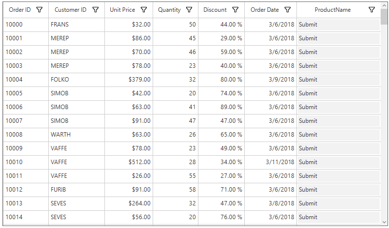
Adding Image for the Button Column
SfDataGrid allows to display image within the button by using the GridButtonColumn.Image property.
this.sfDataGrid1.Columns.Add(new GridButtonColumn()
            {
                MappingName = "ProductName",
                HeaderText = "Product Name",
                Image = SystemIcons.Information.ToBitmap(),
});Me.sfDataGrid1.Columns.Add(New GridButtonColumn() With {.MappingName = "ProductName", .HeaderText = "Product Name", .Image = SystemIcons.Information.ToBitmap()})Positioning the Text and Image
The text and image within the GridButtonColumn can be positioned relative to each other by using the TextImageRelation property.
this.sfDataGrid1.Columns.Add(new GridButtonColumn()
            {
                MappingName = "ProductName",
                HeaderText = "Product Name",
                Image = SystemIcons.Information.ToBitmap(),
                ImageSize = new Size(16, 16),
                TextImageRelation = TextImageRelation.ImageBeforeText,
});Me.sfDataGrid1.Columns.Add(New GridButtonColumn() With {.MappingName = "ProductName", .HeaderText = "Product Name", .Image = SystemIcons.Information.ToBitmap(), .ImageSize = New Size(16, 16), .TextImageRelation = TextImageRelation.ImageBeforeText})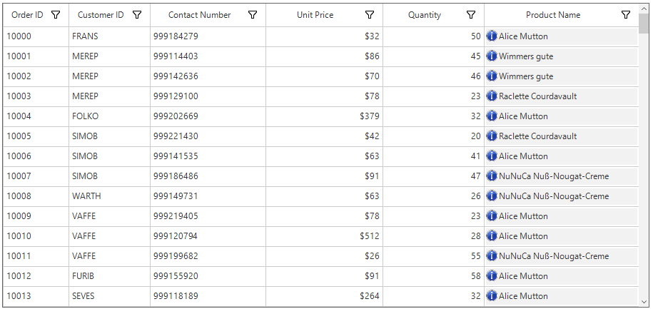
Appearance
SfDataGrid allows to customize the appearance of the button column through SfDataGrid.Style.ButtonStyle property.
//Change the appearance of the button column
this.sfDataGrid1.Style.ButtonStyle.BackColor = Color.LightPink;
this.sfDataGrid1.Style.ButtonStyle.TextColor = Color.DarkBlue;
this.sfDataGrid1.Style.ButtonStyle.BorderColor = Pens.DarkRed;
'Change the appearance of the button column
Me.sfDataGrid1.Style.ButtonStyle.BackColor = Color.LightPink
Me.sfDataGrid1.Style.ButtonStyle.TextColor = Color.DarkBlue
Me.sfDataGrid1.Style.ButtonStyle.BorderColor = Pens.DarkRed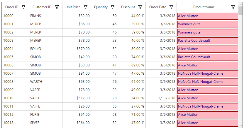
Deleting the selected records by button click
The selected records can be deleted when clicking the cell button by using the DeleteSelectedRecords method in the SfDataGrid.CellButtonClick event.
this.sfDataGrid1.CellButtonClick += sfDataGrid1_CellButtonClick;

private void sfDataGrid1_CellButtonClick(object sender, CellButtonClickEventArgs e)
{
    sfDataGrid1.DeleteSelectedRecords();
}
AddHandler sfDataGrid1.CellButtonClick, AddressOf SfDataGrid1_ CellButtonClick
Private Sub sfDataGrid1_CellButtonClick(ByVal sender As Object, ByVal e As CellButtonClickEventArgs)
sfDataGrid1.DeleteSelectedRecords()
End SubGridHyperlinkColumn
GridHyperlinkColumn provides support to display columns data as HyperLink and allows to open hyperlinks as well as to run executable files.
this.sfDataGrid1.Columns.Add(new GridHyperlinkColumn()
{
   MappingName = " OrderURI ",
   HeaderText = "Order URI"
});Me.sfDataGrid1.Columns.Add(New GridHyperlinkColumn() With {.MappingName = " OrderURI ", .HeaderText = "Order URI"})Behavior Customization
SfDataGrid provide support to open the hyperlink either by single click or double click. This can be specified by the HyperlinkOpenBehavior property.
The HyperlinkOpenArea property decides whether to open the hyperlink by clicking anywhere on the cell or by clicking only on the text inside the cell.
(this.sfDataGrid1.Columns["OrderURI"] as GridHyperlinkColumn).HyperlinkOpenArea = HyperlinkOpenArea.Cell;
(this.sfDataGrid1.Columns["OrderURI"] as GridHyperlinkColumn).HyperlinkOpenBehavior = HyperlinkOpenBehavior.DoubleClick;TryCast(Me.sfDataGrid1.Columns("OrderURI"), GridHyperlinkColumn).HyperlinkOpenArea = HyperlinkOpenArea.Cell
TryCast(Me.sfDataGrid1.Columns("OrderURI"), GridHyperlinkColumn).HyperlinkOpenBehavior = HyperlinkOpenBehavior.DoubleClickNOTE
GridHyperlinkColumnallows to open hyperlink by pressing space key.
Appearance
SfDataGrid allows to customize the appearance of the hyperlink column through SfDataGrid.Style.HyperlinkStyle property.
//Change the appearance of the hyperlink.
this.sfDataGrid1.Style.HyperlinkStyle.DefaultLinkColor = Color.DarkGreen;
this.sfDataGrid1.Style.HyperlinkStyle.HoveredLinkColor = Color.Red;
'Change the appearance of the hyperlink.
Me.sfDataGrid1.Style.HyperlinkStyle.DefaultLinkColor = Color.DarkGreen
Me.sfDataGrid1.Style.HyperlinkStyle.HoveredLinkColor = Color.Red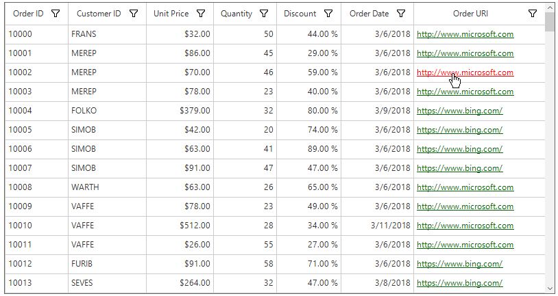
Canceling the Navigation
Navigation to the hyperlinks can be canceled within the HyperlinkOpening event by setting the CellHyperlinkOpeningEventArgs.Cancel to true.
this.sfDataGrid1.HyperlinkOpening += SfDataGrid1_HyperlinkOpening;

void SfDataGrid1_HyperlinkOpening(object sender, CellHyperlinkOpeningEventArgs e)
{
    if (e.NavigateText == "https://www.google.com/")
        e.Cancel = true;
}
AddHandler sfDataGrid1.HyperlinkOpening, AddressOf SfDataGrid1_HyperlinkOpening
Private Sub SfDataGrid1_HyperlinkOpening(ByVal sender As Object, ByVal e As CellHyperlinkOpeningEventArgs)
If e.NavigateText = "https://www.google.com/" Then
e.Cancel = True
End If
End SubHyperlinkOpened event occurs after the hyperlink is opened. It does not occur if the HyperlinkOpening event is canceled.
Changing the Browser to Open the Hyperlink
By default, GridHyperlinkColumn opens the hyperlink in system default browser. This can be changed by handling the HyperlinkOpening event.
The below code shows how to open the hyperlink in Internet Explorer.
this.sfDataGrid1.HyperlinkOpening += SfDataGrid1_HyperlinkOpening;

void SfDataGrid1_HyperlinkOpening(object sender, CellHyperlinkOpeningEventArgs e)
{
    e.Cancel = true;
    System.Diagnostics.Process process = new System.Diagnostics.Process();
    process.StartInfo.FileName = "iexplore";
    process.StartInfo.Arguments = e.NavigateText;
    process.Start();
}
AddHandler sfDataGrid1.HyperlinkOpening, AddressOf SfDataGrid1_HyperlinkOpening
Private Sub SfDataGrid1_HyperlinkOpening(ByVal sender As Object, ByVal e As CellHyperlinkOpeningEventArgs)
e.Cancel = True
Dim process As New System.Diagnostics.Process()
process.StartInfo.FileName = "iexplore"
process.StartInfo.Arguments = e.NavigateText
process.Start()
End SubGridImageColumn
GridImageColumn provides support to display columns data as Image.
GridImageColumn can be created and images can be added to it as given below.
this.sfDataGrid1.Columns.Add(new GridImageColumn()
{
    MappingName = "Images",
    HeaderText = "Country"
});Me.sfDataGrid1.Columns.Add(New GridImageColumn() With {.MappingName = "Images", .HeaderText = "Country"})The image will be added to the column be adding the image to the underlying data as below.
public class OrderInfo : INotifyPropertyChanged
{
    public byte[] Images { get; set; }
}
public class OrderInfoCollection :  IDisposable
{
    public OrderInfoCollection()
    {
        OrdersListDetails = new OrderInfoRepository().GetListOrdersDetails(200);
    }
    public BindingList<OrderInfo> GetListOrdersDetails(int count)
    {
        BindingList<OrderInfo> ordersDetails = new BindingList<OrderInfo>();
        for (int i = 10000; i < count + 10000; i++)
        {
            ordersDetails.Add(GetOrder(i));
        }
        return ordersDetails;
    }
    private OrderInfo GetOrder(int i)
    {
        if (order.OrderID % 2 == 0 )
            order.Images = ImageToByteArray(Image.FromFile(@"..\..\Images\US.jpg"));
        else if (order.OrderID % 3 == 0 )
            order.Images = ImageToByteArray(Image.FromFile(@"..\..\Images\Japan.jpg"));
        else
            order.Images = ImageToByteArray(Image.FromFile(@"..\..\Images\UK.jpg"));
            return order;
    }
    public byte[] ImageToByteArray(System.Drawing.Image imageIn)
    {
        MemoryStream ms = new MemoryStream();
        imageIn.Save(ms, System.Drawing.Imaging.ImageFormat.Bmp);
        return ms.ToArray();
    }
}
Public Class OrderInfo
Implements INotifyPropertyChanged
Public Property Images() As Byte()
End Class
Public Class OrderInfoCollection
Implements IDisposable
Public Sub New()
OrdersListDetails = New OrderInfoRepository().GetListOrdersDetails(200)
End Sub
Public Function GetListOrdersDetails(ByVal count As Integer) As BindingList(Of OrderInfo)
Dim ordersDetails As New BindingList(Of OrderInfo)()
For i As Integer = 10000 To count + 10000 - 1
ordersDetails.Add(GetOrder(i))
Next i
Return ordersDetails
End Function
Private Function GetOrder(ByVal i As Integer) As OrderInfo
If order.OrderID Mod 2 = 0 Then
order.Images = ImageToByteArray(Image.FromFile("..\..\Images\US.jpg"))
ElseIf order.OrderID Mod 3 = 0 Then
order.Images = ImageToByteArray(Image.FromFile("..\..\Images\Japan.jpg"))
Else
order.Images = ImageToByteArray(Image.FromFile("..\..\Images\UK.jpg"))
End If
Return order
End Function
Public Function ImageToByteArray(ByVal imageIn As System.Drawing.Image) As Byte()
Dim ms As New MemoryStream()
imageIn.Save(ms, System.Drawing.Imaging.ImageFormat.Bmp)
Return ms.ToArray()
End Function
End ClassPositioning Text and Image
The text and image within the GridImageColumn can be positioned relative to each other by using the TextImageRelation property.
The TextImageRelation property will not work if ImageLayout property value is not equal to none.
Appearance
SfDataGrid allows to customize the appearance of the image column based on conditions through QueryImageCellStyle event.
this.sfDataGrid1.QueryImageCellStyle += SfDataGrid1_QueryImageCellStyle;
void SfDataGrid1_QueryImageCellStyle(object sender, QueryImageCellStyleEventArgs e)
{
	if (e.RowIndex == 3)
		e.ImageLayout = ImageLayout.Tile;
}
AddHandler sfDataGrid1.QueryImageCellStyle, AddressOf SfDataGrid1_QueryImageCellStyle
Private Sub SfDataGrid1_QueryImageCellStyle(ByVal sender As Object, ByVal e As QueryImageCellStyleEventArgs)
If e.RowIndex = 3 Then
e.ImageLayout = ImageLayout.Tile
End If
End Sub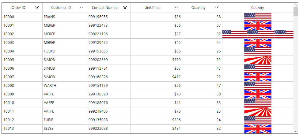
GridProgressBarColumn
GridProgressBarColumn provides support to display non-editable integer type data.
Changing boundary values of progress
You can change the boundary values of ProgressBar using the Maximum and Minimum properties.
Maximum - Specifies the maximum value of progress bar.
Minimum - Specifies the minimum value of progress bar.
this.sfDataGrid.Columns.Add(new GridProgressBarColumn() { MappingName = "SoftwareProficiency", HeaderText = "Software Proficiency", Maximum = 100, Minimum = 0, ValueMode = ProgressBarValueMode.Percentage });Me.sfDataGrid.Columns.Add(New GridProgressBarColumn() With {.MappingName = "SoftwareProficiency", .HeaderText = "Software Proficiency", .Maximum = 100, .Minimum = 0, .ValueMode = ProgressBarValueMode.Percentage})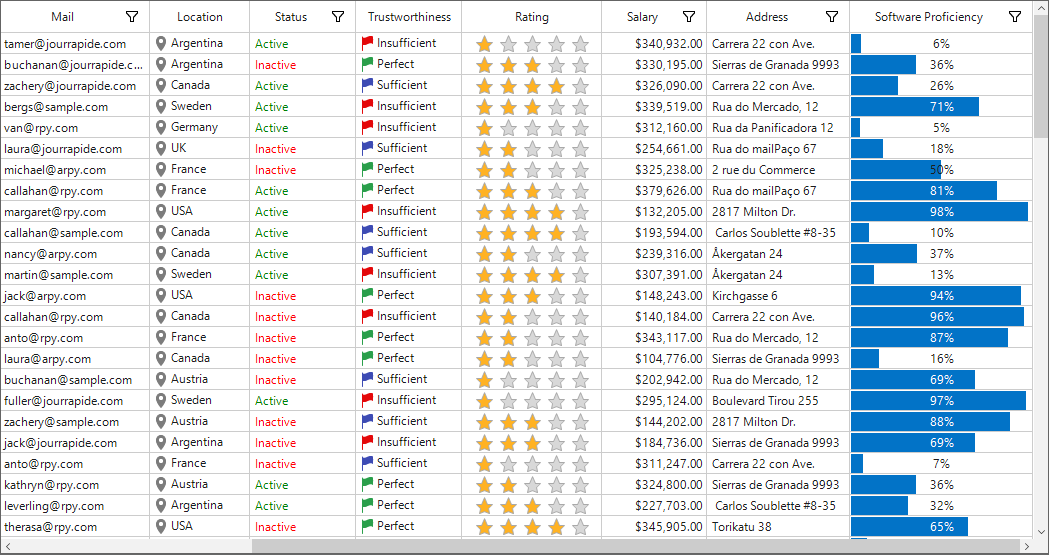
Changing progress value mode
You can change the value mode of ProgressBar using the ValueMode property.
this.sfDataGrid.Columns.Add(new GridProgressBarColumn() { MappingName = "SoftwareProficiency", HeaderText = "Software Proficiency", Maximum = 100, Minimum = 0, ValueMode = ProgressBarValueMode.Value });Me.sfDataGrid.Columns.Add(New GridProgressBarColumn() With {.MappingName = "SoftwareProficiency", .HeaderText = "Software Proficiency", .Maximum = 100, .Minimum = 0, .ValueMode = ProgressBarValueMode.Value })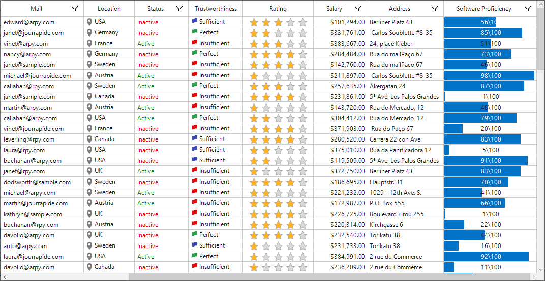
Appearance
Background
The background color can be set by using the BackgroundColor property.
this.sfDataGrid.Style.ProgressBarStyle.BackgroundColor = Color.DarkGray;Me.sfDataGrid.Style.ProgressBarStyle.BackgroundColor = Color.DarkGray
Foreground
The font color and the foreground color can be set by using the ForegroundColor property.
ForegroundColor - Specifies the color used to draw the foreground in segment mode and constant mode.
TextColor - Specifies the color of the font used to draw the text of the ProgressBar.
this.sfDataGrid.Style.ProgressBarStyle.TextColor = Color.Red;
this.sfDataGrid.Style.ProgressBarStyle.ForegroundColor = Color.LightGoldenrodYellow;Me.sfDataGrid.Style.ProgressBarStyle.TextColor = Color.Red
Me.sfDataGrid.Style.ProgressBarStyle.ForegroundColor = Color.LightGoldenrodYellow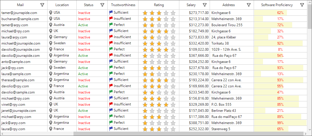
Gradient appearance
Gradient background
The color of the background gradient can be changed using the following properties:
GradientBackgroundStartColor - Specifies the start color of the background gradient.The BackgroundStyle property should be set to Gradient.
GradientBackgroundEndColor - Specifies the end color of the background gradient. The BackgroundStyle property should be set to ‘Gradient’ .
this.sfDataGrid.Style.ProgressBarStyle.BackgroundStyle =  GridProgressBarStyle.Gradient;
this.sfDataGrid.Style.ProgressBarStyle.GradientBackgroundStartColor = Color.GreenYellow;
this.sfDataGrid.Style.ProgressBarStyle.GradientForegroundEndColor = Color.DarkGray;Me.sfDataGrid.Style.ProgressBarStyle.BackgroundStyle = GridProgressBarStyle.Gradient
Me.sfDataGrid.Style.ProgressBarStyle.GradientBackgroundStartColor = Color.GreenYellow
Me.sfDataGrid.Style.ProgressBarStyle.GradientForegroundEndColor = Color.DarkGray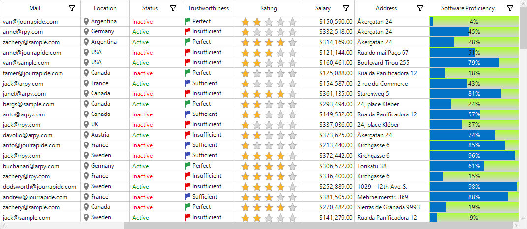
Gradient foreground
The color of the foreground gradient can be changed by using the following properties:
GradientForegroundStartColor - Specifies the start color of the foreground gradient. The ForegroundStyle property should be set to Gradient.
GradientForegroundEndColor - Specifies the end color of the foreground gradient. The ForegroundStyle property should be set to Gradient.
this.sfDataGrid.Style.ProgressBarStyle.ForegroundStyle = GridProgressBarStyle.Gradient;
this.sfDataGrid.Style.ProgressBarStyle.GradientForegroundStartColor = Color.Yellow;
this.sfDataGrid.Style.ProgressBarStyle.GradientForegroundEndColor = Color.Blue;Me.sfDataGrid.Style.ProgressBarStyle.ForegroundStyle = GridProgressBarStyle.Gradient
Me.sfDataGrid.Style.ProgressBarStyle.GradientForegroundStartColor = Color.Yellow
Me.sfDataGrid.Style.ProgressBarStyle.GradientForegroundEndColor = Color.Blue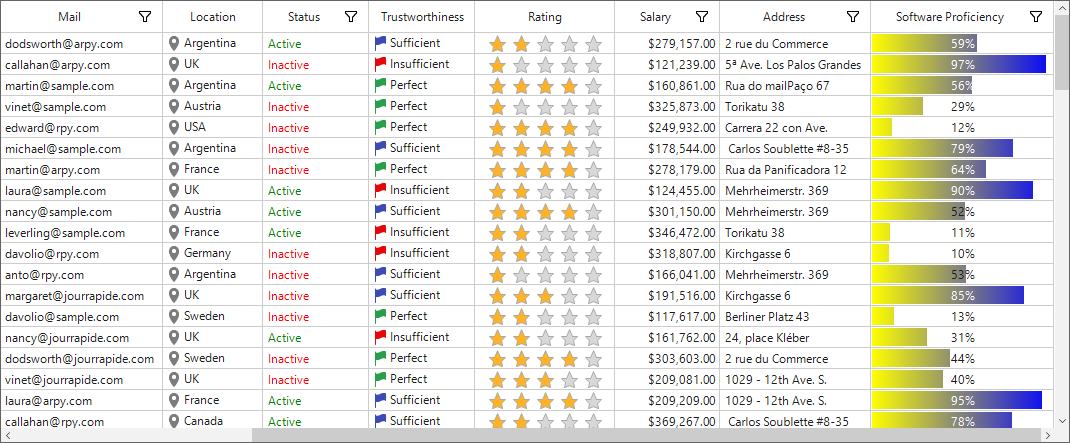
Tube appearance
Colors can be set to the background tube of the ProgressBar column.
Tube background
TubeBackgroundStartColor - Specifies the start color of the background tube. The BackgroundStyle property should be set to Tube.
TubeBackgroundEndColor - Specifies the end color of the background tube. TheBackgroundStyle property should be set to Tube.
this.sfDataGrid.Style.ProgressBarStyle.BackgroundStyle =  GridProgressBarStyle.Tube;
this.sfDataGrid.Style.ProgressBarStyle.TubeBackgroundStartColor = Color.YellowGreen;
this.sfDataGrid.Style.ProgressBarStyle.TubeBackgroundEndColor = Color.White;Me.sfDataGrid.Style.ProgressBarStyle.BackgroundStyle = GridProgressBarStyle.Tube
Me.sfDataGrid.Style.ProgressBarStyle.TubeBackgroundStartColor = Color.YellowGreen
Me.sfDataGrid.Style.ProgressBarStyle.TubeBackgroundEndColor = Color.White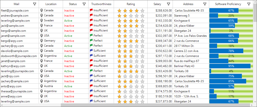
Tube foreground
Colors can be set for the foreground tube of the ProgressBar.
TubeForegroundStartColor - Specifies the start color of the foreground tube.The ForegroundStyle property should be set to Tube.
TubeForegroundEndColor - Specifies the end color of the foreground tube.The ForegroundStyle property should be set to Tube.
this.sfDataGrid.Style.ProgressBarStyle.ForegroundStyle = GridProgressBarStyle.Tube;
this.sfDataGrid.Style.ProgressBarStyle.TubeForegroundStartColor = Color.LightGray;
this.sfDataGrid.Style.ProgressBarStyle.TubeForegroundEndColor = Color.Turquoise;Me.sfDataGrid.Style.ProgressBarStyle.ForegroundStyle = GridProgressBarStyle.Tube
Me.sfDataGrid.Style.ProgressBarStyle.TubeForegroundStartColor = Color.LightGray
Me.sfDataGrid.Style.ProgressBarStyle.TubeForegroundEndColor = Color.Turquoise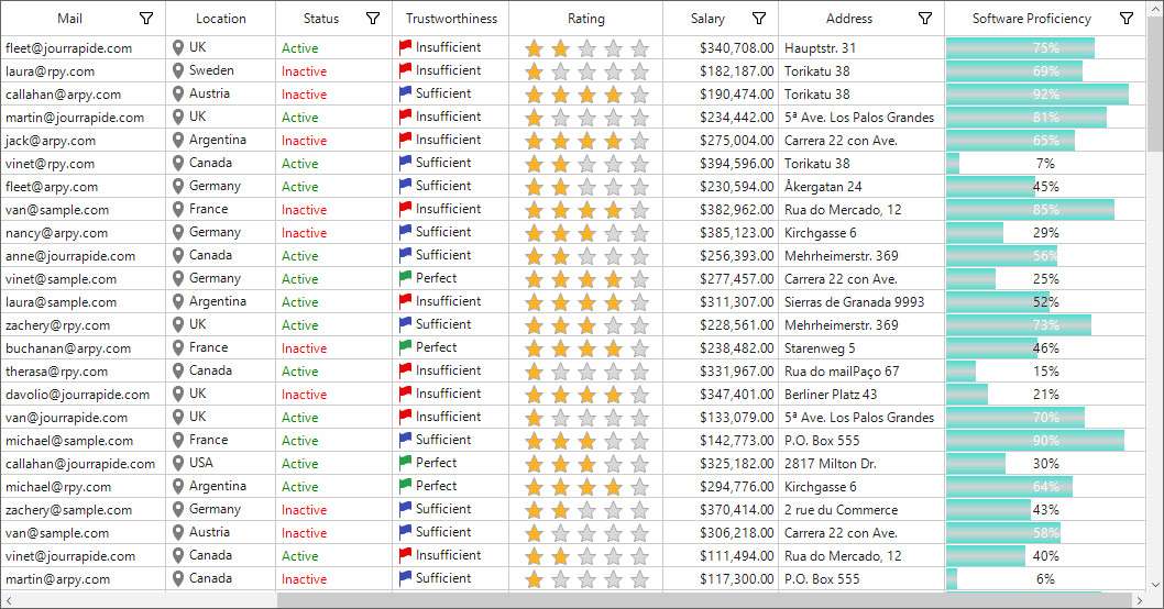
Segment appearance
Segmented background
The background of the ProgressBar column can be displayed with a segmented appearance by using the property given below.
this.sfDataGrid.Style.ProgressBarStyle.AllowBackgroundSegments = true;Me.sfDataGrid.Style.ProgressBarStyle.AllowBackgroundSegments = True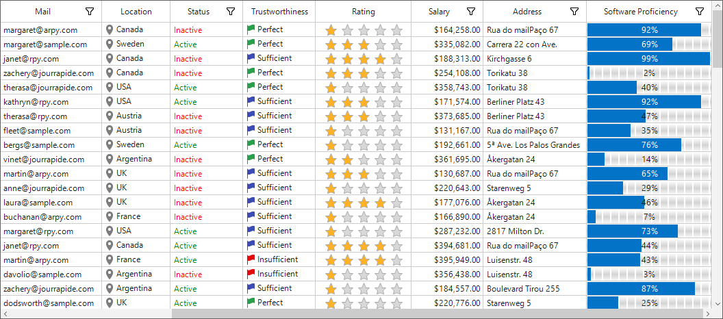
Segmented foreground
The foreground of the ProgressBar column can be displayed with a segmented appearance by using the AllowForegroundSegments property.
this.sfDataGrid.Style.ProgressBarStyle.AllowForegroundSegments =true;Me.sfDataGrid.Style.ProgressBarStyle.AllowForegroundSegments =True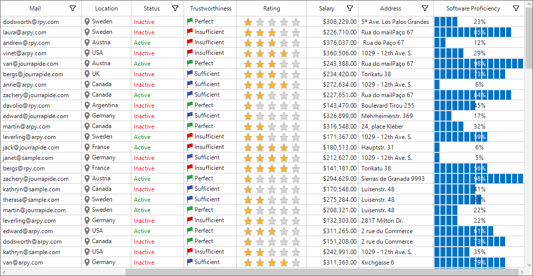
Changing alignment of text
Progressbar allows to change the alignment of text. Progressbar supports the following list of alignment options:
|
Alignment |
Description |
| Center | The text on the progress bar can be set to Center using the `TextAlignment` property. This is the default text alignment. The `ValueMode` property should be set to `Percentage` or `Value`. |
| Left | The text on the progress bar can be set to left using the `TextAlignment` property. The `ValueMode` property should be set to `Percentage` or `Value. |
| Right | The text on the progress bar can be set to right using the `TextAlignment` property. The `ValueMode` property should be set to `Percentage` or `Value`. |
The following code sample demonstrates how to apply the text alignment style to left.
this.sfDataGrid.Style.ProgressBarStyle.TextAlignment = Syncfusion.Windows.Forms.Tools.TextAlignment.Left;Me.sfDataGrid.Style.ProgressBarStyle.TextAlignment = Syncfusion.Windows.Forms.Tools.TextAlignment.Left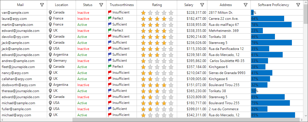
Changing orientation
Progressbar allows to change the orientation of text. Progressbar contains the following list of orientation options:
|
Orientation |
Description |
| Horizontal | The direction of display of the ProgressBar can be changed to `Horizontal` using the following given property. In this case, direction of the text is also changed. |
| Vertical | The direction of display of the ProgressBar can be changed to `Vertical` using the following property. In this case, the direction of the text is also changed. |
The following code sample demonstrates how to apply the progress orientation style to vertical.
this.sfDataGrid.Style.ProgressBarStyle.Orientation = Orientation.Vertical;
this.sfDataGrid.RowHeight = 50;Me.sfDataGrid.Style.ProgressBarStyle.Orientation = Orientation.Vertical
Me.sfDataGrid.RowHeight = 50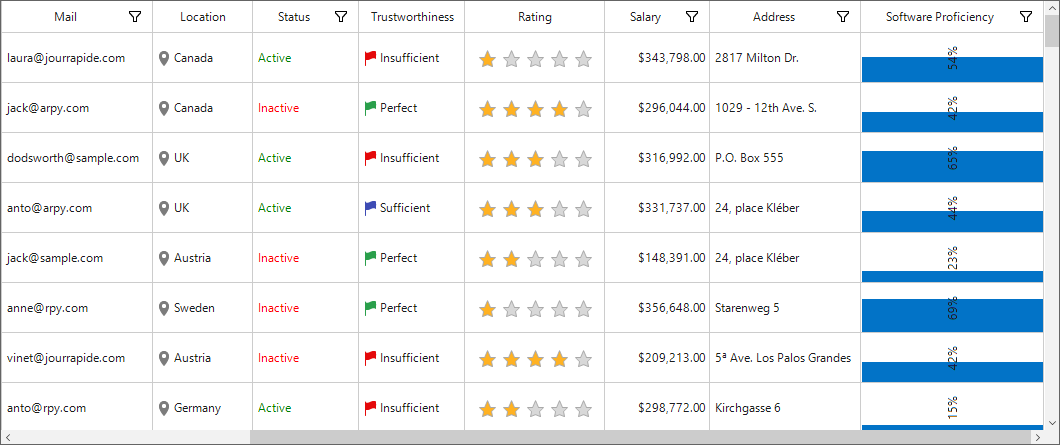
Add image in progress bar
The ForegroundStyle is set to Image style, then the foreground image can be specified using the following given property.
this.sfDataGrid.RowHeight = 50;
this.sfDataGrid.Style.ProgressBarStyle.ForegroundStyle = GridProgressBarStyle.Image;
this.sfDataGrid.Style.ProgressBarStyle.ForegroundImage = (Bitmap)Image.FromFile(@"cloud.jpg");
this.sfDataGrid.Style.ProgressBarStyle.FitImageToProgressBar = false;Me.sfDataGrid.RowHeight = 50
Me.sfDataGrid.Style.ProgressBarStyle.ForegroundStyle = GridProgressBarStyle.Image
Me.sfDataGrid.Style.ProgressBarStyle.ForegroundImage = CType(Image.FromFile("cloud.jpg"), Bitmap)
Me.sfDataGrid.Style.ProgressBarStyle.FitImageToProgressBar = false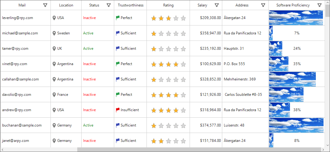
Fit image to progress
Image can be fit to the ForegroundStyle to enable the FitImageToProgressBar property.
this.sfDataGrid.RowHeight = 50;
this.sfDataGrid.Style.ProgressBarStyle.ForegroundStyle = GridProgressBarStyle.Image;
this.sfDataGrid.Style.ProgressBarStyle.ForegroundImage = (Bitmap)Image.FromFile(@"cloud.jpg");
this.sfDataGrid.Style.ProgressBarStyle.FitImageToProgressBar = true;Me.sfDataGrid.RowHeight = 50
Me.sfDataGrid.Style.ProgressBarStyle.ForegroundStyle = GridProgressBarStyle.Image
Me.sfDataGrid.Style.ProgressBarStyle.ForegroundImage = CType(Image.FromFile("cloud.jpg"), Bitmap)
Me.sfDataGrid.Style.ProgressBarStyle.FitImageToProgressBar = true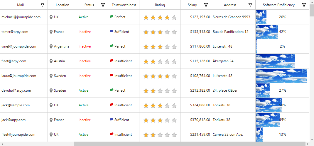
Conditional styling
SfDataGrid allows to customize the appearance of the ProgressBar column based on conditions using the QueryProgressBarCellStyle event.
sfDataGrid.QueryProgressBarCellStyle += SfDataGrid_QueryProgressBarCellStyle;

private void SfDataGrid_QueryProgressBarCellStyle(object sender, QueryProgressBarCellStyleEventArgs e)
{
if (e.ColumnIndex == 10 && e.RowIndex % 2 == 0)
{
e.Style.TextColor = Color.Blue;
e.Style.ForegroundColor = Color.Yellow;
e.Style.TextAlignment = Syncfusion.Windows.Forms.Tools.TextAlignment.Left;
}
}
AddHandler sfDataGrid1.QueryProgressBarCellStyle, AddressOf SfDataGrid_QueryProgressBarCellStyle
Private Sub SfDataGrid_QueryProgressBarCellStyle(ByVal sender As Object, ByVal e As QueryProgressBarCellStyleEventArgs)
If e.ColumnIndex = 10 AndAlso e.RowIndex Mod 2 = 0 Then
e.Style.TextColor = Color.Blue
e.Style.ForegroundColor = Color.Yellow
e.Style.TextAlignment = Syncfusion.Windows.Forms.Tools.TextAlignment.Left
End If
End Sub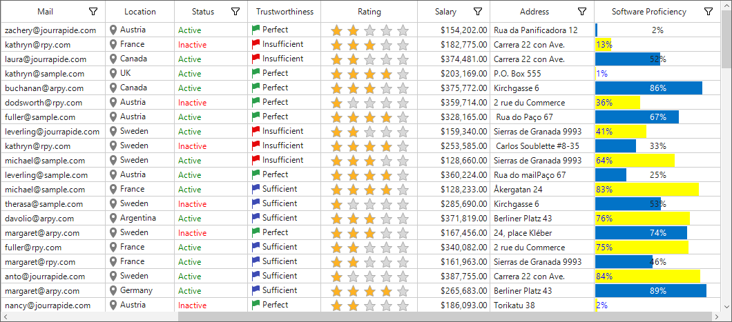
GridMultiSelectComboBoxColumn
GridMultiSelectComboBoxColumn is derived from the GridColumn that hosts SfComboBox as an edit element. Data source to the combo box can be set using the GridMultiSelectComboBoxColumn.DataSource property.
By default, GridMultiSelectComboBoxColumn displays values using the MappingName property. You can set DisplayMember that denotes the string to be displayed in the cell (to serve as visual representation of object). You can set ValueMember that denotes string from the object data source that acts as a value for that cell to get the SelectedValue from the SelectedItem.
this.sfDataGrid1.Columns.Add(new GridMultiSelectComboBoxColumn() { MappingName = "Products", HeaderText = "Products", DisplayMember = "ProductName", ValueMember = "ProductName", DataSource = orderInfo.ProductDetails });Me.sfDataGrid1.Columns.Add(New GridMultiSelectComboBoxColumn() With {.MappingName = "Products", .HeaderText = "Products", .DisplayMember = "ProductName", .ValueMember = "ProductName", .DataSource = orderInfo.ProductDetails})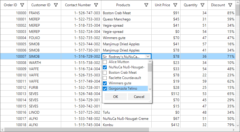
Opening drop-down popup on single-click
The drop-down of the MultiSelectComboBox column can be shown on single click by enabling StaysOpenOnEdit.
this.sfDataGrid1.Columns.Add(new GridMultiSelectComboBoxColumn() { MappingName = "Products", HeaderText = "Products", DisplayMember = "ProductName", ValueMember = "ProductName", DataSource = orderInfo.ProductDetails, StaysOpenOnEdit = true });Me.sfDataGrid1.Columns.Add(New GridMultiSelectComboBoxColumn() With {.MappingName = "Products", .HeaderText = "Products", .DisplayMember = "ProductName", .ValueMember = "ProductName", .DataSource = orderInfo.ProductDetails, .StaysOpenOnEdit = True})Customizing GroupCaptionText based on DisplayMember
By default, the group caption text will be displayed based on MappingName of multi select combo box column. This can be changed to display the DisplayMember using the GroupMode property of column.
this.sfDataGrid1.Columns.Add(new GridMultiSelectComboBoxColumn() { MappingName = "Products", HeaderText = "Products", DisplayMember = "ProductName", ValueMember = "ProductName", DataSource = orderInfo.ProductDetails, GroupMode = Syncfusion.Data.DataReflectionMode.Display });Me.sfDataGrid1.Columns.Add(New GridMultiSelectComboBoxColumn() With {.MappingName = "Products", .HeaderText = "Products", .DisplayMember = "ProductName", .ValueMember = "ProductName", .DataSource = orderInfo.ProductDetails, .GroupMode = Syncfusion.Data.DataReflectionMode.Display})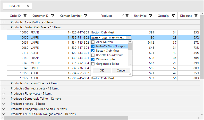
Loading different DataSources for each row
Different data sources can be loaded to each row of GridMultiSelectComboBoxColumn using the DataSourceSelector property.
Implementing IDataSourceSelector
DataSourceSelector needs to implement IDataSourceSelector interface to implement the GetDataSource method that receives the following parameters:
• Record – Data object associated with row.
• DataSource – Data context of data grid.
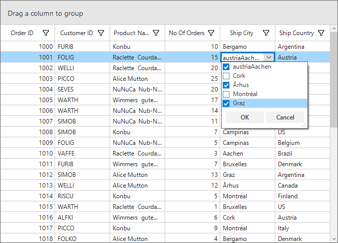
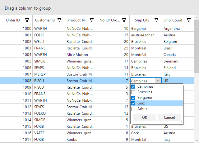
In the following code, DataSource of the ShipCity column is returned based on theShipCountry column value using the record and the data context of SfDataGrid passed to the GetDataSource method.
sfDataGrid.Columns.Add(new GridMultiSelectComboBoxColumn() { MappingName = "ShipCityID", HeaderText = "Ship City", ValueMember = "ShipCityID", DisplayMember = "ShipCityName", IDataSourceSelector = new DataSourceSelector()});

public class DataSourceSelector : IDataSourceSelector
{
    public IEnumerable GetDataSource(object record, object dataSource)
    {
        if (record == null)
            return null;

        var orderInfo = record as OrderDetails;
        var countryName = orderInfo.ShipCountry;

        var countryDetails = new CountryInfoRepository();

        //Returns ShipCity collection based on ShipCountry.
        if (countryDetails.ShipCities.ContainsKey(countryName))
        {
            ObservableCollection<ShipCityDetails> shipCities = null;
            countryDetails.ShipCities.TryGetValue(countryName, out shipCities);
            return shipCities.ToList();
        }
        return null;
    }
}sfDataGrid.Columns.Add(New GridMultiSelectComboBoxColumn() With {.MappingName = "ShipCityID", .HeaderText = "Ship City", .ValueMember = "ShipCityID", .DisplayMember = "ShipCityName", .IDataSourceSelector = New DataSourceSelector()})
Public Class DataSourceSelector
Implements IDataSourceSelector
Public Function GetDataSource(ByVal record As Object, ByVal dataSource As Object) As IEnumerable
If record Is Nothing Then
Return Nothing
End If
Dim orderInfo = TryCast(record, OrderDetails)
Dim countryName = orderInfo.ShipCountry
Dim countryDetails = New CountryInfoRepository()
'Returns ShipCity collection based on ShipCountry.
If countryDetails.ShipCities.ContainsKey(countryName) Then
Dim shipCities As ObservableCollection(Of ShipCityDetails) = Nothing
countryDetails.ShipCities.TryGetValue(countryName, shipCities)
Return shipCities.ToList()
End If
Return Nothing
End Function
End ClassThe following screenshot illustrates the different ShipCity DataSource bound to each row of the multi select combo box column based on the ShipCountry Name.
GridMaskColumn
GridMaskColumn provides the support to display column data with the specified mask pattern. You can set the input mask at runtime by setting GridMaskColumn.Mask property.
sfDataGrid.Columns.Add(new GridMaskColumn() { MappingName = "ContactNumber", HeaderText = "Contact Number", Mask = "(999) 999-9999" });sfDataGrid.Columns.Add(New GridMaskColumn() With {.MappingName = "ContactNumber", .HeaderText = "Contact Number", .Mask = "(999) 999-9999"})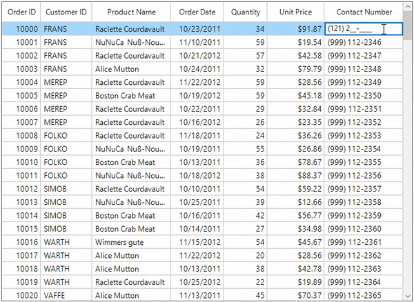
Setting mask format
At runtime, you can copy or paste the entries of GridMaskColumn. The entries that are copied can be specified whether to include literals using the GridMaskColumn.MaskFormat property. By default GridMaskColumn.MaskFormat is set to ClipModes.IncludeLiterals, To get rid of the literals in the formatted string you can set GridMaskColumn.MaskFormat as ClipModes.ExcludeLiterals.
sfDataGrid.Columns.Add(new GridMaskColumn() { MappingName = "ContactNumber", HeaderText = "Contact Number", Mask = "(999) 999-9999", MaskFormat = Syncfusion.Windows.Forms.Tools.ClipModes.ExcludeLiterals });sfDataGrid.Columns.Add(New GridMaskColumn() With {.MappingName = "ContactNumber", .HeaderText = "Contact Number", .Mask = "(999) 999-9999", .MaskFormat = Syncfusion.Windows.Forms.Tools.ClipModes.ExcludeLiterals})Setting prompt character
By default, an underscore (_) is displayed when the user input is absent. This can be changed by setting GridMaskColumn.PromptCharacter property.
sfDataGrid.Columns.Add(new GridMaskColumn() { MappingName = "ContactNumber", HeaderText = "Contact Number", Mask = "(999) 999-9999", PromptCharacter = '^' });sfDataGrid.Columns.Add(New GridMaskColumn() With {.MappingName = "ContactNumber", .HeaderText = "Contact Number", .Mask = "(999) 999-9999", .PromptCharacter = "^"c})Setting separators
You can display the data along with separators specifying date, time and decimals at runtime using the GridMaskColumn.DateSeparator, GridMaskColumn.TimeSeparator and GridMaskColumn.DecimalSeparator properties. Separators can be specified in the mask character itself.
For example, if you want to display the user data in date time format say ‘mm/dd/yy’, the mask character should be ‘##/##/##’.
If you want to display the date time as ‘mm-dd-yy’, change the GridMaskColumn.DateSeparator property from ‘/’ to ‘-‘.
| Separators | Description |
|---|---|
| DateSeparator | Specifies the character to use when a date separator position is specified. The default separator is '/'. |
| DecimalSeparator | Specifies the character to use when a decimal separator position is specified. The default separator is '.'. |
| TimeSeparator | Specifies the character to use when a time separator position is specified. The default separator is ':'. |
sfDataGrid.Columns.Add(new GridMaskColumn() { MappingName = "ShippingDate", HeaderText = "Shipping Date", Mask = "##/##/####", DateSeparator = '-' });
sfDataGrid.Columns.Add(new GridMaskColumn() { MappingName = "Freight", HeaderText = "Freight", Mask = "##.###", DecimalSeparator = '.' });
sfDataGrid.Columns.Add(new GridMaskColumn() { MappingName = "ShippingTime", HeaderText = "Shipping Time", Mask = "##:##:##", TimeSeparator=':' });sfDataGrid.Columns.Add(New GridMaskColumn() With {.MappingName = "ShippingDate", .HeaderText = "Shipping Date", .Mask = "##/##/####", .DateSeparator = "-"c})
sfDataGrid.Columns.Add(New GridMaskColumn() With {.MappingName = "Freight", .HeaderText = "Freight", .Mask = "##.###", .DecimalSeparator = "."c})
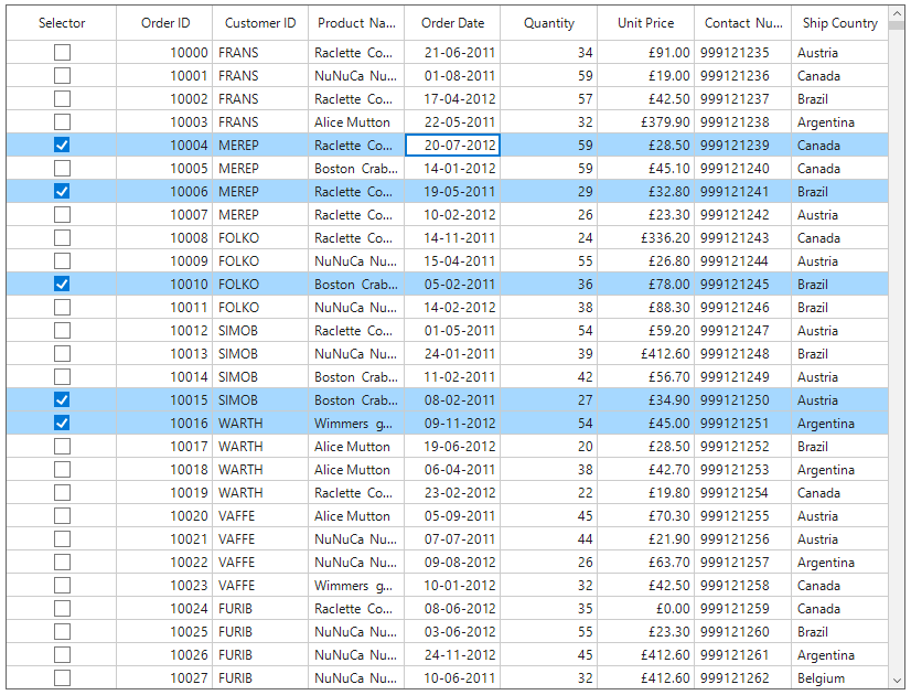
sfDataGrid.Columns.Add(New GridMaskColumn() With {.MappingName = "ShippingTime", .HeaderText = "Shipping Time", .Mask = "##:##:##", .TimeSeparator=":"c})GridCheckBoxSelectorColumn
SfDataGrid allows you to select or deselect individual rows through CheckBox using GridCheckBoxSelectorColumn, which is not bound with data object from underlying data source, and it can be added like normal columns. The selector column supports row selection alone, and selection in selector column works based on the SelectionMode.
this.sfDataGrid1.Columns.Add(new GridCheckBoxSelectorColumn() { MappingName = "SelectorColumn", HeaderText = "Selector", Width = 100, CheckBoxSize = new Size(14, 14) });Me.sfDataGrid1.Columns.Add(New GridCheckBoxSelectorColumn() With
{
.MappingName = "SelectorColumn",
.HeaderText = "Selector",
.Width = 100,
.CheckBoxSize = New Size(14, 14)
})
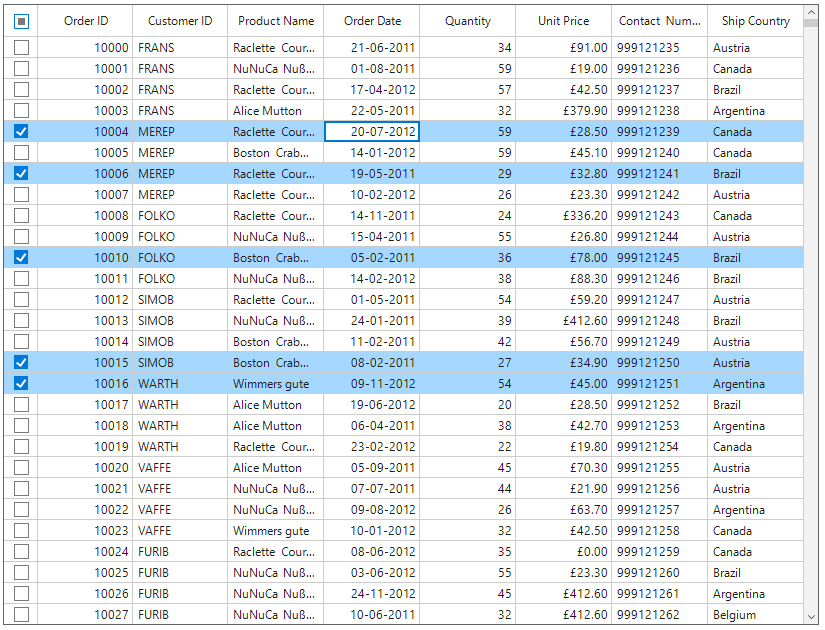
CheckBox on column header
You can display check box instead of text in header of selector column by setting the AllowCheckBoxOnHeader property to True. Using header check box, you can select or deselect all the rows in the datagrid.
this.sfDataGrid1.Columns.Add(new GridCheckBoxSelectorColumn() { MappingName = "SelectorColumn", HeaderText = string.Empty, AllowCheckBoxOnHeader = true, Width = 34, CheckBoxSize = new Size(14, 14) });Me.sfDataGrid1.Columns.Add(New GridCheckBoxSelectorColumn() With
{
.MappingName = "SelectorColumn",
.HeaderText = String.Empty,
.AllowCheckBoxOnHeader = True,
.Width = 34,
.CheckBoxSize = New Size(14, 14)
})
Styling the selector column
The style of checkbox in record cells can be customized using the CheckBoxStyle property.
this.sfDataGrid1.Style.CheckBoxStyle.CheckedBorderColor = Color.DarkViolet;
this.sfDataGrid1.Style.CheckBoxStyle.UncheckedBorderColor = Color.Red;Me.sfDataGrid1.Style.CheckBoxStyle.CheckedBorderColor = Color.DarkViolet
Me.sfDataGrid1.Style.CheckBoxStyle.UncheckedBorderColor = Color.Red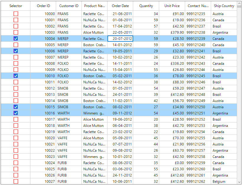
The style of the header checkbox can be customized through the QueryCheckBoxCellStyle event.
this.sfDataGrid1.QueryCheckBoxCellStyle += OnSfDataGrid1_QueryCheckBoxCellStyle;

private void OnSfDataGrid1_QueryCheckBoxCellStyle(object sender, Syncfusion.WinForms.DataGrid.Events.QueryCheckBoxCellStyleEventArgs e)
{
    if (e.RowIndex == this.sfDataGrid1.TableControl.GetHeaderIndex() && e.Column.MappingName == "SelectorColumn")
    {
        e.Style.IndeterminateBorderColor = Color.Red;
        e.Style.IndeterminateColor = Color.DarkViolet;
    }
}
AddHandler sfDataGrid1.QueryCheckBoxCellStyle, AddressOf OnSfDataGrid1_QueryCheckBoxCellStyle
Private Sub OnSfDataGrid1_QueryCheckBoxCellStyle(ByVal sender As Object, ByVal e As QueryCheckBoxCellStyleEventArgs)
If e.RowIndex = Me.sfDataGrid1.TableControl.GetHeaderIndex() AndAlso e.Column.MappingName = "SelectorColumn" Then
e.Style.IndeterminateBorderColor = Color.Red
e.Style.IndeterminateColor = Color.DarkViolet
End If
End Sub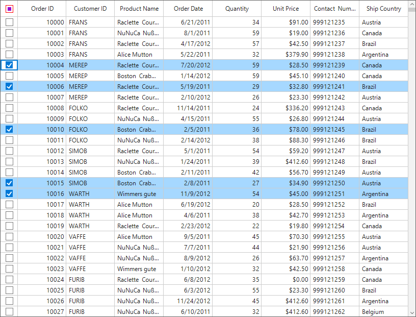
Limitations
The following are the limitations of GridCheckBoxSelectorColumn:
- Selector column does not support cell selection.
- Selector column does not support data operations such as sorting, filtering and grouping.
- Selector column will be excluded in operations such as printing and exporting.
- Selector column does not have filter row support.
Custom Column Support
SfDataGrid allows to create own column by overriding predefined column type and to customize existing column renderer.
Creating Column from Existing Column
New column type can be created by overriding the predefined column types in SfDataGrid.
In the below code snippet, GridCurrencyColumn column created from GridNumericColumn.
public class GridCurrencyColumn : GridNumericColumn
{
    protected override object GetFormattedValue(object record, object value)
    {
        var formatInfo = this.NumberFormatInfo ?? CultureInfo.CurrentUICulture.NumberFormat;
        if (value == null || DBNull.Value.Equals(value))
        {
            if (AllowNull)
                return value;
            value = (double)this.MinValue;
        }
        double originalValue;
        if (double.TryParse(value.ToString(), out originalValue))
        {
            if (originalValue < MinValue)
                originalValue = MinValue;
            if (originalValue > MaxValue)
                originalValue = MaxValue;
            return string.Format(formatInfo, "{0:c}", originalValue);
        }
        return value;
    }
}
Public Class GridCurrencyColumn
Inherits GridNumericColumn
Protected Overrides Function GetFormattedValue(ByVal record As Object, ByVal value As Object) As Object
Dim formatInfo = If(Me.NumberFormatInfo, CultureInfo.CurrentUICulture.NumberFormat)
If value Is Nothing OrElse DBNull.Value.Equals(value) Then
If AllowNull Then
Return value
End If
value = CDbl(Me.MinValue)
End If
Dim originalValue As Double
If Double.TryParse(value.ToString(), originalValue) Then
If originalValue < MinValue Then
originalValue = MinValue
End If
If originalValue > MaxValue Then
originalValue = MaxValue
End If
Return String.Format(formatInfo, "{0:c}", originalValue)
End If
Return value
End Function
End ClassIn the below code snippet, created GridCurrencyColumn added to SfDataGrid.Columns collection to specify the value as currency without setting the format mode.
this.sfDataGrid1.Columns.Add(new GridCurrencyColumn()
{
    MappingName = "UnitPrice",
    HeaderText = "Unit Price",
});Me.sfDataGrid1.Columns.Add(New GridCurrencyColumn() With {.MappingName = "UnitPrice", .HeaderText = "Unit Price"})Customize Column Renderer
SfDataGrid allows to customize the column related operations like key navigation and UI related interactions by overriding the corresponding renderer associated with the column. Each column has its own renderer with set of virtual methods for handling the column level operations.
Below table lists the available cell types for columns and its renderers.
|
Column Name |
Renderer |
Cell Type |
| TextBox | ||
| Numeric | ||
| DataTime | ||
| CheckBox | ||
| Image | ||
| Hyperlink | ||
| Button | ||
| ProgressBar | ||
| MultiSelectComboBox |
Below code, creates the GridTextBoxCellRendererExt to change the fore ground of CustomerID column and replacing created renderer to CellRenderers.
this.sfDataGrid1.CellRenderers.Remove("TextBox");
this.sfDataGrid1.CellRenderers.Add("TextBox", new GridTextBoxCellRendererExt());
public class GridTextBoxCellRendererExt : GridTextBoxCellRenderer
{
	protected override void OnRender(Graphics paint, Rectangle cellRect, string cellValue, CellStyleInfo style, DataColumnBase column, RowColumnIndex rowColumnIndex)
	{
		if (column.GridColumn.MappingName == "CustomerID")
			style.TextColor = Color.DarkBlue;
		base.OnRender(paint, cellRect, cellValue, style, column, rowColumnIndex);
	}
}Me.sfDataGrid1.CellRenderers.Remove("TextBox")
Me.sfDataGrid1.CellRenderers.Add("TextBox", New GridTextBoxCellRendererExt())
public class GridTextBoxCellRendererExt : GridTextBoxCellRenderer
protected override void OnRender(Graphics paint, Rectangle cellRect, String cellValue, CellStyleInfo style, DataColumnBase column, RowColumnIndex rowColumnIndex)
If column.GridColumn.MappingName = "CustomerID" Then
style.TextColor = Color.DarkBlue
End If
MyBase.OnRender(paint, cellRect, cellValue, style, column, rowColumnIndex)
Creating new column and renderer
You can create a new column by deriving GridColumn and create new a cell renderer by overriding the predefined renderer in SfDataGrid. The following steps describe how to create a sparkline column as a custom column.
Creating custom column
You can create a custom column by overriding a new class from the GridColumn class.
public class GridSparklineColumn : GridColumn
{
    /// <summary>
    /// Initializes a new instance of the <see cref="GridSparklineColumn"/> class.
    /// </summary>
    public GridSparklineColumn()
    {
        SetCellType("Sparkline");
        this.SparklineType = SparkLineType.Line;
    }

    /// <summary>
    /// Gets or sets the type of the sparkline control.
    /// </summary>
    public SparkLineType SparklineType { get; set; }
}
Public Class GridSparklineColumn
Inherits GridColumn
''' <summary>
''' Initializes a new instance of the <see cref="GridSparklineColumn"/> class.
''' </summary>
Public Sub New()
SetCellType("Sparkline")
Me.SparklineType = SparkLineType.Line
End Sub
''' <summary>
''' Gets or sets the type of the sparkline control.
''' </summary>
Public Property SparklineType() As SparkLineType
End ClassCreating renderer
After creating a custom column, you need to create renderer for the custom column. You can create custom renderer by deriving the GridCellRendererBase class.
/// <summary>
/// Represents a class that used for drawing the spark line cell.
/// </summary>
public class GridSparklineCellRenderer : GridCellRendererBase
{
/// <summary>
/// Initializes a new instance of the <see cref="GridSparklineCellRenderer"/> class.
/// </summary>
/// <param name="sparkline">The sparkline.</param>
/// <param name="dataGrid">The DataGrid.</param>
public GridSparklineCellRenderer(Syncfusion.Windows.Forms.Chart.SparkLine sparkline, SfDataGrid dataGrid)
{
    Sparkline = sparkline;
    DataGrid = dataGrid;
    IsEditable = false;
}

/// <summary>
/// Gets or sets to specify the datagrid.
/// </summary>
protected SfDataGrid DataGrid { get; set; }

/// <summary>
/// Gets the sparkline control used to draw the sparkline.
/// </summary>
protected SparkLine Sparkline { get; set; }

///<summary>
///Renders the line type sparkline.
///</summary>
///<param name="graphics">The <see cref="System.Windows.Forms.PaintEventArgs"/> instance containing the event data.</param>
///<param name="sparkline">The Sparkline.</param>
public void DrawSparkline(Graphics graphics, Syncfusion.Windows.Forms.Chart.SparkLine sparkline)
{
    SparkLineSource sparkLineSource = new SparkLineSource();
    int areaMarginX = 3;
    int areaMarginY = 3;
    double firstPointX = 0, firstPointY = 0, secondPointX = 0, secondPointY = 0;
    double areaWidth = sparkline.ControlWidth - areaMarginX * areaMarginX;
    double areaHeight = sparkline.ControlHeight - areaMarginY * areaMarginY;

    var sourceList = (List<object>)sparkLineSource.GetSourceList(sparkline.Source, sparkline);

    if (sourceList.Count == 0)
        return;

    double lineInterval = areaWidth / (sourceList.Count);
    double lineRange = sparkline.HighPoint - sparkline.LowPoint;

    for (int i = 0; i < sourceList.Count; i++)
    {
        double Value = Convert.ToDouble(sourceList[i]) - sparkline.LowPoint;

        secondPointX = firstPointX;
        secondPointY = firstPointY;

        firstPointX = this.Sparkline.Location.X + (lineInterval * i + (lineInterval / 2));
        firstPointY = this.Sparkline.Location.Y + (areaHeight - (areaHeight * (Value / lineRange)));

        if (i > 0)
            graphics.DrawLine(new Pen(sparkline.LineStyle.LineColor, 1), (float)(areaMarginX + firstPointX), (float)(areaMarginY + firstPointY), (float)(areaMarginX + secondPointX), (float)(areaMarginY + secondPointY));

        if (sparkline.Markers.ShowMarker)
            graphics.FillEllipse(new SolidBrush(sparkline.Markers.MarkerColor.BackColor), (float)(areaMarginX + firstPointX - 2), (float)(areaMarginY + firstPointY - 2), 5, 5);
        if (Convert.ToDouble(sourceList[i]) == sparkline.StartPoint && sparkline.Markers.ShowStartPoint)
            graphics.FillEllipse(new SolidBrush(sparkline.Markers.StartPointColor.BackColor), (float)(areaMarginX + firstPointX - 2), (float)(areaMarginY + firstPointY - 2), 5, 5);
        if (Convert.ToDouble(sourceList[i]) == sparkline.EndPoint && sparkline.Markers.ShowEndPoint)
            graphics.FillEllipse(new SolidBrush(sparkline.Markers.EndPointColor.BackColor), (float)(areaMarginX + firstPointX - 2), (float)(areaMarginY + firstPointY - 2), 5, 5);

        if (sparkline.GetNegativePoint() != null)
        {
            int count = sparkline.GetNegativePoint().GetUpperBound(0);
            for (int k = 0; k <= count; k++)
            {
                if (Convert.ToDouble(sourceList[i]) == (double)sparkline.GetNegativePoint().GetValue(k) && sparkline.Markers.ShowNegativePoint)
                    graphics.FillEllipse(new SolidBrush(sparkline.Markers.NegativePointColor.BackColor), (float)(areaMarginX + firstPointX - 2), (float)(areaMarginY + firstPointY - 2), 5, 5);
            }
        }

        if (Convert.ToDouble(sourceList[i]) == sparkline.HighPoint && sparkline.Markers.ShowHighPoint)
            graphics.FillEllipse(new SolidBrush(sparkline.Markers.HighPointColor.BackColor), (float)(areaMarginX + firstPointX - 2), (float)(areaMarginY + firstPointY - 2), 5, 5);
        if (Convert.ToDouble(sourceList[i]) == sparkline.LowPoint && sparkline.Markers.ShowLowPoint)
            graphics.FillEllipse(new SolidBrush(sparkline.Markers.LowPointColor.BackColor), (float)(areaMarginX + firstPointX - 2), (float)(areaMarginY + firstPointY - 2), 5, 5);
    }
}

/// <summary>
/// Override to draw the spark line of the cell.
/// </summary>
/// <param name="graphics">The <see cref="T:System.Drawing.Graphics"/> that used to draw the spark line.</param>
/// <param name="cellRect">The cell rectangle.</param>
/// <param name="cellValue">The cell value.</param>
/// <param name="style">The CellStyleInfo of the cell.</param>
/// <param name="column">The DataColumnBase of the cell.</param>
/// <param name="rowColumnIndex">The row and column index of the cell.</param>
protected override void OnRender(Graphics graphics, Rectangle cellRect, string cellValue, CellStyleInfo style, DataColumnBase column, RowColumnIndex rowColumnIndex)
{
    using (SolidBrush brush = new SolidBrush(style.BackColor))
        graphics.FillRectangle(brush, cellRect);

    var sparklineColumn = column.GridColumn as GridSparklineColumn;
    this.Sparkline = new Syncfusion.Windows.Forms.Chart.SparkLine();
    var record = this.DataGrid.GetRecordAtRowIndex(rowColumnIndex.RowIndex);

    this.Sparkline.Source = GetSparklineSource(column.GridColumn.MappingName, record);
    this.Sparkline.Type = sparklineColumn.SparklineType;
    this.Sparkline.Markers.ShowEndPoint = true;
    this.Sparkline.Markers.ShowHighPoint = true;
    this.Sparkline.Markers.ShowLowPoint = true;
    this.Sparkline.Markers.ShowMarker = true;
    this.Sparkline.Markers.ShowNegativePoint = true;
    this.Sparkline.Markers.ShowStartPoint = true;
    this.Sparkline.Size = cellRect.Size;
    this.Sparkline.Location = cellRect.Location;

    var smoothingMode = graphics.SmoothingMode;
    var clipBounds = graphics.VisibleClipBounds;
    graphics.SetClip(cellRect);
    graphics.SmoothingMode = System.Drawing.Drawing2D.SmoothingMode.HighQuality;
    if (this.Sparkline.Type == SparkLineType.Line)
        DrawSparkline(graphics, Sparkline);
    else if (this.Sparkline.Type == SparkLineType.Column)
        DrawSparkColumn(graphics, Sparkline);
    else
        DrawSparkWinLossColumn(graphics, Sparkline);

    graphics.SmoothingMode = smoothingMode;
    graphics.SetClip(clipBounds);
}

/// <summary>
/// Occurs when a key is pressed while the cell has focus.
/// </summary>
/// <param name="dataColumn">The DataColumnBase of the cell.</param>
/// <param name="rowColumnIndex">The row and column index of the cell.</param>
/// <param name="e">The <see cref="T:System.Windows.Forms.KeyEventArgs"/> that contains the event data.</param>
protected override void OnKeyDown(DataColumnBase dataColumn, RowColumnIndex rowColumnIndex, KeyEventArgs e)
{
    var selectionController = this.DataGrid.SelectionController as CustomSelectionController;
    switch (e.KeyCode)
    {
        case Keys.Space:
        case Keys.Down:
        case Keys.Up:
        case Keys.Left:
        case Keys.Right:
        case Keys.Enter:
        case Keys.PageDown:
        case Keys.PageUp:
        case Keys.Tab:
        case Keys.Home:
        case Keys.End:
            selectionController.HandleKeyOperations(e);
            break;
    }

    base.OnKeyDown(dataColumn, rowColumnIndex, e);
}

/// <summary>
/// Gets data to the sparkline column.
/// </summary>
/// <param name="mappingName">The mapping name of the column.</param>
/// <param name="record">Data of the SparkLine.</param>
/// <returns>returns collection.</returns>
private double[] GetSparklineSource(string mappingName, object record)
{
    var salesCollection = record as System.Data.DataRowView;
    var item = salesCollection.Row.ItemArray[5];
    return item as double[];
}
''' <summary>
''' Represents a class used for drawing the sparkline cell.
''' </summary>
Public Class GridSparklineCellRenderer
Inherits GridCellRendererBase
''' <summary>
''' Initializes a new instance of the <see cref="GridSparklineCellRenderer"/> class.
''' </summary>
''' <param name="sparkline">The sparkline.</param>
''' <param name="dataGrid">The DataGrid.</param>
Public Sub New(ByVal sparkline As Syncfusion.Windows.Forms.Chart.SparkLine, ByVal dataGrid As SfDataGrid)
Me.Sparkline = sparkline
Me.DataGrid = dataGrid
IsEditable = False
End Sub
''' <summary>
''' Gets or sets to specify the datagrid.
''' </summary>
Protected Property DataGrid() As SfDataGrid
''' <summary>
''' Gets the sparkline control used to draw the sparkline.
''' </summary>
Protected Property Sparkline() As SparkLine
'''<summary>
'''Renders the line type sparkline.
'''</summary>
'''<param name="graphics">The <see cref="System.Windows.Forms.PaintEventArgs"/> instance containing the event data.</param>
'''<param name="sparkline">The Sparkline.</param>
Public Sub DrawSparkline(ByVal graphics As Graphics, ByVal sparkline As Syncfusion.Windows.Forms.Chart.SparkLine)
Dim sparkLineSource As New SparkLineSource()
Dim areaMarginX As Integer = 3
Dim areaMarginY As Integer = 3
Dim firstPointX As Double = 0, firstPointY As Double = 0, secondPointX As Double = 0, secondPointY As Double = 0
Dim areaWidth As Double = sparkline.ControlWidth - areaMarginX * areaMarginX
Dim areaHeight As Double = sparkline.ControlHeight - areaMarginY * areaMarginY
Dim sourceList = CType(sparkLineSource.GetSourceList(sparkline.Source, sparkline), List(Of Object))
If sourceList.Count = 0 Then
Return
End If
Dim lineInterval As Double = areaWidth / (sourceList.Count)
Dim lineRange As Double = sparkline.HighPoint - sparkline.LowPoint
For i As Integer = 0 To sourceList.Count - 1
Dim Value As Double = Convert.ToDouble(sourceList(i)) - sparkline.LowPoint
secondPointX = firstPointX
secondPointY = firstPointY
firstPointX = Me.Sparkline.Location.X + (lineInterval * i + (lineInterval / 2))
firstPointY = Me.Sparkline.Location.Y + (areaHeight - (areaHeight * (Value / lineRange)))
If i > 0 Then
graphics.DrawLine(New Pen(sparkline.LineStyle.LineColor, 1), CSng(areaMarginX + firstPointX), CSng(areaMarginY + firstPointY), CSng(areaMarginX + secondPointX), CSng(areaMarginY + secondPointY))
End If
If sparkline.Markers.ShowMarker Then
graphics.FillEllipse(New SolidBrush(sparkline.Markers.MarkerColor.BackColor), CSng(areaMarginX + firstPointX - 2), CSng(areaMarginY + firstPointY - 2), 5, 5)
End If
If Convert.ToDouble(sourceList(i)) = sparkline.StartPoint AndAlso sparkline.Markers.ShowStartPoint Then
graphics.FillEllipse(New SolidBrush(sparkline.Markers.StartPointColor.BackColor), CSng(areaMarginX + firstPointX - 2), CSng(areaMarginY + firstPointY - 2), 5, 5)
End If
If Convert.ToDouble(sourceList(i)) = sparkline.EndPoint AndAlso sparkline.Markers.ShowEndPoint Then
graphics.FillEllipse(New SolidBrush(sparkline.Markers.EndPointColor.BackColor), CSng(areaMarginX + firstPointX - 2), CSng(areaMarginY + firstPointY - 2), 5, 5)
End If
If sparkline.GetNegativePoint() IsNot Nothing Then
Dim count As Integer = sparkline.GetNegativePoint().GetUpperBound(0)
For k As Integer = 0 To count
If Convert.ToDouble(sourceList(i)) = CDbl(sparkline.GetNegativePoint().GetValue(k)) AndAlso sparkline.Markers.ShowNegativePoint Then
graphics.FillEllipse(New SolidBrush(sparkline.Markers.NegativePointColor.BackColor), CSng(areaMarginX + firstPointX - 2), CSng(areaMarginY + firstPointY - 2), 5, 5)
End If
Next k
End If
If Convert.ToDouble(sourceList(i)) = sparkline.HighPoint AndAlso sparkline.Markers.ShowHighPoint Then
graphics.FillEllipse(New SolidBrush(sparkline.Markers.HighPointColor.BackColor), CSng(areaMarginX + firstPointX - 2), CSng(areaMarginY + firstPointY - 2), 5, 5)
End If
If Convert.ToDouble(sourceList(i)) = sparkline.LowPoint AndAlso sparkline.Markers.ShowLowPoint Then
graphics.FillEllipse(New SolidBrush(sparkline.Markers.LowPointColor.BackColor), CSng(areaMarginX + firstPointX - 2), CSng(areaMarginY + firstPointY - 2), 5, 5)
End If
Next i
End Sub
''' <summary>
''' Overrides to draw the sparkline of the cell.
''' </summary>
''' <param name="graphics">The <see cref="T:System.Drawing.Graphics"/> that used to draw the spark line.</param>
''' <param name="cellRect">The cell rectangle.</param>
''' <param name="cellValue">The cell value.</param>
''' <param name="style">The CellStyleInfo of the cell.</param>
''' <param name="column">The DataColumnBase of the cell.</param>
''' <param name="rowColumnIndex">The row and column index of the cell.</param>
Protected Overrides Sub OnRender(ByVal graphics As Graphics, ByVal cellRect As Rectangle, ByVal cellValue As String, ByVal style As CellStyleInfo, ByVal column As DataColumnBase, ByVal rowColumnIndex As RowColumnIndex)
Using brush As New SolidBrush(style.BackColor)
graphics.FillRectangle(brush, cellRect)
End Using
Dim sparklineColumn = TryCast(column.GridColumn, GridSparklineColumn)
Me.Sparkline = New Syncfusion.Windows.Forms.Chart.SparkLine()
Dim record = Me.DataGrid.GetRecordAtRowIndex(rowColumnIndex.RowIndex)
Me.Sparkline.Source = GetSparklineSource(column.GridColumn.MappingName, record)
Me.Sparkline.Type = sparklineColumn.SparklineType
Me.Sparkline.Markers.ShowEndPoint = True
Me.Sparkline.Markers.ShowHighPoint = True
Me.Sparkline.Markers.ShowLowPoint = True
Me.Sparkline.Markers.ShowMarker = True
Me.Sparkline.Markers.ShowNegativePoint = True
Me.Sparkline.Markers.ShowStartPoint = True
Me.Sparkline.Size = cellRect.Size
Me.Sparkline.Location = cellRect.Location
Dim smoothingMode = graphics.SmoothingMode
Dim clipBounds = graphics.VisibleClipBounds
graphics.SetClip(cellRect)
graphics.SmoothingMode = System.Drawing.Drawing2D.SmoothingMode.HighQuality
If Me.Sparkline.Type = SparkLineType.Line Then
DrawSparkline(graphics, Sparkline)
ElseIf Me.Sparkline.Type = SparkLineType.Column Then
DrawSparkColumn(graphics, Sparkline)
Else
DrawSparkWinLossColumn(graphics, Sparkline)
End If
graphics.SmoothingMode = smoothingMode
graphics.SetClip(clipBounds)
End Sub
''' <summary>
''' Occurs when the key is pressed while the cell has focus.
''' </summary>
''' <param name="dataColumn">The DataColumnBase of the cell.</param>
''' <param name="rowColumnIndex">The row and column index of the cell.</param>
''' <param name="e">The <see cref="T:System.Windows.Forms.KeyEventArgs"/> that contains the event data.</param>
Protected Overrides Sub OnKeyDown(ByVal dataColumn As DataColumnBase, ByVal rowColumnIndex As RowColumnIndex, ByVal e As KeyEventArgs)
Dim selectionController = TryCast(Me.DataGrid.SelectionController, CustomSelectionController)
Select Case e.KeyCode
Case Keys.Space, Keys.Down, Keys.Up, Keys.Left, Keys.Right, Keys.Enter, Keys.PageDown, Keys.PageUp, Keys.Tab, Keys.Home, Keys.End
selectionController.HandleKeyOperations(e)
End Select
MyBase.OnKeyDown(dataColumn, rowColumnIndex, e)
End Sub
''' <summary>
''' Gets data to the sparkline column.
''' </summary>
''' <param name="mappingName">The mapping name of the column.</param>
''' <param name="record">Data of the SparkLine.</param>
''' <returns>returns collection.</returns>
Private Function GetSparklineSource(ByVal mappingName As String, ByVal record As Object) As Double()
Dim salesCollection = TryCast(record, System.Data.DataRowView)
Dim item = salesCollection.Row.ItemArray(5)
Return TryCast(item, Double())
End FunctionAdding the custom renderer to CellRenderers collection
By using the following code, you can add the previous created custom renderer to the SfDataGrid.CellRenderers collection.
this.sfDataGrid1.CellRenderers.Add("Sparkline", new GridSparklineCellRenderer(new Syncfusion.Windows.Forms.Chart.SparkLine(), this.sfDataGrid1));Me.sfDataGrid1.CellRenderers.Add("Sparkline", New GridSparklineCellRenderer(New Syncfusion.Windows.Forms.Chart.SparkLine(), Me.sfDataGrid1))Loading custom column
By using the following code, you can define the custom column in SfDataGrid.
this.sfDataGrid1.Columns.Add(new GridSparklineColumn() { MappingName = "Sparkline", HeaderText = "Analysis Report", Width = 150, AllowFiltering = false });Me.sfDataGrid1.Columns.Add(New GridSparklineColumn() With {.MappingName = "Sparkline", .HeaderText = "Analysis Report", .Width = 150, .AllowFiltering = False})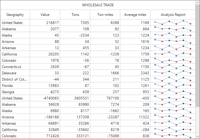
Refer to the above prepared sparkline column in this following link: Sparkline column
Here, a rating column has been created as a custom column. The sample for this can be downloaded from this following link: RatingColumn
See also
How to suspend the PING sound when perform the Tab operation in DataGrid(SfDataGrid)
How to change the ValidationMode of the GridNumericColumn in WinForms DataGrid (SfDataGrid)