How can I help you?
Symbol filtering of Stencil in WPF Diagram (SfDiagram)
29 Nov 20248 minutes to read
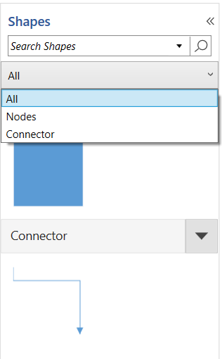
The grouped symbols can be filtered or hidden using the SymbolFilters. The SymbolFilters are a collection of SymbolFilterProvider, which contains the SymbolFilter delegate property to filter the specific symbol group.
The Content and ContentTemplate property of the SymbolFilterProvider is used to update the content of the symbol filter.
The following code explains how to create a symbol filter in the stencil.
<Window.DataContext>
   <viewmodel:StencilVM></viewmodel:StencilVM>
</Window.DataContext>
<Window.Resources>
<DataTemplate x:Key="TitleTemplate">
   <TextBlock x:Name="HeaderText" Text="{Binding}" FontSize="15" FontWeight="SemiBold"  Foreground="#2b579a" >
   </TextBlock>
</DataTemplate>
<!--Style for Node-->
<Style TargetType="{x:Type syncfusion:Node}">
    <Setter Property="ShapeStyle">
     <Setter.Value>
       <Style  TargetType="Path">
         <Setter Property="Fill" Value="#FF5B9BD5"/>
         <Setter Property="Stroke" Value="#FFEDF1F6"/>
         <Setter Property="StrokeThickness" Value="1"/>
         <Setter Property="Stretch" Value="Fill"/>
       </Style>
     </Setter.Value>
    </Setter>
</Style>
<!--Style for Connector-->
<Style TargetType="{x:Type syncfusion:Connector}">
   <Setter Property="ConnectorGeometryStyle">
    <Setter.Value>
      <Style TargetType="Path">
        <Setter Property="Stroke" Value="#FF5B9BD5"></Setter>
        <Setter Property="StrokeThickness" Value="1"></Setter>
      </Style>
    </Setter.Value>
   </Setter>
   <Setter Property="TargetDecoratorStyle">
    <Setter.Value>
      <Style TargetType="Path">
        <Setter Property="Fill" Value="#FF5B9BD5"></Setter>
        <Setter Property="StrokeThickness" Value="1"></Setter>
      </Style>
    </Setter.Value>
   </Setter>
</Style>
<!--Style for Symbol-->
<Style TargetType="stencil:Symbol">
  <Setter Property="Width" Value="100" />
  <Setter Property="Height" Value="100" />
  <Setter Property="BorderThickness" Value="1" />
  <Setter Property="Background" Value="Transparent" />
  <Setter Property="BorderBrush" Value="Transparent" />
  <Setter Property="Margin" Value="4"></Setter>
</Style>
<!--Style for Symbol Group-->
<Style TargetType="stencil:SymbolGroup">
  <Setter Property="FontFamily" Value="Regular"/>
  <Setter Property="Background" Value="#ffffff"/>
  <Setter Property="Foreground" Value="#222222"/>
  <Setter Property="FontSize" Value="14"/>
  <Setter Property="HeaderTemplate">
    <Setter.Value>
      <DataTemplate>
        <stencil:Header>
          <stencil:Header.Template>
            <ControlTemplate TargetType="stencil:Header">
              <Grid>
                <Border x:Name="header" Background="#f5f5f5" BorderBrush="#dfdfdf" BorderThickness="1">
                  <ContentPresenter Margin="10" Content="{Binding}"/>
                </Border>
               </Grid>
            </ControlTemplate>
          </stencil:Header.Template>
        </stencil:Header>
      </DataTemplate>
    </Setter.Value>
  </Setter>
</Style>
</Window.Resources>
<Grid>
  <Grid.ColumnDefinitions>
    <ColumnDefinition Width="2*"/>
    <ColumnDefinition Width="8*"/>
  </Grid.ColumnDefinitions>
  <!--Define the Stencil-->
   <stencil:Stencil Grid.Column="0" BorderThickness="1" BorderBrush="#dfdfdf" Title="Shapes" TitleTemplate="{StaticResource TitleTemplate}"  x:Name="stencil" ExpandMode="All" SymbolFilters="{Binding Symbolfilters}" SelectedFilter="{Binding Selectedfilter}">
     <!--Initialize the SymbolSource-->
     <stencil:Stencil.SymbolSource>
      <!--Initialize the SymbolCollection-->
      <local:SymbolCollection>
       <!--Define the DiagramElement-Node-->
        <syncfusion:NodeViewModel x:Name="node" UnitHeight="100" UnitWidth="100" OffsetX="100" OffsetY="100" Shape="{StaticResource Rectangle}" Key="Nodes">
          </syncfusion:NodeViewModel>
       <!--Define the DiagramElement- Connector-->
         <syncfusion:ConnectorViewModel SourcePoint="100,100" TargetPoint="200,200" Key="Connector">
          </syncfusion:ConnectorViewModel>
      </local:SymbolCollection>
      </stencil:Stencil.SymbolSource>
       <!--Initialize the SymbolGroup-->
       <stencil:Stencil.SymbolGroups>
        <stencil:SymbolGroups>
         <!--Map Symbols Using MappingName-->
         <stencil:SymbolGroupProvider MappingName="Key"></stencil:SymbolGroupProvider>
        </stencil:SymbolGroups>
       </stencil:Stencil.SymbolGroups>
     </stencil:Stencil>
</Grid>
public class StencilVM : INotifyPropertyChanged
{
public StencilVM()
{
Symbolfilters = new SymbolFilters();
SymbolFilterProvider all = new SymbolFilterProvider { Content = "All", SymbolFilter = Filter };
SymbolFilterProvider Node = new SymbolFilterProvider { Content = "Nodes", SymbolFilter = Filter };
SymbolFilterProvider Con = new SymbolFilterProvider { Content = "Connector", SymbolFilter = Filter };
this.Symbolfilters.Add(all);
this.Symbolfilters.Add(Node);
this.Symbolfilters.Add(Con);
this.Selectedfilter = Symbolfilters[0];
}
// Define the filtering of symbols.
private bool Filter(SymbolFilterProvider sender, object symbol)
{
if (symbol is NodeViewModel)
{
if (sender.Content.ToString() == (symbol as NodeViewModel).Key.ToString())
return true;
}
if (symbol is ConnectorViewModel)
{
if (sender.Content.ToString() == (symbol as ConnectorViewModel).Key.ToString())
return true;
}
if (sender.Content.ToString() == "All")
{
return true;
}
return false;
}
public ObservableCollection<SymbolFilterProvider> Symbolfilters { get; set; }
public SymbolFilterProvider Selectedfilter { get; set; }
public event PropertyChangedEventHandler PropertyChanged;
}
NOTE
SymbolFilters and SymbolFilterProviders can only be used when the SymbolGroupDisplayMode in Stencil is set to Accordion.