Node in WPF Diagram (SfDiagram)
17 Jun 202624 minutes to read
The nodes are graphical objects used to visually represent the geometrical information, process flow, internal business procedure, or any other kind of data, and it represents the functions of a complete system in regards of how it interacts with external entities.
Create node
A node can be created and added to the WPF Diagram, either programmatically or interactively. Nodes are stacked on the Diagram area from bottom to top in the order they are added.
Add Node through Nodes collection
To create a node, you have to define the node object and add that to Nodes collection of the Diagram.
<!--Resource Dictionary which contains predefined shapes for Node-->
<ResourceDictionary.MergedDictionaries>
  <ResourceDictionary Source="/Syncfusion.SfDiagram.Wpf;component/Resources/BasicShapes.xaml"/>
</ResourceDictionary.MergedDictionaries>

<!--Shape style for Node-->
<Style x:Key="ShapeStyle" TargetType="Path">
  <Setter Property="Fill" Value="#FF5B9BD5"/>
  <Setter Property="Stretch" Value="Fill"/>
  <Setter Property="Stroke" Value="#FFEDF1F6"/>
</Style>

<!--Initialize the Sfdiagram-->
<syncfusion:SfDiagram x:Name="diagram">
  <syncfusion:SfDiagram.Nodes>
    <!--Initialize the NodeCollection-->
    <syncfusion:NodeCollection>
      <!--Initialize the Node-->
      <syncfusion:NodeViewModel ID="Begin" OffsetX="300" OffsetY="60"
                                Shape="{StaticResource Ellipse}"
                                ShapeStyle="{StaticResource ShapeStyle}"
                                UnitHeight="40" UnitWidth="120"/>
      </syncfusion:NodeCollection>
  </syncfusion:SfDiagram.Nodes>
</syncfusion:SfDiagram>
//Initialize the SfDiagram
SfDiagram diagram = new SfDiagram();
//Initialize NodeCollection to SfDiagram
diagram.Nodes = new NodeCollection();
//Initialize ConnectorCollection to SfDiagram
diagram.Connectors = new ConnectorCollection();
//Creating the NodeViewModel
NodeViewModel Begin = new NodeViewModel()
{
ID = "Begin",
UnitWidth = 120,
UnitHeight = 40,
OffsetX = 300,
OffsetY = 60,
//Specify shape to the Node from built-in Shape Dictionary
Shape = App.Current.Resources["Ellipse"],
//Apply style to Shape
ShapeStyle = App.Current.Resources["ShapeStyle"] as Style,
};
//Add Node to Nodes property of the Diagram
(diagram.Nodes as NodeCollection).Add(Begin);Now, node will be as follows.

Add node from stencil
Nodes can be predefined and added to the stencil and can be dropped into the Diagram when needed. For more information about adding Nodes from Stencil, refer to the Stencil.
Create node through data source
Nodes can be generated automatically with the information provided through data source. For more information about data source, refer to the Data Source.
Draw nodes
Nodes can be drawn interactively by clicking and dragging the Diagram surface by using the Drawing Tool. For more information about drawing nodes, refer to the Draw Nodes.
Visualize a node
You can use text, image, controls, panels, or any UIElement or template to visualize a node as follows:
1) Content template
2) Content
3) Geometry
4) Custom shapes
5) Built-in resource
Using content template
Node is a ContentControl, so you can use DataTemplate to display the content of the node using the ContentTemplate property. Refer to the following code example to define node’s shape through ContentTemplate.
<DataTemplate x:Key="NodeTemplate">
  <Border BorderThickness="2" BorderBrush="Black">
      <TextBlock Text="NodeTemplate" Width="100" Height="100" Background="White"/>
  </Border>
</DataTemplate>

<!--Initialize the Node-->
<syncfusion:NodeViewModel UnitHeight="100" UnitWidth="100"
                          OffsetX="100" OffsetY="100"
                          ContentTemplate="{StaticResource NodeTemplate}"/>
//Define the Node
NodeViewModel node = new NodeViewModel()
{
//sets the size
UnitHeight = 100,
UnitWidth = 100,
//sets the position
OffsetX = 100,
OffsetY = 100,
ContentTemplate = App.Current.Resources["NodeTemplate"] as DataTemplate
};
//Adding Node to Collection
(diagram.Nodes as NodeCollection).Add(node);Using content
Node is a ContentControl, so you can set text, image, or any UIElement as node content using the Content property. Refer to the following code example to define image as content of the Node.
<!--Initialize the Node-->
<syncfusion:NodeViewModel UnitHeight="100" UnitWidth="100"
                          OffsetX="100" OffsetY="100">
  <!--Assigning user image as Node's Content-->
  <syncfusion:NodeViewModel.Content>
    <Image Source="/Image/user_image.png" Height="100" Width="100"/>
  </syncfusion:NodeViewModel.Content>
</syncfusion:NodeViewModel>
Image img = new Image();
BitmapImage bmp = new BitmapImage();
bmp.BeginInit();
bmp.UriSource = new Uri("Image/user_image.png", UriKind.Relative);
bmp.EndInit();
img.Stretch = Stretch.Fill;
img.Source = bmp;
img.Height = 100;
img.Width = 100;
//Define the Node
NodeViewModel node = new NodeViewModel()
{
//sets the size
UnitHeight = 100,
UnitWidth = 100,
//sets the position
OffsetX = 100,
OffsetY = 100,
//set image as content
Content = img
};
//Adding Node to Collection
(diagram.Nodes as NodeCollection).Add(node);Using geometry
The Shape property of the Node class allows to visualize any geometry path as node’s content. Refer to the following code example to define geometry for node’s shape.
<Style TargetType="syncfusion:Node">
  <Setter Property="ShapeStyle">
    <Setter.Value>
      <Style TargetType="Path">
        <Setter Property="Fill" Value="#FF5B9BD5"/>
        <Setter Property="Stretch" Value="Fill"/>
        <Setter Property="Stroke" Value="#FFEDF1F6 "/>
      </Style>
    </Setter.Value>
  </Setter>
</Style>

<!--Initialize the Node-->
<syncfusion:NodeViewModel UnitWidth="100" UnitHeight="100"
                          OffsetX="100" OffsetY="100">
  <syncfusion:NodeViewModel.Shape>
    <RectangleGeometry Rect="100,100,100,100"/>
  </syncfusion:NodeViewModel.Shape>
</syncfusion:NodeViewModel>
//Define the Node
NodeViewModel node = new NodeViewModel()
{
//sets the size
UnitHeight = 100,
UnitWidth = 100,
//sets the position
OffsetX = 100,
OffsetY = 100,
Shape = new RectangleGeometry() { Rect = new Rect(100, 100, 100, 100) }
};
//Adding Node to Collection
(diagram.Nodes as NodeCollection).Add(node);Custom shapes
How to add custom shape using path data
Refer to the following code example to define custom path as node’s shape.
<!--Namespace to define String in XAML-->
xmlns:sys="clr-namespace:System;assembly=mscorlib"

<sys:String x:Key="Rectangle">
  M242,1078L231,1078L231,1067L242,1067z
</sys:String>

<!--Initialize the Sfdiagram-->
<syncfusion:SfDiagram x:Name="diagram">
  <syncfusion:SfDiagram.Nodes>
    <!--Initialize the NodeCollection-->
    <syncfusion:NodeCollection>
      <!--Initialize the Node-->
      <syncfusion:NodeViewModel UnitWidth="100" UnitHeight="100"
                                OffsetX="100" OffsetY="100"
                                Shape="{StaticResource Rectangle}"
                                ShapeStyle="{StaticResource ShapeStyle}"/>
    </syncfusion:NodeCollection>
  </syncfusion:SfDiagram.Nodes>
</syncfusion:SfDiagram>
//Define the Node
NodeViewModel node = new NodeViewModel()
{
//sets the size
UnitHeight = 100,
UnitWidth = 100,
//sets the position
OffsetX = 100,
OffsetY = 100,
Shape= App.Current.Resources["Rectangle"] as Style,
//Apply style to Shape
ShapeStyle = App.Current.Resources["ShapeStyle"] as Style,
};
//Adding Node to Collection
(diagram.Nodes as NodeCollection).Add(node);
How to add custom shape using data template
Refer to the following code example to define data template for node’s custom shape,
<DataTemplate x:Key="Square">
  <Path Stretch="Fill" Data="M242,1078L231,1078L231,1067L242,1067z" Fill="#FF5B9BD5" Stroke="#FFC4C4C4" StrokeThickness="2"/>
</DataTemplate>

<!--Initialize the Sfdiagram-->
<syncfusion:SfDiagram x:Name="diagram">
  <syncfusion:SfDiagram.Nodes>
    <!--Initialize the NodeCollection-->
    <syncfusion:NodeCollection>
      <!--Initialize the Node-->
      <syncfusion:NodeViewModel UnitWidth="100" UnitHeight="100" OffsetX="100" OffsetY="100" ContentTemplate="{StaticResource Square}" />
    </syncfusion:NodeCollection>
  </syncfusion:SfDiagram.Nodes>
</syncfusion:SfDiagram>
//Define the Node
NodeViewModel node = new NodeViewModel()
{
//sets the size
UnitHeight = 100,
UnitWidth = 100,
//sets the position
OffsetX = 100,
OffsetY = 100,
ContentTemplate = this.Resources["Square"] as DataTemplate,
};
//Adding Node to Collection
(diagram.Nodes as NodeCollection).Add(node);
How to add image as node shape
Refer to the following code example to add image as node shape,
<DataTemplate x:Key="User">
  <Image Stretch="Uniform" HorizontalAlignment="Center" Source="Images\User.png"/>
</DataTemplate>

<!--Initialize the Sfdiagram-->
<syncfusion:SfDiagram x:Name="diagram">
  <syncfusion:SfDiagram.Nodes>
    <!--Initialize the NodeCollection-->
    <syncfusion:NodeCollection>
      <!--Initialize the Node-->
      <syncfusion:NodeViewModel UnitWidth="100" UnitHeight="100" OffsetX="100" OffsetY="100" ContentTemplate="{StaticResource User}" />
    </syncfusion:NodeCollection>
  </syncfusion:SfDiagram.Nodes>
</syncfusion:SfDiagram>
//Define the Node
NodeViewModel node = new NodeViewModel()
{
//sets the size
UnitHeight = 100,
UnitWidth = 100,
//sets the position
OffsetX = 100,
OffsetY = 100,
ContentTemplate = this.Resources["User"] as DataTemplate,
};
//Adding Node to Collection
(diagram.Nodes as NodeCollection).Add(node);
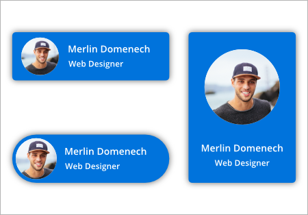
How to add framework element as node content
Refer to the following code example to add framework elements as node content,
<DataTemplate x:Key="UserProfile">
  <Border  BorderThickness="1" Background ="#2E95D8" BorderBrush="LightGray">
    <Grid>
      <Grid.ColumnDefinitions>
        <ColumnDefinition Width="60" />
        <ColumnDefinition Width="100" />
      </Grid.ColumnDefinitions>
      <Grid Grid.Column="0">
        <Border Grid.Column="0" VerticalAlignment="Stretch" Background="Transparent" BorderBrush="#FF5DC3B1" Padding="5">
          <Image Stretch="Uniform" HorizontalAlignment="Center" Source="Images\User.png"/>
        </Border>
      </Grid>
      <Grid Grid.Column="1">
        <Grid.RowDefinitions>
          <RowDefinition Height="25" />
          <RowDefinition Height="25" />
        </Grid.RowDefinitions>
        <TextBlock x:Name="Name" Grid.Row="0"
                   HorizontalAlignment="Left"
                   VerticalAlignment="Center"
                   FontFamily="Segoe UI"
                   FontSize="12"
                   FontWeight="Bold"
                   Foreground="White"
                   Text="Daniel Tonini"
                   TextAlignment="Left" />
        <TextBlock x:Name="Designation" Grid.Row="1"
                   HorizontalAlignment="Left"
                   VerticalAlignment="Top"
                   FontFamily="Segoe UI"
                   FontSize="11"
                   FontWeight="SemiBold"
                   Foreground="White"
                   Text="Project Lead"
                   TextAlignment="Left" />
      </Grid>
    </Grid>
  </Border>
</DataTemplate>

<!--Initialize the Sfdiagram-->
<syncfusion:SfDiagram x:Name="diagram">
  <syncfusion:SfDiagram.Nodes>
    <!--Initialize the NodeCollection-->
    <syncfusion:NodeCollection>
      <!--Initialize the Node-->
      <syncfusion:NodeViewModel UnitWidth="150" UnitHeight="50" OffsetX="100" OffsetY="100" ContentTemplate="{StaticResource UserProfile}" />
    </syncfusion:NodeCollection>
  </syncfusion:SfDiagram.Nodes>
</syncfusion:SfDiagram>
//Define the Node
NodeViewModel node = new NodeViewModel()
{
//sets the size
UnitHeight = 50,
UnitWidth = 150,
//sets the position
OffsetX = 100,
OffsetY = 100,
ContentTemplate = this.Resources["UserProfile"] as DataTemplate,
};
//Adding Node to Collection
(diagram.Nodes as NodeCollection).Add(node);
Built-in resource
Some basic built-in shapes are provided as ResourceDictionary. For more information, refer to the Shapes.
Position
Position of a node is controlled by using its OffsetX and OffsetY properties. By default, these Offset properties represent the distance between origin of the diagram’s page and node’s center point. You may expect this Offset values to represent the distance between page origin and node’s top left corner instead of center. The Pivot property helps solve this problem. Default value of node’s pivot point is (0.5, 0.5), that means center of node.
The following table explains how Pivot relates Offset values with Node boundaries:
| Pivot | Offset |
|---|---|
| (0,5, 0.5) | OffsetX and OffsetY values are considered as the node’s center point. |
| (0,0) | OffsetX and OffsetY values are considered as the top left corner of node. |
| (1,1) | OffsetX and OffsetY values are considered as the bottom right corner of the node. |
<!--Initialize the Node with Pivot-->
<syncfusion:NodeViewModel UnitHeight="65" UnitWidth="100"
                          OffsetX="100" OffsetY="100" Pivot="0,0"
                          Shape="{StaticResource Rectangle}"/>
//Define the Node
NodeViewModel node = new NodeViewModel()
{
//sets the size
UnitHeight = 65,
UnitWidth = 100,
//sets the position
OffsetX = 100,
OffsetY = 100,
//sets the Pivot point
Pivot=new Point(0,0),
Shape = new RectangleGeometry() { Rect = new Rect(0, 0, 10, 10) },
};
//Adding Node to Collection
(diagram.Nodes as NodeCollection).Add(node);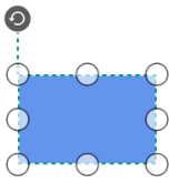
Flip
Diagram provides support to flip the node.Flip is performed to give the mirrored node of the original element.
The Flip types are:
-
Flip
Flipthat involves both vertical and horizontal changes of the element. -
VerticalFlip
VerticalFlipthat involves changes in the vertical direction of the element. -
HorizontalFlip
HorizontalFlipthat involves changes in the horizontal direction of the element.
<!--Initialize Vertical Flip to the Node-->
<syncfusion:NodeViewModel Flip="VerticalFlip"
                          UnitHeight="100" UnitWidth="100"
                          OffsetX="200" OffsetY="100"
                          Shape="{StaticResource Triangle}"
                          ShapeStyle="{StaticResource ShapeStyle}"/>
//Define the Node
NodeViewModel node = new NodeViewModel()
{
UnitHeight = 100,
UnitWidth = 100,
OffsetX=200,
OffsetY=100,
//Initialize Vertical Flip to the Node
Flip = Flip.VerticalFlip,
Shape = App.Current.Resources["Triangle"],
ShapeStyle = App.Current.Resources["ShapeStyle"] as Style,
};
//Adding Node to Collection
(diagram.Nodes as NodeCollection).Add(node);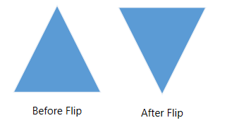
Padding
Padding is used to leave space between the connector’s end point and the object to where it is connected. The ConnectorPadding property of Node defines the space to be left between the node bounds and its edges.
<syncfusion:SfDiagram.Nodes>
  <syncfusion:NodeCollection>
    <!--Initialize connector padding to the Node-->
    <syncfusion:NodeViewModel ID="node1" ConnectorPadding="5"
                              UnitHeight="65" UnitWidth="100"
                              OffsetX="200" OffsetY="200"
                              Shape="{StaticResource Rectangle}"
                              ShapeStyle="{StaticResource ShapeStyle}"/>
    <syncfusion:NodeViewModel ID="node2" UnitHeight="65" UnitWidth="100"
                              OffsetX="400" OffsetY="200"
                              Shape="{StaticResource Rectangle}"
                              ShapeStyle="{StaticResource ShapeStyle}"/>
  </syncfusion:NodeCollection>
</syncfusion:SfDiagram.Nodes>
<syncfusion:SfDiagram.Connectors>
  <syncfusion:ConnectorCollection>
    <!--Establish connection between the nodes-->
    <syncfusion:ConnectorViewModel SourceNodeID="node1" TargetNodeID="node2"/>
  </syncfusion:ConnectorCollection>
</syncfusion:SfDiagram.Connectors>
//Define NodeProperty
NodeViewModel node1 = AddNode(200,200,65,100);
//Space between Connector and Node
node1.ConnectorPadding = 5;
//Adding Node to Collection
(diagram.Nodes as NodeCollection).Add(node1);
NodeViewModel node2 = AddNode(400,200,65,100);
(diagram.Nodes as NodeCollection).Add(node2);
//Define ConnectorCollection
diagram.Connectors = new ConnectorCollection();
ConnectorViewModel conn1 = new ConnectorViewModel()
{
SourceNode = node1,
TargetNode=node2
};
//Adding Connector to Collection
(diagram.Connectors as ConnectorCollection).Add(conn1);
//Method for Creating Node
public NodeViewModel AddNode(double offsetX, double offsetY,double height,double width)
{
NodeViewModel node = new NodeViewModel();
node.OffsetX = offsetX;
node.OffsetY = offsetY;
node.UnitHeight = height;
node.UnitWidth = width;
node.Shape = new RectangleGeometry { Rect = new Rect(0, 0, 10, 10) } ;
return node;
}
Appearance
You can customize the appearance of a node by changing its ShapeStyle. The following code explains how to customize the appearance of the Shape.
<Style TargetType="Path" x:key="shapestyle">
  <Setter Property="Fill" Value="#FF41719C"/>
  <Setter Property="Stretch" Value="Fill"/>
  <Setter Property="Stroke" Value="#FFEDF1F6"/>
  <Setter Property="StrokeDashArray" Value="4,5"/>
  <Setter Property="StrokeThickness" Value="2"/>
</Style>
Style style = new Style(typeof(Path));
style.Setters.Add(new Setter(Path.FillProperty, Brushes.SteelBlue));
style.Setters.Add(new Setter(Path.StrokeProperty, Brushes.WhiteSmoke));
style.Setters.Add(new Setter(Path.StrokeThicknessProperty, 2d));
style.Setters.Add(new Setter(Path.StrokeDashArrayProperty, new DoubleCollection() { 5 }));
style.Setters.Add(new Setter(Path.StretchProperty, Stretch.Fill));
return style;
Interaction
Diagram provides support to drag, resize, or rotate the node interactively.
Select
Node can be selected by clicking (tap) it.
-
The
IsSelectedProperty is used to select or unselect the node at runtime. -
ItemSelectingEventandItemSelectedEventfor selecting an element, will notify you the item and its original source. To explore about arguments, refer to the DiagramPreviewEventArgs and ItemSelectedEventArgs. -
ItemUnselectingEventandItemUnselectedEventfor unselecting an element, will notify you the item and its original source. To explore about arguments, refer to the DiagramPreviewEventArgs and DiagramEventArgs.
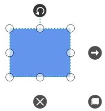
To explore about selection and selection related events, refer to the Selection.
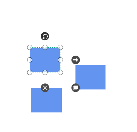
Drag
-
Selected object can be dragged by clicking and dragging it. When multiple elements are selected, dragging any one of the selected elements move every selected element.
-
Instead of dragging original object, preview of the node alone can be dragged. For preview dragging, refer to the PreviewSettings.
-
While dragging, the objects are snapped towards the nearest objects to make better alignments. For better alignments, refer to the Snapping.
-
The
BoundaryConstraintsargument in theNodeChangedEventis used to restrict the dragging of the Nodes in the given region. -
The
NodeChangedEventwill notify theOffsetXandOffsetYchanges with their old and new values. Along with that, this event will give information about interaction state. To explore about aruguments, refer to the NodeChangedEventArgs .
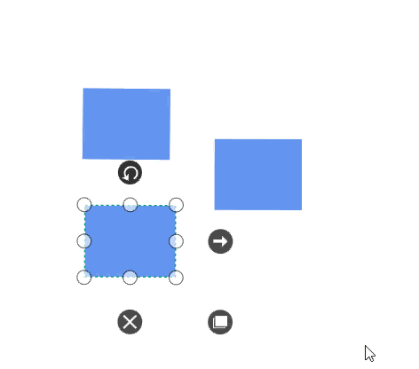
Resize
- Selector is surrounded by eight thumbs. When dragging these thumbs, selected items can be resized smaller or larger.
- When one corner of the selector is dragged, opposite corner is in a static position.
- Enable AspectRatio NodeConstraints to maintain the aspect ratio of the node when its being resized.
-
While resizing, the objects are snapped towards the nearest objects to make better alignments. For better alignments, refer to the Snapping.
- The
NodeChangedEventwill notify theUnitHeightandUnitWidthchanges with their old and new values. Along with that, this event will give information about interaction state. To explore about arguments, refer to the NodeChangedEventArgs .
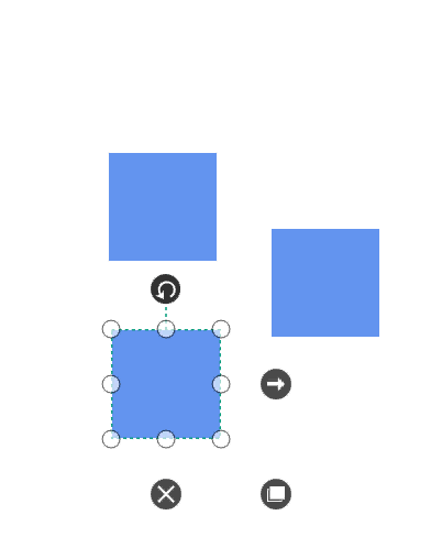
Rotate
- A rotate handler is placed above the selector. Clicking and dragging the handler in a circular direction lead to rotate the node.
- The node is rotated with reference to the static pivot point.
-
Pivotthumb (thumb at the middle of the Node) appears when rotating the node to represent the static point. For more information about pivot, refer toPosition - The
NodeChangedEventwill notify theRotateAnglechanges with their old and new values. Along with that, this event will give information about interaction state. To explore about arguments, refer to the NodeChangedEventArgs .
Events
- The
ItemTappedEventis invoked on clicking the node. To explore about arguments, refer to the ItemTappedEventargs. - The
ItemDoubleTappedEventis invoked on double-clicking the node. To explore about arguments, refer to the ItemDoubleTappedEventargs. - The
MouseDownandMouseUpare invoked as similar to framework element that is raised together with either MouseLeftButtonUp or MouseRightButtonUp. To explore about arguments, refer to the MouseDownEventArgs and MouseUpEventArgs.
Constraints
The Constraints property of node allows you to enable or disable certain features. For more information about node constraints, refer to the Node Constraints.
See Also
How to add Annotations to the Node?
How to add Nodes to the stencil?
How to apply built-in theme for node and connector?
How to customize the connection indicator style of node and port?
How to host different UI elements as node content?
How to restrict the child node dragging whereas allow group dragging?
How to restrict the node dragging within boundaries?
How to show assistants to the parent node of the organization layout?
How to create port at runtime though SetTool?
How to customize the context menu?
How to drag node from one diagram to another diagram?
How to restrict node’s dragging from native lane to other lanes in diagram?
How to add ToolTip for Diagram objects of Node, NodePort in Diagram?
How to add image annotations to a Node?
How to notify state of operation performed on node?
How to remove all its children nodes when deleting a parent node?
How to restrict annotation editing by double-clicking the node or connector?
How to disable the animation while creating a connection in diagram?
How to enable or disable the QuickCommands for node in WPF Diagram ?
How to bring the specific diagram object to the center or viewport of the Diagram?
How to programmatically Show/Hide the Annotations of node and connector?
How to hide the specific default QuickCommands of a node?
How to show the copied diagram elements as preview image along with the mouse pointer?
How to serialize the Content and ContentTemplate properties of a Node?
How to use ContentTemplateSelector based on the Content of the Node?
How to customize the appearance of the node selector?
How to update the Zindex of the dragged node?
How to restrict diagram objects dragging in the positive side?
How to use the property grid for diagram elements?
How to add multiple ports for Node?
How to override the default cursors while interact on diagram objects?
How to create parent and child relationship by drag and drop nodes?
How to connect only with port not with node?
How to Notify when diagramming object is duplicated with source?
How to enable the behaviour of drag the node from one diagram to another diagram?
How to remove the rotator thumb of the node?
How to add space between connector decorator and node?
How to disable the selection of diagram objects?
How to get base node interface while dropping a symbol from stencil?
How to enable the AspectRatio for node?
How to select the node that is outside of the selection region in the WPF Diagram ?
How to manage the node’s visibility when it is dropped onto another node in WPF Diagram (SfDiagram)?
How to use the WPF SfDiagram as the Content of the Node?
How to Prevent Nodes from being Unselected when Right-Clicking in WPF SfDiagram?
How to Obtain InConnectors and OutConnectors of Node in WPF Diagram?
How to disable Ctrl + Drag duplicate behavior in WPF Diagram(SfDiagram)?
How to Fit Selected Nodes and Connectors to the WPF Diagram Window?
How to add a node as a child of a container using the context menu in the WPF Diagram (SfDiagram)?
How to set the semi-transparent color to Nodes in the WPF Diagram (SfDiagram)?
How to update the ShapeStyle of the selected node at runtime in WPF Diagram (SfDiagram) ?
How to prevent nodes from moving to a negative index when nudging in WPF Diagram (SfDiagram)?
How to clone the NodeViewModel in SfDiagram?
How to apply styles to nodes based on key values in the WPF Diagram?
How to Get the Node or Connector in the MouseMove Event in the WPF Diagram (SfDiagram)?
How to avoid the node clipping while export in the WPF Diagram?
How to manage the visibility of node and connector objects in the WPF Diagram (SfDiagram)?
How to customize the connection indicator style of node and port in WPF Diagram (SfDiagram)?
How to notify state of operation performed on node in WPF Diagram?
How to remove all its children when deleting a parent node in WPF Diagram (SfDiagram)?
How to hide specific default QuickCommands of node in WPF Diagram?
How to serialize Content and ContentTemplate properties of a Node in WPF Diagram(SfDiagram)?
How to create filled PolyLine Node in WPF Diagram (SfDiagram)?
How to bring the specific node to the center or viewport in WPF Diagram (SfDiagram)?
How to switch the visibility of an icon in the ContentTemplate in WPF Diagram (SfDiagram) ?