How can I help you?
Themes with WPF Diagram (SfDiagram)
29 Jan 20253 minutes to read
Diagram themes are predefined sets of diagram item styles that can be applied easily to the diagram elements. In Diagram, nearly 20 Built-In themes are available. DiagramTheme has NodeStyles, ConnectorStyles, and Theme properties that can be used to create custom Diagram theme.
To know more about DiagramTheme properties, refer to the DiagramTheme.
Built-In Themes
Built-In themes are predefined themes inherited from DiagramTheme. Each Built-In themes has four variants. Based on the selected theme and variants, the style of the node and connector will be changed. By default, first variant style of the specified Built-In theme will be applied to the Diagram elements.
To Know more about Built-In themes, refer to Built-In.
To change the DiagramTheme,
<!--Resource Dictionary which contains predefined shapes for Node-->
<ResourceDictionary.MergedDictionaries>
    <ResourceDictionary Source="/Syncfusion.SfDiagram.Wpf;component/Resources/BasicShapes.xaml"/>
</ResourceDictionary.MergedDictionaries>

<!--Initialize the Sfdiagram-->
<syncfusion:SfDiagram x:Name="diagram">
    <syncfusion:SfDiagram.Theme>
        <syncfusion:OfficeTheme></syncfusion:OfficeTheme>
    </syncfusion:SfDiagram.Theme>
</syncfusion:SfDiagram>
//Instance of SfDiagram
SfDiagram diagram = new SfDiagram();
DiagramTheme theme = new OfficeTheme();
diagram.Theme = theme;Variant Styles and ShapeStyles
Variant styles are set of styles that are applied to Diagram elements. Each variant style contains 46 shape styles. You can change the style of each node in the diagram using the ThemeStyleId property. Based on the values of theme and variant style, the style will be applied to the node.
To change the Variant and Style,
<!--Initialize the Sfdiagram-->
<syncfusion:SfDiagram x:Name="diagram">
    <syncfusion:SfDiagram.Theme>
        <syncfusion:OfficeTheme></syncfusion:OfficeTheme>
    </syncfusion:SfDiagram.Theme>
    <syncfusion:SfDiagram.Nodes>
        <!--Initialize the NodeCollection-->
        <syncfusion:NodeCollection>
            <!--Initialize the Node-->
            <syncfusion:NodeViewModel OffsetX="100" OffsetY="100" UnitWidth="75" UnitHeight = "75" Shape="{StaticResource Ellipse}" ThemeStyleId="Variant1">
            </syncfusion:NodeViewModel>
        </syncfusion:NodeCollection>
    </syncfusion:SfDiagram.Nodes>
</syncfusion:SfDiagram>diagram.Theme = new OfficeTheme();
NodeViewModel node = new NodeViewModel()
{
OffsetX = 100,
OffsetY = 100,
UnitWidth = 75,
UnitHeight = 75,
Shape = App.Current.Resources["Rectangle"],
//adding theme style ID as variant1.
ThemeStyleId = StyleId.Variant1,
};
node.Annotations = new ObservableCollection<IAnnotation>()
{
new TextAnnotationViewModel()
{
Text = node.ThemeStyleId.ToString(),
TextWrapping = TextWrapping.Wrap,
}
};
(diagram.Nodes as ObservableCollection<NodeViewModel>).Add(node);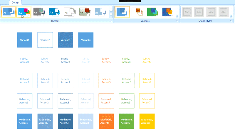
NOTE
When you apply a theme, it affects all SfDiagram elements and overrides any individual
ShapeStylesettings for those elements. And also, you cannot update theShapeStyleproperty for diagram elements when a theme is applied.
See Also
How to apply built-in theme for node and connector?
How to create a custom theme using the SfDiagram Control in the WPF Diagram?