Getting Started with WPF Diagram (SfDiagram)
1 Jul 202624 minutes to read
Assembly deployment
Refer to the control dependencies section to get the list of assemblies or NuGet package that needs to be added as a reference to use the control in any application.
You can find more details about installing the NuGet package in a WPF application in the following link:
How to install nuget packages
The following section helps you to build your application with WPF Diagram.
Creating the project
Create new WPF project using Visual Studio. For more details.
Adding control via Designer
WPF Diagram (SfDiagram) control can be added to the application by dragging it from Toolbox and dropping it in Designer view. The required assembly references will be added automatically.
Adding control manually in XAML
To add control manually in XAML, do the following steps:
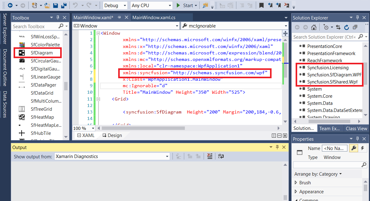
- Add the following required assembly reference to the project, Syncfusion.SfDiagram.WPF .
- Import Syncfusion® WPF schema http://schemas.syncfusion.com/wpf or SfDiagram control namespace Syncfusion.UI.Xaml.Diagram in XAML page.
- Declare SfDiagram control in XAML page.
NOTE
Starting with v16.2.0.x, if you reference Syncfusion® assemblies from trial setup or from the NuGet feed, you also have to include a license key in your projects. Refer to this link to learn about registering Syncfusion® license key in your WPF application to use Syncfusion® components.
<Window xmlns="http://schemas.microsoft.com/winfx/2006/xaml/presentation"
           xmlns:x="http://schemas.microsoft.com/winfx/2006/xaml"
           xmlns:d="http://schemas.microsoft.com/expression/blend/2008"
           xmlns:mc="http://schemas.openxmlformats.org/markup-compatibility/2006"
           xmlns:local="clr-namespace:SfDiagram_WPF"
           xmlns:syncfusion="http://schemas.syncfusion.com/wpf" x:Class="SfDiagram_WPF.MainWindow"
           mc:Ignorable="d" Title="MainWindow" Height="350" Width="525">
       <Grid>
           <!--Initializes the SfDiagram in XMAL window-->
           <syncfusion:SfDiagram x:Name="diagram"/>
       </Grid>
   </Window>
Adding control manually in C#
To add control manually in C#, do the following steps:
- Add the following required assembly references to the project, Syncfusion.SfDiagram.WPF.
- Import SfDiagram namespace Syncfusion.UI.Xaml.Diagram.
-
Create SfDiagram control instance and add it to the Grid.
using Syncfusion.UI.Xaml.Diagram;

namespace SfDiagram_WPF
{
    public partial class MainWindow : Window
    {
        public MainWindow()
        {
            InitializeComponent();
            // Initializes the SfDiagram
            SfDiagram diagram=new SfDiagram();
            Root_Grid.Children.Add(diagram);
        }
    }
}
Basic Diagram elements
- Node: Visualizes any graphical object using nodes, which can also be arranged and manipulated on a diagram page.
-
Connector: Represents the relationship between two nodes. Four types of connectors provided as follows:
1) Orthogonal 2) Bezier 3) Straight 4) Cubic Bezier - Port: Acts as the connection points of node or connector and allows you to create connections with only specific points.
- Annotation: Shows additional information by adding text or labels on nodes and connectors.
Flow chart
Let us create a simple flow chart using SfDiagram.
Initialize the Diagram
The SfDiagram exists in the Syncfusion.UI.Xaml.Diagram namespace. Initialize SfDiagram in XAML as shown in the following code example.
<!--Initializes the SfDiagram in XMAL window-->
<syncfusion:SfDiagram x:Name="diagram"/>
//Initializes the SfDiagram in C#
SfDiagram diagram =new SfDiagram();Initialize nodes and connectors
To initialize the nodes and connectors properties of the SfDiagram, the Nodes property is assigned with the NodeCollection, that is, ObservableCollection of the Node.
The Connectors property is assigned with the ConnectorCollection, that is, ObservableCollection of the Connector.
<syncfusion:SfDiagram.Nodes>
   <!--Observable Collection of NodeViewModel-->
   <syncfusion:NodeCollection/>
</syncfusion:SfDiagram.Nodes>

<syncfusion:SfDiagram.Connectors>
   <!--Observable Collection of ConnectorViewModel-->
   <syncfusion:ConnectorCollection/>
</syncfusion:SfDiagram.Connectors>
//Initialize Nodes with Observable Collection of NodeViewModel.
diagram.Nodes = new NodeCollection();
//Initialize Connectors with Observable Collection of ConnectorViewModel
diagram.Connectors = new ConnectorCollection();Add nodes
Let us create and add a NodeViewModel with height, width, shape, shape style, specific position, size, and annotation.
Creating a node
Creating NodeViewModel with specified height and width at a specific position.
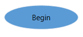
<syncfusion:NodeViewModel ID="Begin" UnitHeight="40" UnitWidth="120"
                          OffsetX="300" OffsetY="60"/>
NodeViewModel Begin = new NodeViewModel()
{
ID = "Begin",
UnitWidth = 120,
UnitHeight = 40,
OffsetX = 300,
OffsetY = 60,
};Adding shape and style to node
We have provided set of basic shapes for Diagram as ResourceDictionary. To use the built-in shapes, Shapes dictionary should be merged in the application.
Please refer to Shapes to know about built-in Shapes.
<ResourceDictionary>
    <ResourceDictionary.MergedDictionaries>
        <!--Initialize Shapes-->
        <ResourceDictionary Source="/Syncfusion.SfDiagram.Wpf;component/Resources/BasicShapes.xaml" />
    </ResourceDictionary.MergedDictionaries>
    <!--Style for Shape of the Node-->
    <Style TargetType="Path" x:Key="ShapeStyle">
        <Setter Property="Fill" Value="#FF5B9BD5"/>
        <Setter Property="Stretch" Value="Fill"/>
        <Setter Property="Stroke" Value="#FFEDF1F6"/>
    </Style>

    <!--To apply Style for NodeViewModel-->
    <Style TargetType="syncfusion:Node">
        <Setter Property="ShapeStyle" Value="{StaticResource ShapeStyle}"></Setter>
    </Style>
</ResourceDictionary>

<syncfusion:NodeViewModel ID="Begin" OffsetX="300" OffsetY="60"
                          Shape="{StaticResource Ellipse}"
                          UnitHeight="40" UnitWidth="120"/>
NodeViewModel Begin = new NodeViewModel()
{
ID = "Begin", UnitWidth = 120, UnitHeight = 40, OffsetX = 300, OffsetY = 60,
//Specify shape to the Node from built-in Shape Dictionary
Shape = this.Resources["Ellipse"],
//Apply style to Shape
ShapeStyle = this.Resources["ShapeStyle"] as Style,
};Now, the node will be as follows.

NOTE
ID sets for each node to identify nodes easily while setting connectors.
Adding annotation to node
To initialize the Annotation property of the node and connector, it is assigned with the annotation collection, that is, ObservableCollection of the IAnnotation.
Now add the Annotation content to Node.
<syncfusion:NodeViewModel ID="Begin" OffsetX="300" OffsetY="60"
                          Shape="{StaticResource Ellipse}"
                          UnitHeight="40" UnitWidth="120">
    <syncfusion:NodeViewModel.Annotations>
        <!--Observable Collection of AnnotationEditorViewModel-->
        <syncfusion:AnnotationCollection>
            <syncfusion:AnnotationEditorViewModel Content="Begin"/>
        </syncfusion:AnnotationCollection>
    </syncfusion:NodeViewModel.Annotations>
</syncfusion:NodeViewModel>
// Creating the NodeViewModel
NodeViewModel Begin = new NodeViewModel()
{
ID = "Begin",
UnitWidth = 120,
UnitHeight = 40,
OffsetX = 300,
OffsetY = 60,
//Specify shape to the Node from built-in Shape Dictionary
Shape = this.Resources["Ellipse"],
//Apply style to Shape
ShapeStyle = this.Resources["ShapeStyle"] as Style,
Annotations = new AnnotationCollection()
{
new AnnotationEditorViewModel()
{
Content="Begin",
}
}
};
//Add Node to Nodes property of the Diagram
(diagram.Nodes as NodeCollection).Add(Begin);Now, the node will be as follows.
NOTE
Annotationsproperty is a collection, which indicates that more than one Annotation can be added to a Node and Connector. By default,Annotationsproperty of Node and Connector is null.
Nodes for flow diagram
You can add multiple nodes with different shapes into diagram as NodeViewModel.
<syncfusion:NodeCollection>
    <!--Begin-->
    <syncfusion:NodeViewModel ID="Begin" OffsetX="300" OffsetY="60"
                              Shape="{StaticResource Ellipse}"
                              UnitHeight="40" UnitWidth="120">
        <syncfusion:NodeViewModel.Annotations>
            <!--Observable Collection of AnnotationEditorViewModel-->
            <syncfusion:AnnotationCollection>
                <syncfusion:AnnotationEditorViewModel Content="Begin"/>
            </syncfusion:AnnotationCollection>
        </syncfusion:NodeViewModel.Annotations>
    </syncfusion:NodeViewModel>
    <!--Process-->
    <syncfusion:NodeViewModel ID="Process" UnitHeight="60" UnitWidth="120"
                              OffsetX="300" OffsetY="140"
                              Shape="{StaticResource PredefinedProcess}">
        <syncfusion:NodeViewModel.Annotations>
            <syncfusion:AnnotationCollection>
                <syncfusion:AnnotationEditorViewModel Content="Process"/>
            </syncfusion:AnnotationCollection>
        </syncfusion:NodeViewModel.Annotations>
    </syncfusion:NodeViewModel>
    <!--End-->
    <syncfusion:NodeViewModel ID="End" UnitHeight="40" UnitWidth="40"
                              OffsetX="300" OffsetY="225"
                              Shape="{StaticResource Ellipse}">
        <syncfusion:NodeViewModel.Annotations>
            <syncfusion:AnnotationCollection>
                <syncfusion:AnnotationEditorViewModel Content="End"/>
            </syncfusion:AnnotationCollection>
        </syncfusion:NodeViewModel.Annotations>
    </syncfusion:NodeViewModel>
</syncfusion:NodeCollection>
//Create Begin node
NodeViewModel Begin = AddNode(300, 60, 120, 40, "Begin", "Ellipse");
//Create Process node
NodeViewModel Process = AddNode(300, 140, 120, 60, "Process", "PredefinedProcess");
//Creae End node
NodeViewModel End = AddNode(300, 225, 40, 40, "End", "Ellipse");
//Add Node to Nodes property of the Diagram
(diagram.Nodes as NodeCollection).Add(Begin);
(diagram.Nodes as NodeCollection).Add(Process);
(diagram.Nodes as NodeCollection).Add(End);
//Creating NodeViewModel
public NodeViewModel AddNode(double offsetX, double offsetY, double width, double height, string text, string shape)
{
NodeViewModel node = new NodeViewModel();
node.ID = text;
node.OffsetX = offsetX;
node.OffsetY = offsetY;
node.UnitHeight = height;
node.UnitWidth = width;
//Specify shape to the Node from built-in Shape Dictionary
node.Shape = this.Resources[shape];
//Apply style to Shape
node.ShapeStyle = this.Resources["ShapeStyle"] as Style;
node.Annotations = new AnnotationCollection()
{
new AnnotationEditorViewModel()
{
Content=text,
},
};
return node;
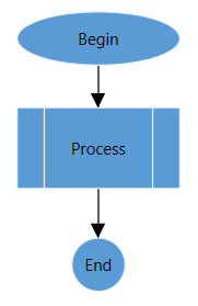
}Finally, all the nodes are added to diagram and they will be as follows.
Add connectors
Connector is to make connection or link between two nodes, ports, and points.
Create connector With source node and target node
Here, the SourceNodeID and TargetNodeID properties of the Connector are used. These properties will be assigned with the ID property of the node.
<syncfusion:ConnectorViewModel SourceNodeID="Begin" TargetNodeID="Process"/>ConnectorViewModel connector1 = new ConnectorViewModel()
{
SourceNodeID = "Begin",
TargetNodeID = "Process",
};Adding connector geometry style
Here, the ConnectorGeometryStyle property of the Connector are used to customize the appearance of the line. And, SourceDecoratorStyle and TargetDecoratorStyle properties are used to customize the appearance of the decorators.
<!--Style for TargetDecorator of the Connector-->
<Style TargetType="Path" x:Key="TargetDecoratorStyle">
    <Setter Property="Stroke" Value="Black"/>
    <Setter Property="Stretch" Value="Fill"/>
    <Setter Property="Fill" Value="Black"/>
    <Setter Property="Height" Value="10"/>
    <Setter Property="Width" Value="10"/>
</Style>

<!--Style for Geometry of the Connector-->
<Style TargetType="Path" x:Key="ConnectorGeometryStyle">
    <Setter Property="Stroke" Value="Black" />
    <Setter Property="StrokeThickness" Value="1" />
</Style>

<!--To apply Style for ConnectorViewModel-->
<Style TargetType="syncfusion:Connector" >
    <Setter Property="TargetDecoratorStyle" Value="{StaticResource TargetDecoratorStyle}"/>
    <Setter Property="ConnectorGeometryStyle" Value="{StaticResource ConnectorGeometryStyle}"/>
</Style>
ConnectorViewModel connector1 = new ConnectorViewModel()
{
SourceNodeID = "Begin",
TargetNodeID = "Process",
//Apply Style to TargetDecorator
TargetDecoratorStyle = this.Resources["TargetDecoratorStyle"] as Style,
//Apply Style to Geometry of the Connector.
ConnectorGeometryStyle = this.Resources["ConnectorGeometryStyle"] as Style
};
//Add Connector to Connectors property of the Diagram
(diagram.Connectors as ConnectorCollection).Add(connector1);Now, the output will be as follows.
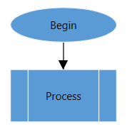
Connectors for flow diagram
Now, you can connect all nodes using ConnectorViewModel.
<syncfusion:ConnectorCollection>
    <syncfusion:ConnectorViewModel SourceNodeID="Begin" TargetNodeID="Process"/>
    <syncfusion:ConnectorViewModel SourceNodeID="Process" TargetNodeID="End"/>
</syncfusion:ConnectorCollection>
//Creating ConnectorViewModel
ConnectorViewModel connector1 = CreateConnector("Begin", "Process");
ConnectorViewModel connector2 = CreateConnector("Process", "End");
//Add Connector to Connectors property of the Diagram
(diagram.Connectors as ConnectorCollection).Add(connector1);
(diagram.Connectors as ConnectorCollection).Add(connector2);
//Creating ConnectorViewModel
private ConnectorViewModel CreateConnector(string source, string target)
{
ConnectorViewModel connector = new ConnectorViewModel()
{
SourceNodeID = source,
TargetNodeID = target,
//Apply Style to TargetDecorator
TargetDecoratorStyle = this.Resources["TargetDecoratorStyle"] as Style,
//Apply Style to Geometry of the Connector.
ConnectorGeometryStyle = this.Resources["ConnectorGeometryStyle"] as Style
};
return connector;
}Now, the output will be as follows.
Flowchart creation using stencil
Let us create a simple flowchart diagram using stencil.
Define stencil
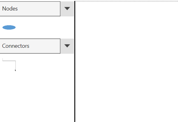
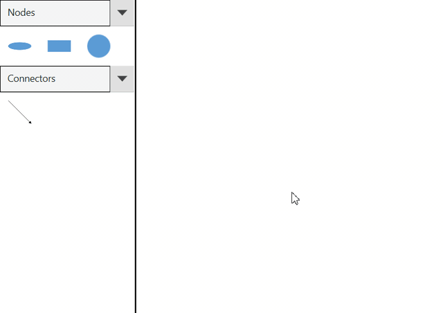
Stencil is a gallery of reusable symbols and nodes, which can be dragged and dropped onto the diagram surface at any number of times.
<!--Namespace for stencil-->
xmlns:stencil="clr-namespace:Syncfusion.UI.Xaml.Diagram.Stencil;assembly=Syncfusion.SfDiagram.WPF"

<!--Define the Stencil-->
<stencil:Stencil x:Name="stencil"  ExpandMode="All"
                 BorderBrush="Black" BorderThickness="0,0,2,0"/>
Define SymbolSource
SymbolSource is the property of stencil, which is a collection of objects like symbol, node, connector, and more. Based on the SymbolSource, the Stencil will populate the Symbols. And the SymbolGroupProvider groups the symbols into SymbolGroup based on the MappingName property.
<!--Define the Stencil-->
<stencil:Stencil x:Name="stencil"  ExpandMode="All"
                 BorderBrush="Black" BorderThickness="0,0,2,0">
    <!--Initialize the SymbolSource-->
    <stencil:Stencil.SymbolSource>
        <!--Initialize the SymbolCollection-->
        <local:SymbolCollection>
            <!--Define the DiagramElement-Node-->
            <syncfusion:NodeViewModel UnitHeight="40" UnitWidth="120"
                                      Shape="{StaticResource Ellipse}" Key="Nodes">
                <syncfusion:NodeViewModel.Annotations>
                    <!--Observable Collection of AnnotationEditorViewModel-->
                    <syncfusion:AnnotationCollection>
                        <syncfusion:AnnotationEditorViewModel Content="Begin"/>
                    </syncfusion:AnnotationCollection>
                </syncfusion:NodeViewModel.Annotations>
            </syncfusion:NodeViewModel>
            <!--Define the DiagramElement-Connector-->
            <syncfusion:ConnectorViewModel Key="Connectors"
                                           SourcePoint="100,100"
                                           TargetPoint="200,200" />
        </local:SymbolCollection>
    </stencil:Stencil.SymbolSource>
    <!--Initialize the SymbolGroup-->
    <stencil:Stencil.SymbolGroups>
        <stencil:SymbolGroups>
            <!--Map Symbols Using MappingName-->
            <stencil:SymbolGroupProvider MappingName="Key"/>
        </stencil:SymbolGroups>
    </stencil:Stencil.SymbolGroups>
</stencil:Stencil>

<!--Define DiagramControl to drag and drop elements into the diagram-->
<syncfusion:SfDiagram x:Name="sfdiagram">
    <syncfusion:SfDiagram.Nodes>
        <syncfusion:NodeCollection/>
    </syncfusion:SfDiagram.Nodes>
    <syncfusion:SfDiagram.Connectors>
        <syncfusion:ConnectorCollection/>
    </syncfusion:SfDiagram.Connectors>
</syncfusion:SfDiagram>
//Initialize SfDiagram
SfDiagram diagram = new SfDiagram();
//Initialize NodeCollection to SfDiagram
diagram.Nodes = new NodeCollection();
//Initialize ConnectorCollection to SfDiagram
diagram.Connectors = new ConnectorCollection();
//Initialize Stencil and its properties
Stencil stencil = new Stencil();
stencil.ExpandMode = ExpandMode.All;
stencil.BorderBrush = new SolidColorBrush(Colors.Black);
stencil.BorderThickness = new Thickness(0,0,2,0);
NodeViewModel node1 = new NodeViewModel()
{
UnitHeight = 40,
UnitWidth = 120,
Shape = this.Resources["Ellipse"],
Key = "Nodes",
Annotations = new AnnotationCollection()
{
new AnnotationEditorViewModel()
{
Content ="Begin"
}
}
};
ConnectorViewModel connector = new ConnectorViewModel()
{
SourcePoint = new Point(100, 100),
TargetPoint = new Point(200, 200),
Key = "Connectors",
Segments = new ConnectorSegments()
{
new StraightSegment()
}
};
//Initialize collection to hold the symbols
SymbolCollection symbolcollection = new SymbolCollection();
//Add the symbols to the collection
symbolcollection.Add(node1);
symbolcollection.Add(connector);
//Initialize the SymbolSource
stencil.SymbolSource = symbolcollection;
//Map Symbols Using MappingName
SymbolGroupProvider sgp = new SymbolGroupProvider()
{
MappingName = "Key"
};
//Initialize SymbolGroup
stencil.SymbolGroups = new SymbolGroups();
//Add the SymbolGroupProvider to SymbolGroup
stencil.SymbolGroups.Add(sgp);
//Add the Diagram and Stencil to Mainwindow grid
RootGrid.Children.Add(stencil);
RootGrid.Children.Add(diagram);
//Position the stencil and Diagram in the Main Grid
stencil.SetValue(Grid.RowProperty, 1);
stencil.SetValue(Grid.ColumnProperty, 0);
diagram.SetValue(Grid.RowProperty, 1);
diagram.SetValue(Grid.ColumnProperty, 1);
public class SymbolCollection:ObservableCollection<object>
{
}Visualization of stencil elements
Declare the style for node, connector, symbol, and symbol group to visualize the elements in the stencil.
<!--Namespace for stencil-->
xmlns:stencil="clr-namespace:syncfusion.UI.Xaml.Diagram.Stencil;assembly=syncfusion.SfDiagram.WPF"

<ResourceDictionary>
    <ResourceDictionary.MergedDictionaries>
        <ResourceDictionary Source="/Syncfusion.SfDiagram.Wpf;component/Resources/BasicShapes.xaml"/>
    </ResourceDictionary.MergedDictionaries>

    <!--Style for Node-->
    <Style TargetType="syncfusion:Node">
        <Setter Property="ShapeStyle">
            <Setter.Value>
                <Style TargetType="Path">
                    <Setter Property="Stretch" Value="Fill"></Setter>
                    <Setter Property="Fill" Value="#FF5B9BD5"></Setter>
                </Style>
            </Setter.Value>
        </Setter>
    </Style>

    <!--Style for Connector-->
    <Style TargetType="syncfusion:Connector">
        <Setter Property="TargetDecoratorStyle">
            <Setter.Value>
                <Style TargetType="Path">
                    <Setter Property="Stretch" Value="Fill"/>
                    <Setter Property="Fill" Value="Black"/>
                    <Setter Property="Stroke" Value="Black"/>
                    <Setter Property="StrokeThickness" Value="1"/>
                </Style>
            </Setter.Value>
        </Setter>
    </Style>

    <!--Style for Symbol-->
    <Style TargetType="stencil:Symbol">
        <Setter Property="Width" Value="50"/>
        <Setter Property="Height" Value="50"/>
        <Setter Property="Padding" Value="3" />
        <Setter Property="BorderThickness" Value="1" />
        <Setter Property="Background" Value="Transparent" />
        <Setter Property="BorderBrush" Value="Transparent" />
        <Setter Property="Margin" Value="4"></Setter>
    </Style>

    <!--Style for Symbol Group-->
    <Style TargetType="stencil:SymbolGroup">
        <Setter Property="FontFamily" Value="Regular"/>
        <Setter Property="Background" Value="#ffffff"/>
        <Setter Property="Foreground" Value="#222222"/>
        <Setter Property="FontSize" Value="14"/>
        <Setter Property="HeaderTemplate">
            <Setter.Value>
                <DataTemplate>
                    <stencil:Header>
                        <stencil:Header.Template>
                            <ControlTemplate TargetType="stencil:Header">
                                <Grid>
                                    <Border x:Name="header" Background="#f5f5f5"
                                            BorderBrush="Black" BorderThickness="1">
                                        <ContentPresenter Margin="10" Content="{Binding}"/>
                                    </Border>
                                </Grid>
                            </ControlTemplate>
                        </stencil:Header.Template>
                    </stencil:Header>
                </DataTemplate>
            </Setter.Value>
        </Setter>
    </Style>
</ResourceDictionary>
The output will be as follows.
Interaction with stencil
We have represented the steps to interact with stencil such as drag and drop elements from stencil to diagram in the following gif.
For more information about stencil, please refer.
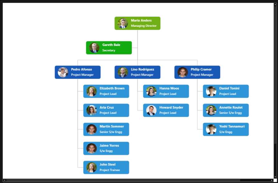
Organization layout
WPF Diagram (SfDiagram) provides support to auto-arrange the nodes in the diagram area that is referred as Layout.
Business object (employee information)
Define employee information as collection of data. The following code example shows the employee information whose, EmpId is used as an unique identifier and ParentId is used to identify the person to whom an employee report to, in the organization.
<!--Initializes the DataSource -->
<local:Employees x:Key="employees">
   <local:Employee EmpId="1" ParentId="" Designation="CEO"/>
   <local:Employee EmpId="2" ParentId="1" Designation="Project Manager1"/>
   <local:Employee EmpId="3" ParentId="1" Designation="Project Manager2"/>
   <local:Employee EmpId="4" ParentId="2" Designation="Engineer1"/>
   <local:Employee EmpId="5" ParentId="3" Designation="Engineer2"/>
</local:Employees>
private Employees GetData()
{
Employees data = new Employees();
data.Add(new Employee() { EmpId = "1", ParentId = "", Designation = "CEO" });
data.Add(new Employee() { EmpId = "2", ParentId = "1", Designation = "Project Manager1" });
data.Add(new Employee() { EmpId = "3", ParentId = "1", Designation = "Project Manager2" });
data.Add(new Employee() { EmpId = "4", ParentId = "2", Designation = "Engineer1" });
data.Add(new Employee() { EmpId = "5", ParentId = "3", Designation = "Engineer2" });
return data;
}
public class Employee
{
public Employee()
{
}
public string EmpId { get; set; }
public string ParentId { get; set; }
public string Designation { get; set; }
}
public class Employees:ObservableCollection<Employee>
{
}Map DataSource with Diagram
You can configure the above “Employee Information” with diagram, so that the nodes and connectors are automatically generated using the mapping properties. The following code example shows how dataSourceSettings is used to map Id , ParentId and DataSource with property name identifiers for employee information.
<!--Initializes the DataSourceSettings -->
<syncfusion:DataSourceSettings x:Key="DataSourcesettings"
                               DataSource="{StaticResource employees}"
                               ParentId="ParentId" Id="EmpId" />
    <!--Map the DataSourceSettings class with Diagram-->
    <syncfusion:SfDiagram x:Name="sfdiagram"
                          DataSourceSettings="{StaticResource DataSourcesettings}"/>
</syncfusion:SfDiagram>
//Initialize SfDiagram
SfDiagram diagram = new SfDiagram();
//Initialize NodeCollection to SfDiagram
diagram.Nodes = new NodeCollection();
//Initialize ConnectorCollection to SfDiagram
diagram.Connectors = new ConnectorCollection();
//Initialize DataSourceSettings to SfDiagram
diagram.DataSourceSettings = new DataSourceSettings()
{
DataSource =GetData(),
ParentId= "ParentId",
Id= "EmpId"
};Rendering layout with DataSource
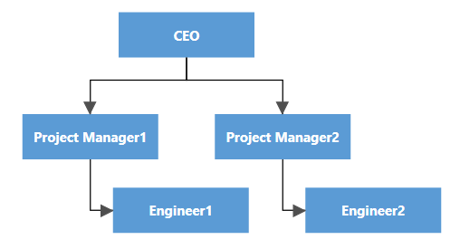
To create an organizational chart, TreeLayout type should be set to LayoutType.Organization. The following code example shows how LayoutManager is used to generate TreeLayout based on the DataSourceSettings of the Diagram.
<!--Style for Connector-->
<Style TargetType="syncfusion:Connector">
    <Setter Property="ConnectorGeometryStyle">
        <Setter.Value>
            <Style TargetType="Path">
                <Setter Property="Stroke" Value="Black"  />
                <Setter Property="StrokeThickness" Value="1" />
            </Style>
        </Setter.Value>
    </Setter>
    <Setter Property="TargetDecoratorStyle">
        <Setter.Value>
            <Style TargetType="Path">
                <Setter Property="Stroke" Value="#4f4f4f"  />
                <Setter Property="Stretch" Value="Fill" />
                <Setter Property="Fill" Value="#4f4f4f"  />
                <Setter Property="StrokeThickness" Value="1" />
            </Style>
        </Setter.Value>
    </Setter>
</Style>

<!--Style for Node-->
<Style TargetType="syncfusion:Node">
    <Setter Property="ContentTemplate">
        <Setter.Value>
            <DataTemplate>
                <Border Background="#FF5B9BD5" BorderBrush="Blue"
                        Width="120" Height="40"
                        VerticalAlignment="Center" HorizontalAlignment="Center">
                    <TextBlock Margin="5" TextWrapping="Wrap" FontSize="12"
                               Foreground="#ffffff" Text="{Binding Path=Designation}"
                               FontFamily="Segoe UI" VerticalAlignment="Center"
                               FontWeight="Bold" HorizontalAlignment="Center"/>
                </Border>
            </DataTemplate>
        </Setter.Value>
    </Setter>
</Style>

<!--Initializes the Layout-->
<syncfusion:DirectedTreeLayout x:Key="treeLayout" Orientation="TopToBottom"
                               HorizontalSpacing="50" Type="Organization"/>

<!--Initializes the LayoutManager-->
<syncfusion:LayoutManager x:Key="LayoutManager" Layout="{StaticResource treeLayout}" />

<!--Map the DataSourceSettings and LayoutManager class with Diagram-->
<syncfusion:SfDiagram x:Name="sfdiagram"
                      DataSourceSettings="{StaticResource DataSourcesettings}"
                      LayoutManager="{StaticResource LayoutManager}">
    <syncfusion:SfDiagram.Nodes>
        <syncfusion:NodeCollection/>
    </syncfusion:SfDiagram.Nodes>
    <syncfusion:SfDiagram.Connectors>
        <syncfusion:ConnectorCollection/>
    </syncfusion:SfDiagram.Connectors>
</syncfusion:SfDiagram>
//Initialize LayoutManager to SfDiagram
diagram.LayoutManager = new LayoutManager()
{
//Initialize Layout for LayoutManager
Layout=new DirectedTreeLayout()
{
Type=LayoutType.Organization,
Orientation=TreeOrientation.TopToBottom,
HorizontalSpacing=50
}
};
//RootGrid is the instance of the MainWindow Grid
RootGrid.Children.Add(diagram);The output will be as follows.
For more information about Layout, refer
Theme
SfDiagram supports various built-in themes. Refer to the below links to apply themes for the SfDiagram,
NOTE
Looking for the full WPF Diagram component overview, features, pricing, and documentation? Visit the WPF Diagram page.
See Also
How to create treeview and diagram with editing options in the WPF Diagram?
How to create a WPF SfDiagram?
How to Automate Diagram using WinAppDriver
How to get the coordinates of the current viewport in WPF Diagram (SfDiagram)?