How can I help you?
Container in WPF Diagram (SfDiagram)
29 Jan 202515 minutes to read
Containers are collections of logically grouped shapes surrounded by a visible border, which the shapes can be dragged in and out of during runtime. Every change made to the Container has no effect on its children. Child elements can be edited individually.
Create a Container
Add a Container
The following code illustrates how to create a Container Node.
<syncfusion:SfDiagram x:Name="diagram">
    <syncfusion:SfDiagram.Nodes>
        <!--Initialize the NodeCollection-->
        <syncfusion:NodeCollection>
        </syncfusion:NodeCollection>
    </syncfusion:SfDiagram.Nodes>
    <syncfusion:SfDiagram.Groups>
        <syncfusion:GroupCollection>
            <syncfusion:ContainerViewModel>
                <syncfusion:ContainerViewModel.Nodes>
                    <syncfusion:NodeCollection>
                        <syncfusion:NodeViewModel OffsetX="100" OffsetY="100"
                                                  Shape="{StaticResource Rectangle}"
                                                  ShapeStyle="{StaticResource shapestyle}"
                                                  UnitHeight="100" UnitWidth="100"/>
                        <syncfusion:NodeViewModel OffsetX="200" OffsetY="200"
                                                  Shape="{StaticResource Rectangle}"
                                                  ShapeStyle="{StaticResource shapestyle}"
                                                  UnitHeight="100" UnitWidth="100"/>
                    </syncfusion:NodeCollection>
                </syncfusion:ContainerViewModel.Nodes>
            </syncfusion:ContainerViewModel>
        </syncfusion:GroupCollection>
    </syncfusion:SfDiagram.Groups>
</syncfusion:SfDiagram>ObservableCollection<NodeViewModel> nodes = new ObservableCollection<NodeViewModel>();
NodeViewModel node = new NodeViewModel()
{
UnitWidth = 100,
UnitHeight = 100,
OffsetX = 100,
OffsetY = 100,
Shape = new RectangleGeometry() { Rect = new Rect(0, 0, 10, 10) },
ShapeStyle = App.Current.Resources["shapestyle"] as Style
};
NodeViewModel node1 = new NodeViewModel()
{
UnitWidth = 100,
UnitHeight = 100,
OffsetX = 200,
OffsetY = 200,
Shape = new RectangleGeometry() { Rect = new Rect(0, 0, 10, 10) },
ShapeStyle = App.Current.Resources["shapestyle"] as Style
};
ObservableCollection<GroupViewModel> groups = new ObservableCollection<GroupViewModel>();
ContainerViewModel container = new ContainerViewModel()
{
Nodes = new ObservableCollection<NodeViewModel>()
{
node,
node1
},
};
groups.Add(container);
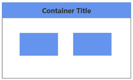
diagram.Groups = groups;Setting a Header
You can textually describe a container by using its Header property. Also, users can customize the header’s appearance using the header’s ShapeStyle property.
The following code example explains how to define a container header and its customization:
<Style TargetType="syncfusion:ContainerHeader">
    <Setter Property="ShapeStyle">
        <Setter.Value>
            <Style TargetType="Path">
                <Setter Property="Fill" Value="CornflowerBlue"/>
                <Setter Property="Stretch" Value="Fill"/>
                <Setter Property="Data">
                    <Setter.Value>
                        <RectangleGeometry Rect="10,10,10,10"/>
                    </Setter.Value>
                </Setter>
            </Style>
        </Setter.Value>
    </Setter>
</Style>

<syncfusion:SfDiagram x:Name="diagram">
    <syncfusion:SfDiagram.Nodes>
        <!--Initialize the NodeCollection-->
        <syncfusion:NodeCollection>
        </syncfusion:NodeCollection>
    </syncfusion:SfDiagram.Nodes>
    <syncfusion:SfDiagram.Groups>
        <syncfusion:GroupCollection>
            <syncfusion:ContainerViewModel>
                <syncfusion:ContainerViewModel.Nodes>
                    <syncfusion:NodeCollection>
                        <syncfusion:NodeViewModel OffsetX="100" OffsetY="100"
                                                  Shape="{StaticResource Rectangle}"
                                                  ShapeStyle="{StaticResource shapestyle}"
                                                  UnitHeight="100" UnitWidth="100"/>
                        <syncfusion:NodeViewModel OffsetX="200" OffsetY="200"
                                                  Shape="{StaticResource Rectangle}"
                                                  ShapeStyle="{StaticResource shapestyle}"
                                                  UnitHeight="100" UnitWidth="100"/>
                    </syncfusion:NodeCollection>
                </syncfusion:ContainerViewModel.Nodes>
                <syncfusion:ContainerViewModel.Header>
                    <syncfusion:ContainerHeaderViewModel UnitHeight="40">
                        <syncfusion:ContainerHeaderViewModel.Annotation>
                            <syncfusion:AnnotationEditorViewModel Content="Title" UnitHeight="30" Shape="{StaticResource Rectangle}"/>
                        </syncfusion:ContainerHeaderViewModel.Annotation>
                    </syncfusion:ContainerHeaderViewModel>
                </syncfusion:ContainerViewModel.Header>
            </syncfusion:ContainerViewModel>
        </syncfusion:GroupCollection>
    </syncfusion:SfDiagram.Groups>
</syncfusion:SfDiagram>ObservableCollection<NodeViewModel> nodes = new ObservableCollection<NodeViewModel>();
NodeViewModel node = new NodeViewModel()
{
UnitWidth = 100,
UnitHeight = 100,
OffsetX = 100,
OffsetY = 100,
Shape = new RectangleGeometry() { Rect = new Rect(0, 0, 10, 10) },
ShapeStyle = App.Current.Resources["shapestyle"] as Style
};
NodeViewModel node1 = new NodeViewModel()
{
UnitWidth = 100,
UnitHeight = 100,
OffsetX = 200,
OffsetY = 200,
Shape = new RectangleGeometry() { Rect = new Rect(0, 0, 10, 10) },
ShapeStyle = App.Current.Resources["shapestyle"] as Style
};
ObservableCollection<GroupViewModel> groups = new ObservableCollection<GroupViewModel>();
ContainerViewModel container = new ContainerViewModel()
{
Nodes = new ObservableCollection<NodeViewModel>()
{
node,
node1
},
};
container.Header = new ContainerHeaderViewModel()
{
UnitHeight = 40,
Annotation = new AnnotationEditorViewModel()
{
Content = "Container Title",
FontSize = 18,
FontWeight = FontWeights.Bold,
Foreground = new SolidColorBrush((Color)ColorConverter.ConvertFromString("#343434"))
},
};
groups.Add(container);
diagram.Groups = groups;NOTE
You can edit the header by double-clicking the region of the container’s header, or by pressing F2.
Container from Stencil
Container Nodes can be predefined and added to the stencil. You can drop those Containers into Diagram when required.
To explore how to add Containers from stencil, refer to Stencil.
Interactively add or remove diagram elements into Container
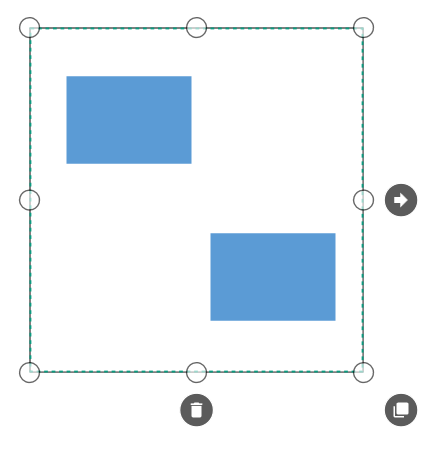
You can interactively add or remove diagram elements from the Container in the runtime. Container will adjust its size when you drop diagram element into its edges.
Interaction
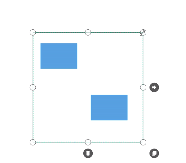
Diagram provides support to drag or resize the container interactively.
Select
Container can be selected by clicking (tap) it.
-
The
IsSelectedProperty is used to select or unselect the node at runtime. -
ItemSelectingEventandItemSelectedEventfor selecting an element, will notify you the item and its original source. To explore about arguments, refer to the DiagramPreviewEventArgs and ItemSelectedEventArgs. -
ItemUnselectingEventandItemUnselectedEventfor unselecting an element, will notify you the item and its original source. To explore about arguments, refer to the DiagramPreviewEventArgs and DiagramEventArgs.
To explore about selection and selection related events, refer to the Selection.
Drag
-
Selected object can be dragged by clicking and dragging it. When multiple elements are selected, dragging any one of the selected elements will move all of the selected elements.
-
Instead of dragging original object, preview of the container alone can be dragged. For preview dragging, refer to the PreviewSettings.
-
While dragging, the objects are snapped towards the nearest objects to make better alignments. For better alignments, refer to the Snapping.
-
The
NodeChangedEventwill notify theOffsetXandOffsetYchanges with their old and new values. Along with that, this event will give information about interaction state. To explore about arguments, refer to the NodeChangedEventArgs.
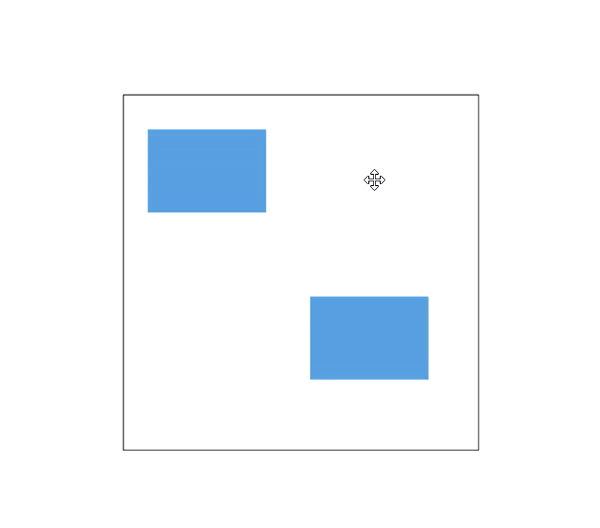
Resize
- The selector is surrounded by eight thumbs. By dragging these thumbs, selected items can be resized smaller or larger.
- When one corner of the selector is dragged, opposite corner is in a static position.
- Enable AspectRatio NodeConstraints to maintain the aspect ratio of the container when its being resized.
-
While resizing, the objects are snapped towards the nearest objects to make better alignments. For better alignments, refer to the Snapping.
- The
NodeChangedEventwill notify theUnitHeightandUnitWidthchanges with their old and new values. Along with that, this event will give information about interaction state. To explore about arguments, refer to the NodeChangedEventArgs.
Events
- The
ItemTappedEventis invoked on clicking the container. To explore about arguments, refer to the ItemTappedEventArgs. - The
ItemDoubleTappedEventis invoked on double-clicking the container. To explore about arguments, refer to the ItemDoubleTappedEventArgs. - The
MouseDownandMouseUpare invoked as similar to framework element that is raised together with either MouseLeftButtonUp or MouseRightButtonUp. To explore about arguments, refer to the MouseDownEventArgs and
MouseUpEventArgs.
See Also
How to Obtain InConnectors and OutConnectors of Node in WPF Diagram?
How to add a node as a child of a container using the context menu in the WPF Diagram (SfDiagram)?
How to rearrange the containers after the layout has been updated in WPF Diagram (SfDiagram) ?
How to adjust the unit width of the Container in the WPF Diagram?