Getting Started with WPF Theme Studio
13 Jul 20268 minutes to read
The Theme Studio enables users to transform their application’s visual presentation into a new theme within minutes. Users can choose a base theme, change its primary color, preview the changes, and export the result as a theme project, ready to be integrated into their applications for a rich and engaging user interface experience.
Supported themes
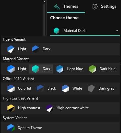
The WPF Theme Studio includes the following built-in themes:
-
Windows 11 Light
-
Windows 11 Dark
-
Fluent Light
-
Fluent Dark
-
Material 3 Light
-
Material 3 Dark
-
Material Light
-
Material Dark
-
Material Light Blue
-
Material Dark Blue
-
Office 2019 Colorful
-
Office 2019 Black
-
Office 2019 White
-
Office 2019 Dark Gray
-
Office 2019 High Contrast
-
Office 2019 High Contrast White
-
System Theme
Supported palettes
The WPF Theme Studio comes with various sets of palettes for each theme variant.
| Theme variant | Palette list | Supported themes |
|---|---|---|
| Windows 11 |
|
|
| Fluent |
|
|
| Material 3 |
|
|
| Office 2019 |
|
|
| High Contrast |
|
|
| Material |
|
|
Creating custom theme
Customizing theme color from theme studio
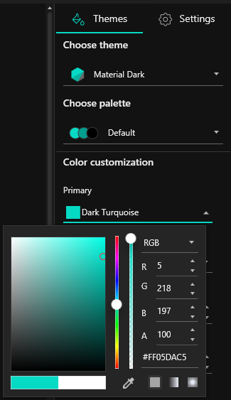
In theme studio utility, each theme has a unique common variable list. When user changes the common variable color code value, it will be reflected in all the Syncfusion® WPF controls. All Syncfusion® WPF control styles are derived from these theme-based common variables. This common variable list is handled inside the theme studio application for customizing theme-based colors.
Let us see the step-by-step procedure to launch and work with the theme studio utility as follows.
Step 1
After installing the Syncfusion WPF suite, launch it and select Theme Studio from the start-up panel.
Step 2
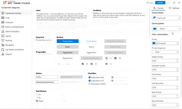
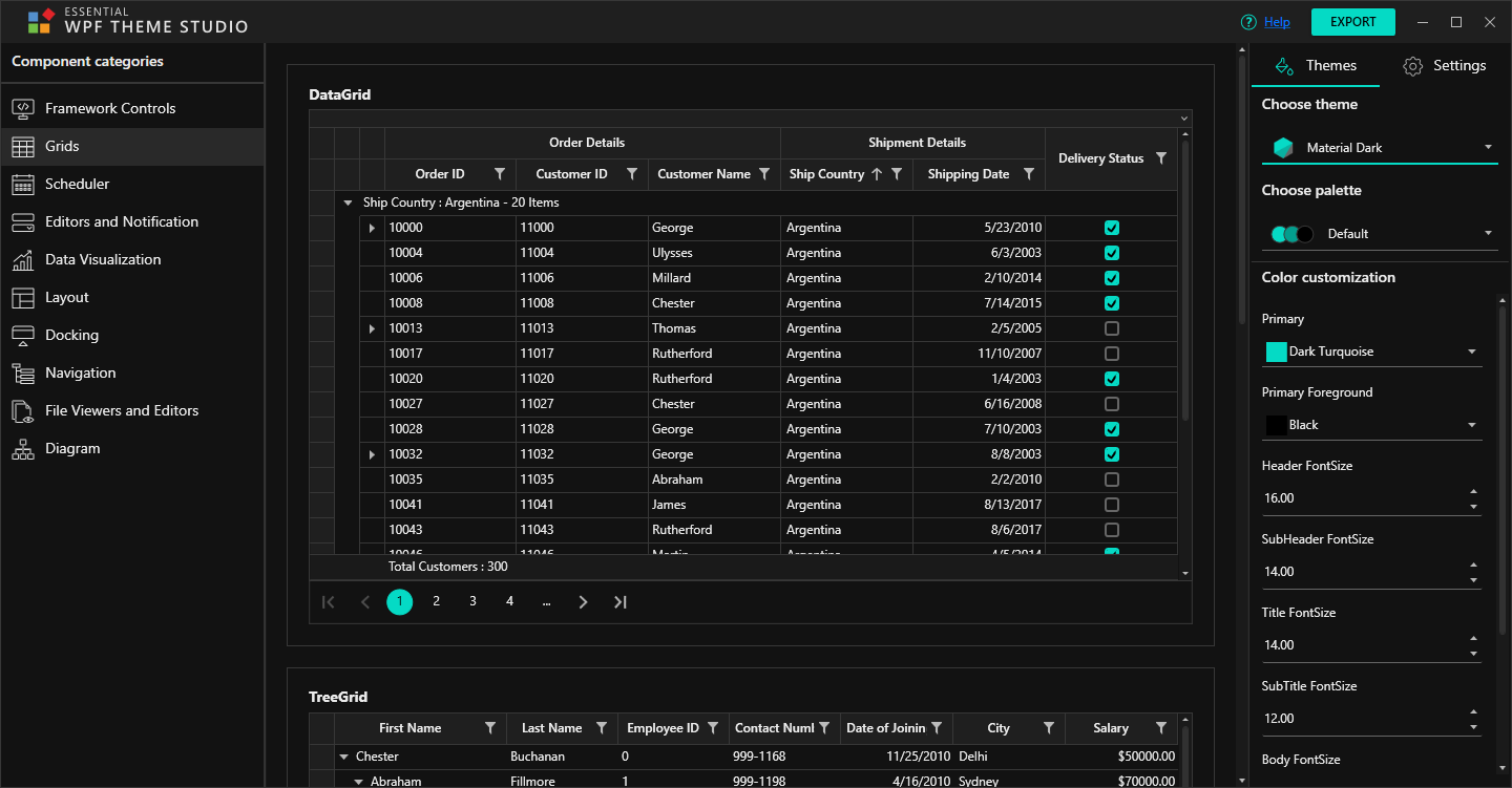
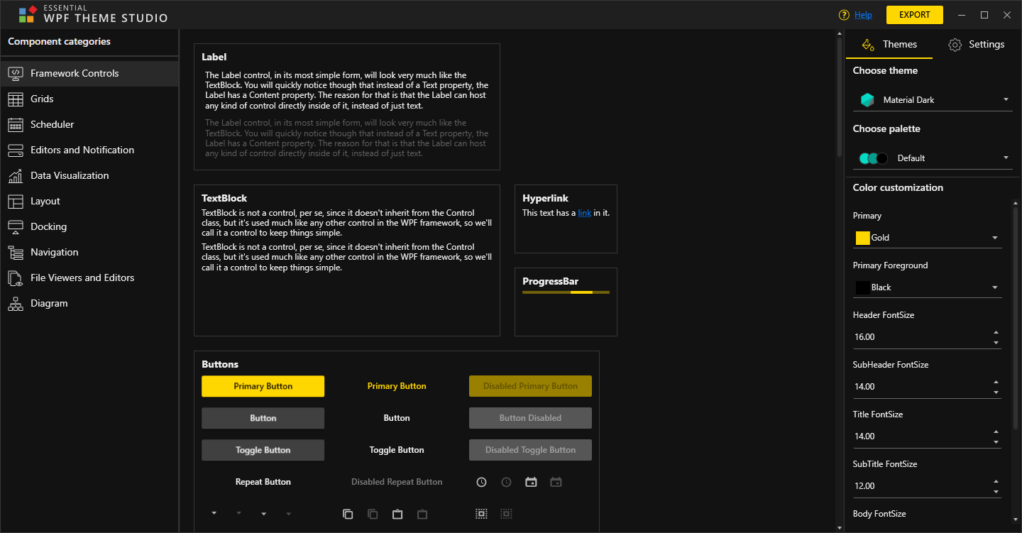
The theme studio application has been divided into two sections: the controls preview section on the left, and the theme customization section on the right.
Step 3
To apply predefined themes, select the appropriate themes from Themes List Drop-down available in the top right corner.
Step 4
Use the built-in color picker in the theme customization section to select the desired solid or gradient color.
Step 5
The Syncfusion® WPF controls will be rendered with the newly selected colors in the preview section, after selecting the desired color.
NOTE
The WPF theme studio groups both Syncfusion® and Framework controls under different tabs for a quick preview of the UI when the color changes.
Exporting theme project
Let us see the step-by-step procedure for exporting theme project from a theme studio.
Step 1
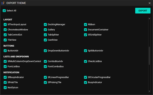
Click Export in the top right corner, below the exit of the theme studio application.

Step 2
Now, the Export dialog box appears with the option to select either the entire controls or just the desired control(s). This option is useful only for selective list of Syncfusion® WPF controls in the application. The theme studio will filter only the selected controls and customize the final output for those controls alone.
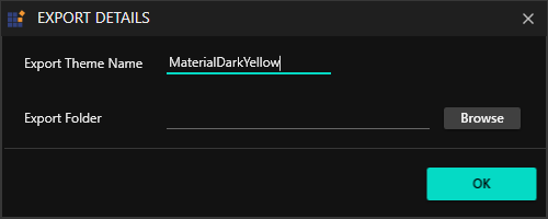
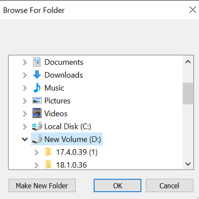
Step 3
Provide the theme name, in which the theme should be exported, and select the required folder for Theme Export to be selected. When you export the download theme, it will come as a theme project with color codes for the selected Syncfusion® WPF controls.
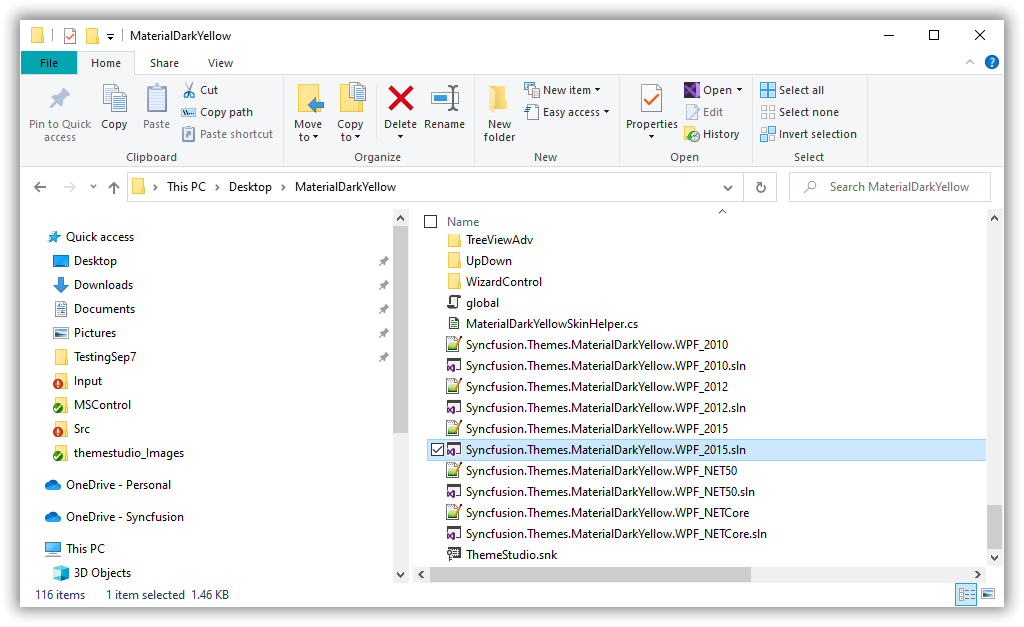
Until version 31.2.2, while exporting themes from Theme Studio, separate projects were created for each framework. Starting with version 31.2.12, themes are exported as a single SDK-style project that supports multiple frameworks: .NET Framework 4.6.2, .NET 8.0, .NET 9.0, and .NET 10.
When opening the exported theme project, the .NET Framework 4.6.2 will be selected by default.
If any of the supported frameworks (.NET Framework 4.6.2, .NET 8.0, .NET 9.0, or .NET 10) are not installed on your machine, you can remove the unavailable framework from the <TargetFrameworks> tag in the MultiTargeting.targets file located at: [ ..\ {exported theme}\targets\MultiTargeting.targets ].This will resolve any compilation issues caused by missing frameworks.
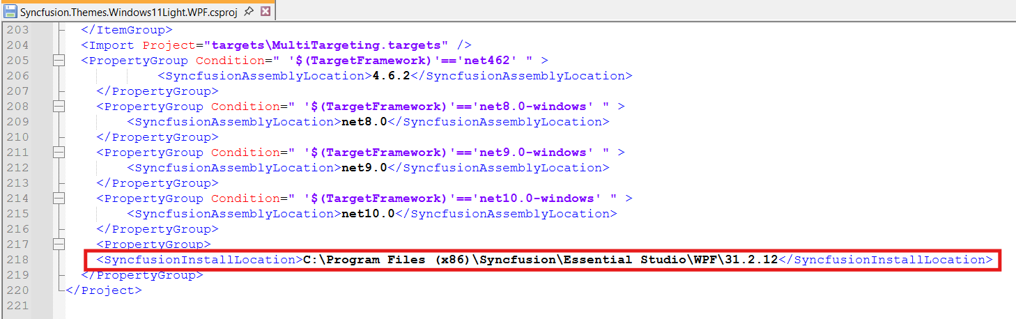
When running the exported single SDK-style theme project, you may encounter reference issues due to missing or incompatible assemblies across the targeted frameworks (4.6.2, .NET 8.0, .NET 9.0, and .NET 10). To resolve this, update the product version in the path specified in the <SyncfusionInstallLocation> tag of the exported .csproj theme project to match the installed product version, as shown in the image below. Reference path: C:\Program Files (x86)\Syncfusion\Essential Studio\WPF\ {product version}
Generating theme assembly
Let us see the procedure for ensuring theme assembly generation for exported theme projects.
Rebuild the exported single SDK-Style theme project in Release mode to generate the theme assembly.
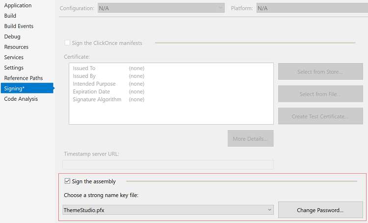
The export theme project has default ThemeStudio.snk key pair. If it is not required, use the already created private key pair by referring to the export theme project inside the application properties or Create a new key pair using Visual Studio if the private key pair was not created externally.
Ensure whether the Sign the assembly checkbox is clicked or not, to use the private key pair for generating theme assembly.
Integrating custom theme to the application
The SfSkinManager control helps to apply the built-in themes to the Syncfusion® UI controls for WPF.
Let us see the step-by-step procedure for adding exported theme project as assembly(.dll) and apply the custom theme to the DockingManager.
Step 1
Now, add the exported theme project as an assembly (.dll) from the Release folder of the export theme project into the WPF application.
Step 2
Add reference of Syncfusion.SfSkinManager.Wpf.dll to the WPF application and import SfSkinManager namespace in Main window.
<Window
    xmlns="http://schemas.microsoft.com/winfx/2006/xaml/presentation"
    xmlns:x="http://schemas.microsoft.com/winfx/2006/xaml"
    xmlns:syncfusionskin="clr-namespace:Syncfusion.SfSkinManager;assembly=Syncfusion.SfSkinManager.WPF"
    xmlns:syncfusion="http://schemas.syncfusion.com/wpf"/>
Step 3
The appearance of any Syncfusion® UI controls for WPF can be customized by using the Theme attached property of the SfSkinManager.
Now, use the RegisterTheme method to register the instance of generated Windows11LightYellow (Syncfusion.Themes.Windows11LightYellow.WPF) assembly from the exported theme project for demonstration purposes, passing the exported custom theme name and respective theme assembly instance as parameters.
string style = "Windows11LightYellow";
SkinHelper styleInstance = null;
var skinHelpterStr = "Syncfusion.Themes." + style + ".WPF." + style + "SkinHelper, Syncfusion.Themes." + style + ".WPF";
Type skinHelpterType = Type.GetType(skinHelpterStr);
if (skinHelpterType != null)
    styleInstance = Activator.CreateInstance(skinHelpterType) as SkinHelper;
if (styleInstance != null)
{
    SfSkinManager.RegisterTheme("Windows11LightYellow", styleInstance);
}
Step 4
Now, set the SfSkinManager attached property Theme as Windows11LightYellow;Windows11Light for the Docking Manager control since the Windows11LightYellow (Syncfusion.Themes.Windows11LightYellow.WPF) assembly has been generated from the exported theme project for demonstration purposes.
NOTE
Custom theme name is provided in this format:
CustomTheme1;BaseThemeName, whereCustomTheme1denotes the custom theme name andBaseThemeNamedenotes the theme name from which it is derived. For example,Windows11LightYellow;Windows11Light.
<syncfusion:DockingManager x:Name="SyncDockingManager" UseDocumentContainer="True"
PersistState="True">
<ContentControl x:Name="SolutionExplorer" syncfusion:DockingManager.Header="Solution Explorer"
syncfusion:DockingManager.SideInDockedMode="Right"/>
<ContentControl x:Name="ToolBox" syncfusion:DockingManager.Header="Toolbox"
syncfusion:DockingManager.State="AutoHidden" />
<ContentControl x:Name="Output" syncfusion:DockingManager.Header="Output"
syncfusion:DockingManager.SideInDockedMode="Tabbed"
syncfusion:DockingManager.TargetNameInDockedMode="SolutionExplorer"/>
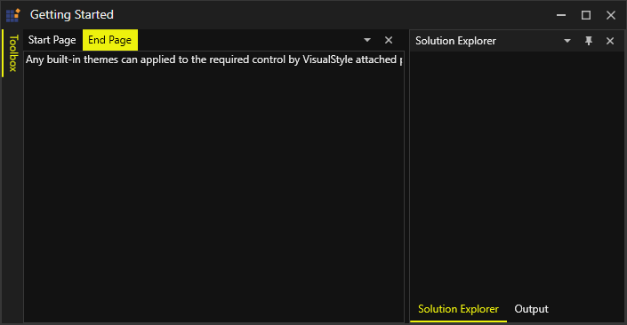
<ContentControl x:Name="EndPage" syncfusion:DockingManager.Header="End Page"
syncfusion:DockingManager.State="Document" >
<TextBlock Text="Any built-in themes can applied to the required control by VisualStyle attached property of the SfSkinManager." />
</ContentControl>
<ContentControl x:Name="StartPage" syncfusion:DockingManager.Header="Start Page"
syncfusion:DockingManager.State="Document" >
<TextBlock Text="Any built-in themes can applied to the required control by VisualStyle attached property of the SfSkinManager." />
</ContentControl>
</syncfusion:DockingManager>string style = "Windows11LightYellow";
SkinHelper styleInstance = null;
var skinHelpterStr = "Syncfusion.Themes." + style + ".WPF." + style + "SkinHelper, Syncfusion.Themes." + style + ".WPF";
Type skinHelpterType = Type.GetType(skinHelpterStr);
if (skinHelpterType != null)
styleInstance = Activator.CreateInstance(skinHelpterType) as SkinHelper;
if (styleInstance != null)
{
SfSkinManager.RegisterTheme("Windows11LightYellow", styleInstance);
}
SfSkinManager.SetTheme(this, new Theme("Windows11LightYellow;Windows11Light"));Step 4
Compile and run the WPF application and witness the custom theme being applied to Docking Manager control at run-time.