Getting Started with WPF Skin Manager
13 Jul 202621 minutes to read
The SfSkinManager helps you apply themes for both Syncfusion® and Framework controls.
Themes list
The following table lists the available themes as well as the assembly or NuGet reference to be used in the application.
| Styles | Assembly | NuGet package |
|---|---|---|
| Windows11Light | Syncfusion.Themes.Windows11Light.Wpf.dll | |
| Windows11Dark | Syncfusion.Themes.Windows11Dark.Wpf.dll | |
| FluentLight | Syncfusion.Themes.FluentLight.Wpf.dll | |
| FluentDark | Syncfusion.Themes.FluentDark.Wpf.dll | |
| Material3Light | Syncfusion.Themes.Material3Light.Wpf.dll | |
| Material3Dark | Syncfusion.Themes.Material3Dark.Wpf.dll | |
| MaterialLight | Syncfusion.Themes.MaterialLight.Wpf.dll | |
| MaterialDark | Syncfusion.Themes.MaterialDark.Wpf.dll | |
| MaterialLightBlue | Syncfusion.Themes.MaterialLightBlue.Wpf.dll | |
| MaterialDarkBlue | Syncfusion.Themes.MaterialDarkBlue.Wpf.dll | |
| Office2019Colorful | Syncfusion.Themes.Office2019Colorful.Wpf.dll | |
| Office2019Black | Syncfusion.Themes.Office2019Black.Wpf.dll | |
| Office2019White | Syncfusion.Themes.Office2019White.Wpf.dll | |
| Office2019DarkGray | Syncfusion.Themes.Office2019DarkGray.Wpf.dll | |
| Office2019HighContrast | Syncfusion.Themes.Office2019HighContrast.Wpf.dll | |
| Office2019HighContrastWhite | Syncfusion.Themes.Office2019HighContrastWhite.Wpf.dll | |
| SystemTheme | Syncfusion.Themes.SystemTheme.Wpf.dll |
Apply a Theme to a Control
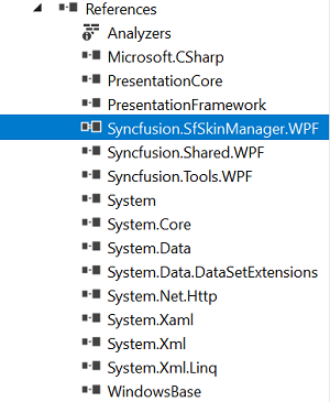
Add SkinManager reference
There are several ways to include the Syncfusion® SfSkinManager reference in the Visual Studio WPF project. The following steps will help you to add XAML Code:
1) Add a reference to the Syncfusion.SfSkinManager.WPF assembly or Syncfusion.SfSkinManager.WPF nuget package to the project.
2) Import Syncfusion® WPF schema http://schemas.syncfusion.com/wpf or the assembly namespace Syncfusion.SfSkinManager into a XAML page.
<Window
    xmlns="http://schemas.microsoft.com/winfx/2006/xaml/presentation"
    xmlns:x="http://schemas.microsoft.com/winfx/2006/xaml"
    xmlns:syncfusionskin ="clr-namespace:Syncfusion.SfSkinManager;assembly=Syncfusion.SfSkinManager.WPF"
    xmlns:syncfusion="http://schemas.syncfusion.com/wpf" />
Add a theme assembly reference
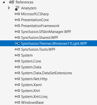
The SfSkinManager supports applying themes listed in themes list. To use a theme in the application, add Reference to the corresponding theme assembly. For example, to apply Windows11Light theme, attach Syncfusion.Themes.Windows11Light.Wpf assembly or NuGet reference to the project. While applying a theme to a Window, SkinManager inherits the same theme to all the elements inside the Window.
Set theme
Themes will be applied to both Syncfusion® and Framework controls by using Theme attached property of the SfSkinManager. Also ensure that the ApplyThemeAsDefaultStyle property is set to true before calling the SetTheme method.
NOTE
While applying the theme to a Window or any element,
SkinManagerinherits the same theme to all its descendants.
<Window x:Class="DataGrid_Themes.MainWindow"
                             xmlns="http://schemas.microsoft.com/winfx/2006/xaml/presentation"
                             xmlns:x="http://schemas.microsoft.com/winfx/2006/xaml"
                             xmlns:local="clr-namespace:DataGrid_Themes"
                             xmlns:syncfusion="http://schemas.syncfusion.com/wpf"
							 xmlns:syncfusionskin ="clr-namespace:Syncfusion.SfSkinManager;assembly=Syncfusion.SfSkinManager.WPF"
                             Icon="App.ico"
                             Title="Getting Started"
                             WindowStartupLocation="CenterScreen"
                             syncfusionskin:SfSkinManager.Theme="{syncfusionskin:SkinManagerExtension ThemeName=Windows11Light}">

    <Grid DataContext="{StaticResource viewmodel}">
        <syncfusion:SfDataGrid Name="sfgrid" Margin="5"
                                       AutoGenerateColumns="False"
                                       AllowDraggingColumns="True"
                                       AllowEditing="True"
                                       LiveDataUpdateMode="AllowDataShaping"
                                       AllowFiltering="True"
                                       HeaderRowHeight="26"
                                       SelectionMode="Extended"
                                       ColumnSizer="Auto"
                                       ItemsSource="{Binding EmployeeDetails}">
        </syncfusion:SfDataGrid>
    </Grid>
<Window>SfSkinManager.ApplyThemeAsDefaultStyle = true;
SfSkinManager.SetTheme(this, new Theme("Windows11Light"));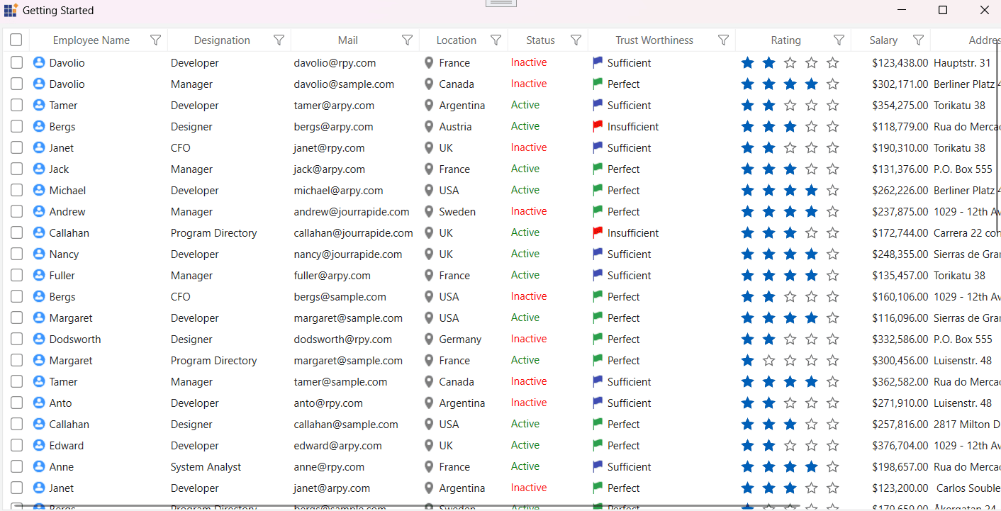
NOTE
Apply a Theme Globally in the Application
To apply a theme globally in an application, set the theme using ApplicationTheme attached property of the SfSkinManager in the constructor of your MainWindow. This ensures that the selected theme is automatically applied to any new windows when they are loaded.
If you set the theme using the ApplicationTheme attached property of SfSkinManager, you don’t need to set it again using the Theme attached property in xaml or by using SetTheme in code behind.
Also ensure that the ApplyThemeAsDefaultStyle property is set to true.
NOTE
The
SfSkinManager.ApplicationThemestatic property should be set beforeInitializeComponentof the window or during application startup, when applying for multiple windows.
public partial class MainWindow : Window
{
public MainWindow()
{
SfSkinManager.ApplyThemeAsDefaultStyle = true;
SfSkinManager.ApplicationTheme = new Theme("Windows11Light");
InitializeComponent();
}
}
Customization
Customize Theme Colors and Fonts in the Application
To customize the theme colors and fonts in the application, call RegisterThemeSettings method and pass the theme name and respective theme setting instance as parameters.
Each theme supported by the theme studio has its own theme settings class, which begins with the theme name as a prefix. For example, if the theme name is Windows11Light, then there will be theme settings class called Windows11LightThemeSettings.
NOTE
You need to register theme settings before setting respective themes for window or control.
Please find the complete list of theme names, respective theme settings class, and supported palette.
| Styles/Theme name | Respective theme settings class to customize | Supported palette |
|---|---|---|
| Windows11Light | ||
| Windows11Dark | ||
| FluentLight | ||
| FluentDark | ||
| Material3Light | ||
| Material3Dark | ||
| MaterialLight | ||
| MaterialDark | ||
| MaterialLightBlue | ||
| MaterialDarkBlue | ||
| Office2019Colorful | ||
| Office2019Black | ||
| Office2019White | ||
| Office2019DarkGray | ||
| Office2019HighContrast | ||
| Office2019HighContrastWhite | ||
| SystemTheme | - |
Customize theme colors and fonts in the application
Windows11LightThemeSettings themeSettings = new Windows11LightThemeSettings();
themeSettings.PrimaryBackground = new SolidColorBrush(Colors.Red);
themeSettings.PrimaryForeground = new SolidColorBrush(Colors.AntiqueWhite);
themeSettings.BodyFontSize = 15;
themeSettings.HeaderFontSize = 18;
themeSettings.SubHeaderFontSize = 17;
themeSettings.TitleFontSize = 17;
themeSettings.SubTitleFontSize = 16;
themeSettings.BodyAltFontSize = 15;
themeSettings.FontFamily = new FontFamily("Callibri");
SfSkinManager.RegisterThemeSettings("Windows11Light", themeSettings);
SfSkinManager.ApplyThemeAsDefaultStyle = true;
SfSkinManager.SetTheme(this, new Theme("Windows11Light"));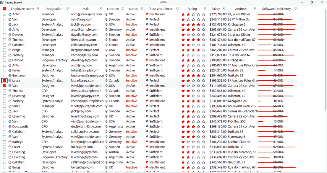
Customize theme colors using the predefined palette
Windows11LightThemeSettings themeSettings = new Windows11LightThemeSettings();
themeSettings.Palette = FluentPalette.PinkRed;
SfSkinManager.RegisterThemeSettings("Windows11Light", themeSettings);
SfSkinManager.ApplyThemeAsDefaultStyle = true;
SfSkinManager.SetTheme(this, new Theme("Windows11Light"));
NOTE
Styling with Dynamic Themes Using ThemeResource and ThemeKey
When a button is used in XAML, it automatically applies the base style associated with its control type. If you want to apply a different predefined style to the same target type (Button), you can use ThemeResource and ThemeKey to override the default appearance.ThemeKey identifies a specific resource, such as a style or brush, within the theme library. It is typically mapped to a visual element, like a button style or a background color.
To dynamically apply different brush keys (for properties such as Background, Foreground, etc.) or to reference alternative styles for the same Button type, use the following code in XAML
xmlns:sfskin="clr-namespace:Syncfusion.SfSkinManager;assembly=Syncfusion.SfSkinManager.WPF"Also, in your MainWindow constructor, set the ApplyThemeAsDefaultStyle API to true
public partial class MainWindow : Window
{
    public MainWindow()
    {
       SfSkinManager.ApplyThemeAsDefaultStyle = true;
       InitializeComponent();
    }
}
Applying Background Using ErrorBackground Brush:
Background="{sfskin:ThemeResource ThemeKey={sfskin:ThemeKey Key=ErrorBackground}}"This sets the button’s background based on the themed ErrorBackground brush.
You can find the brushes for each theme in the Brushes.xaml file located in the Common folder after exporting theme project.
Applying Style Using WPFPrimaryButtonStyle:
Style="{sfskin:ThemeResource ThemeKey={sfskin:ThemeKey Key=WPFPrimaryButtonStyle}}"This applies the WPFPrimaryButtonStyle to the button, overriding its default style.
You can retrieve the styles for specific controls from the Resource Key list according to your requirements.
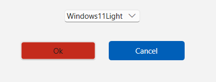
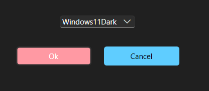
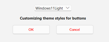
In the example below, a ComboBox is used to toggle between the Windows11Light and Windows11Dark themes. Two buttons are displayed: one applies a different style (WPFPrimaryButtonStyle), while the other uses a different background brush (ErrorBackground).
<StackPanel Orientation="Horizontal" >
    <Button Content="OK" Height="30" Width="120" Margin="10" Background="{sfskin:ThemeResource ThemeKey={sfskin:ThemeKey Key=ErrorBackground}}"></Button>
    <Button Content="Cancel" Height="30" Width="120" Margin="10" Style="{sfskin:ThemeResource ThemeKey={sfskin:ThemeKey Key=WPFPrimaryButtonStyle}}"></Button>
</StackPanel>
This creates two buttons styled dynamically based on the active theme. One reflects an error state background; the other adopts the primary button style.
Output Screenshots
Light Theme:
Dark Theme:
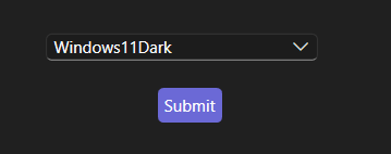
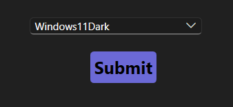
Apply Centralized Styling with ThemeKey
The StyleVariant attached property is used to apply theme styles automatically based on the active theme.
<Window
    xmlns="http://schemas.microsoft.com/winfx/2006/xaml/presentation"
    xmlns:x="http://schemas.microsoft.com/winfx/2006/xaml"
    xmlns:syncfusionskin ="clr-namespace:Syncfusion.SfSkinManager;assembly=Syncfusion.SfSkinManager.WPF"
    xmlns:syncfusion="http://schemas.syncfusion.com/wpf" />
    <Grid>
        <Button Content="Submit" syncfusionskin:SfSkinManager.StyleVariant="WPFPrimaryButtonStyle"/>
    </Grid>
</Window>SfSkinManager.ApplyThemeAsDefaultStyle = true;
SfSkinManager.SetTheme(this, new Theme("Windows11Dark"));The control style is resolved automatically from the active theme.
Output Screenshot
Apply StyleVariant with Custom Style
You can also combine StyleVariant with a custom Style to override or extend properties.
<Window
    xmlns="http://schemas.microsoft.com/winfx/2006/xaml/presentation"
    xmlns:x="http://schemas.microsoft.com/winfx/2006/xaml"
    xmlns:syncfusionskin ="clr-namespace:Syncfusion.SfSkinManager;assembly=Syncfusion.SfSkinManager.WPF"
    xmlns:syncfusion="http://schemas.syncfusion.com/wpf" />
    <Window.Resources>
        <Style TargetType="Button" x:Key="CustomButtonStyle" >
            <Setter Property="Foreground" Value="Black"/>
            <Setter Property="FontWeight" Value="Bold"/>
            <Setter Property="FontSize" Value="20"/>
        </Style>
    </Window.Resources>
    <Grid>
        <Button Content="Submit" syncfusionskin:SfSkinManager.StyleVariant="WPFPrimaryButtonStyle"
        Style="{StaticResource CustomButtonStyle}" />
    </Grid>
</Window>SfSkinManager.ApplyThemeAsDefaultStyle = true;
SfSkinManager.SetTheme(this, new Theme("Windows11Dark"));Output Screenshot
Accessing Theme Resources Using TryFindResource
To access specific theme resources in your WPF application, you can use the TryFindResource(key) method to retrieve a resource by its key and apply it in the code-behind.
Theme resource keys are typically defined in:
1) Brushes.xaml: Contains brush-related keys such as ContentBackground, ContentForeground, etc.
2) Common.xaml: Contains font size and style keys like HeaderTextStyle, SubHeaderTextStyle, etc.
These files are located under the Common folder when exporting a theme from ThemeStudio. You can also refer to the Resource Key list to locate specific styles for various controls.
Example: Applying Theme Resources to a Button
<Button x:Name="myButton" Content="Submit" Height="30" Width="120" Margin="10"></Button>Include the following namespace and apply the implementation in your code-behind to retrieve and assign theme-specific resources for a button control.
using Syncfusion.Themes.Windows11Light.WPF;

Theme currentTheme = SfSkinManager.GetTheme(myButton);

if (currentTheme.ThemeName == "Windows11Light")
{
    var buttonStyleKey = new ThemeKey
    {
        Theme = typeof(Windows11LightSkinHelper),
        Key = "WPFPrimaryButtonStyle"
    };
    var textStyleKey = new ThemeKey
    {
        Theme = typeof(Windows11LightSkinHelper),
        Key = "HeaderTextStyle"
    };
    var foregroundStyleKey = new ThemeKey
    {
        Theme = typeof(Windows11LightSkinHelper),
        Key = "ContentForeground"
    };
    Style buttonStyle = TryFindResource(buttonStyleKey) as Style;
    myButton.Style = buttonStyle;
    double fontSize = (double)TryFindResource(textStyleKey);
    myButton.FontSize = fontSize;
    SolidColorBrush backgroundBrush = TryFindResource(foregroundStyleKey) as SolidColorBrush;
    myButton.Foreground = backgroundBrush;
}
This example demonstrates how to dynamically apply a button style, foreground color, and font size using theme resource keys defined in the Brushes.xaml and Common.xaml files for the Windows11Light theme.
Output Screenshot

Resource Key List
Framework Controls
| Control Name | Key Name |
|---|---|
| Button | WPFButtonStyle |
| Calendar | WPFCalendarStyle |
| CheckBox | WPFCheckBoxStyle |
| ComboBox | WPFComboBoxStyle |
| DataGrid | WPFDataGridStyle |
| DatePicker | WPFDatePickerStyle |
| Expander | WPFExpanderStyle |
| FlatButton | WPFFlatButtonStyle |
| FlatPrimaryButton | WPFFlatPrimaryButtonStyle |
| FlatToggleButton | WPFFlatToggleButtonStyle |
| GlyphButton | WPFGlyphButtonStyle |
| GlyphDropdownExpander | WPFGlyphDropdownExpanderStyle |
| GlyphEditableDropdownExpander | WPFGlyphEditableDropdownExpanderStyle |
| GlyphPrimaryToggleButton | WPFGlyphPrimaryToggleButtonStyle |
| GlyphRepeatButton | WPFGlyphRepeatButtonStyle |
| GlyphToggleButton | WPFGlyphToggleButtonStyle |
| GlyphTreeExpander | WPFGlyphTreeExpanderStyle |
| GridSplitter | WPFGridSplitterStyle |
| GroupBox | WPFGroupBoxStyle |
| Hyperlink | WPFHyperlinkStyle |
| Label | WPFLabelStyle |
| ListBox | WPFListBoxStyle |
| ListView | WPFListViewStyle |
| Menu | WPFMenuStyle |
| PasswordBox | WPFPasswordBoxStyle |
| PrimaryButton | WPFPrimaryButtonStyle |
| ProgressBar | WPFProgressBarStyle |
| RadioButton | WPFRadioButtonStyle |
| RepeatButton | WPFRepeatButtonStyle |
| ResizeGrip | WPFResizeGripStyle |
| RichTextBox | WPFRichTextBoxStyle |
| ScrollViewer | WPFScrollViewerStyle |
| Separator | WPFSeparatorStyle |
| Slider | WPFSliderStyle |
| StatusBar | WPFStatusBarStyle |
| TabControl | WPFTabControlStyle |
| TextBox | WPFTextBoxStyle |
| ToggleButton | WPFToggleButtonStyle |
| ToolBar | WPFToolBarStyle |
| ToolTip | WPFToolTipStyle |
| TreeView | WPFTreeViewStyle |
| Window | WPFWindowStyle |
Syncfusion® Controls
| Control Name | Key Name |
|---|---|
| AutoComplete | SyncfusionAutoCompleteStyle |
| AssistView | SyncfusionAssistViewStyle |
| AvatarView | SyncfusionAvatarViewStyle |
| BusyIndicator | SyncfusionBusyIndicatorStyle |
| ButtonAdv | SyncfusionButtonAdvStyle |
| CalendarEdit | SyncfusionCalendarEditStyle |
| CardView | SyncfusionCardViewStyle |
| CheckListBox | SyncfusionCheckListBoxStyle |
| ChromelessWindow | SyncfusionChromelessWindowStyle |
| Clock | SyncfusionClockStyle |
| ColorEdit | SyncfusionColorEditStyle |
| ColorPicker | SyncfusionColorPickerStyle |
| ColorPickerPalette | SyncfusionColorPickerPaletteStyle |
| ComboBoxAdv | SyncfusionComboBoxAdvStyle |
| CurrencyTextBox | SyncfusionCurrencyTextBoxStyle |
| DateTimeEdit | SyncfusionDateTimeEditStyle |
| DockingManager | SyncfusionDockingManagerStyle |
| DocumentContainer | SyncfusionDocumentContainerStyle |
| DoubleTextBox | SyncfusionDoubleTextBoxStyle |
| DropDownButtonAdv | SyncfusionDropDownButtonAdvStyle |
| EditControl | SyncfusionEditControlStyle |
| FontListBox | SyncfusionFontListBoxStyle |
| FontListComboBox | SyncfusionFontListComboBoxStyle |
| Gallery | SyncfusionGalleryStyle |
| GridPrintPreviewControl | SyncfusionGridPrintPreviewControlStyle |
| GroupBar | SyncfusionGroupBarStyle |
| HierarchyNavigator | SyncfusionHierarchyNavigatorStyle |
| IntegerTextBox | SyncfusionIntegerTextBoxStyle |
| MaskedTextBox | SyncfusionMaskedTextBoxStyle |
| MenuAdv | SyncfusionMenuAdvStyle |
| NotifyIcon | SyncfusionNotifyIconStyle |
| PdfViewerControl | SyncfusionPdfViewerControlStyle |
| PercentTextBox | SyncfusionPercentTextBoxStyle |
| PinnableListBox | SyncfusionPinnableListBoxStyle |
| PivotGridControl | SyncfusionPivotGridControlStyle |
| PrintPreview | SyncfusionPrintPreviewStyle |
| PrintPreviewControl | SyncfusionPrintPreviewControlStyle |
| PropertyGrid | SyncfusionPropertyGridStyle |
| Ribbon | SyncfusionRibbonStyle |
| SfAccordion | SyncfusionSfAccordionStyle |
| SfAreaSparkline | SyncfusionSfAreaSparklineStyle |
| SfBadge | SyncfusionSfBadgeStyle |
| SfBulletGraph | SyncfusionSfBulletGraphStyle |
| SfBusyIndicator | SyncfusionSfBusyIndicatorStyle |
| SfCalculator | SyncfusionSfCalculatorStyle |
| SfChart | SyncfusionSfChartStyle |
| SfChart3D | SyncfusionSfChart3DStyle |
| SfCircularGauge | SyncfusionSfCircularGaugeStyle |
| SfCircularProgressBar | SyncfusionSfCircularProgressBarStyle |
| SfColorPalette | SyncfusionSfColorPaletteStyle |
| SfColumnSparkline | SyncfusionSfColumnSparklineStyle |
| SfDataGrid | SyncfusionSfDataGridStyle |
| SfDataPager | SyncfusionSfDataPagerStyle |
| SfDatePicker | SyncfusionSfDatePickerStyle |
| SfDateSelector | SyncfusionSfDateSelectorStyle |
| SfDateTimeRangeNavigator | SyncfusionSfDateTimeRangeNavigatorStyle |
| SfDiagram | SyncfusionSfDiagramStyle |
| SfDiagramRibbon | SyncfusionSfDiagramRibbonStyle |
| SfDigitalGauge | SyncfusionSfDigitalGaugeStyle |
| SfDomainUpDown | SyncfusionSfDomainUpDownStyle |
| SfGridSplitter | SyncfusionSfGridSplitterStyle |
| SfHeatMap | SyncfusionSfHeatMapStyle |
| SfHubTile | SyncfusionSfHubTileStyle |
| SfImageEditor | SyncfusionSfImageEditorStyle |
| SfKanban | SyncfusionSfKanbanStyle |
| SfLineSparkline | SyncfusionSfLineSparklineStyle |
| SfLinearGauge | SyncfusionSfLinearGaugeStyle |
| SfLinearProgressBar | SyncfusionSfLinearProgressBarStyle |
| SfMap | SyncfusionSfMapStyle |
| SfMaskedEdit | SyncfusionSfMaskedEditStyle |
| SfMultiColumnDropDownControl | SyncfusionSfMultiColumnDropDownControlStyle |
| SfNavigationDrawer | SyncfusionSfNavigationDrawerStyle |
| SfPulsingTile | SyncfusionSfPulsingTileStyle |
| SfRadialMenu | SyncfusionSfRadialMenuStyle |
| SfRadialSlider | SyncfusionSfRadialSliderStyle |
| SfRangeSlider | SyncfusionSfRangeSliderStyle |
| SfRating | SyncfusionSfRatingStyle |
| SfRichTextBoxAdv | SyncfusionSfRichTextBoxAdvStyle |
| SfScheduler | SyncfusionSfSchedulerStyle |
| SfSmithChart | SyncfusionSfSmithChartStyle |
| SfSpreadsheet | SyncfusionSfSpreadsheetStyle |
| SfStepProgressBar | SyncfusionSfStepProgressBarStyle |
| SfSunburstChart | SyncfusionSfSunburstChartStyle |
| SfTextBoxExt | SyncfusionSfTextBoxExtStyle |
| SfTextInputLayout | SyncfusionSfTextInputLayoutStyle |
| SfTimePicker | SyncfusionSfTimePickerStyle |
| SfTimeSelector | SyncfusionSfTimeSelectorStyle |
| SfTreeGrid | SyncfusionSfTreeGridStyle |
| SfTreeMap | SyncfusionSfTreeMapStyle |
| SfTreeNavigator | SyncfusionSfTreeNavigatorStyle |
| SfTreeView | SyncfusionSfTreeViewStyle |
| SfWinLossSparkline | SyncfusionSfWinLossSparklineStyle |
| SplitButtonAdv | SyncfusionSplitButtonAdvStyle |
| Stencil | SyncfusionStencilStyle |
| TabControlExt | SyncfusionTabControlExtStyle |
| TabNavigationControl | SyncfusionTabNavigationControlStyle |
| TabSplitter | SyncfusionTabSplitterStyle |
| TaskBar | SyncfusionTaskBarStyle |
| TileViewControl | SyncfusionTileViewControlStyle |
| TimeSpanEdit | SyncfusionTimeSpanEditStyle |
| ToolBarAdv | SyncfusionToolBarAdvStyle |
| TreeViewAdv | SyncfusionTreeViewAdvStyle |
| UpDown | SyncfusionUpDownStyle |
| WizardControl | SyncfusionWizardControlStyle |
Apply Themes to the Controls Derived from Syncfusion® Controls
To apply themes to a derived control using SfSkinManager, assign the base control type to the DefaultStyleKey property in the constructor of your derived control. Also ensure that the ApplyThemeAsDefaultStyle property is set to true in the MainWindow constructor.
<local:SfDataGridExt x:Name="grid"
                             AllowGrouping="True"
                             AutoGenerateColumns="False"
                             ItemsSource="{Binding EmployeeDetails}"
                             ShowGroupDropArea="True">
            <local:SfDataGridExt.Columns>
                <syncfusion:GridNumericColumn MappingName="EmployeeAge" />
                <syncfusion:GridTextColumn MappingName="EmployeeName" />
                <syncfusion:GridTextColumn MappingName="EmployeeGender" />
                <syncfusion:GridTextColumn AllowEditing="True" MappingName="Country" />
                <syncfusion:GridNumericColumn MappingName="EmployeeSalary" />
            </local:SfDataGridExt.Columns>
</local:SfDataGridExt>public partial class MainWindow : Window
{
public MainWindow()
{
SfSkinManager.ApplyThemeAsDefaultStyle = true;
InitializeComponent();
}
}
public class SfDataGridExt : SfDataGrid
{
public SfDataGridExt()
{
this.DefaultStyleKey = typeof(SfDataGrid);
}
}Apply Customized Theme from Theme Studio
Create custom themes by modifying the existing themes from Theme Studio. To apply a custom theme in the application, use the following reference.
xmlns:syncfusion="http://schemas.syncfusion.com/wpf"
xmlns:syncfusionskin="clr-namespace:Syncfusion.SfSkinManager;assembly=Syncfusion.SfSkinManager.WPF"
syncfusionskin:SfSkinManager.Theme="{syncfusionskin:SkinManagerExtension ThemeName=Windows11LightYellow}"SfSkinManager.SetTheme(this, new Theme("Windows11LightYellow"));Apply Custom Style to Active Theme
You can customize the theme by setting the ApplyThemeAsDefaultStyle property to true, which applies the theme based on each control’s default style.
SfSkinManager.ApplyThemeAsDefaultStyle = true;NOTE
The
SfSkinManager.ApplyThemeAsDefaultStylestatic property should be set beforeInitializeComponentof the window or during application startup.
Enabling this setting allows you to override default theme styles. Follow the steps below to implement this behavior:
Step 1: In your MainWindow constructor, set the ApplyThemeAsDefaultStyle API to true:
public partial class MainWindow : Window
{
    public MainWindow()
    {
        SfSkinManager.ApplyThemeAsDefaultStyle = true;
        InitializeComponent();
    }
}
Step 2: Declare styles for the controls you wish to customize. Below is an example of a Button style override.
<Style TargetType="{x:Type Button}">
    <Setter Property="Foreground" Value="Blue" />
    <Setter Property="FontFamily" Value="Berlin Sans FB Demi" />
</Style>
Step 3: You can now add controls to your XAML. The applied theme along with the custom style modifications will be applied to all instances of the target control type
<StackPanel Orientation="Horizontal">
    <Button Content="Ok" Height="30" Width="120" Margin="10"></Button>
    <Button Content="Cancel" Height="30" Width="120" Margin="10"></Button>
</StackPanel>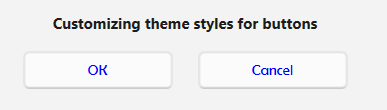
You can also change a theme dynamically with custom styles.
In the following example, a ComboBox is used to toggle between the Windows11Light and Windows11Dark themes. The foreground color of the Button is customized to red.
private void ComboBox_SelectionChanged(object sender, SelectionChangedEventArgs e)
{
   switch (combo.SelectedIndex)
   {
      case 0: SfSkinManager.SetTheme(this, new Theme("Windows11Light"));
           break;
      case 1: SfSkinManager.SetTheme(this, new Theme("Windows11Dark"));
           break;
    }
 }
At runtime, the applied theme along with any custom style modifications will reflect on the Button control
Output Screenshots
Light Theme:
Dark Theme:
Clearing SkinManager instance in an application
The SfSkinManager will hold some instances to use it further when applying the theme. However, this can be cleared using the function named Dispose(object), which must be called when the theme applied by SfSkinManager is to be cleared, as shown in the following code. Object refers to the element whose instance needs to be cleared.
private void Window_Closed(object sender, EventArgs e)
{
   SfSkinManager.Dispose(this);
}