How can I help you?
Appearance of Stencil in WPF Diagram (SfDiagram)
29 Nov 20248 minutes to read
Stencil symbol titles, headers, names, tooltips, and symbols display modes can be customized.
Add a title to the Stencil
The Title property of the Stencil class is used to add the title to the stencil. Please find the following code example that explains how to provide the content to the stencil.
<!--Initialize the stencil-->
<stencil:Stencil x:Name="stencil" Title="Shapes">
    <!--Initialize the stencil categories-->
    <stencil:Stencil.Categories>
        <stencil:StencilCategoryCollection>
            <!--Specify the basic shapes category with a title and resource key-->
            <stencil:StencilCategory Title="Basic Shapes" Keys="{StaticResource BasicShapes}"/>
        </stencil:StencilCategoryCollection>
    </stencil:Stencil.Categories>
</stencil:Stencil>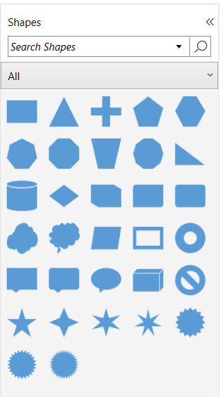
Customize the stencil title
The appearance of the title can be customized by using the TitleTemplate property of the Stencil class.
The following code example explains how to add a title and its customization.
<DataTemplate x:Key="TitleTemplate">
  <StackPanel Orientation="Horizontal">
   <Image Source="/Image/Shapes.png"
      Width="15" Height="15" />
   <TextBlock Margin="5,0,0,0" HorizontalAlignment="Center" VerticalAlignment="Center" Text="Shapes" />
  </StackPanel>
</DataTemplate>

<!--Initialize the stencil-->
<stencil:Stencil x:Name="stencil" Title="Shapes" TitleTemplate="{StaticResource TitleTemplate}>
    <!--Initialize the stencil categories-->
    <stencil:Stencil.Categories>
        <stencil:StencilCategoryCollection>
            <!--Specify the basic shapes category with a title and resource key-->
            <stencil:StencilCategory Title="Basic Shapes" Keys="{StaticResource BasicShapes}"/>
        </stencil:StencilCategoryCollection>
    </stencil:Stencil.Categories>
</stencil:Stencil>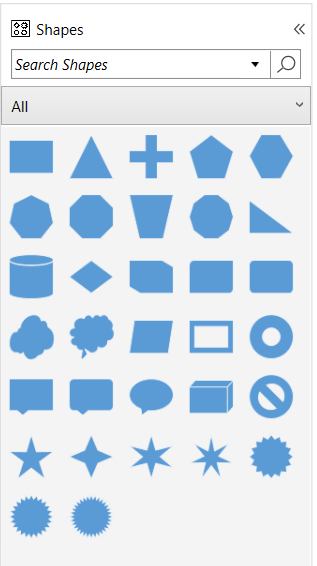
Customize the Symbol appearance
You can customize the appearance of a Symbol by changing its style properties of Background, BorderThickness, BorderBrush, and Padding. The below code example explains how to customize the appearance of the symbol.
The width and height properties of the symbol allow you to define the size of the symbols.
<!--Style for Symbol-->
<Style TargetType="stencil:Symbol">
    <Setter Property="Width" Value="100" />
    <Setter Property="Height" Value="100" />
    <Setter Property="BorderThickness" Value="1" />
    <Setter Property="Background" Value="Transparent" />
    <Setter Property="BorderBrush" Value="Blue" />
    <Setter Property="Padding" Value="5"></Setter>
</Style>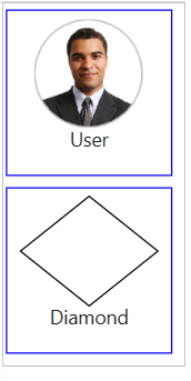
Add the name and tooltip to the symbol
To specify the identifying name to that element, use the Name property of the NodeViewModel, ConnectorViewModel, GroupViewModel, and SymbolViewModel. Please find the following code example.
<stencil:Stencil x:Name="stencil" ExpandMode="ZeroOrMore">
    <stencil:Stencil.SymbolSource>
       <syncfusion:SymbolCollection>
        <syncfusion:NodeViewModel Key="Basic Shapes" UnitHeight="100" UnitWidth="100" Name="Triangle" Shape="{StaticResource Triangle}"></Syncfusion:NodeViewModel>
        <syncfusion:SymbolViewModel Symbol="User" Key="Image" Name="User"
          SymbolTemplate="{StaticResource symboltemplate}" />
      </syncfusion:SymbolCollection>
    </stencil:Stencil.SymbolSource>
    <stencil:Stencil.SymbolGroups>
      <stencil:SymbolGroups>
      <!--Separate groups based on the key-->
         <stencil:SymbolGroupProvider MappingName="Key" />
       </stencil:SymbolGroups>
    </stencil:Stencil.SymbolGroups>
</stencil:Stencil>
Custom tool tip to the symbol
When SymbolsDisplayMode is set to IconsOnly, the Name property of the diagramming elements(NodeViewModel, ConnectorViewModel, GroupViewModel, and more) is displayed as a tooltip of that symbol when you move the mouse over it, but you can also give that symbol as a custom tooltip.
Please find the following code example.
<!--Style for Symbol-->
<Style TargetType="stencil:Symbol">
 <Setter Property="ToolTip" Value="{Binding Symbol}"></Setter>
 <Setter Property="Width" Value="100" />
 <Setter Property="Height" Value="100" />
 <Setter Property="BorderThickness" Value="1" />
 <Setter Property="Background" Value="Transparent" />
 <Setter Property="BorderBrush" Value="Blue" />
 <Setter Property="Padding" Value="5"></Setter>
</Style>
<stencil:Stencil x:Name="stencil" ExpandMode="ZeroOrMore">
    <stencil:Stencil.SymbolSource>
       <syncfusion:SymbolCollection>
        <syncfusion:SymbolViewModel Symbol="User" Key="Image" Name="User"
          SymbolTemplate="{StaticResource symboltemplate}" />
        <syncfusion:SymbolViewModel  Key="Template" Name="Diamond"
             SymbolTemplate="{StaticResource Diamond}" >
         <syncfusion:SymbolViewModel.Symbol>
            <StackPanel Orientation="Vertical">
                <TextBlock   FontSize="14" FontWeight="Bold" Foreground="Black" Text="Diamond" Margin="0,0,0,10">
                </TextBlock>
                <TextBlock FontStyle="Italic" FontSize="12" Foreground="Black" Text="Drag onto the Page">
                </TextBlock>
            </StackPanel>
        </syncfusion:SymbolViewModel.Symbol>
        </syncfusion:SymbolViewModel>
      </syncfusion:SymbolCollection>
    </stencil:Stencil.SymbolSource>
    <stencil:Stencil.SymbolGroups>
      <stencil:SymbolGroups>
      <!--Separate groups based on the key-->
         <stencil:SymbolGroupProvider MappingName="Key" />
       </stencil:SymbolGroups>
    </stencil:Stencil.SymbolGroups>
</stencil:Stencil>
NOTE
The
DataContextof theSymbolwill be any diagramming elements such asNodeViewModel,ConnectorViewModel,GroupViewModel,andSymbolViewModel.
Stencil display mode
The stencil view can be toggled between the expanded and compact modes by clicking the expander at the top right corner of the Stencil during run-time. You can do the same using the DisplayMode property of the Stencil class.
| DisplayMode | Description | Output |
|---|---|---|
| Compact | The stencil always shows as a narrow sliver which can be opened to full width |  |
| Expanded | Specifies to update the Expanded state of the stencil | 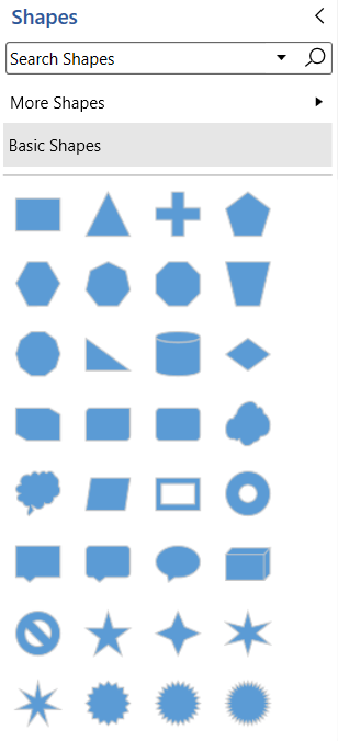 |
You can show or hide the expander icon by using the ShowDisplayModeToggleButton property of the Stencil class.
Symbols display mode
Stencil has option to control how the symbols should be displayed. By default, symbols will be displayed only by its icon. This can be changed by using SymbolsDisplayMode property of Stencil class.
<!--Initialize the stencil-->
<Stencil:Stencil x:Name="stencil" Title="Shapes" SymbolsDisplayMode ="NamesUnderIcons">
</Stencil:Stencil>
//Defines symbols display mode as name under icons.
stencil.SymbolsDisplayMode = SymbolsDisplayMode.NamesUnderIcons;
//Defines symbols display mode as icons only.
stencil.SymbolsDisplayMode = SymbolsDisplayMode.IconsOnly;| SymbolsDisplayMode | Description | Output |
|---|---|---|
| IconsOnly | Symbols will be displayed only by its icon | 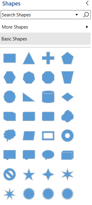 |
| NamesUnderIcons | Symbols will be displayed by its icon under its name | 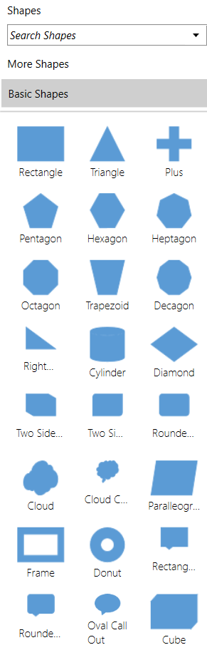 |
NOTE
The
Nameproperty value will be displayed as tool tip of the symbols whenSymbolsDisplayModeis set toIconsOnly.