How can I help you?
Symbol groups of Stencil in WPF Diagram (SfDiagram)
13 Mar 202524 minutes to read
A set of stencil symbols can be combined together to create a group and many numbers of group can be created. This helps you to look overall stencil symbols into split view and it is easy to find specific or particular shape category into stencil.
SymbolCollection With GroupMappingName in Stencil
The symbols of the same category can be grouped using the GroupMappingName property of the Stencil class. The Stencil groups the symbols based on the GroupMappingName property, which specifies the name of the property whose value will determine the group category. In the following code example, the GroupMappingName is set to “Key”, so the Stencil will create the SymbolGroups based on the value of the Key property.
<!--Style for Node-->
<Style TargetType="syncfusion:Node">
    <Setter Property="ShapeStyle">
        <Setter.Value>
            <Style  TargetType="Path">
                <Setter Property="Fill"
                        Value="#FF5B9BD5" />
                <Setter Property="Stretch"
                        Value="Fill" />
            </Style>
        </Setter.Value>
    </Setter>
</Style>

<!--Style for Connector-->
<Style TargetType="syncfusion:Connector">
    <Setter Property="ConnectorGeometryStyle">
        <Setter.Value>
            <Style TargetType="Path">
                <Setter Property="Stroke" Value="#FF5B9BD5"></Setter>
            </Style>
        </Setter.Value>
    </Setter>
</Style>

<!--Template for the Stencil title-->
<DataTemplate x:Key="TitleTemplate">
   <TextBlock x:Name="HeaderText" Text="{Binding}" FontSize="15" FontWeight="SemiBold"  Foreground="#2b579a" />
</DataTemplate>

<!--Initialize the stencil-->
<stencil:Stencil x:Name="stencil"
                  Grid.Column="0"
                  Grid.Row="1"
                  ExpandMode="ZeroOrMore"
                  BorderBrush="#dfdfdf"
                  BorderThickness="1"
                  GroupMappingName="Key"
                  Title="Shapes"
                  TitleTemplate="{StaticResource TitleTemplate}">
    <stencil:Stencil.SymbolSource>
        <syncfusion:SymbolCollection>
            <!--Define the Node element-->
            <syncfusion:NodeViewModel x:Name="node"
                                      Key="Node"
                                      UnitHeight="70"
                                      UnitWidth="100"
                                      OffsetX="100"
                                      OffsetY="100"
                                      Shape="{StaticResource Rectangle}">
            </syncfusion:NodeViewModel>
            <!--Define the Connector-->
            <syncfusion:ConnectorViewModel Key="Connector"
                                           SourcePoint="100,100"
                                           TargetPoint="200,200" />
            <!--Define the Group element-->
            <syncfusion:GroupViewModel Key="Group">
                <!--Creates the Group Nodes-->
                <syncfusion:GroupViewModel.Nodes>
                    <syncfusion:NodeCollection>
                        <syncfusion:NodeViewModel ID="srcnode"
                                                  UnitHeight="70"
                                                  UnitWidth="100"
                                                  OffsetX="0"
                                                  OffsetY="300"
                                                  Shape="{StaticResource Rectangle}">
                        </syncfusion:NodeViewModel>
                        <syncfusion:NodeViewModel ID="tarnode"
                                                  UnitHeight="70"
                                                  OffsetX="100"
                                                  OffsetY="500"
                                                  UnitWidth="100"
                                                  Shape="{StaticResource Rectangle}">
                        </syncfusion:NodeViewModel>
                    </syncfusion:NodeCollection>
                </syncfusion:GroupViewModel.Nodes>
                <!--Creates the Group Connectors-->
                <syncfusion:GroupViewModel.Connectors>
                    <syncfusion:ConnectorCollection>
                        <syncfusion:ConnectorViewModel SourceNodeID="srcnode"
                                                       TargetNodeID="tarnode" />
                    </syncfusion:ConnectorCollection>
                </syncfusion:GroupViewModel.Connectors>
            </syncfusion:GroupViewModel>
        </syncfusion:SymbolCollection>
    </stencil:Stencil.SymbolSource>
</stencil:Stencil>
//Define a Stencil.
Stencil stencil = new Stencil()
{
GroupMappingName = "Key",
};
//Define the SymbolSource with the SymbolCollection.
stencil.SymbolSource = new SymbolCollection();
NodeViewModel node = new NodeViewModel()
{
Key = "Node",
UnitHeight = 100,
UnitWidth = 100,
OffsetX = 100,
OffsetY = 100,
Shape = this.Resources["Rectangle"],
};
ConnectorViewModel connector = new ConnectorViewModel()
{
Key="Connector",
SourcePoint = new Point(100, 100),
TargetPoint = new Point(200, 200),
};
GroupViewModel group = new GroupViewModel()
{
Key="Group",
Nodes = new NodeCollection()
{
new NodeViewModel()
{
ID = "srcnode",
UnitHeight = 70,
UnitWidth = 100,
OffsetX = 0,
OffsetY = 300,
Shape = this.Resources["Rectangle"]
},
new NodeViewModel()
{
ID = "tarnode",
UnitHeight = 70,
UnitWidth = 100,
OffsetX = 100,
OffsetY = 500,
Shape = this.Resources["Rectangle"]
}
},
Connectors = new ConnectorCollection()
{
new ConnectorViewModel()
{
SourceNodeID = "srcnode",
TargetNodeID = "tarnode"
}
}
};
//Add the element to the symbol collection.
(stencil.SymbolSource as SymbolCollection).Add(node);
(stencil.SymbolSource as SymbolCollection).Add(connector);
(stencil.SymbolSource as SymbolCollection).Add(group);
Customize the appearance of the symbol group header
You can customize the appearance of each SymbolGroup header by changing the header property style. The following code explains how to customize the appearance of the symbol group header.
<!--Style for Symbol Group-->
<Style TargetType="stencil:SymbolGroup">
    <Setter Property="FontFamily" Value="Comic Sans MS"/>
    <Setter Property="Background" Value="#ffffff"/>
    <Setter Property="Foreground" Value="Brown"/>
    <Setter Property="FontSize" Value="14"/>
    <Setter Property="HeaderTemplate">
    <Setter.Value>
      <DataTemplate>
        <stencil:Header>
           <stencil:Header.Template>
              <ControlTemplate TargetType="stencil:Header">
                <Grid>
                  <Border x:Name="header" Background="#ffffff" BorderBrush="#Brown" BorderThickness="1">
                    <ContentPresenter Margin="10" Content="{Binding}"/>
                  </Border>
                </Grid>
               </ControlTemplate>
           </stencil:Header.Template>
        </stencil:Header>
      </DataTemplate>
    </Setter.Value>
   </Setter>
</Style>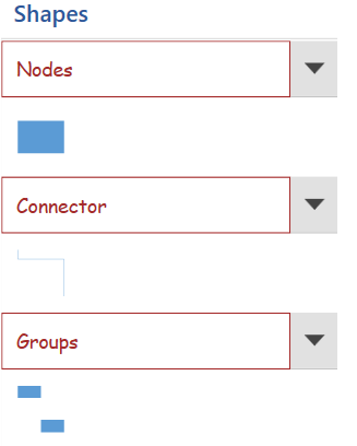
Expand and collapse the symbol group
When there is more number of symbol groups in the stencil, then you can expand and collapse the symbol groups using the ExpandMode property of Stencil class. The ExpandMode property allows you to decide the number of symbol groups that can be expanded in a stencil.
| ExpandMode | Description | Output |
|---|---|---|
| All | Enables all the symbol group that can be expanded |  |
| One | Enables only one symbol group that can be expanded |  |
| OneOrMore | Enables one or more symbol group that can be expanded | 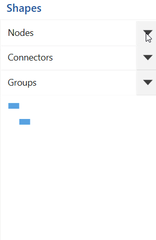 |
| ZeroOrMore | Enables none or more symbol group that can be expanded | 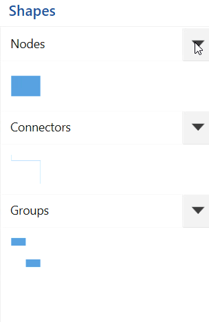 |
| ZeroOrOne | Enables none or one symbol group that can be expanded |  |
SymbolGroupViewModel in Stencil
The SymbolGroupViewModel class provides the support to create the view models to the symbol group and provides supports to add symbols to it as Node, Connectors, groups and list of predefined symbols. It includes the following properties:
-
Name: Specifies the display name of the symbol group. It also adds the symbols to the symbol groups defined through the
SymbolSourceproperty which symbol has sameKeyvalue as thisNameproperty. - Symbols: Specifies the list of symbols need to be added to the symbol group. It can be any diagram elements such as Nodes, Connectors, Groups, Containers, BPMN elements.
-
CategorySource: Specifies the list of symbols need to be added to the
SymbolGroupViewModelusing the static resource key value from the predefined category collections. - IsChecked: Shows or hides SymbolGroups in the Stencil when the SymbolGroupDisplayMode is set to List or Tab. The default value is true.
Additionally, You can dynamically add new symbols to symbol groups or remove existing ones at runtime. Similarly, you can also add or remove entire symbol groups within the stencil as needed.
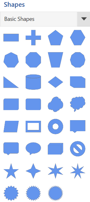
Adding Symbols via Symbols Property in SymbolGroupViewModel
To add symbols through the Symbols property, you can define a collection of symbols directly within the SymbolGroupViewModel, allowing for more customized symbol definitions.
<!--Initialize the stencil-->
<syncfusion:Stencil x:Name="stencil"
                    Title="Shapes"
                    SymbolGroupDisplayMode="Accordion"
                    SymbolSelectionMode="Multiple"
                    DisplayMode="Expanded"
                    GroupMappingName="Key">
        <syncfusion:Stencil.SymbolGroups>
            <syncfusion:SymbolGroups>
                <syncfusion:SymbolGroupViewModel Name="Symbols">
                    <syncfusion:SymbolGroupViewModel.Symbols>
                        <syncfusion:SymbolCollection>
                            <syncfusion:NodeViewModel Name="Object"
                                                      UnitHeight="50"
                                                      UnitWidth="50"
                                                      Shape="{StaticResource Object}"/>
                            <syncfusion:NodeViewModel Name="User"
                                                      UnitHeight="50"
                                                      UnitWidth="50"
                                                      Shape="{StaticResource User}"/>
                            <syncfusion:NodeViewModel Name="Amplifier"
                                                      UnitHeight="50"
                                                      UnitWidth="50"
                                                      Shape="{StaticResource  Amplifier}"/>
                            <syncfusion:NodeViewModel Name="CircularArrow"
                                                      UnitHeight="50"
                                                      UnitWidth="50"
                                                      Shape="{StaticResource CircularArrow}"/>
                            <syncfusion:NodeViewModel Name="Data1"
                                                      UnitHeight="50"
                                                      UnitWidth="50"
                                                      Shape="{StaticResource Data1}"/>
                        </syncfusion:SymbolCollection>
                    </syncfusion:SymbolGroupViewModel.Symbols>
                </syncfusion:SymbolGroupViewModel>
            </syncfusion:SymbolGroups>
        </syncfusion:Stencil.SymbolGroups>
</syncfusion:Stencil>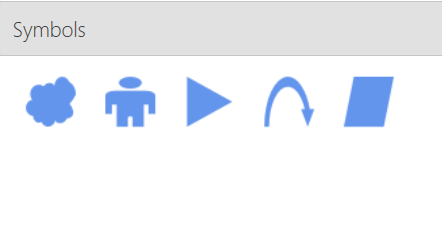
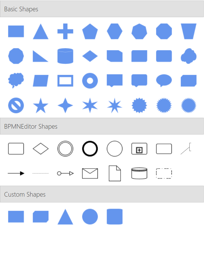
Adding Symbols via CategorySource Property in SymbolGroupViewModel
The sfDiagram resource dictionary includes a wide array of shapes organized into categorized lists. These shape paths are grouped into specific categories to simplify the process of adding them to the stencil, avoiding repetitive additions. Below are the built-in categories available in the diagram resource dictionary:
- BasicShapes
- FlowShapes
- ArrowShapes
- DataFlowShapes
- UMLActivity
- UMLUseCase
- UMLRelationship
- ElectricalShapes
- SwimlaneShapes
- BPMNEditorShapes
You can also create custom symbol collections. This additional flexibility allows you to tailor the stencil to your specific needs beyond the built-in options.
To add symbols to a Stencil through SymbolGroupViewModel, you can utilize the CategorySource property, which allows you to bind a predefined collection of symbols based on a static resource key. This enables dynamic loading of symbols into the group, ensuring that any updates to the category collection are reflected in the symbol group automatically.
<ResourceDictionary>
<ResourceDictionary.MergedDictionaries>
<!--Dictionary which contains the inbuilt shapes-->
<ResourceDictionary Source="/Syncfusion.SfDiagram.Wpf;component/Resources/BasicShapes.xaml" />
</ResourceDictionary.MergedDictionaries>
<!--custom path data-->
<sys:String x:Key="CustomPath">
F1M1.66,0.25C0.882,0.25,0.25,0.881,0.25,1.66L0.25,24.622C0.25,25.401,0.882,26.032,1.66,26.032L4.48,26.032C5.259,26.032,5.89,25.401,5.89,24.622L5.89,1.66C5.89,0.881,5.259,0.25,4.48,0.25z
</sys:String>
<!--custom shapes collection-->
<x:Array Type="sys:String" x:Key="customShapeCollection">
<sys:String>Rectangle</sys:String>
<sys:String>Cube</sys:String>
<sys:String>Triangle</sys:String>
<sys:String>Ellipse</sys:String>
<sys:String>CustomPath</sys:String>
</x:Array>
</ResourceDictionary>
<!--Initialize the stencil-->
<syncfusion:Stencil x:Name="stencil"
Title="Shapes"
SymbolGroupDisplayMode="Accordion"
SymbolSelectionMode="Multiple"
DisplayMode="Expanded"
GroupMappingName="Key">
<syncfusion:Stencil.SymbolGroups>
<syncfusion:SymbolGroups>
<syncfusion:SymbolGroupViewModel Name="Basic Shapes" CategorySource="{StaticResource BasicShapes}"/>
<syncfusion:SymbolGroupViewModel Name="BPMNEditor Shapes" CategorySource="{StaticResource BPMNEditorShapes}"/>
<syncfusion:SymbolGroupViewModel Name="Custom Shapes" CategorySource="{StaticResource customShapeCollection}"/>
</syncfusion:SymbolGroups>
</syncfusion:Stencil.SymbolGroups>
</syncfusion:Stencil>
Customize the appearance of the symbols in the built-in categories
The symbol sizes for the built-in symbol categories are equivalent to the Visio symbol size. Each symbol available in the category collection can be customized by the PrepareSymbolViewModel virtual method of the stencil class. Symbols can be modified by using the following properties of the PrepareSymbolViewModel method:
-
Item: To modify the symbol and its properties. -
SymbolName: To know the name of the symbol. -
CategoryName: To know the name of the category.
Also, you can decide whether a symbol can be added to the stencil symbol collection or not. It can be achieved by using the Cancel property of CanAddSymbol, the virtual method of stencil class.
/// <summary>
/// The custom class for the stencil view model.
/// </summary>
public class StencilViewModel : Stencil
{
    /// <summary>
    /// Overridden method to change the symbol.
    /// </summary>
    /// <param name="Item">Item value of the shape</param>
    /// <param name="SymbolName">Name of the symbol</param>
    /// <param name="CategoryName">Name of the category</param>
    /// <returns>Return the item of the shape</returns>
    protected override object PrepareSymbolViewModel(object Item, string SymbolName, string CategoryName)
    {
        if (SymbolName == "Rectangle")
        {
            (Item as INode).UnitWidth = 80;
            (Item as INode).UnitHeight = 40;
            return Item;
        }
        else
            return base.PrepareSymbolViewModel(Item, SymbolName, CategoryName);
    }

    /// <summary>
    /// Overidden method to decide whether a symbol can be added or not
    /// </summary>
    /// <param name="symbolName">Name of the symbol</param>
    /// <param name="categoryName">Name of the category</param>
    /// <returns>Return the boolean</returns>
    protected override bool CanAddSymbol(string symbolName, string categoryName)
    {
        if (symbolName == "Triangle")
        {
            return false;
        }

        return base.CanAddSymbol(symbolName, categoryName);
    }
}
See also
How to expand all SymbolGroups?
How to group all the SymbolViewModels into the same group in the WPF Diagram (SfDiagram)?
How to Change the Background Color of a Symbol in WPF SfDiagram?