Visual Styles in Windows Forms GridGrouping control
21 Jan 202517 minutes to read
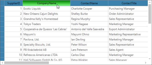
The GridGroupingControl can be displayed with the different themes by using the GridVisualStyles property. The following themes are available for GridGroupingControl,
- Office2003
- Office2007Blue
- Office2007Black
- Office2007Silver
- Office2010Blue
- Office2010Black
- Office2010Silver
- Office2016Black
- Office2016Colorful
- Office2016DarkGray
- Office2016White
- Metro
- SystemTheme
//Applying Visual Styles to the Grid
this.gridGroupingControl1.GridVisualStyles = Syncfusion.Windows.Forms.GridVisualStyles.Office2010Black;
'Applying Visual Styles to the Grid
Me.gridGroupingControl1.GridVisualStyles = Syncfusion.Windows.Forms.GridVisualStyles.Office2010Black
NOTE
To apply the enhanced themes to the GridGroupingControl, set EnableLegacyStyle property to
false.
Along with the basic themes defined by GridVisualStyles, you can also apply themes by using GridSkins. It is available as an add-on feature in the GridHelperClasses library. Currently, it comes with Vista skin that makes the grid components appear in vista-like look and feel. This can be set to the grid by using the ApplySkin method.
//Apply skin to the GridGroupingControl
GridSkins.ApplySkin(this.gridGroupingControl1.TableModel, Skins.Vista);
'Apply skin to the GridGroupingControl
GridSkins.ApplySkin(Me.gridGroupingControl1.TableModel, Skins.Vista)
The change of visual styles can be handled by using the ThemesChanged event. It will be fired while changing the GridVisualStyles of the GridGroupingControl.
Enabling Visual Styles
In GridGroupingControl, themes can be enabled by setting the ThemesEnabled property value as true. By default, the grid will be loaded with the SystemTheme.
//To apply other visual styles except SystemTheme
this.gridGroupingControl1.ThemesEnabled = true;
'To apply other visual styles except SystemTheme
Me.gridGroupingControl1.ThemesEnabled = TrueApplying themes for ComboBox Cell
There will be no themes applied to the ComboBox cell by default. If you want to enable the theme, set EnableGridListControlInComboBox property to false. It will add the GridListControl to the ComboBox drop down and the visual style of the grid will be applied.
// To Use GridComboBoxCellModel in Grid
this.gridGroupingControl1.TableModel.EnableGridListControlInComboBox = false;
'To Use GridComboBoxCellModel in Grid
Me.gridGroupingControl1.TableModel.EnableGridListControlInComboBox = FalseModifying Metro Colors
Custom colors can be applied to the metro theme by using the SetMetroStyle method. It can be used to change the colors of mouse hover, pressed and clicked colors of the headers and the embedded cell controls of the GridGroupingControl.
//Create GridMetroColors object for customizing the metro visual style
GridMetroColors metroColor = new GridMetroColors();

//Set custom colors to Metro Headers of the GridGroupingControl
metroColor.HeaderColor.NormalColor = Color.FromArgb(169, 219, 128);
metroColor.HeaderColor.HoverColor = Color.FromArgb(0, 110, 46);
metroColor.HeaderColor.PressedColor = Color.GhostWhite;
metroColor.HeaderBottomBorderWeight = GridBottomBorderWeight.None;

//set bottom border color of the column header

//metroColor.HeaderBottomBorderColor = Color.LightGreen;

//Set the back colors for the CheckBox and ComboBox
metroColor.CheckBoxColor.BackColor = Color.FromArgb(251, 157, 35);
metroColor.ComboboxColor.NormalBackColor = Color.FromArgb(255, 26, 0);

//Apply Custom colors to the Metro visual style
this.gridGroupingControl1.SetMetroStyle(metroColor);
'Create GridMetroColors object for customizing the metro visual style
Dim metroColor As New GridMetroColors()
'Set custom colors to Metro Headers of the GridGroupingControl
metroColor.HeaderColor.NormalColor = Color.FromArgb(169, 219, 128)
metroColor.HeaderColor.HoverColor = Color.FromArgb(0, 110, 46)
metroColor.HeaderColor.PressedColor = Color.GhostWhite
metroColor.HeaderBottomBorderWeight = GridBottomBorderWeight.None
'set bottom border color of the column header
'metroColor.HeaderBottomBorderColor = Color.LightGreen;
'Set the back colors for the CheckBox and ComboBox
metroColor.CheckBoxColor.BackColor = Color.FromArgb(251, 157, 35)
metroColor.ComboboxColor.NormalBackColor = Color.FromArgb(255, 26, 0)
'Apply Custom colors to the Metro visual style
Me.gridGroupingControl1.SetMetroStyle(metroColor)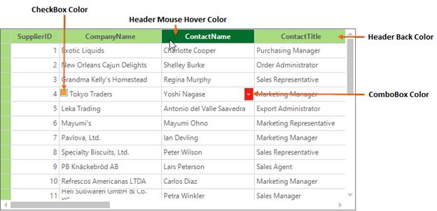
Modifying Metro Scrollbar Colors
The scrollbars of the metro visual style can be customized by setting the MetroColorTable property as of follows.
//Used to set the custom colors to the Metro scrollbars
this.gridGroupingControl1.TableControl.MetroColorTable.ScrollerBackground = Color.NavajoWhite;
this.gridGroupingControl1.TableControl.MetroColorTable.ArrowNormalBackGround = Color.FromArgb(0, 110, 46);
this.gridGroupingControl1.TableControl.MetroColorTable.ThumbNormal = Color.ForestGreen;
'Used to set the custom colors to the Metro scrollbars
Me.gridGroupingControl1.TableControl.MetroColorTable.ScrollerBackground = Color.NavajoWhite
Me.gridGroupingControl1.TableControl.MetroColorTable.ArrowNormalBackGround = Color.FromArgb(0, 110, 46)
Me.gridGroupingControl1.TableControl.MetroColorTable.ThumbNormal = Color.ForestGreen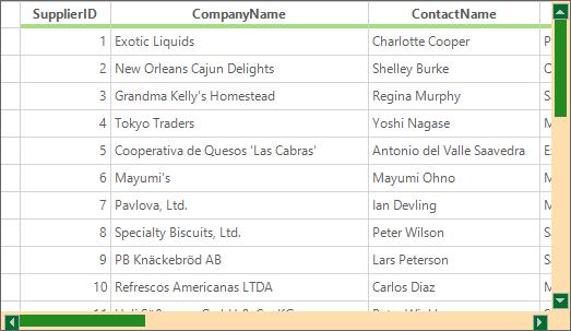
NOTE
The scrollbar customization is briefly discussed in the Scrolling section.
Modifying Office2016 colors
Custom colors can be applied to the office2016 theme by using the SetOffice2016ThemeStyle method. It can be used to change the colors of Mouse hover, pressed, and clicked colors of the headers and the embedded cell controls of the GridGroupingControl.
//Create GridOffice2016ThemeColors object for customizing the Office2016 visual style
GridOffice2016ThemeColors office2016Colors = new GridOffice2016ThemeColors();

//Set custom colors to Office2016 Headers of the GridGroupingControl
office2016Colors.HeaderColor.NormalColor = Color.FromArgb(169, 219, 128);
office2016Colors.HeaderColor.HoverColor = Color.FromArgb(0, 110, 46);
office2016Colors.HeaderColor.PressedColor = Color.GhostWhite;

//Set the back colors for the ComboBox
office2016Colors.ComboboxColor.NormalBackColor = Color.FromArgb(255, 26, 0);
office2016Colors.CheckBoxColor.BackColor = Color.FromArgb(251, 157, 35);

//Apply Custom colors to the Office2016 visual style
this.gridGroupingControl1.SetOffice2016ThemeStyle(GridVisualStyles.Office2016Colorful, office2016Colors);
'Create GridOffice2016ThemeColors object for customizing the Office2016 visual style
Dim office2016Colors As New GridOffice2016ThemeColors()
'Set custom colors to Headers of the GridGroupingControl
office2016Colors.HeaderColor.NormalColor = Color.FromArgb(169, 219, 128)
office2016Colors.HeaderColor.HoverColor = Color.FromArgb(0, 110, 46)
'Set the back colors for the ComboBox
office2016Colors.ComboboxColor.NormalBackColor = Color.FromArgb(255, 26, 0)
office2016Colors.CheckBoxColor.BackColor = Color.FromArgb(251, 157, 35)
'Apply Custom colors to the Office2016 visual style
Me.gridGroupingControl1.SetOffice2016ThemeStyle(GridVisualStyles.Office2016Colorful, office2016Colors)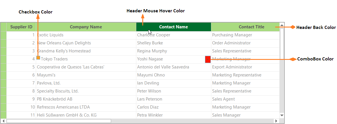
Modifying Office2016 scrollbar colors
The Scrollbars of the Office2016 visual style can be customized by setting any one of the following respective property based on theme:
- Office2016ColorfulColorTable
- Office2016BlackColorTable
- Office2016WhiteColorTable
- Office2016DarkGrayColorTable
//Used to set the custom colors to the Office2016 scrollbars
this.gridGroupingControl1.TableControl.Office2016ColorfulColorTable.ScrollerBackground = Color.NavajoWhite;
this.gridGroupingControl1.TableControl.Office2016ColorfulColorTable.ArrowNormalBackGround = Color.FromArgb(0, 110, 46);
this.gridGroupingControl1.TableControl.Office2016ColorfulColorTable.ThumbNormal = Color.ForestGreen;
'Used to set the custom colors to the Office2016 scrollbars
Me.gridGroupingControl1.TableControl.Office2016ColorfulColorTable.ScrollerBackground = Color.NavajoWhite
Me.gridGroupingControl1.TableControl.Office2016ColorfulColorTable.ArrowNormalBackGround = Color.FromArgb(0, 110, 46)
Me.gridGroupingControl1.TableControl.Office2016ColorfulColorTable.ThumbNormal = Color.ForestGreen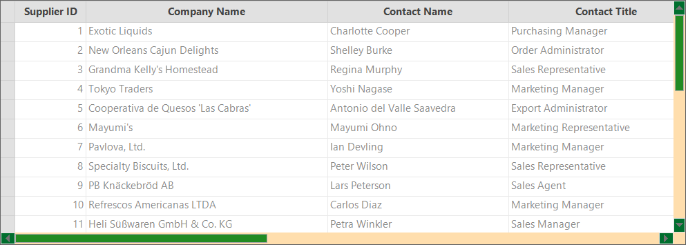
Skin Manager
Theme can also be applied to the GridGroupingControl by using SetVisualStyle method of SkinManager.
// Code for applying visual theme for only one control.
SkinManager.SetVisualStyle(this.gridGroupingControl1, VisualTheme.Office2010Blue);
' Code for applying visual theme for only one control.
SkinManager.SetVisualStyle(Me.gridGroupingControl1, VisualTheme.Office2010Blue)The SkinManager provides the supports for all the VisualTheme available in GridGroupingControl. It is also used to apply the same visual style for all the Syncfusion® controls in the form.
// Code for applying visual theme for the whole form.
SkinManager.SetVisualStyle(this, VisualTheme.Office2010Blue);
' Code for applying visual theme for the whole form.
SkinManager.SetVisualStyle(Me, VisualTheme.Office2010Blue)
Customizing Visual Styles
All the elements of the GridGroupingControl appearance can be customized. This section will explain about the customization of the themes using IVisualStylesDrawing.
Customization Using IVisualStylesDrawing
The grid can be applied with the custom visual styles by implementing the IVisualStylesDrawing interface. This interface provides the list of methods for drawing the icons and header colors of the grid.
public class CustomTheme : IVisualStylesDrawing
{

    private GridVisualStyles visualStyle;

    public CustomTheme(GridVisualStyles style)
    {
        this.visualStyle = style;

    }

    public CustomTheme(GridVisualStyles style, bool legacyStyle)
    {
        this.visualStyle = style;
        this.isLegacyStyle = legacyStyle;
    }

    public void DrawHeaderStyle(Graphics g, Rectangle rect, ThemedHeaderDrawing.HeaderState state)
    {

        //Check for empty headers

        if (rect.Height == 0 && rect.Width == 0)
            return;

        //Check for the current state of the header and paints the foreground accordingly.

        if (state == ThemedHeaderDrawing.HeaderState.Normal)
        {
            LinearGradientBrush br = new LinearGradientBrush(rect, Color.FromArgb(255, 128, 255), Color.FromArgb(255, 0, 128), LinearGradientMode.Vertical);
            g.FillRectangle(br, rect);
            g.FillRectangle(br, new Rectangle(rect.X + 1, rect.Y + 1, rect.Width - 2, rect.Height - 2));
            br.Dispose();
        }

        else
        {
            LinearGradientBrush br = new LinearGradientBrush(rect, Color.FromArgb(0, 128, 0), Color.FromArgb(128, 255, 128), LinearGradientMode.Vertical);
            g.FillRectangle(br, rect);
            g.FillRectangle(br, new Rectangle(rect.X + 1, rect.Y + 1, rect.Width - 2, rect.Height - 2));
            br.Dispose();
        }
    }

    // IVisualStylesDrawing Members …
}
Public Class CustomTheme
Implements IVisualStylesDrawing
Private visualStyle As GridVisualStyles
Public Sub New(ByVal style As GridVisualStyles)
Me.visualStyle = style
End Sub
Public Sub New(ByVal style As GridVisualStyles, ByVal legacyStyle As Boolean)
Me.visualStyle = style
Me.isLegacyStyle = legacyStyle
End Sub
Public Sub DrawHeaderStyle(ByVal g As Graphics, ByVal rect As Rectangle, ByVal state As ThemedHeaderDrawing.HeaderState)
'Check for empty headers
If rect.Height = 0 AndAlso rect.Width = 0 Then
Return
End If
'Check for the current state of the header and paints the foreground accordingly.
If state Is ThemedHeaderDrawing.HeaderState.Normal Then
Dim br As New LinearGradientBrush(rect, Color.FromArgb(255, 128, 255), Color.FromArgb(255, 0, 128), LinearGradientMode.Vertical)
g.FillRectangle(br, rect)
g.FillRectangle(br, New Rectangle(rect.X + 1, rect.Y + 1, rect.Width - 2, rect.Height - 2))
br.Dispose()
Else
Dim br As New LinearGradientBrush(rect, Color.FromArgb(0, 128, 0), Color.FromArgb(128, 255, 128), LinearGradientMode.Vertical)
g.FillRectangle(br, rect)
g.FillRectangle(br, New Rectangle(rect.X + 1, rect.Y + 1, rect.Width - 2, rect.Height - 2))
br.Dispose()
End If
End Sub
' IVisualStylesDrawing Members …
End ClassFor applying the customized theme settings to grid, GridVisualStyles.Custom option should be set to GridVisualStyles property. After that, the CustomTheme class can be assigned to GridVisualStyleDrawing property.
//Adding custom visual styles to the GridGroupingControl
this.gridGroupingControl1.GridVisualStyles = GridVisualStyles.Custom;
this.gridGroupingControl1.TableOptions.GridVisualStylesDrawing = new CustomTheme(this.gridGroupingControl1.GridVisualStyles);
'Adding custom visual styles to the GridGroupingControl
Me.gridGroupingControl1.GridVisualStyles = GridVisualStyles.Custom
Me.gridGroupingControl1.TableOptions.GridVisualStylesDrawing = New CustomTheme(Me.gridGroupingControl1.GridVisualStyles)