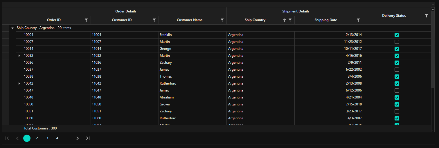
How can I help you?
Getting Started with WPF DataGrid (SfDataGrid)
27 Feb 202516 minutes to read
This section provides a quick overview for working with the WPF DataGrid (SfDataGrid) for WPF. Walk through the entire process of creating a real world of this control.
To get start quickly with WPF DataGrid, you can check on this video:
Assembly deployment
The following list of assemblies needs to be added as reference to use SfDataGrid control in any application,
| Required assemblies | Description |
|---|---|
| Syncfusion.Data.WPF | Syncfusion.Data.WPF assembly contains fundamental and base classes for which is responsible for data processing operations handled in SfDataGrid. |
| Syncfusion.SfGrid.WPF | Syncfusion.SfGrid.WPF assembly contains classes that handles all UI operations of SfDataGrid. SfDataGrid control present Syncfusion.UI.Xaml.Grid namespace. This namespace also added in http://schemas.syncfusion.com/wpf Syncfusion® WPF schema. |
| Syncfusion.Shared.WPF | Syncfusion.Shared.WPF contains various editor controls (such as IntegerTextBox, DoubleTextBox and etc) which are used in SfDataGrid. |
In order to use export to excel and export to PDF functionalities of SfDataGrid control, add the reference to following assemblies,
| Optional Assemblies | Description |
|---|---|
| Syncfusion.SfGridConverter.WPF | Syncfusion.SfGridConverter.WPF contains static extension classes for exporting SfDataGrid to excel and PDF in Syncfusion.UI.Xaml.Grid.Converter namespace. |
| Syncfusion.XlsIO.Base | Syncfusion.XlsIO.Base contains fundamental and base classes for creating and manipulating excel files. |
| Syncfusion.Pdf.Base | Syncfusion.Pdf.Base contains fundamental and base classes for creating PDF. |
Creating simple application with SfDataGrid
In this walk through, you will create WPF application that contains SfDataGrid control.
- Creating project
- Adding control via Designer
- Adding control manually in XAML
- Adding control manually in C#
- Creating Data Model for application
- Binding to Data
- Defining Columns
- Selection
- Sorting, Grouping, and Filtering
- Editing
Creating the project
Create new WPF Project in Visual Studio to display SfDataGrid with data objects.
Adding control via Designer
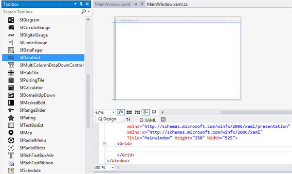
SfDataGrid control can be added to the application by dragging it from Toolbox and dropping it in Designer view. The required assembly references will be added automatically.
Adding control manually in XAML
In order to add control manually in XAML, do the below steps,
- Add the below required assembly references to the project,
- Syncfusion.Data.WPF
- Syncfusion.SfGrid.WPF
- Syncfusion.Shared.WPF
- Import Syncfusion® WPF schema http://schemas.syncfusion.com/wpf or SfDataGrid control namespace Syncfusion.UI.Xaml.Grid in XAML page.
-
Declare SfDataGrid control in XAML page.
<Window xmlns="http://schemas.microsoft.com/winfx/2006/xaml/presentation"
        xmlns:x="http://schemas.microsoft.com/winfx/2006/xaml"
        xmlns:syncfusion="http://schemas.syncfusion.com/wpf"
        x:Class="WpfApplication1.MainWindow"
        Title="MainWindow" Height="350" Width="525">
    <Grid>
        <syncfusion:SfDataGrid  x:Name="dataGrid"/>
    </Grid>
</Window>
Adding control manually in C#
In order to add control manually in C#, do the below steps,
- Add the below required assembly references to the project,
- Syncfusion.Data.WPF
- Syncfusion.SfGrid.WPF
- Syncfusion.Shared.WPF
- Import SfDataGrid namespace Syncfusion.UI.Xaml.Grid .
-
Create SfDataGrid control instance and add it to the Page.
using Syncfusion.UI.Xaml.Grid;
namespace WpfApplication1
{

    public partial class MainWindow : Window
    {

        public MainWindow()
        {
            InitializeComponent();
            SfDataGrid dataGrid = new SfDataGrid();
            Root_Grid.Children.Add(dataGrid);
        }
    }
}
Creating Data Model for sample application
SfDataGrid is a data-bound control. So before create binding to the control, you must create data model for Application.
-
Create data object class named OrderInfo and declare properties as shown below,
public class OrderInfo
{
    int orderID;
    string customerId;
    string country;
    string customerName;
    string shippingCity;

    public int OrderID
    {
        get {   return orderID;  }
        set {   orderID = value; }
    }

    public string CustomerID
    {
        get {  return customerId; }
        set {  customerId = value; }
    }

    public string CustomerName
    {
        get {  return customerName; }
        set {  customerName = value;}
    }

    public string Country
    {
        get { return country; }
        set  {  country = value; }
    }

    public string ShipCity
    {
        get {  return shippingCity; }
        set {  shippingCity = value; }
    }

    public OrderInfo(int orderId, string customerName, string country, string customerId,string shipCity)
    {
        this.OrderID = orderId;
        this.CustomerName = customerName;
        this.Country = country;
        this.CustomerID = customerId;
        this.ShipCity = shipCity;
    }
}
NOTE
If you want your data object (OrderInfo class) to automatically reflect property changes, then the object must implement INotifyPropertyChanged interface.
-
Create a ViewModel class with Orders property and Orders property is initialized with several data objects in constructor.
public class ViewModel
{
    private ObservableCollection<OrderInfo> _orders;
    public ObservableCollection<OrderInfo> Orders
    {
        get { return _orders; }
        set { _orders = value; }
    }

    public ViewModel()
    {
        _orders = new ObservableCollection<OrderInfo>();
        this.GenerateOrders();
    }

    private void GenerateOrders()
    {
        _orders.Add(new OrderInfo(1001, "Maria Anders", "Germany", "ALFKI", "Berlin"));
        _orders.Add(new OrderInfo(1002, "Ana Trujilo", "Mexico", "ANATR", "Mexico D.F."));
        _orders.Add(new OrderInfo(1003, "Antonio Moreno", "Mexico", "ANTON", "Mexico D.F."));
        _orders.Add(new OrderInfo(1004, "Thomas Hardy", "UK", "AROUT", "London"));
        _orders.Add(new OrderInfo(1005, "Christina Berglund", "Sweden", "BERGS", "Lula"));
        _orders.Add(new OrderInfo(1006, "Hanna Moos", "Germany", "BLAUS", "Mannheim"));
        _orders.Add(new OrderInfo(1007, "Frederique Citeaux", "France", "BLONP", "Strasbourg"));
        _orders.Add(new OrderInfo(1008, "Martin Sommer", "Spain", "BOLID", "Madrid"));
        _orders.Add(new OrderInfo(1009, "Laurence Lebihan", "France", "BONAP", "Marseille"));
       _orders.Add(new OrderInfo(1010, "Elizabeth Lincoln", "Canada", "BOTTM", "Tsawassen"));
    }
}
Binding to Data
To bind the SfDataGrid to data, set the SfDataGrid.ItemsSource property to an IEnumerable implementation. Each row in SfDataGrid is bound to an object in data source and each column in SfDataGrid bound to a property in data object.
Bind the collection created in previous step to SfDataGrid.ItemsSource property in XAML by setting ViewModel as DataContext.
<Window xmlns="http://schemas.microsoft.com/winfx/2006/xaml/presentation"
        xmlns:x="http://schemas.microsoft.com/winfx/2006/xaml"
        xmlns:syncfusion="http://schemas.syncfusion.com/wpf"
        x:Class="WpfApplication1.MainWindow"
        xmlns:local="clr-namespace:WpfApplication1"
        Title="MainWindow" Height="350" Width="525">

    <Window.DataContext>
        <local:ViewModel/>
    </Window.DataContext>

    <Grid x:Name="Root_Grid">
        <syncfusion:SfDataGrid x:Name="dataGrid"  ItemsSource="{Binding Orders}" />
    </Grid>

</Window>
ViewModel viewModel = new ViewModel();
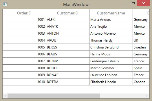
dataGrid.ItemsSource = viewModel.Orders;Now, run the application and you can expect the see the below output,
Defining Columns
By default, the SfDataGrid control generates the columns automatically when value assigned to SfDataGrid.ItemsSource property. The type of the column generated depends on the type of data in the column and the attribute of the property the column bound with.
The following table lists the column types and its constraints for auto column generation.
| Generated Column Type | Data Type / Attribute |
|---|---|
| GridTextColumn | Property of type String and any other type apart from below specified cases. |
| GridNumericColumn | Property of type Int or Double. |
| GridCurrencyColumn |
Property with Currency DataType attribute. [DataType(DataType.Currency)]. |
| GridMaskColumn |
Property with PhoneNumber DataType attribute. [DataType(DataType.PhoneNumber)]. |
| GridDateTimeColumn | Property of type DateTime. |
| GridCheckBoxColumn | Property of type Bool. |
When columns are auto-generated, you can handle the SfDataGrid.AutoGeneratingColumn event to customize or cancel the columns before they are added to the SfDataGrid.
You can prevent the automatic column generation by setting SfDataGrid.AutoGenerateColumns property is false, you have to define the columns to be displayed as below,
<syncfusion:SfDataGrid x:Name="dataGrid"
                       ItemsSource="{Binding Orders}"
                       AutoGenerateColumns="False">
    <syncfusion:SfDataGrid.Columns>
        <syncfusion:GridTextColumn MappingName="CustomerID"/>
        <syncfusion:GridTextColumn MappingName="CustomerName"/>
    </syncfusion:SfDataGrid.Columns>
</syncfusion:SfDataGrid>
SfDataGrid dataGrid = new SfDataGrid();
dataGrid.AutoGenerateColumns = false;
dataGrid.Columns.Add(new GridTextColumn() { MappingName = "CustomerID" });
dataGrid.Columns.Add(new GridTextColumn() { MappingName = "CustomerName" });Below is the list of column types provided in SfDataGrid.
| Column Type | Comments |
|---|---|
| GridTextColumn | Represents SfDataGrid column that hosts textual content in its cells. |
| GridNumericColumn | Represents SfDataGrid column that hosts controls in its cells which is used to format and display Numeric values. |
| GridCurrencyColumn | Represents SfDataGrid column that hosts controls in its cells which is used to display numeric values with currency format. |
| GridPercentColumn | Represents SfDataGrid column that hosts controls in its cells which is used to display numeric values with percent format. |
| GridMaskColumn | Represents SfDataGrid column that hosts MaskedTextBox controls in its cells which is used to display textual content by applying Mask. |
| GridTimeSpanColumn | Represents SfDataGrid column that hosts controls in its cells which is used to display format and display TimeSpan values. |
| GridDateTimeColumn | Represents SfDataGrid column that hosts controls in its cells which is used to display and format DateTime values. |
| GridComboBoxColumn | Represents SfDataGrid column that hosts ComboBox controls in its cells. |
| GridCheckBoxColumn | Represents SfDataGrid column that hosts CheckBox controls in its cells. |
| GridImageColumn | Represents SfDataGrid column that hosts Image controls in its cells. |
| GridHyperlinkColumn | Represents SfDataGrid column that hosts Hyperlink controls in its cells. |
| GridTemplateColumn | Represents SfDataGrid column that hosts template-specified content in its cells |
| GridUnboundColumn | Represents SfDataGrid column that hosts textual or template-specified content which are not actually bound with data object of row. |
| GridMultiColumnDropdownList | Represents SfDataGrid column that hosts in its cells. |
Selection
By default, the entire row is selected when a user clicks a cell in a SfDataGrid. You can set the SfDataGrid.SelectionMode property to specify whether a user can select single row or cell, or multiple rows or cells. Set the SfDataGrid.SelectionUnit property to specify whether rows can be selected, or cells can selected.
When SelectionUnit is Row, you can get information about the rows that are selected using SfDataGrid.SelectedItem and SfDataGrid.SelectedItems properties.
When SfDataGrid.SelectionUnit is Cell, you can get information about the cells that are selected by calling SfDataGrid.GetSelectedCells method.
You can handle the selection operations with the help of SfDataGrid.SelectionChanging and SfDataGrid.SelectionChanged events of SfDataGrid.
Sorting, Grouping, and Filtering
Sorting
By default, you can sort columns in a SfDataGrid by clicking the column header. You can configure the sorting by setting SfDataGrid.SortColumnDescriptions property as below,
<syncfusion:SfDataGrid x:Name="dataGrid"
                       ItemsSource="{Binding Orders}" >
    <syncfusion:SfDataGrid.SortColumnDescriptions>
        <syncfusion:SortColumnDescription ColumnName="CustomerName"/>
    </syncfusion:SfDataGrid.SortColumnDescriptions>
</syncfusion:SfDataGrid>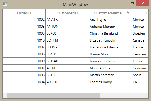
You can customize sorting by handling the SfDataGrid.SortColumnsChanging and SfDataGrid.SortColumnsChanged events. To cancel the default sort, set the Cancel property to true in SfDataGrid.SortColumnsChanging event.
this.dataGrid.SortColumnsChanging += dataGrid_SortColumnsChanging;

void dataGrid_SortColumnsChanging(object sender, GridSortColumnsChangingEventArgs e)
{

    if (e.AddedItems[0].ColumnName == "CustomerName")
    e.Cancel = true;
}
Grouping
Grouping can be enabled by setting SfDataGrid.ShowGroupDropArea property, where you can group by dragging the column header and dropping it in the GroupDropArea over the column headers. You can configure the grouping by setting SfDataGrid.GroupColumnDescriptions property as below,
<syncfusion:SfDataGrid x:Name="dataGrid"
                       ItemsSource="{Binding Orders}" >
    <syncfusion:SfDataGrid.GroupColumnDescriptions>
        <syncfusion:GroupColumnDescription ColumnName="CustomerName"/>
    </syncfusion:SfDataGrid.GroupColumnDescriptions>
</syncfusion:SfDataGrid>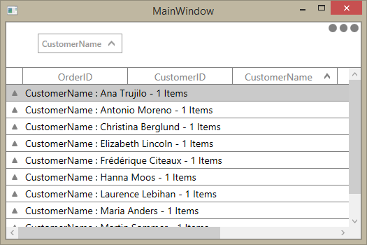
Filtering
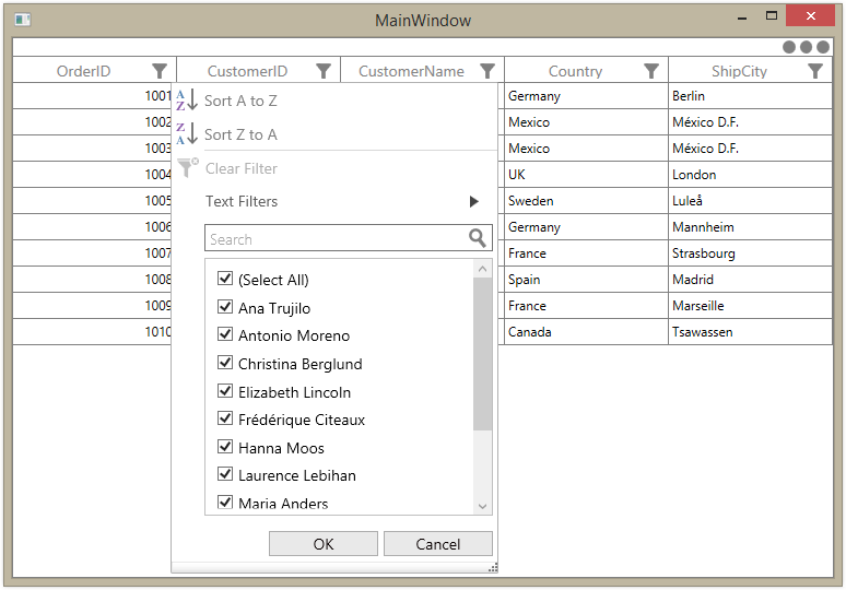
Filtering can be enabled by setting SfDataGrid.AllowFiltering property to true , where you can open advanced filter UI by clicking the Filter icon in column header and filter the SfDataGrid. You can customize the filtering operations by handling SfDataGrid.FilterChanging and SfDataGrid.FilterChanged events.
Editing
Editing can be enabled by setting SfDataGrid.AllowEditing property to true . Set SfDataGrid.AllowDeleting property to specify whether user can delete rows by pressing Delete key.
Set SfDataGrid.AddNewRowPosition property to enable additional row either Top or Bottom of SfDataGrid, where user can enter new items into the blank row. Adding new row adds an item to the SfDataGrid.ItemsSource.
You can customize the editing operations by handling SfDataGrid.CurrentCellBeginEdit and SfDataGrid.CurrentCellEndEdit events.
Theme
SfDataGrid supports various built-in themes. Refer to the below links to apply themes for the SfDataGrid,
