WPF Currency TextBox Overview
24 Mar 20262 minutes to read
The CurrencyTextBox is a specialized input control designed to accept, format, and display numeric values as currency in WPF applications. It enforces numeric input, formats numbers according to currency conventions, and exposes a concise API for common scenarios such as data binding, range validation, culture-aware formatting, and UI-driven value adjustment. The control is intended for forms, financial entry screens, reporting dialogs, dashboards, and any UI that requires reliable currency input and presentation.
Control structure
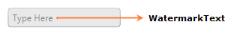
The CurrencyTextBox combines a text-editing area with a number-formatting layer and optional adorner for visual feedback. Typical visual elements include a watermark (placeholder text) when the control is empty, the formatted currency text, and an optional range adorner that can act like a progress indicator based on MinValue/MaxValue.

Typical usage scenarios
- Data-entry forms where users input monetary values (invoices, purchase orders, budgets).
- Financial dashboards that present editable currency fields with immediate formatting.
- Localized applications that must display currency values according to the user’s culture and regional settings.
- UI components that need numeric constraints, e.g., limits, step increments, or visual progress indication for values within a range.
Key capabilities
- Value enforcement and parsing: accepts only decimal-compatible characters and exposes the current numeric value through the
Valueproperty. - Formatting and culture support: formats the displayed value as currency using either a
NumberFormatInfoinstance or theCultureproperty; supports dedicated formatting properties such asCurrencySymbol,CurrencyDecimalDigits, andCurrencyGroupSeparator. See details in Culture and Formatting. - Range and validation: allows
MinValueandMaxValuelimits and configurable validation timing (OnKeyPressorOnLostFocus). Advanced options control behavior when entered digits exceed the allowed limits. See Restriction or Validation for full guidance. - Range adorner: optionally renders a colored fill inside the control to indicate a value proportion within the configured range. This is useful for quick visual feedback and is documented in Range Adorner.
- Incrementing/scrolling: supports keyboard arrow keys and mouse wheel increments with a configurable
ScrollIntervaland circular scrolling options. - Data binding and notifications: supports two‑way binding on the
Valueproperty and exposes value-change notifications so view models can react immediately to user edits. - Accessibility and read-only mode: supports
IsReadOnlyand related caret behavior to present values without allowing edits while keeping selection and focusable behavior as needed.
Integration and quick start
To add a CurrencyTextBox to your view and get started quickly, see the step-by-step instructions in Getting Started. That page shows the required assembly reference, XAML and C# examples, and the preferred Value-based approach for setting and binding currency data.
Behavior and developer notes
- Prefer the
Valueproperty rather thanTextwhen reading or setting the control programmatically;Valuealways represents the parsed numeric value. - When both
NumberFormatandCultureare specified,NumberFormattakes precedence for display formatting. -
CurrencyDecimalDigits,MinimumCurrencyDecimalDigits, andMaximumCurrencyDecimalDigitscontrol decimal precision and interact according to explicit precedence rules documented in the formatting guide.
Theming, styling and extensibility
The CurrencyTextBox supports built-in visual themes and can be styled using standard WPF templates and brushes. Visual states for positive, negative and zero values can be customized to make value meaning immediately perceptible. For examples and theming notes see the related Getting Started and Culture/Formatting documentation.