How can I help you?
Record Template View in WPF DataGrid (SfDataGrid)
11 Aug 202524 minutes to read
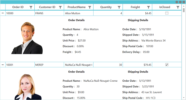
The SfDataGrid provides support to represent additional information of a row using TemplateViewDefinition that can be defined in datagrid. It allows you to load any WPF controls to TemplateViewDefinition.RowTemplate in order to display the additional information of a row. You can expand or collapse the row template view by using an expander in a row or programmatically.

Defining row template
Template view can be generated for the master row by using the RowTemplate defined in the TemplateViewDefinition.
Follow the below steps to define the row template,
- Create TemplateViewDefinition.
- Define data template for the TemplateViewDefinition.RowTemplate property.
- Then add TemplateViewDefinition to the SfDataGrid.DetailsViewDefinition.
You can bind the row data using the Data.PropertyName (where Data is the underlying object bound).
<Window.Resources>
	<DataTemplate x:Key="DetailsViewTemplate">
        <Grid>
            <Grid.RowDefinitions>
                <RowDefinition Height="Auto"/>
                <RowDefinition Height="125"/>
			</Grid.RowDefinitions>
            <Grid.ColumnDefinitions>
                <ColumnDefinition Width="250"/>
                <ColumnDefinition/>
                <ColumnDefinition/>
            </Grid.ColumnDefinitions>
            <Image Grid.Row="0" Grid.Column="0" Grid.RowSpan="2" Margin="5" Height="150" HorizontalAlignment="Left"
                   Source="{Binding Path=Data.CustomerID, Converter={StaticResource ImageConverter}}" />
            <Label Grid.Column="1" Grid.Row="0" HorizontalAlignment="Left"
                   Margin="25,0,0,0" Content="Order Details" FontWeight="Bold" />
            <StackPanel Orientation="Vertical" Grid.Column="1" Grid.Row="1"
						HorizontalAlignment="Left" VerticalAlignment="Center">
                <StackPanel Orientation="Horizontal">
                    <Label HorizontalAlignment="Left" VerticalAlignment="Center" FontWeight="SemiBold"
                           Content="Product Name :"/>
                    <TextBlock HorizontalAlignment="Left" VerticalAlignment="Center" Margin="5"
                               Text="{Binding Data.ProductName}"/>
                </StackPanel>

                <StackPanel Orientation="Horizontal">
                    <Label HorizontalAlignment="Left" VerticalAlignment="Center"
                           FontWeight="SemiBold" Content="Quantity :"/>
                    <TextBlock HorizontalAlignment="Left" VerticalAlignment="Center" Margin="5"
                               Text="{Binding Data.Quantity}"/>
                </StackPanel>

                <StackPanel Orientation="Horizontal">
                    <Label HorizontalAlignment="Left" VerticalAlignment="Center"
                           FontWeight="SemiBold" Content="Unit Price :"/>
                    <TextBlock HorizontalAlignment="Left" VerticalAlignment="Center" Margin="5"
                               Text="{Binding Data.UnitPrice, StringFormat='{}{0:C}'}"/>
                </StackPanel>

                <StackPanel Orientation="Horizontal">
                    <Label HorizontalAlignment="Left" VerticalAlignment="Center"
                           FontWeight="SemiBold" Content="Discount :"/>
                    <TextBlock HorizontalAlignment="Left" VerticalAlignment="Center" Margin="5"
                               Text="{Binding Data.Discount, StringFormat='{}{0:P}'}"/>
                </StackPanel>

                <StackPanel Orientation="Horizontal">
                    <Label HorizontalAlignment="Left" VerticalAlignment="Center"
                           FontWeight="SemiBold" Content="Freight :"/>
                    <TextBlock HorizontalAlignment="Left" VerticalAlignment="Center" Margin="5"
                               Text="{Binding Data.Freight, StringFormat='{}{0:c}'}"/>
                </StackPanel>
            </StackPanel>
            <Label Grid.Column="2" Grid.Row="0" HorizontalAlignment="Left" Margin="25,0,0,0"
                   Content="Shipping Details" FontWeight="Bold" />
            <StackPanel Orientation="Vertical" Grid.Column="2" Grid.Row="1"
						HorizontalAlignment="Left" VerticalAlignment="Center">
                <StackPanel Orientation="Horizontal">
                    <Label HorizontalAlignment="Right" VerticalAlignment="Center"
                           FontWeight="SemiBold" Content="Order Date :"/>
                    <TextBlock HorizontalAlignment="Left" VerticalAlignment="Center" Margin="5"
                               Text="{Binding Data.OrderDate, StringFormat=d}"/>
                </StackPanel>

                <StackPanel Orientation="Horizontal">
                    <Label HorizontalAlignment="Right" VerticalAlignment="Center"
                           FontWeight="SemiBold" Content="Shipped Date :"/>
                    <TextBlock HorizontalAlignment="Left" VerticalAlignment="Center" Margin="5"
                               Text="{Binding Data.ShippedDate, StringFormat=d}"/>
                </StackPanel>

                <StackPanel Orientation="Horizontal">
                    <Label HorizontalAlignment="Right" VerticalAlignment="Center"
                           FontWeight="SemiBold" Content="Ship Address :"/>
                    <TextBlock HorizontalAlignment="Left" VerticalAlignment="Center" Margin="5"
                               Text="{Binding Data.ShipAddress}"/>
                </StackPanel>

                <StackPanel Orientation="Horizontal">
                    <Label HorizontalAlignment="Right" VerticalAlignment="Center"
                           FontWeight="SemiBold" Content="Ship Postal Code :"/>
                    <TextBlock HorizontalAlignment="Left" VerticalAlignment="Center" Margin="5"
                               Text="{Binding Data.ShipPostalCode, StringFormat=hh\\:mm}"/>
                </StackPanel>

                <StackPanel Orientation="Horizontal">
                    <Label HorizontalAlignment="Right" VerticalAlignment="Center"
                           FontWeight="SemiBold" Content="Delivery Delay :"/>
                    <TextBlock HorizontalAlignment="Left" VerticalAlignment="Center" Margin="5"
                               Text="{Binding Data.DeliveryDelay, StringFormat=dd\\:hh}"/>
                </StackPanel>
            </StackPanel>
        </Grid>
    </DataTemplate>
</Window.Resources>

<syncfusion:SfDataGrid Name="dataGrid"
                       AutoGenerateColumns="False"
                       ItemsSource="{Binding OrderList}">
	<syncfusion:SfDataGrid.DetailsViewDefinition>
		<syncfusion:TemplateViewDefinition  RowTemplate="{StaticResource DetailsViewTemplate}"/>
	</syncfusion:SfDataGrid.DetailsViewDefinition>
</syncfusion:SfDataGrid>
Defining RowTemplateSelector
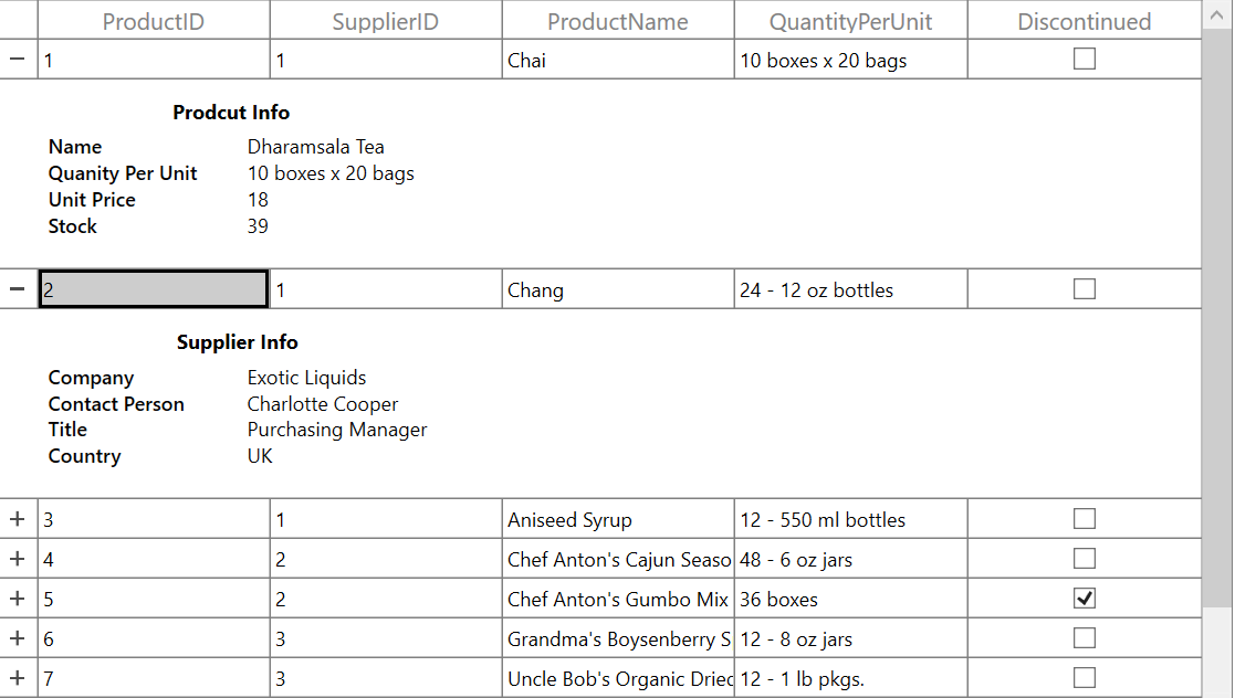
TemplateViewDefinition provides support to choose different DataTemplate based on underlying data object using TemplateViewDefinition.RowTemplateSelector property.
<Application.Resources>
    <DataTemplate x:Key="ProductInfo">
        <Grid HorizontalAlignment="Left">
            <Grid.RowDefinitions>
                <RowDefinition Height="Auto" />
                <RowDefinition Height="Auto" />
            </Grid.RowDefinitions>
            <Label Grid.Row="0" HorizontalAlignment="Center" Content="Prodcut Info"
                   FontWeight="Bold" />
			<Grid Grid.Row="1" HorizontalAlignment="Left" VerticalAlignment="Center">
                <Grid.ColumnDefinitions>
                    <ColumnDefinition Width="120" />
                    <ColumnDefinition Width="*" />
                </Grid.ColumnDefinitions>
                <Grid.RowDefinitions>
                    <RowDefinition Height="Auto" />
                    <RowDefinition Height="Auto" />
                    <RowDefinition Height="Auto" />
                    <RowDefinition Height="Auto" />
                </Grid.RowDefinitions>
                <TextBlock Grid.Row="0" Grid.Column="0" HorizontalAlignment="Left"
                               FontWeight="DemiBold" Text="Name" />
                <TextBlock Grid.Row="0" Grid.Column="1" HorizontalAlignment="Left"
                               Text="{Binding Data.EnglishName}" />
                <TextBlock Grid.Row="1" Grid.Column="0" HorizontalAlignment="Left"
                               FontWeight="DemiBold" Text="Quantity Per Unit" />
                <TextBlock Grid.Row="1" Grid.Column="1" HorizontalAlignment="Left"
                               Text="{Binding Data.QuantityPerUnit}" />
                <TextBlock Grid.Row="2" Grid.Column="0" HorizontalAlignment="Left"
                               FontWeight="DemiBold" Text="Unit Price" />
                <TextBlock Grid.Row="2" Grid.Column="1" HorizontalAlignment="Left"
                               Text="{Binding Data.UnitPrice}" />
                <TextBlock Grid.Row="3" Grid.Column="0" HorizontalAlignment="Left"
                               FontWeight="DemiBold" Text="Stock" />
                <TextBlock Grid.Row="3" Grid.Column="1" HorizontalAlignment="Left"
                               Text="{Binding Data.UnitsInStock}" />
            </Grid>
        </Grid>
    </DataTemplate>

    <DataTemplate x:Key="SupplierInfo" >
        <Grid HorizontalAlignment="Left">
            <Grid.RowDefinitions>
                <RowDefinition Height="Auto" />
                <RowDefinition Height="Auto" />
            </Grid.RowDefinitions>
            <Label Grid.Row="0" HorizontalAlignment="Center" Content="Supplier Info"
                   FontWeight="Bold" />
            <Grid HorizontalAlignment="Left" Grid.Row="1" >
                <Grid.ColumnDefinitions>
                    <ColumnDefinition Width="120" />
                    <ColumnDefinition Width="*" />
                </Grid.ColumnDefinitions>
                <Grid.RowDefinitions>
                    <RowDefinition Height="Auto" />
                    <RowDefinition Height="Auto" />
                    <RowDefinition Height="Auto" />
                    <RowDefinition Height="Auto" />
                </Grid.RowDefinitions>
                <TextBlock Grid.Row="0" Grid.Column="0" HorizontalAlignment="Left"
                           FontWeight="DemiBold" Text="Company" />
                <TextBlock Grid.Row="0" Grid.Column="1" HorizontalAlignment="Left"
                           Text="{Binding Data.Suppliers.CompanyName}" />
                <TextBlock Grid.Row="1" Grid.Column="0" HorizontalAlignment="Left"
                           FontWeight="DemiBold" Text="Contact Person" />
                <TextBlock Grid.Row="1" Grid.Column="1" HorizontalAlignment="Left"
                           Text="{Binding Data.Suppliers.ContactName}" />
                <TextBlock Grid.Row="2" Grid.Column="0" HorizontalAlignment="Left"
                           FontWeight="DemiBold" Text="Title" />
                <TextBlock Grid.Row="2" Grid.Column="1" HorizontalAlignment="Left"
                           Text="{Binding Data.Suppliers.ContactTitle, Mode=OneTime}" />
                <TextBlock Grid.Row="3" Grid.Column="0" HorizontalAlignment="Left"
                           FontWeight="DemiBold" Text="Country" />
                <TextBlock Grid.Row="3" Grid.Column="1" HorizontalAlignment="Left"
                           Text="{Binding Data.Suppliers.Country}" />
			</Grid>
		</Grid>
    </DataTemplate>
</Application.Resources>

<Window.Resources>
	<local:detailsViewTemplateSelector x:Key="EditTemplateSelector"/>
</Window.Resources>

<syncfusion:SfDataGrid Name="dataGrid"
                       AutoGenerateColumns="False"
                       ItemsSource="{Binding OrderList}">
	<syncfusion:SfDataGrid.DetailsViewDefinition>
		<syncfusion:TemplateViewDefinition RowTemplateSelector="{StaticResource EditTemplateSelector}"/>
	</syncfusion:SfDataGrid.DetailsViewDefinition>
</syncfusion:SfDataGrid>
public class detailsViewTemplateSelector : DataTemplateSelector
{
public override DataTemplate SelectTemplate(object item, DependencyObject container)
{
var productId = ((item as RecordEntry).Data as Products).ProductID;
if (productId % 2 == 0)
return Application.Current.FindResource("SupplierInfo") as DataTemplate;
else
return Application.Current.FindResource("ProductInfo") as DataTemplate;
}
}
Height customization
Height mode
You can customize height of the row that contains RowTemplate by using the TemplateViewDefinition.HeightMode property. The height modes are as follows.
| Height mode | Definition |
|---|---|
Auto
|
Arranges template for the actual size as the is measured. |
Fixed
|
Arranges template for the specified height in . |
ViewPort
|
Arranges template for the ViewPortHeight when the
actual height is greater than ViewPortHeight.
|
Handling Row Virtualization in RowTemplate
By default, rows in the DataGrid are virtualized and reused to enhance performance. However, when using a RowTemplate that includes interactive controls (such as SfDataGrid, DataGrid, or similar components), this reuse can lead to unexpected behavior during data operations like sorting or filtering. Specifically, the visual state and data bindings of these controls may not persist correctly.
This occurs because the same row visual elements are recycled and displayed for different data items during virtualization.
To provide greater flexibility, the TemplateRenderMode property is available for row templates. This property allows you to configure how the row templates are instantiated and managed within the DataGrid.
TemplateRenderMode
Shared (Default)
- Rows (and their templates) are reused across multiple rows as you scroll or interact with the grid.
- This mode provides the best performance and lowest memory usage.
- Since templates are shared, visual state and control data may not persist correctly during operations like expanding, collapsing, or scrolling. This can lead to visual inconsistencies or data mismatches.
Individual
- A unique rows and template instance is created for each data row.
- Template instances are not shared or reused across rows.
- Data operations and visual state are always preserved correctly for each row, even after expanding, collapsing, or scrolling.
NOTE
Use
Sharedfor maximum performance and when your row template only contains simple data-bound controls with no per-row persistent state.
UseIndividualwhen your row template is contains interactive controls that need to preserve their state for each data row independently.
Keyboard navigation support for DetailsViewTemplate
In the SfDataGrid, you can navigate from parent row to DetailsViewTemplate and vice-versa using Tab key by default. You can also restrict tab key navigation from parent to DetailsViewTemplate by setting the TemplateViewDefinition.TemplateNavigationMode property value to ExcludeTemplateRow.
<syncfusion:SfDataGrid Name="dataGrid"
                       AutoGenerateColumns="False"
                       ItemsSource="{Binding OrderList}">
	<syncfusion:SfDataGrid.DetailsViewDefinition>
		<syncfusion:TemplateViewDefinition  RowTemplate="{StaticResource DetailsViewTemplate}" TemplateNavigationMode="ExcludeTemplateRow`"/>
	</syncfusion:SfDataGrid.DetailsViewDefinition>
</Syncfusion.SfDataGrid>
NOTE
Except Tab key, other keys does not allow keyboard navigation from parent row to DetailsViewTemplate and vice-versa.
Populating record template view using events
You can set the RowTemplate on-demand when expanding the record by using the GridDetailsViewExpandingEventArgs.RowTemplate property in SfDataGrid.DetailsViewExpanding event handler.
<syncfusion:SfDataGrid Name="dataGrid"
                       AutoGenerateColumns="False"
                       ItemsSource="{Binding OrderList}">
	<syncfusion:SfDataGrid.DetailsViewDefinition>
		<syncfusion:TemplateViewDefinition  RowTemplate="{StaticResource DetailsViewTemplate}"/>
	</syncfusion:SfDataGrid.DetailsViewDefinition>
</Syncfusion.SfDataGrid>
private DataTemplate GetDataTemplate()
{
FrameworkElementFactory textBlock = new FrameworkElementFactory(typeof(TextBlock));
Binding binding = new Binding();
textBlock.SetBinding(TextBlock.TextProperty, binding);
binding.Path = new PropertyPath("Data.ProductName");
var dataTemplate = new DataTemplate() { VisualTree = textBlock };
return dataTemplate;
}
private void dataGrid_DetailsViewExpanding(object sender, Syncfusion.UI.Xaml.Grid.GridDetailsViewExpandingEventArgs e)
{
e.RowTemplate = GetDataTemplate();
}Expanding and collapsing row template programmatically
The SfDataGrid allows you to expand or collapse the RowTemplate programmatically in different ways.
Expand or collapse all the row template
You can expand or collapse all the RowTemplate by using the ExpandAllDetailsView and CollapseAllDetailsView methods.
this.dataGrid.ExpandAllDetailsView();
this.dataGrid.CollapseAllDetailsView();
Expand or collapse row template based on record index
You can expand or collapse the RowTemplate based on the record index by using the ExpandDetailsViewAt and CollapseDetailsViewAt methods.
this.dataGrid.ExpandDetailsViewAt(0);
this.dataGrid.CollapseDetailsViewAt(0);
Handling events
DetailsViewExpanding
The DetailsViewExpanding event is raised when the RowTemplate is expanded by using an expander.
this.dataGrid.DetailsViewExpanding += dataGrid_DetailsViewExpanding;

void dataGrid_DetailsViewExpanding(object sender, Syncfusion.UI.Xaml.Grid.GridDetailsViewExpandingEventArgs e)
{
}
DetailsViewExpanded
The DetailsViewExpanded event is raised when the RowTemplate is expanded by using an expander.
this.dataGrid.DetailsViewExpanded += dataGrid_DetailsViewExpanded;

void dataGrid_DetailsViewExpanded(object sender, Syncfusion.UI.Xaml.Grid.GridDetailsViewExpandingEventArgs e)
{
}
DetailsViewCollapsing
The DetailsViewCollapsing event is raised when the RowTemplate is collapsed by using an expander.
this.dataGrid.DetailsViewCollapsing += dataGrid_DetailsViewCollapsing;

void dataGrid_DetailsViewCollapsing(object sender, Syncfusion.UI.Xaml.Grid.GridDetailsViewExpandingEventArgs e)
{
}
DetailsViewCollapsed
The DetailsViewCollapsed event is raised when the RowTemplate is collapsed by using an expander.
this.dataGrid.DetailsViewCollapsed += dataGrid_DetailsViewCollapsed;

void dataGrid_DetailsViewCollapsed(object sender, Syncfusion.UI.Xaml.Grid.GridDetailsViewExpandingEventArgs e)
{
}
Cancel expanding or collapsing operations through events
You can cancel the expanding operation when expanding the RowTemplate by using the GridDetailsViewExpandingEventArgs.Cancel property in the DetailsViewExpanding event handler.
this.dataGrid.DetailsViewExpanding += dataGrid_DetailsViewExpanding;

void dataGrid_DetailsViewExpanding(object sender, Syncfusion.UI.Xaml.Grid.GridDetailsViewExpandingEventArgs e)
{

    if ((e.Record as OrderInfo).OrderID == 1002)
        e.Cancel = true;
}
Similarly, the collapsing operation can also be canceled through the GridDetailsViewCollapsingEventArgs.Cancel property in DetailsViewCollapsing event handler.
this.dataGrid.DetailsViewCollapsing += dataGrid_DetailsViewCollapsing;

void dataGrid_DetailsViewCollapsing(object sender, Syncfusion.UI.Xaml.Grid.GridDetailsViewCollapsingEventArgs e)
{

    if ((e.Record as OrderInfo).OrderID == 1002)
        e.Cancel = true;
}
Limitations
Limitations are:
- Does not support both
DetailsViewTemplateandDetailsViewDataGridat same level. - Does not support more than one
DetailsViewTemplatein same level.