How can I help you?
Column Types in WPF DataGrid (SfDataGrid)
18 Mar 202624 minutes to read
SfDataGrid provides support for various built-in column types. Each column has its own properties and renderer to handle different types of data.
You can also add or override existing columns and renderers as you need.
| Column Type | Renderer | Description |
|---|---|---|
| Use to display the string data. | ||
| Use to display the numeric data. | ||
| Use to display the currency value. | ||
| Use to display the percent value. | ||
| Use to display the data to be masked. | ||
| Use to display the time span value. | ||
| Use to display the date time value. | ||
| Use to display the IEnumerable data using ComboBox. | ||
| Use to display the boolean type data. | ||
| Use to display the image in each row. | ||
| Use to display the URI data. | ||
| Use to display the custom template-specified content. | ||
| Use to display custom information of each record. | ||
| Use to display the IEnumerable data using . | ||
| Selects or deselects rows based on the check box value, which is not bound with data object. |
GridColumn
GridColumn is an abstract class provides base functionalities for all the column types in SfDataGrid.
Column mapping
Column can be bound to a property in data object using GridColumn.MappingName property. In addition, it supports to format or bind different property for display and edit mode separately via GridColumn.DisplayBinding and GridColumn.ValueBinding.
When you set MappingName, DisplayBinding and ValueBinding are created based on MappingName, if these properties are not defined explicitly.
You can use DisplayBinding property to format the column in display, by setting StringFormat or Converter properties of Binding.
<syncfusion:SfDataGrid x:Name="dataGrid"
ColumnSizer="Star"
AutoGenerateColumns="False"
ItemsSource="{Binding Orders}">
<syncfusion:SfDataGrid.Columns>
<syncfusion:GridTextColumn DisplayBinding="{Binding Path=UnitPrice,
StringFormat='{}{0:C}'}"
HeaderText="Unit Price"
MappingName="UnitPrice"
ValueBinding="{Binding Path=Quantity}" />
</syncfusion:SfDataGrid.Columns>
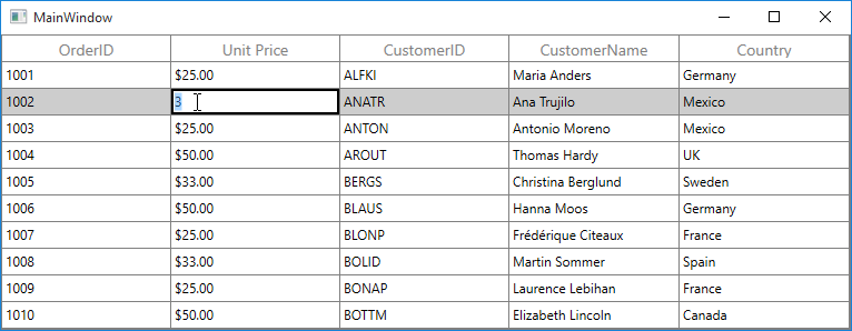
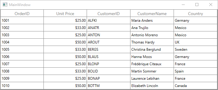
</syncfusion:SfDataGrid>In the below screenshot, Unit Price column display value is formatted to currency by setting DisplayBinding property.
By default, Columns handling the data operations (sorting and grouping) based on MappingName property. You can perform data operations based on ValueBinding by setting GridColumn.UseBindingValue to true, when the standard reflection not works or binding column with complex or indexer properties.
Column CellTemplate
You can load any WPF control in the display mode for all columns by setting GridColumn.CellTemplate property. In edit mode, corresponding editor will be loaded based on column type.
Using CellTemplate, you can format data or conditionally change the properties using DataTrigger.
In the below code snippet, GridNumericColumn is loaded with ProgressBar and TextBlock. When you start editing DoubleTextBox will be loaded as Editor.
<syncfusion:SfDataGrid x:Name="dataGrid"
                       ColumnSizer="Star"
                       AutoGenerateColumns="False"
                       ItemsSource="{Binding Orders}">
    <syncfusion:SfDataGrid.Columns>
        <syncfusion:GridNumericColumn   HeaderText="Unit Price"
                                        MappingName="UnitPrice">
            <syncfusion:GridNumericColumn.CellTemplate>
                <DataTemplate>
                    <Grid>
                        <ProgressBar x:Name="progressBar"
                                     Background="Transparent"
                                     Visibility="Visible"
                                     Minimum="0"
                                     Maximum="100"
                                     BorderThickness="0"
                                     Value="{Binding Path=UnitPrice}" />
                        <TextBlock  Text="{Binding Path=UnitPrice}"
                                    HorizontalAlignment="Right"
                                    VerticalAlignment="Center"
                                    TextAlignment="Center"/>
                    </Grid>
                </DataTemplate>
            </syncfusion:GridNumericColumn.CellTemplate>
        </syncfusion:GridNumericColumn>
    </syncfusion:SfDataGrid.Columns>
</syncfusion:SfDataGrid>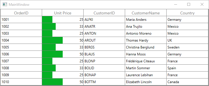
CellTemplate is not support by GridHyperlinkColumn, GridCheckboxColumn and GridImageColumn columns.
NOTE
When using a cell template, a column mapping name is optional during the initial load. For data operations, the mapping name is mandatory; otherwise, an InvalidOperationException is thrown.
Reusing same DataTemplate for multiple columns
By default, underlying record is DataContext for CellTemplate. So you have to define, template for each column to display values based on MappingName.
You can use the same DataTemplate for all columns to display value based on MappingName by setting GridColumn.SetCellBoundValue property to true. Setting SetCellBoundValue to true, changes the DataContext for CellTemplate to DataContextHelper which has the following members,
-
Value- Return the value base onMappingName. -
Record- Returns the underlying data object.
<Window.Resources>
    <DataTemplate   x:Key="cellTemplate">
        <TextBlock  Foreground="Red"
                    Margin="3,0,0,0"
                    Text="{Binding Path=Value}"/>
    </DataTemplate>
</Window.Resources>

<syncfusion:SfDataGrid x:Name="dataGrid"
                       ColumnSizer="Star"
                       AutoGenerateColumns="False"
                       ItemsSource="{Binding Orders}">
    <syncfusion:SfDataGrid.Columns>
        <syncfusion:GridTextColumn SetCellBoundValue="True"
                                   MappingName="OrderID"
                                   CellTemplate="{StaticResource cellTemplate}" />
        <syncfusion:GridTextColumn MappingName="CustomerName"
                                   SetCellBoundValue="True"
                                   CellTemplate="{StaticResource cellTemplate}"/>
    </syncfusion:SfDataGrid.Columns>
</syncfusion:SfDataGrid>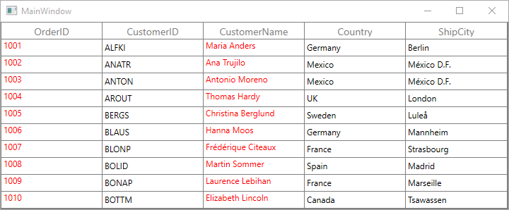
Setting CellTemplate based on custom logic using template selector
GridColumn provides support to choose different DataTemplate based on underlying data object using GridColumn.CellTemplateSelector property.
For example, two different templates loaded alternatively in OrderID column.
<Window.Resources>
<local:CustomCellTemplateSelector x:Key="cellTemplateSelector"/>
<DataTemplate x:Key="DefaultTemplate">
<TextBlock Background="Wheat"
Foreground="Red"
Text="{Binding Path=OrderID}"
TextAlignment="Center" />
</DataTemplate>
<DataTemplate x:Key="AlternateTemplate">
<TextBlock Background="Beige"
Foreground="Green"
Text="{Binding Path=OrderID}"
TextAlignment="Center" />
</DataTemplate>
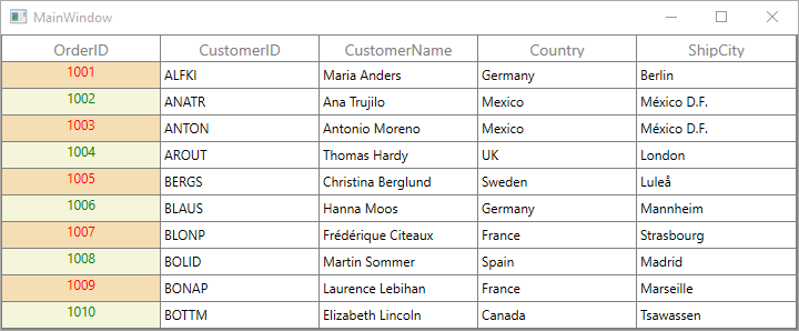
</Window.Resources>Below code returns the DefaultTemplate and AlternateTemplate based on OrderID’s value
.
public class CustomCellTemplateSelector : DataTemplateSelector
{

    public override System.Windows.DataTemplate SelectTemplate(object item, System.Windows.DependencyObject container)
    {

        if (item == null)
            return null ;
        var data = item as OrderInfo;

        if (data.OrderID % 2 == 0)
            return Application.Current.MainWindow.FindResource("AlternateTemplate") as DataTemplate;

        else
            return Application.Current.MainWindow.FindResource("DefaultTemplate") as DataTemplate;
    }
}
In the below code, the custom template selector set to GridColumn.CellTemplateSelector and set SetCellBoundValue to true.
<syncfusion:SfDataGrid x:Name="dataGrid"
                       ColumnSizer="Star"
                       AutoGenerateColumns="False"
                       ItemsSource="{Binding Orders}">
    <syncfusion:SfDataGrid.Columns>
        <syncfusion:GridTextColumn MappingName="OrderID"
                                   CellTemplateSelector="{StaticResource cellTemplateSelector}"/>
    </syncfusion:SfDataGrid.Columns>
</syncfusion:SfDataGrid>
NOTE
Non-Editable columns does not support
CellTemplate.
Binding ViewModel properties with CellTemplate
You can bind properties in ViewModel with the controls in CellTemplate.
Below command defined in ViewModel is bound to Button inside CellTemplate. Below code, denote the base command.
public class BaseCommand:ICommand
{
    #region Fields
    readonly Action<object> _execute;
    readonly Predicate<object> _canExecute;
    #endregion

    #region Constructors
    /// <summary>
    /// Creates a new command that always execute.
    /// </summary>
    /// <param name="execute">The execution logic.</param>

    public BaseCommand(Action<object> execute)

        : this(execute, null)
    {
    }

    /// <summary>
    /// Creates a new command.
    /// </summary>
    /// <param name="execute">The execution logic.</param>
    /// <param name="canExecute">The execution status logic.</param>

    public BaseCommand(Action<object> execute, Predicate<object> canExecute)
    {

        if (execute == null)
            throw new ArgumentNullException("execute");
        _execute = execute;
        _canExecute = canExecute;
    }
    #endregion

    #region ICommand Members

    public bool CanExecute(object parameter)
    {
        return _canExecute == null ? true : _canExecute(parameter);
    }

    public event EventHandler CanExecuteChanged
    {
        add { CommandManager.RequerySuggested += value; }
        remove { CommandManager.RequerySuggested -= value; }
    }

    public void Execute(object parameter)
    {
        _execute(parameter);
    }
    #endregion
}
Below code, defines the command for Button in ViewModel.
public class ViewModel
{
    private BaseCommand deleteRecord;

    public BaseCommand DeleteRecord
    {
        get
        {

            if (deleteRecord == null)
                deleteRecord = new BaseCommand(OnDeleteRecordClicked, OnCanDelete);
            return deleteRecord;
        }
    }

    private static bool OnCanDelete(object obj)
    {
        return true;
    }

    private void OnDeleteRecordClicked(object obj)
    {
        //TODO ACTION.
    }
}
In the below code, Button inside CellTemplate bound to the command in ViewModel.
<syncfusion:SfDataGrid x:Name="dataGrid"
                    AutoGenerateColumns="False"
                    ItemsSource="{Binding Orders}">
    <syncfusion:SfDataGrid.Columns>
        <syncfusion:GridTextColumn MappingName="Delete">
            <syncfusion:GridTextColumn.CellTemplate>
                <DataTemplate>
                    <Button Command="{Binding DataContext.DeleteRecord, ElementName=dataGrid}"
                            CommandParameter="{Binding}"
                            Content="Delete" />
                    <!--or-->
                    <Button Command="{Binding DeleteRecord,
                            Source={StaticResource viewModel}}"
                            CommandParameter="{Binding}"
                            Content="Delete" />
                </DataTemplate>
            </syncfusion:GridTextColumn.CellTemplate>
        </syncfusion:GridTextColumn>
    </syncfusion:SfDataGrid.Columns>
</syncfusion:SfDataGrid>
Column Formatting
GridColumn supports to format the data using StringFormat and Converter properties, by defining GridColumn.DisplayBinding and GridColumn.ValueBinding. GridColumn.DisplayBinding formats the data in display mode. GridColumn.ValueBinding formats the data in edit mode.
Column formatting using Binding
You can apply format for the column using StringFormat property by defining DisplayBinding. StringFormat applies to GridTexColumn alone. Refer the Converter section to format the other column types.
<syncfusion:SfDataGrid x:Name="dataGrid"
                       ColumnSizer="Star"
                       AutoGenerateColumns="False"
                       ItemsSource="{Binding Orders}">
    <syncfusion:SfDataGrid.Columns>
        <syncfusion:GridTextColumn  DisplayBinding="{Binding Path=UnitPrice,
                                    StringFormat='{}{0:C}'}"
                                    HeaderText="Unit Price"
                                    MappingName="UnitPrice"
                                    ValueBinding="{Binding Path=UnitPrice}" />
    </syncfusion:SfDataGrid.Columns>
</syncfusion:SfDataGrid>
When column is auto-generated, you can set the StringFormat by handling AutoGeneratingColumn event.
void dataGrid_AutoGeneratingColumn(object sender, AutoGeneratingColumnArgs e)
{

    if (e.Column.MappingName == "UnitPrice")
    {

        if (e.Column is GridNumericColumn)
        {
            e.Column = new GridTextColumn() { MappingName = "UnitPrice", HeaderText = "Unit Price" };
        }
        e.Column.DisplayBinding = new Binding() { Path = new PropertyPath(e.Column.MappingName), StringFormat = "{0:C}" };
        e.Column.ValueBinding = new Binding() { Path = new PropertyPath(e.Column.MappingName),StringFormat="{0:C}" };
    }
}
Column formatting using converter
You can format the column using Converter property by defining DisplayBinding.
<Window.Resources>
    <local:CurrencyFormatConverter x:Key="currencyFormatConverter" />
</Window.Resources>

<syncfusion:SfDataGrid x:Name="dataGrid"
                       AutoGenerateColumns="False"
                       ItemsSource="{Binding Orders}">
    <syncfusion:SfDataGrid.Columns>
        <syncfusion:GridNumericColumn   DisplayBinding="{Binding Path=UnitPrice,
                                        Converter={StaticResource currencyFormatConverter}}"
                                        HeaderText="Unit Price"
                                        MappingName="UnitPrice" />
    </syncfusion:SfDataGrid.Columns>
</syncfusion:SfDataGrid>
public class CurrencyFormatConverter:IValueConverter
{
object IValueConverter.Convert(object value, Type targetType, object parameter, System.Globalization.CultureInfo culture)
{
return string.Format("{0:C}", value);
}
object IValueConverter.ConvertBack(object value, Type targetType, object parameter, System.Globalization.CultureInfo culture)
{
return value;
}
}When column is auto-generated, you can set the Converter by handling AutoGeneratingColumn event
void dataGrid_AutoGeneratingColumn(object sender, AutoGeneratingColumnArgs e)
{

    if (e.Column.MappingName == "UnitPrice")
    {

        if (e.Column is GridNumericColumn)
        {
            e.Column = new GridTextColumn() { MappingName = "UnitPrice", HeaderText = "Unit Price" };
        }
        e.Column.DisplayBinding = new Binding() { Path = new PropertyPath(e.Column.MappingName), Converter = new CurrencyFormatConverter() };
    }
}
Column styling
GridColumn support to customize the style of particular column using GridColumn.CellStyle property. For more information, refer Styling and Template section.
Change the column font setting
You can change the font settings such as FontSize, FontFamily, FontWeight etc. by writing style of TargetType GridCell or GridColumn.CellStyle property.
<syncfusion:SfDataGrid x:Name="dataGrid"
                       AutoGenerateColumns="False"
                       ItemsSource="{Binding Orders}">
    <syncfusion:SfDataGrid.Columns>
        <syncfusion:GridTextColumn MappingName="CustomerName">
            <syncfusion:GridTextColumn.CellStyle>
                <Style TargetType="syncfusion:GridCell">
                    <Setter Property="FontSize" Value="12" />
                    <Setter Property="FontFamily" Value="Segoe UI" />
                    <Setter Property="FontWeight" Value="Bold" />
                    <Setter Property="FontStyle" Value="Italic" />
                    <Setter Property="FontStretch" Value="Condensed" />
                </Style>
            </syncfusion:GridTextColumn.CellStyle>
        </syncfusion:GridTextColumn>
    </syncfusion:SfDataGrid.Columns>
</syncfusion:SfDataGrid>
When column is auto-generated, you can style the column by handling AutoGeneratingColumn event
this.dataGrid.AutoGeneratingColumn += dataGrid_AutoGeneratingColumn;

void dataGrid_AutoGeneratingColumn(object sender, AutoGeneratingColumnArgs e)
{

    if (e.Column.MappingName == "CustomerName")
        e.Column.CellStyle = this.FindResource("cellStyle") as Style;
}
Styles based on custom logic
You can apply the styles to columns based on certain condition using GridColumn.CellStyleSelector property.
Below code creates two different styles by TargetType GridCell.
<Application.Resources>
<Style x:Key="cellStyle1" TargetType="syncfusion:GridCell">
<Setter Property="Background" Value="Bisque" />
</Style>
<Style x:Key="cellStyle2" TargetType="syncfusion:GridCell">
<Setter Property="Background" Value="Aqua" />
</Style>
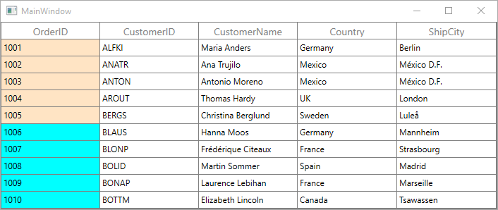
</Application.Resources>In the below code, returns the style based on OrderID value. Using Container you can format the columns data based on GridCell.
public class CustomCellStyleSelector : StyleSelector
{

    public override Style SelectStyle(object item, System.Windows.DependencyObject container)
    {
            var gridCell = container as GridCell;
            var mappingName = gridCell.ColumnBase.GridColumn.MappingName;
            var record = gridCell.DataContext;
            var cellValue = record.GetType().GetProperty(mappingName).GetValue(record);

            if (mappingName.Equals("OrderID"))
            {

                if (Convert.ToInt16(cellValue) <= 1005)
                    return App.Current.Resources["cellStyle1"] as Style;

                else
                    return App.Current.Resources["cellStyle2"] as Style;
            }
            return base.SelectStyle(item, container);
    }
}
Below code, sets the customized style selector to GridColumn.CellStyleSelector property.
<syncfusion:SfDataGrid x:Name="dataGrid"
                       ItemsSource="{Binding Orders}"
                       AutoGenerateColumns="True" >
    <syncfusion:SfDataGrid.Columns>
        <syncfusion:GridTextColumn MappingName="OrderID" CellStyleSelector="{StaticResource cellStyleSelector}"/>
    </syncfusion:SfDataGrid.Columns>
</syncfusion:SfDataGrid>
When column is auto-generated, you can style the column by handling AutoGeneratingColumn event
this.dataGrid.AutoGeneratingColumn += dataGrid_AutoGeneratingColumn;

void dataGrid_AutoGeneratingColumn(object sender, AutoGeneratingColumnArgs e)
{

    if (e.Column.MappingName == "OrderID")
    {
        e.Column.CellStyleSelector = new CustomCellStyleSelector();
    }
}
End-user interaction
Hide Column
You can hide or unhide the particular column programmatically by setting GridColumn.IsHidden property. For allowing end-user to hide or unhide column in UI refer Resizing Columns section.
Disable column
You can disable column by setting GridColumn.AllowFocus property. Therefore, that column can’t be selected or edited.
Column width, alignment and padding
Column width
The width of GridColumn can be changed by setting Width property. Column width set based on GridColumn.MinimumWidth and GridColumn.MaximumWidth properties.
NOTE
If the
GridColumn.Widthis defined explicitly takes priority thanGridColumn.ColumnSizer.
Column padding
GridColumn allows you to the change the padding of cell content by setting Padding property.
Column alignment
GridColumn allows you to change the alignment of GridCell and GridHeaderCell content using TextAlignment, VerticalAlignment and HorizontalHeaderContentAlignment properties.
GridTextColumnBase
GridTextColumnBase is the abstract class derived from GridColumn. The following columns are derived from the GridTextColumnBase.
- GridTextColumn
- GridDateTimeColumn
- GridTimeSpanColumn
- GridMaskColumn
- GridTemplateColumn
- GridMultiColumnDropDownList
GridTextColumnBase properties
-
Text decorations - You can decorate column’s data using TextDecorations property.
-
Text trimming - You can trim the column’s data using TextTrimming property.
-
Text wrapping - You can wrap the column’s data using TextWrapping property.
<syncfusion:SfDataGrid x:Name="dataGrid"
                       AutoGenerateColumns="False"
                       ItemsSource="{Binding Orders}">
    <syncfusion:SfDataGrid.Columns>
        <syncfusion:GridTextColumn  HeaderText="Customer Name"
                                    MappingName="CustomerName"
                                    TextDecorations="StrikeThrough"
                                    TextTrimming="WordEllipsis"
                                    TextWrapping="Wrap" />
    </syncfusion:SfDataGrid.Columns>
</syncfusion:SfDataGrid>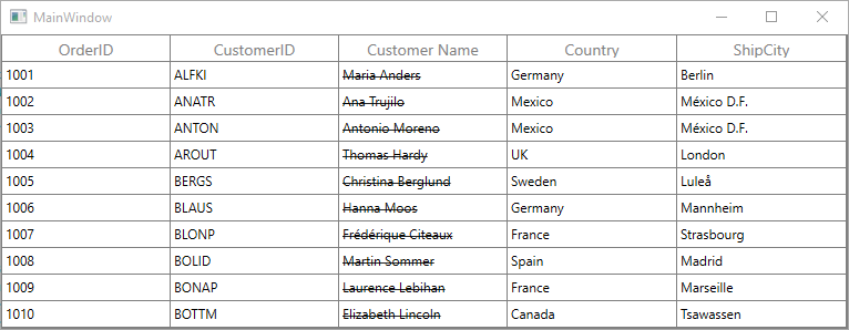
GridEditorColumn
GridEditorColumn is the abstract class derived from GridTextColumnBase. The following columns derived from GridEditorColumn class.
- GridNumericColumn
- GirdCurrencyColumn
- GridPercentColumn
Auto increment
You can allow end-user to increment or decrement the column value’s when MouseWheel or pressing up and down arrow keys by setting AllowScrollingOnCircle property to true.
Null value support
GridEditorColumn provides support to restrict or allow null value in columns based on AllowNullValue property. Instead of displaying null values, you can display hint text using NullText property or you can set the default value when null value encountered using NullValue property.
The NullText and NullValue properties won’t work, when the AllowNullValue is false.
Setting input range
You can restrict and display the input value with in the range using MinValue and MaxValue properties. You can set the constraint to validate the maximum value using MaxValidation and minimum value using MinValidation properties. Below are the two constraints that specify when to validate.
-
LostFocus- Validates input when the focus is lost. -
OnKeyPress- Validates input, when user type the value.
GridTextColumn
GridTextColumn derived from GridTextColumnBase which hosts TextBox in edit mode.
<syncfusion:SfDataGrid x:Name="dataGrid"
                       AutoGenerateColumns="False"
                       ItemsSource="{Binding Orders}">
    <syncfusion:SfDataGrid.Columns>
        <syncfusion:GridTextColumn HeaderText="Customer Name"
                                   MappingName="CustomerName" />
    </syncfusion:SfDataGrid.Columns>
</syncfusion:SfDataGrid>this.dataGrid.Columns.Add(new GridTextColumn()
{
HeaderText = "Customer Name",
MappingName = "CustomerName",
});GridNumericColumn
GridNumericColumn derived from GridEditorColumn which displays columns data as numeric. It hosts DoubleTextBox in editing mode.
<syncfusion:SfDataGrid x:Name="dataGrid"
                       AutoGenerateColumns="False"
                       ItemsSource="{Binding Orders}">
    <syncfusion:SfDataGrid.Columns>
        <syncfusion:GridNumericColumn HeaderText="Quantity" MappingName="Quantity" />
    </syncfusion:SfDataGrid.Columns>
</syncfusion:SfDataGrid>this.dataGrid.Columns.Add(new GridNumericColumn() { MappingName = "Quantity", HeaderText = "Quantity" });Data formatting
GridNumericColumn allows you to format the numeric data with culture-specific information.
-
NumberDecimalDigits - You can change the Number of decimal digits to be displayed after the decimal point using
NumberDecimalDigitsproperty. -
NumberDecimalSeparator - By default, the dot (.) operator separates the decimal part of numeric value .You can use any operator as decimal separator using
NumberDecimalSeparatorproperty. -
NumberGroupSeparator - By default, the comma (,) separates group of digits before the decimal point. You can use any operator as group separator using
NumberGroupSeparatorproperty. -
NumberGroupSizes - You can change the number of digits in each group before the decimal point on numeric values using
NumberGroupSizesproperty. -
Formatting negative pattern- You can format the pattern of negative numeric values usingNumberNegativePattern.
<syncfusion:SfDataGrid x:Name="dataGrid"
                       AutoGenerateColumns="False"
                       ItemsSource="{Binding Orders}">
    <syncfusion:SfDataGrid.Columns>
        <syncfusion:GridNumericColumn   HeaderText="Quantity"
                                        MappingName="Quantity"
                                        NumberDecimalDigits="2"
                                        NumberDecimalSeparator="."
                                        NumberGroupSeparator=","
                                        NumberGroupSizes="3"/>
    </syncfusion:SfDataGrid.Columns>
</syncfusion:SfDataGrid>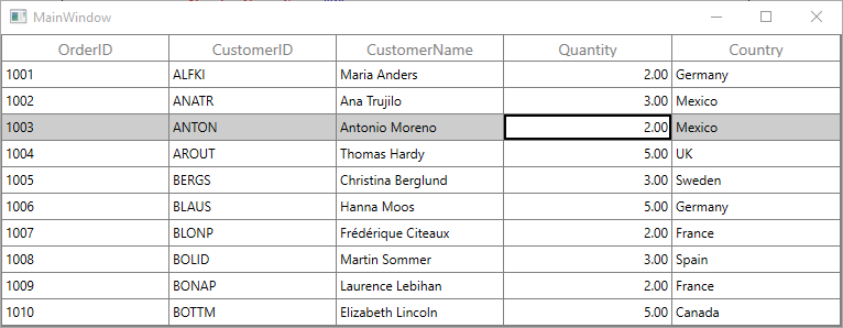
ParsingMode support
GridNumericColumn process int, double and decimal data types. By default, it treats all values as double internally and return the same. When you are binding dynamic property, we need to maintain the type which can be achieved by setting GridNumericColumn.ParsingMode property.
For example, you have dynamic object with property OrderID type int. When you edit the OrderID using GridNumericColumn, its type will be changed as double. To avoid this, you must set ParsingMode property based on the type of property you are binding to GridNumericColumn or you need to use ValueBinding converter change type according to your underlying property type.
<Syncfusion:GridNumericColumn ParsingMode="Int" MappingName="OrderID" HeaderText="OrderID"/>datagrid.Columns.Add(new GridNumericColumn() { MappingName = "OrderID", ParsingMode = ParseMode.Int });GridCurrencyColumn
GridCurrencyColumn derived from GridEditorColumn and it displays columns data as currency. It hosts CurrencyTextBox element in editing mode.
<syncfusion:SfDataGrid x:Name="dataGrid"
                       AutoGenerateColumns="False"
                       ItemsSource="{Binding Orders}">
    <syncfusion:SfDataGrid.Columns>
        <syncfusion:GridCurrencyColumn HeaderText="Unit Price" MappingName="UnitPrice" />
    </syncfusion:SfDataGrid.Columns>
</syncfusion:SfDataGrid>this.dataGrid.Columns.Add(new GridCurrencyColumn() { MappingName = "UnitPrice", HeaderText = "Unit Price" });Data formatting
GridCurrencyColumn allows you to format the parsing currency data with culture-specific information.
-
CurrencySymbol - By default, the currency symbol will be displayed based on culture. You can change the symbol using
CurrencySymbolproperty. -
CurrencyDecimalDigits - You can change the number of decimal digits to be displayed after the decimal point on currency values using
CurrencyDecimalDigitsproperty. -
CurrencyDecimalSeparator - By default, the dot (.) operator separates the decimal part of currency value .You can use any operator as decimal separator through
CurrencyDecimalSeparatorproperty. -
CurrencyGroupSeparator - By default, the comma (,) separates the group of digits before the decimal point on currency value .You can use any operator as group separator through CurrencyGroupSeparator property.
-
CurrencyGroupSizes - You can specify the number of digits in each group before the decimal point on currency value using
CurrencyGroupSizesproperty. -
Pattern- You can format the pattern for both positive and negative currency values through CurrencyPositivePattern and CurrencyNegativePattern.
<syncfusion:SfDataGrid x:Name="dataGrid"
                       AutoGenerateColumns="False"
                       ItemsSource="{Binding Orders}">
    <syncfusion:SfDataGrid.Columns>
        <syncfusion:GridCurrencyColumn  CurrencyDecimalDigits="2"
                                        CurrencyDecimalSeparator="."
                                        CurrencyGroupSeparator=","
                                        CurrencyGroupSizes="3"
                                        CurrencyPositivePattern="1"
                                        CurrencySymbol="$"
                                        HeaderText="Unit Price"
                                        MappingName="UnitPrice" />
    </syncfusion:SfDataGrid.Columns>
</syncfusion:SfDataGrid>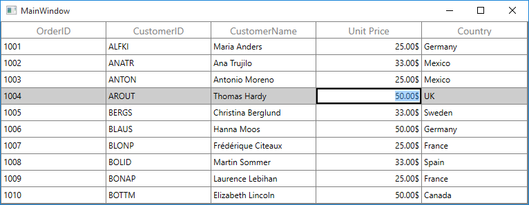
GridPercentColumn
GridPercentColumn derived from GridEditorColumn and it displays columns data as percent. It hosts PercentTextBox element in editing mode.
You can display data as percent value or double value using PercentEditMode property. PercentEditMode.PercentMode returns the value as percentage. PercentEditMode.DoubleMode returns the value as numeric.
<syncfusion:SfDataGrid x:Name="dataGrid"
                       AutoGenerateColumns="False"
                       ItemsSource="{Binding Orders}">
    <syncfusion:SfDataGrid.Columns>
        <syncfusion:GridPercentColumn HeaderText="Discount" MappingName="Discount" />
    </syncfusion:SfDataGrid.Columns>
</syncfusion:SfDataGrid>this.dataGrid.Columns.Add(new GridPercentColumn() { HeaderText = "Discount", MappingName = "Discount" });Data formatting
GridPercentColumn allows you to format the parsing percent data with culture-specific information.
-
PercentSymbol - By default, the percent operator (%) will be loaded with the value. You can change the symbol using
PercentSymbolproperty. -
PercentDecimalDigits - You can change the number of decimal digits to be displayed after the decimal point on percent value can be specified using
PercentDecimalDigitsproperty. -
PercentDecimalSeparator - By default, the dot (.) operator separates the decimal part of percent value .You can use any operator as decimal separator using
PercentDecimalSeparatorproperty. -
PercentGroupSeparator - By default, the comma (,) operator separates the group of digits left to the decimal point on currency value .You can use any operator as group separator using
PercentGroupSeparatorproperty. -
PercentGroupSizes - You can specify the number of digits in each group before the decimal point through
PercentGroupSizesproperty. -
Pattern- You can specify the pattern for both positive and negative percent values through PercentPositivePattern and PercentNegativePattern.
<syncfusion:SfDataGrid x:Name="dataGrid"
                       AutoGenerateColumns="False"
                       ItemsSource="{Binding Orders}">
    <syncfusion:SfDataGrid.Columns>
        <syncfusion:GridPercentColumn   HeaderText="Discount"
                                        MappingName="Discount"
                                        PercentDecimalDigits="2"
                                        PercentDecimalSeparator="."
                                        PercentEditMode="PercentMode"
                                        PercentGroupSeparator=","
                                        PercentGroupSizes="2"
                                        PercentPositivePattern="0" />
    </syncfusion:SfDataGrid.Columns>
</syncfusion:SfDataGrid>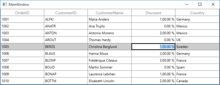
GridDateTimeColumn
GridDateTimeColumn derived from GridTextColumnBase and it displays columns data as date time. It hosts DateTimeEdit element in editing mode.
<syncfusion:SfDataGrid x:Name="dataGrid"
                       AutoGenerateColumns="False"
                       ItemsSource="{Binding Orders}">
    <syncfusion:SfDataGrid.Columns>
        <syncfusion:GridDateTimeColumn HeaderText="Order Date" MappingName="OrderDate" />
    </syncfusion:SfDataGrid.Columns>
</syncfusion:SfDataGrid>this.dataGrid.Columns.Add(new GridDateTimeColumn() { HeaderText = "Order Date", MappingName = "OrderDate" });Change the pattern of date time value
You can format the date time value using GridDateTimeColumn.Pattern property, which contains the set of predefined date time patterns,
| Pattern | Expected |
|---|---|
LongDate
|
Monday, June 15, 2016 |
LongTime
|
1:45:30 PM |
ShortDate
|
6/15/2016 |
ShortTime
|
1:45 PM |
FullDateTime
|
Monday, June 15, 2016 1:45 PM |
MonthDay
|
June 15 |
RFC1123
|
Mon, 15 Jun 2016 20:45:30 GMT |
SortableDateTime
|
2016-06-15T13:45:30 |
UniversalSortableDateTime
|
2016-06-15 13:45:30Z |
YearMonth
|
June, 2016 |
When the predefined Pattern does not meet your requirement, you can set the custom pattern using CustomPattern property.
<syncfusion:SfDataGrid x:Name="dataGrid"
                       AutoGenerateColumns="False"
                       ItemsSource="{Binding Orders}">
    <syncfusion:SfDataGrid.Columns>
        <syncfusion:GridDateTimeColumn  CustomPattern="dd-m-yyyy hh:mm:ss"
                                        HeaderText="Order Date"
                                        MappingName="OrderDate"
                                        Pattern="CustomPattern" />
    </syncfusion:SfDataGrid.Columns>
</syncfusion:SfDataGrid>
You can also change the format of standard date time pattern such as short pattern, long pattern, etc. by using GridDateTimeColumn.DateTimeFormat property.
<syncfusion:SfDataGrid x:Name="dataGrid"
                       AutoGenerateColumns="False"
                       ItemsSource="{Binding Orders}">
    <syncfusion:SfDataGrid.Columns>
        <syncfusion:GridDateTimeColumn  HeaderText="Order Date"
                                        MappingName="OrderDate"
                                        Pattern="LongDate">
            <syncfusion:GridDateTimeColumn.DateTimeFormat>
                <global:DateTimeFormatInfo LongDatePattern="dd-MM-yyyy hh:mm:ss" />
            </syncfusion:GridDateTimeColumn.DateTimeFormat>
        </syncfusion:GridDateTimeColumn>
    </syncfusion:SfDataGrid.Columns>
</syncfusion:SfDataGrid>
Auto increment
You can allow end-user to increment or decrement the value when MouseWheel or pressing up and down arrow keys by setting AllowScrollingOnCircle property to true.
Null value support
GridDateTimeColumn provides support to restrict or allow null value in columns based on AllowNullValue property. Instead of displaying null values, you can display hint text using NullText property or you can set the default value using NullValue property.
The NullText and NullValue properties won’t work, when the AllowNullValue is false.
<syncfusion:SfDataGrid x:Name="dataGrid"
                       AutoGenerateColumns="False"
                       ItemsSource="{Binding Orders}">
    <syncfusion:SfDataGrid.Columns>
        <syncfusion:GridDateTimeColumn  AllowNullValue="True"
                                        HeaderText="Order Date"
                                        MappingName="OrderDate"
                                        NullValue="07/05/2010" />
    </syncfusion:SfDataGrid.Columns>
</syncfusion:SfDataGrid>
Setting date time value range
You can restrict and display the input value within the range using MinDateTime and MaxDateTime properties.
Editing support
By default, the user can input the date time value by selecting through Calendar in dropdown. You allow users to input or delete the date time value from the key board by setting GridDateTimeColumn.CanEdit to true.
Disable date selection
You can disable the date selection on dropdown popup by setting the DisableDateSelection property to true, so dropdown calender displays months to select.
EnableBackSpaceKey and EnableDeleteKey
You can delete using backspace and delete keys by setting EnableBackSpaceKey and EnableDeleteKey properties to true.
Enable clock and calendar
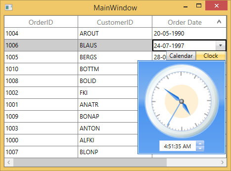
By default, the Calendar displayed in dropdown popup. You can enable both Calendar and Clock control in dropdown popup by setting the EnableClassicStyle to true.
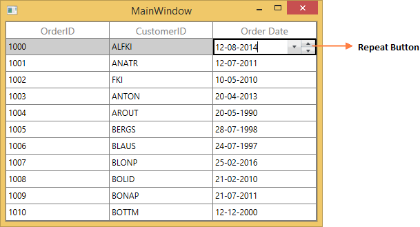
Show repeat button
You can increment or decrement the selected part of date time value by enabling the repeat button through GridDateTimeColumn.ShowRepeatButton property.
Format using Converter
GridDateTimeColumn allows you to set different cultures by setting ConverterCulture property in DisplayBinding and ValueBinding.
<Window.Resources>
    <local:CultureFormatConverter x:Key="converter"/>
</Window.Resources>

<syncfusion:SfDataGrid x:Name="dataGrid"
                       AutoGenerateColumns="False"
                       ItemsSource="{Binding Orders}">
    <syncfusion:SfDataGrid.Columns>
        <syncfusion:GridDateTimeColumn  DisplayBinding="{Binding Path=OrderDate,
                                        ConverterCulture=fr-FR,
                                        Converter={StaticResource converter}}"
                                        HeaderText="Order Date"
                                        ValueBinding="{Binding  Path=OrderDate,
                                        ConverterCulture=fr-FR}" />
    </syncfusion:SfDataGrid.Columns>
</syncfusion:SfDataGrid>
NOTE
By default, short date pattern is applied in GridDateTimeColumn.
Below code, returns the culture-specified date time value instead of default pattern.
public class CultureFormatConverter:IValueConverter
{

    public object Convert(object value, Type targetType, object parameter, System.Globalization.CultureInfo culture)
    {
        return value;
    }

    public object ConvertBack(object value, Type targetType, object parameter, System.Globalization.CultureInfo culture)
    {
        throw new NotImplementedException();
    }
}
GridCheckBoxColumn
GridCheckBoxColumn derived from GridColumn and it used display and edit Boolean type data. It hosts CheckBox element as GridCell content.
<syncfusion:SfDataGrid x:Name="dataGrid"
                       AutoGenerateColumns="False"
                       ItemsSource="{Binding Orders}">
    <syncfusion:SfDataGrid.Columns>
        <syncfusion:GridCheckBoxColumn HeaderText="Is Delivered" MappingName="IsDelivered" />
    </syncfusion:SfDataGrid.Columns>
</syncfusion:SfDataGrid>this.dataGrid.Columns.Add(new GridCheckBoxColumn() { HeaderText = "Is Delivered", MappingName = "IsDelivered" });GridCheckBoxColumn allows you to customize check box state and its alignment.
-
IsThreeState - By default, the
GridCheckBoxColumnhasCheckedandUncheckedstate. You can enable anotherIntermediatestate settingIsThreeStateproperty totrue. -
HorizontalAlignment - You can change the horizontal alignment of CheckBox using
HorizontalAlignmentproperty.
Canceling the check box state change
The checkbox state change can be canceled by setting CellCheckBoxClickEventArgs.Cancel to true in the SfDataGrid.CellCheckBoxClick event. Additionally, the checkbox value can be modified by setting CellCheckBoxClickEventArgs.NewValue within the event.
this.sfDataGrid1.CellCheckBoxClick += OnCellCheckBoxClick;

void OnCellCheckBoxClick(object sender, CellCheckBoxClickEventArgs e)
{
    if (e.RowIndex == 1)
        e.Cancel = true;
    else if (e.RowIndex == 2)
        e.NewValue = CheckState.Checked;
}
AddHandler sfDataGrid1.CellCheckBoxClick, AddressOf OnCellCheckBoxClick
Private Sub OnCellCheckBoxClick(ByVal sender As Object, ByVal e As CellCheckBoxClickEventArgs)
If e.RowIndex = 1 Then
e.Cancel = True
ElseIf e.RowIndex = 2 Then
e.NewValue = CheckState.Checked
End If
End SubGridTemplateColumn
GridTemplateColumn derived from GridTextColumnBase and it displays the template-specified cell content. You can load any WPF control in the display mode for all columns by setting CellTemplate and EditTemplate properties.
Using CellTemplate, you can format data or conditionally change the properties using DataTrigger.
<syncfusion:SfDataGrid x:Name="dataGrid"
                       AutoGenerateColumns="False"
                       ItemsSource="{Binding Orders}">
    <syncfusion:SfDataGrid.Columns>
        <syncfusion:GridTemplateColumn MappingName="CustomerID">
            <syncfusion:GridTemplateColumn.CellTemplate>
                <DataTemplate>
                    <TextBlock Text="{Binding CustomerID}" />
                </DataTemplate>
            </syncfusion:GridTemplateColumn.CellTemplate>

            <syncfusion:GridTemplateColumn.EditTemplate>
                <DataTemplate>
                    <TextBox Text="{Binding CustomerID, Mode=TwoWay}" />
                </DataTemplate>
            </syncfusion:GridTemplateColumn.EditTemplate>
        </syncfusion:GridTemplateColumn>
    </syncfusion:SfDataGrid.Columns>
</syncfusion:SfDataGrid>
//CellTemplate creation.
DataTemplate cellTemplate = new DataTemplate();
FrameworkElementFactory frameworkElement1 = new FrameworkElementFactory(typeof(TextBlock));
Binding displayBinding = new Binding() { Path = new PropertyPath("CustomerID") };
frameworkElement1.SetValue(TextBlock.TextProperty, displayBinding);
cellTemplate.VisualTree = frameworkElement1;
//EditTemplate creation.
DataTemplate editTemplate = new DataTemplate();
FrameworkElementFactory frameworkElement2 = new FrameworkElementFactory(typeof(TextBox));
Binding editBinding = new Binding() { Path = new PropertyPath("CustomerID"), Mode = BindingMode.TwoWay };
frameworkElement2.SetValue(TextBox.TextProperty, editBinding);
editTemplate.VisualTree = frameworkElement2;
this.dataGrid.Columns.Add(new GridTemplateColumn() { HeaderText = "Customer ID", MappingName = "CustomerID", CellTemplate = cellTemplate, EditTemplate = editTemplate, SetCellBoundValue = false });Mouse interaction for UIElement loaded inside template
You can allow UIElement loaded inside CellTemplate or EditTemplate to handle mouse interaction in required cases by setting VisualContainer.WantsMouseInput attached property to the particular UIElement inside template.
<syncfusion:SfDataGrid x:Name="dataGrid"
                       AutoGenerateColumns="False"
                       ItemsSource="{Binding Orders}">
    <syncfusion:SfDataGrid.Columns>
        <syncfusion:GridTemplateColumn MappingName="ProductName">
            <syncfusion:GridTemplateColumn.CellTemplate>
                <DataTemplate>
                    <ComboBox ItemsSource="{Binding ComboItems, Source={StaticResource viewModel}}" syncfusion:VisualContainer.WantsMouseInput="True" />
                </DataTemplate>
            </syncfusion:GridTemplateColumn.CellTemplate>
        </syncfusion:GridTemplateColumn>
    </syncfusion:SfDataGrid.Columns>
</syncfusion:SfDataGrid>
Keyboard interaction for UIElement loaded inside CellTemplate
You can allow UIElement loaded inside CellTemplate to handle keyboard interaction by setting FocusManagerHelper.WantsKeyInput attached property to GridColumn. You can use this when loading edit element in CellTemplate.
In this case SfDataGrid handles the below key operations and other keys are handled by UIElement loaded inside CellTemplate.
- Tab
- Enter
- PageUp
- PageDown
<syncfusion:SfDataGrid x:Name="dataGrid"
                       AutoGenerateColumns="False"
                       ItemsSource="{Binding Orders}">
    <syncfusion:SfDataGrid.Columns>
        <syncfusion:GridTemplateColumn MappingName="CustomerName" syncfusion:FocusManagerHelper.WantsKeyInput="True">
            <syncfusion:GridTemplateColumn.CellTemplate>
                <TextBox Text="{Binding Country}" />
            </syncfusion:GridTemplateColumn.CellTemplate>
        </syncfusion:GridTemplateColumn>
    </syncfusion:SfDataGrid.Columns>
</syncfusion:SfDataGrid>
Setting focus to particular element inside Template when cell gets activated or edited
You can allow logical focus to specific UIElement loaded inside EditTemplate or CellTemplate by setting FocusManagerHelper.FocusedElement attached property. You can use this property to start editing the template column value as like normal column when the user gets into edit mode.
<syncfusion:SfDataGrid x:Name="dataGrid"
                       AutoGenerateColumns="False"
                       ItemsSource="{Binding Orders}">
    <syncfusion:SfDataGrid.Columns>
        <syncfusion:GridTemplateColumn MappingName="CustomerName">
            <syncfusion:GridTemplateColumn.CellTemplate>
                <DataTemplate>
                    <Grid>
                        <TextBlock Text="{Binding CustomerName}" />
                    </Grid>
                </DataTemplate>
            </syncfusion:GridTemplateColumn.CellTemplate>
            <syncfusion:GridTemplateColumn.EditTemplate>
                <DataTemplate>
                    <Grid>
                        <TextBox Text="{Binding CustomerName}" syncfusion:FocusManagerHelper.FocusedElement="True" />
                    </Grid>
                </DataTemplate>
            </syncfusion:GridTemplateColumn.EditTemplate>
        </syncfusion:GridTemplateColumn>
    </syncfusion:SfDataGrid.Columns>
</syncfusion:SfDataGrid>
Binding CellTemplate and EditTemplate based on MappingName
By default, underlying record is DataContext for CellTemplate. So you have to define, template for each column to display values based on MappingName.
You can use the same DataTemplate for all columns to display value based on MappingName by setting SetCellBoundValue property to true. Setting SetCellBoundValue to true, changes the DataContext for CellTemplate to DataContextHelper which has the following members,
-
Value- Return the value base onMappingName. -
Record- Returns the underlying data object.
NOTE
EditTemplate support available only for GridTemplateColumn.
<syncfusion:SfDataGrid x:Name="dataGrid"
                       AutoGenerateColumns="False"
                       ItemsSource="{Binding Orders}">
    <syncfusion:SfDataGrid.Columns>
        <syncfusion:GridTemplateColumn MappingName="OrderID" SetCellBoundValue="True">
            <syncfusion:GridTemplateColumn.CellTemplate>
                <DataTemplate>
                    <Grid>
                        <TextBlock Text="{Binding Value}" />
                    </Grid>
                </DataTemplate>
            </syncfusion:GridTemplateColumn.CellTemplate>
            <syncfusion:GridTemplateColumn.EditTemplate>
                <DataTemplate>
                    <Grid>
                        <TextBox Text="{Binding Value}" />
                    </Grid>
                </DataTemplate>
            </syncfusion:GridTemplateColumn.EditTemplate>
        </syncfusion:GridTemplateColumn>
    </syncfusion:SfDataGrid.Columns>
</syncfusion:SfDataGrid>
Sets EditTemplate based on custom logic
GridTemplateColumn provides support to load different edit elements based on underlying data object using GridTemplateColumn.EditTemplateSelector property.
Below code returns the DefaultTemplate and AlternateTemplate based on OrderID’s value.
public class CustomEditTemplateSelector:DataTemplateSelector
{
    public override System.Windows.DataTemplate SelectTemplate(object item, System.Windows.DependencyObject container)
    {

        if (item == null)
            return null ;
        var data = item as OrderInfo;

        if (data.OrderID % 2 == 0)
            return App.Current.Resources["AlternateTemplate"] as DataTemplate;

        else
            return App.Current.Resources["DefaultTemplate"] as DataTemplate;
    }
}
In the below code, custom template selector set to GridTemplateColumn.EditTemplateSelector.
<syncfusion:SfDataGrid x:Name="dataGrid"
                       AutoGenerateColumns="False"
                       ItemsSource="{Binding Orders}">
    <syncfusion:SfDataGrid.Columns>
        <syncfusion:GridTemplateColumn MappingName="OrderID"
                                       CellTemplateSelector="{StaticResource cellTemplateSelector}"
                                       EditTemplateSelector="{StaticResource editTemplateSelector}"/>
    </syncfusion:SfDataGrid.Columns>
</syncfusion:SfDataGrid>
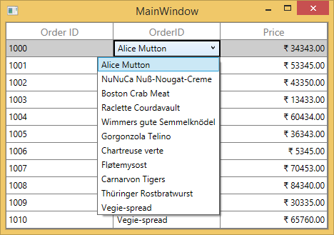
GridComboBoxColumn
GridComboBoxColumn derived from GridColumn which hosts ComboBox as edit element.You can enable editing in ComboBox by setting IsEditable property to true. The data source to ComboBox can be set by using GridComboBoxColumn.ItemsSource property.
By default, GridComboBoxColumn displays the value using MappingName property. You can set DisplayMemberPath which denotes the path to a value on the source object(GridComboBoxColumn.ItemsSource) to serve as visual representation of object. You can set SelectedValuePath which denotes the path to get the SelectedValue from the SelectedItem.
<Window.Resources>
    <local:ViewModel x:key="viewModel"/>
</Window.Resources>

<syncfusion:SfDataGrid x:Name="dataGrid"
                       AutoGenerateColumns="False"
                       ItemsSource="{Binding Orders}">
    <syncfusion:SfDataGrid.Columns>
        <syncfusion:GridComboBoxColumn  HeaderText="Product Name"
                                        ItemsSource="{Binding ComboItems,
                                        Source={StaticResource viewModel}}"
                                        MappingName="ProductName" />
    </syncfusion:SfDataGrid.Columns>
</syncfusion:SfDataGrid>this.dataGrid.Columns.Add(new GridComboBoxColumn() { HeaderText = "Product Name", MappingName = "ProductName", ItemsSource = viewModel.ComboItems });SfDataGrid triggers, CurrentCellDropDownSelectionChanged event, when the SelectedValue is changed.CurrentCellDropDownSelectionChangedEventArgs of CurrentCellDropDownSelectionChanged event provides the information about the changed cell value.
SelectedIndex property returns the index of selected item.
SelectedItem property returns the selected item from drop down list.
Keep the dropdown to be opened
You can keep the drop-down control open when start editing on the text box of ComboBox also by setting StaysOpenOnEdit property to true.
Improving dropdown opening time
You can improve the drop-down opening time on loading by setting VirtualizingStackPanel as ItemsPanelTemplate of ComboBox, when the large number of items loaded in it.
<Window.Resources>
    <Style TargetType="ComboBox">
        <Setter Property="ItemsPanel">
            <Setter.Value>
                <ItemsPanelTemplate>
                    <VirtualizingStackPanel />
                </ItemsPanelTemplate>
            </Setter.Value>
        </Setter>
    </Style>
</Window.Resources>
Opening dropdown popup in single-click
You can open the drop down within single click by setting ComboBox.IsDropDownOpen property to true in OnEditElementLoaded method by overriding existing renderer.
Below code, creates GridCellComboBoxRendererExt to set IsDropDownOpen property. Replace the default renderer with created renderer in SfDataGrid.CellRenderers collection.
this.dataGrid.CellRenderers.Remove("ComboBox");
this.dataGrid.CellRenderers.Add("ComboBox", new GridCellComboBoxRendererExt());

public class GridCellComboBoxRendererExt:GridCellComboBoxRenderer
{

    protected override void OnEditElementLoaded(object sender, System.Windows.RoutedEventArgs e)
    {
        base.OnEditElementLoaded(sender, e);
        var combobox = sender as ComboBox;
        combobox.IsDropDownOpen = true;
    }
}
NOTE
This is applicable when the SfDataGrid.EditTrigger is set as
OnTap.
Customizing GroupCaptionText based on DisplayMemberPath
By default, the GroupCaptionText will be displayed based on MappingName. You can display the GroupCaptionText based on DisplayMemberPath using GroupColumnDescription.Converter property.
<syncfusion:SfDataGrid x:Name="dataGrid"
                       AutoGenerateColumns="False"
                       ItemsSource="{Binding Orders}">
    <syncfusion:SfDataGrid.Columns>
        <syncfusion:GridComboBoxColumn  DisplayMemberPath="OrderID"
                                        HeaderText="Order ID"
                                        IsEditable="True"
                                        ItemsSource="{Binding ComboItems}"
                                        MappingName="ProductName"
                                        SelectedValuePath="ProductName" />
    </syncfusion:SfDataGrid.Columns>
</syncfusion:SfDataGrid>
Below code returns the group caption based on GridComboBoxColumn.ItemsSource.
public class GroupCaptionConverter:IValueConverter
{

    public object Convert(object value, Type targetType, object parameter, System.Globalization.CultureInfo culture)
    {

        if (!(parameter is GridComboBoxColumn))
            return value;
        var column = parameter as GridComboBoxColumn;
        var record = value as OrderInfo;

        foreach (var item in column.ItemsSource)
        {

            if (record.ProductName == (item as OrderDetails).ProductName)
                return (item as OrderDetails).OrderID;
        }
        return null;
    }

    public object ConvertBack(object value, Type targetType, object parameter, System.Globalization.CultureInfo culture)
    {
        throw new NotImplementedException();
    }
}
In the below code snippet, GroupCaptionConverter set to GroupColumnDescription.Converter while grouping.
this.dataGrid.GroupColumnDescriptions.CollectionChanged += GroupColumnDescriptions_CollectionChanged;

void GroupColumnDescriptions_CollectionChanged(object sender, System.Collections.Specialized.NotifyCollectionChangedEventArgs e)
{

    if (e.Action == NotifyCollectionChangedAction.Add)
    {
        var groupDescription = e.NewItems[0] as GroupColumnDescription;

        if (groupDescription.ColumnName == "ProductName")
            groupDescription.Converter = new GroupCaptionConverter();
    }
}
Loading Different ItemSource for each row of GridComboBoxColumn
You can load the different ItemsSource to each row of GridComboBoxColumn by setting SfDataGrid.ItemsSourceSelector property.
Implementing IItemsSourceSelector
ItemsSourceSelector needs to implement IItemsSourceSelector interface which requires you to implement GetItemsSource method which receives the below parameters,
- Record – data object associated with row.
- Data Context – Data context of data grid.
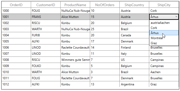
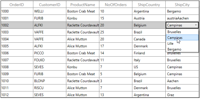
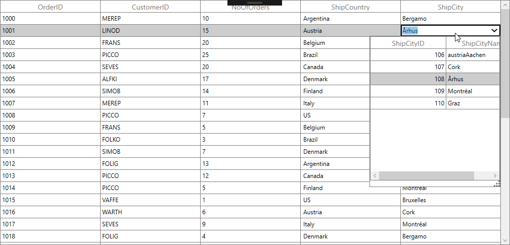
In the below code, ItemsSource for ShipCity column returned based on ShipCountry column value using the record and data context of data grid passed to GetItemsSource method.
<Window.Resources>
    <local:ItemsSourceSelector x:Key="itemSourceSelector" />
</Window.Resources>

<syncfusion:SfDataGrid x:Name="sfdatagrid"
                        AllowEditing="True"
                        AutoGenerateColumns="False"
                        ItemsSource="{Binding OrderDetails}"
                        ColumnSizer="Star">
    <interactivity:Interaction.Behaviors>
        <local:ItemsSourceSelectorBehavior />
    </interactivity:Interaction.Behaviors>
    <syncfusion:SfDataGrid.Columns>
        <syncfusion:GridComboBoxColumn MappingName="ShipCountry"  ItemsSource="{Binding Path=DataContext.CountryList, ElementName=sfdatagrid}"/>
        <syncfusion:GridComboBoxColumn  HeaderText="ShipCity" DisplayMemberPath="ShipCityName"
                                ItemsSourceSelector="{StaticResource itemSourceSelector}"
                                MappingName="ShipCityID" SelectedValuePath="ShipCityID"/>
    </syncfusion:SfDataGrid.Columns>
</syncfusion:SfDataGrid>
/// <summary>
/// Implementation class for ItemsSourceSelector interface
/// </summary>
public class ItemsSourceSelector : IItemsSourceSelector
{
public IEnumerable GetItemsSource(object record, object dataContext)
{
if (record == null)
return null;
var orderinfo = record as OrderDetails;
var countryName = orderinfo.ShipCountry;
var viewModel = dataContext as ViewModel;
//Returns ShipCity collection based on ShipCountry.
if (viewModel.ShipCities.ContainsKey(countryName))
{
ObservableCollection<ShipCityDetails> shipCities = null;
viewModel.ShipCities.TryGetValue(countryName, out shipCities);
return shipCities.ToList();
}
return null;
}
}The following screenshot illustrates the different ShipCity ItemsSource bound to each row of the ComboBox based on the Country Name.
You can download the sample from here.
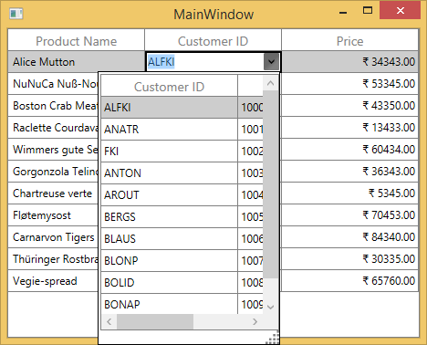
GridMultiColumnDropDownList
GridMultiColumnDropDownList derived from GridTextColumnBase and it displays enumeration as cell contents. It hosts SfMultiDropDownControl in editing mode. GridMultiColumnDropDownList allows you to define the predefined columns in its drop-down like SfDataGrid.
You can change the value by selecting the item from drop down or you can edit the SfMultiColumnDropDownControl.Editor. You can disable the editing by setting IsTextReadOnly.
<syncfusion:SfDataGrid x:Name="dataGrid"
                       AutoGenerateColumns="False"
                       ItemsSource="{Binding Orders}">
    <syncfusion:SfDataGrid.Columns>
        <syncfusion:GridMultiColumnDropDownList AutoGenerateColumns="False"
                                                DisplayMember="CustomerID"
                                                HeaderText="Customer ID"
                                                ItemsSource="{Binding Orders}"
                                                MappingName="OrderID"
                                                ValueMember="OrderID">
            <syncfusion:GridMultiColumnDropDownList.Columns>
                <syncfusion:Columns>
                    <syncfusion:GridTextColumn HeaderText="Customer ID" MappingName="CustomerID" />
                    <syncfusion:GridTextColumn HeaderText="Order ID" MappingName="OrderID" />
                </syncfusion:Columns>
            </syncfusion:GridMultiColumnDropDownList.Columns>
        </syncfusion:GridMultiColumnDropDownList>
    </syncfusion:SfDataGrid.Columns>
</syncfusion:SfDataGrid>
Columns columns = new Columns();
columns.Add(new GridTextColumn() { HeaderText = "Order ID", MappingName = "OrderID" });
columns.Add(new GridTextColumn() { HeaderText = "Customer ID", MappingName = "CustomerID" });
this.dataGrid.Columns.Add(new GridMultiColumnDropDownList() { ItemsSource = viewModel.Orders, MappingName = "OrderID", HeaderText = "Customer ID", DisplayMember = "CustomerID", ValueMember = "OrderID", AutoGenerateColumns = false, Columns = columns });SfDataGrid triggers, CurrentCellDropDownSelectionChanged event, when the SelectedValue is changed.CurrentCellDropDownSelectionChangedEventArgs of CurrentCellDropDownSelectionChanged event provides the information about the changed cell value.
SelectedIndex property returns the index of selected item.
SelectedItem property returns the selected item from drop down list.
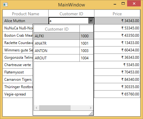
Auto-complete support
You can allow SfMultiDropDownControl to complete the entered input value automatically by setting the AllowAutoComplete property to true. AllowAutoComplete property will autocomplete the input value by comparing it to each item of the underlying data source of GridMultiColumnDropDownList and returns the matched value by DisplayMember.
Filtering
You can allow SfMultiDropDownControl to filter the drop-down list items dynamically based on the text typed on editor by setting AllowIncrementalFiltering property to true. GridMultiColumnDropDownList allows you to filter the items based on case by setting AllowCasingforFilter to true. This will help users to select from large number of items.
Auto increment
You can increment or decrement the value via the Mouse-Wheel or up and down key by setting AllowSpinOnMouseWheel to true.
Null value support
You can allow the null values by setting the AllowNullInput property to true.
NOTE
The AllowNullInput will work only when the underlying property type is Nullable.
Popup customization
Size
You can allow change the size of drop-down popup by setting PopUpWidth and PopUpHeight property. The PopUpWidth will be set based on PopUpMinWidth and PopUpMaxWidth properties when the value is not between them. By default, the PopUpMinWidth value is 200.0.
Similarly, the PopUpHeight based on PopUpMinHeight and PopUpMaxHeight when the value is not between them. The default value of PopUpMinHeight is 300.0.
SfMultiDropDownControl can automatically adjust the popup width based on the actual size of SfDataGrid when setting IsAutoPopupSize to true.
Resizing drop-down popup
You can allow end-user to resize the drop-down popup by showing resizing thumb by setting ShowResizeThumb property to Visible.
Keep popup open on editing
You can open the drop-down popup, when the user start editing on text editor using AllowImmediatePopup property to true in OnEditElementLoaded method by overriding existing renderer.
Below code, creates GridCellMultiColumnDropDownRendererExt to set AllowImmediatePopup property. Replace the default renderer with created renderer in SfDataGrid.CellRenderers collection.
this.dataGrid.CellRenderers.Remove("MultiColumnDropDown");
this.dataGrid.CellRenderers.Add("MultiColumnDropDown", new GridCellMultiColumnDropDownRendererExt());

public class GridCellMultiColumnDropDownRendererExt : GridCellMultiColumnDropDownRenderer
{

    protected override void OnEditElementLoaded(object sender, System.Windows.RoutedEventArgs e)
    {
        (sender as SfMultiColumnDropDownControl).AllowImmediatePopup = true;
        (sender as SfMultiColumnDropDownControl).Text = PreviewInputText;
        base.OnEditElementLoaded(sender, e);
    }
}
Loading different ItemsSource for each row
You can load different ItemsSource to each row of GridMultiColumnDropDownList by setting the SfDataGrid.ItemsSourceSelector property.
Implementing IItemsSourceSelector
ItemsSourceSelector needs to implement the IItemsSourceSelector interface, which is required to implement the GetItemsSource method. The GetItemsSource method receives the following parameters:
- Record – Data object associated with row.
- Data Context – Data context of data grid.
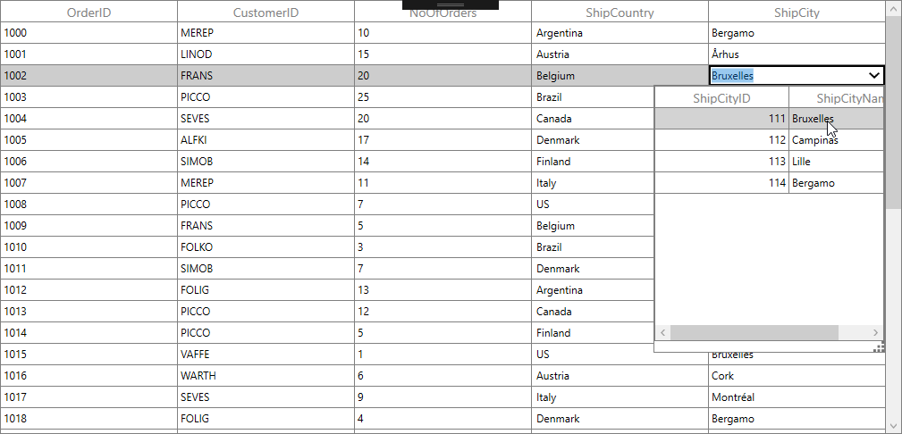
In the following code, ItemsSource for ShipCity column is returned based on ShipCountry column value using the record and data context of data grid passed to the GetItemsSource method.
<Window.Resources>
        <local:ItemsSourceSelector x:Key="itemSourceSelector" />
</Window.Resources>
<syncfusion:SfDataGrid x:Name="sfdatagrid"
                         AllowEditing="True"
                         AutoGenerateColumns="False"
                         AllowFiltering="False"
                         ItemsSource="{Binding OrderDetails}"
                         ColumnSizer="Star">
    <syncfusion:SfDataGrid.Columns>
        <syncfusion:GridTextColumn MappingName="OrderID" />
        <syncfusion:GridTextColumn MappingName="CustomerID" />
        <syncfusion:GridTextColumn MappingName="NoOfOrders" />
        <syncfusion:GridComboBoxColumn MappingName="ShipCountry" ItemsSource="{Binding Path=DataContext.CountryList, ElementName=sfdatagrid}"/>
        <syncfusion:GridMultiColumnDropDownList AllowEditing="True"	 HeaderText="ShipCity" DisplayMember="ShipCityName"
                        ItemsSourceSelector="{StaticResource itemSourceSelector}"
                        MappingName="ShipCityID" ValueMember="ShipCityID"/>
    </syncfusion:SfDataGrid.Columns>
 </syncfusion:SfDataGrid>
/// <summary>
/// Implementation class for ItemsSourceSelector interface
/// </summary>
public class ItemsSourceSelector : IItemsSourceSelector
{
public IEnumerable GetItemsSource(object record, object dataContext)
{
if (record == null)
return null;
var orderinfo = record as OrderDetails;
var countryName = orderinfo.ShipCountry;
var viewModel = dataContext as ViewModel;
//Returns ShipCity collection based on ShipCountry.
if (viewModel.ShipCities.ContainsKey(countryName))
{
ObservableCollection<ShipCityDetails> shipCities = null;
viewModel.ShipCities.TryGetValue(countryName, out shipCities);
return shipCities.ToList();
}
return null;
}
}The following screenshot illustrates different ShipCity ItemsSource bound to each row of the MultiColumnDropDownList based on country name.
You can download the sample from the following link: Sample.
GridHyperlinkColumn
GridHyperlinkColumn derived from GridTextColumn and it displays columns data as HyperLinkControl. It hosts TextBlock element as GridCell content.
<syncfusion:SfDataGrid x:Name="dataGrid"
                       AutoGenerateColumns="False"
                       ItemsSource="{Binding Orders}">
    <syncfusion:SfDataGrid.Columns>
        <syncfusion:GridHyperlinkColumn HeaderText="Country Link" MappingName="Country" />
    </syncfusion:SfDataGrid.Columns>
</syncfusion:SfDataGrid>this.dataGrid.Columns.Add(new GridHyperlinkColumn() { HeaderText = "Country Link", MappingName = "Country" });You can allow end-user to navigate the Uri when the cell value contains valid Uri address or using CurrentCellRequestNavigate event. The CurrentCellRequestNavigate occurs when the current cell in GridHyperlinkColumn is clicked for navigation.
CurrentCellRequestNavigateEventArgs of CurrentCellRequestNavigate event provide information about the hyperlink triggered this event. CurrentCellRequestNavigateEventArgs.NavigateText returns the value using ValueBinding or MappingName to navigate.
this.dataGrid.CurrentCellRequestNavigate += dataGrid_CurrentCellRequestNavigate;

void dataGrid_CurrentCellRequestNavigate(object sender, CurrentCellRequestNavigateEventArgs args)
{
    string address = "https://en.wikipedia.org/wiki/" + args.NavigateText;
    Process.Start(new ProcessStartInfo(address));
}
Cancel the navigation
You can cancel the navigation by setting CurrentCellRequestNavigateEventArgs.Handled to true.
this.dataGrid.CurrentCellRequestNavigate += dataGrid_CurrentCellRequestNavigate;

void dataGrid_CurrentCellRequestNavigate(object sender, CurrentCellRequestNavigateEventArgs args)
{
    args.Handled = true;
}
Customize HyperLink
Change the alignment
You can change the horizontal alignment of GridHyperlinkColumn using HorizontalAlignment property.
Change the foreground color
You can change the foreground color of GridHyperlinkColumn by writing the style with target type Hyperlink.
<syncfusion:SfDataGrid x:Name="dataGrid"
                       AllowEditing="True"
                       AutoGenerateColumns="False"
                       ItemsSource="{Binding Orders}">
    <syncfusion:SfDataGrid.Columns>
                <syncfusion:GridHyperlinkColumn MappingName="HyperLink">
                    <syncfusion:GridHyperlinkColumn.CellStyle>
                        <Style>
                            <Style.Resources>
                                <Style TargetType="Hyperlink">
                                    <Setter Property="Foreground" Value="Purple" />
                                </Style>
                            </Style.Resources>
                        </Style>
                    </syncfusion:GridHyperlinkColumn.CellStyle>
                </syncfusion:GridHyperlinkColumn>
    </syncfusion:SfDataGrid.Columns>
</syncfusion:SfDataGrid>
GridImageColumn
GridImageColumn derived from GridColumn and it displays columns data as Image. It hosts Image element as GridCell content.
public class OrderInfo
{
    private BitmapImage _imageLink;

    public BitmapImage ImageLink
    {
        get {  return _imageLink;}
        set { _imageLink = value;    }
    }

    public OrderInfo(int orderId, string customerName, string country, string
        customerId, string shipCity)
    {
        ImageLink = new System.Windows.Media.Imaging.BitmapImage(new Uri(string.Format(@"..\..\Images\{0}", this.Country + ".jpg"), UriKind.Relative));
    }
}
In the below code GridImageColumn defined with ImageLink property using MappingName
<syncfusion:SfDataGrid x:Name="dataGrid"
                       AutoGenerateColumns="False"
                       ItemsSource="{Binding Orders}">
    <syncfusion:SfDataGrid.Columns>
        <syncfusion:GridImageColumn MappingName="ImageLink"
                                    HeaderText="Image"
                                    Stretch="Uniform"
                                    TextAlignment="Center" />
    </syncfusion:SfDataGrid.Columns>
</syncfusion:SfDataGrid>
Read image from path using ValueBinding
You can use converter to read image from resource by setting Converter in ValueBinding definition.
Below code, returns the Image URI using ValueBinding property.
public class StringToImageConverter:IValueConverter
{

    public object Convert(object value, Type targetType, object parameter, System.Globalization.CultureInfo culture)
    {
        string imageName = value as string+".jpg";
        return new BitmapImage(new Uri(string.Format(@"..\..\Images\{0}", imageName), UriKind.Relative));
    }

    public object ConvertBack(object value, Type targetType, object parameter, System.Globalization.CultureInfo culture)
    {
        return null;
    }
}<syncfusion:SfDataGrid x:Name="dataGrid"
AutoGenerateColumns="False"
ItemsSource="{Binding Orders}">
<syncfusion:SfDataGrid.Columns>
<syncfusion:GridImageColumn MappingName="Country"
HeaderText="Image"
Stretch="Uniform"
TextAlignment="Center"
ValueBinding="{Binding Path=Country,
Converter={StaticResource ImageConverter}}" />
</syncfusion:SfDataGrid.Columns>
</syncfusion:SfDataGrid>this.dataGrid.Columns.Add(new GridImageColumn() { HeaderText = "Image", MappingName = "Country", ValueBinding = new Binding() { Path = new PropertyPath("Country"), Converter = new StringToImageConverter() }, TextAlignment = TextAlignment.Center, Stretch = Stretch.Uniform });Customize Image
GridImageColumn allows you to customize the image with below properties.
-
Width and Height- You can change the height and width of the image using GridImageColumn.ImageHeight and GridImageColumn.ImageWidth properties. -
Stretch - The image can be stretch by setting
Stretchproperty. -
Scale - You can
scalethe image using StretchDirection property.
GridMaskColumn
GridMaskColumn derived from GridTextColumnBase and it displays columns data with specified mask pattern. It hosts MaskedTextBox element in editing mode.
You can set the input mask at runtime by setting GridMaskColumn.Mask property.
For example,
In the below code snippet, Mask applied to format and validate the user input to get five digit numeric value for phone number.
<syncfusion:SfDataGrid x:Name="dataGrid"
                       AutoGenerateColumns="False"
                       ItemsSource="{Binding Orders}">
    <syncfusion:SfDataGrid.Columns>
        <syncfusion:GridMaskColumn  HeaderText="Contact Number"
                                    MappingName="ContactNumber"
                                    Mask="(99)999" />
    </syncfusion:SfDataGrid.Columns>
</syncfusion:SfDataGrid>this.dataGrid.Columns.Add(new GridMaskColumn() { HeaderText = "Contact Number", MappingName = "ContactNumber", Mask = "(99)999" });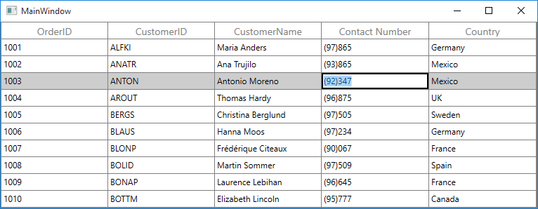
Mask for numeric value not exceeds two digits to the left of the decimal point.
In the below code snippet, Mask applied to format and validate the user input to enter one digit double value.
<syncfusion:SfDataGrid x:Name="dataGrid"
                       AutoGenerateColumns="False"
                       ItemsSource="{Binding Orders}">
    <syncfusion:SfDataGrid.Columns>
        <syncfusion:GridMaskColumn MappingName="UnitPrice" Mask="#.0" />
    </syncfusion:SfDataGrid.Columns>
</syncfusion:SfDataGrid>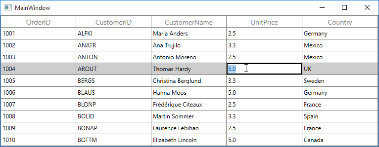
Specifying prompt character
By default, an underscore (_) is displayed when the user input is absent. This can be changed by setting GridMaskColumn.PromptChar property.
<syncfusion:SfDataGrid x:Name="dataGrid"
                       AutoGenerateColumns="False"
                       ItemsSource="{Binding Orders}">
    <syncfusion:SfDataGrid.Columns>
        <syncfusion:GridMaskColumn  MappingName="OrderID"
                                    Mask="#####"
                                    PromptChar="^" />
    </syncfusion:SfDataGrid.Columns>
</syncfusion:SfDataGrid>
Setting mask format
You can decide whether the value contains the literals and prompt characters in it through GridMaskColumn.MaskFormat property.
The GridMaskColumn.MaskFormat property has the following format.
ExcludePromptAndLiteralsIncludePromptIncludeLiteralsIncludePromptAndLiterals
GridTimeSpanColumn
GridTimeSpanColumn derived from GridTextColumnBase and it displays columns data as time span. It hosts TimeSpanEdit element in editing mode.
<syncfusion:SfDataGrid x:Name="dataGrid"
                       AutoGenerateColumns="False"
                       ItemsSource="{Binding Orders}">
    <syncfusion:SfDataGrid.Columns>
        <syncfusion:GridTimeSpanColumn HeaderText="Delivery Time"
                                       MappingName="DeliveryTime" />
    </syncfusion:SfDataGrid.Columns>
</syncfusion:SfDataGrid>this.dataGrid.Columns.Add(new GridTimeSpanColumn() { HeaderText = "DeliveryTime", MappingName = "DeliveryTime" });Auto increment
You can allow end-user to increment or decrement the column value’s when MouseWheel or pressing up arrow keys by setting AllowScrollingOnCircle property to true. You can also use ArrowButtons to change the value by setting ShowArrowButtons to true.
Null value support
GridTimeSpanColumn provides support to restrict or allow null value in columns based on AllowNull property. Instead of displaying null values, you can display hint text using NullText property.
The NullText properties won’t work, when the AllowNull is false.
Setting input value range
You can restrict and display the input value with in the range using MinValue and MaxValue properties.
Data formatting
You can format the time span values by setting Format property.
<syncfusion:SfDataGrid x:Name="dataGrid"
                       AutoGenerateColumns="False"
                       ItemsSource="{Binding Orders}">
    <syncfusion:SfDataGrid.Columns>
        <syncfusion:GridTimeSpanColumn  Format="d 'days' h'hours'"
                                        HeaderText="Delivery Time"
                                        MappingName="DeliveryTime" />
    </syncfusion:SfDataGrid.Columns>
</syncfusion:SfDataGrid>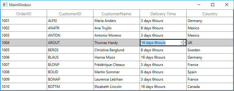
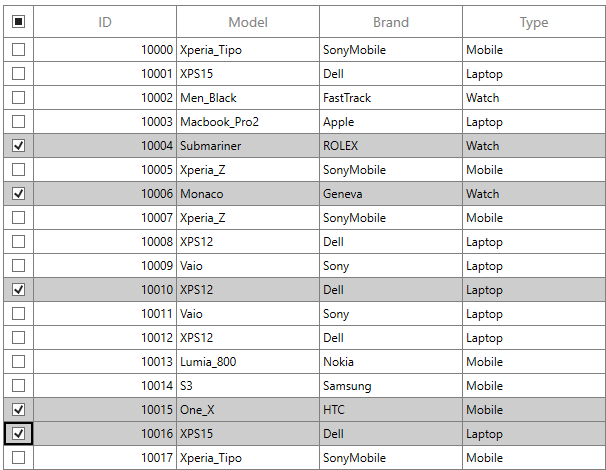
GridCheckBoxSelectorColumn
SfDataGrid allows you to select or deselect individual rows through CheckBox using GridCheckBoxSelectorColumn, which is not bound with data object from underlying data source, and it can be added like normal columns. The selector column supports row selection alone, and selection in selector column works based on the SelectionMode.
<syncfusion:SfDataGrid x:Name="dataGrid"
                       AutoGenerateColumns="False"
                       ItemsSource="{Binding Orders}">
      <syncfusion:SfDataGrid.Columns>
            <syncfusion:GridCheckBoxSelectorColumn MappingName="SelectorColumn"
                                                   Width="30"/>
      </syncfusion:SfDataGrid.Columns>
</syncfusion:SfDataGrid>this.dataGrid.Columns.Add(new GridCheckBoxSelectorColumn()
{
MappingName = "SelectorColumn",
Width = 30
});By default, check box is displayed in the header of selector column, which is used to select or deselect all the rows in the datagrid.
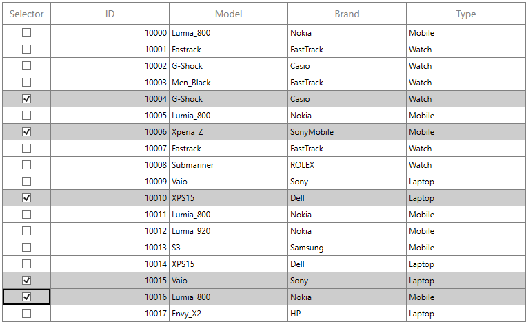
Text on column header
You can display text instead of check box in header of selector column by setting the AllowCheckBoxOnHeader property to False.
<syncfusion:SfDataGrid x:Name="dataGrid"
                       AutoGenerateColumns="False"
                       ItemsSource="{Binding Orders}">
      <syncfusion:SfDataGrid.Columns>
            <syncfusion:GridCheckBoxSelectorColumn MappingName="SelectorColumn"
                                                   AllowCheckBoxOnHeader="False"
                                                   HeaderText="Selector"
                                                   Width="70"/>
      </syncfusion:SfDataGrid.Columns>
</syncfusion:SfDataGrid>this.dataGrid.Columns.Add(new GridCheckBoxSelectorColumn()
{
HeaderText = "Selector",
MappingName = "SelectorColumn",
AllowCheckBoxOnHeader = false ,
Width = 70
});
Styling selector column
The style of checkbox in record cells can be customized using the CellStyle property.
<syncfusion:SfDataGrid x:Name="dataGrid"
                       AutoGenerateColumns="False"
                       ItemsSource="{Binding Orders}">
      <syncfusion:SfDataGrid.Columns>
            <syncfusion:GridCheckBoxSelectorColumn MappingName="SelectorColumn"
                                                   Width="30">
                    <syncfusion:GridCheckBoxSelectorColumn.CellStyle>
                        <Style TargetType="syncfusion:GridCell">
                            <Style.Resources>
                                <Style TargetType="CheckBox">
                                    <Setter Property="BorderBrush" Value="Red"/>
                                </Style>
                            </Style.Resources>
                        </Style>
                    </syncfusion:GridCheckBoxSelectorColumn.CellStyle>
                </syncfusion:GridCheckBoxSelectorColumn>
      </syncfusion:SfDataGrid.Columns>
</syncfusion:SfDataGrid>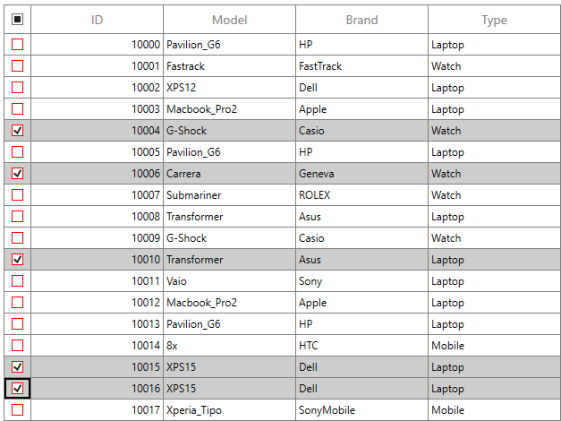
As above, style of the header check box can be customized using the HeaderCellStyle property.
<syncfusion:SfDataGrid x:Name="dataGrid"
                       AutoGenerateColumns="False"
                       ItemsSource="{Binding Orders}">
      <syncfusion:SfDataGrid.Columns>
            <syncfusion:GridCheckBoxSelectorColumn MappingName="SelectorColumn"
                                                   Width="30">
                    <syncfusion:GridCheckBoxSelectorColumn.HeaderStyle>
                        <Style TargetType="syncfusion:GridHeaderCellControl">
                            <Style.Resources>
                                <Style TargetType="CheckBox">
                                    <Setter Property="BorderBrush" Value="Blue"/>
                                    <Setter Property="BorderThickness" Value="2"/>
                                </Style>
                            </Style.Resources>
                        </Style>
                    </syncfusion:GridCheckBoxSelectorColumn.HeaderStyle>
                </syncfusion:GridCheckBoxSelectorColumn>
      </syncfusion:SfDataGrid.Columns>
</syncfusion:SfDataGrid>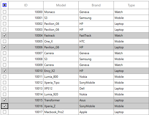
Canceling the check box state change
The checkbox state change in the GridCheckBoxSelectorColumn can be canceled by setting CellCheckBoxClickEventArgs.Cancel to true in the SfDataGrid.CellCheckBoxClick event. Additionally, the checkbox value can be modified by setting CellCheckBoxClickEventArgs.NewValue within the same event.
Based on this, the selection state is not changed when e.Cancel is set to true, and the selection is applied according to the value specified in e.NewValue.
this.sfDataGrid1.CellCheckBoxClick += OnCellCheckBoxClick;

void OnCellCheckBoxClick(object sender, CellCheckBoxClickEventArgs e)
{
    if (e.RowIndex == 1)
        e.Cancel = true;
    else if (e.RowIndex == 2)
        e.NewValue = CheckState.Checked;
}
AddHandler sfDataGrid1.CellCheckBoxClick, AddressOf OnCellCheckBoxClick
Private Sub OnCellCheckBoxClick(ByVal sender As Object, ByVal e As CellCheckBoxClickEventArgs)
If e.RowIndex = 1 Then
e.Cancel = True
ElseIf e.RowIndex = 2 Then
e.NewValue = CheckState.Checked
End If
End SubLimitations
The following are the limitations of GridCheckBoxSelectorColumn:
- Selector column does not support cell selection.
- Selector column does not support data operations such as sorting, filtering, and grouping.
- Selector column will be excluded in operations such as printing and exporting.
- Selector column does not have filter row support.
Custom column support
SfDataGrid allows you to create your own column by overriding predefined column type or creating a new custom column.
Creating column from existing column
You can create your own column by overriding the predefined column types in SfDataGrid.
For example, the GridDateTimeColumn loads the DateTime value by default. If you want to display DateTimeOffset value, you can create a new column by overriding the GridDateTimeColumn class.
In the below code snippet, converter created to format the DateTimeOffSet value to DateTime by defining ValueBinding (edit) and DisplayBinding (non-edit).
public class DateTimeOffsetFormatConverter : IValueConverter
{
    private GridDateTimeOffsetColumn cachedColumn;

    public DateTimeOffsetFormatConverter(GridDateTimeOffsetColumn column)
    {
        cachedColumn = column;
    }

    public object Convert(object value, Type targetType, object parameter, System.Globalization.CultureInfo culture)
    {
        value = ((DateTimeOffset)value).DateTime;
        var column = cachedColumn as GridDateTimeColumn;

        if (value == null || DBNull.Value == value)
        {

            if (column.AllowNullValue && column.MaxDateTime != System.DateTime.MaxValue && column.NullText == string.Empty)
                return column.MaxDateTime;

            if (column.AllowNullValue && column.NullValue != null)
                return column.NullValue;

            else if (column.AllowNullValue && column.NullText != string.Empty)
                return column.NullText;

            if (column.MaxDateTime != System.DateTime.MaxValue)
                return column.MaxDateTime;
        }

        DateTime _columnValue;
        _columnValue = (DateTime)value;

        if (_columnValue < column.MinDateTime)
            _columnValue = column.MinDateTime;

        if (_columnValue > column.MaxDateTime)
            _columnValue = column.MaxDateTime;

        return DateTimeFormatString(_columnValue, column);
    }

    private string DateTimeFormatString(DateTime columnValue, GridDateTimeColumn column)
    {

        switch (column.Pattern)
        {

            case DateTimePattern.ShortDate:
                return columnValue.ToString("d", column.DateTimeFormat);

            case DateTimePattern.LongDate:
                return columnValue.ToString("D", column.DateTimeFormat);

            case DateTimePattern.LongTime:
                return columnValue.ToString("T", column.DateTimeFormat);

            case DateTimePattern.ShortTime:
                return columnValue.ToString("t", column.DateTimeFormat);

            case DateTimePattern.FullDateTime:
                return columnValue.ToString("F", column.DateTimeFormat);

            case DateTimePattern.RFC1123:
                return columnValue.ToString("R", column.DateTimeFormat);

            case DateTimePattern.SortableDateTime:
                return columnValue.ToString("s", column.DateTimeFormat);

            case DateTimePattern.UniversalSortableDateTime:
                return columnValue.ToString("u", column.DateTimeFormat);

            case DateTimePattern.YearMonth:
                return columnValue.ToString("Y", column.DateTimeFormat);

            case DateTimePattern.MonthDay:
                return columnValue.ToString("M", column.DateTimeFormat);

            case DateTimePattern.CustomPattern:
                return columnValue.ToString(column.CustomPattern, column.DateTimeFormat);

            default:
                return columnValue.ToString("MMMM", column.DateTimeFormat);
        }
    }

    public object ConvertBack(object value, Type targetType, object parameter, System.Globalization.CultureInfo culture)
    {
        throw new NotImplementedException();
    }
}

public class DateTimeOffsetToDateTimeConverter : IValueConverter
{

    public object Convert(object value, Type targetType, object parameter, System.Globalization.CultureInfo culture)
    {

        if (value == null)
            return null;
        return ((DateTimeOffset)value).DateTime;
    }

    public object ConvertBack(object value, Type targetType, object parameter, System.Globalization.CultureInfo culture)
    {

        if (value == null)
            return null;
        return value is DateTimeOffset ? value : new DateTimeOffset((DateTime)value);
    }
}
In the below code snippet, GridDateTimeOffsetColumn column created from GridDateTimeColumn.
public class GridDateTimeOffsetColumn : GridDateTimeColumn
{

    protected override void SetDisplayBindingConverter()
    {

        if ((DisplayBinding as Binding).Converter == null)
            (DisplayBinding as Binding).Converter = new DateTimeOffsetFormatConverter(this);

        if ((ValueBinding as Binding).Converter == null)
            (ValueBinding as Binding).Converter = new DateTimeOffsetToDateTimeConverter();
    }
}
In the below code snippet, created GridDateTimeOffsetColumn added to SfDataGrid.Columns collection and specify the Pattern as FullDateTime. Since the ShortDate is the default pattern of GridDateTimeColumn.
<syncfusion:SfDataGrid x:Name="dataGrid"
                       AutoGenerateColumns="False"
                       ItemsSource="{Binding Orders}">
    <syncfusion:SfDataGrid.Columns>
        <local:GridDateTimeOffsetColumn MappingName="OrderDate" Pattern="FullDateTime" UseBindingValue="True"/>
    </syncfusion:SfDataGrid.Columns>
</syncfusion:SfDataGrid>this.datagrid1.Columns.Add(new GridDateTimeOffsetColumn()
{
MappingName = "OrderDate",
Pattern = Syncfusion.Windows.Shared.DateTimePattern.FullDateTime,
UseBindingValue = true
});You can get the sample from here.
Customize column renderer
SfDataGrid allows you to customize the column related operations like key navigation and UI related interactions by overriding the corresponding renderer associated with the column. Each column has its own renderer with set of virtual methods for handling the column level operations.
Below table lists the available cell types for columns and its renderers.
| Column Name | Renderer | Cell Type |
|---|---|---|
| GridTextColumn | TextBox | |
| GridNumericColumn | Numeric | |
| GridCheckBoxColumn | CheckBox | |
| GridTemplateColumn | Template | |
| GridImageColumn | Image | |
| GridUnBoundColumn | UnBoundTextColumn UnBoundTemplateColumn | |
| GridComboBoxColumn | ComboBox | |
| GridDateTimeColumn | DateTime | |
| GridHyperlinkColumn | HyperLink | |
| GridMaskColumn | Mask | |
| GridPercentColumn | Percent | |
| GridCurrencyColumn | Currency | |
| GridMultiColumnDropDownList | MultiColumnDropDown | |
| GridTimeSpanColumn | TimeSpan | |
| GridCheckBoxSelectorColumn | Selector |
Below code, creates the GridCellTextBoxRendererExt to change the fore ground of CustomerID column and replacing created renderer to CellRenderers.
this.dataGrid.CellRenderers.Remove("TextBox");
this.dataGrid.CellRenderers.Add("TextBox", new GridCellTextBoxRendererExt());

public class GridCellTextBoxRendererExt:GridCellTextBoxRenderer
{

    public override void OnInitializeDisplayElement(DataColumnBase dataColumn, TextBlock uiElement, object dataContext)
    {
        base.OnInitializeDisplayElement(dataColumn, uiElement, dataContext);

        if(dataColumn.GridColumn.MappingName.Equals("CustomerID"))
            uiElement.Foreground = new SolidColorBrush(Colors.Blue);
    }

    public override void OnUpdateDisplayBinding(DataColumnBase dataColumn, TextBlock uiElement, object dataContext)
    {
        base.OnUpdateDisplayBinding(dataColumn, uiElement, dataContext);

        if (dataColumn.GridColumn.MappingName.Equals("CustomerID"))
            uiElement.Foreground = new SolidColorBrush(Colors.Blue);
    }
}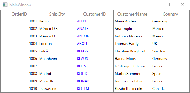
Create the renderer of existing column
You can change the renderer of existing column by removing the predefined cell type value from CellRenderers collection and add the newly derived renderer from GridVirtualizingCellRenderer.
For Non-Editable columns, SupportsRenderOptimization property should be set as false to set focus for the control loaded as DisplayElement in the column when interact through mouse.
Below code creates the new GridComboBoxRenderer with ComboBoxAdv as edit element for GridComboBoxColumn and replacing created renderer to CellRenderers.
dataGrid.CellRenderers.Remove("ComboBox");
dataGrid.CellRenderers.Add("ComboBox", new GridComboBoxRenderer());

public class GridComboBoxRenderer : GridVirtualizingCellRenderer<TextBlock, ComboBoxAdv>
{

    public GridComboBoxRenderer()
    {
    }
    /// <summary>
    /// Create new display element.
    /// </summary>
    /// <returns></returns>

    protected override TextBlock OnCreateDisplayUIElement()
    {
        return new TextBlock();
    }
    /// <summary>
    /// Create new edit element.
    /// </summary>
    /// <returns></returns>

    protected override ComboBoxAdv OnCreateEditUIElement()
    {
        return new ComboBoxAdv();
    }
    /// <summary>
    /// Initialize binding for display element.
    /// </summary>
    /// <param name="dataColumn"></param>
    /// <param name="uiElement"></param>
    /// <param name="dataContext"></param>

    public override void OnInitializeDisplayElement(Syncfusion.UI.Xaml.Grid.DataColumnBase dataColumn, TextBlock uiElement, object dataContext)
    {
        base.OnInitializeDisplayElement(dataColumn, uiElement, dataContext);
        SetDisplayBinding(uiElement, dataColumn.GridColumn, dataContext);
    }

    /// <summary>
    /// custom binding for display element.
    /// </summary>
    /// <param name="element"></param>
    /// <param name="column"></param>
    /// <param name="dataContext"></param>

    private static void SetDisplayBinding(TextBlock element, GridColumn column, object dataContext)
    {
        var comboBoxColumn = (GridComboBoxColumn)column;
        var binding = new Binding
        {
            Path = new PropertyPath(comboBoxColumn.MappingName),
            Mode = BindingMode.TwoWay,
            UpdateSourceTrigger = UpdateSourceTrigger.PropertyChanged,
            Converter = new DisplayConverter(comboBoxColumn),
        };
        element.SetBinding(TextBlock.TextProperty, binding);
    }
    /// <summary>
    /// Update binding for display element.
    /// </summary>
    /// <param name="dataColumn"></param>
    /// <param name="uiElement"></param>
    /// <param name="dataContext"></param>

    public override void OnUpdateDisplayBinding(DataColumnBase dataColumn, TextBlock uiElement, object dataContext)
    {
        base.OnUpdateDisplayBinding(dataColumn, uiElement, dataContext);
        SetDisplayBinding(uiElement, dataColumn.GridColumn, dataContext);
    }
    /// <summary>
    /// Initialize binding for edit element.
    /// </summary>
    /// <param name="dataColumn"></param>
    /// <param name="uiElement"></param>
    /// <param name="dataContext"></param>

    public override void OnInitializeEditElement(DataColumnBase dataColumn, ComboBoxAdv uiElement, object dataContext)
    {
        base.OnInitializeEditElement(dataColumn, uiElement, dataContext);
        SetEditBinding(uiElement, dataColumn.GridColumn, dataContext);
    }

    /// <summary>
    /// Update binding for edit element.
    /// </summary>
    /// <param name="dataColumn"></param>
    /// <param name="uiElement"></param>
    /// <param name="dataContext"></param>

    public override void OnUpdateEditBinding(DataColumnBase dataColumn, ComboBoxAdv element, object dataContext)
    {
        base.OnUpdateEditBinding(dataColumn, element, dataContext);
        SetEditBinding(element, dataColumn.GridColumn, dataContext);
    }

    /// <summary>
    /// custom binding for display element.
    /// </summary>
    /// <param name="element"></param>
    /// <param name="column"></param>
    /// <param name="dataContext"></param>

    private static void SetEditBinding(ComboBoxAdv element, GridColumn column, object dataContext)
    {
        var comboboxColumn = (GridComboBoxColumn)column;
        var binding = new Binding
        {
            Source = dataContext,
            Path = new PropertyPath(comboboxColumn.MappingName),
            Mode = BindingMode.TwoWay,
            UpdateSourceTrigger = UpdateSourceTrigger.PropertyChanged,
        };
        element.SetBinding(ComboBoxAdv.SelectedItemsProperty, binding);

        var itemsSourceBinding = new Binding { Path = new PropertyPath("ItemsSource"), Mode = BindingMode.TwoWay, Source = comboboxColumn };
        element.SetBinding(ComboBoxAdv.ItemsSourceProperty, itemsSourceBinding);

        var displayMemberBinding = new Binding { Path = new PropertyPath("DisplayMemberPath"), Mode = BindingMode.TwoWay, Source = comboboxColumn };
        element.SetBinding(ComboBoxAdv.DisplayMemberPathProperty, displayMemberBinding);

        var selectedValuePathBinding = new Binding { Path = new PropertyPath("SelectedValuePath"), Mode = BindingMode.TwoWay, Source = comboboxColumn };
        element.SetBinding(ComboBoxAdv.SelectedValuePathProperty, selectedValuePathBinding);

        element.AllowMultiSelect = true;
    }

    /// <summary>
    /// Let Renderer decide whether the parent grid should be allowed to handle keys and prevent
    /// the key event from being handled by the visual UIElement for this renderer.
    /// </summary>
    /// <param name="e">A <see cref="KeyEventArgs" /> object.</param>
    /// <returns>
    /// True if the parent grid should be allowed to handle keys; false otherwise.
    /// </returns>

    protected override bool ShouldGridTryToHandleKeyDown(System.Windows.Input.KeyEventArgs e)
    {
        if (!HasCurrentCellState || !IsInEditing)
            return true;

        switch (e.Key)
        {
            case Key.End:
            case Key.Home:
            case Key.Enter:
            case Key.Escape:
                return !((ComboBoxAdv)CurrentCellRendererElement).IsDropDownOpen;

            case Key.Down:
            case Key.Up:
            case Key.Left:
            case Key.Right:
                return !((ComboBoxAdv)CurrentCellRendererElement).IsDropDownOpen;
        }
        return base.ShouldGridTryToHandleKeyDown(e);
    }
    /// <summary>
    /// Gets the control value.
    /// </summary>

    public override object GetControlValue()
    {

        if (!HasCurrentCellState)
            return base.GetControlValue();

        return CurrentCellRendererElement.GetValue(IsInEditing ? ComboBoxAdv.SelectedValueProperty : TextBlock.TextProperty);
    }

    /// <summary>
    /// Sets the control value.
    /// </summary>
    /// <param name="value">The value.</param>

    public override void SetControlValue(object value)
    {

        if (!HasCurrentCellState)
            return;

        if (IsInEditing)
            ((ComboBoxAdv)CurrentCellRendererElement).SelectedValue = value;

        else
            throw new Exception("Value cannot be Set for Unloaded Editor");
    }
}
Below code, returns the display value from multiple selected items.
public class DisplayConverter : IValueConverter
{
    GridColumn cachedColumn;

    public DisplayConverter()
    {

    }

    public DisplayConverter(GridColumn column)
    {
        cachedColumn = column;
    }

    public object Convert(object value, Type targetType, object parameter, System.Globalization.CultureInfo culture)
    {
        var selectedItems = value as IEnumerable;
        var displayMemberPath = string.Empty;

        var column = cachedColumn as GridComboBoxColumn;
        displayMemberPath = column.DisplayMemberPath;

        if (selectedItems == null)
            return null;

        string selectedItem = string.Empty;
         PropertyDescriptorCollection pdc = null;
         var enumerator = selectedItems.GetEnumerator();

        while (enumerator.MoveNext())
        {
            var type = enumerator.Current.GetType();

            pdc = pdc ?? TypeDescriptor.GetProperties(type);

                if (!string.IsNullOrEmpty(displayMemberPath))
                    selectedItem +=  pdc.GetValue(enumerator.Current, displayMemberPath) + " - ";
            }
        return selectedItem.Substring(0,selectedItem.Length - 2);
    }

    public object ConvertBack(object value, Type targetType, object parameter, System.Globalization.CultureInfo culture)
    {
        return value;
    }
}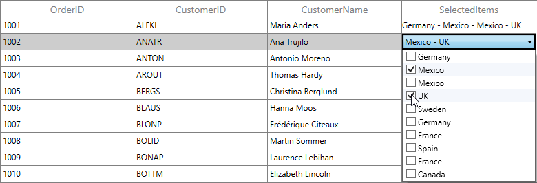
Creating new column and renderer
You can create a new column by deriving GridColumn, rendered in UI using customized CellType using GridVirtualizingCellRenderer.
Below steps to create custom column in SfDataGrid.
- Creating custom column.
- Creating renderer.
- Adding the custom renderer to SfDataGrid.CellRenderers collection.
- Defining custom column.
Creating custom column
You can create custom column by overriding a new class from GridColumn class.
Below code creates the converter to format the date time value.
public class CustomConverter : IValueConverter
{

    public object Convert(object value, Type targetType, object parameter, System.Globalization.CultureInfo culture)
    {

        if (string.IsNullOrEmpty(value.ToString()))
            return null;
        return new ConvertToDateTimeClass().ConvertToDateTime(value);
    }

    public object ConvertBack(object value, Type targetType, object parameter, System.Globalization.CultureInfo culture)
    {
        return new ConvertToDateTimeClass().ConvertToDateTime(value);
    }
}

public class ConvertToDateTimeClass
{

    public string ConvertToDateTime(object value)
    {
        DateTime date = Convert.ToDateTime(value);
        return date.Year + "/" + date.Month + "/" +date.Day;
    }
}
In the below code, new column created with converter using SetDisplayBindingConverter method.
public class DatePickerColumn : GridColumn
{

    public DatePickerColumn()
    {
        SetCellType("DatePickerRenderer");
    }

    protected override void SetDisplayBindingConverter()
    {
        (this.DisplayBinding as Binding).Converter = new CustomConverter();
    }

    protected override Freezable CreateInstanceCore()
    {
        return new DatePickerColumn();
    }
}
Creating renderer
After creating custom column, you need to create renderer for the custom column. Below are the steps to create custom renderer. You can create custom renderer either by deriving GridVirtualizingCellRenderer class or overriding existing renderers.
In the below code snippet, display and edit UIElement defined via GridVirtualizingCellRenderer parameter.
/// <summary>
/// CustomRenderer Creation
/// </summary>
/// <param name="TextBlock">Display Control</param>
/// <param name="DatePicker">Edit Control</param>

public class DatePickerRenderer : GridVirtualizingCellRenderer<TextBlock, DatePicker>
{

    public DatePickerRenderer()
    {

    }
}
With the below code snippet, you can create the display and edit element for renderer by overriding OnCreateDisplayUIElement and OnCreateEditUIElement methods.
/// <summary>
/// Create new display element.
/// </summary>
/// <returns></returns>

protected override TextBlock OnCreateDisplayUIElement()
{
    return new TextBlock();
}
/// <summary>
/// Create new edit element.
/// </summary>
/// <returns></returns>

protected override DatePicker OnCreateEditUIElement()
{
    return new DatePicker();
}
With the below code snippet, you can initialize the binding for display element by overriding the OnInitializeDisplayElement method.
/// <summary>
/// Initialize binding for display element.
/// </summary>
/// <param name="dataColumn"></param>
/// <param name="uiElement"></param>
/// <param name="dataContext"></param>

public override void OnInitializeDisplayElement(Syncfusion.UI.Xaml.Grid.DataColumnBase dataColumn, TextBlock uiElement, object dataContext)
{
    base.OnInitializeDisplayElement(dataColumn, uiElement, dataContext);
    SetDisplayBinding(uiElement, dataColumn.GridColumn, dataContext);
}

/// <summary>
/// custom binding for display element.
/// </summary>
/// <param name="element"></param>
/// <param name="column"></param>
/// <param name="dataContext"></param>

private static void SetDisplayBinding(TextBlock element, GridColumn column, object dataContext)
{
    var customColumn = (DatePickerColumn)column;
    var binding = new Binding
    {
        Path = new PropertyPath(customColumn.MappingName),
        Mode = BindingMode.TwoWay,
        UpdateSourceTrigger = UpdateSourceTrigger.PropertyChanged,
        Converter = (column.DisplayBinding as Binding).Converter,
    };
    element.SetBinding(TextBlock.TextProperty, binding);
}
With the below code snippet, updates the binding while UI interaction by overriding OnUpdateDisplayBinding method.
/// <summary>
/// Update binding for display element.
/// </summary>
/// <param name="dataColumn"></param>
/// <param name="uiElement"></param>
/// <param name="dataContext"></param>

public override void OnUpdateDisplayBinding(DataColumnBase dataColumn, TextBlock uiElement, object dataContext)
{
    base.OnUpdateDisplayBinding(dataColumn, uiElement, dataContext);
    SetDisplayBinding(uiElement, dataColumn.GridColumn, dataContext);
}
Similarly, you can initialize and update the binding for edit element by overriding OnInitializeEditElement and OnUpdateEditBinding methods.
/// <summary>
/// Initialize binding for edit element.
/// </summary>
/// <param name="dataColumn"></param>
/// <param name="uiElement"></param>
/// <param name="dataContext"></param>

public override void OnInitializeEditElement(DataColumnBase dataColumn, DatePicker uiElement, object dataContext)
{
    base.OnInitializeEditElement(dataColumn, uiElement, dataContext);
    SetEditBinding(uiElement, dataColumn.GridColumn, dataContext);
}

/// <summary>
/// Update binding for edit element.
/// </summary>
/// <param name="dataColumn"></param>
/// <param name="uiElement"></param>
/// <param name="dataContext"></param>

public override void OnUpdateEditBinding(DataColumnBase dataColumn, DatePicker element, object dataContext)
{
    base.OnUpdateEditBinding(dataColumn, element, dataContext);
    SetEditBinding(element, dataColumn.GridColumn, dataContext);
}

/// <summary>
/// custom binding for display element.
/// </summary>
/// <param name="element"></param>
/// <param name="column"></param>
/// <param name="dataContext"></param>

private static void SetEditBinding(DatePicker element, GridColumn column, object dataContext)
{
    var customColumn = (DatePickerColumn)column;
    var binding = new Binding
    {
        Source = dataContext,
        Path = new PropertyPath(customColumn.MappingName),
        Mode = BindingMode.TwoWay,
        UpdateSourceTrigger = UpdateSourceTrigger.PropertyChanged,
    };

    element.SetBinding(DatePicker.TextProperty, binding);
}
You can customize the editor control while loading by overriding OnEditElementLoaded method.
/// <summary>
/// Handling operations on edit mode UIElement.
/// </summary>
/// <param name="sender"></param>
/// <param name="e"></param>

protected override void OnEditElementLoaded(object sender, RoutedEventArgs e)
{
    var datePicker = (sender as DatePicker);
    datePicker.Focus();

    DatePickerTextBox datePickerTextBox =
        (DatePickerTextBox)GridUtil.FindDescendantChildByType(datePicker, typeof(DatePickerTextBox));

    if ((this.DataGrid.EditorSelectionBehavior == EditorSelectionBehavior.SelectAll ||
            this.DataGrid.IsAddNewIndex(this.CurrentCellIndex.RowIndex)) && PreviewInputText == null)
    {
        datePickerTextBox.SelectAll();
    }

    else
    {
        datePickerTextBox.Select(datePickerTextBox.SelectedText.Length, 0);
    }
    PreviewInputText = null;
}
With the below code snippet, you can customize the keyboard interactions for the custom column by overriding ShouldGridTryToHandleKeyDown method.
/// <summary>
/// Let Renderer decide whether the parent grid should be allowed to handle keys and prevent
/// the key event from being handled by the visual UIElement for this renderer.
/// </summary>
/// <param name="e">A <see cref="KeyEventArgs" /> object.</param>
/// <returns>
/// True if the parent grid should be allowed to handle keys; false otherwise.
/// </returns>

protected override bool ShouldGridTryToHandleKeyDown(System.Windows.Input.KeyEventArgs e)
{
    if (!HasCurrentCellState || !IsInEditing)
        return true;

    DatePickerTextBox datePickerTextBox =
        (DatePickerTextBox)
            GridUtil.FindDescendantChildByType(CurrentCellRendererElement as DatePicker,
                typeof(DatePickerTextBox));

    switch (e.Key)
    {
        case Key.End:
        case Key.Home:
        case Key.Enter:
        case Key.Escape:
            return !((DatePicker)CurrentCellRendererElement).IsDropDownOpen;

        case Key.Down:
        case Key.Up:
        case Key.Left:
        case Key.Right:
            return !((DatePicker)CurrentCellRendererElement).IsDropDownOpen;
    }
    return base.ShouldGridTryToHandleKeyDown(e);
}
You can handle the cell value for the custom renderer by overriding GetControlValue and SetControlValue methods.
/// <summary>
/// Gets the control value.
/// </summary>

public override object GetControlValue()
{

    if (!HasCurrentCellState)
        return base.GetControlValue();

    return CurrentCellRendererElement.GetValue(IsInEditing ? DatePicker.TextProperty : TextBlock.TextProperty);
}

/// <summary>
/// Sets the control value.
/// </summary>
/// <param name="value">The value.</param>

public override void SetControlValue(object value)
{

    if (!HasCurrentCellState)
        return;

    if (IsInEditing)
        ((TextBox)CurrentCellRendererElement).Text = value.ToString();

    else
        throw new Exception("Value cannot be Set for Unloaded Editor");
}
Adding the custom renderer to SfDataGrid.CellRenderers collection
By below code, you can add the previous created custom renderer to SfDataGrid.CellRenderers collection.
dataGrid.CellRenderers.Add("DatePickerRenderer", new DatePickerRenderer());Loading custom column
By below code, you can define the custom column in SfDataGrid.
<syncfusion:SfDataGrid x:Name="dataGrid"
                       AutoGenerateColumns="False"
                       ItemsSource="{Binding Orders}">
    <syncfusion:SfDataGrid.Columns>
        <local:DatePickerColumn MappingName="OrderDate"/>
    </syncfusion:SfDataGrid.Columns>
</syncfusion:SfDataGrid>this.dataGrid.Columns.Add(new DatePickerColumn() {AllowEditing=true, MappingName = "DateOfMonth"} );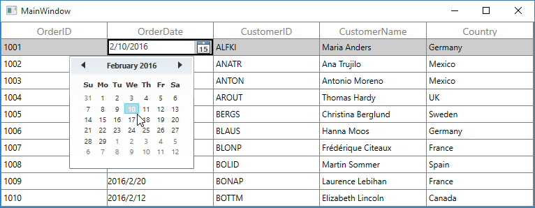
How To
Restrict the input content length
You can restrict the range of input using MaxLength property on GridColumn in below ways.
- Using Converter property in DisplayBinding and ValueBinding
- Using control style
- Overriding existing cell types
Using Converter
You can restrict the length of user input in both display and edit element using Converter using DisplayBinding and ValueBinding.
<Window.Resources>
    <local:MaxLengthConverter x:Key="converter" />
</Window.Resources>

<syncfusion:SfDataGrid x:Name="dataGrid"
                       AutoGenerateColumns="False"
                       ItemsSource="{Binding Orders}">
    <syncfusion:SfDataGrid.Columns>
        <syncfusion:GridTextColumn  DisplayBinding="{Binding CustomerName,
                                    Converter={StaticResource converter}}"
                                    HeaderText="Customer Name"
                                    MappingName="CustomerName"
                                    ValueBinding="{Binding CustomerName,
                                    Converter={StaticResource converter}}" />
    </syncfusion:SfDataGrid.Columns>
</syncfusion:SfDataGrid>
public class MaxLengthConverter : IValueConverter
{
public object Convert(object value, Type targetType, object parameter, System.Globalization.CultureInfo culture)
{
int maxLength = 5;
var columnValue = System.Convert.ToString(value);
if (columnValue.Length < maxLength)
return columnValue;
else
return columnValue.Substring(0, maxLength);
}
public object ConvertBack(object value, Type targetType, object parameter, System.Globalization.CultureInfo culture)
{
return value;
}
}Using control style
You can set the MaxLength property in edit mode by writing style of TargetType edit element of the corresponding column.
NOTE
TextBlock does not have the MaxLength property. Therefore, you can use the converter to format in display.
<Window.Resources>
    <Style TargetType="TextBox">
        <Setter Property="MaxLength" Value="7" />
    </Style>
</Window.Resources>

<syncfusion:SfDataGrid x:Name="dataGrid"
                       AutoGenerateColumns="False"
                       ItemsSource="{Binding Orders}">
    <syncfusion:SfDataGrid.Columns>
        <syncfusion:GridTextColumn  MappingName="CustomerName"/>
    </syncfusion:SfDataGrid.Columns>
</syncfusion:SfDataGrid>
Overriding existing cell types
You can set the MaxLength property to the edit element of the particular column by overriding existing cell types.
Below code, overrides the OnInitializeEditElement method of the corresponding renderer and set the MaxLength to the UIElement and add the renderer to SfDataGrid.CellRenderers collection.
this.dataGrid.CellRenderers.Remove("TextBox");
this.dataGrid.CellRenderers.Add("TextBox", new GridCellTextBoxRendererExt());

public class GridCellTextBoxRendererExt:GridCellTextBoxRenderer
{

    public override void OnInitializeEditElement(Syncfusion.UI.Xaml.Grid.DataColumnBase dataColumn, System.Windows.Controls.TextBox uiElement, object dataContext)
    {

        if (dataColumn.GridColumn != null && dataColumn.GridColumn.MappingName == "ProductName")
            uiElement.MaxLength = 7;

        else
            uiElement.MaxLength = 0;
        base.OnInitializeEditElement(dataColumn, uiElement, dataContext);
    }
}