Styling in .NET MAUI DataGrid (SfDataGrid)
9 Jul 202624 minutes to read
The DataGrid applies style for all of its elements by setting desired values to the style properties in SfDataGrid.DefaultStyle. This property has all the required styling properties for each element in the DataGrid.
Note: Styling Priority Order: Column-level styles (explicit) take precedence over implicit TargetType styles, which take precedence over the default DataGridStyle. Supported color formats include hex (#RRGGBB), named colors (Blue, White, etc.), and RGBA values.
To get started quickly with styling the .NET MAUI DataGrid, you can check this video:
<syncfusion:SfDataGrid x:Name="dataGrid"
                       ItemsSource="{Binding Orders}">
    <syncfusion:SfDataGrid.DefaultStyle>
        <syncfusion:DataGridStyle HeaderRowBackground="#0074E3"
                                  HeaderRowTextColor="White"
                                  RowBackground="#AFD5FB"
                                  RowTextColor="#212121"/>
    </syncfusion:SfDataGrid.DefaultStyle>
</syncfusion:SfDataGrid>
public partial class MainPage : ContentPage
{
public MainPage()
{
InitializeComponent();
SfDataGrid dataGrid = new SfDataGrid();
OrderInfoViewModel orderInfoViewModel = new OrderInfoViewModel();
dataGrid.ItemsSource = orderInfoViewModel.Orders;
dataGrid.DefaultStyle.HeaderRowBackground = Color.FromArgb("#0074E3");
dataGrid.DefaultStyle.HeaderRowTextColor = Colors.White;
dataGrid.DefaultStyle.RowBackground = Color.FromArgb("#AFD5FB");
dataGrid.DefaultStyle.RowTextColor = Color.FromArgb("#212121");
this.Content = dataGrid;
}
}
Set datagrid style from application resources
You can write custom style for the properties in the SfDataGrid.DefaultStyle class using the application resource and consume the custom style as a static resource to the DefaultStyle property for the required DataGrid used on that page.
<Application.Resources>
    <ResourceDictionary>
        <syncfusion:DataGridStyle x:Key="customStyle"
                                  RowBackground="LightBlue"
                                  HeaderRowBackground="Blue"
                                  RowTextColor="Black"
                                  HeaderRowTextColor="White"/>
    </ResourceDictionary>
</Application.Resources>
<syncfusion:SfDataGrid DefaultStyle="{StaticResource customStyle}"
ItemsSource="{Binding Orders}">
</syncfusion:SfDataGrid>Set datagrid style from page resources
You can write custom style for the properties in the SfDataGrid.DefaultStyle class using page resource and consume the custom style as a static resource to the DefaultStyle property for the required DataGrid used on that page.
<ContentPage.Resources>
<ResourceDictionary>
<syncfusion:DataGridStyle x:Key="customStyle"
RowBackground="LightBlue"
HeaderRowBackground="Blue"
RowTextColor="Black"
HeaderRowTextColor="White"/>
</ResourceDictionary>
</ContentPage.Resources>
<syncfusion:SfDataGrid DefaultStyle="{StaticResource customStyle}"
                       ItemsSource="{Binding Orders}">
</syncfusion:SfDataGrid>
Implicit styling
The appearance of DataGrid (SfDataGrid) and its inner elements can be customized by the writing style of TargetType to those control. If the key is not specified, then the style will be applied to all the SfDataGrid in its scope. You can apply specific to DataGridRow or DataGridCell using various properties exposed.
Styling Record Cell
The record cells can be customized by writing a style for DataGridCell TargetType. The underlying record serves as the DataContext for DataGridCell.
<ContentPage.Resources>
    <Style TargetType="syncfusion:DataGridCell">
        <Setter Property="Background"
                Value="#AFD5FB"/>
        <Setter Property="TextColor"
                Value="#212121"/>
        <Setter Property="FontAttributes"
                Value="Italic"/>
        <Setter Property="FontSize"
                Value="14"/>
        <Setter Property="FontFamily"
                Value="TimesNewRoman"/>
    </Style>
</ContentPage.Resources>

<syncfusion:SfDataGrid x:Name="dataGrid"
                       ItemsSource="{Binding Orders}">
</syncfusion:SfDataGrid>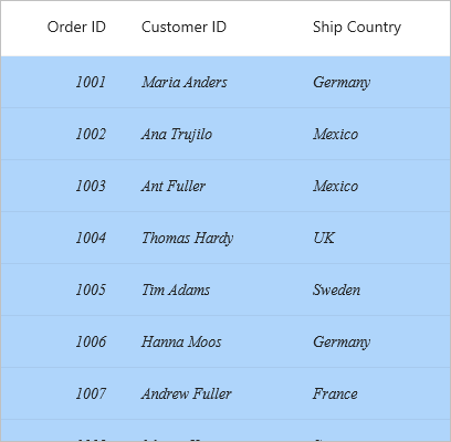
Styling Record Row
The record row can be customized by writing a style for DataGridRow TargetType.
<ContentPage xmlns:syncfusion="http://schemas.syncfusion.com/maui">
    <ContentPage.Resources>
        <Style TargetType="syncfusion:DataGridRow">
            <Setter Property="Background"
                    Value="#AFD5FB"/>
        </Style>
    </ContentPage.Resources>

    <syncfusion:SfDataGrid x:Name="dataGrid"
                           ItemsSource="{Binding Orders}">
    </syncfusion:SfDataGrid>
</ContentPage>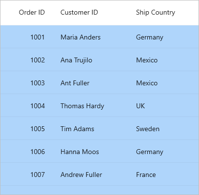
Styling Header Cell
The header cells can be customized by writing a style for DataGridHeaderCell TargetType.
<ContentPage xmlns:syncfusion="http://schemas.syncfusion.com/maui">
    <ContentPage.Resources>
        <Style TargetType="syncfusion:DataGridHeaderCell">
            <Setter Property="Background"
                    Value="#0074E3"/>
            <Setter Property="TextColor"
                    Value="White"/>
            <Setter Property="FontAttributes"
                    Value="Bold"/>
            <Setter Property="FontSize"
                    Value="14"/>
            <Setter Property="FontFamily"
                    Value="TimesNewRoman"/>
        </Style>
    </ContentPage.Resources>

    <syncfusion:SfDataGrid x:Name="dataGrid"
                           ItemsSource="{Binding Orders}">
    </syncfusion:SfDataGrid>
</ContentPage>
Styling Header Row
The header row can be customized by writing a style for DataGridHeaderRow TargetType.
<ContentPage.Resources>
    <Style TargetType="syncfusion:DataGridHeaderRow">
        <Setter Property="Background"
                Value="#0074E3"/>
    </Style>
</ContentPage.Resources>

<syncfusion:SfDataGrid x:Name="dataGrid"
                       ItemsSource="{Binding Orders}">
</syncfusion:SfDataGrid>
Styling Table Summary Cell
The table summary cell can be customized by writing a style for DataGridTableSummaryCell TargetType.
<ContentPage xmlns:syncfusion="http://schemas.syncfusion.com/maui">
    <ContentPage.Resources>
        <Style TargetType="syncfusion:DataGridTableSummaryCell">
            <Setter Property="Background"
                    Value="#0074E3"/>
            <Setter Property="TextColor"
                    Value="White"/>
            <Setter Property="FontAttributes"
                    Value="Bold"/>
            <Setter Property="FontSize"
                    Value="16"/>
            <Setter Property="FontFamily"
                    Value="TimesNewRoman"/>
        </Style>
    </ContentPage.Resources>
</ContentPage>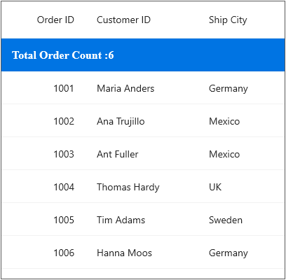
Styling Table Summary Row
The table summary row can be customized by writing a style for DataGridTableSummaryRowView TargetType.
<ContentPage xmlns:syncfusion="http://schemas.syncfusion.com/maui">
    <ContentPage.Resources>
        <Style TargetType="syncfusion:DataGridTableSummaryRowView">
            <Setter Property="Background"
                    Value="#0074E3"/>
        </Style>
    </ContentPage.Resources>
</ContentPage>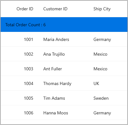
Styling Caption Summary Cell
The caption summary cell can be customized by writing a style for DataGridCaptionSummaryCell TargetType.
<ContentPage xmlns:syncfusion="http://schemas.syncfusion.com/maui">
    <ContentPage.Resources>
        <Style TargetType="syncfusion:DataGridCaptionSummaryCell">
            <Setter Property="Background"
                    Value="#0074E3"/>
            <Setter Property="TextColor"
                    Value="White"/>
            <Setter Property="FontAttributes"
                    Value="Bold"/>
            <Setter Property="FontSize"
                    Value="14"/>
            <Setter Property="FontFamily"
                    Value="TimesNewRoman"/>
        </Style>
    </ContentPage.Resources>
</ContentPage>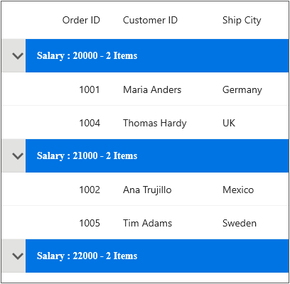
Styling Caption Summary Row
The caption summary row can be customized by writing a style for DataGridCaptionSummaryRowView TargetType.
<ContentPage xmlns:syncfusion="http://schemas.syncfusion.com/maui">
    <ContentPage.Resources>
        <Style TargetType="syncfusion:DataGridCaptionSummaryRowView">
            <Setter Property="Background"
                    Value="#0074E3"/>
        </Style>
    </ContentPage.Resources>
</ContentPage>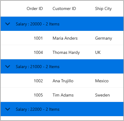
Styling Group Summary Cell
The group summary cell can be customized by writing a style for DataGridGroupSummaryCell TargetType.
<ContentPage xmlns:syncfusion="http://schemas.syncfusion.com/maui">
    <ContentPage.Resources>
        <Style TargetType="syncfusion:DataGridGroupSummaryCell">
            <Setter Property="Background"
                    Value="#0074E3"/>
            <Setter Property="TextColor"
                    Value="White"/>
            <Setter Property="FontAttributes"
                    Value="Bold"/>
            <Setter Property="FontSize"
                    Value="14"/>
            <Setter Property="FontFamily"
                    Value="TimesNewRoman"/>
        </Style>
    </ContentPage.Resources>
</ContentPage>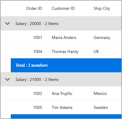
Styling Group Summary Row
The group summary row can be customized by writing a style for DataGridGroupSummaryRowView TargetType.
<ContentPage xmlns:syncfusion="http://schemas.syncfusion.com/maui">
    <ContentPage.Resources>
        <Style TargetType="syncfusion:DataGridGroupSummaryRowView">
            <Setter Property="Background"
                    Value="#0074E3"/>
        </Style>
    </ContentPage.Resources>
</ContentPage>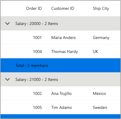
Styling Unbound Row Cell
The unbound row cell can be customized by writing a style for DataGridUnboundRowCell TargetType.
<ContentPage xmlns:syncfusion="http://schemas.syncfusion.com/maui">
    <ContentPage.Resources>
        <Style TargetType="syncfusion:DataGridUnboundRowCell">
            <Setter Property="Background"
                    Value="#0074E3"/>
            <Setter Property="TextColor"
                    Value="White"/>
            <Setter Property="FontAttributes"
                    Value="Bold"/>
            <Setter Property="FontSize"
                    Value="14"/>
            <Setter Property="FontFamily"
                    Value="TimesNewRoman"/>
        </Style>
    </ContentPage.Resources>
</ContentPage>
Styling Unbound Row
The unbound row can be customized by writing a style for DataGridUnboundRowView TargetType.
<ContentPage xmlns:syncfusion="http://schemas.syncfusion.com/maui">
    <ContentPage.Resources>
        <Style TargetType="syncfusion:DataGridUnboundRowView">
            <Setter Property="Background"
                    Value="#0074E3"/>
        </Style>
    </ContentPage.Resources>
</ContentPage>
Styling Row Header
The row header can be customized by writing a style for DataGridRowHeaderCell TargetType.
<ContentPage.Resources>
    <Style TargetType="syncfusion:DataGridRowHeaderCell">
        <Setter Property="Background"
                Value="LightSeaGreen"/>
    </Style>
</ContentPage.Resources>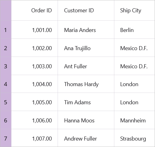
Column Styling
You can apply the style for a particular column by using DataGridColumn.CellStyle and DataGridColumn.HeaderStyle property.
Note: The column styling (explicit styling) takes higher priority than implicit styling, and implicit styling takes higher priority than default styling in SfDataGrid.
<ContentPage xmlns:syncfusion="http://schemas.syncfusion.com/maui">
    <ContentPage.Resources>
        <Style TargetType="syncfusion:DataGridHeaderCell"
               x:Key="customHeaderStyle">
            <Setter Property="Background"
                    Value="#0074E3"/>
            <Setter Property="TextColor"
                    Value="White"/>
            <Setter Property="FontAttributes"
                    Value="Bold"/>
            <Setter Property="FontSize"
                    Value="14"/>
            <Setter Property="FontFamily"
                    Value="TimesNewRoman"/>
        </Style>
        <Style TargetType="syncfusion:DataGridCell"
               x:Key="customCellStyle">
            <Setter Property="Background"
                    Value="#AFD5FB"/>
            <Setter Property="TextColor"
                    Value="#212121"/>
            <Setter Property="FontAttributes"
                    Value="Italic"/>
            <Setter Property="FontSize"
                    Value="14"/>
            <Setter Property="FontFamily"
                    Value="TimesNewRoman"/>
        </Style>
    </ContentPage.Resources>

    <syncfusion:SfDataGrid ItemsSource="{Binding Orders}">
        <syncfusion:SfDataGrid.Columns>
            <syncfusion:DataGridTextColumn MappingName="OrderID"
                                           HeaderText="Order ID"
                                           CellStyle="{StaticResource customCellStyle}"
                                           HeaderStyle="{StaticResource customHeaderStyle}"/>
        </syncfusion:SfDataGrid.Columns>
    </syncfusion:SfDataGrid>
</ContentPage>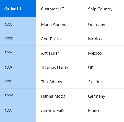
Applying alternate row style
You can apply the alternative row color by using AlternateRowBackground in SfDataGrid.DefaultStyle.
<ContentPage xmlns:syncfusion="http://schemas.syncfusion.com/maui">
    <ContentPage.Content>
        <syncfusion:SfDataGrid x:Name="dataGrid"
                               ItemsSource="{Binding Orders}">
            <syncfusion:SfDataGrid.DefaultStyle>
                <syncfusion:DataGridStyle AlternateRowBackground="#AFD5FB"/>
            </syncfusion:SfDataGrid.DefaultStyle>
        </syncfusion:SfDataGrid>
    </ContentPage.Content>
</ContentPage>
SfDataGrid dataGrid = new SfDataGrid();
OrderInfoViewModel orderInfoViewModel = new OrderInfoViewModel();
dataGrid.ItemsSource = orderInfoViewModel.Orders;
dataGrid.DefaultStyle.AlternateRowBackground = Color.FromArgb("#AFD5FB");
this.Content = dataGrid;
Changing the alternation row count
You can change the row count which should be considered to apply the background for alternate rows using the SfDataGrid.AlternationRowCount property.
<ContentPage xmlns:syncfusion="http://schemas.syncfusion.com/maui">
    <ContentPage.Content>
        <syncfusion:SfDataGrid x:Name="dataGrid"
                               AlternationRowCount="3"
                               ItemsSource="{Binding Orders}">
            <syncfusion:SfDataGrid.DefaultStyle>
                <syncfusion:DataGridStyle AlternateRowBackground="#AFD5FB"/>
            </syncfusion:SfDataGrid.DefaultStyle>
        </syncfusion:SfDataGrid>
    </ContentPage.Content>
</ContentPage>
SfDataGrid dataGrid = new SfDataGrid();
OrderInfoViewModel orderInfoViewModel = new OrderInfoViewModel();
dataGrid.ItemsSource = orderInfoViewModel.Orders;
dataGrid.AlternationRowCount = 3;
dataGrid.DefaultStyle.AlternateRowBackground = Color.FromArgb("#AFD5FB");
this.Content = dataGrid;
Applying Row Hover Background Color
You can enable row hover highlighting effect by setting AllowRowHoverHighlighting property to true. The default value is false. You can change the mouse hover background color using the RowHoveredBackground property of SfDataGrid.DefaultStyle.
<ContentPage xmlns:syncfusion="http://schemas.syncfusion.com/maui">
    <ContentPage.Content>
        <syncfusion:SfDataGrid x:Name="dataGrid"
                               ItemsSource="{Binding Orders}"
                               AllowRowHoverHighlighting="True">
            <syncfusion:SfDataGrid.DefaultStyle>
                <syncfusion:DataGridStyle RowHoveredBackground="#AFD5FB"/>
            </syncfusion:SfDataGrid.DefaultStyle>
        </syncfusion:SfDataGrid>
    </ContentPage.Content>
</ContentPage>
SfDataGrid dataGrid = new SfDataGrid();
OrderInfoViewModel orderInfoViewModel = new OrderInfoViewModel();
dataGrid.ItemsSource = orderInfoViewModel.Orders;
dataGrid.AllowRowHoverHighlighting = true;
dataGrid.DefaultStyle.RowHoveredBackground = Color.FromArgb("#AFD5FB");
this.Content = dataGrid;Applying Column Hover Background Color
The column hover highlighting feature in SfDataGrid allows you to visually highlight an entire column when the mouse pointer is placed over it.
To enable this feature, set the SfDataGrid.AllowColumnHoverHighlighting property to true. The default value is false.
You can also customize the appearance of the highlighted column by setting the ColumnHoveredBackground property in SfDataGrid.DefaultStyle.
<ContentPage xmlns:syncfusion="http://schemas.syncfusion.com/maui">
    <ContentPage.Content>
        <syncfusion:SfDataGrid x:Name="dataGrid"
                               ItemsSource="{Binding Orders}"
                               AllowColumnHoverHighlighting="True">
            <syncfusion:SfDataGrid.DefaultStyle>
                <syncfusion:DataGridStyle ColumnHoveredBackground="#E0C375"/>
            </syncfusion:SfDataGrid.DefaultStyle>
        </syncfusion:SfDataGrid>
    </ContentPage.Content>
</ContentPage>
SfDataGrid dataGrid = new SfDataGrid();
OrderInfoViewModel orderInfoViewModel = new OrderInfoViewModel();
dataGrid.ItemsSource = orderInfoViewModel.Orders;
dataGrid.AllowColumnHoverHighlighting = true;
dataGrid.DefaultStyle.ColumnHoveredBackground = Color.FromArgb("#E0C375");
this.Content = dataGrid;
Applying Header Cell Hover Background Color
The header cell hover highlighting feature in SfDataGrid allows you to visually highlight a column header cell when the mouse pointer is placed over it.
To enable this feature, set the SfDataGrid.AllowHeaderCellHoverHighlighting property to true. The default value is false.
You can also customize the appearance of the hovered header cell by setting the HeaderCellHoveredBackground property in SfDataGrid.DefaultStyle.
<ContentPage xmlns:syncfusion="http://schemas.syncfusion.com/maui">
    <ContentPage.Content>
        <syncfusion:SfDataGrid x:Name="dataGrid"
                               ItemsSource="{Binding Orders}"
                               AllowHeaderCellHoverHighlighting="True">
            <syncfusion:SfDataGrid.DefaultStyle>
                <syncfusion:DataGridStyle HeaderCellHoveredBackground="#B1BFAC"/>
            </syncfusion:SfDataGrid.DefaultStyle>
        </syncfusion:SfDataGrid>
    </ContentPage.Content>
</ContentPage>
SfDataGrid dataGrid = new SfDataGrid();
OrderInfoViewModel orderInfoViewModel = new OrderInfoViewModel();
dataGrid.ItemsSource = orderInfoViewModel.Orders;
dataGrid.AllowHeaderCellHoverHighlighting = true;
dataGrid.DefaultStyle.HeaderCellHoveredBackground = Color.FromArgb("#B1BFAC");
this.Content = dataGrid;
Note: When both Header Cell Hover and Column Hover are enabled, the Column Hover Background Color property will take precedence.
Changing the font style
You can apply the style for header and row font attributes by using SfDataGrid.DefaultStyle.
<ContentPage xmlns:syncfusion="http://schemas.syncfusion.com/maui">
    <ContentPage.Content>
        <syncfusion:SfDataGrid x:Name="dataGrid"
                               ItemsSource="{Binding Orders}">
            <syncfusion:SfDataGrid.DefaultStyle>
                <syncfusion:DataGridStyle HeaderRowFontAttributes="Bold"
                                          HeaderRowFontFamily="TimesNewRoman"
                                          HeaderRowFontSize="16"
                                          RowFontAttributes="Italic"
                                          RowFontFamily="Adabi"
                                          RowFontSize="14"/>
            </syncfusion:SfDataGrid.DefaultStyle>
        </syncfusion:SfDataGrid>
    </ContentPage.Content>
</ContentPage>
SfDataGrid dataGrid = new SfDataGrid();
OrderInfoViewModel orderInfoViewModel = new OrderInfoViewModel();
dataGrid.ItemsSource = orderInfoViewModel.Orders;
var style = new DataGridStyle()
{
HeaderRowFontAttributes = FontAttributes.Bold,
HeaderRowFontFamily = "TimesNewRoman",
HeaderRowFontSize = 16,
RowFontAttributes = FontAttributes.Italic,
RowFontFamily = "Adabi",
RowFontSize = 14
};
dataGrid.DefaultStyle = style;
this.Content = dataGrid;
Border customization
The DataGrid provides support to change the visibility of the vertical and horizontal borders. Set desired value to SfDataGrid.GridLinesVisibility for data rows or SfDataGrid.HeaderGridLinesVisibility for header row.
Following are the options available to customize the grid borders:
- Both
- Horizontal
- Vertical
- None
The following example shows how to apply both vertical and horizontal borders for header and data rows,
<ContentPage xmlns:syncfusion="http://schemas.syncfusion.com/maui">
    <ContentPage.Content>
        <syncfusion:SfDataGrid x:Name="dataGrid"
                               ItemsSource="{Binding Orders}"
                               GridLinesVisibility="Both"
                               HeaderGridLinesVisibility="Both"/>
    </ContentPage.Content>
</ContentPage>
SfDataGrid dataGrid = new SfDataGrid();
OrderInfoViewModel orderInfoViewModel = new OrderInfoViewModel();
dataGrid.ItemsSource = orderInfoViewModel.Orders;
dataGrid.GridLinesVisibility = GridLinesVisibility.Both;
dataGrid.HeaderGridLinesVisibility = GridLinesVisibility.Both;
this.Content = dataGrid;
Changing the border color
The grid line color of column header and data row cells can be customized by setting DataGridStyle.GridLineColor and DataGridStyle.HeaderGridLineColor properties.
<ContentPage xmlns:syncfusion="http://schemas.syncfusion.com/maui">
    <ContentPage.Content>
        <syncfusion:SfDataGrid x:Name="dataGrid"
                               ItemsSource="{Binding Orders}"
                               GridLinesVisibility="Both"
                               HeaderGridLinesVisibility="Both">
            <syncfusion:SfDataGrid.DefaultStyle>
                <syncfusion:DataGridStyle  HeaderGridLineColor="#219ebc"
                                           GridLineColor="#219ebc"/>
            </syncfusion:SfDataGrid.DefaultStyle>
        </syncfusion:SfDataGrid>
    </ContentPage.Content>
</ContentPage>
SfDataGrid dataGrid = new SfDataGrid();
OrderInfoViewModel orderInfoViewModel = new OrderInfoViewModel();
dataGrid.ItemsSource = orderInfoViewModel.Orders;
dataGrid.GridLinesVisibility = GridLinesVisibility.Both;
dataGrid.HeaderGridLinesVisibility = GridLinesVisibility.Both;
dataGrid.DefaultStyle.HeaderGridLineColor = Color.FromArgb("#219ebc");
dataGrid.DefaultStyle.GridLineColor = Color.FromArgb("#219ebc");
this.Content = dataGrid;
Changing the border width
The grid line stroke thickness of column header and data row cells can be customized by setting DataGridStyle.GridLineStrokeThickness and DataGridStyle.HeaderGridLineStrokeThickness properties.
<ContentPage xmlns:syncfusion="http://schemas.syncfusion.com/maui">
    <ContentPage.Content>
        <syncfusion:SfDataGrid x:Name="dataGrid"
                               ItemsSource="{Binding Orders}"
                               GridLinesVisibility="Both"
                               HeaderGridLinesVisibility="Both">
            <syncfusion:SfDataGrid.DefaultStyle>
                <syncfusion:DataGridStyle HeaderGridLineStrokeThickness="3"
                                          GridLineStrokeThickness="3"/>
            </syncfusion:SfDataGrid.DefaultStyle>
        </syncfusion:SfDataGrid>
    </ContentPage.Content>
</ContentPage>
SfDataGrid dataGrid = new SfDataGrid();
OrderInfoViewModel orderInfoViewModel = new OrderInfoViewModel();
dataGrid.ItemsSource = orderInfoViewModel.Orders;
dataGrid.GridLinesVisibility = GridLinesVisibility.Both;
dataGrid.HeaderGridLinesVisibility = GridLinesVisibility.Both;
dataGrid.DefaultStyle.HeaderGridLineStrokeThickness = 3;
dataGrid.DefaultStyle.GridLineStrokeThickness = 3;
this.Content = dataGrid;