Swiping in MAUI DataGrid (SfDataGrid)
7 Jul 202624 minutes to read
The SfDataGrid enables the swiping option by setting the SfDataGrid.AllowSwiping property to true. Swipe views are displayed when swiping left-to-right (swipe right) or right-to-left (swipe left) on a data row. The control provides customizable swipe templates for both the left and right sides. Additionally, the swipe gesture can be restricted to a certain point on the row by setting the SfDataGrid.MaxSwipeOffset property.
Swipe template
The data grid allows for loading desired content using the SfDataGrid.LeftSwipeTemplate when swiping to the right. The template can be defined either in code or XAML. The content within the swipe template is arranged according to the offset values when swiping a data row.
<syncfusion:SfDataGrid x:Name="DataGrid"
                       ItemsSource="{Binding Orders}"
                       AllowSwiping="True">
    <syncfusion:SfDataGrid.LeftSwipeTemplate>
        <DataTemplate>
            <Grid BackgroundColor="#6750A4"
                  Padding="0"
                  ColumnDefinitions="*,*">
                <Label Grid.Column="0"
                       Text="EDIT"
                       HorizontalTextAlignment="End"
                       TextColor="#FFFFFF"
                       VerticalTextAlignment="Center"
                       LineBreakMode="NoWrap"
                       BackgroundColor="Transparent" />
                <Image Grid.Column="1"
                       Source="edit.png"
                       HeightRequest="18"
                       WidthRequest="18"
                       Margin="12,0,0,0"
                       HorizontalOptions="Start"
                       VerticalOptions="Center"/>
            </Grid>
        </DataTemplate>
    </syncfusion:SfDataGrid.LeftSwipeTemplate>
</syncfusion:SfDataGrid>
public partial class MainPage : ContentPage
{
SfDataGrid dataGrid;
OrderInfoViewModel viewModel;
public MainPage()
{
InitializeComponent();
dataGrid = new SfDataGrid();
viewModel = new OrderInfoViewModel();
dataGrid.ItemsSource = viewModel.Orders;
dataGrid.AllowSwiping = true;
dataGrid.LeftSwipeTemplate = new DataTemplate(() =>
{
var grid = new Grid
{
BackgroundColor = Color.FromArgb("#6750A4"),
Padding = new Thickness(0)
};
grid.ColumnDefinitions.Add(new ColumnDefinition());
grid.ColumnDefinitions.Add(new ColumnDefinition());
var editLabel = new Label
{
Text = "EDIT",
HorizontalTextAlignment = TextAlignment.End,
TextColor = Colors.White,
VerticalTextAlignment = TextAlignment.Center,
LineBreakMode = LineBreakMode.NoWrap,
BackgroundColor = Colors.Transparent
};
Grid.SetColumn(editLabel, 0);
var image = new Image
{
Source="edit.png",
HeightRequest = 18,
WidthRequest = 18,
Margin = new Thickness(12, 0, 0, 0),
HorizontalOptions = LayoutOptions.Start,
VerticalOptions = LayoutOptions.Center
};
Grid.SetColumn(image, 1);
grid.Children.Add(editLabel);
grid.Children.Add(image);
return grid;
});
Content = dataGrid;
}
}
Note: Similarly, the desired content can be loaded using the SfDataGrid.RightSwipeTemplate when swiping to the left.
Note:
- The
DataTemplateSelectorcan be directly assigned to both theSfDataGrid.RightSwipeTemplateand theSfDataGrid.LeftSwipeTemplate. You can load the appropriate template based on the RowData and the row element provided in the event arguments.
- When using data template selector, performance issues occur as the conversion template views take time within the framework.
Swipe events
SwipeStarting: Raised when the swipe offset changes from its initial value. The swipe action can be canceled by setting the Cancel property of the DataGridSwipeStartingEventArgs to true.
SwipeEnded: The event is triggered when the swipe offset value reaches SfDataGrid.MaxSwipeOffset, indicating that the swipe action is complete. This event is triggered with DataGridSwipeEndedEventArgs.
Swiping: The event is raised while a row is being swiped. This event is triggered with DataGridSwipingEventArgs.
The swipe events provide the following properties in their arguments:
- RowIndex: Defines the index of the swiping row.
- RowData: Defines the underlying data associated with the swiped row as its argument.
- SwipeDirection: Defines the swipe direction of the swiped row.
- SwipeOffset: Defines the current swipe offset of the row that is being swiped.
By handling the swipe events, you can use the values of these properties from the arguments to perform any desired actions, such as deleting a row or editing the data, etc.
Loading multiple views as swipe template
The swipe templates can be customized by loading any view into the templates and assigning custom actions to them, such as deleting a row, adding a row, or editing the underlying associated data. Multiple views can also be displayed in a template, as shown in the following example, where two views are loaded for editing the cell values in a row and deleting the row, respectively.
<syncfusion:SfDataGrid x:Name="DataGrid"
                       ItemsSource="{Binding Orders}"
                       AllowSwiping="True"
                       SwipeEnded="DataGrid_SwipeEnded">
    <syncfusion:SfDataGrid.LeftSwipeTemplate>
        <DataTemplate>
            <Grid ColumnDefinitions="*,*">
                <Grid.GestureRecognizers>
                    <TapGestureRecognizer NumberOfTapsRequired="1"
                                          Tapped="TapGestureRecognizer_InsertButtonTapped" />
                </Grid.GestureRecognizers>
                <Grid BackgroundColor="#009EDA"
                      ColumnDefinitions="4*,6*"
                      Grid.Column="0">
                    <Image Grid.Column="0"
                           HorizontalOptions="End"
                           Source="insert.png"
                           HeightRequest="18"
                           WidthRequest="18"
                           Margin="0,0,8,0" />
                    <Label Grid.Column="1"
                           BackgroundColor="Transparent"
                           LineBreakMode="NoWrap"
                           Text="INSERT"
                           TextColor="White"
                           HorizontalTextAlignment ="Start"
                           VerticalTextAlignment="Center" />
                </Grid>
                <Grid Grid.Column="1"
                      BackgroundColor="#DC595F"
                      ColumnDefinitions="4*,6*">
                    <Grid.GestureRecognizers>
                        <TapGestureRecognizer NumberOfTapsRequired="1"
                                              Tapped="TapGestureRecognizer_DeleteButtonTapped" />
                    </Grid.GestureRecognizers>
                    <Image Grid.Column="0"
                           BackgroundColor="Transparent"
                           HorizontalOptions="Center"
                           Source="delete.png"
                           HeightRequest="18"
                           WidthRequest="18"/>
                    <Label Grid.Column="1"
                           BackgroundColor="Transparent"
                           LineBreakMode="NoWrap"
                           Text="DELETE"
                           TextColor="White"
                           HorizontalOptions="Start"
                           HorizontalTextAlignment ="Start"
                           VerticalTextAlignment ="Center" />
                </Grid>
            </Grid>
        </DataTemplate>
    </syncfusion:SfDataGrid.LeftSwipeTemplate>
</syncfusion:SfDataGrid>
public partial class MainPage : ContentPage
{
private int swipedRowIndex;
private OrderInfoViewModel ViewModel;
public MainPage()
{
InitializeComponent();
ViewModel = new OrderInfoViewModel();
}
private void TapGestureRecognizer_InsertButtonTapped(object sender, TappedEventArgs e)
{
InsertButtonPressed();
}
private void TapGestureRecognizer_DeleteButtonTapped(object sender, TappedEventArgs e)
{
DeleteButtonPressed();
}
internal void DeleteButtonPressed()
{
ViewModel.Orders.RemoveAt(this.swipedRowIndex - 1);
}
internal void InsertButtonPressed()
{
ViewModel.Orders.Insert(this.swipedRowIndex - 1, InsertItems());
}
private void DataGrid_SwipeEnded(object sender, Syncfusion.Maui.DataGrid.DataGridSwipeEndedEventArgs e)
{
this.swipedRowIndex = e.RowIndex;
}
internal OrderInfo InsertItems()
{
var order = new OrderInfo()
{
OrderID = 1101,
Customer = "Anderson",
City = "Italy",
Country = "France",
};
return order;
}
}
Note: Similarly, you can load two views using the
SfDataGrid.RightSwipeTemplatewhen swiping towards left will result in the following outcome:

Customized swipe delete functionality
Operations such as deleting a row by swiping a data row from one extent to another in the view can be performed.
<syncfusion:SfDataGrid x:Name="DataGrid"
                       ItemsSource="{Binding Orders}"
                       AllowSwiping="True"
                       MaxSwipeOffset="404"
                       SwipeEnded="DataGrid_SwipeEnded">
    <syncfusion:SfDataGrid.LeftSwipeTemplate>
        <DataTemplate>
            <ContentView x:Name="leftTemplateView"
                         BackgroundColor="#1AAA87">
                <Label FontSize="15"
                       Text ="Deleted"
                       TextColor ="White"
                       HorizontalTextAlignment ="Center"
                       VerticalTextAlignment ="Center" />
            </ContentView>
        </DataTemplate>
    </syncfusion:SfDataGrid.LeftSwipeTemplate>
    <syncfusion:SfDataGrid.RightSwipeTemplate>
        <DataTemplate>
            <ContentView x:Name="rightTemplateView"
                         BackgroundColor="#1AAA87">
                <Label FontSize="15"
                       HorizontalTextAlignment ="Center"
                       Text ="Deleted"
                       TextColor ="White"
                       VerticalTextAlignment ="Center" />
            </ContentView>
        </DataTemplate>
    </syncfusion:SfDataGrid.RightSwipeTemplate>
</syncfusion:SfDataGrid>
public partial class MainPage : ContentPage
{
private int swipedRowIndex;
private OrderInfoViewModel ViewModel;
public MainPage()
{
InitializeComponent();
ViewModel = new OrderInfoViewModel();
}
private void DataGrid_SwipeEnded(object sender, Syncfusion.Maui.DataGrid.DataGridSwipeEndedEventArgs e)
{
swipedRowIndex = e.RowIndex;
DoDeleting();
}
private void DoDeleting()
{
ViewModel.Orders.RemoveAt(swipedRowIndex - 1);
}
}
Loading complex template for swiping
The datagrid allows you to swipe the data rows, even when we have a complex template in DataGridTemplateColumn.
<syncfusion:SfDataGrid x:Name="DataGrid"
                       ItemsSource="{Binding Orders}"
                       AllowSwiping="True"
                       RowHeight="60"
                       MaxSwipeOffset="150">
    <syncfusion:SfDataGrid.LeftSwipeTemplate>
        <DataTemplate>
            <Grid BackgroundColor="#6750A4"
                  Padding="0"
                  ColumnDefinitions="*,*">
                <Label Grid.Column="0"
                       Text="EDIT"
                       HorizontalTextAlignment="End"
                       TextColor="#FFFFFF"
                       VerticalTextAlignment="Center"
                       LineBreakMode="NoWrap"
                       BackgroundColor="Transparent" />
                <Image Grid.Column="1"
                       Source="edit.png"
                       HeightRequest="18"
                       WidthRequest="18"
                       Margin="12,0,0,0"
                       HorizontalOptions="Start"
                       VerticalOptions="Center" />
            </Grid>
        </DataTemplate>
    </syncfusion:SfDataGrid.LeftSwipeTemplate>
    <syncfusion:SfDataGrid.Columns>
        <syncfusion:DataGridTemplateColumn MappingName="Customer"
                                           HeaderText="Customer Details"
                                           Width="160">
            <syncfusion:DataGridTemplateColumn.CellTemplate>
                <DataTemplate>
                    <Grid InputTransparent="True"
                          ColumnSpacing="0"
                          RowSpacing="0"
                          HorizontalOptions="Fill"
                          Margin="0"
                          ColumnDefinitions="*,*,*"
                          RowDefinitions="10,*,10">
                        <StackLayout Margin="2"
                                     BackgroundColor="White"
                                     Orientation="Vertical"
                                     HorizontalOptions="Fill"
                                     VerticalOptions="Fill"
                                     Grid.Column="0"
                                     Grid.ColumnSpan="3"
                                     Grid.Row="1">
                            <StackLayout Orientation="Horizontal"
                                         HorizontalOptions="Fill" >
                                <Label Text="Customer ID: "
                                       HorizontalTextAlignment="Start"
                                       FontSize="13"
                                       Padding="0,0,4,0" />
                                <Label Text="{Binding Customer}"
                                       FontAttributes="Bold"
                                       TextColor="Black"
                                       FontSize="13"
                                       HorizontalTextAlignment="Start" />
                            </StackLayout>
                            <StackLayout Orientation="Horizontal"
                                         HorizontalOptions="Fill">
                                <Label Text="Country:"
                                       HorizontalTextAlignment="Start"
                                       FontSize="13"
                                       Padding="0,0,4,0" />
                                <Label Text="{Binding Country}"
                                       FontAttributes="Bold"
                                       TextColor="Black"
                                       FontSize="13"
                                       HorizontalTextAlignment="Start" />
                            </StackLayout>
                        </StackLayout>
                    </Grid>
                </DataTemplate>
            </syncfusion:DataGridTemplateColumn.CellTemplate>
        </syncfusion:DataGridTemplateColumn>
    </syncfusion:SfDataGrid.Columns>
</syncfusion:SfDataGrid>
Cancel the swipe programmatically
The data grid allows you to cancel the swipe programmatically by calling the SfDataGrid.ResetSwipeOffset() method in the SfDataGrid.SwipeEnded event handler.
<syncfusion:SfDataGrid x:Name="DataGrid"
                       ItemsSource="{Binding Orders}"
                       AllowSwiping="True"
                       SwipeEnded="DataGrid_SwipeEnded">
    <syncfusion:SfDataGrid.LeftSwipeTemplate>
        <DataTemplate>
            <Grid BackgroundColor="Blue" Padding="9">
                <Label Text ="Edit"
                   HorizontalTextAlignment="Center"
                   VerticalTextAlignment="Center"
                   LineBreakMode ="NoWrap"
                   BackgroundColor="Transparent"
                   TextColor ="White" />
            </Grid>
        </DataTemplate>
    </syncfusion:SfDataGrid.LeftSwipeTemplate>
    <syncfusion:SfDataGrid.RightSwipeTemplate>
        <DataTemplate>
            <Grid BackgroundColor="Red" Padding="9">
                <Label FontSize="15"
                   HorizontalTextAlignment ="Center"
                   Text ="Delete"
                   TextColor ="White"
                   VerticalTextAlignment ="Center"
                   LineBreakMode ="NoWrap" />
            </Grid>
        </DataTemplate>
    </syncfusion:SfDataGrid.RightSwipeTemplate>
</syncfusion:SfDataGrid>
private void DataGrid_SwipeEnded(object sender, Syncfusion.Maui.DataGrid.DataGridSwipeEndedEventArgs e)
{
DataGrid.ResetSwipeOffset();
}Set MaxSwipeOffset based on content size
Users can restrict the max swipe offset of a row to the width of the content loaded inside the swipe template by setting the SfDataGrid.SwipeOffsetMode as SwipeOffsetMode.Auto. The default value of the SwipeOffsetMode is SwipeOffsetMode.Custom.
SwipeOffsetMode Behavior:
- Auto: The swipe offset automatically calculates based on the actual width of the content in the swipe template. This is useful when swipe content size varies or is dynamic.
-
Custom: The swipe offset is controlled by the
MaxSwipeOffsetproperty value. Use this when you need precise control over how far a row can be swiped.
<syncfusion:SfDataGrid x:Name="DataGrid"
                       ItemsSource="{Binding Orders}"
                       AllowSwiping="True"
                       SwipeOffsetMode="Auto">
    <syncfusion:SfDataGrid.LeftSwipeTemplate>
        <DataTemplate>
            <Grid BackgroundColor="#48cae4"
                  Padding="9">
                <Label Text ="Edit"
                       HorizontalTextAlignment="Center"
                       VerticalTextAlignment="Center"
                       LineBreakMode ="NoWrap"
                       BackgroundColor="Transparent"
                       TextColor ="White" />
            </Grid>
        </DataTemplate>
    </syncfusion:SfDataGrid.LeftSwipeTemplate>
</syncfusion:SfDataGrid>
public partial class MainPage : ContentPage
{
SfDataGrid dataGrid;
OrderInfoViewModel viewModel;
public MainPage()
{
InitializeComponent();
dataGrid = new SfDataGrid();
viewModel = new OrderInfoViewModel();
dataGrid.ItemsSource = viewModel.Orders;
dataGrid.AllowSwiping = true;
dataGrid.SwipeOffsetMode = DataGridSwipeOffsetMode.Auto;
dataGrid.LeftSwipeTemplate = new DataTemplate(() =>
{
var grid = new Grid
{
BackgroundColor = Color.FromArgb("#48cae4"),
Padding = new Thickness(0)
};
var editLabel = new Label
{
Text = "EDIT",
HorizontalTextAlignment = TextAlignment.Center,
TextColor = Colors.White,
VerticalTextAlignment = TextAlignment.Center,
LineBreakMode = LineBreakMode.NoWrap,
BackgroundColor = Colors.Transparent
};
grid.Children.Add(editLabel);
return grid;
});
Content = dataGrid;
}
}
Note: The value of the
SfDataGrid.MaxSwipeOffsetproperty will not be considered when theSfDataGrid.SwipeOffsetModeis set toSwipeOffsetMode.Auto.
Load custom swipe buttons based on row data
Using a DataTemplateSelector, you can load specific views based on row data, such as SfDataGrid.RightSwipeTemplate and SfDataGrid.LeftSwipeTemplate. Refer to the code example below to load the desired template based on the row data.
<syncfusion:SfDataGrid x:Name="DataGrid"
ItemsSource="{Binding Orders}"
AllowSwiping="True">
<syncfusion:SfDataGrid.LeftSwipeTemplate>
<local:LeftTemplateSelector />
</syncfusion:SfDataGrid.LeftSwipeTemplate>
<syncfusion:SfDataGrid.RightSwipeTemplate>
<local:RightTemplateSelector />
</syncfusion:SfDataGrid.RightSwipeTemplate>
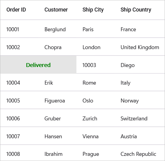
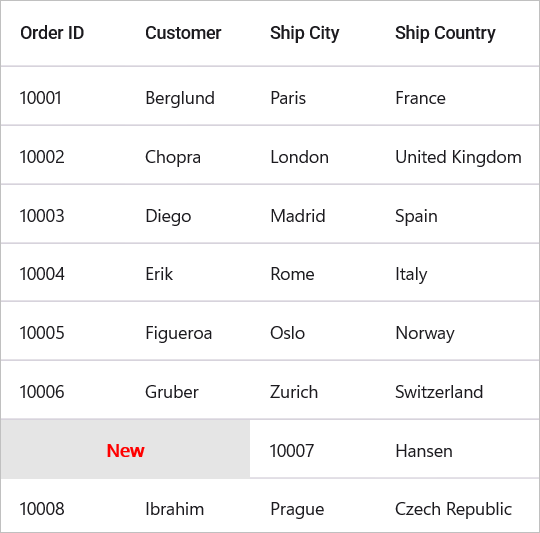
</syncfusion:SfDataGrid>public class LeftTemplateSelector : DataTemplateSelector
{
protected override DataTemplate OnSelectTemplate(object item, BindableObject container)
{
var value = (item as OrderInfo).Status;
if (value == "Delivered")
{
var dataTemplate = new DataTemplate(() =>
{
Button button = new Button()
{
TextColor = Colors.Green,
VerticalOptions = LayoutOptions.Center,
HorizontalOptions = LayoutOptions.Center,
Text = "Delivered",
BackgroundColor = Color.FromArgb("#e5e5e5"),
WidthRequest = 200,
CornerRadius = 0,
FontAttributes = FontAttributes.Bold
};
return button;
});
return dataTemplate;
}
else if(value == "New")
{
var dataTemplate = new DataTemplate(() =>
{
Grid grid = new Grid();
Button button = new Button()
{
TextColor = Colors.Red,
VerticalOptions = LayoutOptions.Center,
HorizontalOptions = LayoutOptions.Center,
Text = "New",
WidthRequest = 200,
BackgroundColor = Color.FromArgb("#e5e5e5"),
CornerRadius = 0,
FontAttributes = FontAttributes.Bold
};
grid.Add(button);
return grid;
});
return dataTemplate;
}
else
{
var dataTemplate = new DataTemplate(() =>
{
Button button = new Button()
{
TextColor = Color.FromArgb("#4c1e4f"),
VerticalOptions = LayoutOptions.Center,
HorizontalOptions = LayoutOptions.Center,
Text = value,
BackgroundColor = Color.FromArgb("#e5e5e5"),
WidthRequest = 200,
CornerRadius = 0,
FontAttributes = FontAttributes.Bold
};
return button;
});
return dataTemplate;
}
}
}
public class RightTemplateSelector : DataTemplateSelector
{
protected override DataTemplate OnSelectTemplate(object item, BindableObject container)
{
var value = (item as OrderInfo).Quantity;
if (value <= 3)
{
var dataTemplate = new DataTemplate(() =>
{
Button button = new Button()
{
TextColor = Colors.Green,
VerticalOptions = LayoutOptions.Center,
HorizontalOptions = LayoutOptions.Center,
Text = "Shipping Charge",
BackgroundColor = Colors.LightGray,
WidthRequest = 200,
CornerRadius = 0,
FontAttributes = FontAttributes.Bold
};
return button;
});
return dataTemplate;
}
else
{
var dataTemplate = new DataTemplate(() =>
{
Button button = new Button()
{
TextColor = Colors.Red,
VerticalOptions = LayoutOptions.Center,
HorizontalOptions = LayoutOptions.Center,
Text = "Free Shipping",
BackgroundColor = Colors.LightGray,
WidthRequest = 200,
CornerRadius = 0,
FontAttributes = FontAttributes.Bold
};
return button;
});
return dataTemplate;
}
}
}The following screenshot illustrates the custom swipe buttons that are loaded based on the cell value of the “Is Delivered” switch column.
Enable swiping for summary and unbound rows
By default, swiping is disabled for non-data rows (UnboundRow, CaptionSummaryRow, GroupSummaryRow, and TableSummaryRow). To enable swiping for these row types, handle the SfDataGrid.SwipeStarting event and set the Cancel property to false based on your requirements.
private void dataGrid_SwipeStarting(object sender, Syncfusion.Maui.DataGrid.DataGridSwipeStartingEventArgs e)
{
    if(dataGrid.IsUnboundRow(e.RowIndex) || dataGrid.IsCaptionSummaryRow(e.RowIndex) || dataGrid.IsGroupSummaryRow(e.RowIndex))
    {
        e.Cancel = false;
    }
    else if (e.RowData.GetType() == typeof(SummaryRecordEntry))
    {
        if ((e.RowData as SummaryRecordEntry).Parent?.GetType() == typeof(Group))
        {
            // Enable swiping for group summary row.
            e.Cancel = false;
        }
        else
        {
            // Enable swiping for table summary row.
            e.Cancel = false;
        }
    }
}