How can I help you?
.NET MAUI DataGrid (SfDataGrid) Overview
18 Aug 20254 minutes to read
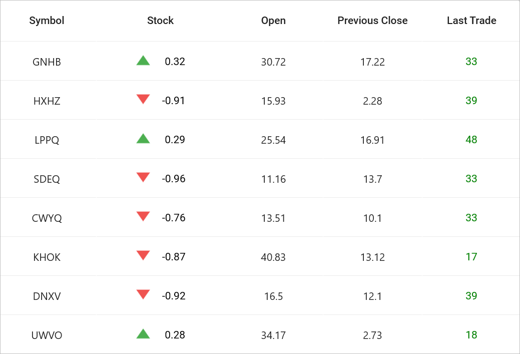
The .NET MAUI DataGrid control is used to display and manipulate data in a tabular view. It was built from the ground up to achieve the best possible performance, even when loading large amounts of data.

Key Features
-
Data Binding - Bind different types of data sources, including DataTable.
-
Column Types - Show different data types in different types of columns. The following column types are supported: numeric, text, date, checkbox, image, combobox, picker and template. The template column is used to load any control in a column.
-
Column Resizing - Interactive support to adjust the width of columns.
-
Column Drag and Drop - Interactive support to drag and drop columns.
-
Row drag and drop - Interaction support to drag and drop rows.
-
Swiping - Interaction support to swipe the rows.
-
Editing - Interactive support to edit with different column types.
-
Sorting - Interactively sort one or more columns.
-
Grouping - Use user-interactive grouping to group one or more columns.
-
Summaries - Extensive support to show brief information about the individual data columns or groups of rows.
-
Filtering - Programmatically filter data based on the criteria.
-
Data virtualization – Support for different modes of data virtualization such as paging, incremental loading.
-
Selection - Select one or more rows. Keyboard navigation is supported in Windows platform.
-
Search - Supports highlighting cell content and provides navigation functionalities.
-
Master-Details View – Supports displaying relational data using hierarchies.
-
Record Template View - Supports customization of row presentation by defining templates for displaying additional information or complex layouts within the DataGrid.
-
Column Sizing - Set the width of columns with various sizing options. Columns can also be sized based on their content.
-
Auto row height - Set the height for rows based on the content of their cells.
-
Freeze Panes - Freeze the rows and columns, keeping them fixed in place while scrolling the grid.
-
Styling - Customize the appearance of cells and headers. Conditional styling is supported.
-
Paging - Support for loading data in segments when dealing with large volumes of data.
-
Stacked Headers - Extensive support to show multiple headers called stacked headers.
-
Load More - Display an interactive view when the grid reaches its maximum or minimum offset while scrolling down or up. Tapping the interactive view triggers a command to add more data to the item source of the grid at runtime.
-
Pull To Refresh - Support allows users to load a subset of data when the DataGrid is pulled down.
-
Serialization and Deserialization – Supports the transfer of grid properties and settings between different instances, allowing for easy saving and loading of configurations.
-
Clipboard Operations – Supports standard clipboard functionalities, enabling the cutting, copying, and pasting of data within the DataGrid and across other applications.
-
Exporting - Support to export the data to Excel and PDF.
-
Unbound column - It allows adding additional columns that are not bound with data objects from the underlying data source.
-
Unbound Row - It allows adding rows at the top and bottom of the DataGrid which are not bound with data objects from the underlying data source.
-
Theme - Use a dark or light theme.
-
Accessibility - The DataGrid can easily be accessed by screen readers.
-
Right to Left (RTL) - Right-to-left direction support for users working in RTL languages like Hebrew and Arabic.
NOTE
You can refer to our MAUI DataGrid feature tour page for its groundbreaking feature representations. You can also explore our MAUI DataGrid example to learn about various features and how to easily configure them, with built-in support for creating stunning visual effects.