Grouping in MAUI DataGrid (SfDataGrid)
7 Jul 202624 minutes to read
Grouping in a datagrid refers to the process of organizing and categorizing data based on specific criteria or field values. It allows you to group related records together, creating a hierarchical structure within the datagrid. Each group is identified by its CaptionSummaryRow, which displays the group key and provides access to the underlying records in that group. The CaptionSummaryRow shows summary information such as the grouping column value and the count of records in each group.
Note:
- To update the grouping for the newly added row or column, set the
SfDataGrid.View.LiveDataUpdateModetoLiveDataUpdateMode.AllowDataShaping.- When
BeginInitmethod is called, it suspends all the updates untilEndInitmethod is called.
UI Grouping
You can enable data grouping in the SfDataGrid by setting the SfDataGrid.AllowGrouping property to true. This allows end users to group data by dragging and dropping columns into the GroupDropArea. When a column is grouped, all records with the same value in that column are organized together in a group.
<syncfusion:SfDataGrid x:Name="dataGrid"
                       ItemsSource="{Binding Orders}"
                       AllowGrouping="True">
</syncfusion:SfDataGrid>
SfDataGrid dataGrid = new SfDataGrid();
OrderInfoViewModel viewModel = new OrderInfoViewModel();
dataGrid.ItemsSource = viewModel.Orders;
dataGrid.AllowGrouping = true;
this.Content = dataGrid;You can group data by an unlimited number of columns. To group multiple columns, drag and drop the desired column headers into the GroupDropArea.

Each group is represented by a CaptionSummaryRow, which organizes data into a hierarchical tree structure according to identical values in the grouped column. Users can expand or collapse the underlying records in a group by clicking on its group caption.
A CaptionSummaryRow displays details about its group, such as the group name and the number of records it contains. For more details, refer to the Caption Summaries section.
Appearance
GroupDropAreaText
You can modify the GroupDropArea text by setting the SfDataGrid.GroupDropAreaText property.
<syncfusion:SfDataGrid x:Name="dataGrid"
                       ItemsSource="{Binding Orders}"
                       GroupDropAreaText="Drag and drop the column here"
                       AllowGrouping="True">
</syncfusion:SfDataGrid>
SfDataGrid dataGrid = new SfDataGrid();
OrderInfoViewModel viewModel = new OrderInfoViewModel();
dataGrid.ItemsSource = viewModel.Orders;
dataGrid.AllowGrouping = true;
dataGrid.GroupDropAreaText = "Drag and drop the column here";
this.Content = dataGrid;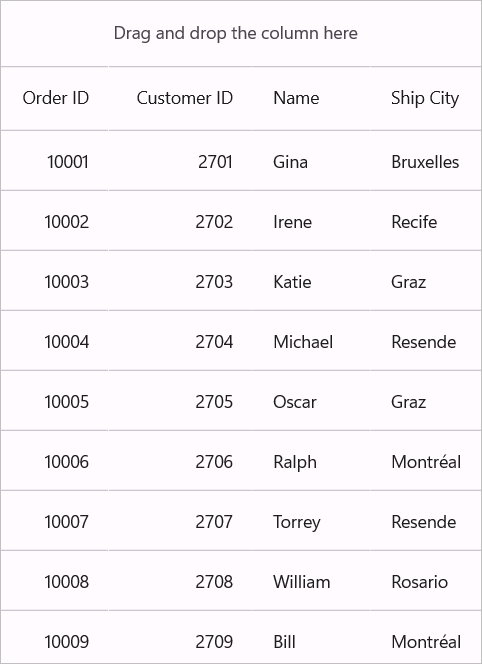
GroupDropAreaHeight
Use the SfDataGrid.GroupDropAreaHeight property to control the vertical size of the GroupDropArea (the region where users drag column headers to create groups).
<syncfusion:SfDataGrid x:Name="dataGrid"
                       ItemsSource="{Binding Orders}"
                       GroupDropAreaHeight="100"
                       AllowGrouping="True">
</syncfusion:SfDataGrid>
SfDataGrid dataGrid = new SfDataGrid();
OrderInfoViewModel viewModel = new OrderInfoViewModel();
dataGrid.ItemsSource = viewModel.Orders;
dataGrid.AllowGrouping = true;
dataGrid.GroupDropAreaHeight = 100;
this.Content = dataGrid;
Customize the GroupDropArea
You can style the GroupDropArea using the following SfDataGrid properties:
- GroupDropAreaStrokeThickness: Sets the border thickness of the GroupDropArea.
- GroupDropAreaStroke: Sets the border color of the GroupDropArea.
- GroupDropAreaBackgroundColor: Sets the background color of the GroupDropArea.
- GroupDropAreaTextColor: Sets the color of the instructional text displayed in the GroupDropArea.
- GroupDropAreaFontSize: Sets the font size of the GroupDropArea text.
- GroupDropAreaFontFamily: Sets the font family used for the GroupDropArea text.
- GroupDropAreaFontAttribute: Sets the font style of the GroupDropArea text.
<syncfusion:SfDataGrid x:Name="dataGrid"
                       ItemsSource="{Binding Orders}"
                       AllowGrouping="True">
    <syncfusion:SfDataGrid.DefaultStyle>
        <syncfusion:DataGridStyle GroupDropAreaTextColor="Blue"
                                  GroupDropAreaBackgroundColor="Yellow"
                                  GroupDropAreaFontAttribute="Bold"
                                  GroupDropAreaFontSize="18"
                                  GroupDropAreaStroke="Brown"
                                  GroupDropAreaStrokeThickness="2"
                                  GroupDropAreaFontFamily="Roboto"/>
    </syncfusion:SfDataGrid.DefaultStyle>
</syncfusion:SfDataGrid>
SfDataGrid dataGrid = new SfDataGrid();
OrderInfoViewModel viewModel = new OrderInfoViewModel();
dataGrid.ItemsSource = viewModel.Orders;
dataGrid.AllowGrouping = true;
var defaultStyle = new DataGridStyle()
{
GroupDropAreaTextColor = Colors.Blue,
GroupDropAreaBackgroundColor = Colors.Yellow,
GroupDropAreaFontAttribute = FontAttributes.Bold,
GroupDropAreaFontSize = 18,
GroupDropAreaStroke = Colors.Brown,
GroupDropAreaStrokeThickness = 2,
GroupDropAreaFontFamily = "Roboto"
};
dataGrid.DefaultStyle = defaultStyle;
this.Content = dataGrid;Customize the GroupDropAreaItem
You can style the GroupDropAreaItem using the following SfDataGrid properties:
- GroupDropItemBackgroundColor: Sets the background color of the GroupDropItem.
- GroupDropItemTextColor: Sets the color of the text displayed in the GroupDropItem.
- GroupDropItemFontSize: Sets the font size of the GroupDropItem text.
- GroupDropItemFontFamily: Sets the font family used for the GroupDropItem text.
- GroupDropItemFontAttribute: Sets the font style of the GroupDropItem text.
- GroupDropItemStrokeThickness: Sets the border thickness of the GroupDropItem.
- GroupDropItemStroke: Sets the border color of the GroupDropItem.
- GroupDropItemCloseIconColor: Sets the color of the close icon displayed in the GroupDropItem.
<syncfusion:SfDataGrid x:Name="dataGrid"
                       ItemsSource="{Binding Orders}"
                       AllowGrouping="True">
    <syncfusion:SfDataGrid.DefaultStyle>
        <syncfusion:DataGridStyle GroupDropItemTextColor="Blue"
                                  GroupDropItemBackgroundColor="Yellow"
                                  GroupDropItemFontAttribute="Bold"
                                  GroupDropItemFontSize="18"
                                  GroupDropItemStroke="Brown"
                                  GroupDropItemStrokeThickness="2"
                                  GroupDropItemFontFamily="Roboto"
                                  GroupDropItemCloseIconColor="Gray"/>
    </syncfusion:SfDataGrid.DefaultStyle>
</syncfusion:SfDataGrid>
dataGrid = new SfDataGrid();
dataGrid.ItemsSource = viewModel.Orders;
dataGrid.AllowGrouping = true;
var defaultStyle = new DataGridStyle()
{
GroupDropItemTextColor = Colors.Blue,
GroupDropItemBackgroundColor = Colors.Yellow,
GroupDropItemFontAttribute = FontAttributes.Bold,
GroupDropItemFontSize = 18,
GroupDropItemStroke = Colors.Brown,
GroupDropItemStrokeThickness = 2,
GroupDropItemFontFamily = "Roboto",
GroupDropItemCloseIconColor = Colors.Gray
};
dataGrid.DefaultStyle = defaultStyle;
this.Content = dataGrid;Programmatic Grouping
The SfDataGrid allows to perform grouping programmatically by adding the GroupColumnDescription object in the SfDataGrid.GroupColumnDescriptions collection. It groups the data based on the GroupColumnDescription object added to this collection.
GroupColumnDescription object holds following two properties:
- ColumnName: The name of the grouped column.
- Converter: It accepts an
IValueConverteras input that helps to apply custom grouping.
To apply column grouping, please refer to the following code example:
<syncfusion:SfDataGrid x:Name="dataGrid"
                       ItemsSource="{Binding Orders}">
    <syncfusion:SfDataGrid.GroupColumnDescriptions>
        <syncfusion:GroupColumnDescription ColumnName="Customer" />
    </syncfusion:SfDataGrid.GroupColumnDescriptions>
</syncfusion:SfDataGrid>
SfDataGrid dataGrid = new SfDataGrid();
OrderInfoViewModel viewModel = new OrderInfoViewModel();
dataGrid.ItemsSource = viewModel.Orders;
dataGrid.GroupColumnDescriptions.Add (new GroupColumnDescription ()
{
ColumnName = "Customer",
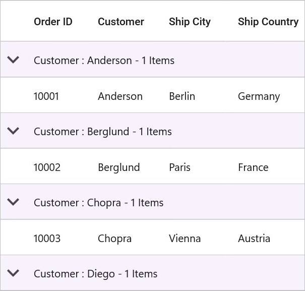
});
this.Content = dataGrid;The following screenshot shows the rendered output when grouping is applied:
Clearing or removing a group
To clear the applied grouping, you can simply remove the particular item from the SfDataGrid.GroupColumnDescriptions collection or clear the entire collection.
//Clearing the Group
dataGrid.GroupColumnDescriptions.Clear();

//Removing the Group based on group item
var groupColumn = dataGrid.GroupColumnDescriptions[1];
dataGrid.GroupColumnDescriptions.Remove(groupColumn);

//Removing the Group based on group index
dataGrid.GroupColumnDescriptions.RemoveAt(0);
Multi Grouping
The SfDataGrid also allows to group the data against one or more columns using the SfDataGrid.GroupingMode property. When the GroupingMode is set as GroupingMode.Multiple, the data is organized into a hierarchical tree structure based on identical values of that column. The multi-grouping feature works similarly to the multi-sorting feature. Initially, the data is grouped according to the first column added in the GroupColumnDescriptions collection. When more columns are added to the GroupColumnDescriptions, the newly added column will be grouped in consideration of the previous group(s). This results in a tree-like hierarchy. Refer to the following code snippet to enable MultiGrouping:
<syncfusion:SfDataGrid  x:Name="dataGrid"
                        ItemsSource="{Binding Orders}"
                        GroupingMode="Multiple">

    <syncfusion:SfDataGrid.GroupColumnDescriptions>
        <syncfusion:GroupColumnDescription ColumnName="Customer" />
        <syncfusion:GroupColumnDescription ColumnName="City" />
    </syncfusion:SfDataGrid.GroupColumnDescriptions>
</syncfusion:SfDataGrid>
SfDataGrid dataGrid = new SfDataGrid();
OrderInfoViewModel viewModel = new OrderInfoViewModel();
dataGrid.ItemsSource = viewModel.Orders;
dataGrid.GroupingMode = GroupingMode.Multiple;
dataGrid.GroupColumnDescriptions.Add (new GroupColumnDescription ()
{
ColumnName = "Customer"
});
dataGrid.GroupColumnDescriptions.Add (new GroupColumnDescription ()
{
ColumnName = "City"
});
this.Content = dataGrid;The following screenshot shows the multi-grouping:

Custom Grouping
The SfDataGrid allows to group a column based on custom logic when the standard grouping techniques do not meet the requirements. You can choose between two approaches:
- IValueConverter: Simpler approach for basic grouping logic with data transformation.
- KeySelector: More direct approach providing full access to the data object for complex scenarios.
Using IValueConverter
To achieve this, you need to write a converter that implements IValueConverter with custom grouping logic and assign that converter to the GroupColumnDescription.Converter property.
To set a custom grouping converter for the group description that is added to group the freight column, follow the code example below:
<ContentPage xmlns="http://schemas.microsoft.com/dotnet/2021/maui"
             xmlns:x="http://schemas.microsoft.com/winfx/2009/xaml"
             xmlns:syncfusion="clr-namespace:Syncfusion.Maui.DataGrid;assembly=Syncfusion.Maui.DataGrid"
             xmlns:local="clr-namespace:GroupingUI"
             x:Class="GroupingUI.MainPage">

    <ContentPage.Resources>
        <ResourceDictionary>
            <local:GroupConverter x:Key="groupConverter" />
        </ResourceDictionary>
    </ContentPage.Resources>

    <ContentPage.BindingContext>
        <local:ViewModel x:Name="viewModel" />
    </ContentPage.BindingContext>

    <syncfusion:SfDataGrid x:Name="dataGrid"
                           ItemsSource="{Binding Orders}">

        <syncfusion:SfDataGrid.GroupColumnDescriptions>
            <syncfusion:GroupColumnDescription ColumnName="Freight"
                                               Converter="{StaticResource groupConverter}" />
        </syncfusion:SfDataGrid.GroupColumnDescriptions>
    </syncfusion:SfDataGrid>
</ContentPage>
SfDataGrid dataGrid = new SfDataGrid();
OrderInfoViewModel viewModel = new OrderInfoViewModel();
dataGrid.ItemsSource = viewModel.Orders;
dataGrid.GroupColumnDescriptions.Add (new GroupColumnDescription ()
{
ColumnName = "Freight",
Converter = new GroupConverter()
});
this.Content = dataGrid;The following code example illustrates the converter used for applying custom grouping logic.
public class GroupConverter : IValueConverter
{
    public object Convert(object value, Type targetType, object parameter, CultureInfo culture)
    {
        var orderInfo = value as OrderInfo;
        if (orderInfo.Freight > 0 && orderInfo.Freight <= 250)
            return "<=250";
        else if (orderInfo.Freight > 250 && orderInfo.Freight <= 500)
            return ">250 & <=500";
        else if (orderInfo.Freight > 500 && orderInfo.Freight <= 750)
            return ">500 & <=750";
        else
            return ">1000";
    }

    public object ConvertBack(object value, Type targetType, object parameter, CultureInfo culture)
    {
        return null;
    }
}
Using KeySelector
To achieve this, specify the custom logic in GroupColumnDescription.KeySelector property and column name in GroupColumnDescription.ColumnName property. The KeySelector is a delegate that takes the column name and data item as parameters and returns the grouping key. This approach provides direct access to the data object, making it ideal for complex grouping scenarios requiring property inspection or calculations.
In the below example, the Date column is grouped based on weeks.
//Apply the CustomGrouping for Date Column by using KeySelector.
dataGrid.GroupColumnDescriptions.Add(new GroupColumnDescription()
{
    ColumnName = "Date",
    KeySelector = (string ColumnName, object o) =>
        {
            var dt = DateTime.Now;
            var item = (o as SalesByDate).Date;
            var days = (int)Math.Floor((dt - item).TotalDays);
            var dayOfWeek = (int)dt.DayOfWeek;
            var difference = days - dayOfWeek;
            if (days <= dayOfWeek)
            {
                if (days == 0)
                    return "TODAY";
                if (days == 1)
                    return "YESTERDAY";
                return item.Date.DayOfWeek.ToString().ToUpper();
            }
            if (difference > 0 && difference <= 7)
                return "LAST WEEK";
            if (difference > 7 && difference <= 14)
                return "TWO WEEKS AGO";
            if (difference > 14 && difference <= 21)
                return "THREE WEEKS AGO";
            if (dt.Year == item.Date.Year && dt.Month == item.Date.Month)
                return "EARLIER THIS MONTH";
            if (DateTime.Now.AddMonths(-1).Month == item.Date.Month)
                return "LAST MONTH";
            return "OLDER";
        }

});
Sorting the records in the grouped columns
In custom grouping, you can sort all the inner records of each group by setting GroupColumnDescription.SortGroupRecords property as true. This will sort the records based on the GroupColumnDescription.ColumnName property.
<ContentPage xmlns="http://schemas.microsoft.com/dotnet/2021/maui"
             xmlns:x="http://schemas.microsoft.com/winfx/2009/xaml"
             xmlns:syncfusion="clr-namespace:Syncfusion.Maui.DataGrid;assembly=Syncfusion.Maui.DataGrid"
             xmlns:local="clr-namespace:GroupingUI"
             x:Class="GroupingUI.MainPage">
    <ContentPage.Resources>
        <ResourceDictionary>
            <local:GroupOrderNoConverter x:Key="groupOrderNoConverter" />
            <local:PriceConverter x:Key="priceConverter" />
        </ResourceDictionary>
    </ContentPage.Resources>

    <ContentPage.BindingContext>
        <local:ViewModel x:Name="viewModel" />
    </ContentPage.BindingContext>

    <syncfusion:SfDataGrid x:Name="dataGrid"
                           ItemsSource="{Binding Orders}">
        <syncfusion:SfDataGrid.GroupColumnDescriptions>
            <syncfusion:GroupColumnDescription ColumnName="OrderID"
                                               Converter="{StaticResource groupOrderNoConverter}"
                                               SortGroupRecords="True" />
            <syncfusion:GroupColumnDescription ColumnName="UnitPrice"
                                               Converter="{StaticResource priceConverter}"
                                               SortGroupRecords="False" />
        </syncfusion:SfDataGrid.GroupColumnDescriptions>
    </syncfusion:SfDataGrid>
</ContentPage>dataGrid.GroupColumnDescriptions.Add(new GroupColumnDescription()
{
ColumnName = "OrderID",
Converter = new GroupOrderNoConverter(),
SortGroupRecords = false
});
dataGrid.GroupColumnDescriptions.Add(new GroupColumnDescription()
{
ColumnName = "Price",
Converter = new PriceConverter(),
SortGroupRecords = true
});
public class GroupOrderNoConverter : IValueConverter
{
public object Convert(object value, Type targetType, object parameter, CultureInfo culture)
{
var orderInfo = value as OrderInfo;
if (orderInfo.OrderID < 10005)
return "<10005";
else if (orderInfo.OrderID >= 10005 && orderInfo.OrderID < 10010)
return "Between 10005 To 10010";
else if (orderInfo.OrderID >= 10010 && orderInfo.OrderID < 10015)
return "Between 10010 To 10015";
else
return ">100015";
}
public object ConvertBack(object value, Type targetType, object parameter, CultureInfo culture)
{
return null;
}
}
public class PriceConverter : IValueConverter
{
public object Convert(object value, Type targetType, object parameter, CultureInfo culture)
{
var orderInfo = value as OrderInfo;
if (orderInfo.UnitPrice < 50)
return "<50";
else if (orderInfo.UnitPrice >= 50 && orderInfo.UnitPrice < 150)
return "Between 50 To 150";
else if (orderInfo.UnitPrice >= 150 && orderInfo.UnitPrice <= 250)
return "Between 150 To 250";
else
return ">250";
}
public object ConvertBack(object value, Type targetType, object parameter, CultureInfo culture)
{
return null;
}
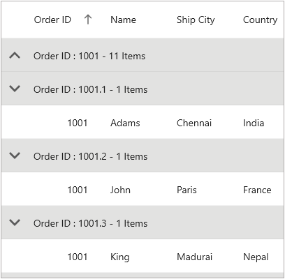
}As you can see in the below screenshot, the records are sorted based on the OrderNo column, since SortGroupRecords is set as true and it is not sorted further based on Price column since SortGroupRecords is set as false.

Display based grouping using GroupMode property
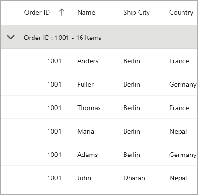
By default, column grouping occurs based on the value in the underlying collection thereby creating a new group for each new value of that column. However, a column can also be grouped based on the Display value by setting the DataGridColumn.GroupMode property as Display. When GroupMode is set to Display, the data grid groups records by their formatted display values rather than the underlying values. In the following code example, set the DataGridColumn.Format property as “#” which displays only the rounded off value in the DataGridCell. For numeric values, common format strings include “0” (round to nearest integer), “0.0” (one decimal), and “C” (currency). Refer to .NET format string documentation for additional format options.
<syncfusion:DataGridTextColumn HeaderText="Order ID"
                               MappingName="OrderID"
                               GroupMode="Display"
                               Format="#" />
DataGridTextColumn orderID = new DataGridTextColumn();
orderID.MappingName = "OrderID";
orderID.GroupMode = Syncfusion.Maui.Data.DataReflectionMode.Display;
orderID.Format = "#";The following screenshot shows a comparison between two group modes. GroupMode.Value on the Top and GroupMode.Display on the Bottom:
Expand and Collapse Groups
To expand and collapse the groups at runtime, you can simply set the SfDataGrid.AllowGroupExpandCollapse property to true. The groups will be in expanded state by default.
<syncfusion:SfDataGrid  x:Name="dataGrid"
                        AllowGroupExpandCollapse="True"
                        ItemsSource="{Binding Orders}" />
SfDataGrid dataGrid = new SfDataGrid();
OrderInfoViewModel viewModel = new OrderInfoViewModel();
dataGrid.AllowGroupExpandCollapse = true;
dataGrid.ItemsSource = viewModel.Orders;
this.Content = dataGrid;Expand groups initially
To expand all groups initially, set the SfDataGrid.AutoExpandGroups to true. While grouping any column, all groups will be in expanded state.
<syncfusion:SfDataGrid  x:Name="dataGrid"
                        AutoExpandGroups="True"
                        AllowGroupExpandCollapse="True"
                        ItemsSource="{Binding Orders}" />
SfDataGrid dataGrid = new SfDataGrid();
OrderInfoViewModel viewModel = new OrderInfoViewModel();
dataGrid.AutoExpandGroups = true;
dataGrid.AllowGroupExpandCollapse = true;
dataGrid.ItemsSource = viewModel.Orders;
this.Content = dataGrid;Expand or collapse all the groups
To expand and collapse the groups programmatically, you can simply invoke the SfDataGrid.ExpandAllGroups and SfDataGrid.CollapseAllGroups methods.
this.dataGrid.ExpandAllGroups();
this.dataGrid.CollapseAllGroups();
Expand or collapse a specific group
To expand and collapse specific groups programmatically, retrieve a Group object from the SfDataGrid.View.Groups collection and pass it to the SfDataGrid.ExpandGroup or SfDataGrid.CollapseGroup methods.
// Get the first group from the View
var group = (dataGrid.View.Groups[0] as Group);

// Expand or collapse the specific group
this.dataGrid.ExpandGroup(group);
this.dataGrid.CollapseGroup(group);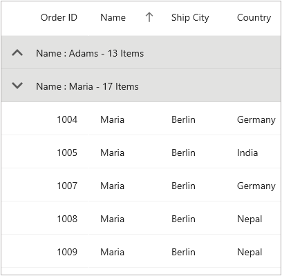
Events
GroupExpanding
The GroupExpanding event occurs when a group is being expanded.
The DataGridColumnGroupChangingEventArgs of the GroupExpanding event provides information about the expanding group and has the following members:
Syncfusion.Data.Group: Gets the expanding group. The Group object contains the Key property (grouping key value) and other properties like ItemsCount (number of records in the group) and IsExpanded (current expansion state).
Cancel: Determines whether to cancel group expansion.
Cancel the group expansion by setting DataGridColumnGroupChangingEventArgs.Cancel to true.
this.dataGrid.GroupExpanding += dataGrid_GroupExpanding;

void dataGrid_GroupExpanding(object sender, DataGridColumnGroupChangingEventArgs e)
{
    if (e.Group.Key.Equals(1001))
        e.Cancel = true;
}
GroupExpanded event
The SfDataGrid.GroupExpanded event occurs after a group is expanded.
The DataGridColumnGroupChangedEventArgs of the GroupExpanded event provides information about the expanded group and it has the following member:
Syncfusion.Data.Group: Retrieves the expanded group.
GroupCollapsing event
The SfDataGrid.GroupCollapsing event occurs when group is being collapsed.
The DataGridColumnGroupChangingEventArgs of the GroupCollapsing event provides the information about the collapsing group and it contains the following member:
Syncfusion.Data.Group: Gets the collapsed group.
Cancel: Determines whether to cancel group collapsing.
Cancel the group is being collapsed by setting the DataGridColumnGroupChangingEventArgs.Cancel to true.
this.dataGrid.GroupCollapsing += dataGrid_GroupCollapsing;

void dataGrid_GroupCollapsing(object sender, DataGridColumnGroupChangingEventArgs e)
{
    if (e.Group.Key.Equals(1001))
        e.Cancel = true;
}
GroupCollapsed event
The SfDataGrid.GroupCollapsed event occurs after group collapsed.
The DataGridColumnGroupChangedEventArgs of the GroupCollapsed event provides the information about collapsed group and it contains the following member:
Syncfusion.Data.Group: Gets the collapsed group.
Customization
Customize indent column width
The width of indent column can be customized by the IndentColumnWidth property. The default width of the indent column is 35.
<syncfusion:SfDataGrid  x:Name="dataGrid"
                        ItemsSource="{Binding Orders}"
                        IndentColumnWidth="60" />
SfDataGrid dataGrid = new SfDataGrid();
OrderInfoViewModel viewModel = new OrderInfoViewModel();
dataGrid.ItemsSource = viewModel.Orders;
dataGrid.IndentColumnWidth = 60;
this.Content = dataGrid;Customize indent column background color
The indent columns can be customized by writing the implicit style for the DataGridIndentCell. The indent cell is a container that appears to the left of grouped rows and displays the expand/collapse button.
The following code snippet shows how to apply a background color to the indent cell based on the row type (header, caption, or data row) by creating a converter that examines the parent row’s data:
<ContentPage.Resources>
    <ResourceDictionary>
        <local:CellStyleConverter x:Key="cellStyleConverter" />
        <Style TargetType="syncfusion:DataGridIndentCell">
            <Setter Property="Background"
                    Value="{Binding Source={RelativeSource Mode=Self},
                    Converter={StaticResource cellStyleConverter}}" />
        </Style>
    </ResourceDictionary>
</ContentPage.Resources>
<syncfusion:SfDataGrid  x:Name="dataGrid"
                        ItemsSource="{Binding Orders}">
    <syncfusion:SfDataGrid.GroupColumnDescriptions>
        <syncfusion:GroupColumnDescription ColumnName="Customer" />
        <syncfusion:GroupColumnDescription ColumnName="City" />
    </syncfusion:SfDataGrid.GroupColumnDescriptions>
</syncfusion:SfDataGrid>
public class CellStyleConverter : IValueConverter
{
object IValueConverter.Convert(object value, Type targetType, object parameter, CultureInfo info)
{
var rowType = ((value as DataGridIndentCell)?.Parent as DataGridRow)?.DataRow?.RowType.ToString();
if (rowType == "HeaderRow")
return Colors.Bisque;
else if (rowType == "CaptionCoveredRow")
return Colors.LightBlue;
else
return Colors.PaleVioletRed;
}
public object ConvertBack(object value, Type targetType, object parameter, CultureInfo culture)
{
return null;
}
}
Customize grouped column visibility
The visibility of the grouped column can be customized by the SfDataGrid.ShowColumnWhenGrouped property. By default, all the grouped columns are visible. Refer to the following code snippet:
<syncfusion:SfDataGrid  x:Name="dataGrid"
                        AutoGenerateColumns="True"
                        ItemsSource="{Binding Orders}"
                        ShowColumnWhenGrouped="False" />
SfDataGrid dataGrid = new SfDataGrid();
OrderInfoViewModel viewModel = new OrderInfoViewModel();
dataGrid.ItemsSource = viewModel.Orders;
dataGrid.ShowColumnWhenGrouped = false;
this.Content = dataGrid;Customize group icon
Load group icon through template
The SfDataGrid uses an icon to indicate the expand and collapse state of groups. You can personalize the group icon by using the SfDataGrid.GroupExpandCollapseTemplate property. This property allows you to define a custom template that displays in its normal form when the group is expanded. The icon is automatically rotated 180 degrees by the control when the group is collapsed, so choose directional icons (like arrows) that clearly show orientation changes. To implement this, refer to the following code snippet:
<syncfusion:SfDataGrid VerticalOptions="FillAndExpand"
                       HorizontalOptions="FillAndExpand"
                       ItemsSource="{Binding Orders}"
                       x:Name="dataGrid"
                       GroupingMode="Multiple"
                       AllowGroupExpandCollapse="True"
                       AutoGenerateColumnsMode="None">
        <syncfusion:SfDataGrid.GroupExpandCollapseTemplate>
            <DataTemplate>
                <Image Source="downward_icon.png"/>
            </DataTemplate>
        </syncfusion:SfDataGrid.GroupExpandCollapseTemplate>

        <syncfusion:SfDataGrid.GroupColumnDescriptions>
            <syncfusion:GroupColumnDescription ColumnName="City" />
            <syncfusion:GroupColumnDescription ColumnName="Customer" />
        </syncfusion:SfDataGrid.GroupColumnDescriptions>
</syncfusion:SfDataGrid>
SfDataGrid dataGrid = new SfDataGrid();
OrderInfoViewModel viewModel = new OrderInfoViewModel();
dataGrid.ItemsSource = viewModel.Orders;
dataGrid.GroupingMode = GroupingMode.Multiple;
dataGrid.AllowGroupExpandCollapse = true;
dataGrid.AutoGenerateColumnsMode = None;
dataGrid.GroupColumnDescriptions.Add (new GroupColumnDescription ()
{
ColumnName = "City"
});
dataGrid.GroupColumnDescriptions.Add (new GroupColumnDescription ()
{
ColumnName = "Customer"
});
dataGrid.GroupExpandCollapseTemplate = new DataTemplate(() =>
{
var imageView1 = new Image()
{
Source = "downward_icon.png",
Aspect = Aspect.AspectFit,
};
return imageView1;
});
this.Content = dataGrid;
Load group icon through template selector
When choosing a GroupExpandCollapseTemplate as a DataTemplateSelector, you have the option to supply distinct templates for both the expanded and collapsed states of the group
<syncfusion:SfDataGrid VerticalOptions="FillAndExpand"
                       HorizontalOptions="FillAndExpand"
                       ItemsSource="{Binding Orders}"
                       x:Name="dataGrid"
                       GroupingMode="Multiple"
                       AllowGroupExpandCollapse="True"
                       AutoGenerateColumnsMode="None">
        <syncfusion:SfDataGrid.GroupExpandCollapseTemplate>
            <local:ExpandCollapseTemplate ExpandTemplate="{StaticResource ExpandIcon }"
                                          CollapseTemplate="{StaticResource CollapseIcon}" />
        </syncfusion:SfDataGrid.GroupExpandCollapseTemplate>

        <syncfusion:SfDataGrid.GroupColumnDescriptions>
            <syncfusion:GroupColumnDescription ColumnName="City" />
            <syncfusion:GroupColumnDescription ColumnName="Customer" />
        </syncfusion:SfDataGrid.GroupColumnDescriptions>
</syncfusion:SfDataGrid>
public class ExpandCollapseTemplate : DataTemplateSelector
{
public DataTemplate ExpandTemplate { get; set; }
public DataTemplate CollapseTemplate { get; set; }
protected override DataTemplate OnSelectTemplate(object item, BindableObject container)
{
var isExpanded = (item as Group).IsExpanded;
if (isExpanded)
{
return ExpandTemplate;
}
else
{
return CollapseTemplate;
}
}
}
Note: When using a DataTemplateSelector, templates are re-evaluated whenever a group’s expanded/collapsed state changes. For optimal performance, use this approach only with small datasets or consider caching templates.
Customize the size of group icon
The size of the group icon can be customized when the icon is loaded through GroupExpandCollapseTemplate by setting the HeightRequest and WidthRequest. To implement this, please refer the following code snippet:
<syncfusion:SfDataGrid VerticalOptions="FillAndExpand"
                       HorizontalOptions="FillAndExpand"
                       ItemsSource="{Binding Orders}"
                       x:Name="dataGrid"
                       GroupingMode="Multiple"
                       AllowGroupExpandCollapse="True"
                       AutoGenerateColumnsMode="None">
        <syncfusion:SfDataGrid.GroupExpandCollapseTemplate>
            <DataTemplate>
                <Image Source="downward_icon.png" HeightRequest="20" WidthRequest="20"/>
            </DataTemplate>
        </syncfusion:SfDataGrid.GroupExpandCollapseTemplate>

        <syncfusion:SfDataGrid.GroupColumnDescriptions>
            <syncfusion:GroupColumnDescription ColumnName="City" />
            <syncfusion:GroupColumnDescription ColumnName="Customer" />
        </syncfusion:SfDataGrid.GroupColumnDescriptions>
</syncfusion:SfDataGrid>
SfDataGrid dataGrid = new SfDataGrid();
OrderInfoViewModel viewModel = new OrderInfoViewModel();
dataGrid.ItemsSource = viewModel.Orders;
dataGrid.GroupingMode = GroupingMode.Multiple;
dataGrid.AllowGroupExpandCollapse = true;
dataGrid.AutoGenerateColumnsMode = None;
dataGrid.GroupColumnDescriptions.Add (new GroupColumnDescription ()
{
ColumnName = "City"
});
dataGrid.GroupColumnDescriptions.Add (new GroupColumnDescription ()
{
ColumnName = "Customer"
});
dataGrid.GroupExpandCollapseTemplate = new DataTemplate(() =>
{
var imageView1 = new Image()
{
Source = "downward_icon.png",
Aspect = Aspect.AspectFit,
HeightRequest = 20,
WidthRequest = 20,
};
return imageView1;
});
this.Content = dataGrid;