Load More in .NET MAUI Data Grid
18 Nov 201817 minutes to read
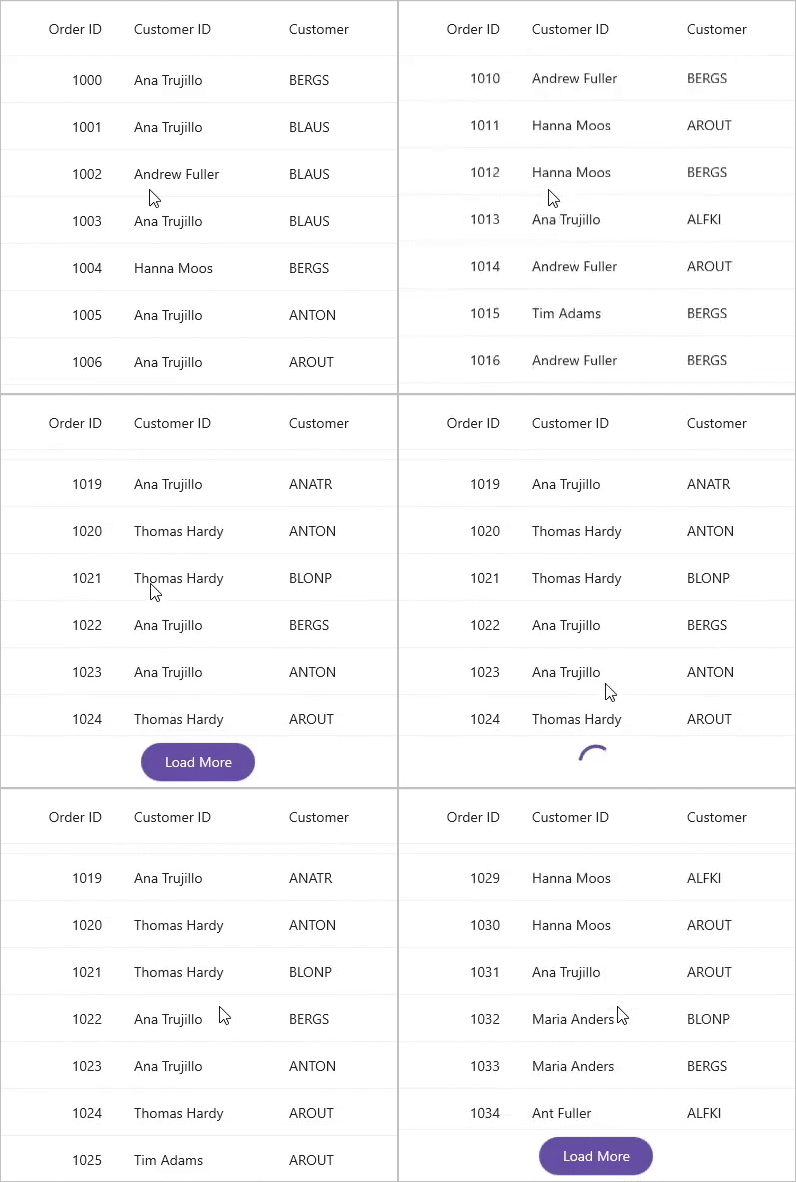
To enable load more functionality in SfDataGrid, set the SfDataGrid.AllowLoadMore property to true and specify a SfDataGrid.LoadMoreOption. When enabled, an interactive load more button appears when the user scrolls to the end of the list. Users can tap this button (or the grid automatically loads more data, depending on the option) to load additional items from your data source.
Load more command
The SfDataGrid.LoadMoreCommand is an ICommand that executes when the user triggers a load more action. Use SfDataGrid.LoadMoreCommandParameter to pass the DataGrid instance or other context to your command.
Managing the loading state:
Set the SfDataGrid.IsBusy property to true before loading items — this displays a loading indicator and prevents duplicate load requests. Set it to false after the load completes (success or failure). The loading indicator remains visible until IsBusy is set to false.
Example: Basic load more with command:
public partial class MainPage : ContentPage
{
    SfDataGrid dataGrid;
    OrderInfoViewModel viewModel;

    public MainPage()
    {
        InitializeComponent();
        dataGrid = new SfDataGrid();
        viewModel = new OrderInfoViewModel();
        dataGrid.ItemsSource = viewModel.Orders;
        dataGrid.AllowLoadMore = true;
        dataGrid.LoadMoreCommand = new Command(ExecuteLoadMoreCommand);
        this.Content = dataGrid;
    }

    private async void ExecuteLoadMoreCommand()
    {
        this.dataGrid.IsBusy = true;
        await Task.Delay(new TimeSpan(0, 0, 5)); // Simulate network delay
        viewModel.LoadMoreItems();
        this.dataGrid.IsBusy = false;
    }
}
You can download the complete project from GitHub.
Load More Option
The SfDataGrid.LoadMoreOption property determines when the load more action is triggered. The default option is Manual.
| Option | Behavior |
|---|---|
| Manual | Displays a “Load More” button at the end. User must tap to trigger LoadMoreCommand. |
| Auto | Automatically executes LoadMoreCommand when the list reaches the end (even before user interaction). |
| AutoOnScroll | Executes LoadMoreCommand only when the user scrolls to the end (not on initial load). |
Configure load more options
All three options use the same command pattern. Here are examples for each:
Auto (automatic loading at end)
<syncfusion:SfDataGrid x:Name="DataGrid"
                       ItemsSource="{Binding Orders}"
                       AllowLoadMore="True"
                       LoadMoreOption="Auto"
                       LoadMoreCommand="{Binding LoadMoreCommand}">
</syncfusion:SfDataGrid>DataGrid.AllowLoadMore = true;
DataGrid.LoadMoreOption = DataGridLoadMoreOption.Auto;
DataGrid.LoadMoreCommand = new Command(ExecuteLoadMoreCommand);
private async void ExecuteLoadMoreCommand()
{
DataGrid.IsBusy = true;
ViewModel.LoadMoreItems();
DataGrid.IsBusy = false;
}Manual (button appears at end)
<syncfusion:SfDataGrid x:Name="DataGrid"
                       ItemsSource="{Binding Orders}"
                       AllowLoadMore="True"
                       LoadMoreOption="Manual"
                       LoadMoreCommand="{Binding LoadMoreCommand}">
</syncfusion:SfDataGrid>
AutoOnScroll (automatic when user scrolls to end)
<syncfusion:SfDataGrid x:Name="DataGrid"
                       ItemsSource="{Binding Orders}"
                       AllowLoadMore="True"
                       LoadMoreOption="AutoOnScroll"
                       LoadMoreCommand="{Binding LoadMoreCommand}">
</syncfusion:SfDataGrid>
Note:
LoadMoreCommandis not executed on initial page load withAutoOnScroll. It only triggers after user scrolling.
Customization
Display text
Customize the text displayed in the load more view by setting the SfDataGrid.LoadMoreText property as follows:
public partial class MainPage : ContentPage
{
    SfDataGrid dataGrid;
    OrderInfoViewModel viewModel;

    public MainPage()
    {
        InitializeComponent();
        dataGrid = new SfDataGrid();
        viewModel = new OrderInfoViewModel();
        dataGrid.ItemsSource = viewModel.Orders;
        dataGrid.AllowLoadMore = true;
        dataGrid.LoadMoreText = "LOAD MORE";
        dataGrid.LoadMoreCommand = new Command(ExecuteLoadMoreCommand);
        this.Content = dataGrid;
    }

    private async void ExecuteLoadMoreCommand()
    {
        this.dataGrid.IsBusy = true;
        await Task.Delay(new TimeSpan(0, 0, 5));
        viewModel.LoadMoreItems();
        this.dataGrid.IsBusy = false;
    }
}
Position
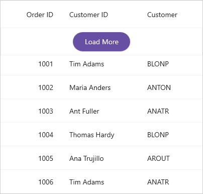
The position of load more view can be customized by using the SfDataGrid.LoadMorePosition property. By default, the load more view is displayed in the bottom position.
public partial class MainPage : ContentPage
{
    SfDataGrid dataGrid;
    OrderInfoViewModel viewModel;

    public MainPage()
    {
        InitializeComponent();
        dataGrid = new SfDataGrid();
        viewModel = new OrderInfoViewModel();
        dataGrid.ItemsSource = viewModel.Orders;
        dataGrid.AllowLoadMore = true;
        dataGrid.LoadMorePosition = DataGridLoadMorePosition.Top;
        dataGrid.LoadMoreCommand = new Command(ExecuteLoadMoreCommand);
        this.Content = dataGrid;
    }

    private async void ExecuteLoadMoreCommand()
    {
        this.dataGrid.IsBusy = true;
        await Task.Delay(new TimeSpan(0, 0, 5));
        viewModel.LoadMoreItems();
        this.dataGrid.IsBusy = false;
    }
}
Appearance
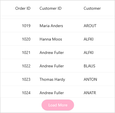
Customize the load more view appearance using the following DataGridStyle properties:
| Property | Description |
|---|---|
| Sets the background of the load more view. | |
| Sets the background of the load more view button. | |
| Sets the text color of the load more view button. | |
| Sets the background of the load more view indicator. |
<syncfusion:SfDataGrid x:Name="DataGrid"
                       ItemsSource="{Binding Orders}"
                       AllowLoadMore="True"
                       LoadMoreOption="Manual">
    <syncfusion:SfDataGrid.DefaultStyle>
        <syncfusion:DataGridStyle LoadMoreBackground="#FFF1F6"
                                  LoadMoreButtonBackground="#FFAFCC"
                                  LoadMoreButtonTextColor="#c1121f"
                                  LoadMoreIndicatorColor="#CDB4DB" />
    </syncfusion:SfDataGrid.DefaultStyle>
</syncfusion:SfDataGrid>
public partial class MainPage : ContentPage
{
SfDataGrid dataGrid;
OrderInfoViewModel viewModel;
public MainPage()
{
InitializeComponent();
viewModel = new OrderInfoViewModel();
dataGrid = new SfDataGrid
{
ItemsSource = viewModel.Orders,
AllowLoadMore = true,
LoadMoreOption = DataGridLoadMoreOption.Manual,
DefaultStyle = new DataGridStyle
{
LoadMoreBackground = Color.FromArgb("#FFF1F6"),
LoadMoreButtonBackground = Color.FromArgb("#FFAFCC"),
LoadMoreButtonTextColor = Color.FromArgb("#C1121F"),
LoadMoreIndicatorColor = Color.FromArgb("#CDB4DB")
}
};
this.Content = dataGrid;
}
}
Change load more view size
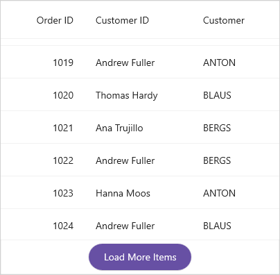
You can customize the load more view size by setting the HeightRequest and WidthRequest properties on the load more view and button. See the following example:
public partial class MainPage : ContentPage
{
    SfDataGrid dataGrid;
    OrderInfoViewModel viewModel;

    public MainPage()
    {
        InitializeComponent();
        dataGrid = new SfDataGrid();
        viewModel = new OrderInfoViewModel();
        dataGrid.ItemsSource = viewModel.Orders;
        dataGrid.AllowLoadMore = true;
        dataGrid.LoadMoreText = "Load More Items";
        dataGrid.LoadMoreView.HeightRequest = 50;
        dataGrid.LoadMoreView.Children.OfType<Button>().First().WidthRequest = 150;
        dataGrid.LoadMoreCommand = new Command(ExecuteLoadMoreCommand);
        this.Content = dataGrid;
    }

    private async void ExecuteLoadMoreCommand()
    {
        dataGrid.IsBusy = true;
        await Task.Delay(new TimeSpan(0, 0, 5));
        viewModel.LoadMoreItems();
        dataGrid.IsBusy = false;
    }
}
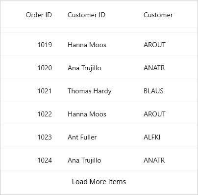
Custom load more view
You can replace the built-in load more view with a custom view to match your app’s design. Create a class that inherits from DataGridLoadMoreView and override the required methods.
When to use: When the built-in load more button doesn’t match your UI design or you need custom behavior (e.g., displaying a progress ring instead of a button).
public partial class MainPage : ContentPage
{
    SfDataGrid dataGrid;
    OrderInfoViewModel viewModel;

    public MainPage()
    {
        InitializeComponent();
        dataGrid = new SfDataGrid();
        viewModel = new OrderInfoViewModel();
        dataGrid.ItemsSource = viewModel.Orders;
        dataGrid.AllowLoadMore = true;
        dataGrid.LoadMoreView = new CustomLoadMoreView();
        dataGrid.LoadMoreCommand = new Command(ExecuteLoadMoreCommand);
        this.Content = dataGrid;
    }

    private async void ExecuteLoadMoreCommand()
    {
        dataGrid.IsBusy = true;
        viewModel.LoadMoreItems();
        dataGrid.IsBusy = false;
    }
}

// Custom load more view implementation
public class CustomLoadMoreView : DataGridLoadMoreView
{
    private Label? loadMoreView;

    protected override void SetLoadMoreViewStyle(DataGridStyle style)
    {
        this.Background = style.LoadMoreBackground;
    }

    protected override void InitLoadMoreView()
    {
        this.HeightRequest = 50;
        var gestureRecognizer = new TapGestureRecognizer();
        loadMoreView = new Label() { HeightRequest = 25, WidthRequest = 150, HorizontalTextAlignment = TextAlignment.Center };
        loadMoreView.Text = "Load More Items";
        loadMoreView.GestureRecognizers.Add(gestureRecognizer);
        this.Children.Add(loadMoreView);
        gestureRecognizer.Tapped += loadMoreView_Tapped;
    }

    void loadMoreView_Tapped(object? sender, EventArgs e)
    {
        if (this.LoadMoreCommand != null)
        {
            this.LoadMoreCommand.Execute(null);
        }
    }

    protected override Size MeasureContent(double widthConstraint, double heightConstraint)
    {
        (loadMoreView as IView)!.Measure(widthConstraint, heightConstraint);
        return new Size(widthConstraint, heightConstraint);
    }

    protected override Size ArrangeContent(Rect bounds)
    {
        (loadMoreView as IView)!.Arrange(bounds);
        return bounds.Size;
    }
}