Conditional Styling in .NET MAUI Data Grid
18 Nov 201824 minutes to read
The SfDataGrid allows you to customize the style of the individual cells and rows based on the requirements.
To get started quickly with applying conditional styling in .NET MAUI Data Grid, you can check this video:
Conditional row style
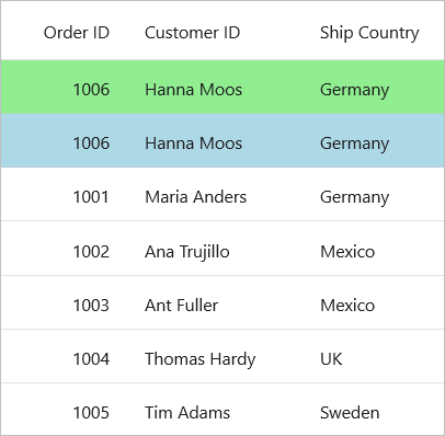
The data rows can be customized conditionally by writing the style with a converter for the DataGridRow control. Its BindingContext is the underlying datasource object.
<ContentPage.Resources>
    <local:ColorConverter x:Key="converter"/>
    <Style TargetType="syncfusion:DataGridRow">
        <Setter Property="Background"
                Value="{Binding Converter={StaticResource converter}}"/>
    </Style>
</ContentPage.Resources>

<syncfusion:SfDataGrid x:Name="dataGrid"
                       ItemsSource="{Binding Orders}">
</syncfusion:SfDataGrid>
using System;
using System.Globalization;
using Microsoft.Maui.Controls;
using Microsoft.Maui.Graphics;
public class ColorConverter : IValueConverter
{
object? IValueConverter.Convert(object? value, Type targetType, object? parameter, CultureInfo? info)
{
if (value is not OrderInfo orderInfo)
return Colors.White;
var input = orderInfo.OrderID;
if (input < 10003)
return Colors.Bisque;
else if (input < 10007)
return Colors.LightBlue;
else
return Colors.White;
}
object? IValueConverter.ConvertBack(object? value, Type targetType, object? parameter, CultureInfo? culture)
{
return null;
}
}
Style a particular row based on row index
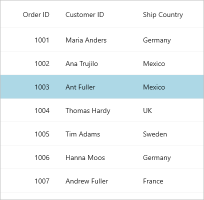
Styling can be applied to a particular row based on RowIndex property by writing the style for the DataGridRow TargetType.
<ContentPage.Resources>
    <local:ColorConverter x:Key="converter"/>
    <Style TargetType="syncfusion:DataGridRow">
        <Setter Property="Background"
                Value="{Binding Source={RelativeSource Mode=Self}, Converter={StaticResource Key=converter}}"/>
    </Style>
</ContentPage.Resources>

<syncfusion:SfDataGrid x:Name="dataGrid"
                       ItemsSource="{Binding Orders}">
</syncfusion:SfDataGrid>
using System;
using System.Globalization;
using Microsoft.Maui.Controls;
using Microsoft.Maui.Graphics;
using Syncfusion.Maui.DataGrid;
public class ColorConverter : IValueConverter
{
object? IValueConverter.Convert(object? value, Type targetType, object? parameter, CultureInfo? info)
{
if (value is not DataGridRow dataGridRow || dataGridRow.DataRow == null)
return Colors.White;
var rowIndex = dataGridRow.DataRow.RowIndex;
if (rowIndex == 3)
return Colors.LightBlue;
else
return Colors.White;
}
object? IValueConverter.ConvertBack(object? value, Type targetType, object? parameter, CultureInfo? culture)
{
return null;
}
}
Style a particular row based on RowData
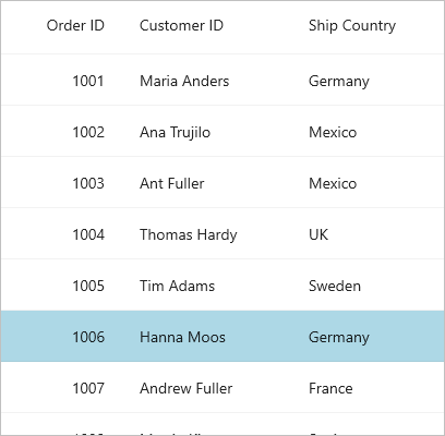
Styling can be applied to a particular row based on the RowData property by writing the style for the DataGridRow TargetType.
<ContentPage.Resources>
    <local:ColorConverter x:Key="converter"/>
    <Style TargetType="syncfusion:DataGridRow">
        <Setter Property="Background"
                Value="{Binding Source={RelativeSource Mode=Self}, Converter={StaticResource Key=converter}}"/>
    </Style>
</ContentPage.Resources>

<syncfusion:SfDataGrid x:Name="dataGrid"
                       ItemsSource="{Binding Orders}">
</syncfusion:SfDataGrid>
using System;
using System.Globalization;
using Microsoft.Maui.Controls;
using Microsoft.Maui.Graphics;
using Syncfusion.Maui.DataGrid;
public class ColorConverter : IValueConverter
{
object? IValueConverter.Convert(object? value, Type targetType, object? parameter, CultureInfo? info)
{
if (value is not DataGridRow dataGridRow || dataGridRow.DataRow == null)
return Colors.White;
var rowData = dataGridRow.DataRow.RowData;
var viewModel = dataGridRow.DataGrid?.BindingContext as OrderInfoViewModel;
if (viewModel?.Orders != null && rowData == viewModel.Orders[5])
return Colors.LightBlue;
else
return Colors.White;
}
object? IValueConverter.ConvertBack(object? value, Type targetType, object? parameter, CultureInfo? culture)
{
return null;
}
}
Conditional style for particular column
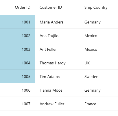
The SfDataGrid provides the support to apply the conditional style for specific column by using the CellStyle property in the DataGridColumn.
<ContentPage.Resources>
    <local:ColorConverter x:Key="converter"/>
</ContentPage.Resources>

<syncfusion:SfDataGrid x:Name="dataGrid"
                       ItemsSource="{Binding Orders}">
    <syncfusion:SfDataGrid.Columns>
        <syncfusion:DataGridNumericColumn MappingName="OrderID"
                                          HeaderText="Order ID"
                                          Format="d">
            <syncfusion:DataGridNumericColumn.CellStyle>
                <Style TargetType="syncfusion:DataGridCell">
                    <Setter Property="Background"
                            Value="{Binding OrderID, Converter={StaticResource converter}}"/>
                </Style>
            </syncfusion:DataGridNumericColumn.CellStyle>
        </syncfusion:DataGridNumericColumn>
    </syncfusion:SfDataGrid.Columns>
</syncfusion:SfDataGrid>
using System;
using System.Globalization;
using Microsoft.Maui.Controls;
using Microsoft.Maui.Graphics;
public class ColorConverter : IValueConverter
{
object? IValueConverter.Convert(object? value, Type targetType, object? parameter, CultureInfo? info)
{
if (value is int orderID && orderID < 10006)
return Colors.LightBlue;
else
return Colors.White;
}
object? IValueConverter.ConvertBack(object? value, Type targetType, object? parameter, CultureInfo? culture)
{
return null;
}
}
Conditional styling for row header
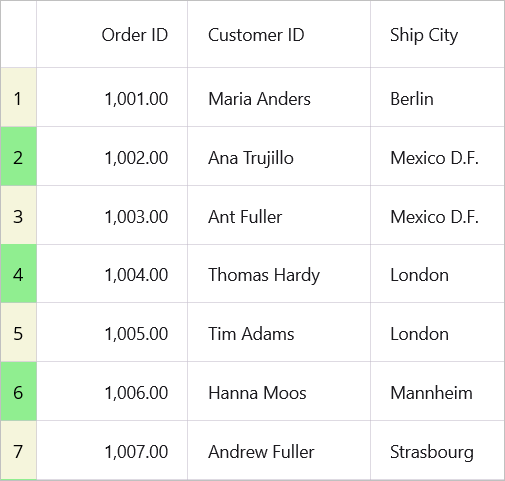
The appearance of row header can be customized conditionally based on properties using converter, where converter returns the value based on various properties.
<ContentPage.Resources>
    <local:CustomConverter x:Key="converter"/>
    <Style  TargetType="syncfusion:DataGridRowHeaderCell">
        <Setter Property="Background"
                Value="{Binding Converter={StaticResource converter }}"/>
    </Style>
</ContentPage.Resources>

<syncfusion:SfDataGrid x:Name="dataGrid"
                       ItemsSource="{Binding Orders}"
                       ShowRowHeader="True"
                       ColumnWidthMode="Auto"
                       GridLinesVisibility="Both"
                       HeaderGridLinesVisibility="Both">
    <syncfusion:SfDataGrid.RowHeaderTemplate>
        <DataTemplate>
            <Label Text="{Binding ID}"
                   HorizontalTextAlignment="Center"
                   VerticalTextAlignment="Center"/>
        </DataTemplate>
    </syncfusion:SfDataGrid.RowHeaderTemplate>
</syncfusion:SfDataGrid>
// Model class
using System;
using System.Globalization;
using System.ComponentModel.DataAnnotations;
using Microsoft.Maui.Controls;
using Microsoft.Maui.Graphics;
public class OrderInfo
{
[Display(AutoGenerateField = false)]
public int ID { get; set; }
public int OrderID { get; set; }
public string Customer { get; set; }
public string City { get; set; }
}
// Converter class
public class CustomConverter : IValueConverter
{
public object? Convert(object? value, Type targetType, object? parameter, CultureInfo? culture)
{
if (value is not OrderInfo data)
return Colors.Transparent;
if (data.ID % 2 == 0)
return Colors.LightGreen;
else
return Colors.Beige;
}
public object? ConvertBack(object? value, Type targetType, object? parameter, CultureInfo? culture)
{
return null;
}
}
Conditional cell style
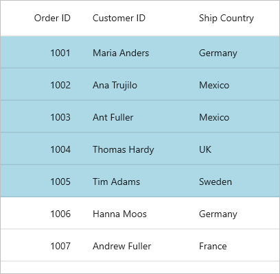
Individual grid cells can be customized conditionally by writing a style with a converter for the DataGridCell control. The BindingContext is the underlying datasource object.
<ContentPage.Resources>
    <local:ColorConverter x:Key="converter"/>
    <Style TargetType="syncfusion:DataGridCell">
        <Setter Property="Background"
                Value="{Binding OrderID, Converter={StaticResource converter}}"/>
    </Style>
</ContentPage.Resources>

<syncfusion:SfDataGrid x:Name="dataGrid"
                       ItemsSource="{Binding Orders}"
                       GridLinesVisibility="Both"
                       HeaderGridLinesVisibility="Both"/>
using System;
using System.Globalization;
using Microsoft.Maui.Controls;
using Microsoft.Maui.Graphics;
public class ColorConverter : IValueConverter
{
object? IValueConverter.Convert(object? value, Type targetType, object? parameter, CultureInfo? info)
{
if (value is int orderID && orderID < 10006)
return Colors.LightBlue;
else
return Colors.White;
}
object? IValueConverter.ConvertBack(object? value, Type targetType, object? parameter, CultureInfo? culture)
{
return null;
}
}
Style a cell based on MappingName and RowColumnIndex
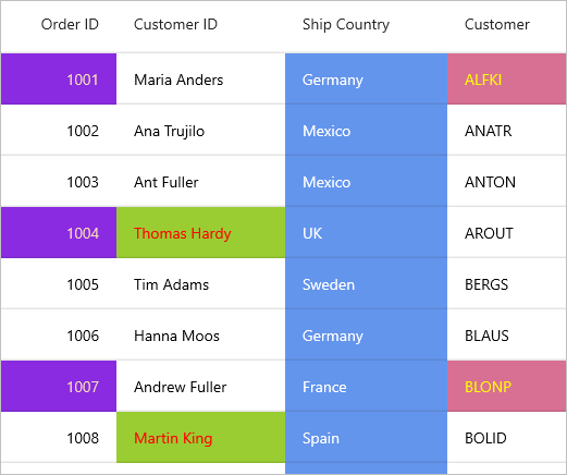
Styling can be applied to a particular cell based on RowIndex, ColumnIndex and MappingName property of the column by writing the style for the DataGridCell TargetType.
<ContentPage.Resources>
    <local:ColorConverter x:Key="converter"/>
    <local:ForeColorConverter x:Key="foreColorconverter"/>
    <Style TargetType="syncfusion:DataGridCell">
        <Setter Property="Background"
                Value="{Binding Source={RelativeSource Mode=Self}, Converter={StaticResource Key=converter}}"/>
        <Setter Property="TextColor"
                Value="{Binding Source={RelativeSource Mode=Self}, Converter={StaticResource Key=foreColorconverter}}"/>
    </Style>
</ContentPage.Resources>

<syncfusion:SfDataGrid x:Name="dataGrid"
                       ItemsSource="{Binding Orders}"/>
using System;
using System.Globalization;
using Microsoft.Maui.Controls;
using Microsoft.Maui.Graphics;
using Syncfusion.Maui.DataGrid;
public class ColorConverter : IValueConverter
{
public object? Convert(object? value, Type targetType, object? parameter, CultureInfo? info)
{
if (value is not DataGridCell gridCell || gridCell.DataColumn?.DataGridColumn == null)
return null;
var columnIndex = gridCell.DataColumn.ColumnIndex;
var rowIndex = gridCell.DataColumn.RowIndex;
var mappingName = gridCell.DataColumn.DataGridColumn.MappingName;
if (columnIndex == 0 && rowIndex % 3 == 1)
return Colors.BlueViolet;
else if (mappingName == "Country")
return Colors.CornflowerBlue;
else if (columnIndex == 1 && rowIndex % 4 == 0)
return Colors.YellowGreen;
else if (columnIndex == 2 && rowIndex % 2 == 1)
return Colors.PaleVioletRed;
return Colors.White;
}
public object? ConvertBack(object? value, Type targetType, object? parameter, CultureInfo? culture)
{
return null;
}
}using System;
using System.Globalization;
using Microsoft.Maui.Controls;
using Microsoft.Maui.Graphics;
using Syncfusion.Maui.DataGrid;
public class ForeColorConverter : IValueConverter
{
public object? Convert(object? value, Type targetType, object? parameter, CultureInfo? info)
{
if (value is not DataGridCell gridCell || gridCell.DataColumn?.DataGridColumn == null)
return null;
var columnIndex = gridCell.DataColumn.ColumnIndex;
var rowIndex = gridCell.DataColumn.RowIndex;
var mappingName = gridCell.DataColumn.DataGridColumn.MappingName;
if (columnIndex == 0 && rowIndex % 3 == 1)
return Colors.Wheat;
else if (mappingName == "Country")
return Colors.White;
else if (columnIndex == 1 && rowIndex % 4 == 0)
return Colors.Red;
else if (columnIndex == 2 && rowIndex % 2 == 1)
return Colors.Yellow;
return Colors.Black;
}
public object? ConvertBack(object? value, Type targetType, object? parameter, CultureInfo? culture)
{
return null;
}
}
Style a cell based on RowIndex and ColumnIndex
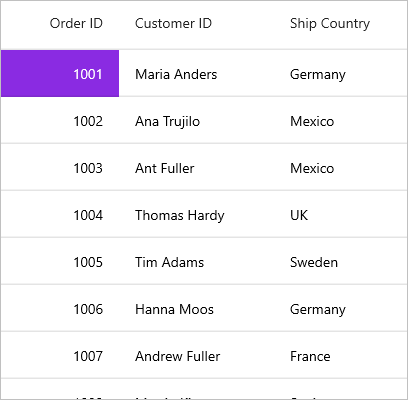
Styling can be applied to a particular cell based on RowIndex and ColumnIndex property by writing the style for the DataGridCell TargetType.
<ContentPage.Resources>
    <local:ColorConverter x:Key="converter"/>
    <local:ForeColorConverter x:Key="foreColorconverter"/>
    <Style TargetType="syncfusion:DataGridCell">
        <Setter Property="Background"
                Value="{Binding Source={RelativeSource Mode=Self}, Converter={StaticResource Key=converter}}"/>
        <Setter Property="TextColor"
                Value="{Binding Source={RelativeSource Mode=Self}, Converter={StaticResource Key=foreColorconverter}}"/>
    </Style>
</ContentPage.Resources>

<syncfusion:SfDataGrid x:Name="dataGrid"
                       ItemsSource="{Binding Orders}"/>
using System;
using System.Globalization;
using Microsoft.Maui.Controls;
using Microsoft.Maui.Graphics;
using Syncfusion.Maui.DataGrid;
public class ColorConverter : IValueConverter
{
public object? Convert(object? value, Type targetType, object? parameter, CultureInfo? info)
{
if (value is not DataGridCell gridCell || gridCell.DataColumn == null)
return null;
var columnIndex = gridCell.DataColumn.ColumnIndex;
var rowIndex = gridCell.DataColumn.RowIndex;
if (columnIndex == 0 && rowIndex == 1)
return Colors.BlueViolet;
return Colors.White;
}
public object? ConvertBack(object? value, Type targetType, object? parameter, CultureInfo? culture)
{
return null;
}
}using System;
using System.Globalization;
using Microsoft.Maui.Controls;
using Microsoft.Maui.Graphics;
using Syncfusion.Maui.DataGrid;
public class ForeColorConverter : IValueConverter
{
public object? Convert(object? value, Type targetType, object? parameter, CultureInfo? info)
{
if (value is not DataGridCell gridCell || gridCell.DataColumn == null)
return null;
var columnIndex = gridCell.DataColumn.ColumnIndex;
var rowIndex = gridCell.DataColumn.RowIndex;
if (columnIndex == 0 && rowIndex == 1)
return Colors.White;
return Colors.Black;
}
public object? ConvertBack(object? value, Type targetType, object? parameter, CultureInfo? culture)
{
return null;
}
}
Customizing the BorderColor of a cell
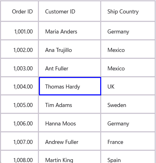
Individual cells can have their border color customized based on RowIndex and ColumnIndex properties by setting the BorderColor property in DataGridCell using a style for the DataGridCell
<ContentPage.Resources>
    <ResourceDictionary>
        <local:BorderColorConverter x:Key="converter"/>
        <Style TargetType="syncfusion:DataGridCell">
            <Setter Property="BorderColor"
                    Value="{Binding Source={RelativeSource Mode=Self}, Converter={StaticResource converter}}"/>
        </Style>
    </ResourceDictionary>
</ContentPage.Resources>

<syncfusion:SfDataGrid x:Name="dataGrid"
                       ItemsSource="{Binding Orders}"
                       GridLinesVisibility="Both"
                       HeaderGridLinesVisibility="Both"/>
using System;
using System.Globalization;
using Microsoft.Maui.Controls;
using Microsoft.Maui.Graphics;
using Syncfusion.Maui.DataGrid;
public class BorderColorConverter : IValueConverter
{
public object? Convert(object? value, Type targetType, object? parameter, CultureInfo? culture)
{
if (value is not DataGridCell gridCell || gridCell.DataColumn == null)
return Colors.Transparent;
if (gridCell.DataColumn.RowIndex == 3 && gridCell.DataColumn.ColumnIndex == 2)
return Colors.Blue;
return Colors.Transparent;
}
public object? ConvertBack(object? value, Type targetType, object? parameter, CultureInfo? culture)
{
return null;
}
}
Style a cell based on cell value
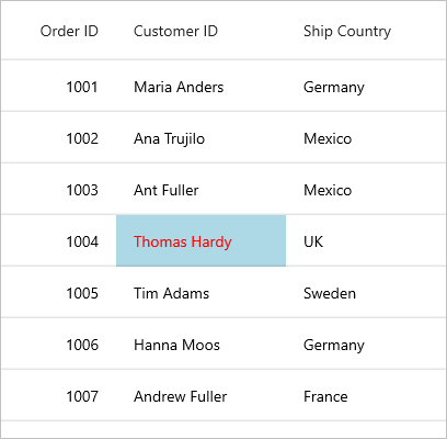
Styling can be applied to a particular cell based on CellValue property by writing the style for the DataGridCell TargetType.
<ContentPage.Resources>
    <local:ColorConverter x:Key="converter"/>
    <local:ForeColorConverter x:Key="foreColorConverter"/>
    <Style TargetType="syncfusion:DataGridCell">
        <Setter Property="Background"
                Value="{Binding Source={RelativeSource Mode=Self}, Converter={StaticResource Key=converter}}"/>
        <Setter Property="TextColor"
                Value="{Binding Source={RelativeSource Mode=Self}, Converter={StaticResource Key=foreColorConverter}}"/>
    </Style>
</ContentPage.Resources>

<syncfusion:SfDataGrid x:Name="dataGrid"
                       ItemsSource="{Binding Orders}"/>
using System;
using System.Globalization;
using Microsoft.Maui.Controls;
using Microsoft.Maui.Graphics;
using Syncfusion.Maui.DataGrid;
public class ColorConverter : IValueConverter
{
public object? Convert(object? value, Type targetType, object? parameter, CultureInfo? info)
{
if (value is not DataGridCell gridCell || gridCell.DataColumn == null)
return null;
var cellValue = gridCell.DataColumn.CellValue;
if (cellValue?.Equals("Diego") == true)
return Colors.LightBlue;
return Colors.White;
}
public object? ConvertBack(object? value, Type targetType, object? parameter, CultureInfo? culture)
{
return null;
}
}using System;
using System.Globalization;
using Microsoft.Maui.Controls;
using Microsoft.Maui.Graphics;
using Syncfusion.Maui.DataGrid;
public class ForeColorConverter : IValueConverter
{
public object? Convert(object? value, Type targetType, object? parameter, CultureInfo? info)
{
if (value is not DataGridCell gridCell || gridCell.DataColumn == null)
return null;
var cellValue = gridCell.DataColumn.CellValue;
if (cellValue?.Equals("Diego") == true)
return Colors.Red;
return Colors.Black;
}
public object? ConvertBack(object? value, Type targetType, object? parameter, CultureInfo? culture)
{
return null;
}
}
Caption summary cell style
Conditional styling of caption summary cells using converter
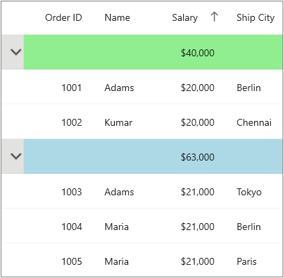
The appearance of caption summary cells can be customized conditionally based on the SummaryValues property by using a converter that returns values based on summary aggregates.
<ContentPage.Resources>
    <local:ColorConverter x:Key="converter"/>
    <Style TargetType="syncfusion:DataGridCaptionSummaryCell">
        <Setter Property="Background"
                Value="{Binding Converter={StaticResource converter}}"/>
    </Style>
</ContentPage.Resources>

<syncfusion:SfDataGrid x:Name="dataGrid"
                       ItemsSource="{Binding Orders}"
                       AllowGroupExpandCollapse="True">
    // Group the data based on the City column
    <syncfusion:SfDataGrid.GroupColumnDescriptions>
        <syncfusion:GroupColumnDescription ColumnName="City"/>
    </syncfusion:SfDataGrid.GroupColumnDescriptions>
    // Display the cities of countries in the caption summary row
    <syncfusion:SfDataGrid.CaptionSummaryRow>
        <syncfusion:DataGridSummaryRow Name="CaptionSummary"
                                       ShowSummaryInRow="True"
                                       Title="Number of cities : {CaptionSummaryColumn}">
            <syncfusion:DataGridSummaryRow.SummaryColumns>
                <syncfusion:DataGridSummaryColumn Name="CaptionSummaryColumn"
                                                  Format="{}{Count}"
                                                  MappingName="City"
                                                  SummaryType="CountAggregate"/>
            </syncfusion:DataGridSummaryRow.SummaryColumns>
        </syncfusion:DataGridSummaryRow>
    </syncfusion:SfDataGrid.CaptionSummaryRow>
</syncfusion:SfDataGrid>
using System;
using System.Globalization;
using System.Linq;
using Microsoft.Maui.Controls;
using Microsoft.Maui.Graphics;
using Syncfusion.Maui.DataGrid;
public class ColorConverter : IValueConverter
{
public object? Convert(object? value, Type targetType, object? parameter, CultureInfo? culture)
{
if (value is not Group group || group.SummaryDetails?.SummaryValues == null || group.SummaryDetails.SummaryValues.Count == 0)
return Colors.LightBlue;
var summaryValue = group.SummaryDetails.SummaryValues[0];
var aggregateValue = summaryValue.AggregateValues.ElementAt(0);
var calculatedValue = aggregateValue.Value;
// Custom condition is checked
if (calculatedValue is int intValue && intValue < 3)
return Colors.LightGreen;
return Colors.LightBlue;
}
public object? ConvertBack(object? value, Type targetType, object? parameter, CultureInfo? culture)
{
return null;
}
}Here, caption summary cells are customized based on the City column summary value.
Group summary cell style
Group summary cells can be customized conditionally by getting particular summary value from SummaryValues through converter. Likewise, you can also customize the group summary cell based on various properties exposed in DataGridSummaryRow (example: ShowSummaryInRow property).
Conditional styling of group summary cell using converter
The appearance of group summary cell can be customized conditionally based on summary value by using converter, where converter returns the value based on summary value.
<ContentPage.Resources>
    <local:ColorConverter x:Key="converter"/>
    <Style TargetType="syncfusion:DataGridGroupSummaryCell">
        <Setter Property="Background"
                Value="{Binding Converter={StaticResource converter}}"/>
    </Style>
</ContentPage.Resources>

<syncfusion:SfDataGrid x:Name="dataGrid"
                       ItemsSource="{Binding Orders}"
                       AllowGroupExpandCollapse="True">
    // Group the data based on the Country column
    <syncfusion:SfDataGrid.GroupColumnDescriptions>
        <syncfusion:GroupColumnDescription ColumnName="City"/>
    </syncfusion:SfDataGrid.GroupColumnDescriptions>
    // Display the count of records in the caption summary row
    <syncfusion:SfDataGrid.CaptionSummaryRow>
        <syncfusion:DataGridSummaryRow Name="CaptionSummary"
                                       ShowSummaryInRow="True"
                                       Title="Number of cities : {CaptionSummaryColumn}">
            <syncfusion:DataGridSummaryRow.SummaryColumns>
                <syncfusion:DataGridSummaryColumn Name="CaptionSummaryColumn"
                                                  Format="{}{Count}"
                                                  MappingName="City"
                                                  SummaryType="CountAggregate"/>
            </syncfusion:DataGridSummaryRow.SummaryColumns>
        </syncfusion:DataGridSummaryRow>
    </syncfusion:SfDataGrid.CaptionSummaryRow>
    // Display the count of Orders in the group summary row
    <syncfusion:SfDataGrid.GroupSummaryRows>
        <syncfusion:DataGridSummaryRow Title="Number of orders : {Orders}"
                                       ShowSummaryInRow="True">
            <syncfusion:DataGridSummaryRow.SummaryColumns>
                <syncfusion:DataGridSummaryColumn Name="Orders"
                                                  MappingName="OrderID"
                                                  Format="{}{Count}"
                                                  SummaryType="CountAggregate">
                </syncfusion:DataGridSummaryColumn>
            </syncfusion:DataGridSummaryRow.SummaryColumns>
        </syncfusion:DataGridSummaryRow>
    </syncfusion:SfDataGrid.GroupSummaryRows>
</syncfusion:SfDataGrid>
using System;
using System.Globalization;
using System.Linq;
using Microsoft.Maui.Controls;
using Microsoft.Maui.Graphics;
using Syncfusion.Maui.DataGrid;
public class ColorConverter : IValueConverter
{
public object? Convert(object? value, Type targetType, object? parameter, CultureInfo? culture)
{
if (value is not SummaryRecordEntry summaryEntry || summaryEntry.SummaryValues == null || summaryEntry.SummaryValues.Count == 0)
return Colors.LightBlue;
var summaryValue = summaryEntry.SummaryValues[0];
var aggregateValue = summaryValue.AggregateValues.ElementAt(0);
var calculatedValue = aggregateValue.Value;
// Custom condition is checked
if (calculatedValue is int intValue && intValue % 2 == 0)
return Colors.LightGreen;
return Colors.LightBlue;
}
public object? ConvertBack(object? value, Type targetType, object? parameter, CultureInfo? culture)
{
return null;
}
}Here, group summary cells are customized based on the OrderID column summary value.
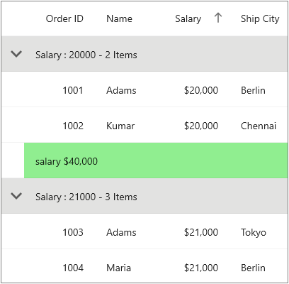
Table summary cell
Table summary cells can be customized conditionally by getting particular summary value from SummaryValues through converter. Likewise, you can also customize the table summary cell based on various properties exposed in DataGridTableSummaryRow (example: ShowSummaryInRow property).
Conditional styling of table summary cells using converter
The appearance of table summary cell can be customized conditionally based on summary value using converter, where converter returns the value based on summary value.
<ContentPage.Resources>
    <local:ColorConverter x:Key="converter"/>
    <Style TargetType="syncfusion:DataGridTableSummaryCell">
        <Setter Property="Background"
                Value="{Binding Converter={StaticResource converter}}"/>
    </Style>
</ContentPage.Resources>

<syncfusion:SfDataGrid x:Name="dataGrid"
                       ItemsSource="{Binding Orders}">
    // Display the count of Orders in the table summary row
    <syncfusion:SfDataGrid.TableSummaryRows>
        <syncfusion:DataGridTableSummaryRow Title="Total Orders :{TotalOrders}"
                                            Position="Bottom"
                                            ShowSummaryInRow="True">
            <syncfusion:DataGridTableSummaryRow.SummaryColumns>
                <syncfusion:DataGridSummaryColumn Name="TotalOrders"
                                                  Format="{}{Count}"
                                                  MappingName="OrderID"
                                                  SummaryType="CountAggregate"/>
            </syncfusion:DataGridTableSummaryRow.SummaryColumns>
        </syncfusion:DataGridTableSummaryRow>
        <syncfusion:DataGridTableSummaryRow Title="Sum of Orders :{SumOfOrders}"
                                            Position="Top"
                                            ShowSummaryInRow="False">
            <syncfusion:DataGridTableSummaryRow.SummaryColumns>
                <syncfusion:DataGridSummaryColumn Name="SumOfOrders"
                                                  Format="{}{Sum:C0}"
                                                  MappingName="OrderID"
                                                  SummaryType="DoubleAggregate"/>
            </syncfusion:DataGridTableSummaryRow.SummaryColumns>
        </syncfusion:DataGridTableSummaryRow>
    </syncfusion:SfDataGrid.TableSummaryRows>
</syncfusion:SfDataGrid>
using System;
using System.Globalization;
using System.Linq;
using Microsoft.Maui.Controls;
using Microsoft.Maui.Graphics;
using Syncfusion.Maui.DataGrid;
public class ColorConverter : IValueConverter
{
public object? Convert(object? value, Type targetType, object? parameter, CultureInfo? culture)
{
if (value is not SummaryRecordEntry summaryEntry || summaryEntry.SummaryValues == null || summaryEntry.SummaryValues.Count == 0)
return Colors.LightBlue;
var summaryValue = summaryEntry.SummaryValues[0];
var aggregateValue = summaryValue.AggregateValues.ElementAt(0);
var calculatedValue = aggregateValue.Value;
// Custom condition is checked
if (aggregateValue.Key == "Count")
{
if (calculatedValue is int intValue && intValue % 2 == 0)
return Colors.LightGreen;
return Colors.LightBlue;
}
else
{
if (calculatedValue is double doubleValue && doubleValue % 2 == 0)
return Colors.LightGreen;
return Colors.LightBlue;
}
}
public object? ConvertBack(object? value, Type targetType, object? parameter, CultureInfo? culture)
{
return null;
}
}Here, table summary cells are customized based on the OrderID column summary value.
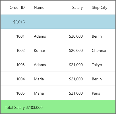
Unbound row cell
Unbound row cells can be customized based on various properties exposed in DataGridUnboundRow (example: the Position property).
Conditional styling of unbound row cell using converter
The appearance of unbound row cells can be customized conditionally based on their properties using a converter that returns values based on various unbound row characteristics.
<ContentPage.Resources>
    <local:ColorConverter x:Key="converter"/>
    <Style TargetType="syncfusion:DataGridUnboundRowCell">
        <Setter Property="Background"
                Value="{Binding Converter={StaticResource converter}}"/>
    </Style>
</ContentPage.Resources>

<syncfusion:SfDataGrid x:Name="dataGrid"
                       ItemsSource="{Binding Orders}">
    <syncfusion:SfDataGrid.UnboundRows>
        <syncfusion:DataGridUnboundRow Position="Top"/>
        <syncfusion:DataGridUnboundRow Position="FixedTop"/>
    </syncfusion:SfDataGrid.UnboundRows>
</syncfusion:SfDataGrid>
using System;
using System.Globalization;
using Microsoft.Maui.Controls;
using Microsoft.Maui.Graphics;
using Syncfusion.Maui.DataGrid;
public class ColorConverter : IValueConverter
{
public object? Convert(object? value, Type targetType, object? parameter, CultureInfo? culture)
{
if (value is not DataGridUnboundRowEventArgs unboundValue || unboundValue.GridUnboundRow == null)
return Colors.LightGreen;
if (unboundValue.GridUnboundRow.Position == DataGridUnboundRowPosition.Top)
return Colors.LightBlue;
return Colors.LightGreen;
}
public object? ConvertBack(object? value, Type targetType, object? parameter, CultureInfo? culture)
{
return null;
}
}