Crosshair in WPF Charts (SfChart)
8 Jul 20269 minutes to read
ChartCrossHairBehavior is used to view the values at mouse point or touch contact point. By moving these lines horizontally, you can get the X values and by moving these lines vertically, you can get the Y values.
Adding CrossHairBehavior to SfChart
You can create an instance ChartCrossHairBehavior and add it to the Behaviors collection.
<syncfusion:SfChart.Behaviors>
    <syncfusion:ChartCrossHairBehavior/>
</syncfusion:SfChart.Behaviors>
ChartCrossHairBehavior behavior = new ChartCrossHairBehavior();
chart.Behaviors.Add(behavior);To view the axis labels, set the ShowTrackBallInfo property to true as in the below code snippet.
<syncfusion:SfChart.PrimaryAxis>
    <syncfusion:CategoryAxis ShowTrackBallInfo="True"/>
</syncfusion:SfChart.PrimaryAxis>

<syncfusion:SfChart.SecondaryAxis>
    <syncfusion:NumericalAxis ShowTrackBallInfo="True"/>
</syncfusion:SfChart.SecondaryAxis>
ChartCrossHairBehavior behavior = new ChartCrossHairBehavior();
chart.Behaviors.Add(behavior);
chart.PrimaryAxis = new CategoryAxis()
{
ShowTrackBallInfo = true
};
chart.SecondaryAxis = new NumericalAxis()
{
ShowTrackBallInfo = true
};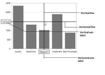
Cross hair is composed of the following parts:
-
Vertical and horizontal line
-
Axis Labels
Vertical and Horizontal Line
If you add ChartCrossHairBehavior to chart you can see horizontal and vertical lines.The horizontal and vertical lines can be customized using HorizontalLineStyle and VerticalLineStyle properties.
HorizontalLineStyle
The following code snippet demonstrates the line style for horizontal line in cross hair.
<syncfusion:SfChart x:Name="chart">
     <syncfusion:SfChart.Resources>
         <Style TargetType="Line" x:Key="lineStyle">
             <Setter Property="Stroke" Value="Green"></Setter>
             <Setter Property="StrokeThickness" Value="1"></Setter>
         </Style>
     </syncfusion:SfChart.Resources>

     <syncfusion:SfChart.Behaviors>
         <syncfusion:ChartCrossHairBehavior HorizontalLineStyle="{StaticResource lineStyle}"/>
     </syncfusion:SfChart.Behaviors>
 </syncfusion:SfChart>
ChartCrossHairBehavior crosshair = new ChartCrossHairBehavior()
{
HorizontalLineStyle = chart.Resources["lineStyle"] as Style
};
chart.Behaviors.Add(crosshair);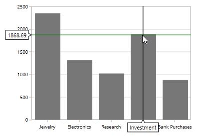
VerticalLineStyle
<syncfusion:SfChart x:Name="chart">
    <syncfusion:SfChart.Resources>
        <Style TargetType="Line" x:Key="lineStyle">
            <Setter Property="StrokeDashArray" Value="10,5"/>
            <Setter Property="Stroke" Value="Red"/>
            <Setter Property="StrokeThickness" Value="1"/>
        </Style>

    </syncfusion:SfChart.Resources>

    <syncfusion:SfChart.Behaviors>
        <syncfusion:ChartCrossHairBehavior VerticalLineStyle="{StaticResource lineStyle}"/>
    </syncfusion:SfChart.Behaviors>
</syncfusion:SfChart>
ChartCrossHairBehavior crosshair = new ChartCrossHairBehavior()
{
VerticalLineStyle = chart.Resources["lineStyle"] as Style
};
chart.Behaviors.Add(crosshair);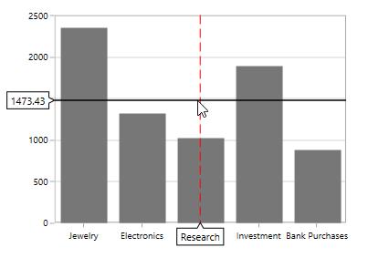
Horizontal axis label
The vertical line in contact with the x axes shows axis label. The horizontal axis label can be aligned using HorizontalAxisLabelAlignment property.
Axis Label can be aligned by Near, Far, Center, Auto and None Options.
-
Auto– Axis label is aligned in Near/Far positions based on the movement of vertical line. -
Far- Axis label is positioned far from the position of vertical line in cross hair. -
Near- Axis label is near to the position of trackball. -
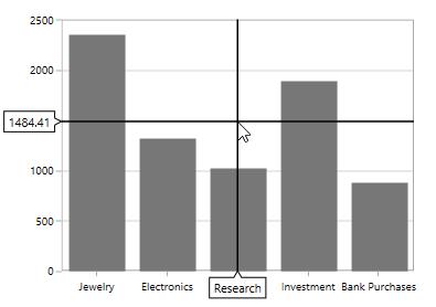
Center- Axis label is aligned to the center of the vertical line. By default the axis label will positioned in center.
The following image demonstrates the horizontal axis label positioned center to the vertical line.
Far
<syncfusion:SfChart.Behaviors>
    <syncfusion:ChartCrossHairBehavior HorizontalAxisLabelAlignment="Far"/>
</syncfusion:SfChart.Behaviors>
ChartCrossHairBehavior behavior = new ChartCrossHairBehavior()
{
HorizontalAxisLabelAlignment = ChartAlignment.Far
};
chart.Behaviors.Add(behavior);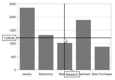
Near
<syncfusion:SfChart.Behaviors>
    <syncfusion:ChartCrossHairBehavior HorizontalAxisLabelAlignment="Near"/>
</syncfusion:SfChart.Behaviors>
ChartCrossHairBehavior behavior = new ChartCrossHairBehavior()
{
HorizontalAxisLabelAlignment = ChartAlignment.Near
};
chart.Behaviors.Add(behavior);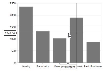
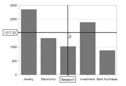
Vertical axis label
Vertical axis label is displayed when the horizontal line in contact with x axis.The label can be aligned using VerticalAxisLabelAlignment property.
Axis Label can be aligned by Near, Far, Center, Auto, and None Options.
The following image demonstrates the horizontal axis label positioned center to the vertical line.
Near
<syncfusion:SfChart.Behaviors>
    <syncfusion:ChartCrossHairBehavior VerticalAxisLabelAlignment="Near"/>
</syncfusion:SfChart.Behaviors>
ChartCrossHairBehavior behavior = new ChartCrossHairBehavior()
{
VerticalAxisLabelAlignment = ChartAlignment.Near
};
chart.Behaviors.Add(behavior);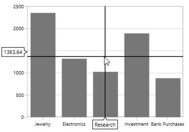
Far
<syncfusion:SfChart.Behaviors>
    <syncfusion:ChartCrossHairBehavior VerticalAxisLabelAlignment="Far"/>
</syncfusion:SfChart.Behaviors>
ChartCrossHairBehavior behavior = new ChartCrossHairBehavior()
{
VerticalAxisLabelAlignment = ChartAlignment.Far
};
chart.Behaviors.Add(behavior);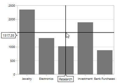
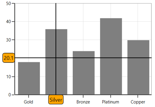
Customization of Crosshair axis labels
The default appearance of the crosshair axis labels can be customized by using the CrosshairLabelTemplate property of chart axis. It can be set as shown in the following code example.
<chart:SfChart.PrimaryAxis>
    <chart:CategoryAxis ShowTrackBallInfo="True">
        <chart:CategoryAxis.CrosshairLabelTemplate>
            <DataTemplate>
                <Border
                    Background="Orange"
                    CornerRadius="4"
                    BorderThickness="1"
                    BorderBrush="Black">
                    <TextBlock
                        Margin="2"
                        Text="{Binding ValueX}"/>
                </Border>
            </DataTemplate>
        </chart:CategoryAxis.CrosshairLabelTemplate>
    </chart:CategoryAxis>
</chart:SfChart.PrimaryAxis>

<chart:SfChart.SecondaryAxis>
    <chart:NumericalAxis ShowTrackBallInfo="True">
        <chart:NumericalAxis.CrosshairLabelTemplate>
            <DataTemplate>
                <Border
                    Background="Orange"
                    CornerRadius="4"
                    BorderThickness="1"
                    BorderBrush="Black">
                    <TextBlock
                        Margin="2"
                        Text="{Binding ValueY}"/>
                </Border>
            </DataTemplate>
        </chart:NumericalAxis.CrosshairLabelTemplate>
    </chart:NumericalAxis>
</chart:SfChart.SecondaryAxis>

<chart:SfChart.Behaviors>
    <chart:ChartCrossHairBehavior/>
</chart:SfChart.Behaviors>