Tooltip in WPF Charts (SfChart)
8 Jul 202624 minutes to read
The Tooltip feature allows you to display any information over a ChartSeries. It is used in conjunction with the pointer or at the data point position. It appears when the mouse hovers over any chart segment. It is set to display the metadata of the particular segment or data point.
Define Tooltip
By default, a small box containing the data point’s Y values is displayed as the Tooltip. The Y values vary depending on the ChartSeries. For example, a single Y value is usually displayed in the Column and BarSeries. In the FinancialSeries, high, low, open, and close values are displayed in the Tooltip.
The tooltip will be visible if you enable the ShowTooltip property as in the below code snippet.
<syncfusion:ColumnSeries
    ShowTooltip="True"
    ItemsSource="{Binding Demands}"
    XBindingPath="Demand"
    YBindingPath="Year2010"/>

<syncfusion:ColumnSeries
    ShowTooltip="True"
    ItemsSource="{Binding Demands}"
    XBindingPath="Demand"
    YBindingPath="Year2011"/>
ColumnSeries series1 = new ColumnSeries()
{
ItemsSource = new ViewModel().Demands,
XBindingPath = "Demand",
YBindingPath = "Year2010",
ShowTooltip = true
};
ColumnSeries series2 = new ColumnSeries()
{
ItemsSource = new ViewModel().Demands,
XBindingPath = "Demand",
YBindingPath = "Year2011",
ShowTooltip = true
};
chart.Series.Add(series1);
chart.Series.Add(series2);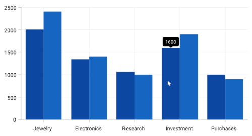
Customizing tooltip using ChartTooltipBehavior
The ChartTooltipBehavior is commonly used for all series to customize the tooltip. For customizing the tooltip, you can create an instance of ChartTooltipBehavior and add it to the SfChart Behaviors collection.
The following properties are used to customize and configure the tooltip, which is available in the ChartTooltipBehavior.
-
EnableAnimation- Used to enable the animation when showing the tooltip. -
Position- Used to position the tooltip at the data point position or the cursor position. -
Style- Used to customize the fill and stroke of the tooltip. -
LabelStyle- Used to customize the tooltip label. -
HorizontalOffset- Used to position the tooltip at a distance from the data point or cursor position horizontally. -
VerticalOffset- Used to position the tooltip at a distance from the data point or cursor position vertically. -
HorizontalAlignment- Used to align the tooltip label at left, right, and center of the data point position or cursor position horizontally. -
VerticalAlignment- Used to align the tooltip label at top, center, and bottom of the data point position or cursor position vertically. -
ShowDuration- Used to set the amount of time that the tooltip remains visible in milliseconds. -
InitialShowDelay- Used to set the delay in milliseconds to show the tooltip once the user interacts with the series.
<chart:SfChart.Behaviors>
    <chart:ChartTooltipBehavior/>
</chart:SfChart.Behaviors>
SfChart chart = new SfChart();
ChartTooltipBehavior behavior = new ChartTooltipBehavior();
chart.Behaviors.Add(behavior);Positioning the tooltip
Tooltip can be positioned at the data point position or the cursor position using the Position property. The Auto value will position the tooltip at the data point position, and the Pointer value will display the tooltip in conjunction with the mouse pointer itself when hovering the mouse inside any chart segment.
NOTE
By default, the tooltip
Positionis set toAuto.
The following code example explains positioning the tooltip at the Pointer position.
<chart:SfChart.Behaviors>
    <chart:ChartTooltipBehavior x:Name="chartTooltipBehavior" Position="Pointer"/>
</chart:SfChart.Behaviors>
SfChart chart = new SfChart();
// code omitted for brevity
ChartTooltipBehavior chartTooltipBehavior = new ChartTooltipBehavior();
chartTooltipBehavior.Position = TooltipPosition.Pointer;
chart.Behaviors.Add(chartTooltipBehavior);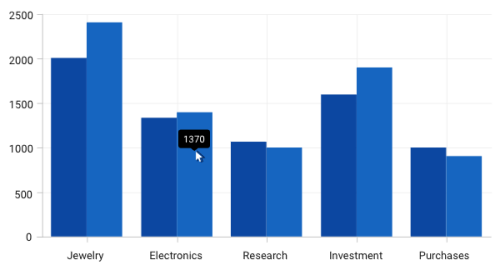
Customizing the tooltip background
The tooltip’s fill and stroke color can be customized using the Style property. To define a style for the tooltip background, specify the style of TargetType as Path.
The following code example explains applying the style for the tooltip.
<chart:SfChart.Resources>
    <Style TargetType="Path" x:Key="style">
        <Setter Property="Stroke" Value="Black"/>
        <Setter Property="Fill" Value="Gray"/>
    </Style>
</chart:SfChart.Resources>
<!-- code omitted for brevity -->
<chart:SfChart.Behaviors>
    <chart:ChartTooltipBehavior Style = "{StaticResource style}"/>
</chart:SfChart.Behaviors>
SfChart chart = new SfChart();
Style style = new Style(typeof(Path));
style.Setters.Add(new Setter(Path.StrokeProperty, new SolidColorBrush(Colors.Black)));
style.Setters.Add(new Setter(Path.FillProperty, new SolidColorBrush(Colors.Gray)));
// code omitted for brevity
ChartTooltipBehavior tooltipBehavior = new ChartTooltipBehavior();
tooltipBehavior.Style = style;
chart.Behaviors.Add(tooltipBehavior);
// code omitted for brevity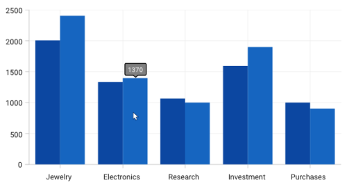
Customizing the tooltip label style
The tooltip label style can be customized using the LabelStyle property. To define a style for the tooltip label, specify the style of TargetType as TextBlock.
The following code example explains applying the style for a tooltip label.
<chart:SfChart.Resources>
    <Style TargetType="TextBlock" x:Key="labelStyle">
        <Setter Property="FontSize" Value="14"/>
        <Setter Property="Foreground" Value="Red"/>
    </Style>
</chart:SfChart.Resources>
<!-- code omitted for brevity -->
<chart:SfChart.Behaviors>
    <chart:ChartTooltipBehavior LabelStyle = "{StaticResource labelStyle}"/>
</chart:SfChart.Behaviors>
SfChart chart = new SfChart();
Style labelStyle = new Style(typeof(TextBlock));
labelStyle.Setters.Add(new Setter(TextBlock.FontSizeProperty, 14d));
labelStyle.Setters.Add(new Setter(TextBlock.ForegroundProperty, new SolidColorBrush(Colors.Red)));
// code omitted for brevity
ChartTooltipBehavior tooltipBehavior = new ChartTooltipBehavior();
tooltipBehavior.LabelStyle = labelStyle;
chart.Behaviors.Add(tooltipBehavior);
// code omitted for brevity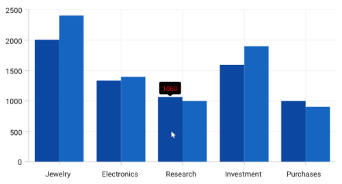
Customizing tooltip using ChartTooltip attached properties
Aligning the Tooltip
The tooltip can be aligned with respect to the cursor position using the HorizontalAlignment and VerticalAlignment properties.
HorizontalAlignment
The following code example explains the positioning of the tooltip to the left of the cursor.
<Chart:ColumnSeries
    ItemsSource="{Binding Demands}"
    XBindingPath="Demand"
    YBindingPath="Year2010"
    ShowTooltip="True"
    Chart:ChartTooltip.HorizontalAlignment="Left"/>

<Chart:ColumnSeries
    ItemsSource="{Binding Demands}"
    XBindingPath="Demand"
    YBindingPath="Year2011"
    ShowTooltip="True"
    Chart:ChartTooltip.HorizontalAlignment="Left"/>
ColumnSeries series1 = new ColumnSeries()
{
ItemsSource = new ViewModel().Demands,
XBindingPath = "Demand",
YBindingPath = "Year2010",
ShowTooltip = true
};
ChartTooltip.SetHorizontalAlignment(series1, HorizontalAlignment.Left);
ColumnSeries series2 = new ColumnSeries()
{
ItemsSource = new ViewModel().Demands,
XBindingPath = "Demand",
YBindingPath = "Year2011",
ShowTooltip = true
};
ChartTooltip.SetHorizontalAlignment(series2, HorizontalAlignment.Left);
chart.Series.Add(series1);
chart.Series.Add(series2);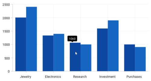
NOTE
By default, the horizontal alignment is
Centerfor the tooltip.
VerticalAlignment
The following code example explains the positioning of the tooltip to the bottom of the cursor.
<Chart:ColumnSeries
    ItemsSource="{Binding Demands}"
    XBindingPath="Demand"
    YBindingPath="Year2010"
    ShowTooltip="True"
    Chart:ChartTooltip.VerticalAlignment="Bottom"/>

<Chart:ColumnSeries
    ItemsSource="{Binding Demands}"
    XBindingPath="Demand"
    YBindingPath="Year2011"
    ShowTooltip="True"
    Chart:ChartTooltip.VerticalAlignment="Bottom"/>
ColumnSeries series1 = new ColumnSeries()
{
ItemsSource = new ViewModel().Demands,
XBindingPath = "Demand",
YBindingPath = "Year2010",
ShowTooltip = true
};
ChartTooltip.SetVerticalAlignment(series1, VerticalAlignment.Bottom);
ColumnSeries series2 = new ColumnSeries()
{
ItemsSource = new ViewModel().Demands,
XBindingPath = "Demand",
YBindingPath = "Year2011",
ShowTooltip = true
};
ChartTooltip.SetVerticalAlignment(series2, VerticalAlignment.Bottom);
chart.Series.Add(series1);
chart.Series.Add(series2);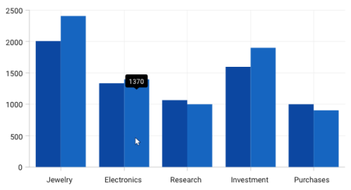
TooltipMargin
You can also set the distance for the margin to be positioned from the cursor using the TooltipMargin property as in the following code sample.
<Chart:ColumnSeries
    Label="2010"
    ShowTooltip="True"
    ItemsSource="{Binding Demands}"
    Interior="#777777"
    Chart:ChartTooltip.TooltipMargin="25"
    XBindingPath="Demand"
    YBindingPath="Year2010"/>

<Chart:ColumnSeries
    Label="2011"
    ShowTooltip="True"
    ItemsSource="{Binding Demands}"
    Interior="#4A4A4A"
    Chart:ChartTooltip.TooltipMargin="25"
    XBindingPath="Demand"
    YBindingPath="Year2011"/>
ColumnSeries series1 = new ColumnSeries()
{
ItemsSource = new ViewModel().Demands,
XBindingPath = "Demand",
YBindingPath = "Year2010",
ShowTooltip = true,
Interior = new SolidColorBrush(Color.FromRgb(0x77, 0x77, 0x77)),
Label = "2010"
};
ChartTooltip.SetTooltipMargin(series1, new Thickness(25));
ColumnSeries series2 = new ColumnSeries()
{
ItemsSource = new ViewModel().Demands,
XBindingPath = "Demand",
YBindingPath = "Year2011",
ShowTooltip = true,
Interior = new SolidColorBrush(Color.FromRgb(0x4A, 0x4A, 0x4A)),
Label = "2011"
};
ChartTooltip.SetTooltipMargin(series2, new Thickness(25));
chart.Series.Add(series1);
chart.Series.Add(series2);
NOTE
By default, the VerticalAlignment of the Tooltip is
Top.
VerticalOffset and HorizontalOffset
The tooltip can be positioned at a particular distance from the cursor horizontally using the HorizontalOffset property and vertically using the VerticalOffset property.
<Chart:ColumnSeries
    ShowTooltip="True"
    ItemsSource="{Binding Demands}"
    Chart:ChartTooltip.HorizontalOffset="40"
    Chart:ChartTooltip.VerticalOffset="40"
    XBindingPath="Demand"
    YBindingPath="Year2010"/>

<Chart:ColumnSeries
    ShowTooltip="True"
    ItemsSource="{Binding Demands}"
    Chart:ChartTooltip.HorizontalOffset="40"
    Chart:ChartTooltip.VerticalOffset="40"
    XBindingPath="Demand"
    YBindingPath="Year2011"/>
ColumnSeries series1 = new ColumnSeries()
{
ItemsSource = new ViewModel().Demands,
XBindingPath = "Demand",
YBindingPath = "Year2010",
ShowTooltip = true,
Interior = new SolidColorBrush(Color.FromRgb(0x77, 0x77, 0x77)),
Label = "2010"
};
ChartTooltip.SetHorizontalOffset(series1, 40);
ChartTooltip.SetVerticalOffset(series1, 40);
ColumnSeries series2 = new ColumnSeries()
{
ItemsSource = new ViewModel().Demands,
XBindingPath = "Demand",
YBindingPath = "Year2011",
ShowTooltip = true,
Interior = new SolidColorBrush(Color.FromRgb(0x4A, 0x4A, 0x4A)),
Label = "2011"
};
ChartTooltip.SetHorizontalOffset(series2, 40);
ChartTooltip.SetVerticalOffset(series2, 40);
chart.Series.Add(series1);
chart.Series.Add(series2);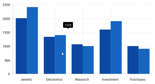
Tooltip duration
This property ShowDuration in ChartToolTip sets the duration time for the tooltip to be displayed in milliseconds.
The following code example demonstrates the duration of the tooltip set to 5 seconds.
<Chart:ColumnSeries
    ShowTooltip="True"
    ItemsSource="{Binding Demands}"
    Interior="#777777"
    Chart:ChartTooltip.ShowDuration="5000"
    XBindingPath="Demand"
    YBindingPath="Year2010">
</Chart:ColumnSeries>
ColumnSeries series = new ColumnSeries()
{
ItemsSource = new ViewModel().Demands,
XBindingPath = "Demand",
YBindingPath = "Year2010",
ShowTooltip = true,
Interior = new SolidColorBrush(Color.FromRgb(0x77, 0x77, 0x77)),
Label = "2010"
};
ChartTooltip.SetShowDuration(series, 5000);
chart.Series.Add(series);NOTE
By default, the tooltip will be displayed for 1000 milliseconds.
Show delay
The tooltip also has support to delay the time to display by setting the SetInitialShowDelay property in milliseconds.
The following code example demonstrates that the tooltip will be delayed for 1 second before display.
<Chart:ColumnSeries
    Label="2010"
    ShowTooltip="True"
    Chart:ChartTooltip.InitialShowDelay="1000"
    ItemsSource="{Binding Demands}"
    Interior="#777777"
    XBindingPath="Demand"
    YBindingPath="Year2010"/>
ColumnSeries series = new ColumnSeries()
{
ItemsSource = new ViewModel().Demands,
XBindingPath = "Demand",
YBindingPath = "Year2010",
ShowTooltip = true,
Interior = new SolidColorBrush(Color.FromRgb(0x77, 0x77, 0x77)),
Label = "2010"
};
ChartTooltip.SetInitialShowDelay(series, 1000);
chart.Series.Add(series);Animation for Tooltip
You can also provide animation effects for the tooltip by setting the EnableAnimation property to true as shown in the following code snippet.
<Chart:ColumnSeries
    Label="2010"
    ShowTooltip="True"
    Chart:ChartTooltip.EnableAnimation="True"
    ItemsSource="{Binding Demands}"
    Interior="#777777"
    XBindingPath="Demand"
    YBindingPath="Year2010"/>
ColumnSeries series = new ColumnSeries()
{
ItemsSource = new ViewModel().Demands,
XBindingPath = "Demand",
YBindingPath = "Year2010",
ShowTooltip = true,
Interior = new SolidColorBrush(Color.FromRgb(0x77, 0x77, 0x77)),
Label = "2010"
};
ChartTooltip.SetEnableAnimation(series, true);
chart.Series.Add(series);Customizing the Appearance
The TooltipTemplate property allows you to customize the default appearance of the tooltip as explained in the following code sample.
<chart:SfChart.Resources>
    <Style TargetType="Path" x:Key="style">
        <Setter Property="Stroke" Value="Black"/>
        <Setter Property="Fill" Value="LightGreen"/>
        <Setter Property="StrokeThickness" Value="2"/>
    </Style>
</chart:SfChart.Resources>

<!-- code omitted for brevity -->

<chart:ColumnSeries
    ShowTooltip="True"
    ItemsSource="{Binding Demands}"
    XBindingPath="Demand"
    YBindingPath="Year2010">

    <chart:ColumnSeries.TooltipTemplate>
        <DataTemplate>
            <StackPanel Orientation="Horizontal">
                <TextBlock
                    Text="{Binding Item.Demand}"
                    Foreground="Black"
                    FontWeight="Medium"
                    FontSize="12"
                    HorizontalAlignment="Center"
                    VerticalAlignment="Center"/>
                <TextBlock
                    Text=" : "
                    Foreground="Black"
                    FontWeight="Medium"
                    FontSize="12"
                    HorizontalAlignment="Center"
                    VerticalAlignment="Center"/>
                <TextBlock
                    Text="{Binding Item.Year2010}"
                    Foreground="Black"
                    FontWeight="Medium"
                    FontSize="12"
					HorizontalAlignment="Center"
                    VerticalAlignment="Center"/>
            </StackPanel>
        </DataTemplate>
    </chart:ColumnSeries.TooltipTemplate>

</chart:ColumnSeries>

<chart:ColumnSeries
    ShowTooltip="True"
    ItemsSource="{Binding Demands}"
    XBindingPath="Demand"
    YBindingPath="Year2011">

    <chart:ColumnSeries.TooltipTemplate>
        <DataTemplate>
            <StackPanel Orientation="Horizontal">
                <TextBlock
                    Text="{Binding Item.Demand}"
                    Foreground="Black"
                    FontWeight="Medium"
                    FontSize="12"
                    HorizontalAlignment="Center"
                    VerticalAlignment="Center"/>
                <TextBlock
                    Text=" : "
                    Foreground="Black"
                    FontWeight="Medium"
                    FontSize="12"
                    HorizontalAlignment="Center"
                    VerticalAlignment="Center"/>
                <TextBlock
                    Text="{Binding Item.Year2011}"
                    Foreground="Black"
                    FontWeight="Medium"
                    FontSize="12"
                    HorizontalAlignment="Center"
                    VerticalAlignment="Center"/>
            </StackPanel>
        </DataTemplate>
    </chart:ColumnSeries.TooltipTemplate>

</chart:ColumnSeries>

<!-- code omitted for brevity -->

<chart:SfChart.Behaviors>
    <chart:ChartTooltipBehavior
        Style="{StaticResource style}" />
</chart:SfChart.Behaviors>
<!-- code omitted for brevity -->
// code omitted for brevity
DataTemplate tooltip = new DataTemplate();
FrameworkElementFactory stackpanel = new FrameworkElementFactory(typeof(StackPanel));
stackpanel.SetValue(StackPanel.OrientationProperty, Orientation.Horizontal);
FrameworkElementFactory textblock = new FrameworkElementFactory(typeof(TextBlock));
textblock.SetBinding(TextBlock.TextProperty, new Binding("Item.Demand"));
textblock.SetValue(TextBlock.FontWeightProperty, FontWeights.Bold);
textblock.SetValue(TextBlock.HorizontalAlignmentProperty, HorizontalAlignment.Center);
textblock.SetValue(TextBlock.VerticalAlignmentProperty, VerticalAlignment.Center);
textblock.SetValue(TextBlock.ForegroundProperty, new SolidColorBrush(Colors.Black));
stackpanel.AppendChild(textblock);
FrameworkElementFactory textblock1 = new FrameworkElementFactory(typeof(TextBlock));
textblock1.SetValue(TextBlock.TextProperty, " : ");
textblock1.SetValue(TextBlock.FontWeightProperty, FontWeights.Bold);
textblock1.SetValue(TextBlock.HorizontalAlignmentProperty, HorizontalAlignment.Center);
textblock1.SetValue(TextBlock.VerticalAlignmentProperty, VerticalAlignment.Center);
textblock1.SetValue(TextBlock.ForegroundProperty, new SolidColorBrush(Colors.Black));
stackpanel.AppendChild(textblock1);
FrameworkElementFactory textblock2 = new FrameworkElementFactory(typeof(TextBlock));
textblock2.SetBinding(TextBlock.TextProperty, new Binding("Item.Year2010"));
textblock2.SetValue(TextBlock.FontWeightProperty, FontWeights.Bold);
textblock2.SetValue(TextBlock.HorizontalAlignmentProperty, HorizontalAlignment.Center);
textblock2.SetValue(TextBlock.VerticalAlignmentProperty, VerticalAlignment.Center);
textblock2.SetValue(TextBlock.ForegroundProperty, new SolidColorBrush(Colors.Black));
stackpanel.AppendChild(textblock2);
tooltip.VisualTree = stackpanel;
ColumnSeries series1 = new ColumnSeries()
{
ItemsSource = new ViewModel().Demands,
XBindingPath = "Demand",
YBindingPath = "Year2010",
Label = "2010",
ShowTooltip = true,
TooltipTemplate = tooltip
};
chart.Series.Add(series1);
// code omitted for brevity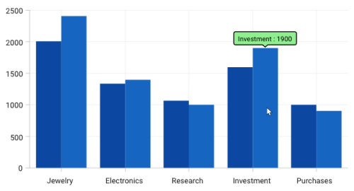
NOTE
The
ChartTooltipBehavioris commonly used for all series to customize the tooltip. You can use the attachedChartTooltipproperties in a series if you need to customize the appearance of the tooltip based on a particular series. Series-attached properties are considered as a high precedence.
See also
How to position tooltip relative to mouse pointer in WPF ChartsHow to customize the default tooltip background in WPF ChartHow to display additional data in the tooltip of WPF ChartHow to customize the Tooltip in WPF SfChartHow to set the duration for WPF Chart (SfChart) tooltipHow to restrict the tooltip on a WPF Chart