Appearance in Windows Forms ComboBox (SfComboBox)
27 Apr 202110 minutes to read
Customizing editor appearance
Appearance of the editor portion can be customized by using the Style.EditorStyle property that contains all the needed properties for appearance customization.
sfComboBox1.Style.EditorStyle.BackColor = Color.Aqua;
sfComboBox1.Style.EditorStyle.BorderColor = Color.Red;
sfComboBox1.Style.EditorStyle.ForeColor = Color.Blue;
sfComboBox1.Style.EditorStyle.Font = new Font("Arial", 10F, FontStyle.Bold);sfComboBox1.Style.EditorStyle.BackColor = Color.Aqua
sfComboBox1.Style.EditorStyle.BorderColor = Color.Red
sfComboBox1.Style.EditorStyle.ForeColor = Color.Blue
sfComboBox1.Style.EditorStyle.Font = New Font("Arial", 10F, FontStyle.Bold)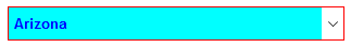
Customizing non-editing mode appearance
Appearance of the editor portion can be customized by setting the ReadOnlyEditorStyle property when the editor portion is non-editable.
sfComboBox1.Style.ReadOnlyEditorStyle.BackColor = Color.Aqua;
sfComboBox1.Style.ReadOnlyEditorStyle.BorderColor = Color.Red;
sfComboBox1.Style.ReadOnlyEditorStyle.ForeColor = Color.Blue;
sfComboBox1.Style.ReadOnlyEditorStyle.Font = new Font("Arial", 10F, FontStyle.Bold);sfComboBox1.Style.ReadOnlyEditorStyle.BackColor = Color.Aqua
sfComboBox1.Style.ReadOnlyEditorStyle.BorderColor = Color.Red
sfComboBox1.Style.ReadOnlyEditorStyle.ForeColor = Color.Blue
sfComboBox1.Style.ReadOnlyEditorStyle.Font = New Font("Arial", 10F, FontStyle.Bold)
Customizing drop-down button appearance
Appearance of the drop-down button can be customized by setting the DropDownButtonStyle property.
sfComboBox1.Style.DropDownButtonStyle.BackColor = Color.Blue;
sfComboBox1.Style.DropDownButtonStyle.HoverBackColor = Color.Red;
sfComboBox1.Style.DropDownButtonStyle.PressedBackColor = Color.Aqua;
sfComboBox1.Style.DropDownButtonStyle.FocusedBackColor = Color.Pink;sfComboBox1.Style.DropDownButtonStyle.BackColor = Color.Blue
sfComboBox1.Style.DropDownButtonStyle.HoverBackColor = Color.Red
sfComboBox1.Style.DropDownButtonStyle.PressedBackColor = Color.Aqua
sfComboBox1.Style.DropDownButtonStyle.FocusedBackColor = Color.Pink
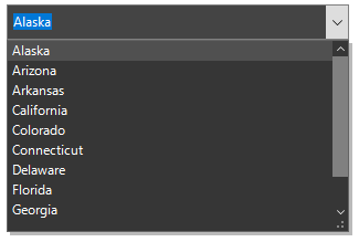
Customizing drop-down appearance
Appearance of the drop-down control can be customized by setting the DropDownStyle property.
sfComboBox1.Style.DropDownStyle.GripperBackColor = Color.Aqua;
sfComboBox1.Style.DropDownStyle.GripperForeColor = Color.Blue;sfComboBox1.Style.DropDownStyle.GripperBackColor = Color.Aqua
sfComboBox1.Style.DropDownStyle.GripperForeColor = Color.Blue
Setting image in drop-down list item
Images can be added to the drop-down list items by using the DrawItem event.
sfComboBox1.DropDownListView.DrawItem += new EventHandler<Syncfusion.WinForms.ListView.Events.DrawItemEventArgs>(DropDownListView_DrawItem);
private void DropDownListView_DrawItem(object sender, Syncfusion.WinForms.ListView.Events.DrawItemEventArgs e)
{
   if (e.Text == "Spain")
     e.Image = Image.FromFile(@"..\..\Flags\Spain.png");
   else if (e.Text == "Germany")
     e.Image = Image.FromFile(@"..\..\Flags\Germany.png");
   else if (e.Text == "Japan")
     e.Image = Image.FromFile(@"..\..\Flags\Japan.png");
   else if (e.Text == "Brazil")
     e.Image = Image.FromFile(@"..\..\Flags\Brazil.png");
   else if (e.Text == "Argentina")
     e.Image = Image.FromFile(@"..\..\Flags\Argentina.png");
   else if (e.Text == "Canada")
     e.Image = Image.FromFile(@"..\..\Flags\Canada.png");
   else if (e.Text == "India")
     e.Image = Image.FromFile(@"..\..\Flags\India.png");
   e.ImageAlignment = ContentAlignment.BottomLeft;
}
AddHandler sfComboBox1.DropDownListView.DrawItem, AddressOf DropDownListView_DrawItem
Private Sub DropDownListView_DrawItem(ByVal sender As Object, ByVal e As Syncfusion.WinForms.ListView.Events.DrawItemEventArgs)
If e.Text = "Spain" Then
e.Image = Image.FromFile("..\..\Flags\Spain.png")
ElseIf e.Text = "Germany" Then
e.Image = Image.FromFile("..\..\Flags\Germany.png")
ElseIf e.Text = "Japan" Then
e.Image = Image.FromFile("..\..\Flags\Japan.png")
ElseIf e.Text = "Brazil" Then
e.Image = Image.FromFile("..\..\Flags\Brazil.png")
ElseIf e.Text = "Argentina" Then
e.Image = Image.FromFile("..\..\Flags\Argentina.png")
ElseIf e.Text = "Canada" Then
e.Image = Image.FromFile("..\..\Flags\Canada.png")
ElseIf e.Text = "India" Then
e.Image = Image.FromFile("..\..\Flags\India.png")
End If
e.ImageAlignment = ContentAlignment.BottomLeft
End Sub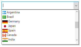
Conditional styling
Appearance of the drop-down list view items can be customized before opening the drop-down by using the DrawItem event.
sfComboBox1.DropDownListView.DrawItem += new EventHandler<Syncfusion.WinForms.ListView.Events.DrawItemEventArgs>(DropDownListView_DrawItem);
private void DropDownListView_DrawItem(object sender, Syncfusion.WinForms.ListView.Events.DrawItemEventArgs e)
{
  if((e.ItemData as CountryInfo).Continent == "Asia")
    {
       e.Style.BackColor = Color.Coral;
       e.Style.ForeColor = Color.White;
    }
}
AddHandler sfComboBox1.DropDownListView.DrawItem, AddressOf DropDownListView_DrawItem
Private Sub DropDownListView_DrawItem(ByVal sender As Object, ByVal e As Syncfusion.WinForms.ListView.Events.DrawItemEventArgs)
If (TryCast(e.ItemData, CountryInfo)).Continent = "Asia" Then
e.Style.BackColor = Color.Coral
e.Style.ForeColor = Color.White
End If
End Sub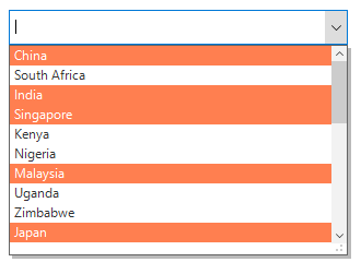
Themes
Four built-in themes for professional representation of SfComboBox are as follows:
- Office2016Colorful
- Office2016White
- Office2016DarkGray
- Office2016Black
Themes can be applied to the SfComboBox by using the following steps:
- Loading theme assembly
- Apply theme
Loading theme assembly
The Syncfusion.Office2016Theme.WinForms assembly should be added as a reference to set theme for the SfComboBox in any application.
Before applying theme to the SfComboBox, required theme assembly should be loaded.
using Syncfusion.WinForms.Controls;
namespace WindowsFormsApplication1
{
    static class Program
    {
        /// <summary>
        /// The main entry point for the application.
        /// </summary>

        static void Main()
        {
            SfSkinManager.LoadAssembly(typeof(Office2016Theme).Assembly);
            Application.EnableVisualStyles();
            Application.SetCompatibleTextRenderingDefault(false);
            Application.Run(new Form1());
        }
    }
}
Imports Syncfusion.WinForms.Controls
Namespace WindowsFormsApplication1
Friend NotInheritable Class Program
''' <summary>
''' The main entry point for the application.
''' </summary>
Private Sub New()
End Sub
Shared Sub Main()
SfSkinManager.LoadAssembly(GetType(Office2016Theme).Assembly)
Application.EnableVisualStyles()
Application.SetCompatibleTextRenderingDefault(False)
Application.Run(New Form1())
End Sub
End Class
End NamespaceApply theme
Appearance of the SfComboBox can be changed by using the ThemeName property.
Office2016Colorful
Sets the Office2016Colorful theme.
sfComboBox1.ThemeName = "Office2016Colorful";sfComboBox1.ThemeName = "Office2016Colorful"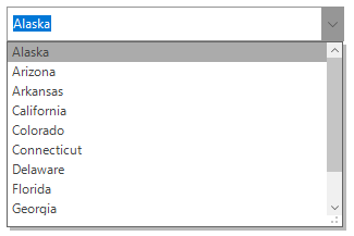
Office2016White
Sets the Office2016White theme.
sfComboBox1.ThemeName = "Office2016White";sfComboBox1.ThemeName = "Office2016White"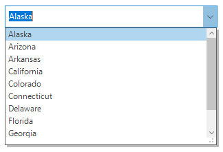
Office2016DarkGray
Sets the Office2016DarkGray theme.
sfComboBox1.ThemeName = "Office2016White";sfComboBox1.ThemeName = "Office2016White"
Office2016Black
Sets the Office2016Black theme.
sfComboBox1.ThemeName = "Office2016Black";sfComboBox1.ThemeName = "Office2016Black"