How can I help you?
Appearance in WPF PropertyGrid
21 Aug 202310 minutes to read
This section explains different UI customization, styling, theming options available in PropertyGrid control.
Setting the Foreground
We can change the foreground color for properties of SelectedObject by setting the Foreground property. The default color value of Foreground property is Blue.
<syncfusion:PropertyGrid Foreground="Red" x:Name="propertyGrid1">
    <syncfusion:PropertyGrid.SelectedObject>
         <Button></Button>
    </syncfusion:PropertyGrid.SelectedObject>
</syncfusion:PropertyGrid>
PropertyGrid propertyGrid1 = new PropertyGrid();
propertyGrid1.SelectedObject = new Button();
propertyGrid1.Foreground = Brushes.Red;
Setting the Background and FontWeight
We can change the background and font weight for all the properties by using the ViewBackgroundColor and FontWeight properties.
<syncfusion:PropertyGrid ViewBackgroundColor="Cyan" FontWeight="Bold"
                         x:Name="propertyGrid1">
    <syncfusion:PropertyGrid.SelectedObject>
        <Button></Button>
    </syncfusion:PropertyGrid.SelectedObject>
</syncfusion:PropertyGrid>
PropertyGrid propertyGrid1 = new PropertyGrid();
propertyGrid1.SelectedObject = new Button();
propertyGrid1.ViewBackgroundColor = Brushes.Cyan;
propertyGrid1.FontWeight = FontWeights.Bold;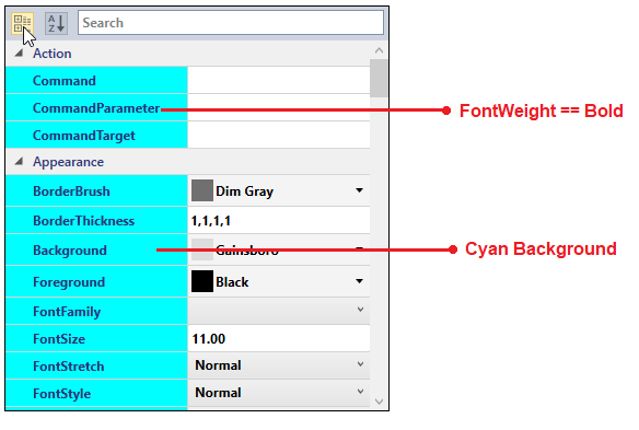
Background and FontWeight for the Editable and Readonly Properties
If we want to differentiate between editable and readonly properties, we can do this by using EditableBackground and EditableFontWeight properties to highlights the editable properties and use the ReadOnlyBackground and ReadOnlyFontWeight properties to highlights the readonly properties.
class Employee {
    public string EmployeeName { get; set; }
    [Editable(false)]
    public int EmployeeID { get; set; }
    public int Age { get; set; }
    [ReadOnly(true)]
    public DateTime DOB { get; set; }
}

public class ViewModel {
    public Object SelectedEmployee { get; set; }
    public ViewModel() {
        SelectedEmployee = new Employee()
        {
            EmployeeName = "John",
            DOB = new DateTime(1995, 01, 08),
            Age=25,
            EmployeeID = 036
        };
    }
}<syncfusion:PropertyGrid EditableBackground="LightGreen" EditableFontWeight="Bold"
ReadOnlyBackground="LightPink" ReadOnlyFontWeight="UltraLight"
SelectedObject="{Binding SelectedEmployee}" x:Name="propertyGrid1" >
<syncfusion:PropertyGrid.DataContext>
<local:ViewModel></local:ViewModel>
</syncfusion:PropertyGrid.DataContext>
</syncfusion:PropertyGrid>PropertyGrid propertyGrid1 = new PropertyGrid();
propertyGrid1.DataContext = new ViewModel();
propertyGrid1.SetBinding(PropertyGrid.SelectedObjectProperty, new Binding("SelectedEmployee"));
propertyGrid1.EditableBackground = Brushes.LightGreen;
propertyGrid1.EditableFontWeight = FontWeights.Bold;
propertyGrid1.ReadOnlyBackground = Brushes.LightPink;
propertyGrid1.ReadOnlyFontWeight = FontWeights.UltraLight;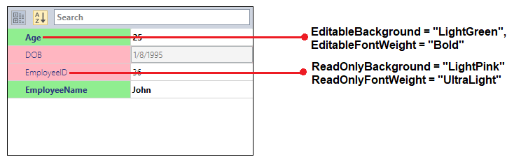
NOTE
If you use
EditableBackgroundorReadOnlyBackgroundproperties withViewBackgroundColorproperty,EditableBackgroundandReadOnlyBackgroundproperties have higher priority.
NOTE
If you use
EditableFontWeightorReadOnlyFontWeightproperties withFontWeightproperty,EditableFontWeightandReadOnlyFontWeightproperties have higher priority.
Category Header’s foreground and background
We can change the background and foreground of the category header by setting the LineColor property and CategoryForeground property. The LineColor property value applied to the background and CategoryForeground property value applied to the foreground of the category header only on category view. To enable category view, use the EnableGrouping property as true.
<syncfusion:PropertyGrid LineColor="Cyan" CategoryForeground="Red"
                         x:Name="propertyGrid1" >
    <syncfusion:PropertyGrid.SelectedObject>
        <Button></Button>
    </syncfusion:PropertyGrid.SelectedObject>
</syncfusion:PropertyGrid>
PropertyGrid propertyGrid1 = new PropertyGrid();
propertyGrid1.SelectedObject = new Button();
propertyGrid1.LineColor = Brushes.Cyan;
propertyGrid1.CategoryForeground = Brushes.Red;
Customize the height of PropertyViewItem and PropertyCatagoryViewItem
We can customize the height of PropertyViewItem and PropertyCatagoryViewItem using its Padding property by overriding style in PropertyGrid.
<Window x:Class="PropertyGrid_CustomEditor.MainWindow"
        xmlns="http://schemas.microsoft.com/winfx/2006/xaml/presentation"
        xmlns:x="http://schemas.microsoft.com/winfx/2006/xaml"
        xmlns:d="http://schemas.microsoft.com/expression/blend/2008"
        xmlns:mc="http://schemas.openxmlformats.org/markup-compatibility/2006"
        xmlns:local="clr-namespace:PropertyGrid_CustomEditor"
        xmlns:syncfusion="http://schemas.syncfusion.com/wpf"
        mc:Ignorable="d" WindowStartupLocation="CenterScreen"
        Title="MainWindow" Height="450" Width="600">
    <Window.Resources>
        <Style TargetType="syncfusion:PropertyViewItem" >
            <Setter Property="Padding" Value="0"/>
        </Style>
        <Style TargetType="syncfusion:PropertyCatagoryViewItem">
            <Setter Property="Padding" Value="0"/>
        </Style>
    </Window.Resources>
    <Grid>
        <syncfusion:PropertyGrid Margin="10" x:Name="propertyGrid1" >
            <syncfusion:PropertyGrid.SelectedObject>
                <Button></Button>
            </syncfusion:PropertyGrid.SelectedObject>
        </syncfusion:PropertyGrid>
    </Grid>
</Window>
PropertyGrid propertyGrid1 = new PropertyGrid();
propertyGrid1.SelectedObject = new Button();
Tooltip support
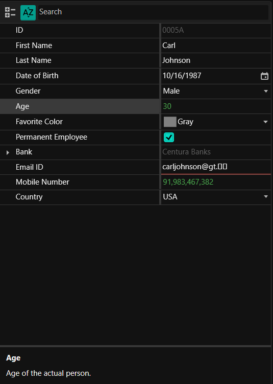
You can get the value and description about the property item through tooltip when hover the mouse on the respective property item and its value field. If the property item not contains any description, tooltip shows the property display name. You can restrict the tooltip support by setting the EnableToolTip property as false. The default value of EnableToolTip property is true.
using System;
using System.ComponentModel;
using System.ComponentModel.DataAnnotations;

public class Employee {
    [Description("Name of the employee")]
    public string Name { get; set; }
    public string ID { get; set; }
    [Description("Birth date of the employee")]
    public DateTime DOB { get; set; }
}

public class ViewModel {
    public Object SelectedEmployee { get; set; }
    public ViewModel() {
        SelectedEmployee = new Employee()
        {
            Name = "John",
            ID = "381",
            DOB = new DateTime(1995, 12, 24)
        };
    }
}<syncfusion:PropertyGrid EnableToolTip="True"
SelectedObject="{Binding SelectedEmployee}"
x:Name="propertyGrid1">
<syncfusion:PropertyGrid.DataContext>
<local:ViewModel></local:ViewModel>
</syncfusion:PropertyGrid.DataContext>
</syncfusion:PropertyGrid>PropertyGrid propertyGrid1 = new PropertyGrid();
propertyGrid1.EnableToolTip = true;
propertyGrid1.DataContext = new ViewModel();
propertyGrid1.SetBinding(PropertyGrid.SelectedObjectProperty, new Binding("SelectedEmployee"));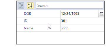
NOTE
View Sample in GitHub
Theme
PropertyGrid supports various built-in themes. Refer to the below links to apply themes for the PropertyGrid,