Category Editor in WPF PropertyGrid
8 Jul 202615 minutes to read
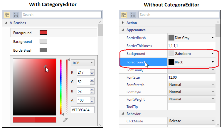
The PropertyGrid control supports several built-in editors. CategoryEditor support enables us to set the related properties (one or more properties) under single or multiple category based on the need. CategoryEditor can be applied in category view. While sorted view, default editors will be applied.
Adding Category Editor to PropertyGrid
If we want to display some related properties under the specific category, we can do it by the CategoryEditor. We can add any number of CategoryEditor. We must add property names in the CategoryEditor.Properties collection which are need to be categorized in the same category. Using the CategoryEditor.EditorTemplate, we can create the own template for the categorized properties with its required value editors. The properties and its value editor can be placed in the PropertyGrid as our wish. To display the CategoryEditor, we need the enable the EnableGrouping property as true.
For example, the Background, BorderBrush and Foreground are brush type properties. They will categorized under ‘A-Brushes’ category. ColorEdit controls are assigned as the value editor for the above properties and located in the same place. Based on the property selection, respective ColorEdit control will be in the view to pick the color for that property.
a. ColorEdit control visibility converter
using System;
   using System.Windows;
   using System.Windows.Data;

   public class SelectedIndexToVisibility : IValueConverter {
       public object Convert(object value, Type targetType, object parameter, System.Globalization.CultureInfo culture) {
           int index = (int)value;
           Visibility vis;
           if (index == 0 && parameter.ToString() == "Foreground") {
               vis = Visibility.Visible;
           }
           else if (index == 1 && parameter.ToString() == "Background") {
               vis = Visibility.Visible;
           }
           else if (index == 2 && parameter.ToString() == "BorderBrush") {
               vis = Visibility.Visible;
           }
           else {
               vis = Visibility.Collapsed;
           }
           return vis;
       }
       public object ConvertBack(object value, Type targetType, object parameter, System.Globalization.CultureInfo culture) {
           return null;
       }
   }
b. Creating the CategoryEditor for the properties:
<Window.Resources>
       <local:SelectedIndexToVisibility x:Key="VisConv"/>
   </Window.Resources>
   <Grid>
       <Grid.ColumnDefinitions>
           <ColumnDefinition></ColumnDefinition>
           <ColumnDefinition Width="300"></ColumnDefinition>
       </Grid.ColumnDefinitions>
       <syncfusion:PropertyGrid SelectedObject="{Binding ElementName=button}"
                                EnableGrouping="True" Name="propertyGrid1"
                                Margin="20" Grid.Column="0"  >
           <syncfusion:PropertyGrid.CategoryEditors>
               <syncfusion:CategoryEditor Category="A-Brushes">
                   <syncfusion:CategoryEditor.Properties>
                       <syncfusion:CategoryEditorProperty Name="Background"/>
                       <syncfusion:CategoryEditorProperty Name="Foreground"/>
                       <syncfusion:CategoryEditorProperty Name="BorderBrush"/>
                   </syncfusion:CategoryEditor.Properties>
                   <syncfusion:CategoryEditor.EditorTemplate>
                       <DataTemplate>
                           <Grid>
                               <Grid.RowDefinitions>
                                   <RowDefinition />
                                   <RowDefinition />
                               </Grid.RowDefinitions>
                               <ListBox BorderBrush="Transparent" x:Name="list" SelectedIndex="0">
                                   <StackPanel HorizontalAlignment="Center" Orientation="Horizontal">
                                       <TextBlock Text="Foreground" Margin="5" Width="80"/>
                                       <Rectangle Fill="{Binding Path=CategoryValueProperties[Foreground].Value, Mode=TwoWay}"
                                                  Stroke="Black" Height="15" Width="25" Margin="5"/>
                                   </StackPanel>
                                   <StackPanel HorizontalAlignment="Center" Orientation="Horizontal">
                                       <TextBlock Text="Background" Margin="5" Width="80"/>
                                       <Rectangle Fill="{Binding Path=CategoryValueProperties[Background].Value, Mode=TwoWay}"
                                                  Stroke="Black" x:Name="background"  Height="15" Width="25" Margin="5" />
                                   </StackPanel>
                                   <StackPanel HorizontalAlignment="Center" Orientation="Horizontal">
                                       <TextBlock Text="BorderBrush" Margin="5" Width="80"/>
                                       <Rectangle Fill="{Binding Path=CategoryValueProperties[BorderBrush].Value, Mode=TwoWay}"
                                                  Stroke="Black"  Height="15" Width="25" Margin="5"/>
                                   </StackPanel>
                               </ListBox>

                               <syncfusion:ColorEdit Visibility="{Binding ElementName=list, Path=SelectedIndex,
                                                                          Converter={StaticResource VisConv}, ConverterParameter=Foreground}"
                                                     Brush="{Binding Path=CategoryValueProperties[Foreground].Value, Mode=TwoWay}"
                                                     EnableToolTip="False" Grid.Row="1" IsGradientPropertyEnabled="False" />
                               <syncfusion:ColorEdit Visibility="{Binding ElementName=list, Path=SelectedIndex,
                                                                          Converter={StaticResource VisConv}, ConverterParameter=Background}"
                                                     Brush="{Binding Path=CategoryValueProperties[Background].Value, Mode=TwoWay}"
                                                     EnableToolTip="False" Grid.Row="1" IsGradientPropertyEnabled="False"/>
                               <syncfusion:ColorEdit Visibility="{Binding ElementName=list, Path=SelectedIndex,
                                                                          Converter={StaticResource VisConv}, ConverterParameter=BorderBrush}"
                                                     Brush="{Binding Path=CategoryValueProperties[BorderBrush].Value, Mode=TwoWay}"
                                                     EnableToolTip="False" Grid.Row="1" IsGradientPropertyEnabled="False"/>
                           </Grid>
                       </DataTemplate>
                   </syncfusion:CategoryEditor.EditorTemplate>
               </syncfusion:CategoryEditor>
           </syncfusion:PropertyGrid.CategoryEditors>
       </syncfusion:PropertyGrid>
       <StackPanel Grid.Column="1" VerticalAlignment="Center" HorizontalAlignment="Center" >
           <TextBlock Grid.Column="1" Margin="10" HorizontalAlignment="Center"
                      TextWrapping="Wrap" VerticalAlignment="Center" Width="168">
               <Run Text="Selected Object: "/><Run FontWeight="Bold" Text="Button"/>
           </TextBlock>
           <Button Name="button" Width="200" Height="50" VerticalAlignment="Center"
                   HorizontalAlignment="Center" Content="Click me"/>
       </StackPanel>
   </Grid>
By Default, the properties are arranged like the key-value pairs with its value editor. Using the CategoryEditor, the Background, Foreground and BorderBrush property value editors are arranged by our wish.
Click here to download the sample that showcases the CategoryEditor support.