How can I help you?
Working with Ribbon in Windows Forms Ribbon (RibbonControlAdv)
21 Mar 202510 minutes to read
Ribbon State
Ribbon state specifies whether the ribbon is in maximized or in minimized state, minimized state collapses the ribbon and provides more space and only tab names will appear.
Auto hide is a state in ribbon in which the ribbon waits for a click, ribbon won’t minimize if the click happens inside the ribbon, if the click happens outside, the ribbon will minimize automatically.
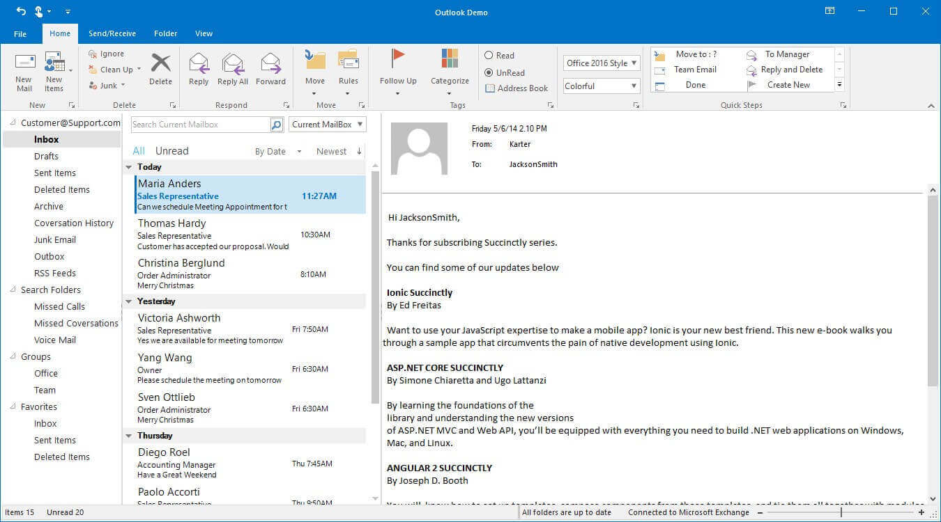
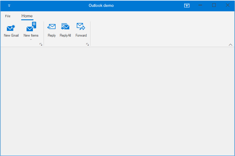
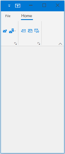
- Maximized State
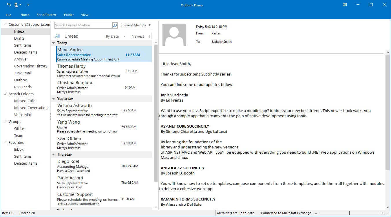
- Minimized State
State change through display option button
Ribbon state can be changed by using the Ribbon display option button, which is present at the right top of the window.
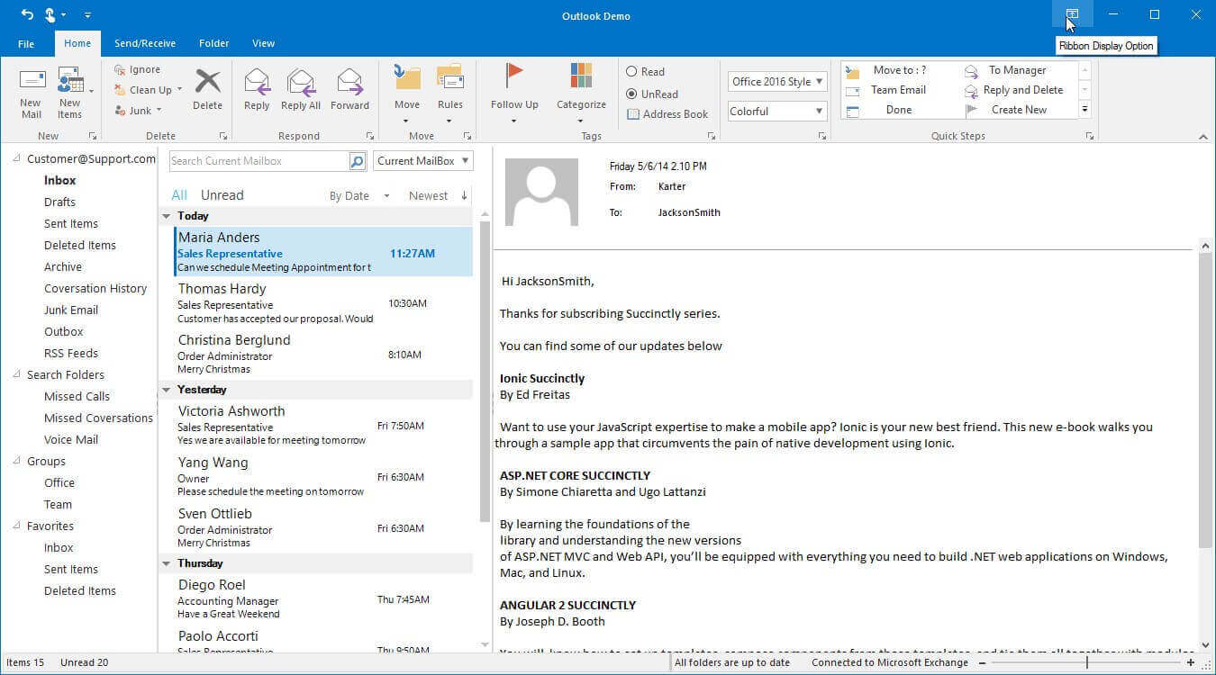
The visibility of this option button can be changed by using a Boolean property ShowRibbonDisplayOptionButton.
this.ribbonControlAdv1.ShowRibbonDisplayOptionButton = true;Me.ribbonControlAdv1.ShowRibbonDisplayOptionButton = TrueState change through property DisplayOption
Ribbon state can be changed programmatically by setting DisplayOption. Default value is ShowTabsAndCommands. The available Ribbon Display Options are:
| Enum | Description |
|---|---|
| AutoHide | Hide the Ribbon. Click at the top of the Ribbon to show it. |
| ShowTabs | Show Ribbon tabs only. Click a tab to show the commands. |
| ShowTabsAndCommands | Show Ribbon Tabs and Command all the time. |
The following code example illustrates how to set DisplayOption for the RibbonControlAdv.
this.ribbonControlAdv1.DisplayOption = RibbonDisplayOption.ShowTabsAndCommands;Me.ribbonControlAdv1.DisplayOption = RibbonDisplayOption.ShowTabsAndCommandsNOTE
This property can be used to change the state of the Ribbon at the startup of application by setting in the Form Load.
State change in double click
Ribbon state can be changed by double clicking on any of the ToolStripTabItem, this will minimize the ribbon if ribbon is in maximized state and vice versa.
If single click on the Tab item, the ribbon will enter Auto Hide state.
State change through minimize button
Ribbon can be minimized by clicking on the minimize button at the right end of the ribbon and visibility of the minimize button can be changed by using the property ShowMinimizeButton.
this.ribbonControlAdv1.ShowMinimizeButton = true;Me.ribbonControlAdv1.ShowMinimizeButton = True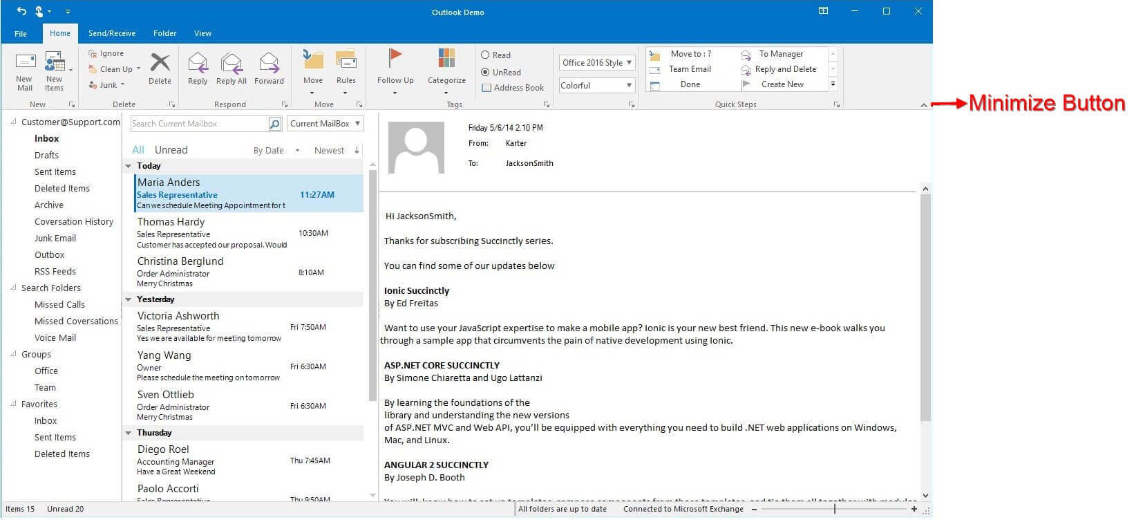
ToolTip for Minimize and Maximize button
this.ribbonControlAdv1.MinimizeToolTip = "Minimize button";Me.ribbonControlAdv1.MinimizeToolTip = "Minimize button"
this.ribbonControlAdv1.MaximizeToolTip = "Maximize button";Me.ribbonControlAdv1.MaximizeToolTip = "Maximize button"
State change through ContextMenu
Ribbon state can also be changed through an option in context menu.
Open the context menu with right click on ToolStripItem or ToolStripTabItem and select the option Collapse the Ribbon which minimizes the ribbon.
Display option changed event
RibbonControlAdv.DisplayOptionChanged event occurs when DisplayOption property is changed in RibbonControlAdv. This event receives two arguments namely sender that handles RibbonControlAdv and DisplayOptionChangedEventArgs as objects.
The DisplayOptionChangedEventArgs object contains the following properties:
-
NewValue- Gets the newRibbonDisplayOptionvalue assigned to the RibbonControlAdv. -
OldValue- Gets the oldRibbonDisplayOptionvalue of the RibbonControlAdv.
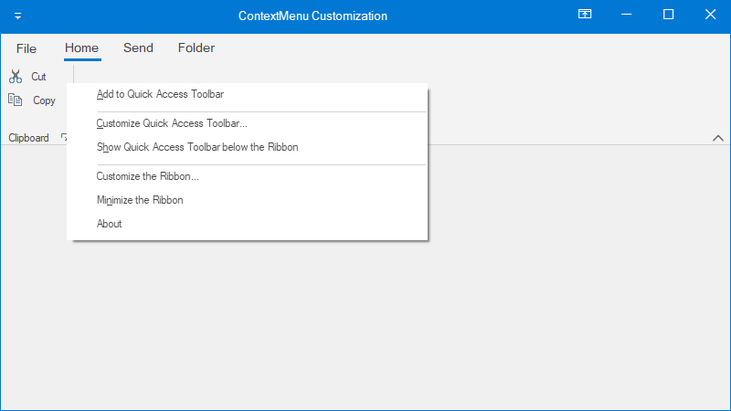
Options Available in Ribbon ContextMenu
ContextMenu can be opened with right click on the ToolStripItem or ToolStripTabItem.
1.Add to Quick Access Toolbar (This option will be available only with right click on ToolStripItem) – Adds that respective item to the Quick Access Toolbar.
2.Customize Quick Access ToolBar – Clicking the option will open the Customize Quick Access Toolbar Editor dialog which lets you do the following.
- Add new items,
- Remove the existing items or
- Change the order of the items
3.Show Quick Access Toolbar Below the Ribbon (or) Show Quick Access Toolbar Above the Ribbon – Allows to change the location of QAT.
4.Customize the Ribbon – RibbonControlAdv Tab and TabItems can be customized in run time using Ribbon Customization window.
Clicking the option will open the Customize Ribbon Editor dialog which lets you do the following.
- Add new ToolStripTabItem to the Ribbon.
- Rename existing ToolStripTabItem.
- Reordering of the ToolStripTabItem.
- Adding panel items to the ToolStripTabItem.
5.Collapse the Ribbon – If the ribbon is in maximized state this option will minimize the ribbon.
Adding custom item to the ContextMenu
The custom items can be added to the ContextMenu of the RibbonControlAdv using the BeforeContextMenuOpen event.
this.ribbonControlAdv1.BeforeContextMenuOpen += RibbonControlAdv1_BeforeContextMenuOpen;

private void RibbonControlAdv1_BeforeContextMenuOpen(object sender, ContextMenuEventArgs e)
{
    ToolStripItem aboutItem = new ToolStripMenuItem();
    aboutItem.Text = "About";
    aboutItem.Click += AboutItem_Click;
    e.ContextMenuItems.Add(aboutItem);
}

private void AboutItem_Click(object sender, EventArgs e)
{
    System.Diagnostics.Process.Start("https://help.syncfusion.com/");
}
NOTE
Ribbon Items size
-
Sizeproperty can be used to set the height and width of the item. -
AutoSizeproperty (please referAutoSizeproperty of ToolStripDropDownButton), when this property value is true, changing the item size manually will not work. -
Marginproperty is used to set the space around the control that keeps other controls a specified distance from the control’s borders. -
Paddingproperty is used to set the space in the interior of a control that keeps the control’s content (for example, the value of its Text property) a specified distance from the control’s borders.
Ribbon Resize behavior
By default, the ribbon control dynamically resizes as width of the window decreases, when the windows border touches the last placed ToolStripEx, the total ToolStripEx will be converted into a dropdown button and the items can be accessed by clicking on that dropdown arrow.
Same behavior will be continued to every ToolStripEx while minimized continuously.
Again, the ToolStripEx will be visible if the spacing between window border and ToolStripEx has enough space to allocate all the items in that ToolStripEx.
This behavior can be changed with the ribbon property CollapseBehavior change the property to 2010, while minimizing, the items in the toolstrip will be converted into small buttons and will be converted to extra small buttons and then finally the toolstrip will be converted to dropdown button.
this.ribbonControlAdv1.CollapseBehavior = CollapseBehavior.Office2010 ;Me.ribbonControlAdv1.CollapseBehavior = CollapseBehavior.Office2010
ToolStripItem image support based on its display size
On setting CollapseBehavior enumeration property to Office2010, initially the items inside the toolstrip will be reduced to small sized buttons. On further re-sizing, the items inside the toolstrip will be reduced to extra small sized buttons and finally the toolstrip will appear like a dropdown button. In-order to maintain the image quality, we support different sized images for different mode (large and small). Please follow the below steps to achieve the same.
- Create an instance for the
ToolStripExImageProviderwhich provides the image list for ToolStripItems.
//To add the images based on size mode.
ToolStripExImageProvider toolStripExImageProvider = new ToolStripExImageProvider(toolStripEx1);
Dim toolStripExImageProvider As ToolStripExImageProvider = New ToolStripExImageProvider(toolStripEx1)- Assign
ImageListAdvfor large and small image list, which holds the images.
//Assigning large and small image list for the ToolStripExImageProvider.
toolStripExImageProvider.LargeImageList = imageListAdv1;
toolStripExImageProvider.SmallImageList = imageListAdv2;toolStripExImageProvider.LargeImageList = imageListAdv1
toolStripExImageProvider.SmallImageList = imageListAdv2- Based on the large and small image list index, images will be assigned to ToolStripItems.
//To add the small icon for ToolStripItem
toolStripExImageProvider.SetSmallItemImage(this.toolStripButton1, 1);

//To add the large icon for ToolStripItem
toolStripExImageProvider.SetLargeItemImage(this.toolStripButton1, 1);toolStripExImageProvider.SetSmallItemImage(Me.toolStripButton1, 1)
toolStripExImageProvider.SetLargeItemImage(Me.toolStripButton1, 1)Large Image
Small Image
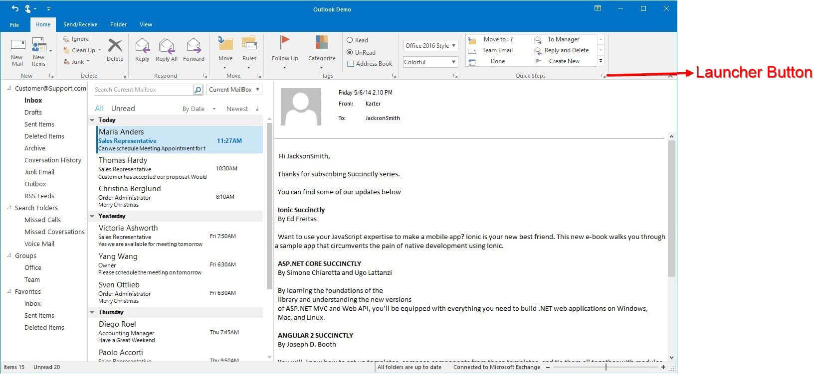
Launcher Button
Access Launcher Button
Set the property ShowLauncher of that ToolStripEx as true to access the launcher button at the corner of the ToolStripEx.
Hide Launcher Button
Launcher button for ToolStripEx can be hidden by changing the value of the property ShowLauncher as false.
//This will hide the launcher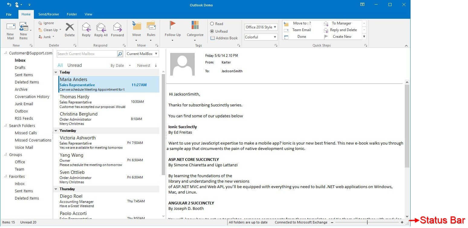
this.ribbonControlAdv1.ShowLauncher = false;Me.ribbonControlAdv1.ShowLauncher = FalseStatus Bar
Essential® Tools has come up with StatusStripEx control which can be added to the bottom of the Ribbon. It can hold controls like TrackBarEx, ProgressBar, StatusStripButtons, and so on.
Ribbon default Shortcut
A default shortcut key is available to change the state of the ribbon. Press (Ctrl + F1) to minimize or maximize the ribbon.
This Shortcut key can be disabled by changing the EnableRibbonStateAccelerator property as false.
this.ribbonControlAdv1.EnableRibbonStateAccelerator = false;Me.ribbonControlAdv1.EnableRibbonStateAccelerator = FalseEnable Classic Style
Aero theme is used for classic style and appearance to the Ribbon form. It can be enabled by making the property EnableAeroTheme of the form as true.
//Enables Aero theme
this.EnableAeroTheme = true;Me.EnableAeroTheme = True