How can I help you?
Ribbon Form in Windows Forms Ribbon (RibbonControlAdv)
4 Feb 20254 minutes to read
RibbonForm is an extension that replaces the default form to enable different Visual styles to the ribbon. This RibbonForm now gives similar look and feel of Microsoft office, to its controls.
Appearance Settings
| Property | Description |
|---|---|
| Appearance | Sets the appearance of the form. The values are Normal and Office2007 |
| ColorScheme | Specifies the office color scheme of the Ribbon form. The color schemes are, Blue, Black, Silver and Managed (Default). |
| EnableAeroTheme | Specifies the Aero theme of the Ribbon form. |
| Font | Gets or sets the RibbonControlAdv Font. |
//Specifies the appearance of the form
this.Appearance = AppearanceType.Office2007;

//Specifies the color scheme for the form
this.ColorScheme = ColorSchemeType.Blue;

//Specifies the Aero theme
this.EnableAeroTheme = true;Me.Appearance = AppearanceType.Office2007
Me.ColorScheme = ColorSchemeType.Blue
Me.EnableAeroTheme = TrueAppearance property can be used to remove the form title bar and replace it with the RibbonControlAdv built-in system buttons.
- Normal
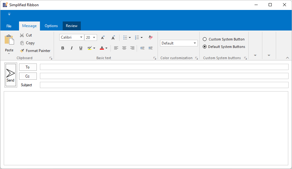
- Office2007
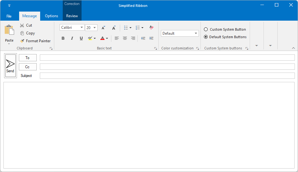
NOTE
IconSize
The icon size can be customized between 16 to 32 pixels using the IconSize property. By default, the icon rendered with a size of 16x16 pixels.
this.IconSize = new Size(32,32);Me.IconSize = New Size(32, 32)![]()
Customization
The property which lets you set borders for the Office2007Style form is as follows.
| Property | Description |
|---|---|
| Borders | Gets/sets the border values of an Office 2007 style form. Sets borders for Left, Top, Right and Bottom sides of the form. |
this.Borders = new System.Windows.Forms.Padding(10);Me.Borders = New System.Windows.Forms.Padding(10)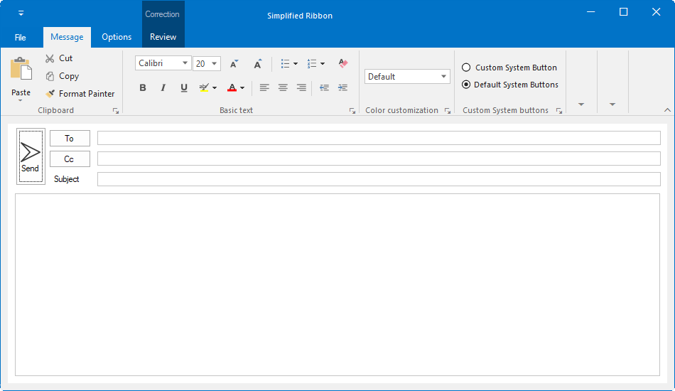
Customizing the Top Left Edge
This TopLeftRadius property gets/sets the curved radius of the top left edge of the form. Default is 8.
this.TopLeftRadius = 20;Me.TopLeftRadius = 20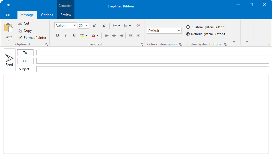
NOTE
The Borders and TopLeftRadius reflect in UI when the EnableAeroTheme is set to false and Appearance to Normal.
Adding user control to the title bar
The RibbonForm allows to load any user control into the right side of the title bar by using the HeaderItem property.
The following code example illustrates how to add the header item in title bar of the RibbonForm.
this.button = new SfButton();
this.button.ForeColor = Color.White;
this.button.Font = Font = new System.Drawing.Font("Segoe UI Semibold", 9F);
this.button.Size = new System.Drawing.Size(75, 50);
this.button.Text = "Sign-In";
this.button.Style.BackColor = System.Drawing.Color.FromArgb(((int)(((byte)(42)))), ((int)(((byte)(120)))), ((int)(((byte)(212)))));
this.button.Style.HoverBackColor = System.Drawing.Color.FromArgb(((int)(((byte)(42)))), ((int)(((byte)(141)))), ((int)(((byte)(212)))));
this.button.Style.FocusedBackColor = System.Drawing.Color.FromArgb(((int)(((byte)(42)))), ((int)(((byte)(87)))), ((int)(((byte)(154)))));
this.button.Style.PressedBackColor = System.Drawing.Color.FromArgb(((int)(((byte)(42)))), ((int)(((byte)(87)))), ((int)(((byte)(154)))));
this.button.Style.PressedForeColor = Color.White;
this.button.Style.HoverForeColor = Color.White;
this.button.Style.FocusedForeColor = Color.White;

this.HeaderItem = button;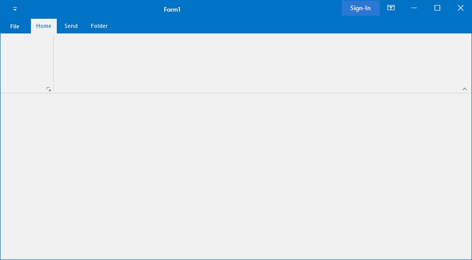
NOTE