How can I help you?
Toolbar
Toolbar can be shown by setting the toolbarSettings.showToolbar as true. To modify the toolbar behavior use toolbarSettings property. Toolbar has an option to add default items in the toolbarSettings.toolbarItems and customized items in the toolbarSettings.customToolbarItems.
Default toolbar items
The following table shows default toolbar items and its action.
| Default toolbar items. | Action |
|---|---|
| Add | Add a new row. |
| Edit | Edit an existing. |
| Delete | Delete a row. |
| Update | Update edited or added row. |
| Cancel | Cancel edited or added row. |
| Search | Search text in records. |
<div id="Grid"></div>
<script type="text/javascript">
  $("#Grid").ejGrid({
      // the datasource "window.gridData" is referred from jsondata.min.js
      dataSource: window.gridData,
      toolbarSettings: {
          showToolbar: true,
          toolbarItems: [ej.Grid.ToolBarItems.Add, ej.Grid.ToolBarItems.Edit, ej.Grid.ToolBarItems.Delete, ej.Grid.ToolBarItems.Update, ej.Grid.ToolBarItems.Cancel]
      },
      allowPaging: true,
      editSettings: { allowEditing: true, allowAdding: true,allowDeleting: true},
      columns:
          [
              { field: "OrderID", isPrimaryKey: true, headerText: "Order ID", textAlign: ej.TextAlign.Right, width: 90 },
              { field: "CustomerID", headerText: 'Customer ID', width: 90 },
              { field: "EmployeeID", headerText: 'Employee ID',editType: ej.Grid.EditingType.Dropdown,textAlign: ej.TextAlign.Right,width: 80 },
              { field: "Freight", headerText: 'Freight', textAlign: ej.TextAlign.Right, editType: ej.Grid.EditingType.Numeric, editParams: { decimalPlaces: 2 }, width: 80, format: "{0:C}" },
              { field: "ShipName", headerText: 'Ship Name', width: 150 }
          ]

  });

</script>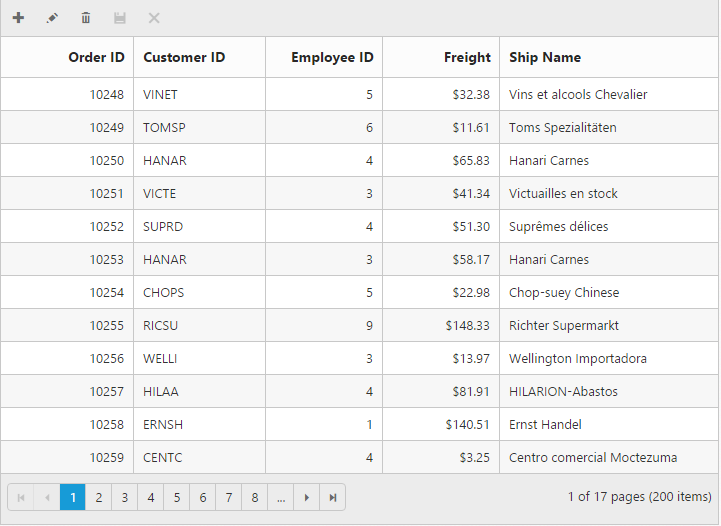
IMPORTANT
editSettings.allowAdding,editSettings.allowEditingandeditSettings.allowDeletingneed to be enabled for add, delete, edit, save & cancel intoolbarItems.allowSearching` to be enabled while adding search in toolbar to perform search action.
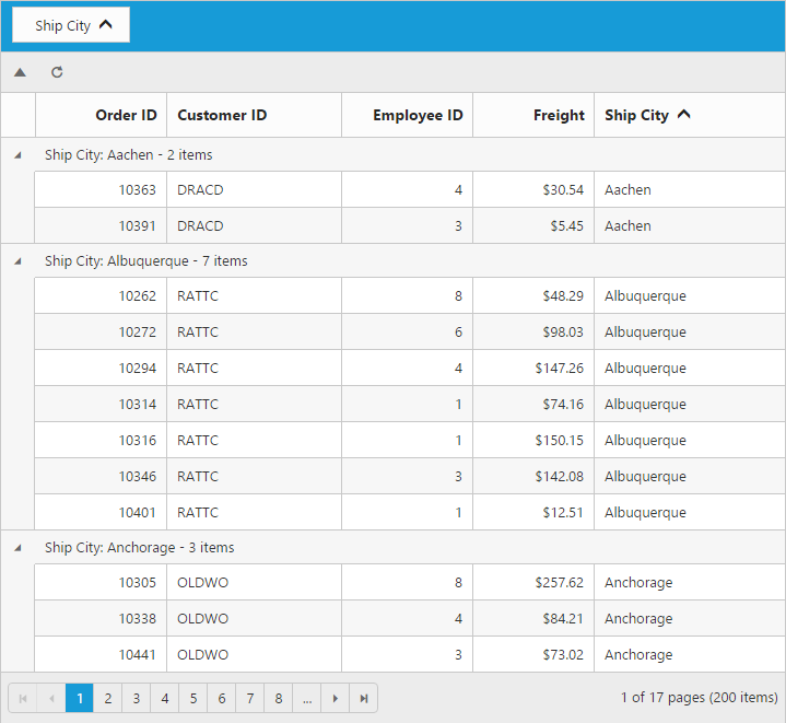
Custom toolbar items
The custom toolbar is used to create your own toolbar items in toolbar. It can be added by defining the toolbarSettings.customToolbarItems. Actions for this customized toolbar is defined in the toolbarClick event.
To add custom toolbar item as template use templateID property and also you can customize the toolbar tooltip by tooltip property.
<div id="Grid"></div>
<script id="Refresh" type="text/x-jsrender">
  <a class="e-toolbaricons e-icon refresh" />
</script>
<script type="text/javascript">
  function onToolBarClick(args) {
      var toolbarObject = $(args.target),
        grid = this;
      if (toolbarObject.hasClass("Collapse")) grid.collapseAll(); //collapse Grid using grid instance, `this` is grid instance
      else grid.refreshContent(); //refresh content using grid instance
  }
  $("#Grid").ejGrid({
      // the datasource "window.gridData" is referred from jsondata.min.js
      dataSource: window.gridData,
      toolbarSettings: {
          showToolbar: true,
          customToolbarItems: ["Collapse", {
              templateID: "#Refresh"
          }]
      },
      toolbarClick: "onToolBarClick",
      allowPaging: true,
      allowGrouping: true,
      groupSettings: {
          groupedColumns: ["ShipCity"]
      },
      columns:
          [
              { field: "OrderID", headerText: "Order ID", isPrimaryKey: true, textAlign: ej.TextAlign.Right, width: 75 },
              { field: "CustomerID", headerText: "Customer ID", width: 100 },
              { field: "EmployeeID", headerText: "Employee ID", textAlign: ej.TextAlign.Right, width: 75 },
              { field: "Freight", headerText: "Freight", textAlign: ej.TextAlign.Right, width: 70, format: "{0:C}" },
              { field: "ShipCity", headerText: "Ship City", width: 110 }
          ]
  });
</script>
<style type="text/css" class="cssStyles">
  .Collapse:before {
  content: "\e625";
  }
  .refresh:before {
  content: "\e677";
  }
</style>